15 Easy Bullet Journal Lettering Styles Every Beginner Should Learn
Disclosure: Some of the links in this post are affiliate links. This means if you click on the link and purchase an item, I will receive an affiliate commission at no extra cost to you.
Somewhere between your first journal page and your fiftieth, you realize something.
The people with the journals you keep saving are not using one lettering style. They have a handful of favorites that they switch between depending on the page.
A reading tracker gets one look. A monthly cover gets another. A quote page gets something completely different.
That is usually what makes their journals feel so interesting. It is not expensive supplies or perfect handwriting. It is variety.
A better-looking journal does not always come from adding more decorations.
Sometimes all it takes is learning a few Bullet Journal Lettering Styles that you can switch between whenever a page starts feeling repetitive. Those small changes can make a surprisingly big impact.
If you’ve been using the same handwriting for every title, this list might be exactly what you need.
These Bullet Journal Lettering Styles are easy to learn, fun to experiment with, and can really make your pages look more interesting.
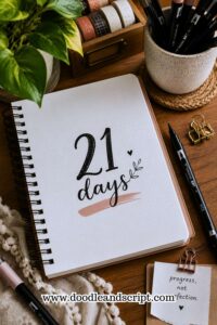
If you need a practice routine while learning these styles, explore How to Practice Bullet Journal Lettering in 21 Days.
15 Easy Bullet Journal Lettering Styles Every Beginner Should Learn
1. Simple Print Lettering

Simple print lettering probably is not the style that made you click on this post, but it might end up being the one you use the most.
When people first get into bullet journaling, they usually want to jump straight into fancy fonts and decorative lettering.
A few pages later, they realize they need titles for habit trackers, reading logs, grocery lists, brain dumps, and dozens of other spreads.
That is when simple print lettering becomes incredibly useful. It is clean, easy to read, and works with almost every journal layout you can think of.
Another reason this style deserves a spot in your lettering toolkit is that it teaches consistency.
When you practice keeping your letters the same height and spacing them evenly, you start developing skills that carry over into more advanced lettering styles.
Even decorative fonts look better when they are built on a strong foundation.
One thing many beginners discover is that simple lettering does not have to look boring. Small changes can make a huge difference.
Try writing in all caps, making the letters slightly taller, or adding a little extra spacing between each character. Those tiny adjustments can make an ordinary title feel much more intentional.
The next time you are setting up a weekly spread or creating a tracker, do not underestimate the power of simple print lettering. Sometimes the cleanest titles end up looking the most polished.
If you want to build stronger lettering habits, explore How to Practice Bullet Journal Lettering in 21 Days.
2. Block Lettering
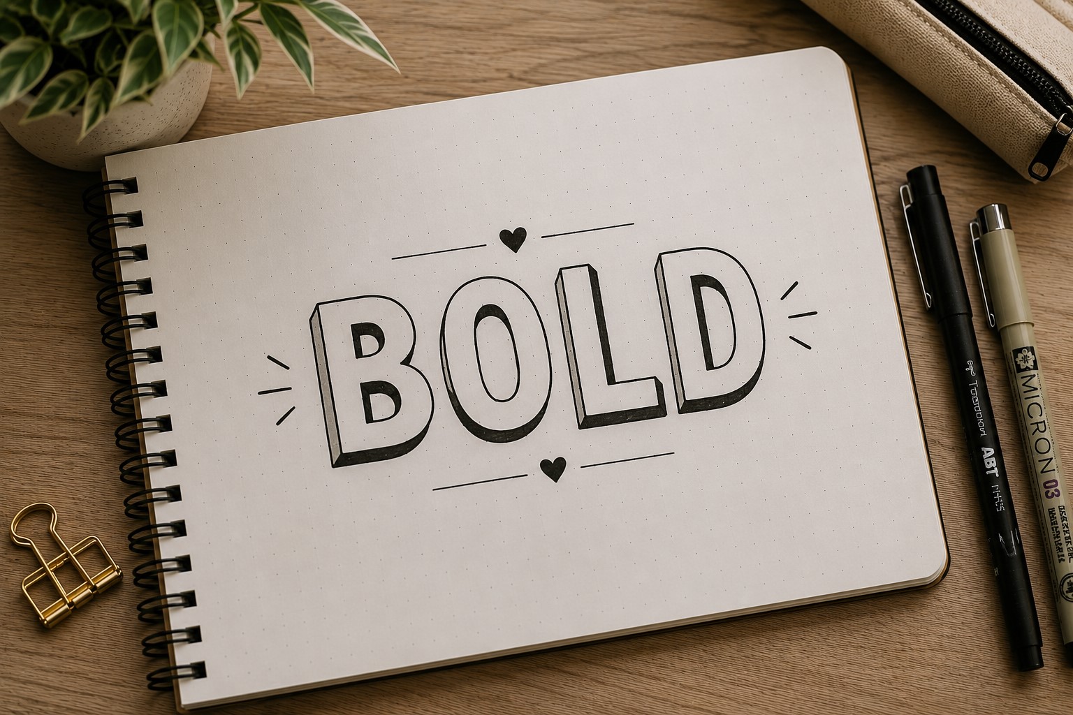
If simple print lettering is the reliable friend, block lettering is the one that always knows how to make an entrance.
There is a reason you see block letters everywhere in bullet journals. They are bold, eye-catching, and almost impossible to ignore.
When you want a title to stand out the moment someone looks at the page, block lettering gets the job done.
It works especially well for monthly covers, yearly goals, challenge pages, and any spread that needs a strong focal point.
What makes this style beginner-friendly is that it is built from simple shapes. Most block letters are made using straight lines and basic outlines, so you do not need amazing handwriting to make them look good.
In fact, many people find block lettering easier than cursive because there is less pressure to create smooth flowing strokes.
The fun starts after you draw the letters. You can leave them plain for a clean look or fill them with patterns, dots, stripes, stars, checkerboards, or tiny doodles.
One font can suddenly look like ten different fonts depending on how you decorate it.
If your journal titles often disappear into the background, block lettering is one of the easiest Bullet Journal Lettering Styles to learn because it naturally demands attention.
3. Bubble Lettering

Some lettering styles feel serious and structured. Bubble lettering is not one of them. The moment you draw those rounded shapes, the entire page feels lighter and more playful.
That is why bubble letters are so popular for mood trackers, birthday spreads, playlists, summer themes, and pages that are meant to feel fun rather than formal.
One thing beginners love about bubble lettering is how forgiving it is. The letters do not need perfectly straight lines or exact measurements.
Their soft, rounded appearance means small mistakes often blend into the style instead of standing out.
Another reason this font is worth learning is that it gives you plenty of room to be creative. You can fill the letters with patterns, color them in, add highlights, or even turn them into themed designs that match your spread.
A simple title can become part of the decoration rather than something sitting on top of it.
If your journal has been looking a little too serious lately, bubble lettering can be an easy way to bring some personality back into your pages.
4. Faux Calligraphy

A lot of people assume calligraphy requires expensive pens, perfect handwriting, and years of practice.
Then they discover faux calligraphy.
This style creates the look of modern calligraphy without requiring any special supplies. All you need is a regular pen and a little patience.
You start by writing a word in cursive, then go back and thicken the downstrokes. That simple trick creates the beautiful contrast that makes calligraphy look so elegant.
One reason beginners fall in love with faux calligraphy is that the results feel dramatic compared to the amount of effort involved.
A simple word can suddenly look like it belongs in a professional journal spread.
This style works especially well for quote pages, gratitude logs, vision boards, and monthly covers. It adds a soft, artistic touch without making the page feel overcrowded.
If you have been admiring beautiful script lettering online but feeling intimidated by it, faux calligraphy is often the perfect place to start.
It gives you the look you want while helping you build confidence at the same time. If you love elegant script styles, check out 17 Creative Bullet Journal Calligraphy Ideas to Try Today.
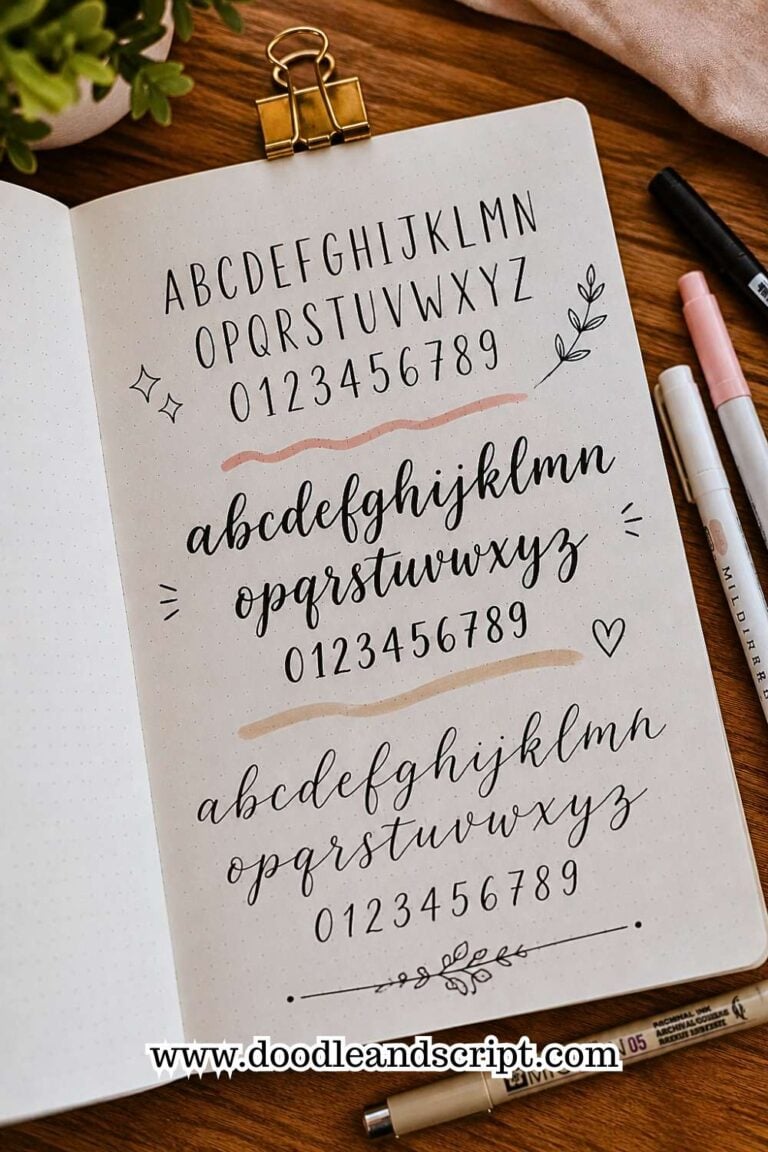
5. Tall Skinny Lettering

Not every title needs to be big and bold.
Sometimes a page looks better when the lettering feels clean, modern, and a little understated. That is exactly where tall skinny lettering shines.
This style uses narrow, elongated letters that take up less horizontal space. It is incredibly useful for long headings that would look crowded in wider fonts.
If you have ever struggled to fit a title across a page, this lettering style can be a lifesaver.
Many journal creators also love how neat it looks. There is something satisfying about rows of tall, evenly spaced letters.
They instantly make a spread feel organized without requiring a lot of decoration.
Another benefit is how well this style works alongside other fonts.
Pairing tall skinny lettering with a bold block font creates contrast and helps certain words stand out more than others. The combination looks intentional and professionally designed.
Among all the Bullet Journal Lettering Styles beginners learn, this is often one of the easiest to incorporate into everyday spreads because it is both practical and stylish.
6. Serif Lettering

Serif lettering has a timeless quality that never really goes out of style.
You have probably seen serif fonts hundreds of times without realizing it. They appear in books, newspapers, magazines, and countless brand logos.
Those tiny strokes at the ends of letters may seem insignificant, but they completely change the personality of a word.
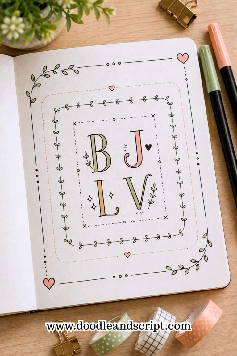
In a bullet journal, serif lettering can make a title feel more refined and sophisticated. It works beautifully for reading journals, book reviews, literature trackers, and quote pages because it has a slightly classic feel.
One thing beginners often like about serif lettering is that it looks more complicated than it actually is.
You start with a simple letter and add small finishing details to the ends. Those little additions create a font that feels much more polished.
This style is also a great reminder that small changes can have a huge impact. You are not learning an entirely new alphabet. You are simply modifying the letters you already know.
If you enjoy creating meaningful quote pages, explore 17 Bullet Journal Quote Lettering Ideas That Stand Out.
7. Sans Serif Lettering

If serif lettering feels classic, sans serif lettering feels modern.
This style removes the extra decorative strokes and focuses on clean, simple letterforms. The result is easy to read, versatile, and surprisingly stylish.
Many people who love minimalist journals rely heavily on sans serif lettering because it looks polished without demanding attention.
It allows the layout, colors, and decorations to shine while still giving the page a professional appearance.
One reason beginners should learn this style is that it teaches simplicity. It is easy to get caught up in trying to make every title elaborate, but sometimes a clean font is exactly what a page needs.
Sans serif lettering proves that beautiful does not always mean complicated.
It is also one of the most flexible Bullet Journal Lettering Styles you can learn. It works for monthly covers, trackers, daily logs, study pages, and practically anything else you can imagine.
The next time you feel tempted to over-decorate a title, try a clean sans serif font instead. You may be surprised by how much you like the result.
8. Outline Lettering

Outline lettering is one of those styles that looks like it took a lot more effort than it actually did.
At its core, the idea is simple. Instead of filling in the letters, you draw only the outer edges and leave the center empty.
That small change completely transforms the look of a title. The letters feel bold and noticeable without making the page look crowded.
One reason beginners love outline lettering is the flexibility it offers. You can leave the letters empty for a clean and modern look, or you can fill them with patterns, colors, doodles, or seasonal designs.
A Halloween spread, for example, might use spiderweb patterns, while a spring page could include tiny flowers inside the letters.
This style also works well for large headings because the open space keeps the title from feeling too heavy.
If you have ever wanted a bold title without covering half the page in ink, outline lettering is a great option.
If you want more title inspiration, explore How to Make Beautiful Bullet Journal Headers in 13 Easy Steps.
9. Shadow Lettering

Sometimes a title looks good but still feels like it is missing something. That is where shadow lettering comes in.
Adding a shadow behind your letters creates depth and makes the title stand out from the page.
It is one of the easiest tricks you can learn, yet the effect is surprisingly dramatic. Even simple handwriting can look more polished with a well-placed shadow.
The best part is that shadow lettering works with almost every font. You can add shadows to block letters, bubble letters, serif fonts, and even simple print lettering.
It is less of a font and more of a technique that instantly upgrades the styles you already know.
Many beginners avoid shadows because they worry about making mistakes. The truth is that most shadows are very forgiving.
As long as the shadow stays consistent throughout the word, it usually looks great.
This is one of those skills that can make your journal pages feel more professional without requiring hours of extra work.
10. Dotted Lettering

Dotted lettering is proof that small details can make a big difference.
Instead of creating solid lines, this style uses tiny dots to form the letters. The finished result feels softer, lighter, and a little more playful than traditional lettering.
This style works especially well in habit trackers, mood logs, seasonal spreads, and pages with a gentle aesthetic. The dots add visual interest without overwhelming the rest of the layout.
One thing people enjoy about dotted lettering is that it encourages patience. There is something oddly relaxing about slowly building a word dot by dot.
It almost feels like a creative break from everyday journaling.
You can also experiment with different dot sizes and spacing to create unique effects. Some journal creators even combine dotted lettering with shadows or outlines for a more decorative look.
If you enjoy adding artistic details to your pages, dotted lettering is definitely worth trying.
11. Script Lettering

There is something about script lettering that instantly makes a page feel more elegant.
The flowing strokes create movement across the page, making words feel softer and more expressive. It is the kind of lettering style that naturally draws attention without shouting for it.
Many beginners feel intimidated by script lettering because it looks complicated. The good news is that you do not need perfect cursive handwriting to make it work.
In fact, some of the most charming script styles look slightly imperfect because they feel more personal.
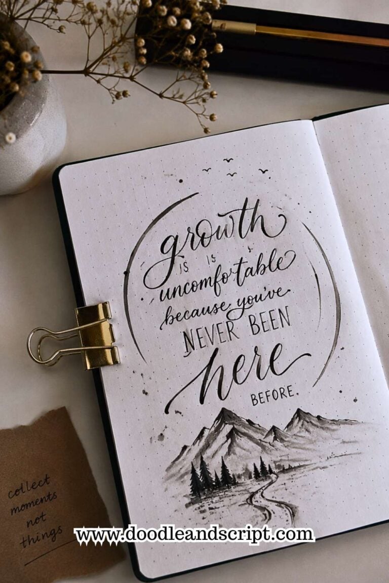
Script lettering is especially popular for quote pages, gratitude journals, memory spreads, and cover pages. It works beautifully when you want a title to feel creative and artistic.
One helpful tip is to focus on smooth movement rather than perfect letters. The overall flow of the word often matters more than any single character.
If you want more creative page ideas, check out 25 Aesthetic Bullet Journal Lettering Ideas You’ll Love.
12. All-Caps Lettering

Some fonts feel fancy. All-caps lettering feels confident. Writing everything in capital letters creates a strong visual presence that is easy to read and surprisingly versatile.
It works for almost every type of spread, from monthly covers to study planners and habit trackers.
One reason people keep coming back to this style is consistency. Since all the letters share a similar height, it is easier to create balanced titles.
That makes it a great choice for beginners who are still developing control.
All-caps lettering also pairs well with decorative elements. You can add shadows, patterns, outlines, or banners without making the title difficult to read.
Do not underestimate this style just because it seems simple. Sometimes the cleanest lettering ends up making the strongest impression.
13. Bouncy Lettering

Most handwriting follows a straight line across the page. Bouncy lettering breaks that rule completely.
In this style, some letters sit slightly above the baseline while others drop below it. The result feels energetic, playful, and full of personality. It is the kind of lettering that looks relaxed rather than rigid.
One reason people love bouncy lettering is that it removes some of the pressure to be perfect. The slight variations are actually part of the style.
Those little differences create movement and make the words feel more natural.
This lettering style works especially well for creative spreads, birthday pages, seasonal themes, and anything that calls for a cheerful vibe.
It is also a great reminder that lettering does not always have to be neat and structured to look good.
If you enjoy playful page designs, explore 21 Cute Bullet Journal Banner Doodles Anyone Can Draw.
14. Mixed Font Lettering
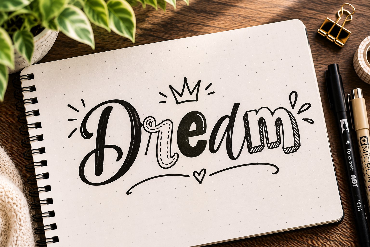
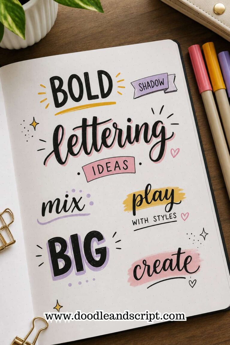
After learning several lettering styles, most people naturally start combining them. That is exactly what mixed font lettering is all about.
Instead of using one font for an entire title, you combine different styles within the same phrase.
You might pair a bold block font with script lettering or combine tall skinny letters with bubble letters. The contrast helps certain words stand out and creates a more dynamic design.
This technique is incredibly popular in bullet journaling because it makes titles look custom and creative.
Even a simple heading can feel professionally designed when the fonts complement each other well.
The trick is to avoid using too many styles at once. Two fonts usually look balanced. Three can work if done carefully. Beyond that, the title can start feeling cluttered.
Once you become comfortable with different Bullet Journal Lettering Styles, mixed font lettering becomes one of the most fun techniques to experiment with.
15. Decorative Lettering

Decorative lettering is where creativity takes over. Instead of stopping at the letters themselves, you add extra details that help the title become part of the page design.
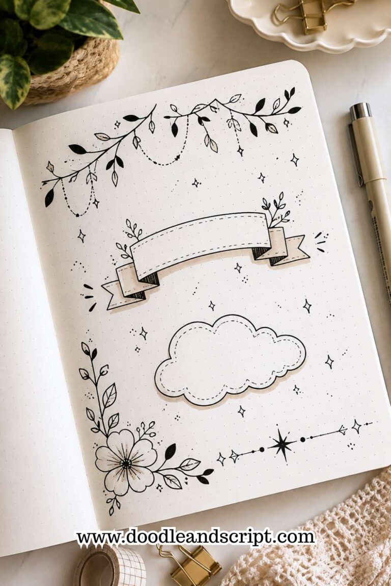
This could include stars, flowers, vines, sparkles, hearts, banners, leaves, or tiny doodles woven around the lettering.
What makes this style so enjoyable is that there are no strict rules. Two people can decorate the same word and end up with completely different results.
That freedom allows your personality to show through in your journal.
Decorative lettering works especially well for special spreads, holiday pages, birthdays, yearly goals, and themed layouts. It turns a title into a focal point rather than just a label.
The key is balance. A few thoughtful details often look better than filling every empty space on the page.
When done well, decorative lettering can transform an ordinary spread into something that feels uniquely yours.
If you want more doodle inspiration, explore 27 Easy Bullet Journal Doodle Ideas for Every Page.
Final Thoughts
Learning new Bullet Journal Lettering Styles can feel a little overwhelming at first.
You see pages filled with beautiful fonts and assume you need to learn all of them before your journal will look good. The truth is much simpler.
Most journal lovers have a small group of lettering styles they use over and over again.
They might pull out block letters for a monthly cover, script lettering for a quote page, and simple print lettering for everyday spreads.
The magic is not in knowing dozens of fonts. It is in knowing a few styles well enough to use them confidently.
As you work through these Bullet Journal Lettering Styles, give yourself permission to experiment. Some fonts will immediately feel natural.
Others might take a little more practice. You may even combine pieces from different styles and create something that feels completely your own. That is part of the fun.
Another thing worth remembering is that lettering does not have to be perfect to look good.
Some of the most interesting journal pages have slightly uneven letters, imperfect spacing, and little quirks that make them feel personal.
Those details give your journal character. They remind you that it was created by a real person rather than printed by a machine.
The next time you sit down to create a spread, challenge yourself to try a style you have never used before. A new font can completely change the mood of a page and make journaling feel fresh again.
Before long, you will have a collection of favorite lettering styles that make titles, headers, and cover pages much easier to create.
If you want even more font inspiration, explore 29 Bullet Journal Font Ideas to Make Your Pages Pop.