17 Bullet Journal Quote Lettering Ideas That Stand Out
Disclosure: Some of the links in this post are affiliate links. This means if you click on the link and purchase an item, I will receive an affiliate commission at no extra cost to you.
There is a reason quote pages end up being some of the most loved pages in a bullet journal. Long after a monthly cover is forgotten and a habit tracker is filled up, a good quote can still make you stop and look.
It might remind you of a goal, a funny moment, a favorite character, or a mindset you are trying to keep.
What makes quote pages interesting is that the same sentence can look completely different from one journal to another. Some people make a single word huge and build the entire page around it.
Others scatter the quote across the spread like pieces of a puzzle. Some keep things simple, while others turn the page into a mini art project. That freedom is what makes them so fun to create.
When it comes to Bullet Journal Quote Lettering, the goal is not to show off perfect handwriting. It is to make the quote feel like it belongs on the page.
The right lettering style can make a funny quote feel funnier, a motivational quote feel more powerful, and a simple quote feel impossible to ignore.
These ideas will help you do exactly that while giving your favorite quotes the attention they deserve. If you want more creative inspiration, explore 23 Beautiful Bullet Journal Lettering Ideas You’ll Want to Copy.
17 Bullet Journal Quote Lettering Ideas That Stand Out
1. Make One Word the Star of the Page
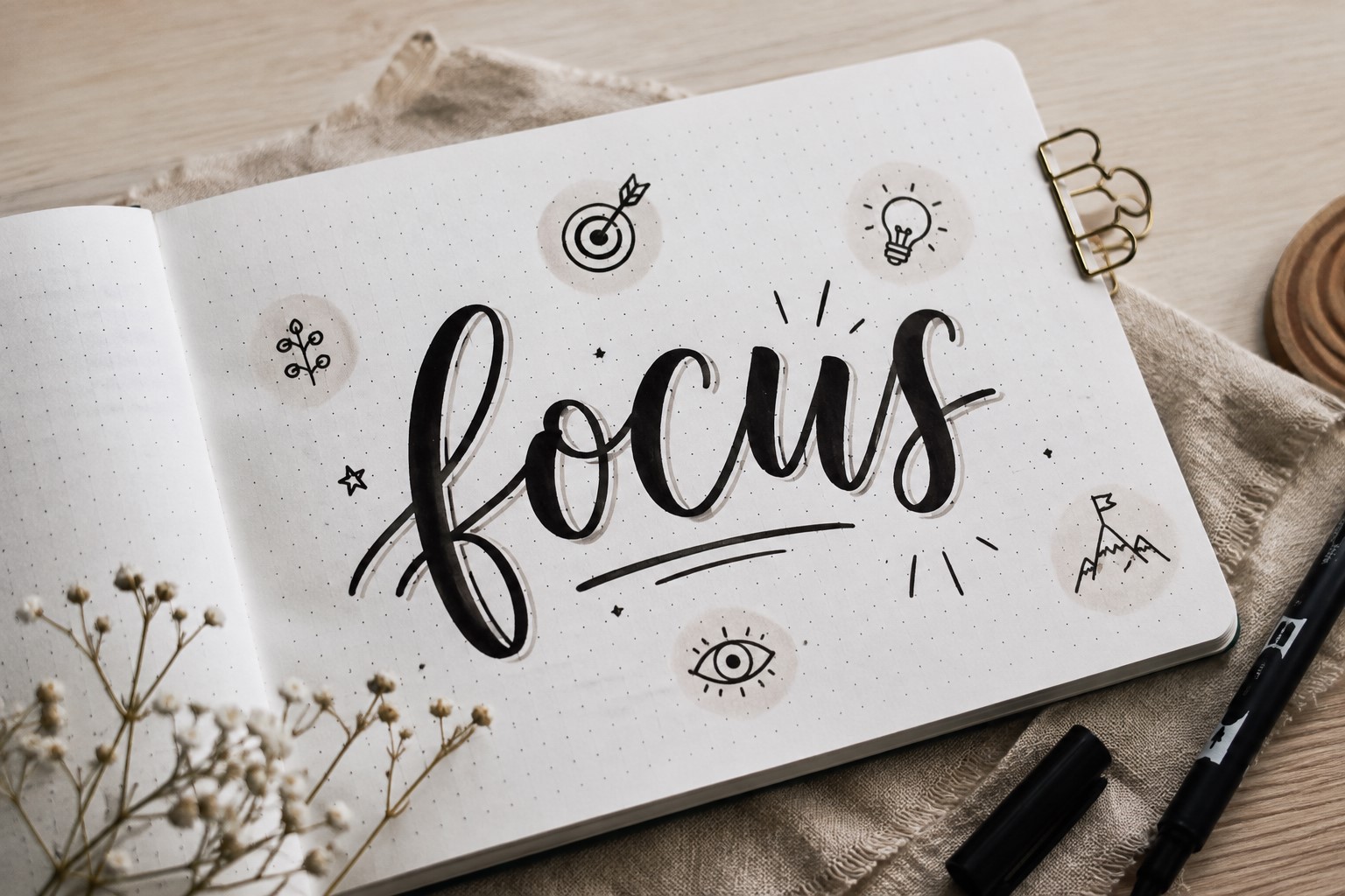
One of the easiest ways to improve Bullet Journal Quote Lettering is to stop treating every word equally. Most quotes have one word or phrase that carries the entire message.
It might be “dream,” “grow,” “believe,” “begin,” or another powerful word that immediately grabs attention.
Instead of lettering the entire quote in the same style, make that keyword much larger than everything else.
You can use bold block letters, decorative shadows, or a different font to help it stand out. The rest of the quote can remain smaller and simpler.
This technique works because it gives the reader’s eyes a clear starting point. Rather than reading every word at once, they notice the most important message first. That simple change can make a quote page feel much more intentional.
It is also a great trick for people who do not enjoy complicated lettering styles. Even simple handwriting can look impressive when the most important word is given extra attention.
Sometimes one oversized word is all a page needs to feel complete.
If you want more creative title inspiration, explore 21 Bullet Journal Title Lettering Ideas That Look Professional.
2. Let the Quote Flow Across the Page
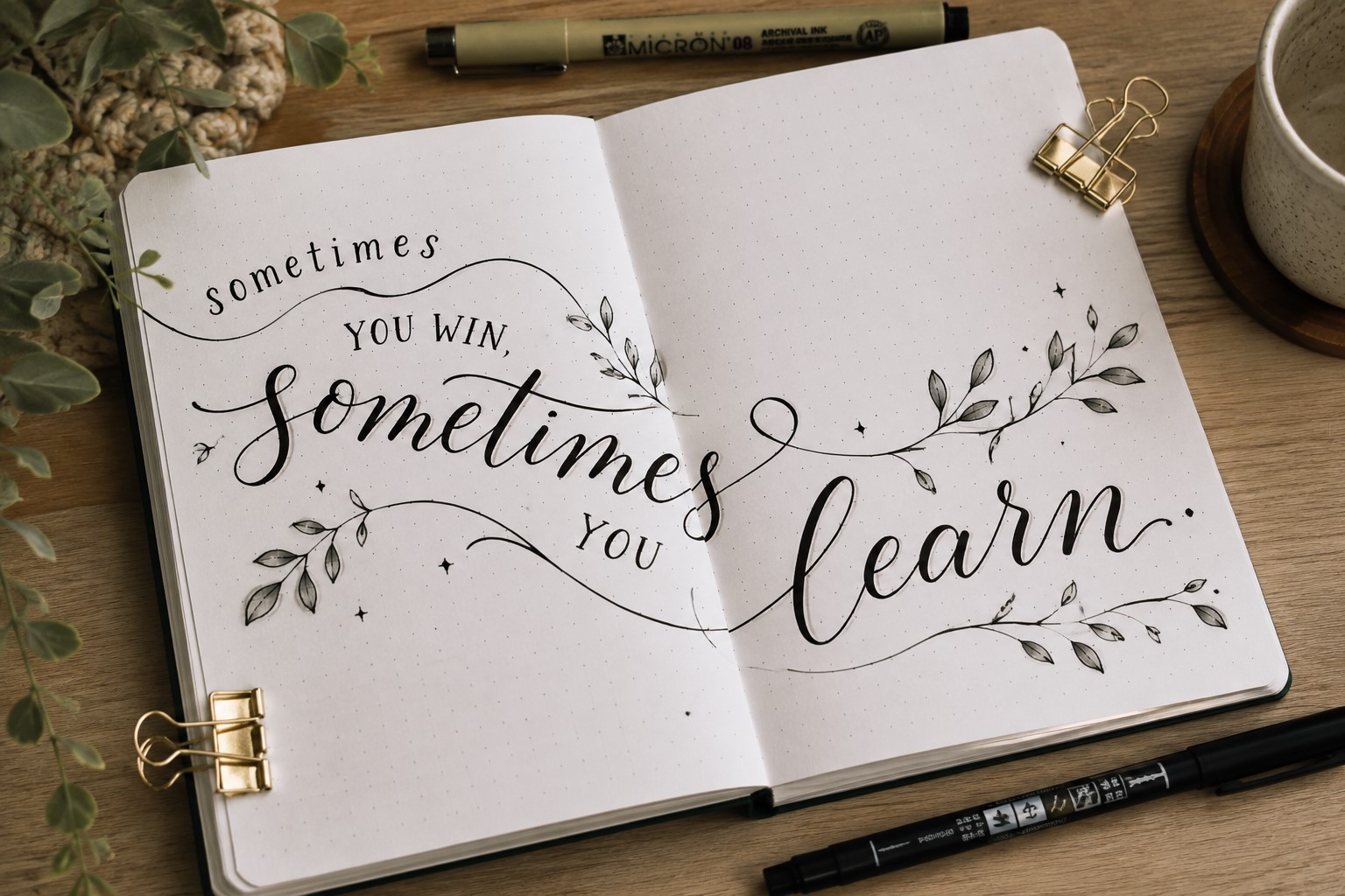
Not every quote needs to sit in a neat rectangle. Some of the most interesting quote pages allow the words to move naturally across the spread.
You might place one line at the top, another in the center, and a key phrase near the bottom. You can also arrange words in a gentle curve or create a layout that guides the eye through the message.
This approach works especially well for longer quotes because it prevents the page from feeling crowded. It also makes the design feel more dynamic and less predictable.
Many people automatically center every quote they write. While there is nothing wrong with that, changing the placement can instantly make the page feel more creative.
A quote that travels across the page often feels more engaging because your eyes naturally follow the journey of the words.
3. Mix Large and Small Lettering Styles
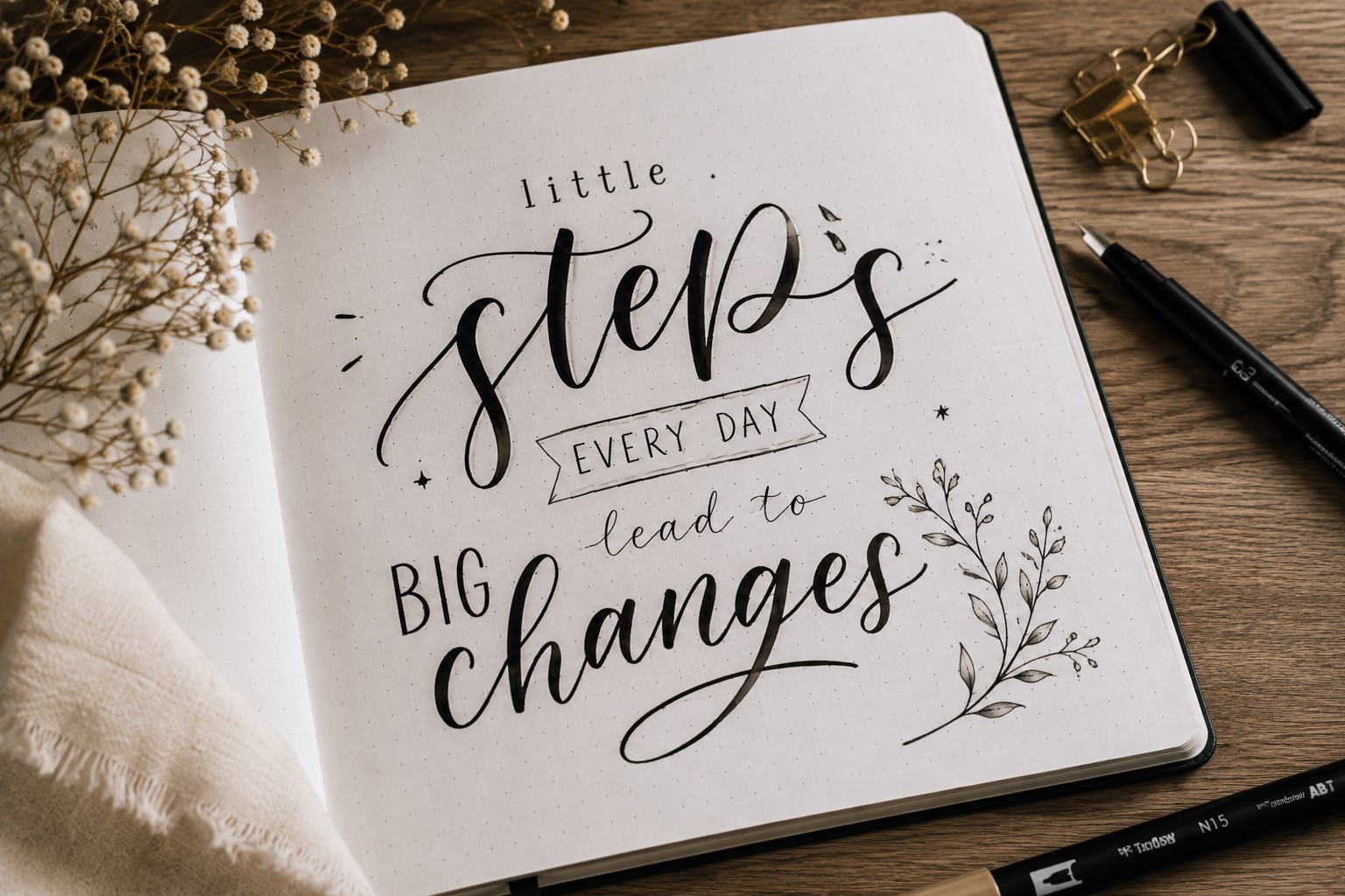
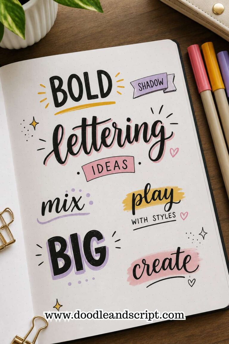
One of the quickest ways to create contrast is by combining different lettering sizes. Large words naturally attract attention, while smaller lettering helps support the message.
For example, you might write the most important phrase in oversized block letters and use a simple script font for the remaining words.
The difference in scale helps create hierarchy and makes the quote easier to read.
This technique is especially useful when you want certain parts of the quote to feel more dramatic. It also adds visual interest without requiring complicated decorations.
The best part is that you do not need multiple fancy fonts to make this work. Simply changing the size of the lettering can create a huge impact.
It is one of the easiest ways to make Bullet Journal Quote Lettering look more professional.
If you enjoy experimenting with different lettering styles, check out 19 Easy Bullet Journal Fonts Anyone Can Learn.
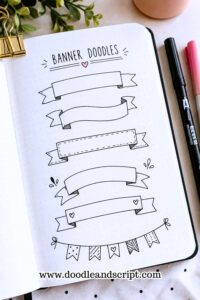
4. Use a Banner to Highlight a Key Phrase
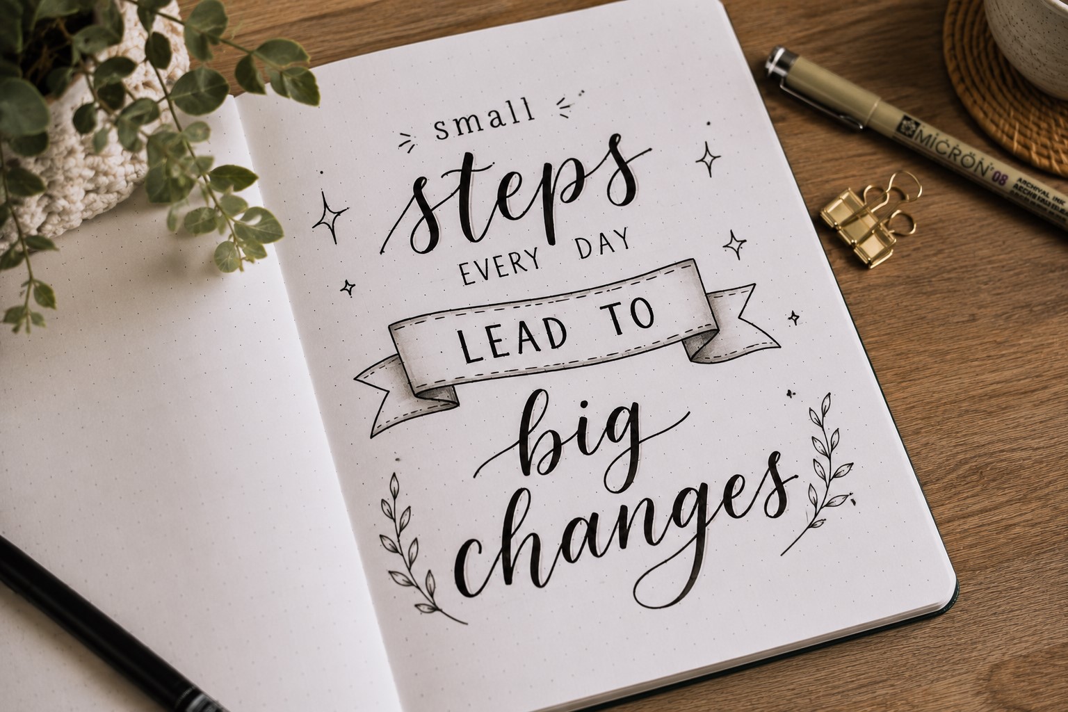
Sometimes a quote contains one line that deserves extra attention. A banner is a simple way to highlight that phrase without overwhelming the rest of the page.
The banner acts like a spotlight. It immediately tells the reader which words matter most. Even a basic banner can transform an ordinary quote into a more engaging design.
You do not need an elaborate banner style. Simple ribbon banners, fishtail banners, and curved banners all work beautifully for quote pages.
Banners are especially helpful when a quote has a phrase you want to remember every time you open your journal.
Framing those words makes them feel more intentional. It also helps break up the layout and keeps the page from looking like a large block of text.
If you love adding banners to your spreads, explore 21 Cute Bullet Journal Banner Doodles Anyone Can Draw.
5. Create a Quote Inside a Shape
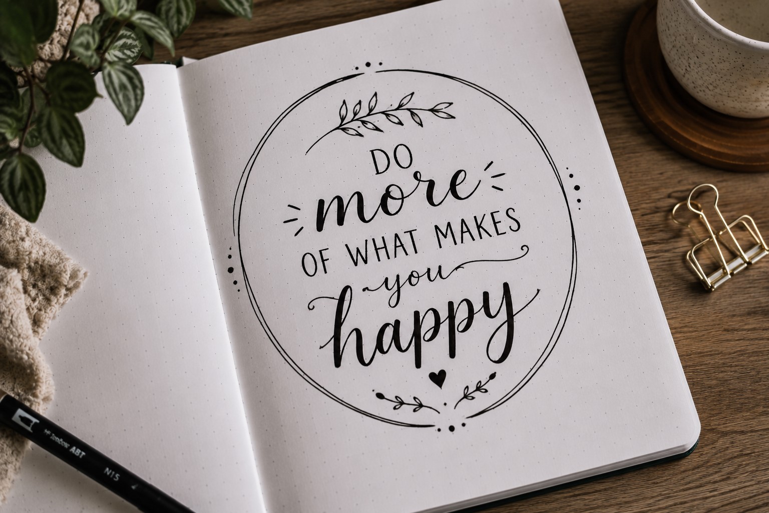
Instead of writing the quote in straight lines, try arranging it inside a shape. Circles, hearts, stars, clouds, and geometric shapes can all create interesting layouts.
This technique makes the quote feel more like artwork and less like a block of text. It also gives you a built-in structure for organizing the words.
The shape should support the quote rather than compete with it. Keeping the design simple usually produces the best results.
This idea works particularly well when you are creating a themed spread. A star shape can complement an inspirational quote, while a heart shape may suit a page filled with meaningful reminders.
Small design choices like these help the quote feel connected to the overall page. Many journal users are surprised by how much personality a simple shape can add to a spread.
6. Use Decorative Shadows for Extra Impact
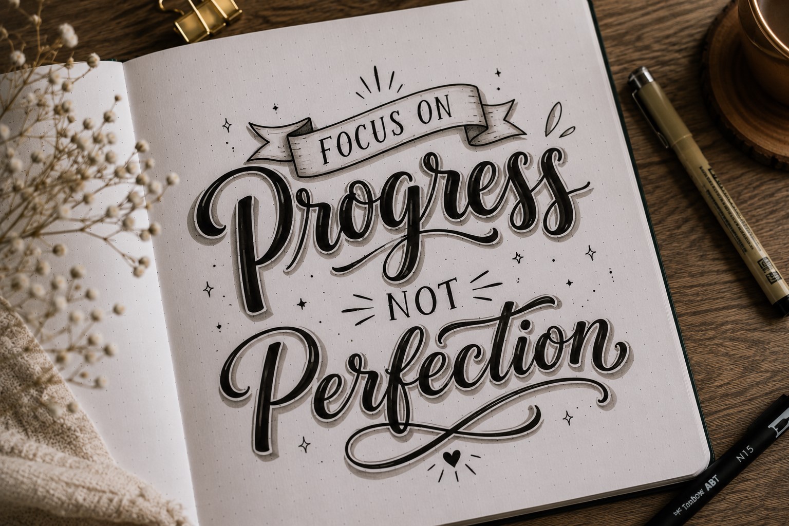
Shadows are one of the easiest ways to make Bullet Journal Quote Lettering stand out. They add depth and help important words feel more prominent.
A simple shadow can make a bold word look stronger and more eye-catching. You can keep the shadow clean or fill it with dots, stars, or small patterns for a decorative effect.
The key is consistency. Every shadow should fall in the same direction so the lettering feels polished and intentional.
Shadows are especially useful when you feel like a quote page looks a little flat. They create dimension without requiring extra doodles or decorations.
A few well-placed shadows can completely change the energy of a page.
If you enjoy decorative lettering techniques, take a look at 11 Decorative Bullet Journal Lettering Ideas for Stunning Pages.
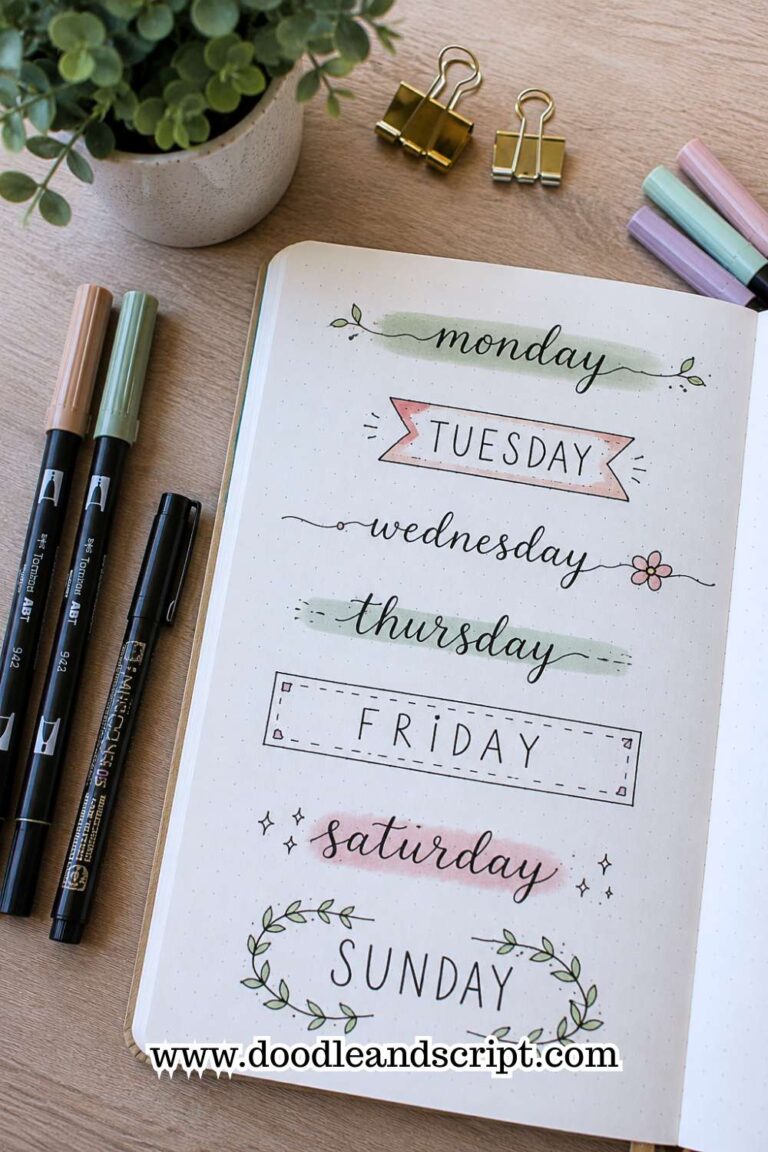
7. Use Different Fonts Within the Same Quote
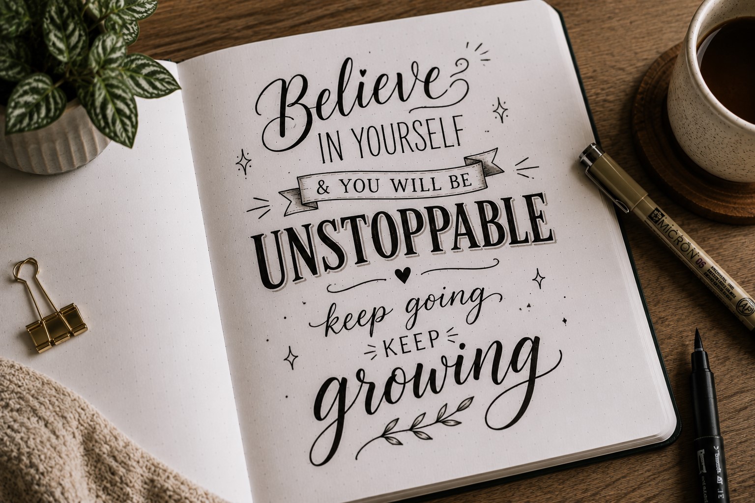
One font can look beautiful, but using two or three complementary styles can make a quote much more interesting.
This is one of the most effective Bullet Journal Quote Lettering techniques because it helps certain words stand out naturally.
For example, you might use a bold block font for important keywords and a simple script font for the connecting words.
This creates contrast without making the page feel busy. The different styles help guide the reader through the quote.
The trick is not using too many fonts at once. A page with five different lettering styles can quickly become distracting.
Sticking to two or three fonts usually creates a cleaner and more balanced result.
This approach is also great for beginners who want variety without learning dozens of new alphabets. Even small font changes can make a quote page feel more creative and polished.
If you want more font inspiration, explore 29 Bullet Journal Font Ideas to Make Your Pages Pop.
8. Stack Words for a Stronger Visual Impact
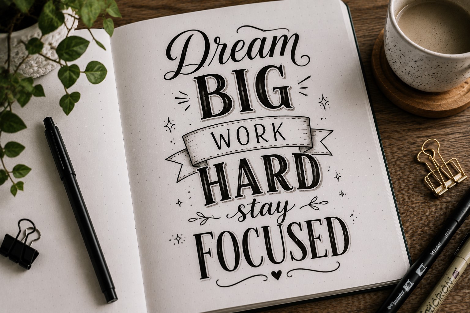
Sometimes a quote becomes more powerful when the words are stacked rather than written in long horizontal lines. Stacking allows you to give each word its own space while creating a bold focal point.
This works especially well for short quotes or phrases. Words like “Choose Joy” or “Keep Going” can become much more striking when arranged vertically.
The layout immediately catches attention and creates a stronger visual presence.
Stacking also helps fill empty space on a page without adding unnecessary decorations. The design feels intentional because the words themselves become part of the artwork.
Many journal users find that stacked quotes look more dramatic and memorable than traditional layouts. They are simple to create but often have a big impact.
9. Add Doodles That Support the Message
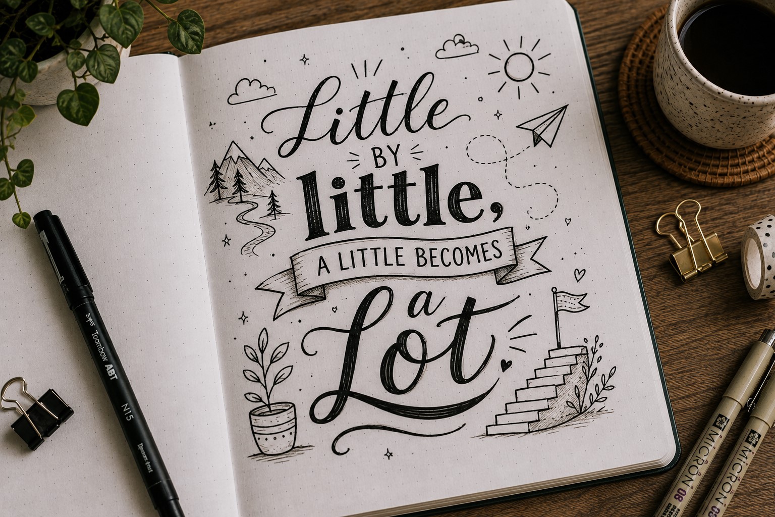
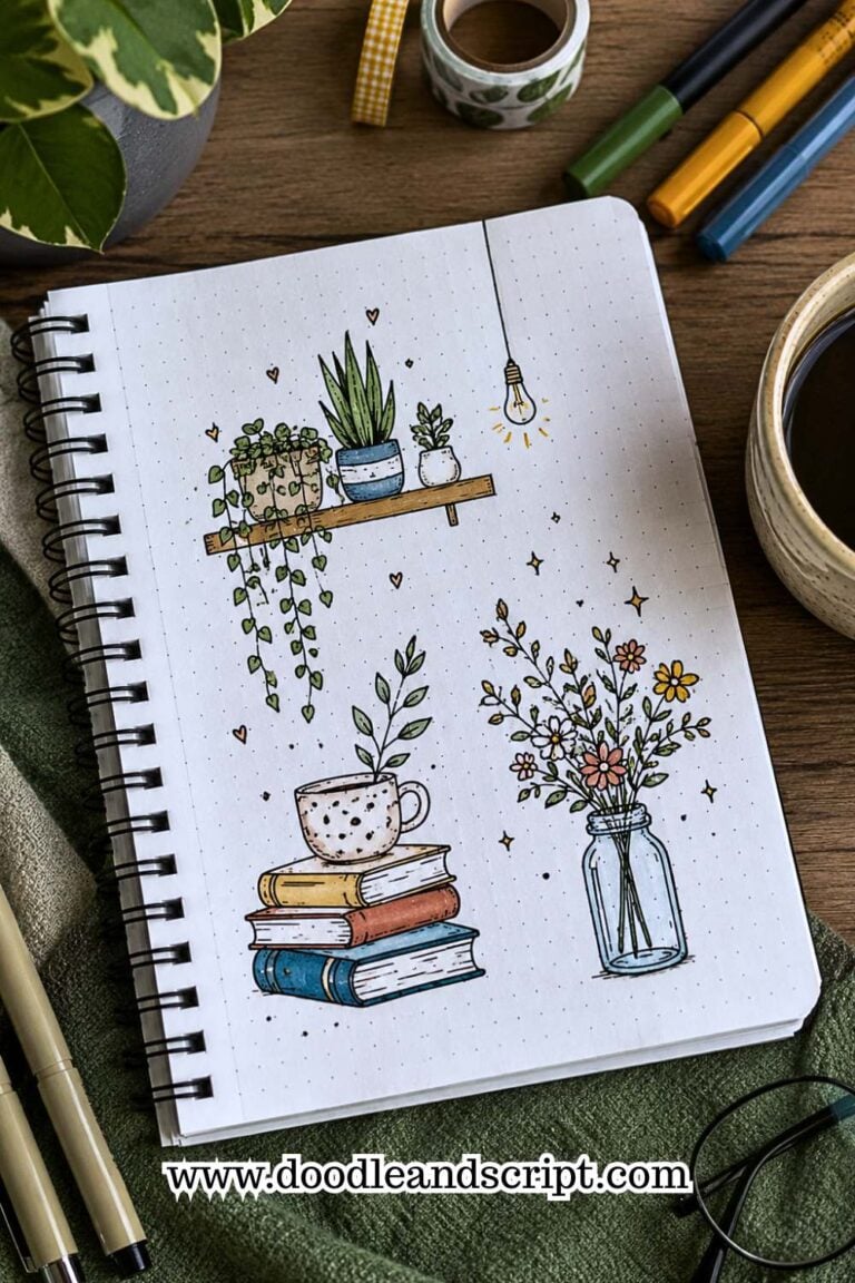
Doodles can make Bullet Journal Quote Lettering feel more personal and connected to the theme of the page. The key is choosing doodles that support the quote rather than distract from it.
A motivational quote might work well with stars, arrows, or lightning bolts. A calming quote may pair beautifully with leaves, flowers, or clouds.
These small details help reinforce the mood of the message.
It is easy to get carried away with decorations, so try to think of doodles as supporting characters rather than the main attraction. The quote should always remain the star of the page.
When used thoughtfully, even a few simple doodles can make a quote spread feel more complete and visually appealing.
If you enjoy adding creative details to your journal, check out 27 Easy Bullet Journal Doodle Ideas for Every Page.
10. Let One Letter Overshadow the Rest
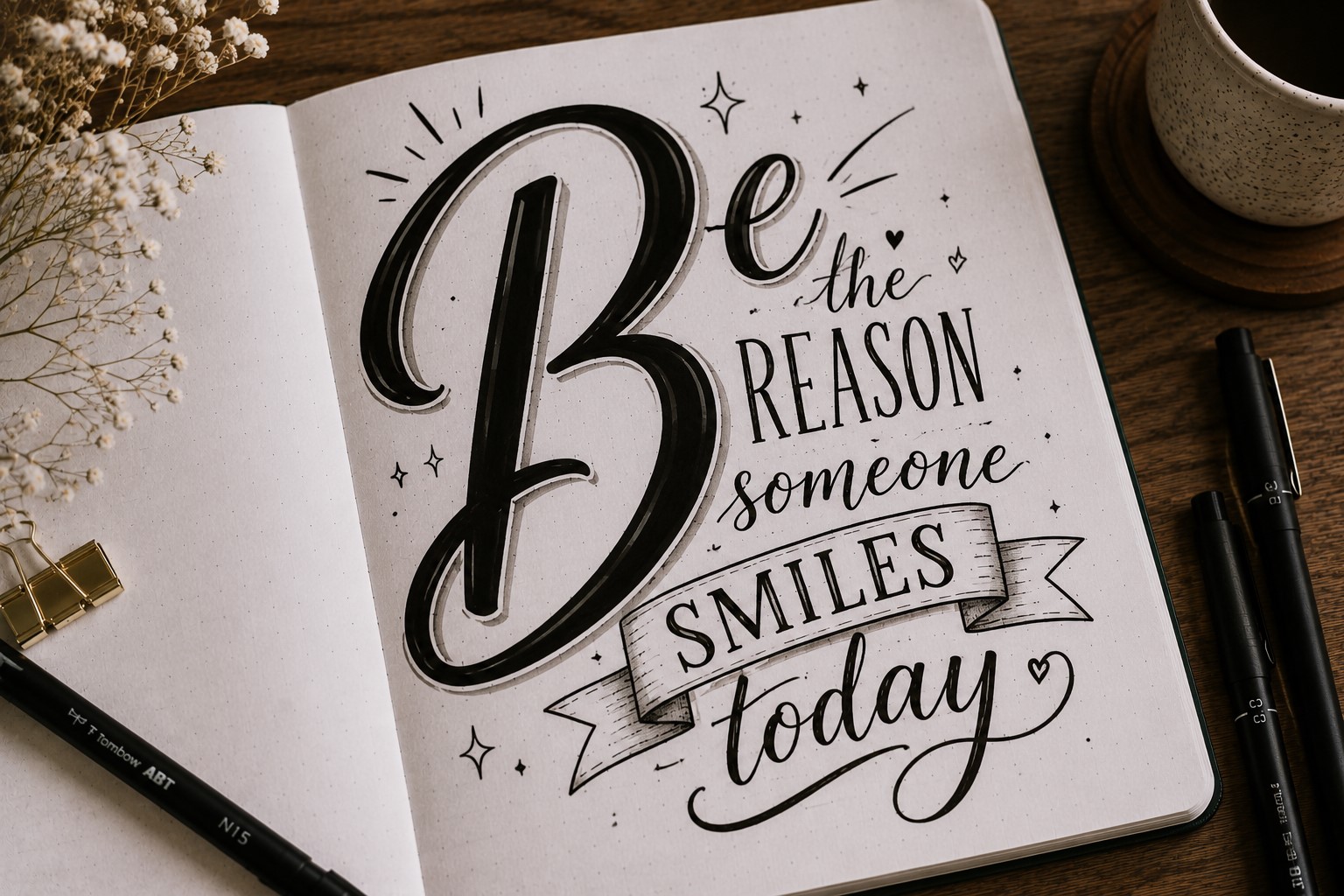
Instead of emphasizing an entire word, focus on a single letter. An oversized first letter can instantly create a focal point and add character to a quote page.
This technique works particularly well when the quote begins with a strong word.
The large letter draws attention first, then leads the reader through the rest of the quote. It is a simple way to add drama without overcrowding the page.
You can decorate the letter with patterns, florals, shadows, or small doodles to make it stand out even more.
The rest of the quote can remain fairly simple so the decorative letter gets the attention it deserves.
Many classic books use decorative initials at the beginning of chapters. Bringing that idea into your journal can make a quote page feel creative and unique.
If you love decorative details, explore 15 Easy Bullet Journal Doodle Borders Anyone Can Draw.
11. Build the Quote Around a Decorative Border
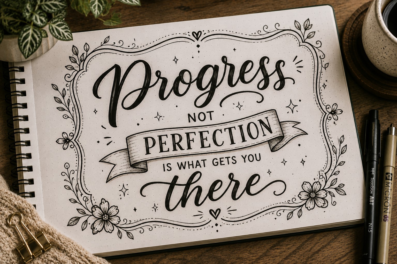
Most people draw a border around a finished quote. Try reversing the process. Create the border first and then fit the quote inside it.
This approach often leads to more interesting layouts because the border becomes part of the design rather than an afterthought.
It also helps you plan spacing more effectively before you start lettering.
Borders can be floral, geometric, seasonal, or completely minimal. The style should match the mood of the quote and the overall look of the spread.
A thoughtfully designed border can make a simple quote feel much more polished. It gives the page structure while helping the words stand out.
If you enjoy creating decorative page elements, take a look at 15 Easy Bullet Journal Doodle Borders Anyone Can Draw.
12. Highlight Important Words With Color
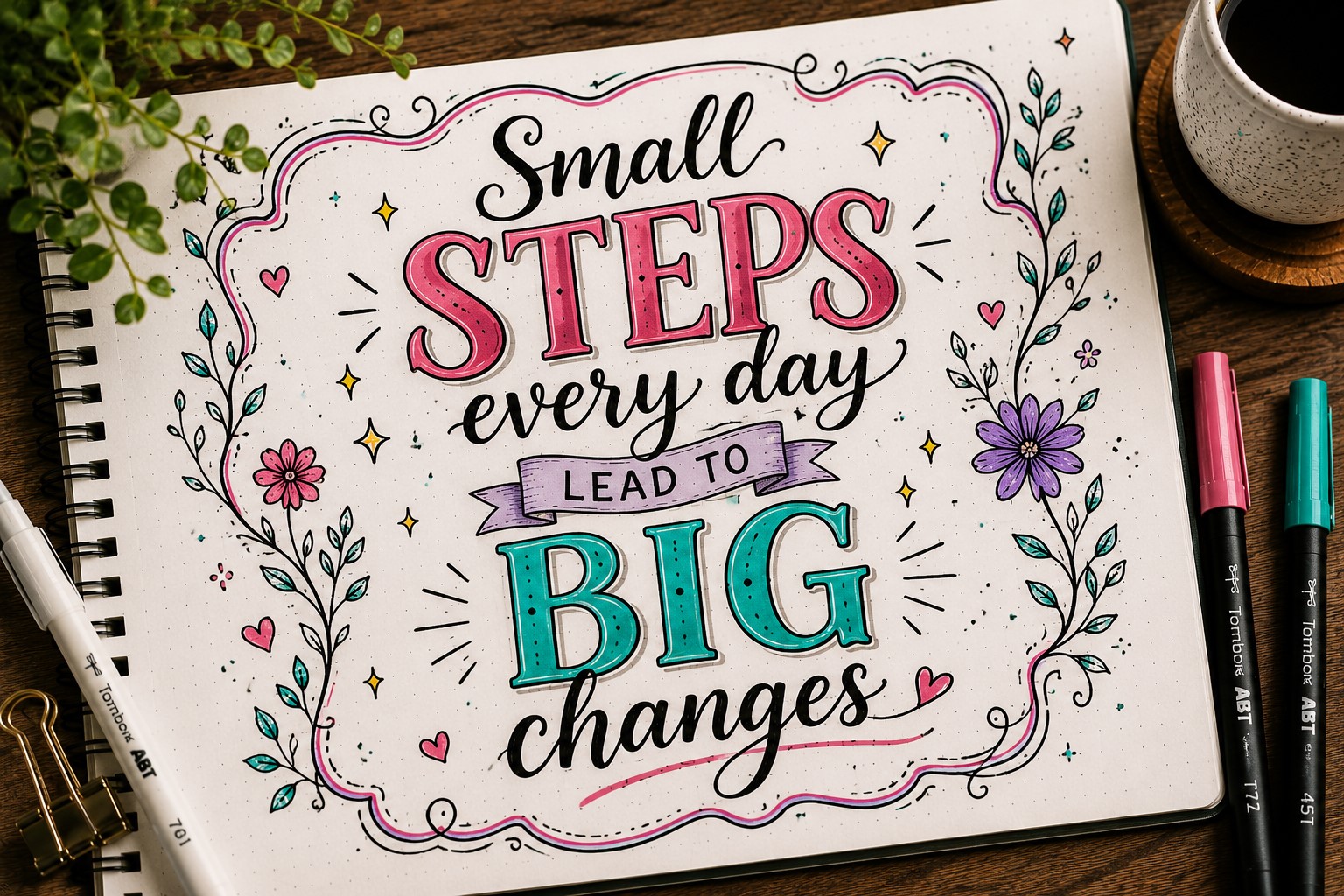
Color is one of the easiest ways to create emphasis. Instead of using the same pen for every word, choose one or two colors to highlight the most important parts of the quote.
This technique works because your eyes naturally notice color before anything else. A brightly colored keyword immediately becomes the focal point of the page.
The goal is not to color every word. Too much color can reduce the impact. A few carefully chosen highlights often create a stronger result than a rainbow of markers.
Color can also help set the mood. Soft shades create a calming feel, while brighter colors add energy and excitement to the design.
If you are looking for more creative lettering inspiration, explore 25 Aesthetic Bullet Journal Lettering Ideas You’ll Love.
13. Turn the Quote Into a Shape
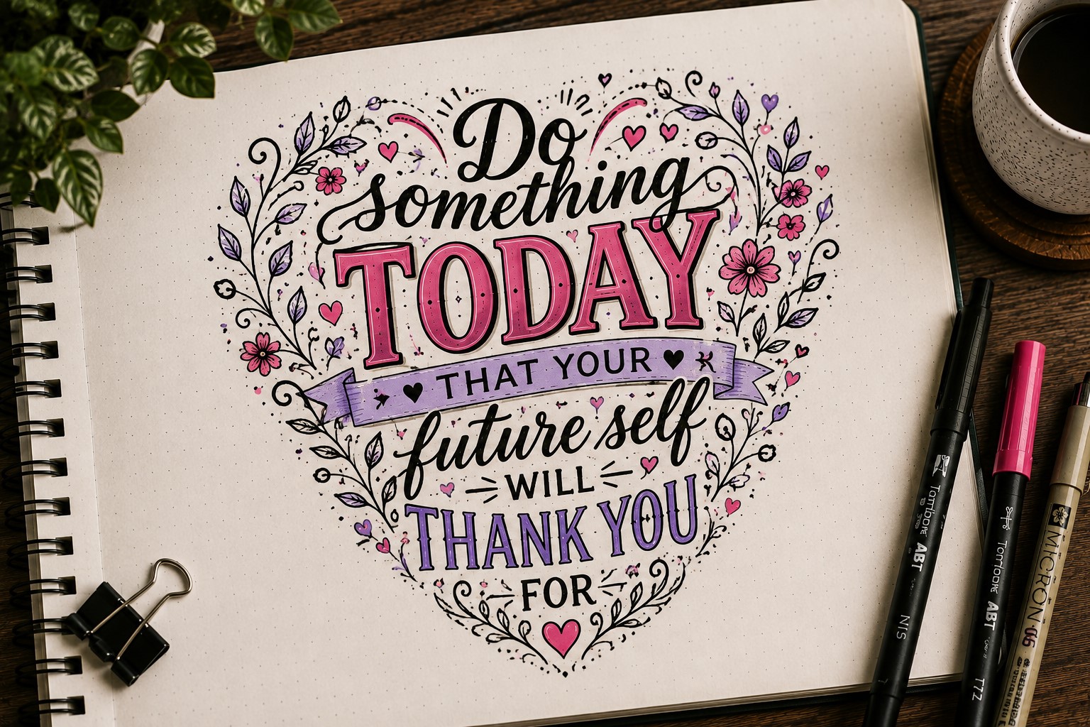
Instead of placing the words inside a shape, make the words create the shape themselves. This technique takes a little more planning, but the results can be stunning.
For example, a motivational quote could be arranged into the shape of a mountain, while a self-love quote might form a heart.
The lettering becomes part of the illustration, making the entire page feel more creative and memorable.
The best way to approach this is to lightly sketch the outline first. Once you know where the words will go, it becomes much easier to fit the quote naturally within the design.
This style works particularly well for shorter quotes because you have more flexibility with spacing. It is also a fun way to challenge yourself if you are looking to try something different.
If you enjoy creative lettering projects, check out 17 Creative Bullet Journal Calligraphy Ideas to Try Today.
14. Create a Quote With a Mixed Alignment Layout
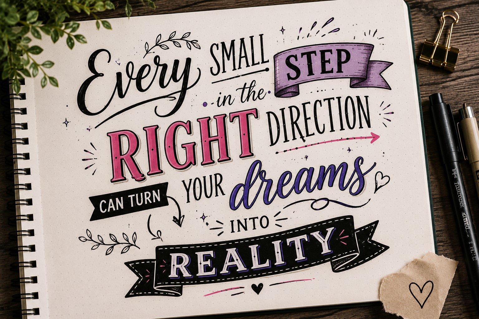
Most quote pages are centered, left-aligned, or right-aligned. A mixed alignment layout breaks that pattern by intentionally changing the alignment throughout the quote.
One line might be centered, the next left-aligned, and another positioned slightly off to the side. This creates movement and helps certain phrases stand out more than others.
The technique works best when there is a clear reason behind the placement. Important words can be isolated, while supporting words stay grouped together. This creates a layout that feels artistic rather than random.
Mixed alignment can make even a simple quote look more dynamic. It encourages the reader’s eyes to travel around the page and engage with the message in a different way.
If you want more ideas for eye-catching titles, explore How to Create Gorgeous Bullet Journal Headers in 15 Steps.
15. Use Negative Space as Part of the Design
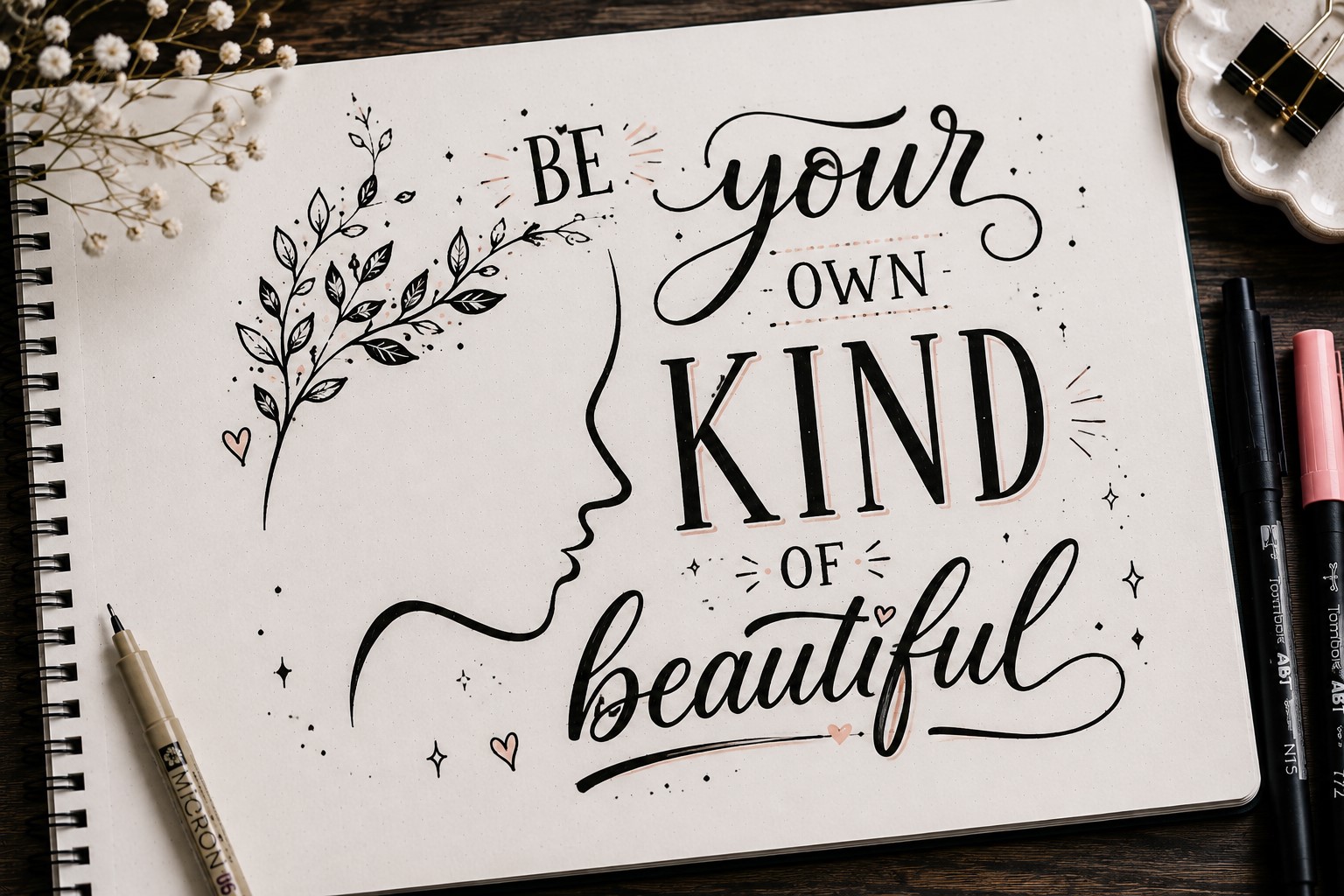
Many people focus on the lettering itself and forget about the empty space around it. However, negative space can be just as important as the words.
Leaving strategic gaps around key phrases helps those words stand out. It gives the page room to breathe and prevents the design from feeling crowded.
Sometimes what you leave out is just as powerful as what you add.
This approach works especially well for short quotes. Instead of filling every corner with decorations, allow the message to command attention through simplicity.
A clean layout can often feel more sophisticated than one packed with doodles and embellishments. The quote gets the spotlight it deserves.
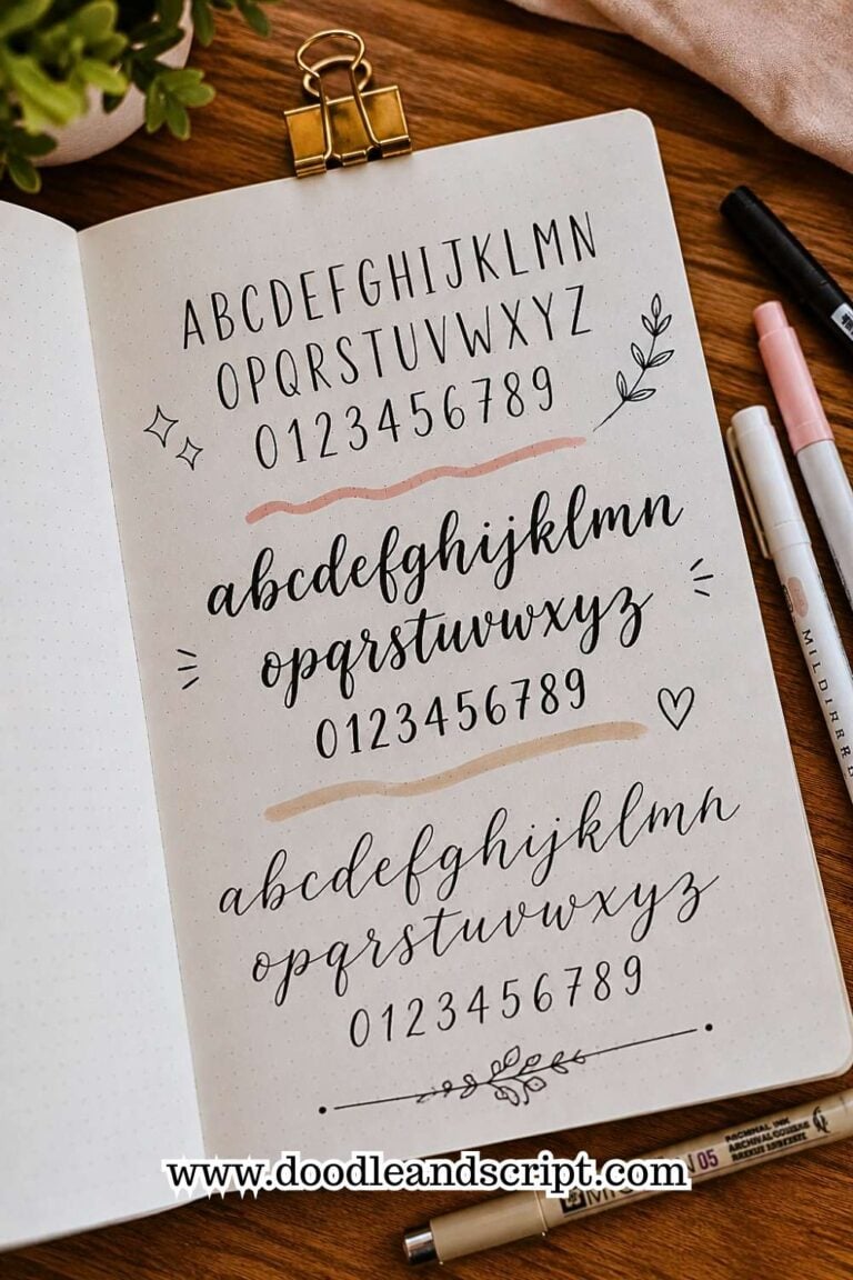
16. Combine Script and Block Lettering
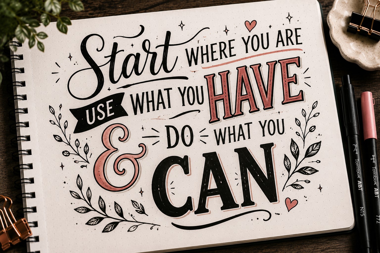
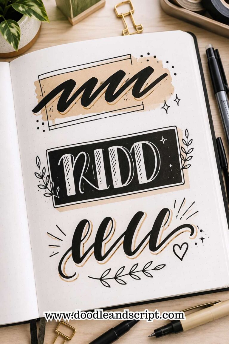
One reason professional-looking quote pages feel so balanced is that they often combine contrasting styles. Script lettering adds elegance and movement, while block lettering adds structure and emphasis.
You might use script for smaller connecting words and reserve block letters for the most important phrases. The contrast creates hierarchy and makes the quote easier to read.
This technique also prevents the page from feeling repetitive. Different lettering styles keep the reader’s attention and add visual variety without requiring complex artwork.
Many people discover that combining just two styles instantly makes their Bullet Journal Quote Lettering look more polished and intentional.
If you want to strengthen your lettering skills, explore 15 Easy Bullet Journal Lettering Styles Every Beginner Should Learn.
17. Let a Single Quote Fill the Entire Page
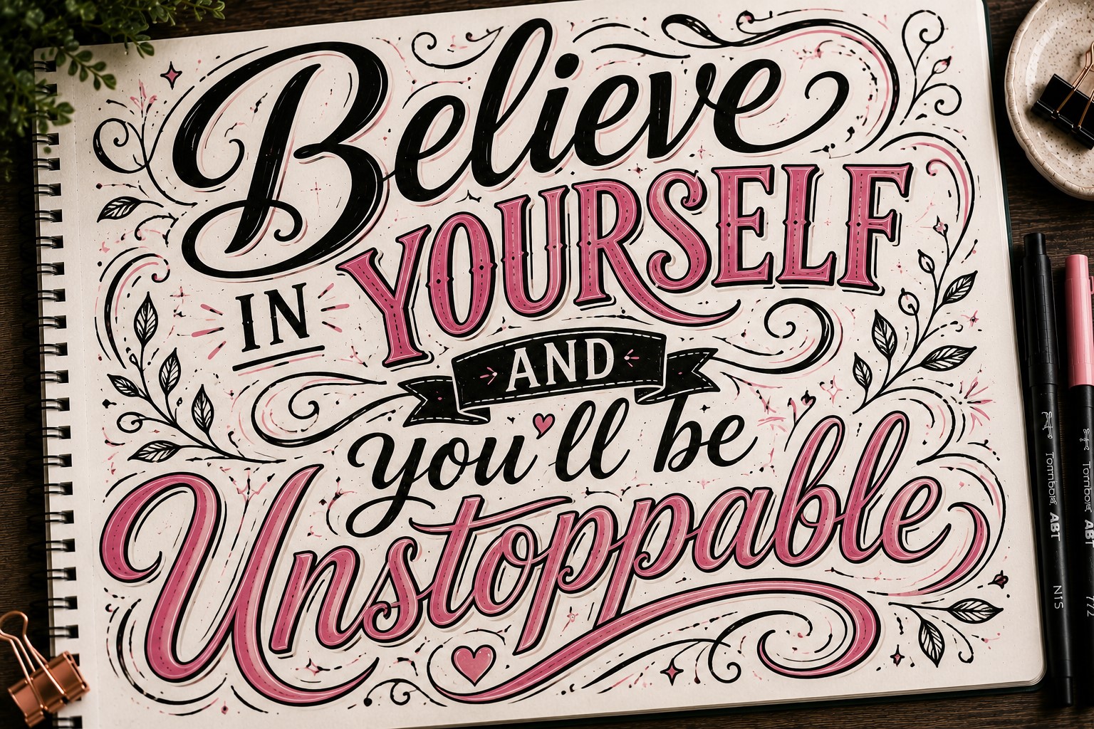
Sometimes the most powerful thing you can do is go all in on one quote. Instead of squeezing several quotes onto a spread, dedicate the entire page to a single message.
This gives you more freedom to experiment with scale, spacing, and lettering styles.
You can make important words huge, add decorative elements, and create a layout that feels immersive rather than crowded.
A full-page quote spread often becomes one of the most memorable pages in a journal because it feels intentional. It shows that the words mattered enough to deserve their own space.
The next time a quote really resonates with you, resist the urge to make it small. Let it take over the page. You may be surprised by how impactful the finished spread feels.
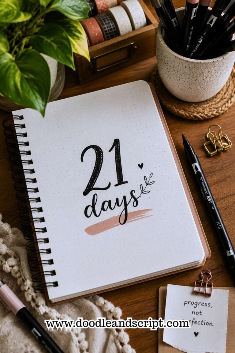
If you want to improve the overall look of your quote pages, check out How to Practice Bullet Journal Lettering in 21 Days.
Final Thoughts
The best Bullet Journal Quote Lettering pages are not always the most complicated. In many cases, they are simply the ones that make the message impossible to ignore.
A clever layout, a bold keyword, or a creative lettering style can completely change the way a quote feels on the page.
As you experiment with these ideas, remember that every quote does not need the same treatment. Some quotes look best with dramatic lettering, while others shine when the design stays simple.
The more layouts and styles you try, the easier it becomes to match the lettering to the mood of the message.
Most importantly, do not be afraid to make the page your own. The quote may belong to someone else, but the way you bring it to life is entirely yours.
If you need more inspiration for creating standout quote pages, explore 11 Decorative Bullet Journal Lettering Ideas for Stunning Pages.