21 Cute Bullet Journal Banner Doodles Anyone Can Draw
Disclosure: Some of the links in this post are affiliate links. This means if you click on the link and purchase an item, I will receive an affiliate commission at no extra cost to you.
If bullet journal doodles had a popularity contest, banners would probably win without even trying. Think about it. A banner is basically a fancy container for words.
Yet somehow, the moment you wrap a title inside one, it feels more important. The page has not changed, neither did the words change. But the entire vibe of the spread suddenly feels different.
What makes banners so fun is that they sit right in the middle of decoration and organization. They are not just cute doodles you add to fill empty space.
They actually help structure a page. A banner can tell your eyes where to look first, separate sections without harsh lines, and make a spread feel more thoughtfully designed. It is a small detail that quietly does a lot of work.
That is why Bullet Journal Banner Doodles have remained a favorite for so many journal lovers. They are easy to learn, surprisingly versatile, and almost impossible to outgrow.
You can keep them simple when you want a clean layout or dress them up when a page needs more personality.
Either way, they have a way of making ordinary headings feel like they belong on a page worth showing off.
If you want to level up your page titles even more, explore How to Make Beautiful Bullet Journal Headers in 13 Easy Steps.
21 Cute Bullet Journal Banner Doodles Anyone Can Draw
1. The Classic Ribbon Banner

If there were a starter pack for Bullet Journal Banner Doodles, the classic ribbon banner would be included. It is simple, versatile, and works with almost every journal style.
This banner usually features a long rectangle in the middle with folded ribbon tails extending from each side.
The reason this banner remains so popular is its flexibility. You can use it for monthly covers, reading logs, goal pages, and section dividers.
It looks just as good with neat block lettering as it does with playful handwritten titles.
One mistake beginners make is drawing the folds too large. The banner should support the title, not overpower it. Keeping the folds slightly smaller than the center section usually creates a cleaner result.
If you are looking for more title inspiration, explore 21 Bullet Journal Title Lettering Ideas That Look Professional.
2. The Curved Banner
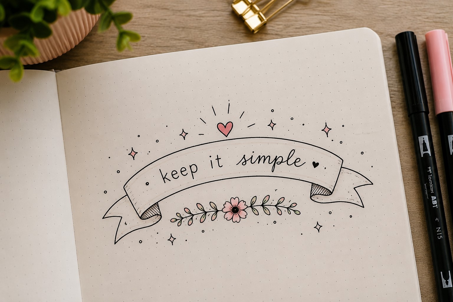
A curved banner instantly feels softer and more playful than a straight one. Instead of running horizontally across the page, it gently arches upward or downward, creating movement within the layout.
This style works beautifully when you want a page to feel relaxed and creative. Many journal users choose curved banners for gratitude spreads, seasonal layouts, and memory pages because the flowing shape feels less structured.
The trick is keeping the curve smooth. Sharp bends can make the banner look awkward and distract from the title. Light pencil guidelines can help you create an even curve before adding ink.
Curved banners are proof that a tiny adjustment can completely change the personality of a design.
3. The Layered Banner
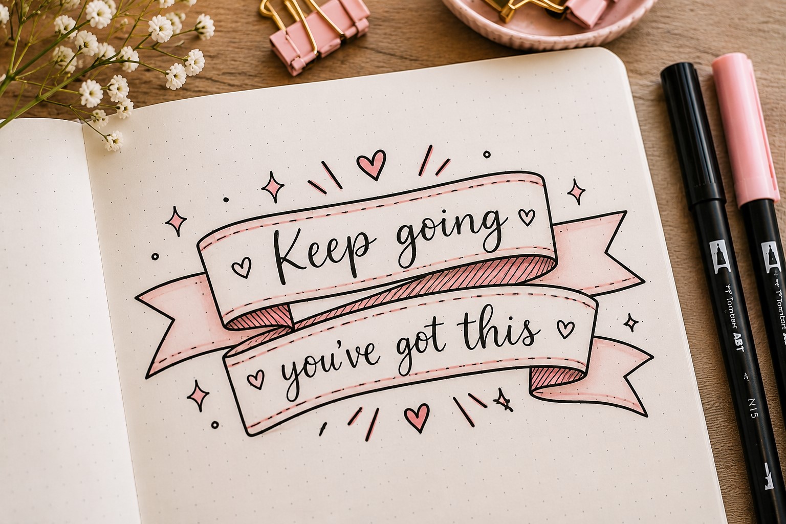
Layered banners create the illusion of depth by placing one banner slightly behind another. This design immediately makes a title feel more dynamic and eye-catching.
You do not need complicated drawing skills to create the effect. Simply draw a second banner peeking out from behind the first. The overlapping shapes create visual interest without making the page feel cluttered.
Many people use layered banners on cover pages because they naturally draw attention. They also work well for longer titles that need a little extra structure.
If you enjoy decorative title designs, take a look at 23 Beautiful Bullet Journal Lettering Ideas You’ll Want to Copy.
4. The Mini Banner

Not every banner needs to dominate a page. Mini banners prove that small details can have a big impact. These tiny banners work beautifully as labels, section markers, and category headings.
One advantage of mini banners is their versatility. They fit easily into smaller layouts without taking up valuable space. This makes them perfect for habit trackers, study planners, and weekly spreads.
Because they are so small, simplicity is important. A few clean lines usually create a stronger result than excessive decoration.
Mini banners are a great reminder that Bullet Journal Banner Doodles do not have to be large to be effective.
5. The Fishtail Banner

The fishtail banner gets its name from the V-shaped cuts at the ends of the ribbon. Those simple cuts instantly give the banner a more decorative appearance.
This style is ideal for people who want something slightly more interesting than a basic rectangle but still easy to draw. The fishtail ends add character without making the design feel complicated.
You can leave the banner plain or add patterns, shadows, and decorative details to match the theme of your spread. The design is simple enough to adapt in countless ways.
If you enjoy experimenting with different fonts inside banners, check out 19 Easy Bullet Journal Fonts Anyone Can Learn.
6. The Hanging Banner
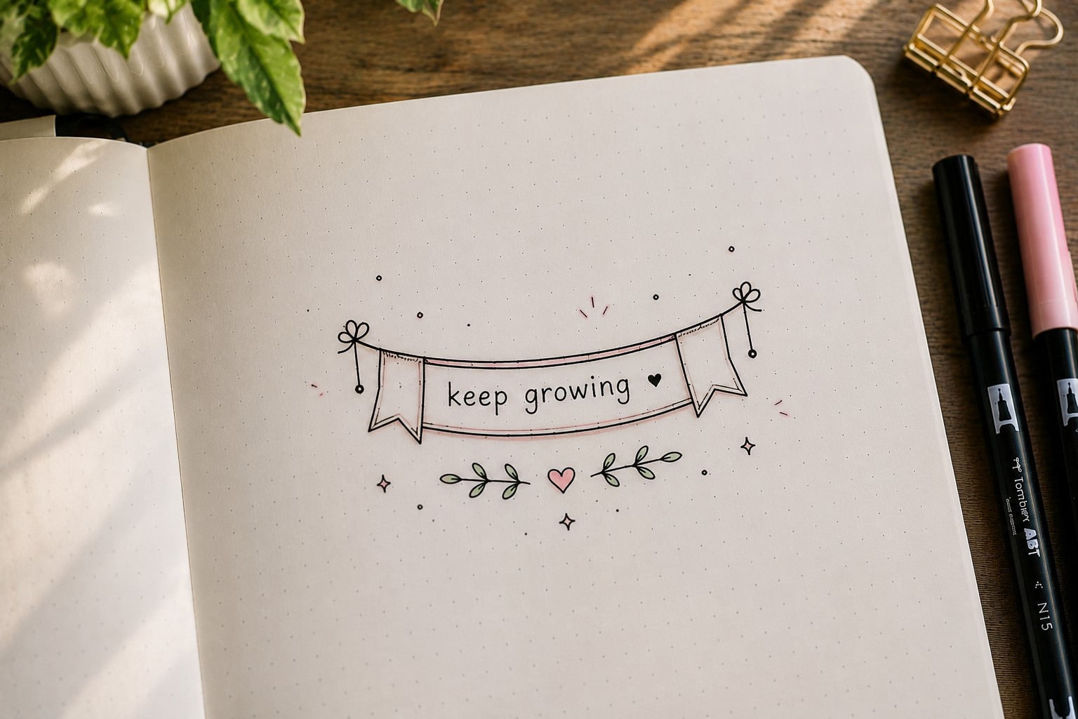
A hanging banner creates the illusion that the title is suspended from a string, branch, or decorative element. This playful design instantly adds charm to a spread.
Many journal users love hanging banners for seasonal themes because they feel festive and fun. They also work beautifully for birthday trackers, bucket lists, and celebration pages.
The key is keeping the supporting lines thin and subtle. They should help create the illusion without distracting from the title itself.
A hanging banner often becomes the focal point of a page because it naturally attracts attention and curiosity.
7. The Scroll Banner

A scroll banner looks like a piece of paper that has been gently rolled at the ends. This style brings a slightly vintage feel to a page and works well when you want a title to feel special.
The curled edges are what make this banner stand out. Even a simple title can look more decorative once it is placed inside a scroll design.
You can keep the scroll clean and minimal or add small details such as shading and line work for extra dimension.
This banner works especially well for reading journals, quote pages, and yearly goal spreads because it naturally feels a little more formal and important.
If you want more ways to make your titles stand out, explore 25 Aesthetic Bullet Journal Lettering Ideas You’ll Love.
8. The Double-Line Banner
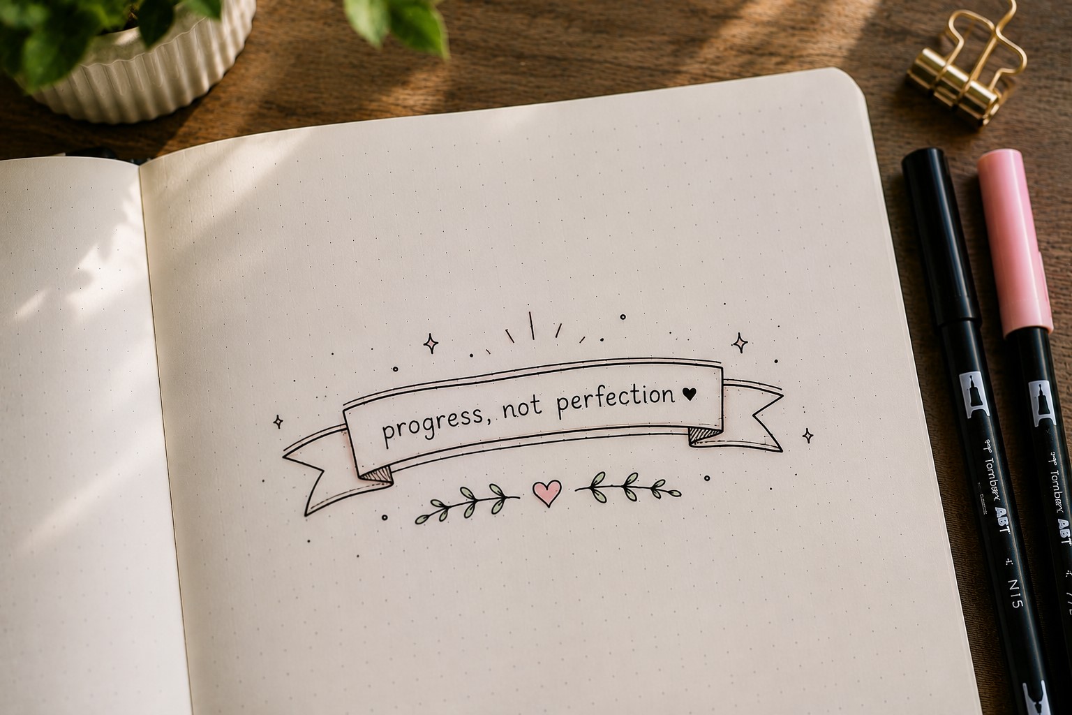
Sometimes the smallest change creates the biggest difference. A double-line banner uses two parallel outlines instead of one, giving the design a slightly bolder appearance without making it complicated.
This style is perfect for people who like clean layouts but still want their headings to stand out. The extra line creates definition and helps the banner feel more polished.
You can leave the space between the lines blank or fill it with dots, stripes, or other simple patterns. The banner remains easy to draw while offering plenty of opportunities for customization.
One reason this banner works so well is that it pairs beautifully with almost any lettering style.
If you enjoy decorative writing styles, take a look at 17 Creative Bullet Journal Calligraphy Ideas to Try Today.
9. The Floral Banner
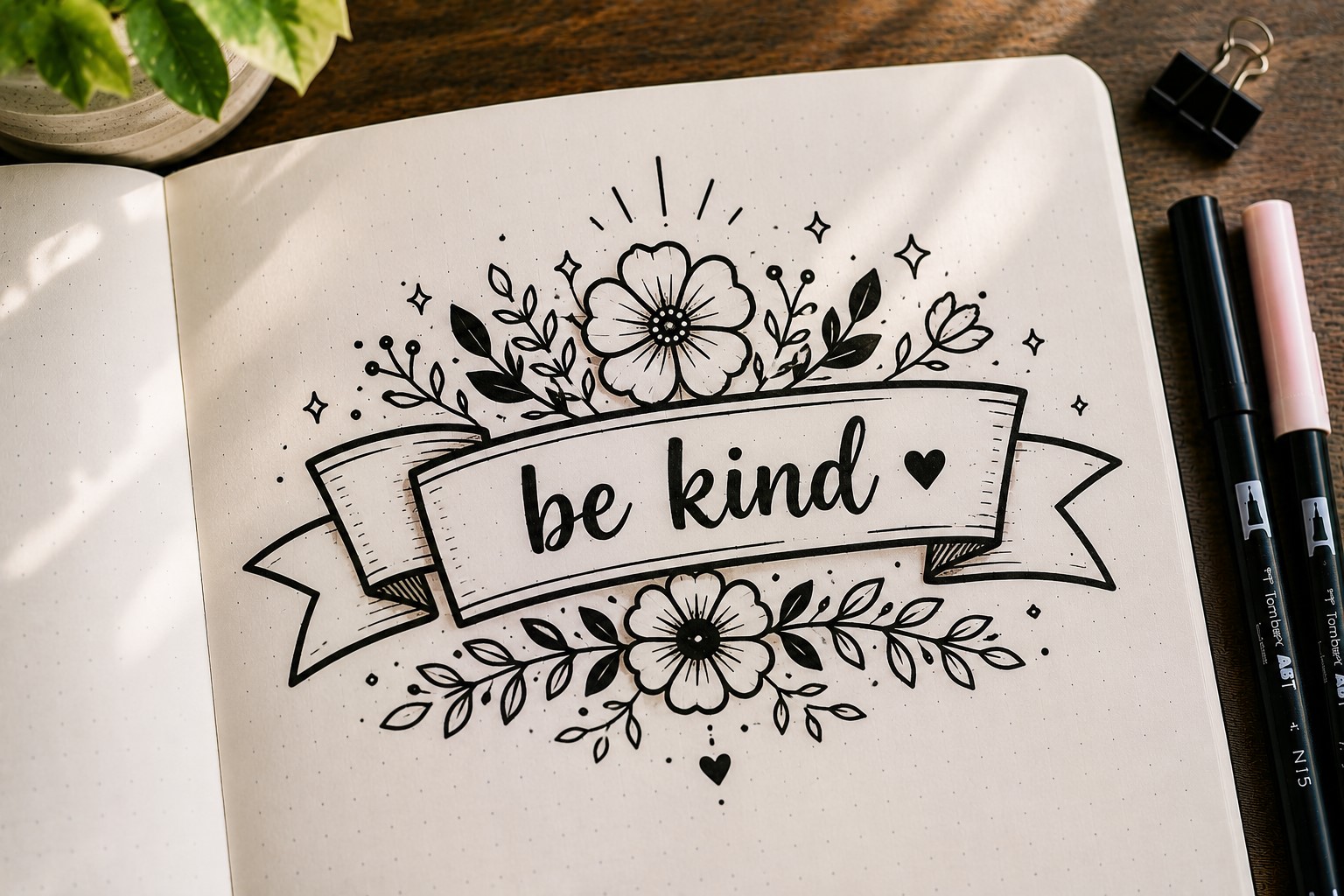
Why stop at drawing flowers around a banner when the flowers can become part of the banner itself? A floral banner combines simple ribbon shapes with leaves, vines, and blossoms to create a softer, more decorative look.
The flowers do not need to be large or detailed. Even tiny blooms placed along the edges can completely change the feel of a design. This makes floral banners approachable for beginners while still looking impressive.
Floral banners are especially popular in spring layouts, gratitude journals, and self-care spreads because they add warmth and personality without overwhelming the page.
If you love decorative page details, check out 15 Easy Bullet Journal Doodle Borders Anyone Can Draw.
10. The Arrow Banner

An arrow banner combines the structure of a banner with the direction of an arrow. The result is a design that naturally guides the eye toward a title, section, or important note.
This style works particularly well on productivity pages because it creates a sense of movement and purpose. It is also useful when you want to highlight goals, deadlines, or key tasks.
One of the best things about arrow banners is their simplicity. They are quick to draw and easy to adapt. You can make them bold and dramatic or thin and minimal depending on the style of your spread.
Arrow banners prove that Bullet Journal Banner Doodles can be both decorative and functional at the same time.
If you need more creative page ideas, explore 27 Easy Bullet Journal Doodle Ideas for Every Page.
11. The Flag Banner

A flag banner is one of the simplest banner styles you can learn. It usually consists of a rectangular shape with a pointed or fishtail end, making it perfect for short titles and labels.
Because the design is so straightforward, it works well in almost every type of layout. You can use it for section headings, monthly goals, important reminders, or habit tracker categories.
The simplicity also makes it easy to decorate. Add patterns, shadows, outlines, or tiny doodles to give the banner a unique look without changing the basic shape.
Many journal users keep coming back to flag banners because they are quick, reliable, and always look good.
If you want more ideas for improving your page layouts, explore How to Create Gorgeous Bullet Journal Headers in 15 Steps.
12. The Folded Corner Banner

This banner creates the illusion that the corners have been folded over like paper. It is a small detail, but it adds depth and makes the design feel more realistic.
The folded corners can be as subtle or dramatic as you like. A tiny fold creates a clean look, while larger folds make the banner feel more playful and decorative.
This style is particularly useful when you want a banner to stand out without adding extra doodles. The folds provide enough visual interest on their own.
The design may look advanced at first, but once you understand the basic shape, it becomes surprisingly easy to recreate.
If you want your titles to look more polished, check out 11 Decorative Bullet Journal Lettering Ideas for Stunning Pages.
13. The Stacked Banner

A stacked banner uses multiple banner shapes placed on top of each other. This design is perfect for longer titles or pages with several sections that need clear labels.
The layered look naturally creates hierarchy. Larger banners can hold main titles, while smaller banners underneath can contain subtitles or dates.
One reason this style is so effective is that it helps organize information visually. Instead of everything competing for attention, the banners guide the reader through the page.
Stacked banners can look elegant, playful, or modern depending on how they are styled, making them one of the most versatile Bullet Journal Banner Doodles you can learn.
If you enjoy experimenting with lettering styles, explore 15 Easy Bullet Journal Lettering Styles Every Beginner Should Learn.
14. The Wavy Banner
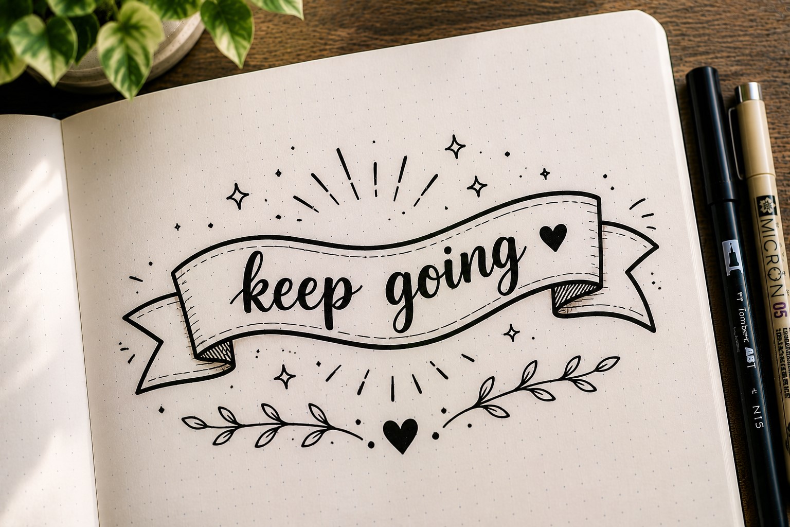
A wavy banner feels cheerful from the moment you draw it. Instead of using straight edges, the top and bottom lines gently curve like a ribbon moving in the wind. This simple change makes the banner feel more relaxed and playful.
Wavy banners work especially well for mood trackers, summer spreads, bucket lists, and pages that need a fun touch. They can also soften a layout that feels too structured or boxy.
The key is keeping the waves smooth and consistent. If the curves become too dramatic, the banner can start looking uneven. A light, flowing shape usually creates the best result.
Many journal users love this style because it adds personality without requiring extra decorations.
If you want even more creative lettering inspiration, explore 29 Bullet Journal Font Ideas to Make Your Pages Pop.
15. The Pennant Banner

Pennant banners are inspired by the decorative flags often seen at parties and celebrations. Each section looks like a small flag, creating a playful design that instantly adds energy to a page.
This banner style is perfect for birthday spreads, celebration pages, travel journals, and memory logs. It naturally creates a festive atmosphere and helps a title stand out.
One of the best things about pennant banners is how easy they are to customize. You can add patterns, colors, shadows, or tiny doodles to each flag section without making the design complicated.
Because the shapes are simple, even beginners can create beautiful results with very little practice.
16. The Badge Banner

A badge banner combines a banner with a circular or badge-like shape. The title sits inside the badge while small banner tails extend from the sides.
This design works particularly well when you want a heading to feel important. It naturally draws attention and creates a strong focal point on the page.
Badge banners are popular for monthly covers, achievement trackers, and milestone pages because they give titles a sense of significance. Even a simple word can feel more impactful when placed inside a badge.
If you want more ideas for creating attractive titles, check out 17 Bullet Journal Quote Lettering Ideas That Stand Out.
17. The Notched Banner

The notched banner is simple, clean, and incredibly versatile. Instead of decorative folds, small notches are cut into the ends of the banner to create visual interest.
This style works well for minimalist journals because it adds character without making the page feel busy. It also pairs nicely with modern lettering styles and clean layouts.
One reason many journal users love notched banners is that they are quick to draw. They provide a decorative touch without requiring a lot of time or effort.
The simplicity makes them a reliable option whenever you need a heading that looks polished but not overly decorated.
18. The Vertical Banner

Most banners stretch across a page horizontally, but vertical banners offer something different. They run up and down instead of side to side, creating a unique visual element that immediately catches the eye.
Vertical banners are useful when space is limited or when you want to highlight a specific section of a spread. They can also help break up large areas of text and make a layout feel more dynamic.
Because they are less common, vertical banners often make a page feel more creative and distinctive. They are a great choice when you want to experiment with new layouts.
If you want more inspiration for beautiful page titles, explore How to Practice Bullet Journal Lettering in 21 Days.
19. The Cloud Banner
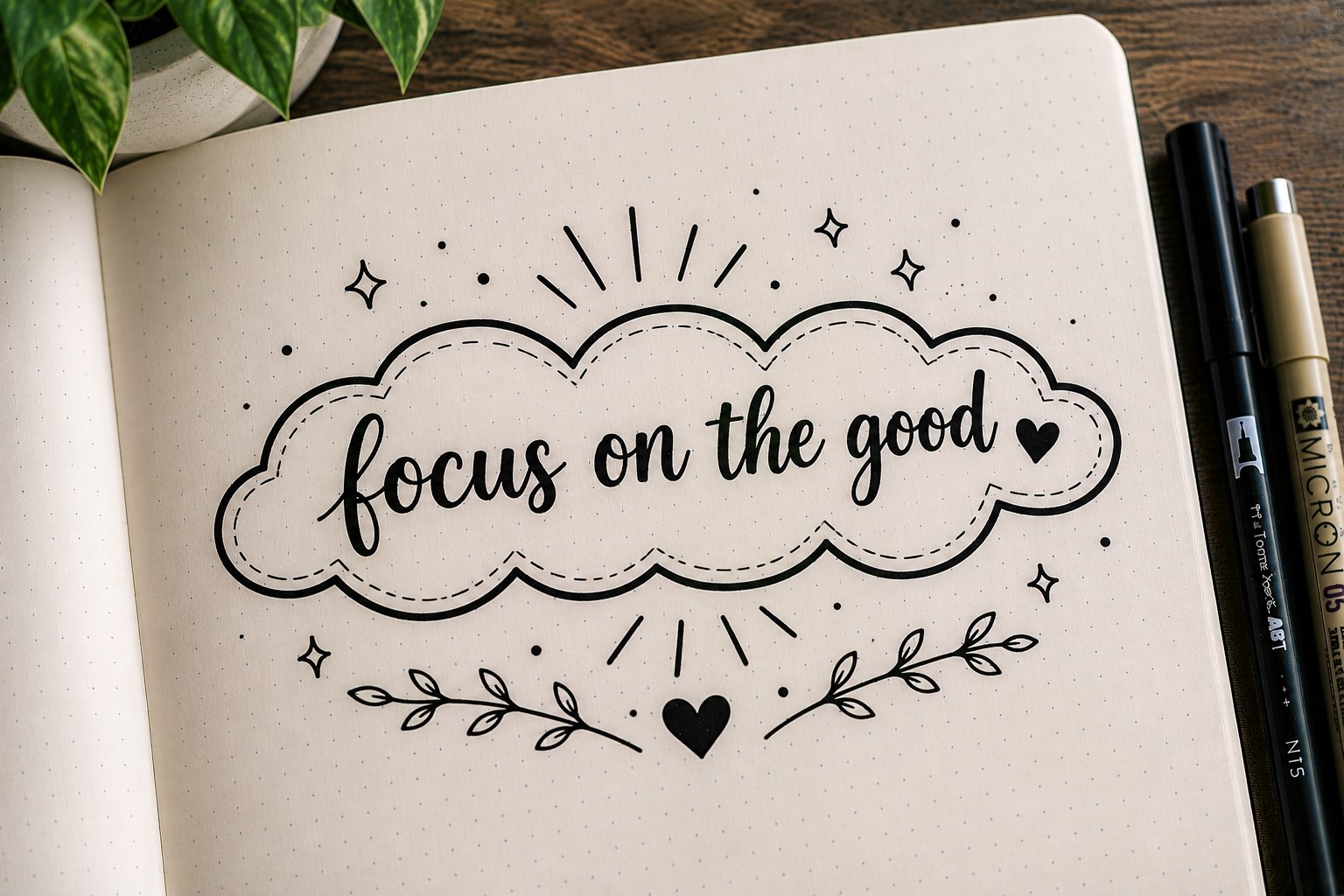
A cloud banner replaces straight edges with soft, rounded shapes. The result feels light, friendly, and slightly whimsical.
This style is particularly popular in dream journals, gratitude logs, and mood trackers because it creates a calm and inviting atmosphere. It also pairs beautifully with stars, moons, and other celestial doodles.
Cloud banners prove that banners do not always have to resemble ribbons. Sometimes changing the outline completely can create an entirely new look.
The rounded shape makes them approachable for beginners while still looking creative and unique.
20. The Split Banner
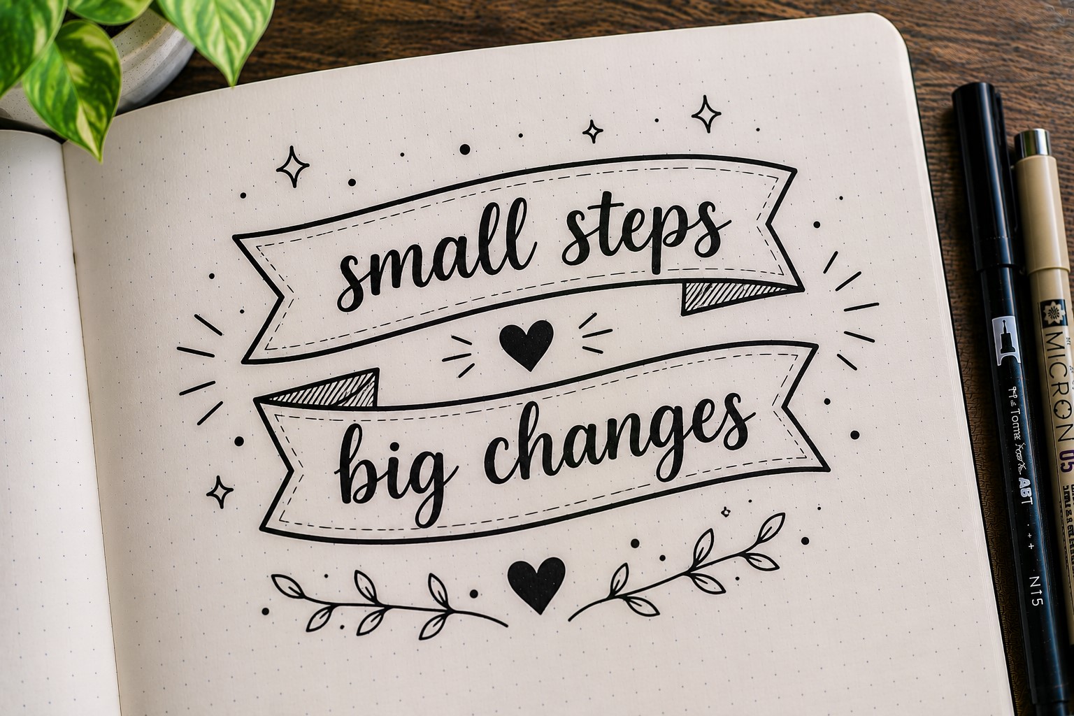
A split banner separates a title into two connected sections. This design is useful for long headings because it helps organize the words without making the title feel cramped.
For example, the first part of a title can sit in one banner while the second part sits in another. The connection between the two sections keeps everything visually linked.
Split banners also create opportunities for creative layouts. You can stagger the sections, overlap them, or place them at slightly different angles for added interest.
The design is both practical and decorative, making it a valuable addition to your collection of Bullet Journal Banner Doodles.
If you are looking for more decorative title ideas, check out 23 Beautiful Bullet Journal Lettering Ideas You’ll Want to Copy.
21. The Doodle-Filled Banner

Why stop at drawing a banner when you can turn the banner itself into a canvas? A doodle-filled banner incorporates tiny patterns, icons, and decorative details inside the banner shape.
You might fill a banner with stars, hearts, books, leaves, geometric patterns, or tiny seasonal doodles. The decorations help reinforce the theme of the page while making the banner feel more personal.
The key is keeping the doodles small enough that the title remains easy to read. The decorations should support the words rather than compete with them.
This banner style is a great reminder that creativity often comes from simple ideas. A basic banner shape can look completely different depending on the details you add inside it, making it one of the most versatile Bullet Journal Banner Doodles to try.
Final Thoughts
The beauty of Bullet Journal Banner Doodles is that they do not require a lot of space, supplies, or artistic experience.
A few simple lines can completely change the way a title looks and help a page feel more organized.
Whether you prefer clean and minimal layouts or highly decorated spreads, there is a banner style that can fit your journal.
Another reason banners are worth learning is their versatility. The same banner can look completely different depending on the lettering, patterns, shadows, and decorations you pair with it.
That means you do not need to memorize dozens of complicated doodles to keep your journal looking fresh. A handful of banner styles can take you surprisingly far.
As you practice these Bullet Journal Banner Doodles, focus on experimenting rather than trying to make every banner perfect. Some of your favorite designs will come from small tweaks and unexpected combinations.
The more you draw them, the easier it becomes to create banners that match your personal style and the mood of each spread.
If you want even more ways to improve your journal layouts, explore 11 Decorative Bullet Journal Lettering Ideas for Stunning Pages.