How to Make Beautiful Bullet Journal Headers in 13 Easy Steps
Disclosure: Some of the links in this post are affiliate links. This means if you click on the link and purchase an item, I will receive an affiliate commission at no extra cost to you.
Imagine opening your bullet journal a few months from now. One page instantly brings back the excitement you felt when you created it.
Another page holds useful information, yet it feels forgettable. You cannot quite explain why. The layouts are similar. The handwriting is similar.
The difference is that one page knows how to grab your attention the moment you see it.
Headers do a lot more work than most people realize. They help break up information, create visual landmarks, and make it easier to find what you need later.
A good header can guide your attention before you read a single word. It gives the page a sense of direction and makes the entire spread feel easier to understand.
That is why this guide focuses on How to Make Bullet Journal Headers step by step rather than simply showing examples.
Instead of copying random designs, you will learn the small decisions that make headers look balanced, attractive, and purposeful.
Once you understand those decisions, you can create headers that fit your own style, even if your journal is simple, colorful, playful, or minimalist.
If you need extra inspiration before getting started, explore 21 Bullet Journal Title Lettering Ideas That Look Professional.
How to Make Beautiful Bullet Journal Headers in 13 Easy Steps
1. Decide What the Header Needs to Do
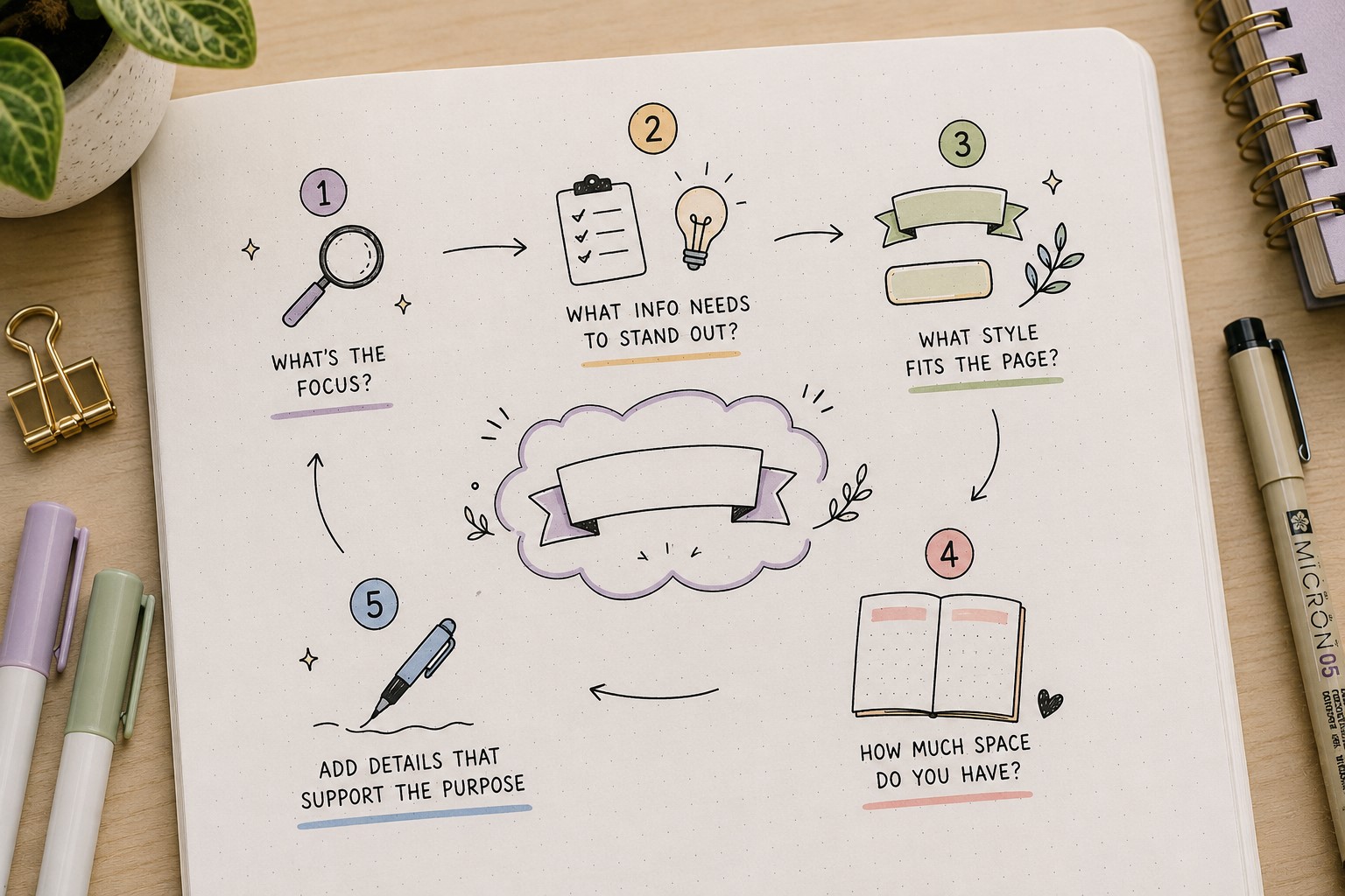
Before you think about fonts, colors, or decorations, take a moment to think about the job of the header. This may sound simple, but it can completely change the final result.
A monthly cover header needs to grab attention. A habit tracker header needs to be clear and easy to find. A reading log header might need to feel creative and inviting.
When you understand the purpose of the header first, every other design choice becomes easier.
Many people start decorating immediately and end up with a beautiful header that does not fit the page. A playful title may look out of place on a serious study spread.
On the other hand, a plain title may feel underwhelming on a colorful monthly cover. Taking a few seconds to identify the purpose helps prevent those mismatches.
Learning How to Make Bullet Journal Headers starts with understanding that headers are not just decorations. They are tools that help organize information and guide attention.
The more clearly you define their purpose, the stronger your headers will become.
2. Give the Header Room to Breathe
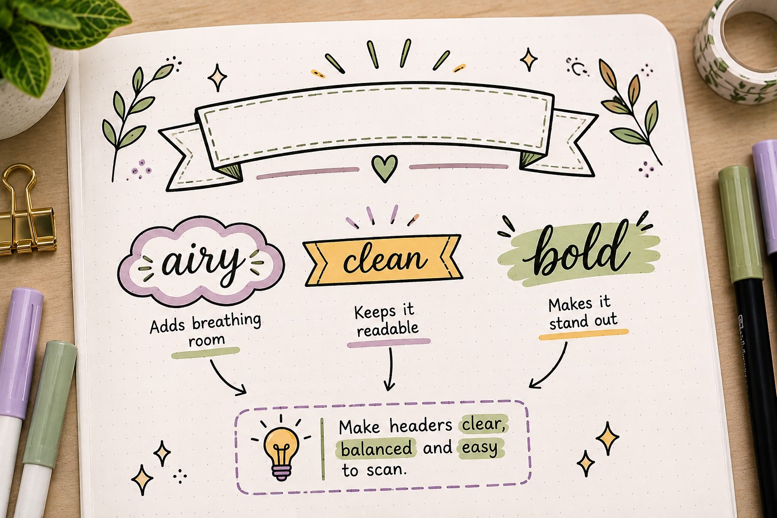
One of the easiest ways to make a header look better is to stop crowding it. Many journal pages feel busy because every inch of space gets filled.
When a header sits too close to lists, boxes, trackers, and notes, it loses its visual impact.
Think of your header as the introduction to the page. Just like a speaker needs a moment to get everyone’s attention before starting a presentation, a header needs a little space around it.
Leaving room above and below the title helps it stand out naturally without requiring extra decoration.
A common mistake is trying to make a header more noticeable by making it larger. Sometimes the better solution is simply creating more space around it.
Even a simple handwritten title can become much more attractive when it has breathing room.
If you want more inspiration for eye-catching titles, explore 25 Aesthetic Bullet Journal Lettering Ideas You’ll Love.
3. Start with a Light Pencil Sketch
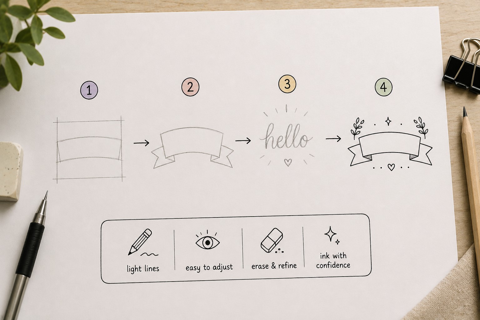
Many attractive headers look effortless, but most of them begin with a rough plan. A quick pencil sketch allows you to test ideas before committing with a pen.
It gives you the freedom to make adjustments without worrying about mistakes.
You do not need to create a detailed drawing. A few guidelines showing placement, spacing, and size are usually enough.
This simple step helps you see whether the title feels balanced on the page. You may discover that the lettering is too large, too small, or slightly off-center before it becomes a permanent problem.
People often skip this step because they want to save time. Ironically, skipping the sketch often leads to more mistakes and more frustration. Spending one minute planning can save much more time later.
The goal is not perfection. The goal is giving yourself a roadmap before you begin creating the final version of the header.
4. Choose a Lettering Style That Matches the Mood
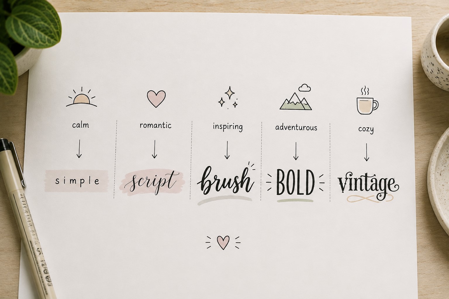
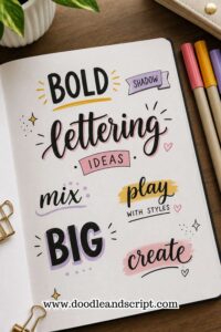
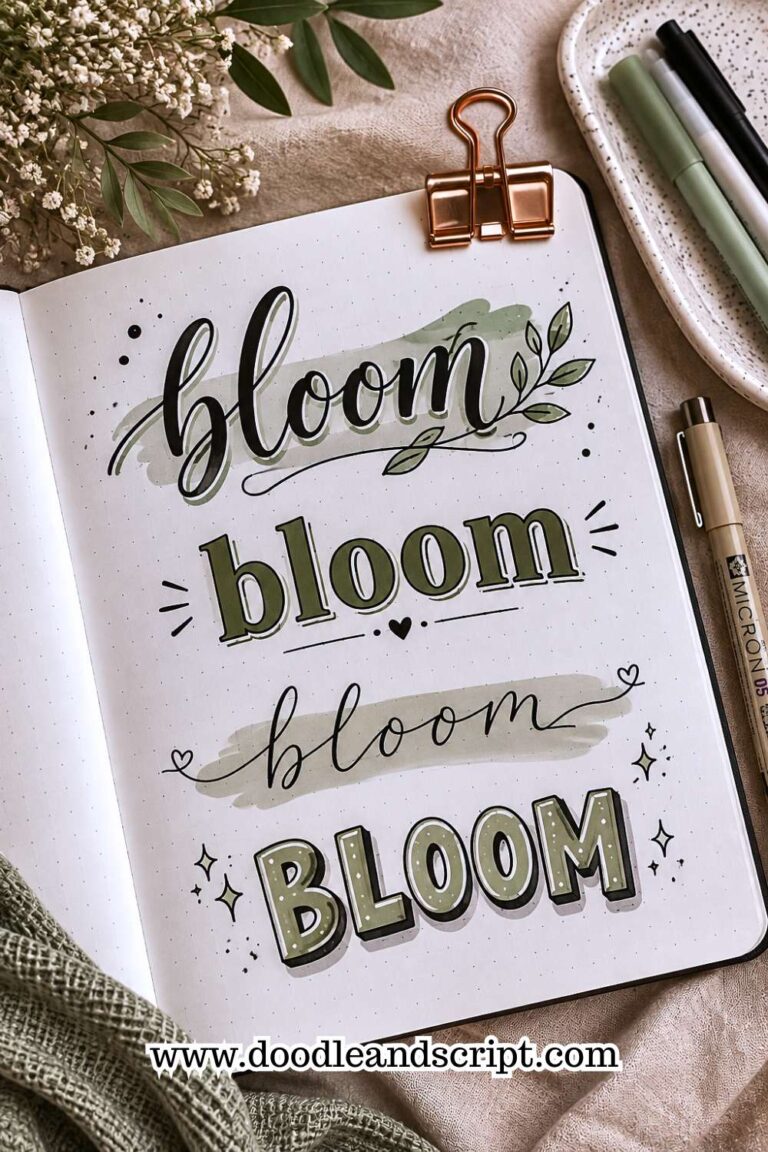
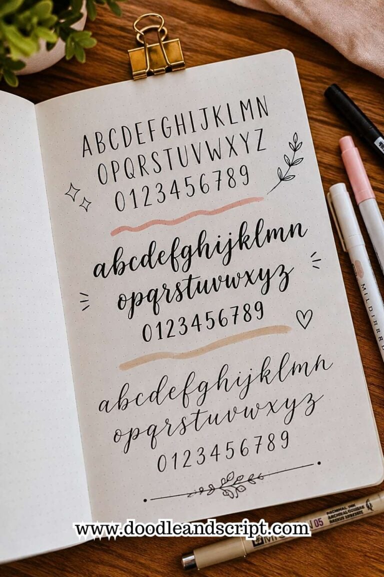
Every lettering style creates a different feeling. Bold block letters feel confident and energetic. Soft script lettering feels elegant and relaxed.
Thin minimalist fonts feel clean and modern. Because of this, the style you choose should support the overall mood of the spread.
Imagine creating a cozy reading journal. A playful handwritten title may feel more appropriate than a sharp geometric font. Now imagine a study planner.
A structured font might work better because it reinforces a sense of organization.
Many people choose fonts based only on appearance. Instead, think about how the lettering makes the page feel. Matching the mood of the spread helps everything look more intentional.
If you need fresh font inspiration, take a look at 19 Easy Bullet Journal Fonts Anyone Can Learn.
5. Make One Word the Star of the Header

Not every word deserves equal attention. In fact, some of the most attractive headers intentionally emphasize one word more than the others. This creates hierarchy and makes the title easier to understand at a glance.
For example, imagine a header that says “My Summer Reading List.” The word “Reading” might become larger, bolder, or more decorative than the surrounding words. That single choice gives the eyes a natural place to focus first.
A common mistake is treating every word exactly the same. When all words compete equally for attention, the title can feel flat. Creating a focal point adds personality and helps the design feel more dynamic.
This technique works with almost every style of header. Whether you prefer minimal layouts or decorative spreads, highlighting one important word often creates a stronger result.
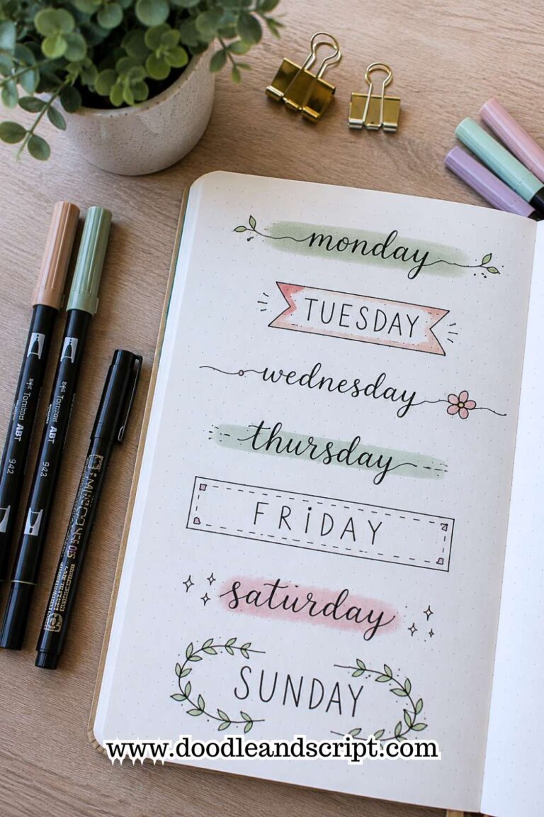
6. Use a Simple Banner to Create a Focal Point
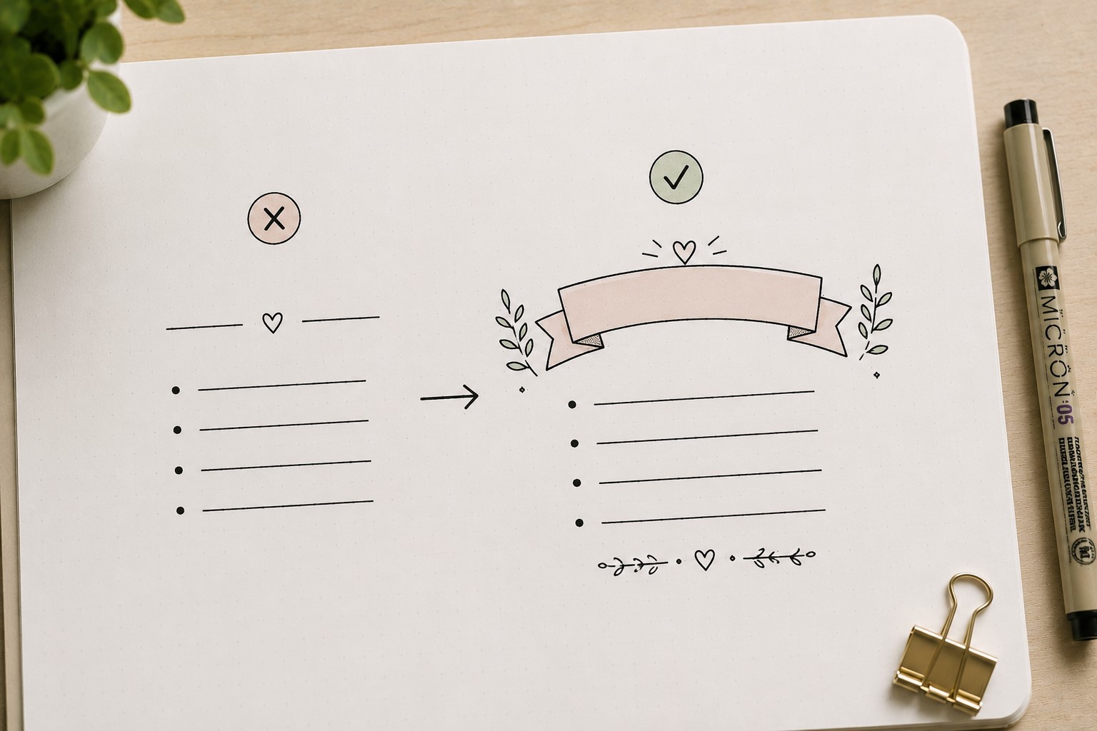
A banner is one of the easiest ways to make a header feel more important. Think about signs at a celebration or ribbons on an award.
They naturally attract attention. A banner does the same thing inside a bullet journal.
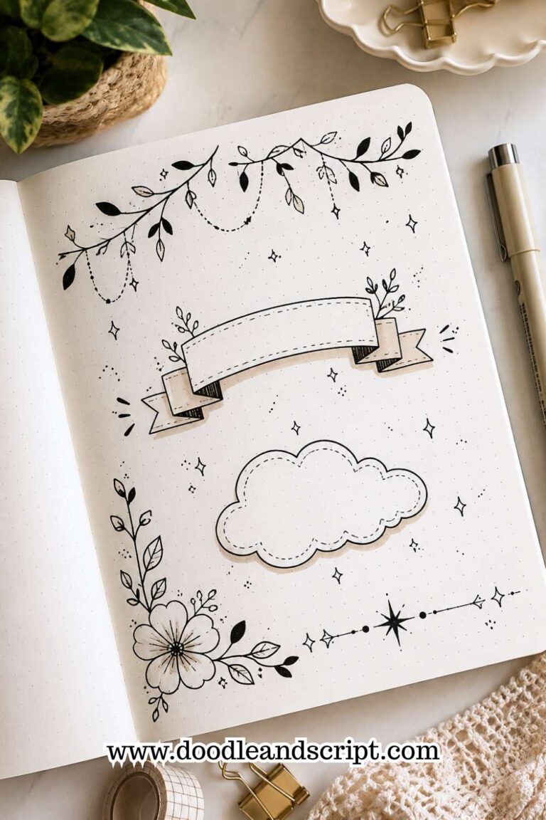
The good news is that you do not need complicated ribbon folds or advanced drawing skills. A simple banner shape can instantly make a title feel more polished.
The banner creates a clear space for the words and separates them from the rest of the content on the page.
Many beginners make the mistake of over-decorating banners. Too many folds, shadows, and details can make the design feel busy.
Start simple. Focus on keeping the lettering centered and balanced inside the banner.
If you enjoy decorative header elements, explore 21 Cute Bullet Journal Banner Doodles Anyone Can Draw.
7. Add a Border That Supports the Title
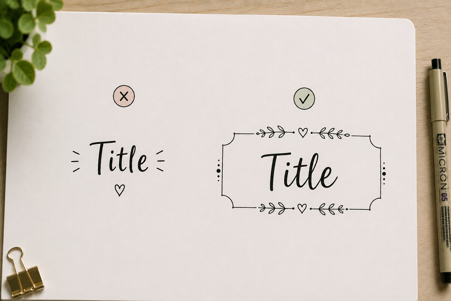
Borders do more than decorate a header. They help define its space and create a visual boundary that makes the title easier to notice. A border can be as simple as a rectangle or as detailed as a floral frame.
The important thing is choosing a border that matches the style of the spread. A minimalist page might benefit from a clean line border. A seasonal layout might look better with leaves, flowers, or stars.
Many people assume borders must surround the entire page. In reality, a small border around the header often creates enough visual structure. The border acts like a spotlight, gently directing attention toward the title.
The best borders support the header rather than overpowering it. When the border and lettering work together, the entire spread feels more cohesive.
8. Use Size Contrast to Create Visual Interest

When every letter has the same size and weight, the header can feel predictable. Size contrast helps break that pattern and adds energy to the design.
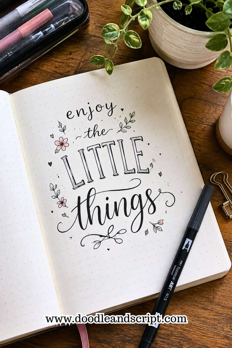
One easy approach is combining large and small words within the same title. The larger words attract attention while the smaller words provide supporting information. This creates a natural flow that guides the reader through the header.
Size contrast also helps with longer titles. Instead of stretching a phrase across the page, you can emphasize the most important words and reduce the size of the rest. The result often feels cleaner and more balanced.
If you want to improve in knowing How to Make Bullet Journal Headers, learning to use size effectively is one of the most valuable skills you can develop.
9. Add Small Details That Reinforce the Theme
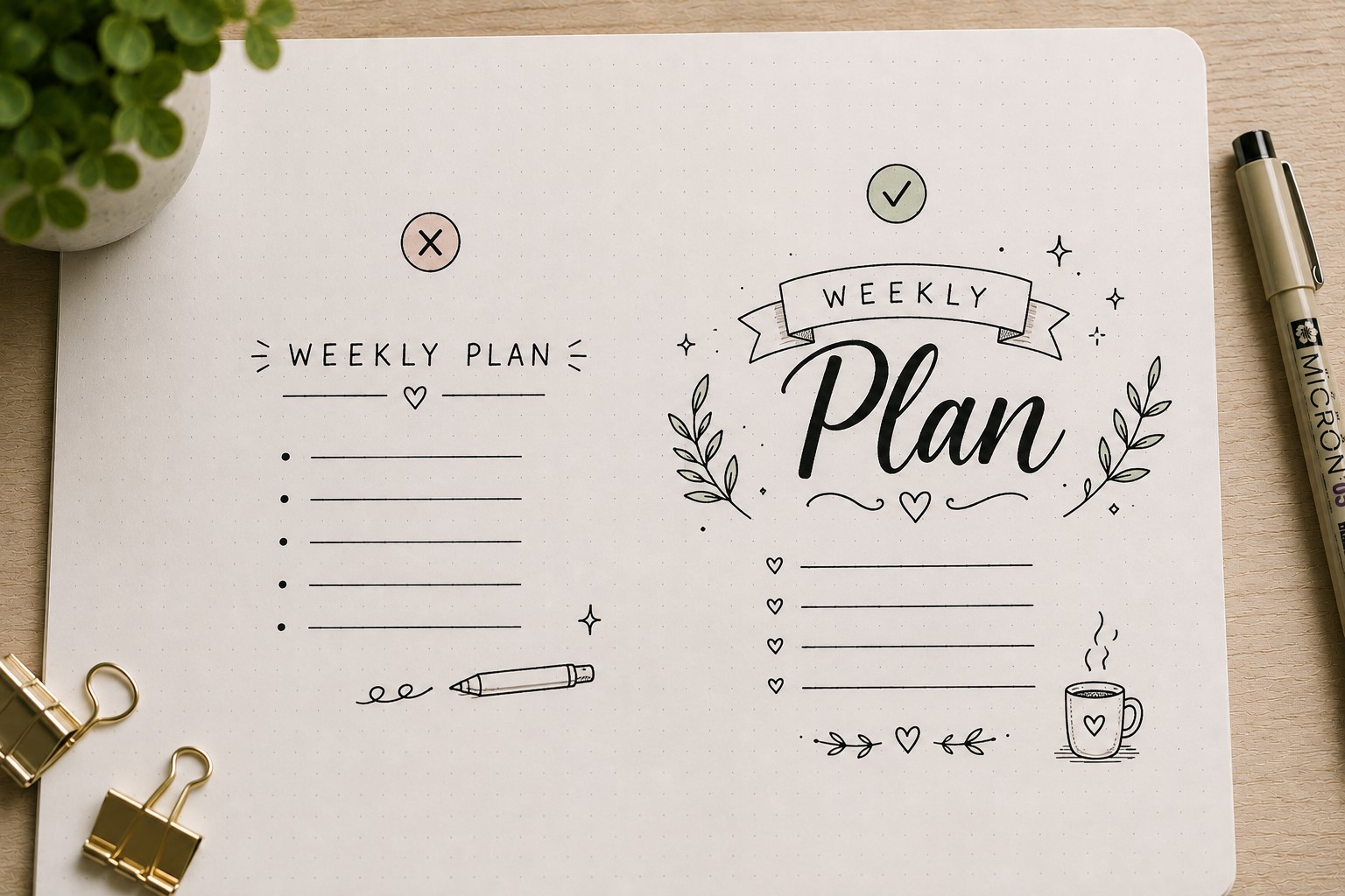
Decorations work best when they support the purpose of the page. Tiny details such as leaves, sparkles, books, arrows, stars, or hearts can help reinforce a theme without overwhelming the layout.
For example, a reading journal header might include tiny book doodles. A travel spread could use small airplanes or compass icons. These details create personality and help make the page feel more memorable.
The key is choosing a few thoughtful accents instead of filling every empty space. Too many decorations can distract from the title itself. A small amount of detail often creates a stronger result than excessive embellishment.
Good headers balance decoration with readability. The title should always remain the main attraction.
10. Add a Shadow for Instant Dimension

A shadow is one of the easiest ways to make a header look more advanced. It adds depth and helps the lettering stand out from the page without requiring major changes.
The process is surprisingly simple. Draw the lettering first. Then add a consistent shadow on one side of each letter. The effect creates dimension and makes the title feel more dynamic.
Many people avoid shadows because they seem difficult. Yet they are often easier than creating elaborate decorations. Even basic handwriting can look significantly more polished after adding a shadow.
This technique works especially well for monthly covers, challenge pages, and section dividers where you want the header to become a focal point.
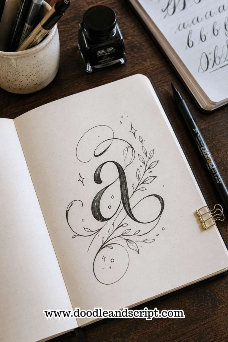
If you enjoy experimenting with decorative lettering techniques, check out 17 Creative Bullet Journal Calligraphy Ideas to Try Today.
11. Use Color With a Purpose
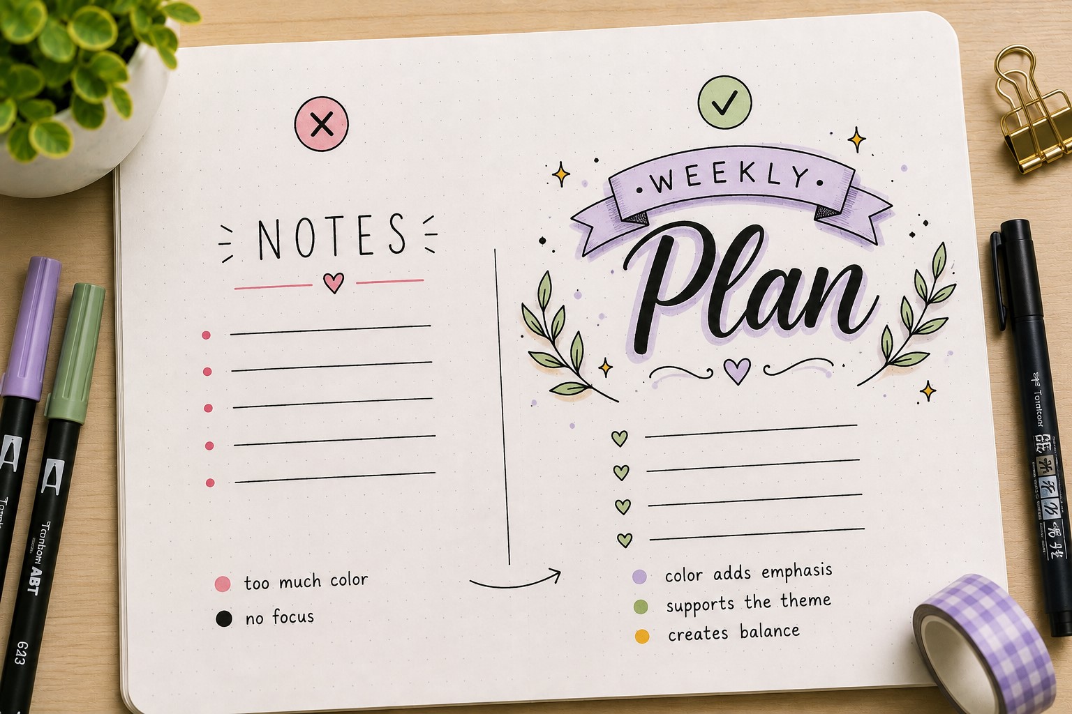
Color can make a header stand out, but it should have a job to do. Many people reach for markers immediately and start adding random shades.
The result often looks busy rather than beautiful. Instead, think about how color supports the page.
One effective approach is choosing one or two main colors and repeating them throughout the spread. This creates consistency and helps the header feel connected to the rest of the layout.
You can also use color to create hierarchy. A bright color on an important word naturally draws attention before the reader looks at anything else.
Another mistake is coloring every part of the header equally. When everything is colorful, nothing truly stands out. Leaving some areas simple can actually make the colored sections more impactful.
A thoughtful use of color often creates a more polished result than using an entire marker collection on one title.
12. Check the Balance Before Finishing
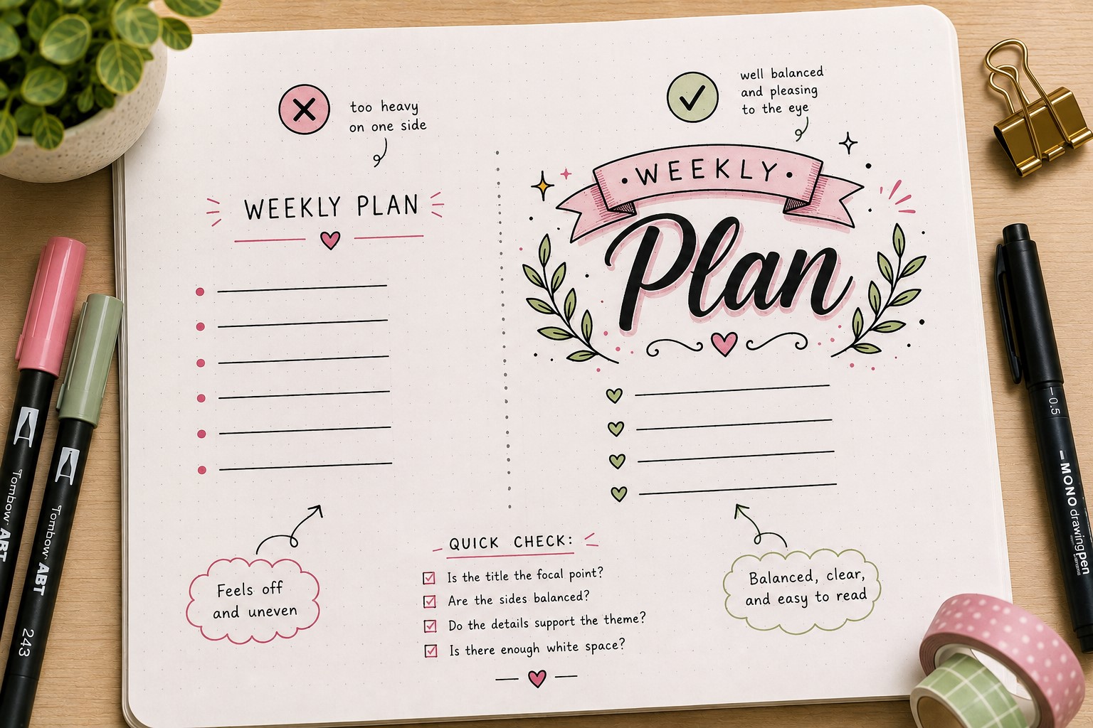
A header can contain beautiful lettering, nice decorations, and great colors yet still feel slightly off. That usually happens because the design lacks balance.
Before you consider the header finished, take a moment to step back and look at the page as a whole.
Ask yourself a few simple questions. Does the title feel too heavy on one side? Are the decorations competing with the lettering? Does the header fit the size of the spread?
Small imbalances become much easier to spot when you stop focusing on individual details and view everything together.
Many experienced journal users develop the habit of pausing before adding final touches. This quick review often prevents unnecessary additions that make the page feel cluttered.
If you want more inspiration for arranging titles effectively, explore 17 Bullet Journal Quote Lettering Ideas That Stand Out.
13. Create a Header Style You Can Repeat
One of the biggest secrets behind beautiful bullet journals is consistency. The most impressive journals often repeat certain design elements throughout the book.
This does not mean every header should look identical. It means creating a style that feels connected from page to page.
Maybe you always use a shadow behind important titles. Perhaps you prefer thin lettering with small decorative stars.
Maybe you love banners and simple borders. Over time, these choices become part of your personal style.
Many people spend so much time searching for new header ideas that they never develop a look of their own.
There is nothing wrong with using inspiration, but eventually it helps to identify the techniques you enjoy most and make them your signature.
Learning How to Make Bullet Journal Headers is not about copying the perfect design. It is about understanding the building blocks well enough to create headers that feel uniquely yours.
If you want to strengthen your lettering skills even further, check out How to Practice Bullet Journal Lettering in 21 Days.
Final Thoughts
Beautiful headers are not the result of artistic talent alone. They come from a series of small decisions that work together.
The size of the title, the spacing around it, the decorations you choose, and the way everything fits on the page all contribute to the final result.
Once you understand those pieces, creating attractive headers becomes much less intimidating.
The best part about learning How to Make Bullet Journal Headers is that the same principles work across almost every type of spread.
Even if you are creating a reading log, a study planner, a habit tracker, or a monthly setup, these steps help you build headers that feel organized and visually appealing.
Small improvements in your headers often improve the appearance of the entire page.
As you practice, do not worry about making every header perfect. Try different styles, experiment with new ideas, and pay attention to what feels natural.
Over time, you will discover techniques that suit your journal and your personality. If you would like more inspiration for creative title designs, explore 15 Easy Bullet Journal Lettering Styles Every Beginner Should Learn.