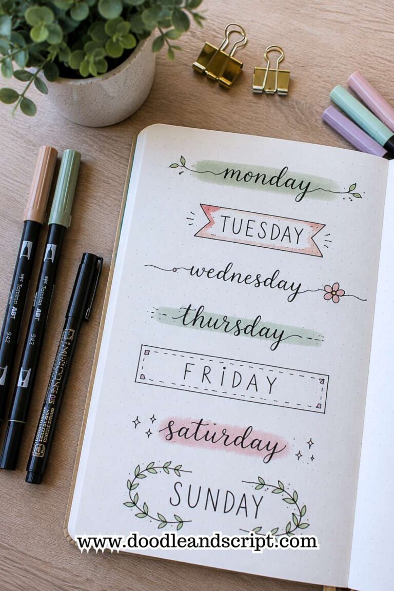
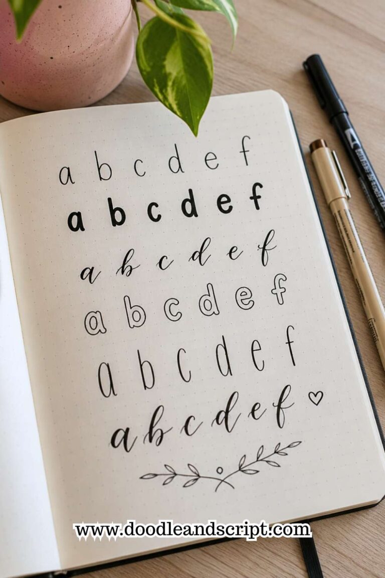
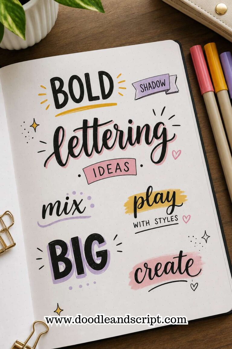
29 Bullet Journal Font Ideas to Make Your Pages Pop
Disclosure: Some of the links in this post are affiliate links. This means if you click on the link and purchase an item, I will receive an affiliate commission at no extra cost to you.
At first, you find one lettering style you like and use it everywhere. Monthly covers? Same font. Reading tracker? Same font. Random quote page? Same font again.
Then one day you’re scrolling through journal photos and wondering why everyone else’s pages look so different while yours all look exactly the same.
The funny thing is that it usually has nothing to do with artistic talent. Most people are not using complicated calligraphy. They just have more variety.
A bold font here. A messy handwritten font there. A tall skinny font for one page and a bubbly font for another. Those small changes make every spread feel new.
That is exactly what this list of Bullet Journal Font Ideas is for. The next time a page feels a little boring, you will have plenty of font styles to pull from instead of reaching for the same one again.
If you want to make those fonts stand out even more, explore How to Make Beautiful Bullet Journal Headers in 13 Easy Steps.
29 Bullet Journal Font Ideas to Make Your Pages Pop
1. The Classic Block Font
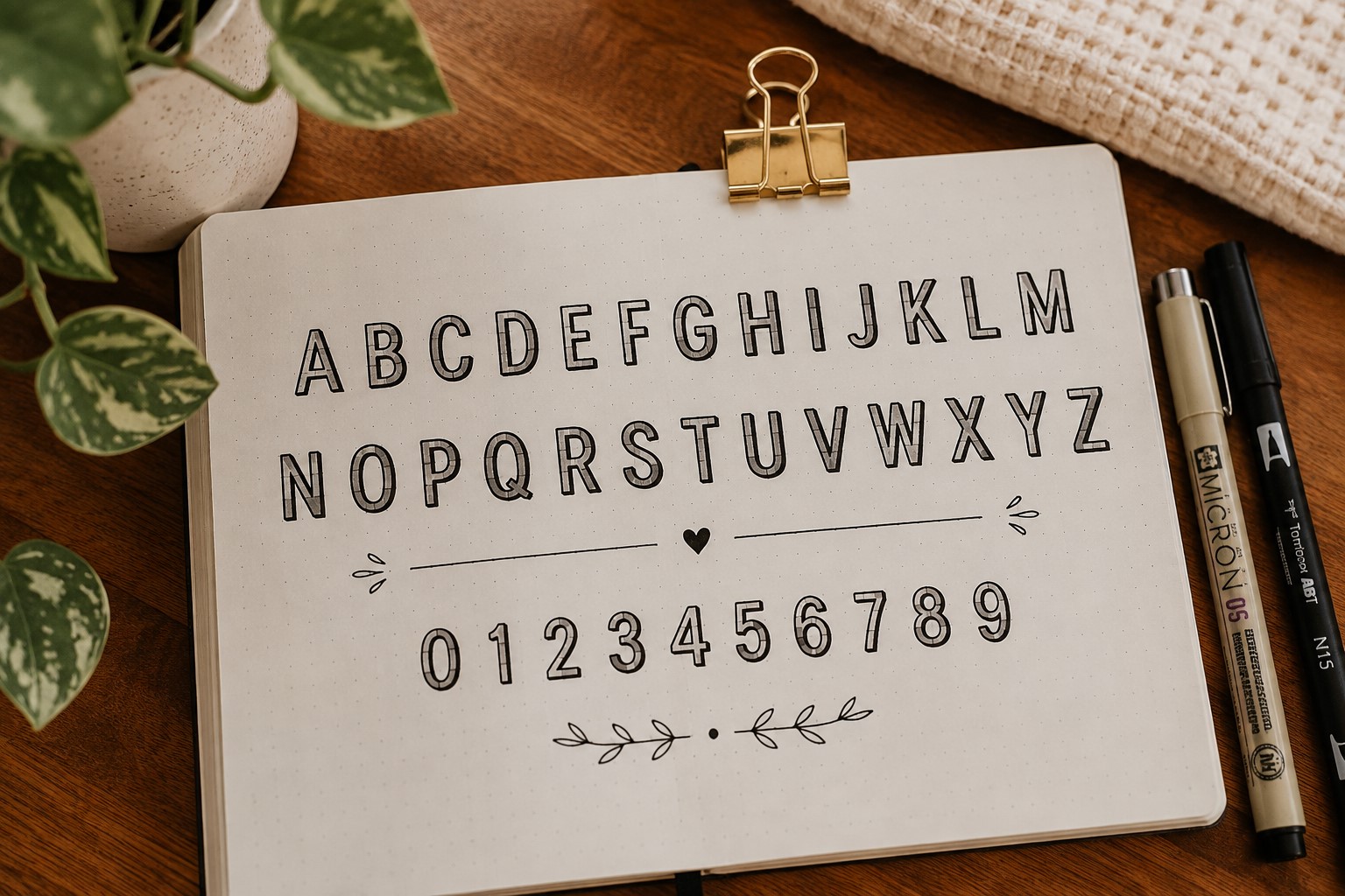
Every collection of Bullet Journal Font Ideas needs a reliable font, and block letters are exactly that. They are clean, bold, and easy to read from across the page.
If you ever sit down to make a spread and have no idea which font to use, block letters are usually a safe choice.
What makes this font so useful is how easy it is to customize. You can leave the letters plain, add shadows, fill them with patterns, or decorate them with tiny doodles.
The basic structure stays the same, but the finished result can look completely different each time.
Another reason people keep coming back to block letters is that mistakes are easy to fix. A slightly uneven line rarely ruins the look because the font is naturally bold and forgiving.
That makes it a great option for beginners who are still building confidence with lettering.
If you want more ways to make simple titles look impressive, explore 21 Bullet Journal Title Lettering Ideas That Look Professional.
2. The Bubble Font
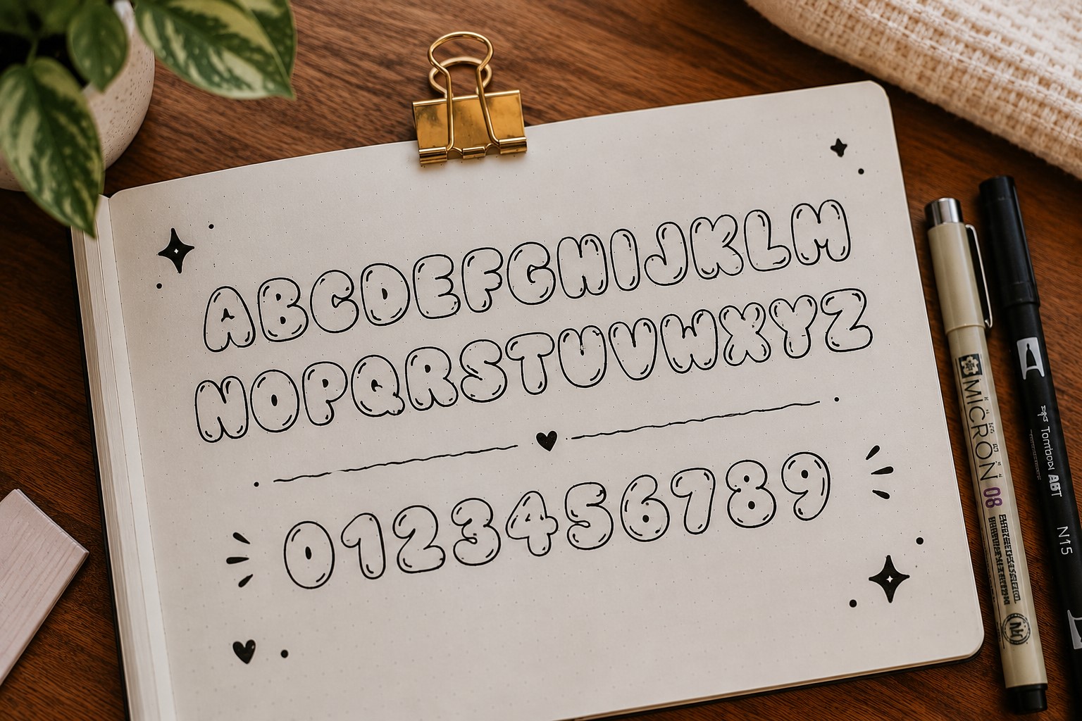
Some fonts just make a page feel more fun. Bubble letters have that effect instantly.
Their rounded shape gives them a playful look that works especially well for mood trackers, birthday spreads, and creative journal pages.
The best thing about bubble letters is that they do not require perfect handwriting. You can start with a normal word and simply draw an outline around each letter.
Once the outline is complete, erase the original lettering and you have a clean bubble font.
This style also gives you plenty of room for creativity. You can fill the letters with stars, dots, hearts, checkerboard patterns, or anything else that matches the theme of your spread. A simple bubble font can easily become the focal point of the page.
3. The Tall Skinny Font
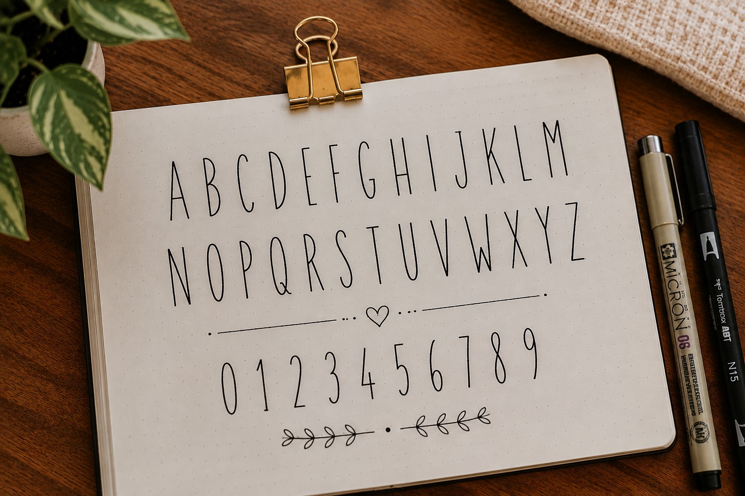
If block letters are loud, tall skinny fonts are their calm and organized cousin. They take up less horizontal space while still creating a strong visual impact.
This font is perfect for journal pages with long titles because the narrow letters fit neatly into smaller spaces.
Many people use it on weekly spreads and habit trackers where space is limited but a stylish heading is still important.
Tall skinny fonts also pair beautifully with other lettering styles. A bold font for one word and a tall skinny font for another can create a balanced and interesting title without much effort.
If you enjoy experimenting with different lettering styles, check out 15 Easy Bullet Journal Lettering Styles Every Beginner Should Learn.
4. The Faux Calligraphy Font
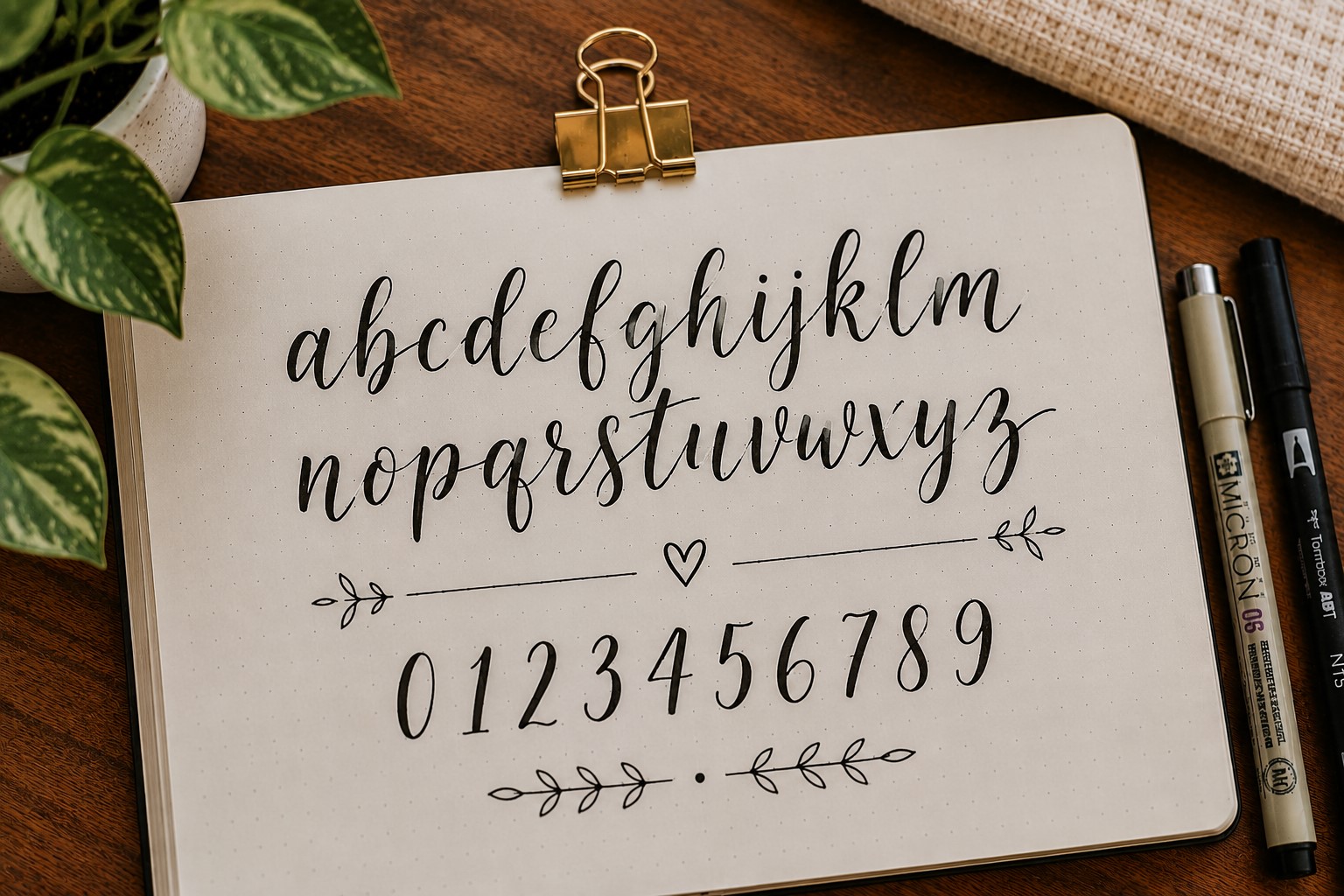
A lot of people avoid calligraphy because they assume it requires expensive pens and years of practice. Faux calligraphy proves otherwise.
The process is surprisingly simple. Write a word in cursive, then go back and thicken the downstrokes. Those extra lines create the illusion of modern calligraphy without requiring special tools.
This font works beautifully on quote pages, cover spreads, and gratitude journals because it feels elegant without looking overly formal.
It is one of those styles that instantly makes a page feel more polished.
Many journal users are surprised by how quickly they can learn this technique. After a few practice sessions, it starts feeling natural.
If you want more creative script inspiration, explore 17 Creative Bullet Journal Calligraphy Ideas to Try Today.
5. The Typewriter Font
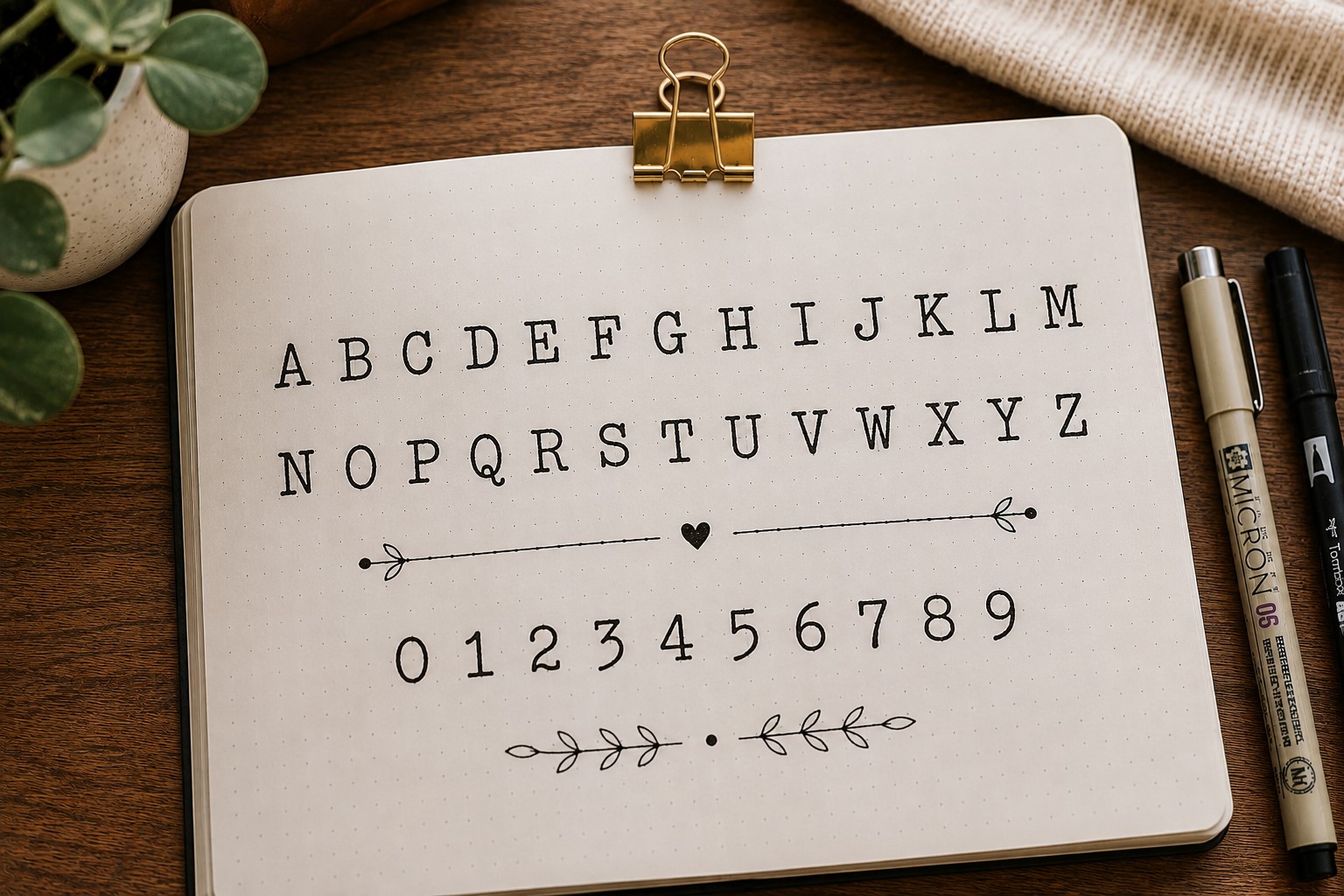
There is something satisfying about a font that looks like it came straight from an old typewriter. It feels neat, nostalgic, and slightly academic in the best possible way.
The letters are usually simple and evenly spaced, which makes this font a great choice for study planners, reading logs, and productivity spreads. It creates a clean appearance without feeling boring.
One thing that makes the typewriter font stand out is its consistency. Every letter looks deliberate, giving the page a structured and organized feel. Even simple layouts can look more refined with this style.
This font is especially useful when you want a title that looks stylish without drawing too much attention away from the rest of the page.
6. The Mixed-Case Font
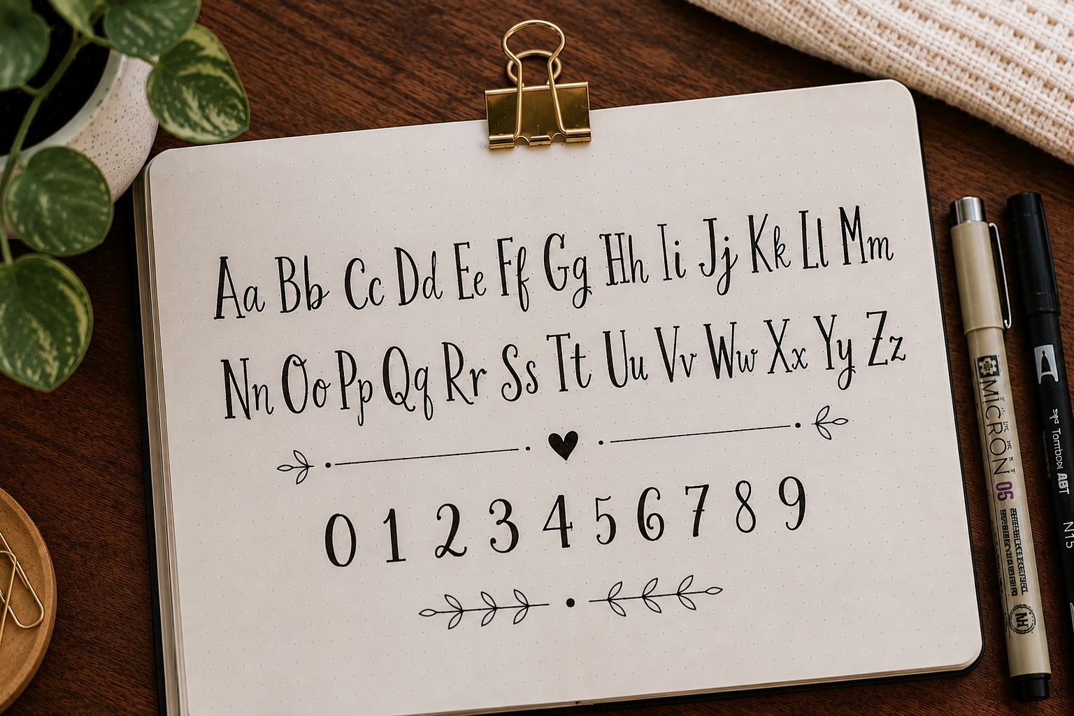
Most people automatically use either uppercase or lowercase letters. Mixed-case fonts break that rule by combining both in creative ways.
For example, you might make the first letter of each word oversized while keeping the remaining letters small.
You could also alternate between uppercase and lowercase letters throughout the title.
The result feels playful and unexpected. It immediately grabs attention because it looks different from traditional lettering styles.
Small changes like this can make a heading feel more custom and personal.
Mixed-case lettering is a great reminder that some of the best Bullet Journal Font Ideas come from experimenting rather than following strict rules.
If you are looking for more creative lettering inspiration, explore 23 Beautiful Bullet Journal Lettering Ideas You’ll Want to Copy.
7. The All-Caps Handwritten Font
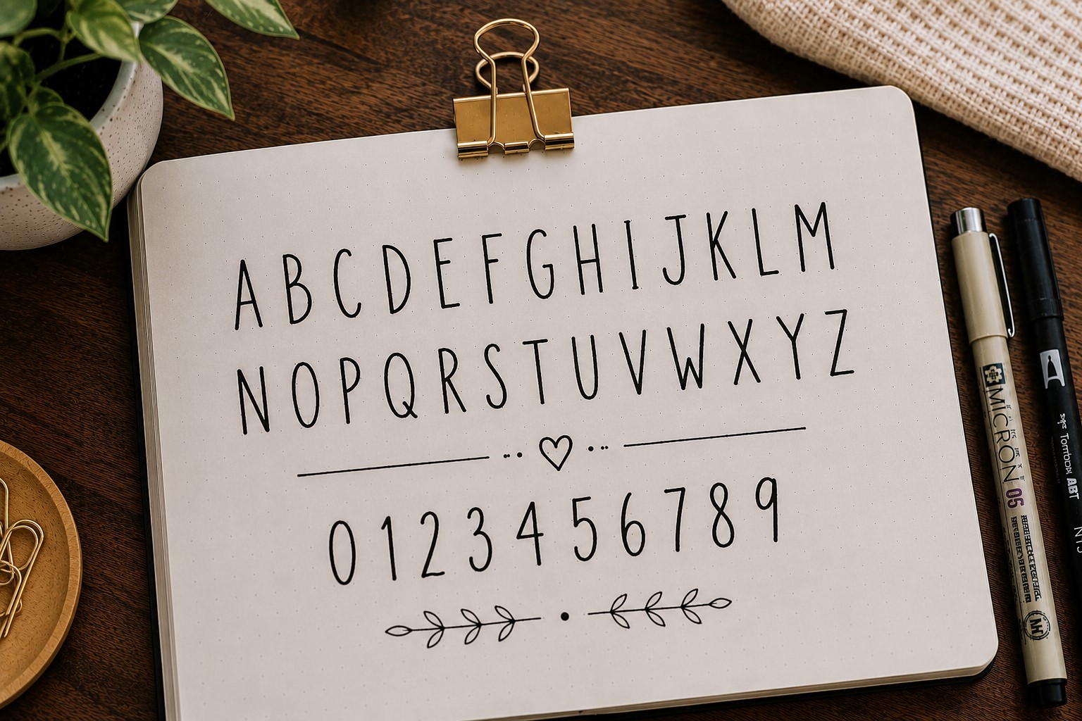
There is something about writing everything in capital letters that makes a title feel more confident. It is simple, easy to learn, and works with almost any type of spread.
Unlike traditional block letters, this font keeps a handwritten feel. The letters do not need to be perfectly straight or identical. In fact, a little inconsistency often gives the font more personality.
This style is great for monthly covers, school planners, and goal-setting pages because it is bold without taking forever to draw.
It also pairs nicely with script fonts if you want to mix different styles in the same title.
If you want more ways to create eye-catching headings, explore How to Create Gorgeous Bullet Journal Headers in 15 Steps.
8. The Bouncy Lettering Font
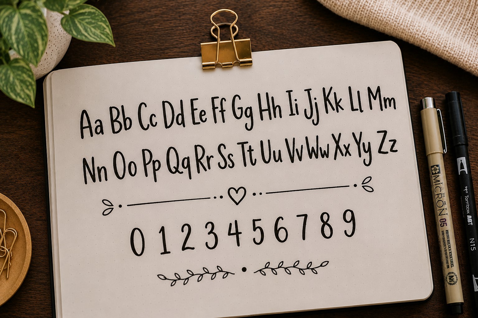
Most fonts sit neatly on an invisible line. Bouncy lettering ignores that rule completely. Some letters sit higher, some drop lower, and the result feels relaxed and playful.
This font works especially well for creative spreads because it gives the page movement. The uneven placement makes the lettering feel more natural and less rigid.
One thing people love about bouncy lettering is that perfection is not required. In fact, trying to make every letter identical often removes the charm.
The slight variations are what make the style interesting. It is a fun font to use when a page feels too structured and needs a little more personality.
9. The Outline Font
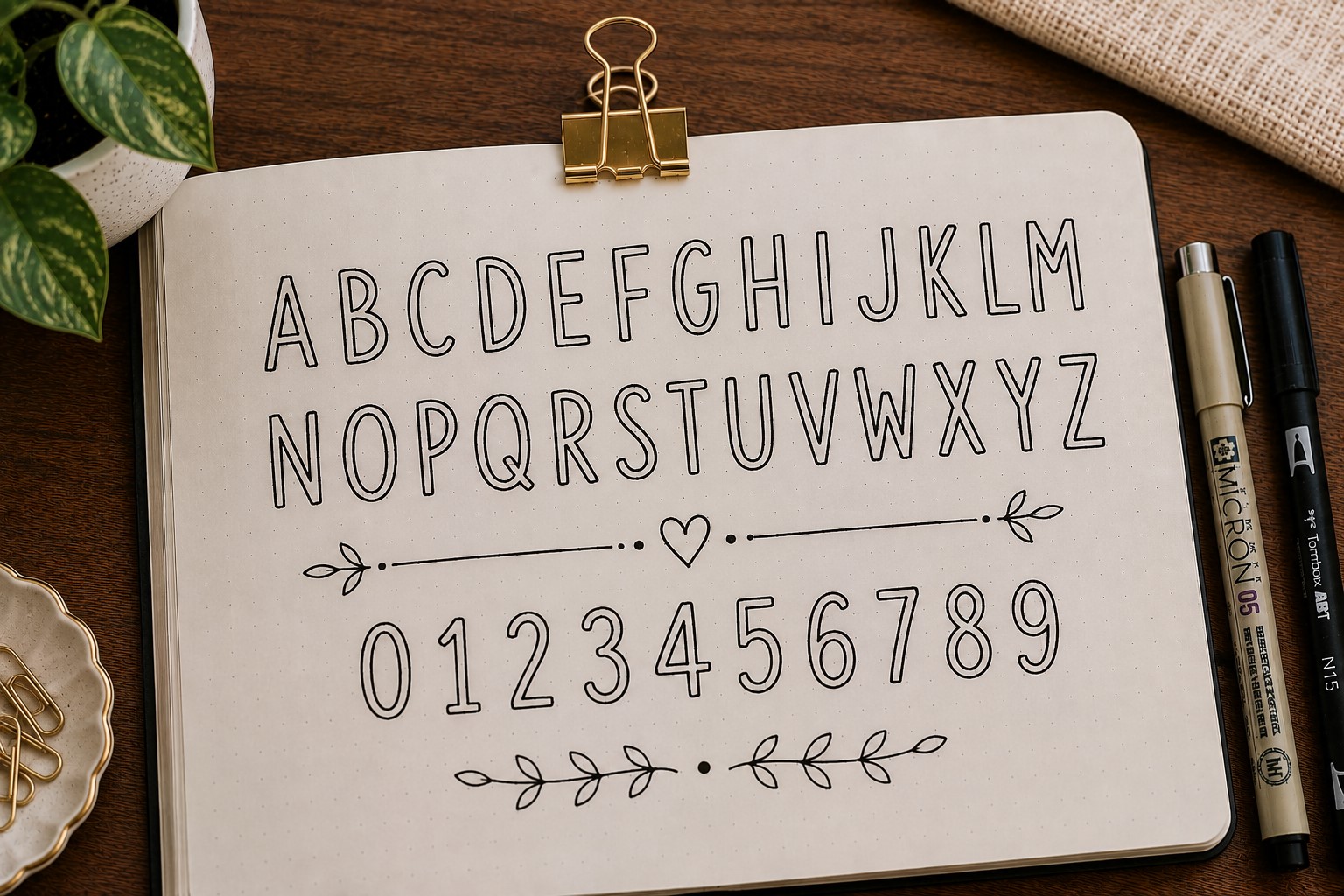
The outline font is exactly what it sounds like. Instead of solid letters, you draw only the outer edges of each letter and leave the center empty.
This creates a clean and modern look while giving you plenty of room for creativity. You can leave the letters empty for a minimalist style or fill them with patterns and doodles later.
Outline fonts are particularly useful for large headings because they add visual impact without making the page feel heavy. The open spaces help keep the layout balanced.
Many journal users keep coming back to this font because it is easy to customize for different themes and seasons.
If you enjoy decorative lettering, check out 11 Decorative Bullet Journal Lettering Ideas for Stunning Pages.
10. The Retro Font
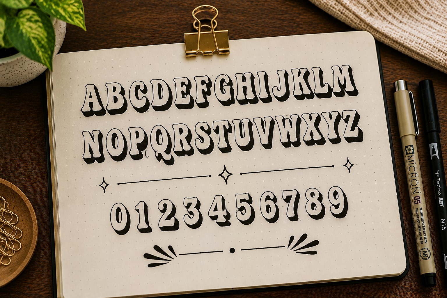
Retro fonts have a way of making a page feel fun before you even read the title. They often feature thick curves, exaggerated shapes, and playful details inspired by older design trends.
This style works beautifully for memory pages, summer spreads, playlists, and anything that needs a cheerful vibe. The letters naturally become part of the decoration.
The great thing about retro fonts is that they do not need to be perfect. Their quirky appearance is part of their charm. Small imperfections often make them look even better.
If your journal feels a little too serious lately, a retro font can be an easy way to switch things up.
11. The Serif Font
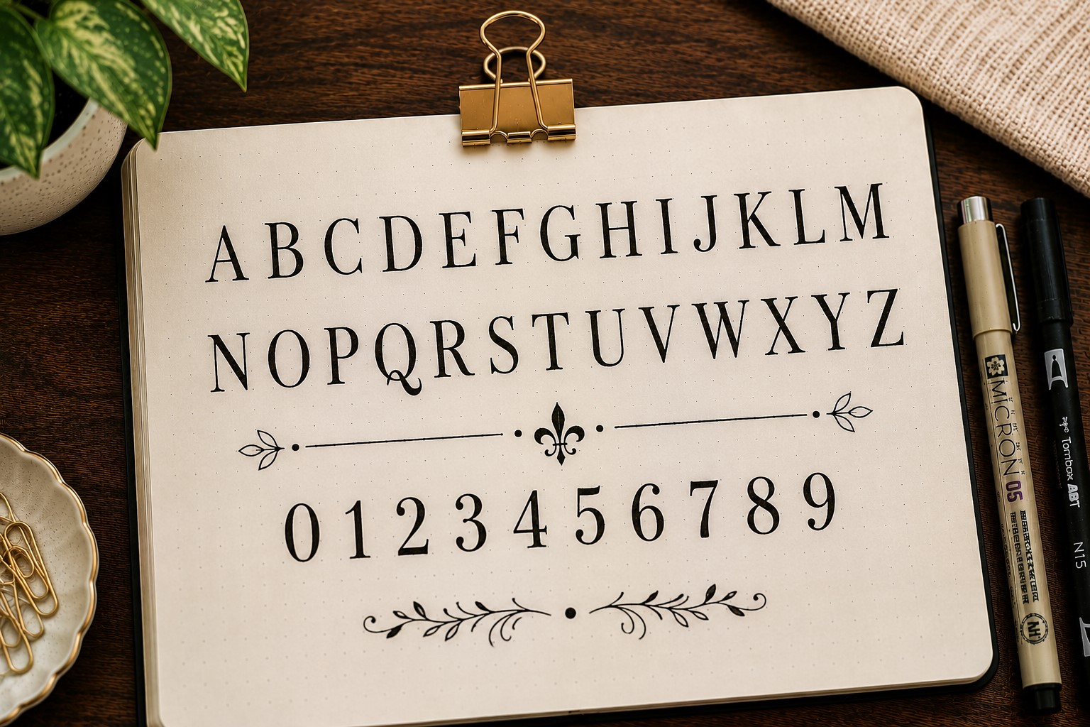
Most everyday handwriting does not include serifs, which is exactly why this font stands out. Serifs are the small strokes added to the ends of letters, giving them a more traditional appearance.
This font feels polished and slightly sophisticated. It works especially well for reading journals, book trackers, and quote pages where you want a more classic look.
The details may seem small, but they make a noticeable difference. Adding serifs instantly changes the personality of a title without requiring a completely new lettering style.
Many people discover that this font looks far more complicated than it actually is.
If you want more inspiration for stylish quote pages, explore 17 Bullet Journal Quote Lettering Ideas That Stand Out.
12. The Sans Serif Font
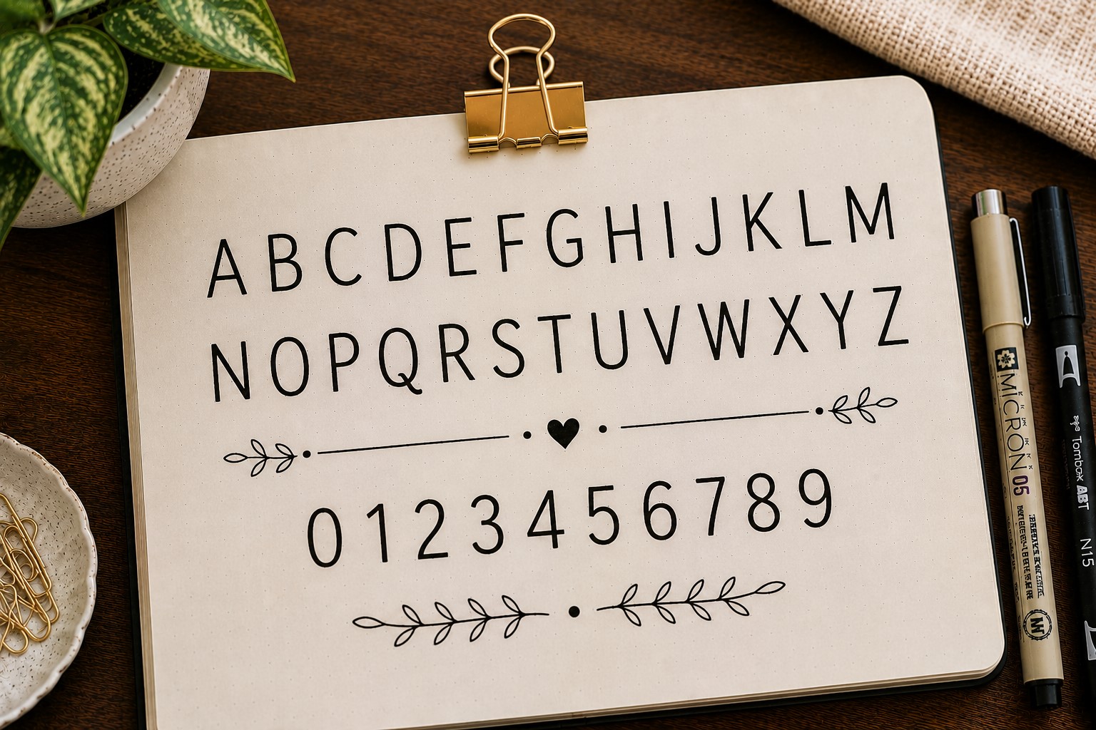
If the serif font feels classic, the sans serif font feels modern. It removes the extra strokes and focuses on clean, straightforward letterforms.
This style is perfect for minimalist journals because it looks neat without drawing too much attention. It is often used in professional designs for the same reason.
One of the biggest advantages of a sans serif font is readability. Even from a distance, the letters remain clear and easy to understand.
That simplicity makes it a dependable choice whenever you want a clean and organized spread.
13. The Dotted Font
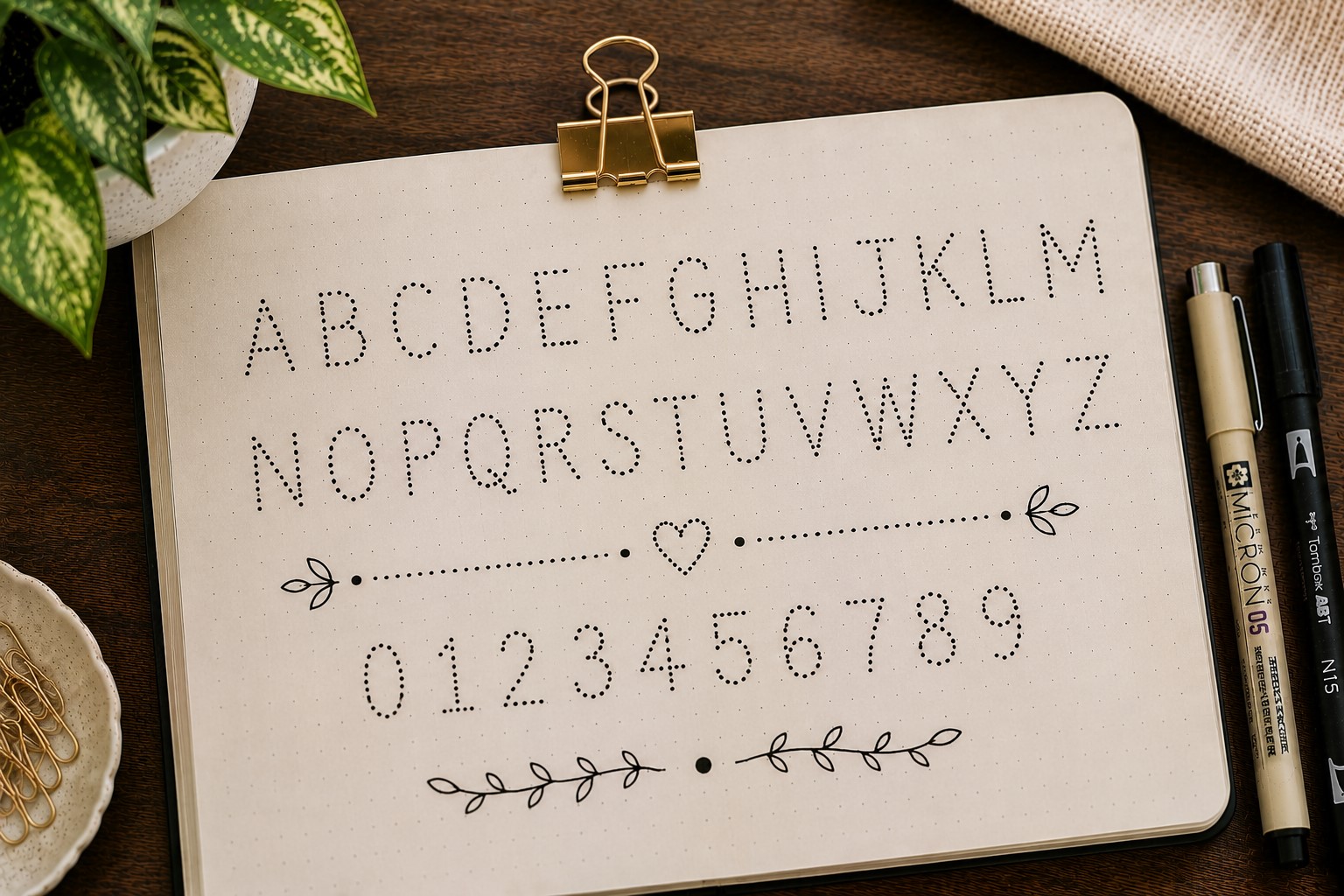
A dotted font replaces solid lines with small dots, creating a softer and more playful effect. It is a simple idea, but it can completely change the mood of a page.
This style works especially well in habit trackers, mood logs, and seasonal spreads where you want something decorative without being overwhelming.
The dots can be evenly spaced for a clean appearance or slightly varied for a more hand-drawn look. Both approaches create interesting results.
Dotted fonts are also surprisingly relaxing to draw, making them a favorite among journal users who enjoy slow, creative setups.
14. The Shadow Font
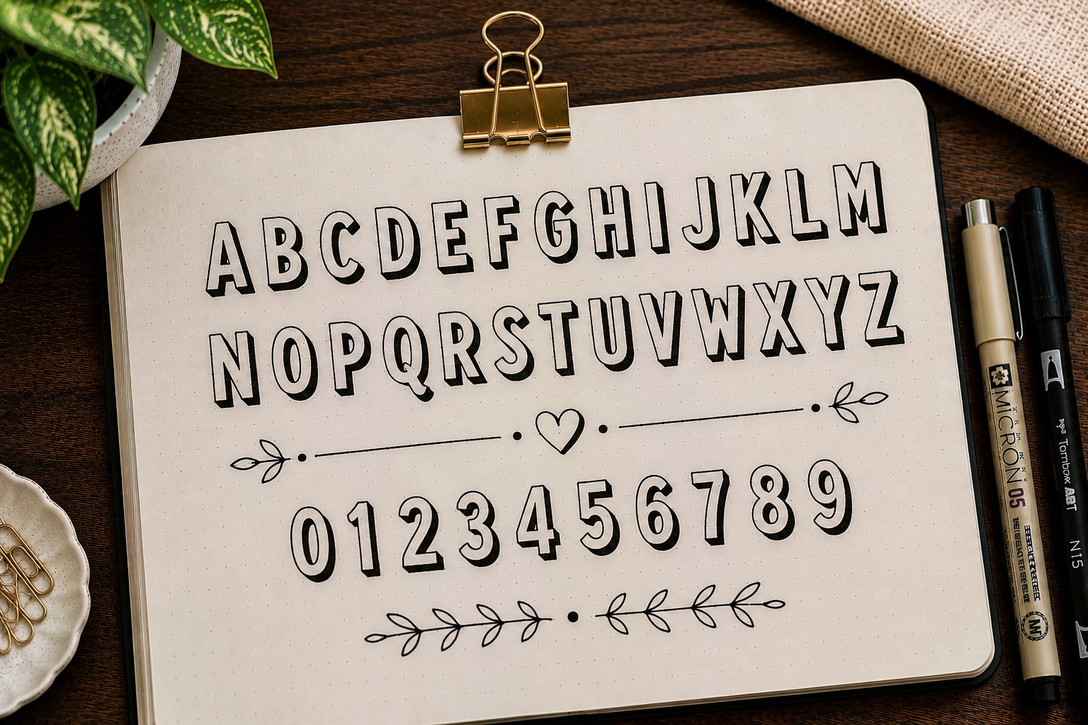
A shadow font starts with a simple lettering style and instantly makes it look more interesting. All you do is add a shadow behind the letters, but the difference is huge.
This font works well because it creates depth. The title feels less flat, and your eyes are naturally drawn to it first. Even basic handwriting can look more polished with a well-placed shadow.
The best part is that you can apply shadows to almost any font in this list. Once you learn the technique, it becomes an easy way to upgrade your headings without learning a completely new style.
If you want more ways to make your lettering stand out, explore 25 Aesthetic Bullet Journal Lettering Ideas You’ll Love.
15. The Checkerboard Font
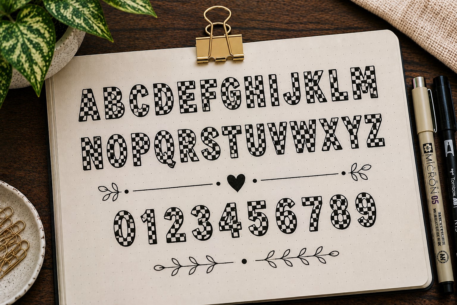
This is the kind of font that immediately catches attention. Instead of leaving letters plain, parts of them are filled with a checkerboard pattern. The result feels bold, trendy, and full of personality.
Checkerboard lettering works especially well for playlist pages, mood boards, and fun monthly covers. It can make even a short title become the focal point of a spread.
You do not have to fill every letter with the pattern. Sometimes adding checkerboard details to just a few letters creates a cleaner and more balanced design.
This font is proof that a simple pattern can completely transform ordinary lettering.
16. The Stacked Font
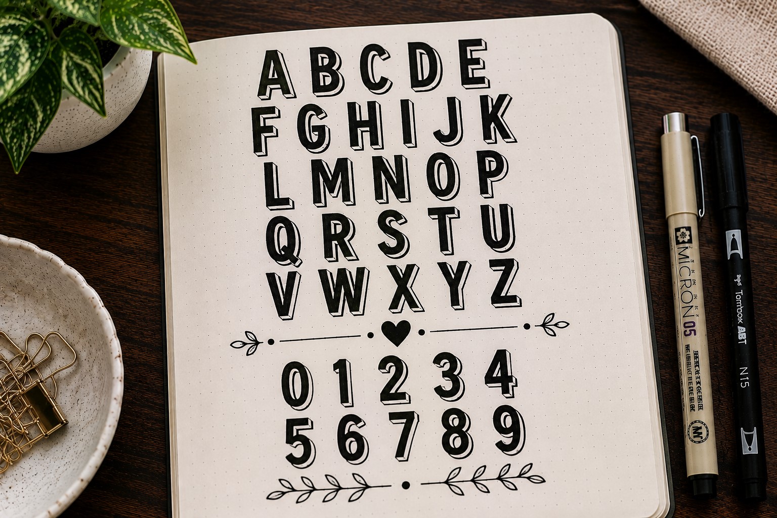
Some titles are too long to fit comfortably on one line. Instead of shrinking the lettering, try stacking the words on top of each other.
This font style creates a strong visual block that naturally grabs attention. It also helps fill empty space without needing extra decorations.
Stacked lettering works particularly well for monthly cover pages because it feels bold and intentional. Each word gets its own space while still feeling connected to the rest of the title.
Many journal users love this style because it makes a heading look impressive with very little effort.
17. The Script Font
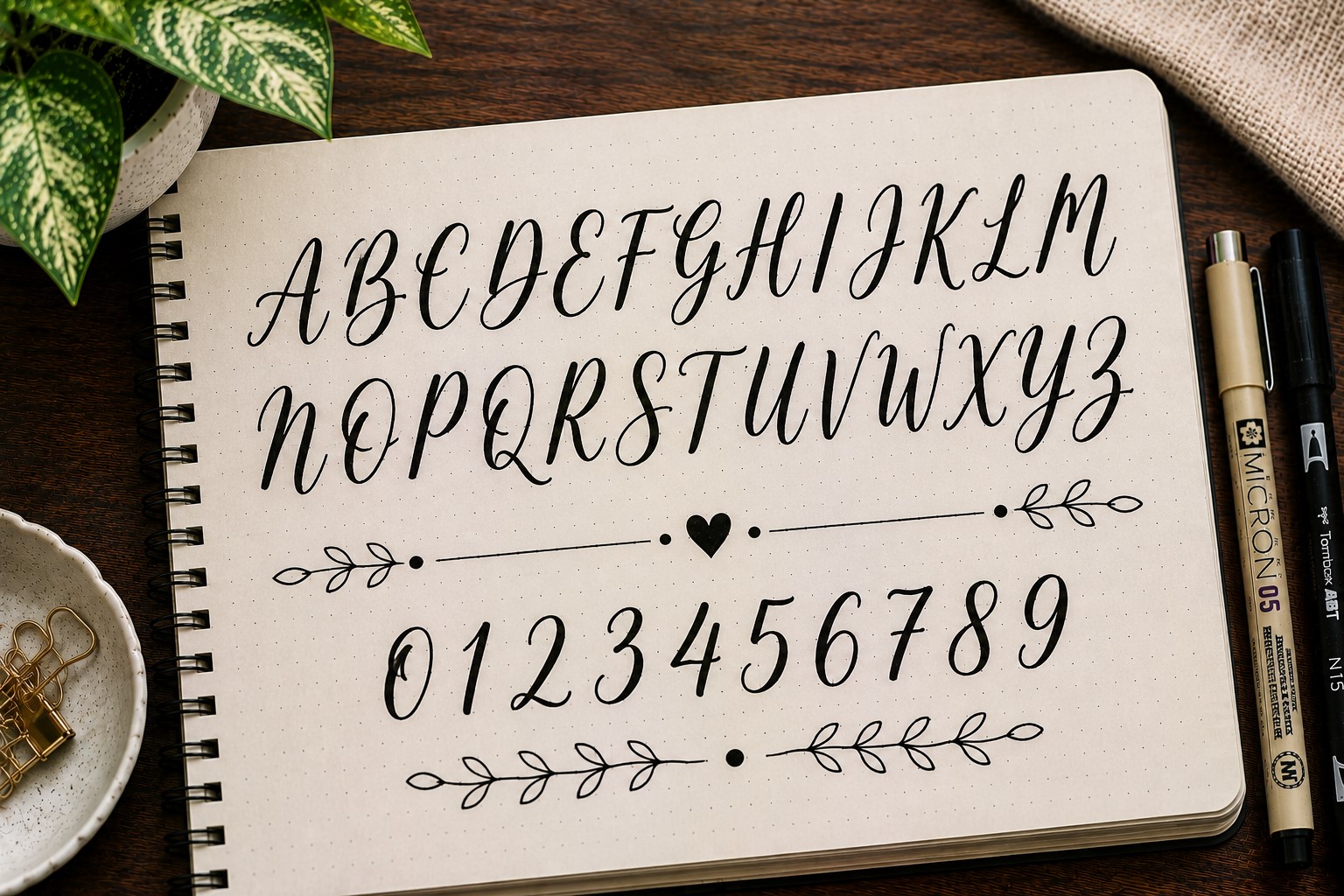
Script fonts flow smoothly from one letter to the next, creating a softer and more elegant look. They are often used for quotes, gratitude spreads, and memory pages.
The beauty of script lettering is that it adds personality without requiring a lot of decoration. The movement of the letters creates visual interest all on its own.
Do not worry if your cursive is not perfect. Script fonts often look better when they have a natural, handwritten feel rather than a perfectly polished appearance.
If you want more ideas for beautiful script layouts, check out 17 Creative Bullet Journal Calligraphy Ideas to Try Today.
18. The Geometric Font
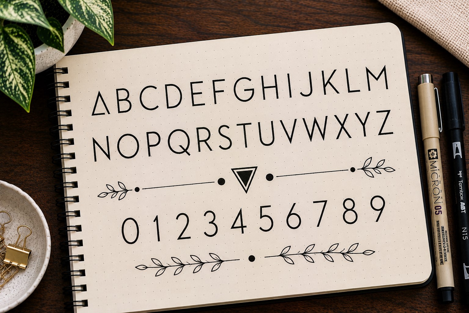
Geometric fonts are built using simple shapes such as circles, squares, and straight lines. They feel modern, structured, and visually satisfying.
This style works particularly well for productivity spreads because the clean lines create an organized appearance. The font feels deliberate without looking boring.
One of the advantages of geometric lettering is consistency. The repeated shapes help the title look balanced even if your handwriting is not naturally neat.
The result is a font that feels creative while still maintaining a polished look.
19. The Ribbon Font
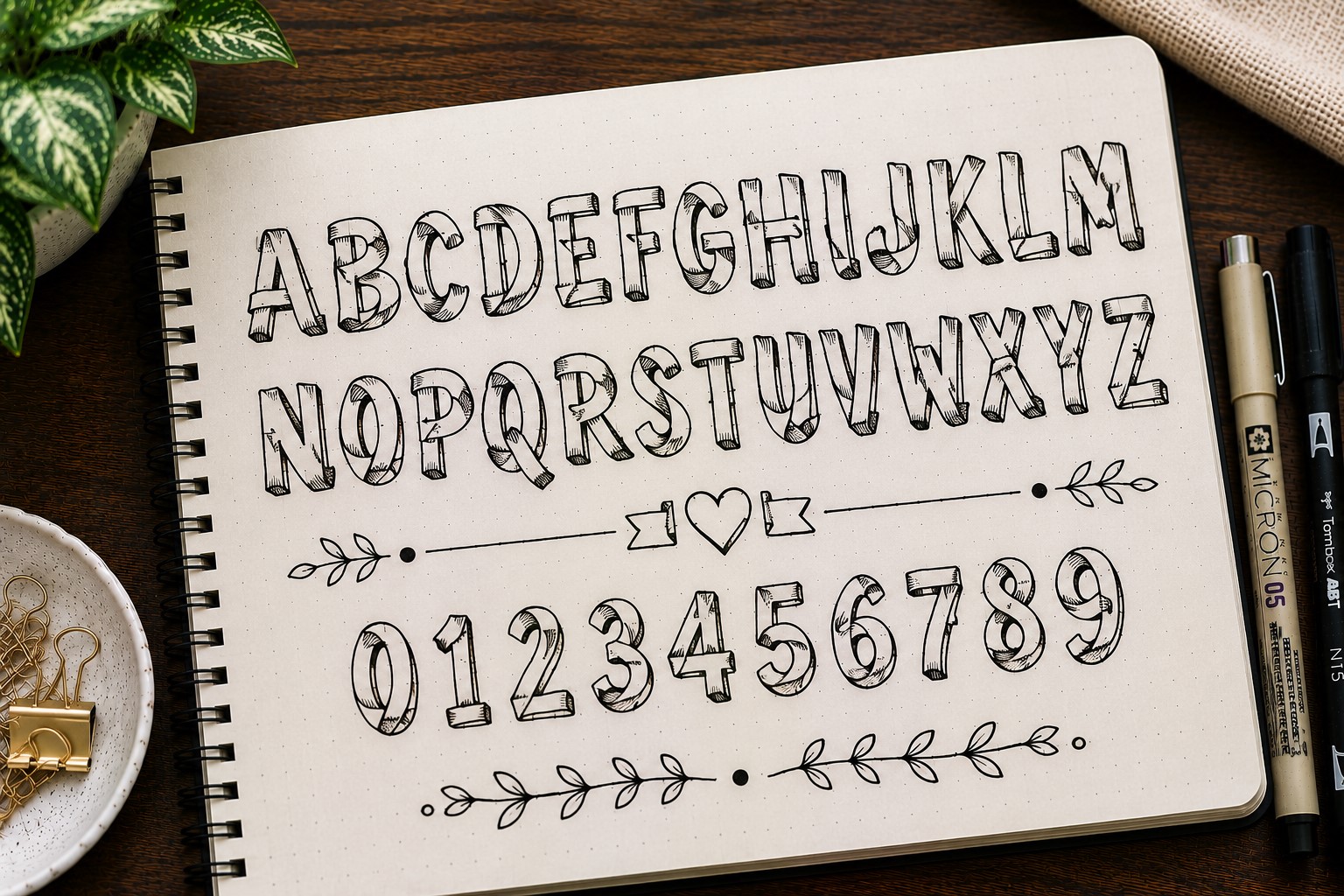
A ribbon font makes letters look as though they have been folded from strips of ribbon. This creates depth, movement, and a decorative feel.
It can take a little longer to draw than some of the simpler fonts, but the results are worth it. Even a short title can look like a piece of artwork.
Ribbon lettering works beautifully on special pages such as birthday spreads, yearly goals, and cover pages. It naturally attracts attention and adds a unique touch.
If you enjoy decorative page elements, explore 21 Cute Bullet Journal Banner Doodles Anyone Can Draw.
20. The Tiny Caps Font
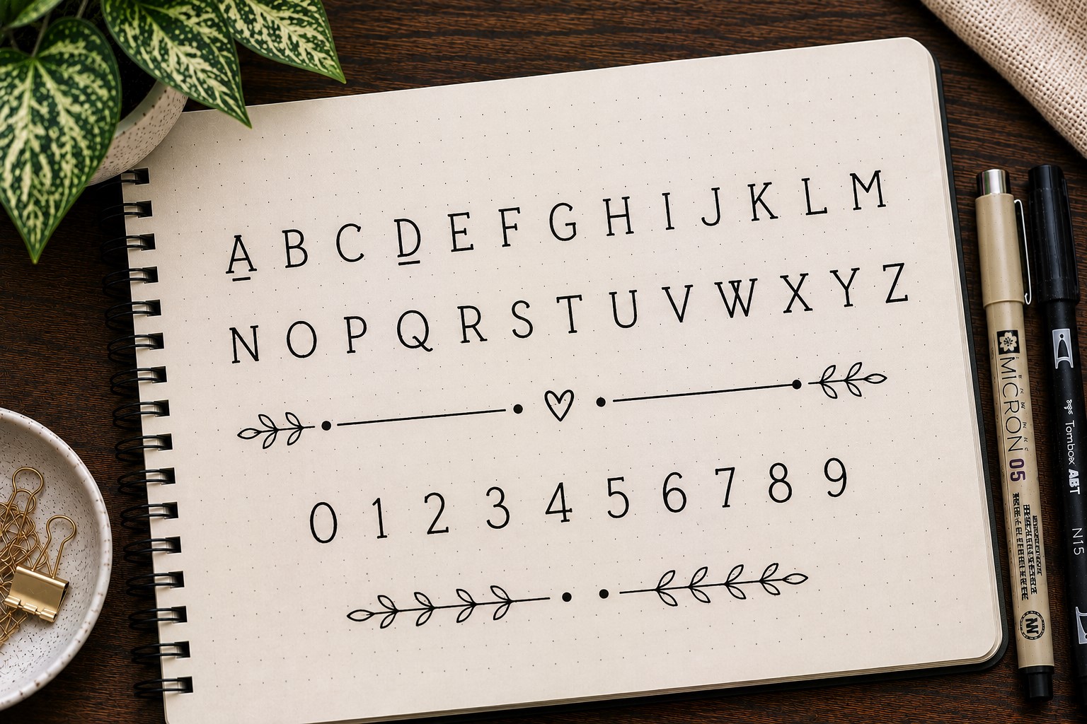
Tiny caps lettering uses small uppercase letters instead of standard lowercase letters. The result feels clean, organized, and slightly professional.
This style is perfect when you want a heading that looks neat without becoming the main focus of the page. It works especially well for trackers and planner spreads.
Tiny caps are also surprisingly versatile. They pair beautifully with larger decorative fonts and help create contrast within a title.
Many people overlook this font because it seems simple, but its clean appearance makes it incredibly useful.
21. The Graffiti-Inspired Font
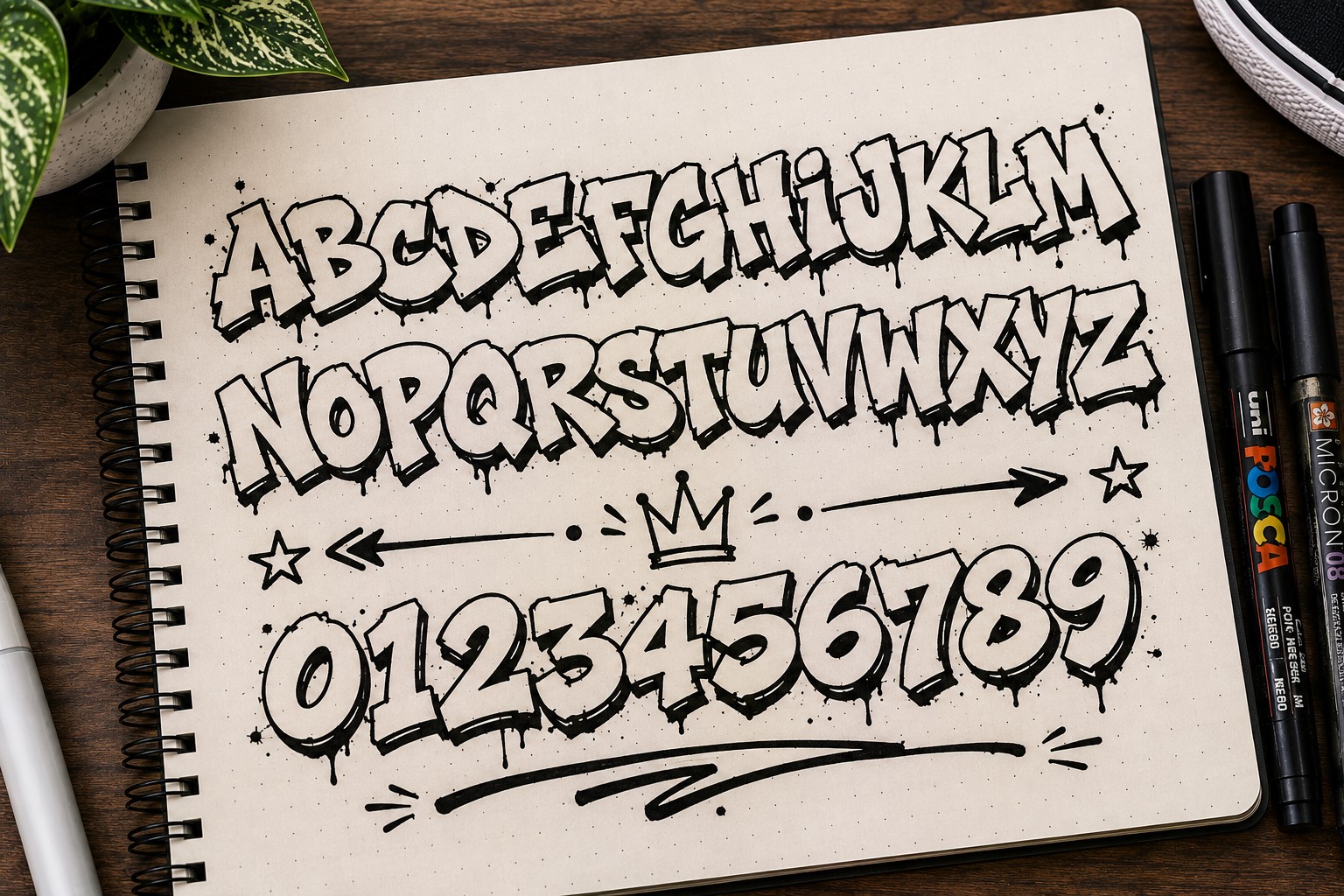
Graffiti-inspired lettering brings energy to a page. The exaggerated shapes, bold outlines, and playful details create a font that feels expressive and fun.
This style works especially well for creative spreads where you want the title to stand out immediately. It can turn an ordinary heading into a statement piece.
You do not need to create elaborate street-art lettering to get the effect. Even small graffiti-inspired details can add personality to your page.
If your journal feels a little too neat and predictable, this font can be a fun way to break the pattern.
22. The Rounded Font
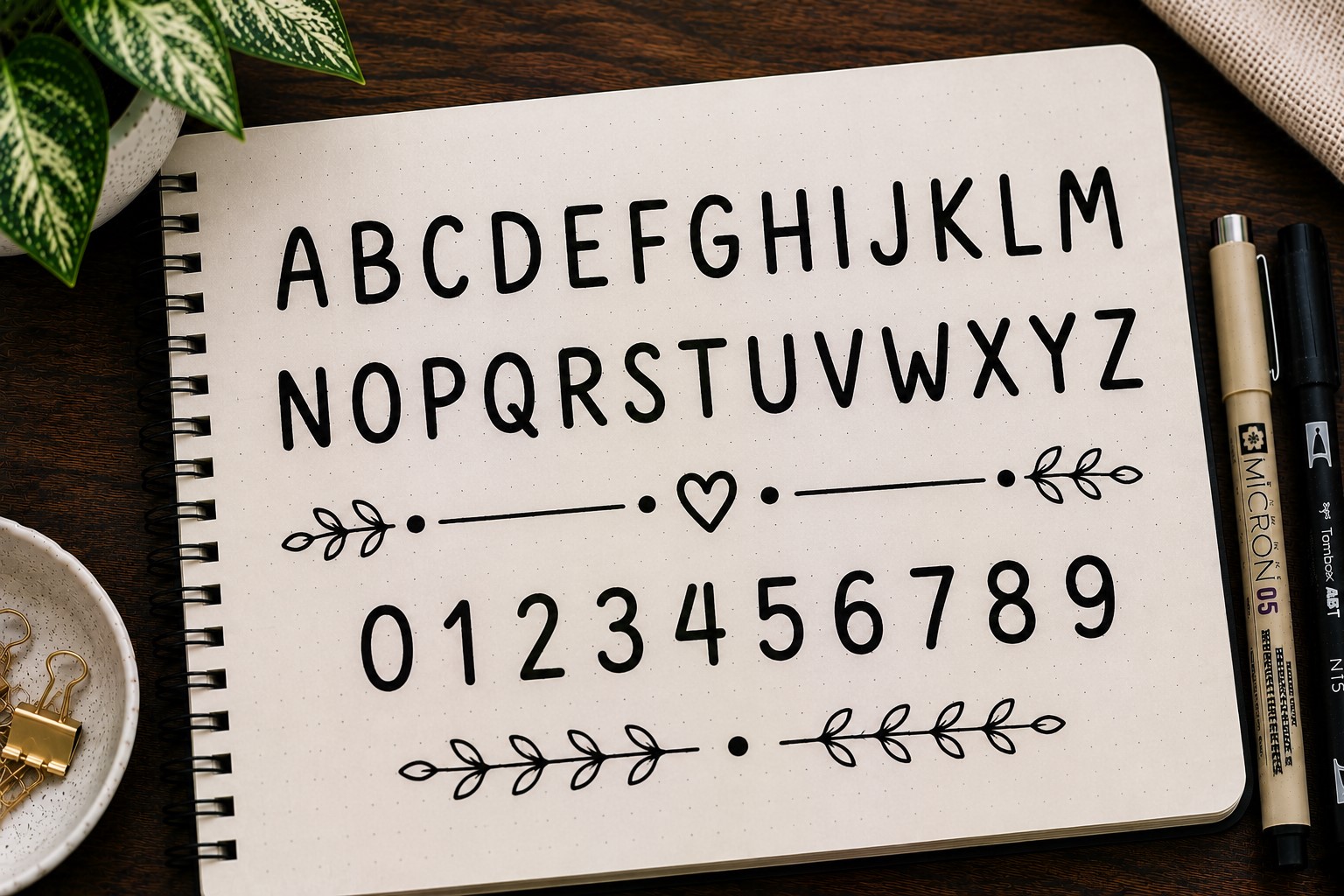
Some fonts look serious the moment you write them. This is not one of them. Rounded fonts have soft edges and smooth curves that make a page feel friendlier and more relaxed.
This style works especially well for self-care spreads, mood trackers, and journaling pages because it creates a welcoming feel. The letters are easy to draw and do not require perfect precision.
Another reason people love rounded fonts is that they pair well with almost every decoration style. Whether your page includes florals, doodles, or minimalist layouts, this font fits right in.
If you are building a collection of Bullet Journal Font Ideas, this is one style you will probably use again and again.
23. The Stencil Font
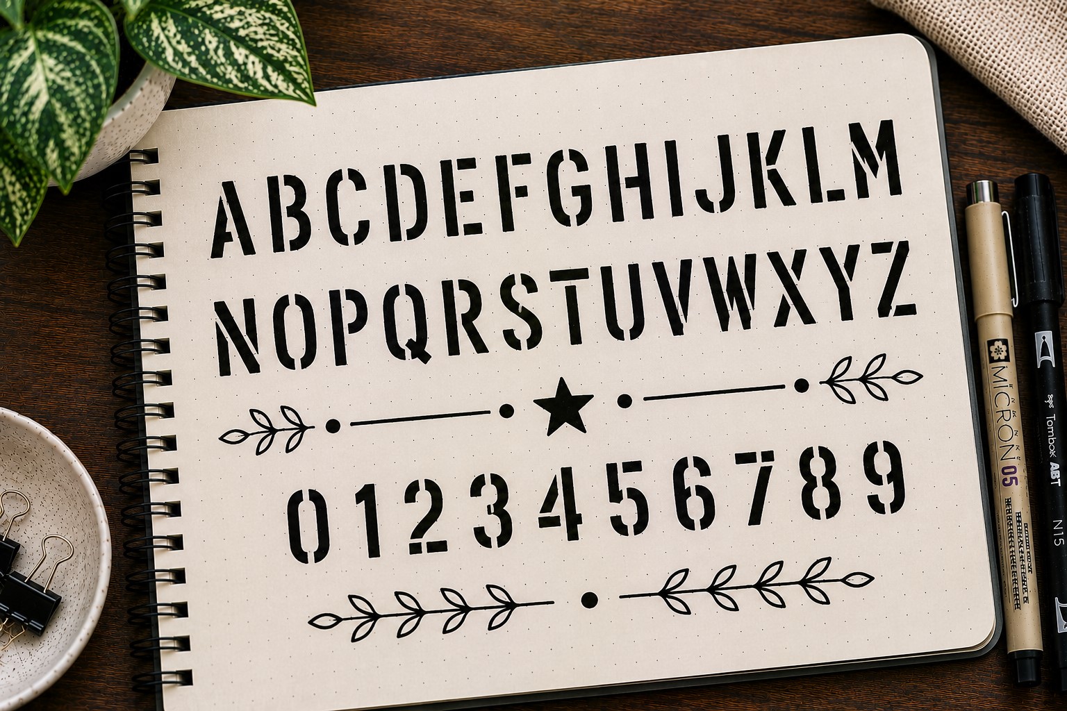
Stencil fonts look like the letters were cut out and sprayed onto the page. The small breaks within each letter create a distinctive look that immediately stands out.
This style feels bold and structured, making it a great choice for titles that need a little extra impact. It works particularly well on cover pages, challenge trackers, and goal-setting spreads.
The gaps inside the letters may seem like a small detail, but they completely change the appearance of the font. It is one of those styles that looks more advanced than it actually is.
Many journal users enjoy stencil lettering because it combines creativity with clean lines.
If you want more inspiration for creative layouts, explore 27 Easy Bullet Journal Doodle Ideas for Every Page.
24. The Dripping Font
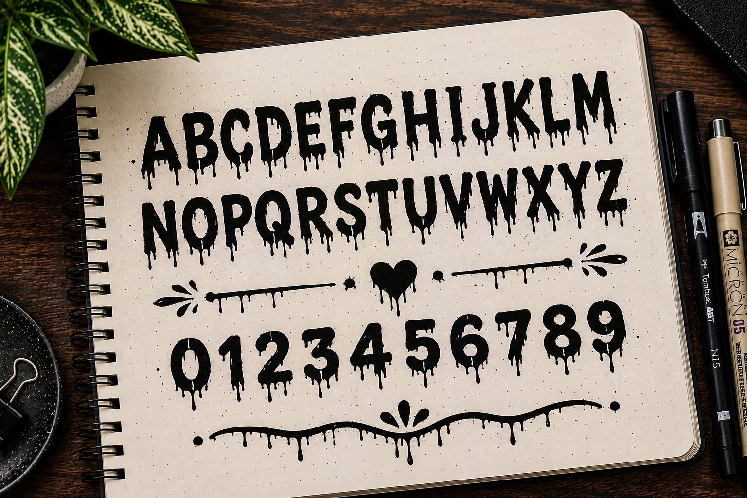
The dripping font looks like the letters are melting or dripping down the page. It is playful, dramatic, and impossible to ignore.
This style is especially fun for Halloween spreads, movie trackers, themed monthly covers, and creative challenge pages. It instantly adds personality to a layout.
The trick is not overdoing the drips. A few carefully placed drops usually look better than covering every letter. Too many can make the title difficult to read.
This font is a great reminder that not every heading has to look neat and traditional.
25. The Patchwork Font
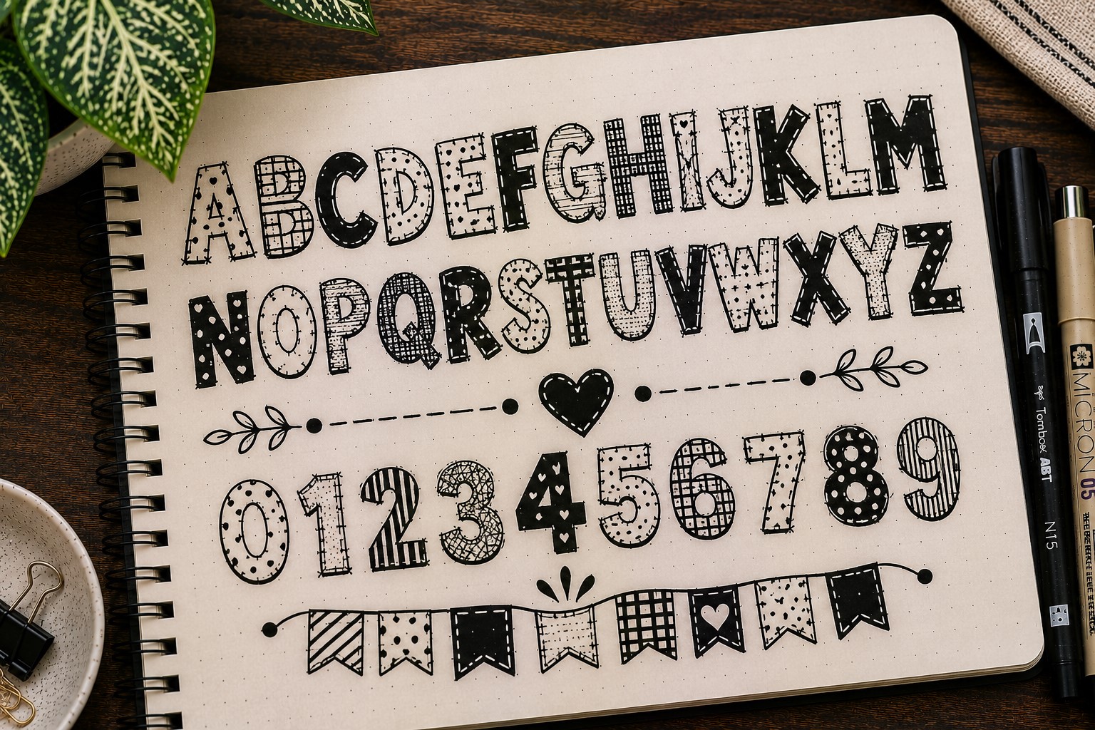
Patchwork lettering makes each letter look like it was stitched together from different pieces. The style feels handmade and full of character.
One way to create this effect is by dividing each letter into sections and filling them with different patterns. Stripes, dots, zigzags, and checkerboards all work beautifully.
This font is perfect when you want a title to become part of the decoration. The extra details make even short words look interesting.
The best thing about patchwork lettering is that no two versions ever look exactly the same. That uniqueness makes it one of the most creative Bullet Journal Font Ideas to experiment with.
26. The Monoline Font
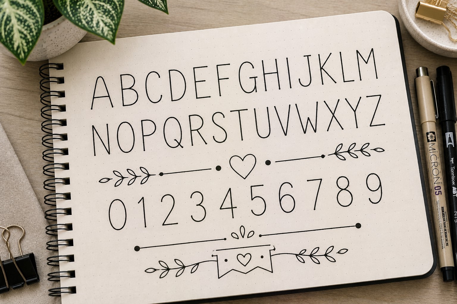
Monoline lettering keeps every stroke the same thickness from beginning to end. There are no thick downstrokes or decorative flourishes, just clean and consistent lines.
This simplicity is exactly what makes the font appealing. It feels modern, uncluttered, and easy to read.
Monoline fonts work particularly well when a page already contains a lot of decorations. The clean lettering helps balance the layout and prevents it from feeling overwhelming.
Many people underestimate how effective simple lettering can be until they try a monoline font for themselves.
If you want more clean lettering inspiration, explore 15 Easy Bullet Journal Lettering Styles Every Beginner Should Learn.
27. The Decorative Floral Font
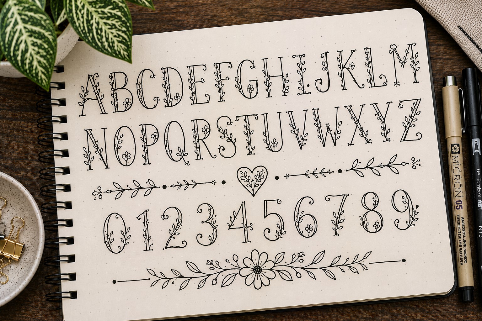
This font combines lettering with tiny floral details. Flowers, leaves, and vines become part of the letters rather than sitting around them.
The result feels creative and elegant without requiring advanced artistic skills. Even a few simple leaves can completely change the appearance of a title.
Floral fonts are especially popular in spring spreads, gratitude journals, and self-care pages because they add warmth and charm.
One reason people love this style is that it can be as simple or detailed as you want. A few leaves create a subtle effect, while full floral embellishments create something much more dramatic.
If you enjoy decorative lettering, check out 11 Decorative Bullet Journal Lettering Ideas for Stunning Pages.
28. The Handwritten Print Font
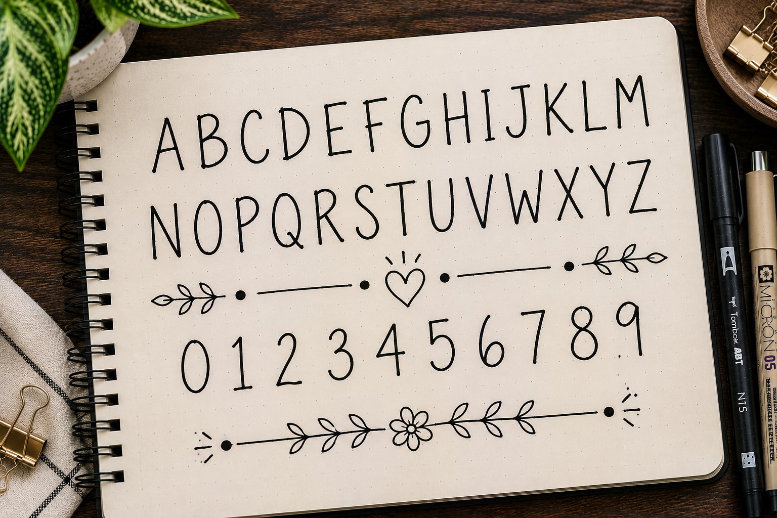
Sometimes the best font is the one that feels the most natural. A handwritten print font embraces the look of everyday handwriting while making it slightly neater and more intentional.
This style works because it feels approachable. It does not look overly formal or heavily decorated. Instead, it creates a relaxed and personal feel.
Many journal users rely on this font when they want a heading that looks good but does not take a lot of time to create. It is simple, practical, and surprisingly versatile.
A good handwritten print font proves that beautiful lettering does not always have to be complicated.
29. The Mixed Font Title
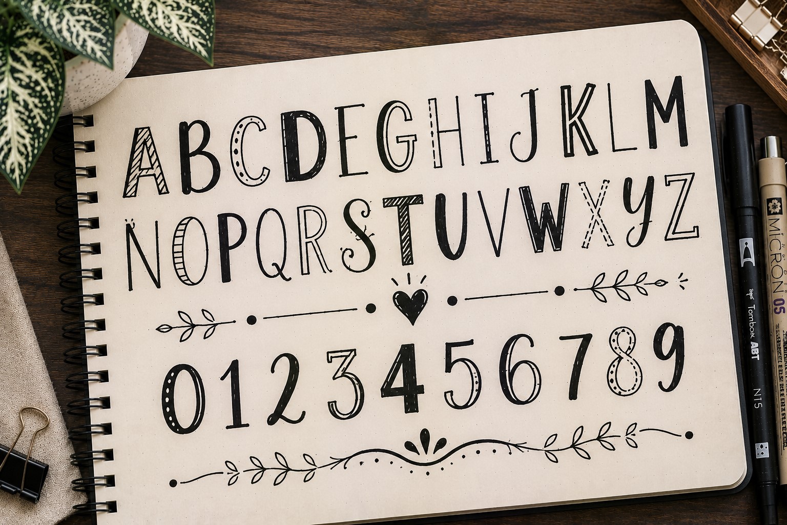
Why choose one font when you can use several? A mixed font title combines different lettering styles within the same heading to create contrast and interest.
You might pair a script font with block letters, combine a tall skinny font with bubble lettering, or mix decorative styles with simple ones. The possibilities are endless.
The key is balance. The fonts should complement each other rather than compete for attention. When done well, a mixed-font title can make even a simple heading look professionally designed.
Many experienced journal users rely on this technique because it allows them to create unique titles without constantly learning new fonts.
If you want more inspiration for combining lettering styles, explore 17 Bullet Journal Quote Lettering Ideas That Stand Out.
Final Thoughts
The funny thing about fonts is that you usually do not realize how much they affect a page until you start changing them.
A spread that felt plain five minutes ago can suddenly feel more creative, more organized, or more fun just because you wrote the title differently.
That is why building a collection of Bullet Journal Font Ideas is so useful. Instead of staring at a blank page wondering how to make it look interesting, you already have a variety of styles to choose from.
Some fonts will become favorites for monthly covers. Others will be perfect for trackers, quote pages, or reading logs. Over time, you will naturally discover which ones fit your style best.
The good news is that you do not need to master all 29 fonts. Even learning three or four new styles can make a huge difference in your journal.
Start with the ones that catch your attention, practice them a few times, and use them in real spreads. The more you use them, the more natural they will feel.
Most importantly, do not worry about making every letter perfect. Some of the most eye-catching journal pages are not perfect at all. They have personality.
They look like they were created by a real person who was having fun. That is what makes them memorable.
If you want to take your page titles to the next level, explore How to Practice Bullet Journal Lettering in 21 Days.