How to Create Gorgeous Bullet Journal Headers in 15 Steps
Disclosure: Some of the links in this post are affiliate links. This means if you click on the link and purchase an item, I will receive an affiliate commission at no extra cost to you.
Scroll through bullet journal photos for a few minutes and a pattern quickly appears. The pages that catch your attention first are usually not the ones with the most decorations.
They are the ones with headers that instantly pull your eyes in. A beautiful header creates structure, adds personality, and gives a page a clear starting point.
That is why learning How to Create Bullet Journal Headers can have a bigger impact than adding more doodles or colors.
Many people treat headers as the final step of a spread. They fill out the page, add a quick title, and move on. Unfortunately, that approach often leaves the page looking flat.
A strong header works best when it becomes part of the design from the beginning.
It can guide the layout, influence the color palette, and help different sections feel connected. In other words, a header does much more than display a title.
This guide takes a different approach. Instead of giving you random header ideas to copy, it breaks down the process behind attractive headers.
You will learn how to build them step by step, from choosing the right placement to adding decorative details that make them stand out.
Once you understand the process, you can create beautiful headers for almost any theme, season, or journal style.
If you want more inspiration after mastering these techniques, explore How to Make Beautiful Bullet Journal Headers in 13 Easy Steps.
How to Create Gorgeous Bullet Journal Headers in 15 Steps
Step 1: Decide What the Header Needs to Do
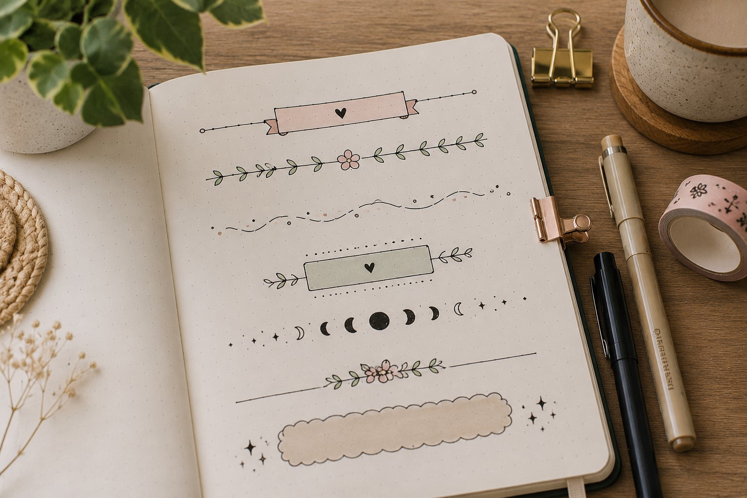
Before choosing fonts, colors, or decorations, think about the purpose of the header. Many people focus on making a title look pretty and forget that a header also serves a practical role.
It helps organize information, guides the reader through the page, and sets the tone for the entire spread.
A monthly cover usually needs a bold header, while a reading log may benefit from something softer and more decorative.
Take a moment to look at the page before you begin drawing. Ask yourself what the header should accomplish. Should it grab attention immediately?
Should it separate sections of information? Should it match a seasonal theme? Answering these questions makes later design decisions much easier.
One common mistake involves decorating first and planning later. This often leads to headers that feel disconnected from the layout.
Instead, treat the header as part of the page design from the beginning. Once you know its purpose, every choice becomes more intentional and the finished spread feels more cohesive.
Step 2: Choose a Header Style Before You Start
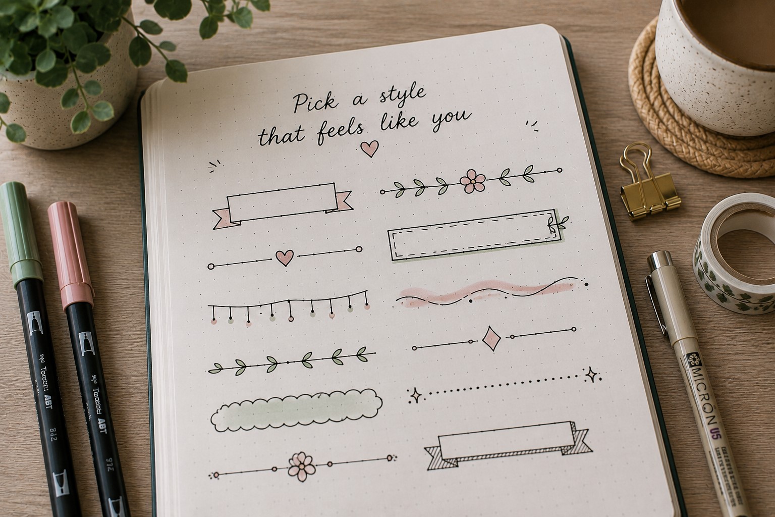
One reason headers sometimes look unfinished is a lack of direction. Many people begin drawing without deciding what style they want.
Then they add lettering, doodles, colors, and decorations as they go. As a result, the header often feels random instead of intentional. Choosing a style first helps every design element work together.
Think about the overall mood of the page. A minimalist spread may look best with clean lettering and simple lines. A floral theme may benefit from softer details and decorative accents.
Seasonal layouts often work well with themed headers. Once you choose a direction, it becomes easier to make decisions about fonts, colors, and embellishments.
A common mistake involves combining too many styles in one header. Try choosing one primary style and building around it.
If you need inspiration before making a decision, browse 23 Beautiful Bullet Journal Lettering Ideas You’ll Want to Copy. Looking at different examples can help you identify what fits your journal best.
Step 3: Pick the Right Placement
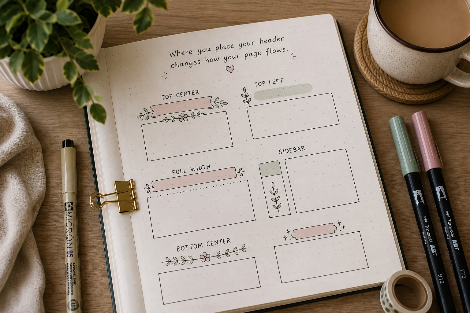
A gorgeous header can lose its impact when it sits in the wrong location. Placement affects how people move through a page.
It also determines how balanced the overall spread feels. That is why placement deserves just as much attention as lettering and decoration.
Start by looking at the entire layout before drawing the header. Consider where trackers, lists, notes, and illustrations will go. Then identify the area that naturally draws attention.
In many cases, this will be near the top of the page. Still, some layouts benefit from off-center placement or corner titles.
One mistake many journal users make is squeezing the header into leftover space. Instead, reserve space for it from the beginning.
The header should feel like an important part of the design rather than an afterthought. Learning How to Create Bullet Journal Headers often starts with understanding layout before decoration.
Step 4: Sketch the Header Lightly First
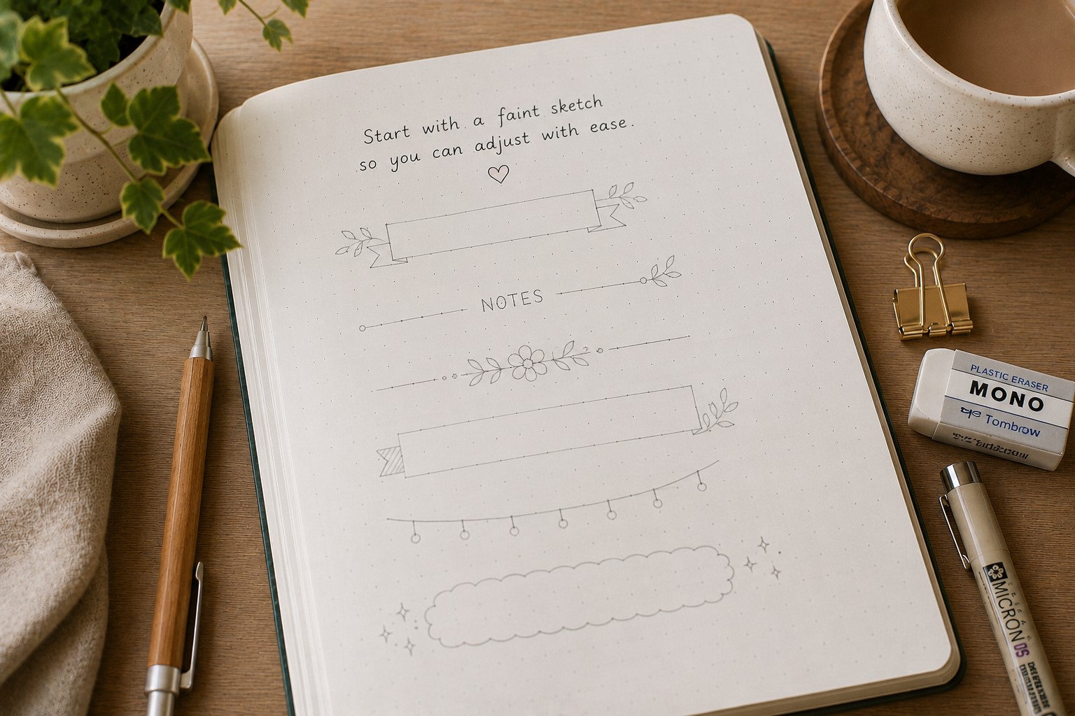
Even experienced journal users make rough sketches before adding ink. A quick pencil draft helps you catch spacing issues, alignment problems, and design mistakes before they become permanent.
Start by lightly sketching the title. Do not worry about perfection during this stage. Focus on placement, size, and overall balance.
Once everything feels right, begin refining the shapes and decorative details. This extra step only takes a few minutes, yet it can save an entire spread.
Many beginners skip sketching because they feel confident. Unfortunately, confidence disappears quickly when a title runs off the page or sits too close to another section. Light guidelines provide flexibility and reduce stress.
If you are trying new lettering techniques, this step becomes even more valuable. Resources like How to Practice Bullet Journal Lettering in 21 Days can help you build confidence while developing better sketching habits.
Step 5: Select a Font That Matches the Theme
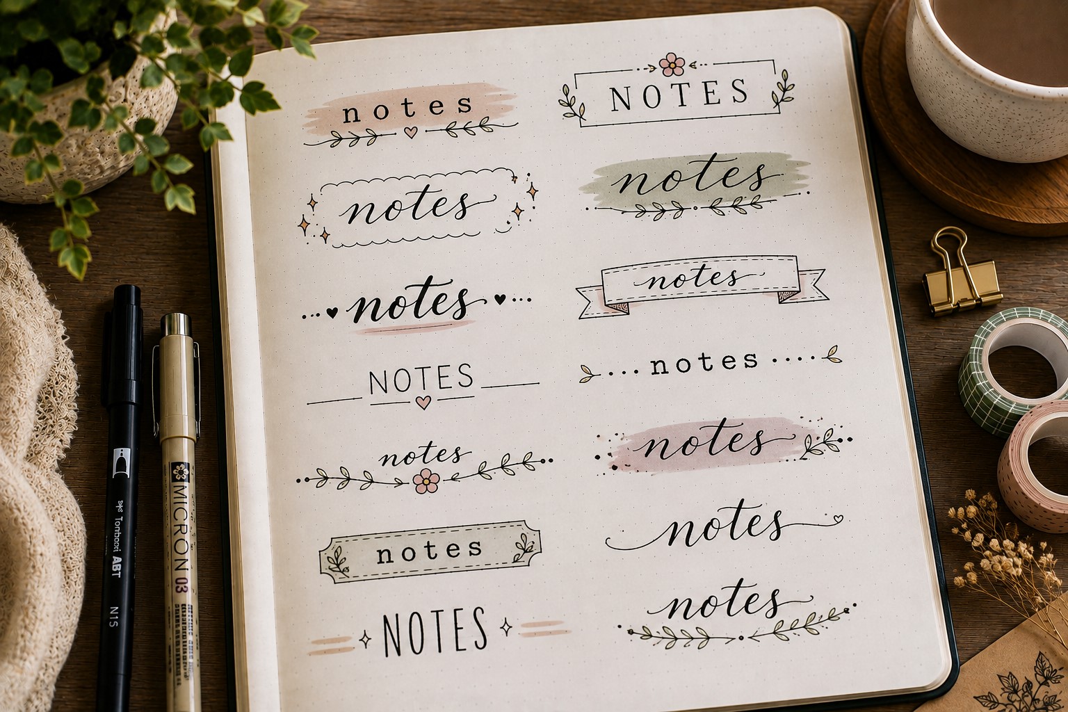
Fonts communicate mood before readers even process the words. A playful font creates a different feeling than a formal font. That is why font selection plays such an important role in header design.
Imagine a holiday spread with rigid geometric lettering. It may feel disconnected from the theme.
On the other hand, a travel journal with adventurous lettering immediately feels more engaging. Matching the font to the purpose of the page creates a stronger visual experience.
Take time to explore different font styles before settling on one. Script fonts feel elegant. Block lettering feels bold. Serif fonts appear timeless.
Decorative styles add personality. The more options you understand, the easier it becomes to choose the right one.
For inspiration, explore 19 Easy Bullet Journal Fonts Anyone Can Learn. Building a small collection of favorite fonts can make future header design much easier.
Step 6: Make Important Words Stand Out
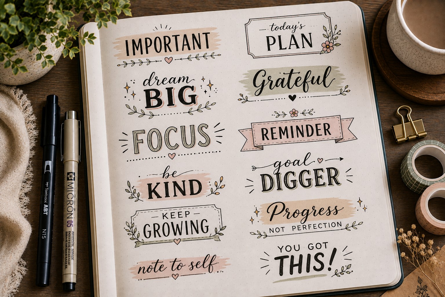
Not every word in a header deserves equal attention. Some words carry more meaning than others. Highlighting those words helps create hierarchy and improves readability.
For example, in a title such as “My Reading Goals,” the word “Goals” could appear larger than the rest.
The size difference immediately tells readers where to focus. This simple technique helps even basic headers look more professional.
There are several ways to create emphasis. You can increase the size, change the color, add shadows, or use a different font. The key is choosing one method and using it intentionally.
Many people try to emphasize every word. Unfortunately, when everything stands out, nothing stands out. Focus on the most important word and allow it to become the focal point of the design.
Step 7: Build Around the Header, Not Against It
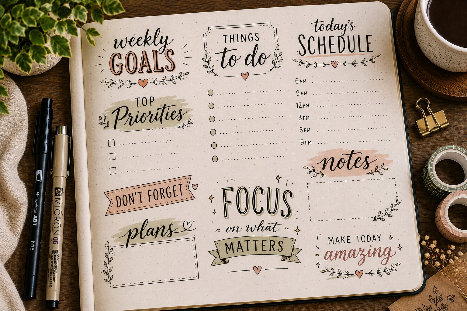
A beautiful header should feel connected to the rest of the spread. Too often, people create a title first and then add unrelated decorations around it. The result feels disconnected and cluttered.
Instead, think of the header as the foundation of the page design. Let its style influence surrounding elements. If the title uses floral details, repeat those details elsewhere.
If the header uses geometric shapes, echo those shapes throughout the layout.
This approach creates visual harmony. The page feels cohesive because every element supports the same theme. Readers may not consciously notice the connection, yet they will sense that the spread feels balanced.
Many examples in 25 Aesthetic Bullet Journal Lettering Ideas You’ll Love demonstrate how repeating design elements can make a page feel more polished.
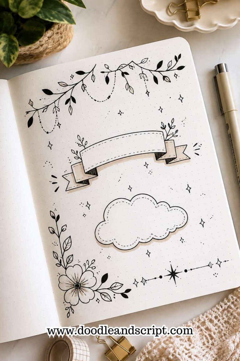
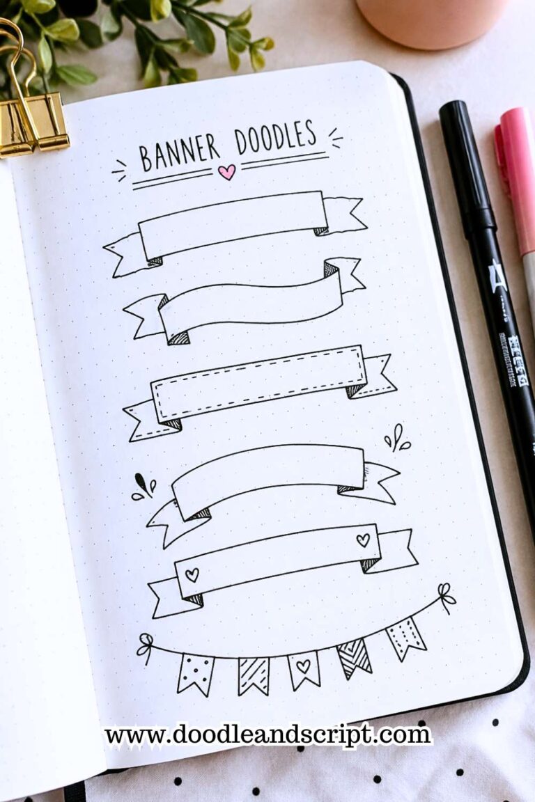
Step 8: Use Banners to Create Focus
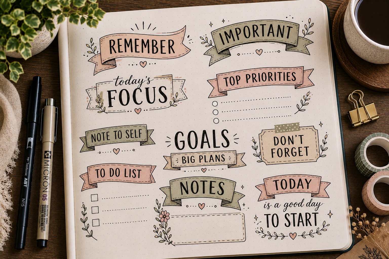
A banner can instantly make a header feel more important. That is why banner designs appear so often in beautiful bullet journal spreads.
The banner creates a frame around the title and naturally guides your eyes toward the words. Even a simple header can feel more polished once you place it inside a banner.
Start with a basic ribbon shape before adding extra details. Draw a long rectangle beneath your title. Then create folded ends on both sides.
If the design feels too plain, add light shading inside the folds. Those small shadows help create depth and make the banner look more realistic.
Many beginners make the folds too large. As a result, the banner competes with the title for attention.
Try keeping the banner slightly smaller than you think it should be. The lettering should remain the star of the design.
Banners work especially well on monthly covers, goal-setting pages, and seasonal spreads. If you enjoy this style, explore 21 Cute Bullet Journal Banner Doodles Anyone Can Draw for even more creative variations.
Step 9: Add Doodles With Purpose

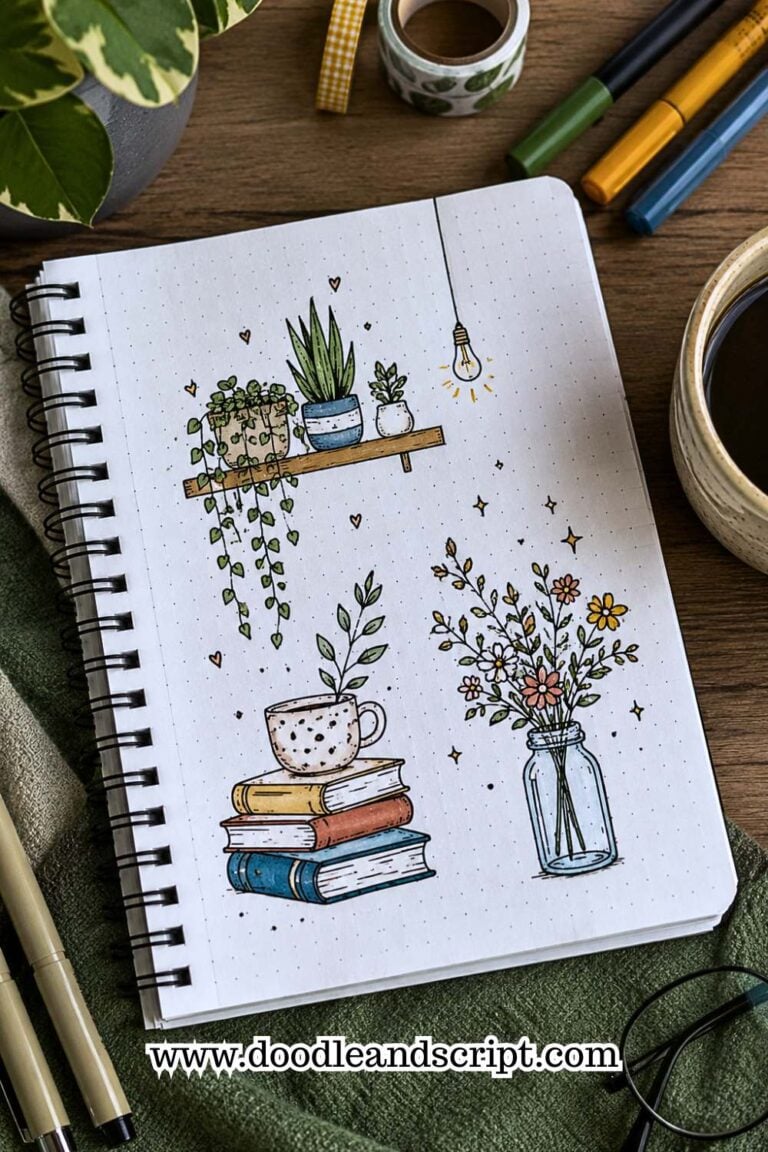
Doodles can transform an ordinary header into something memorable. Yet doodles work best when they support the theme of the page. Random decorations often create clutter rather than beauty.
Before drawing anything, consider the purpose of the spread. A reading tracker may benefit from tiny books. A fitness page could include small dumbbells or sneakers.
Seasonal layouts often look great with flowers, leaves, snowflakes, or stars.
Keep the doodles simple. Small details usually work better than large illustrations. The goal is to enhance the header rather than steal attention from it.
If you need inspiration, explore 27 Easy Bullet Journal Doodle Ideas for Every Page. You can adapt many of those ideas to complement different header styles while keeping the page balanced and visually appealing.
Step 10: Create Depth With Shadows
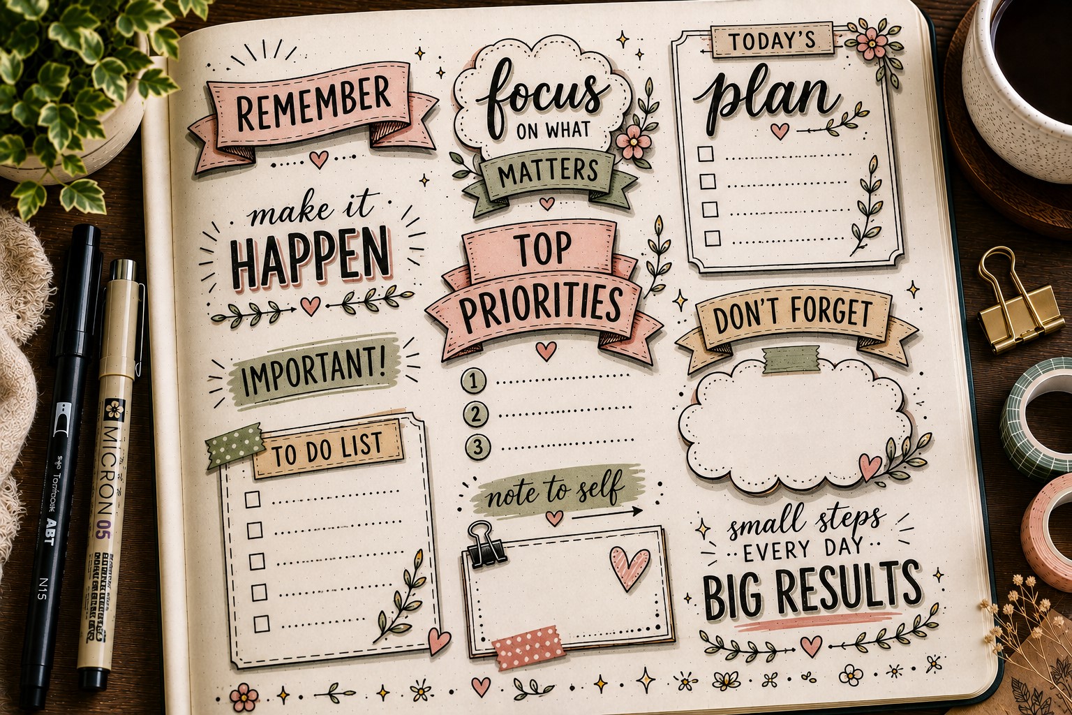
Flat headers can sometimes disappear into a busy layout. Adding shadows helps solve that problem by creating depth and dimension. Even a subtle shadow can make lettering feel more polished.
Choose a consistent direction for the shadow before you begin. Many journal users place shadows on the lower right side of letters.
Once you choose a direction, stick with it throughout the entire header. Consistency helps the effect look intentional.
A common mistake involves making shadows too dark or too thick. Large shadows can overpower the lettering. Instead, start with a light touch and build gradually if needed.
If you enjoy decorative effects like this, browse 11 Decorative Bullet Journal Lettering Ideas for Stunning Pages. Many of those techniques pair beautifully with shadowed headers and can add even more personality to your spreads.
Step 11: Use Color to Guide Attention
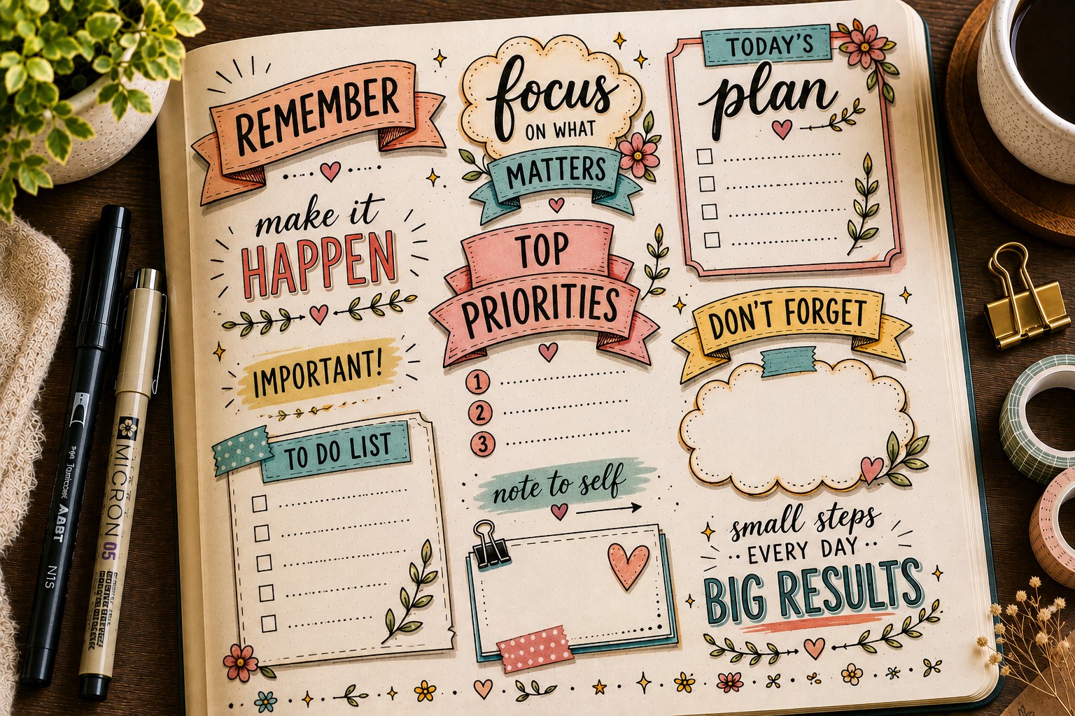
Color can completely change the way a header feels. The right colors help important sections stand out and make a spread look more cohesive.
Yet color works best when you use it with intention rather than adding random shades everywhere.
Start by choosing two or three colors that fit the theme of your page. A spring spread may use soft greens and pinks. A fall layout may look better with warm oranges and browns.
Once you select your palette, repeat those colors throughout the header and the rest of the spread.
Many beginners use too many colors because they want the page to feel exciting. Unfortunately, that often creates visual clutter. A limited palette usually looks more polished and professional.
You can also use color to emphasize important words. This simple technique creates hierarchy and makes the title easier to read.
When learning How to Create Bullet Journal Headers, understanding color often makes a bigger difference than adding more decorations.
Step 12: Frame the Header With Borders
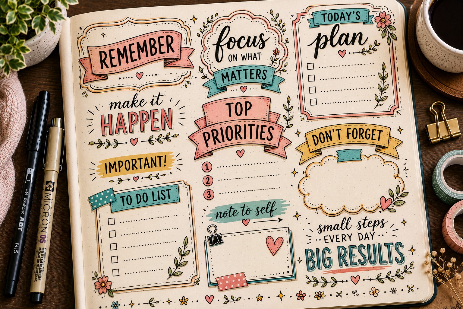
Borders help separate a header from the rest of the page. They create structure and give the title a dedicated space. Even a simple border can make a header feel more intentional.
Start with a basic rectangle, oval, or hand-drawn frame around your title. Once you feel comfortable, experiment with more decorative options.
Scalloped edges, floral frames, and geometric borders can all add personality without overwhelming the page.
One common mistake involves creating borders that feel heavier than the header itself. The border should support the title rather than compete with it.
If the frame grabs more attention than the words, simplify the design.
For more inspiration, explore 15 Easy Bullet Journal Doodle Borders Anyone Can Draw. Many of those border ideas can be adapted to fit different themes while keeping your headers clean and attractive.
Step 13: Experiment With Calligraphy Details
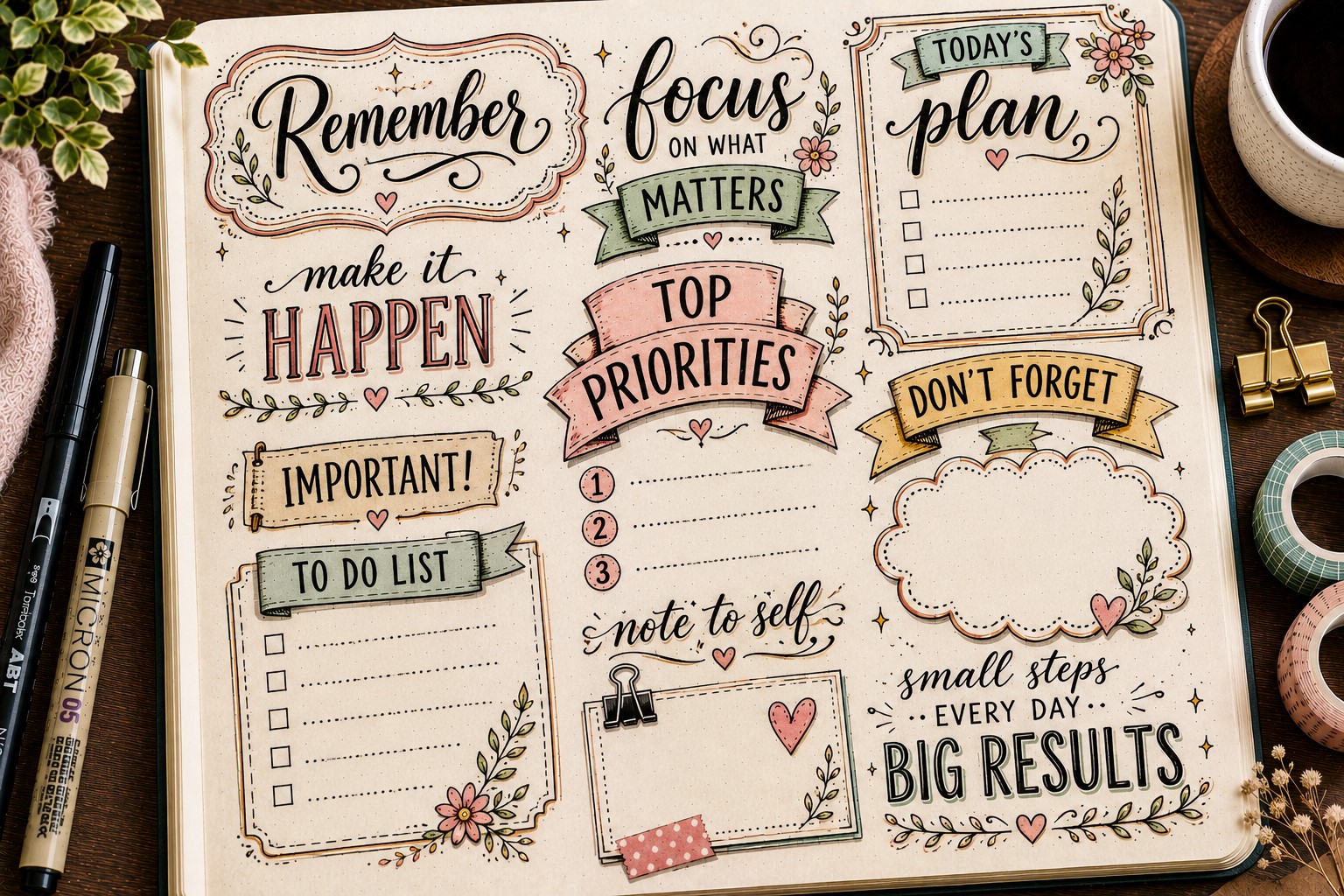
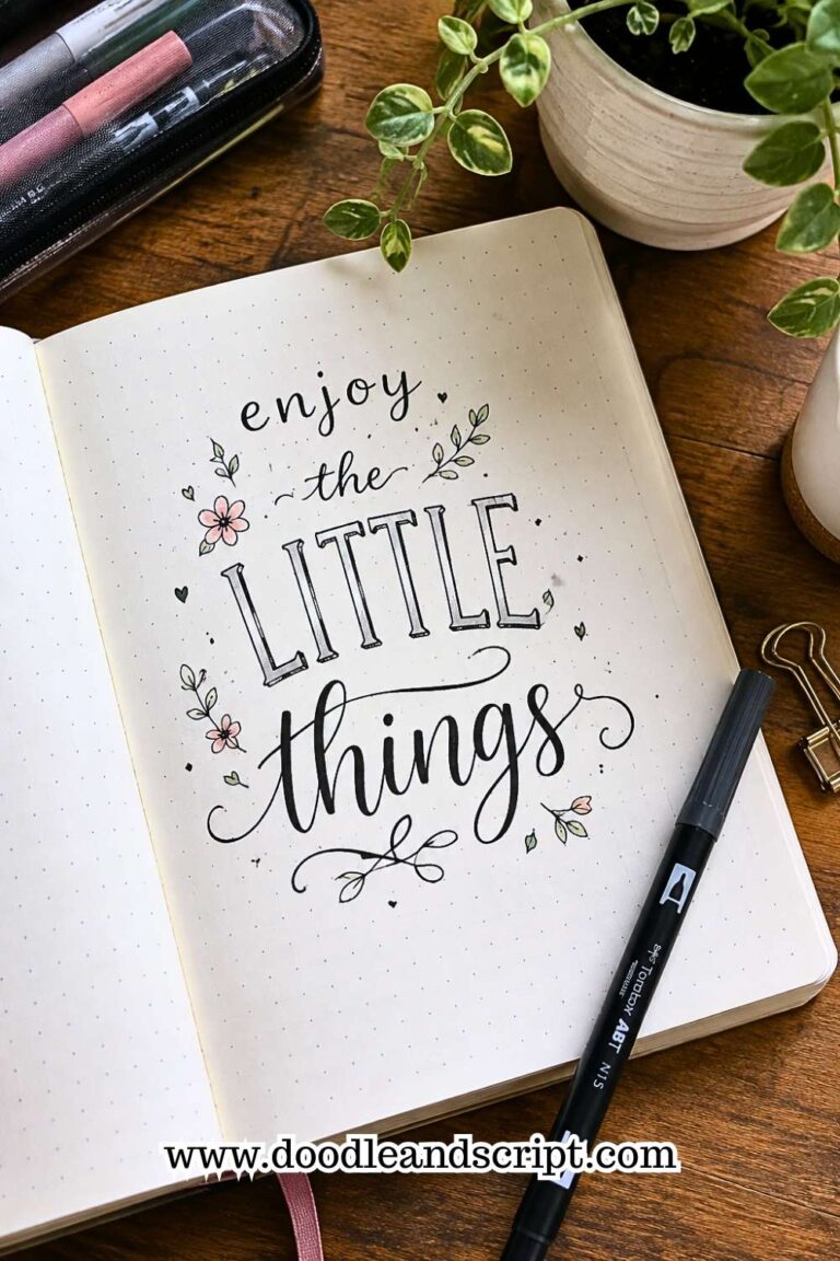
You do not need professional calligraphy skills to create beautiful headers. A few simple calligraphy-inspired details can instantly elevate a title and make it feel more refined.
One easy approach involves adding thicker downstrokes to your lettering. Another option is to incorporate gentle flourishes at the beginning or end of words.
These small touches create elegance without requiring hours of practice.
Many journal users make the mistake of adding too many flourishes. Excessive loops and swirls can make a title difficult to read. Instead, focus on one or two decorative details and keep the lettering clear.
If you want more inspiration, take a look at 17 Creative Bullet Journal Calligraphy Ideas to Try Today.
You can borrow individual techniques and incorporate them into your own header designs without completely changing your lettering style.
Step 14: Make the Header Fit the Theme

The most memorable headers often feel like a natural extension of the page. Every element works together to support a single idea or theme. That sense of consistency helps a spread feel finished.
Think about the story your page tells. A reading tracker might include book-inspired details. A travel journal could feature map elements or tiny airplanes. A self-care spread may benefit from soft colors and floral accents.
The mistake many people make is decorating the header without considering the rest of the page. As a result, the title feels disconnected from the layout. Instead, repeat shapes, colors, and motifs throughout the spread.
You can find plenty of inspiration in 17 Bullet Journal Quote Lettering Ideas That Stand Out. Notice how the lettering and surrounding elements often work together to support the same mood and message.
Step 15: Finish With Small Details
Small details often make the biggest difference. Once your header looks complete, spend a few minutes looking for opportunities to refine it. Tiny adjustments can take a design from good to great.
You might add a few sparkles around the title. Perhaps a thin shadow would create more depth. Maybe a small highlight could make an important word stand out.
These finishing touches help the header feel polished without requiring major changes.
At the same time, avoid the temptation to keep adding decorations forever. One of the most common mistakes involves overworking a design. Sometimes the strongest choice is knowing when to stop.
For additional inspiration, browse 29 Bullet Journal Font Ideas to Make Your Pages Pop. Seeing different lettering approaches can help you identify small details that strengthen your own headers.
Final Thoughts
Creating beautiful headers is not about copying someone else’s journal. It is about understanding the design choices that make a title stand out.
Once you learn those principles, you can adapt them to almost any theme, layout, or style. That is what makes learning How to Create Bullet Journal Headers so valuable.
As you practice, focus on one improvement at a time. Experiment with placement, lettering, banners, borders, and color combinations.
Over time, these small changes will become second nature. You may also enjoy exploring 21 Bullet Journal Title Lettering Ideas That Look Professional for more ways to make your titles feel polished and intentional.
Most importantly, give yourself permission to experiment. Not every header will turn out exactly as planned, and that is perfectly fine. Every spread teaches something new.
The more you create, the easier it becomes to develop a style that feels uniquely yours. For even more inspiration, take a look at 15 Easy Bullet Journal Lettering Styles Every Beginner Should Learn and continue building your lettering skills.