23 Beautiful Bullet Journal Lettering Ideas You’ll Want to Copy
Disclosure: Some of the links in this post are affiliate links. This means if you click on the link and purchase an item, I will receive an affiliate commission at no extra cost to you.
A bullet journal can hold plans, goals, reminders, and creative ideas. Yet many pages still feel unfinished after the writing is done. Often, the missing piece is lettering.
Beautiful headings and titles can make simple spreads look more organized and inviting. That is why many journal lovers search for fresh Bullet Journal Lettering Ideas they can use right away.
Think about the pages that grab your attention online. Most of them do not use complicated artwork. Instead, they use attractive words that guide your eyes across the page.
A bold monthly title creates a strong focal point. A playful habit tracker heading adds personality.
Even a simple shopping list can feel more enjoyable with thoughtful lettering. Small design choices often make the biggest difference.
That is exactly what this collection will help you achieve. Instead of sharing difficult techniques, this guide focuses on lettering ideas you can actually recreate.
Some styles work well for monthly covers. Others fit mood trackers, reading logs, and daily spreads.
Along the way, you will also find inspiration from 25 Aesthetic Bullet Journal Lettering Ideas You’ll Love if you want even more creative ways to style your pages.
By the end, you will have plenty of ideas to make every spread look more polished and intentional.
23 Beautiful Bullet Journal Lettering Ideas You’ll Want to Copy
1. Large Block Letter Titles
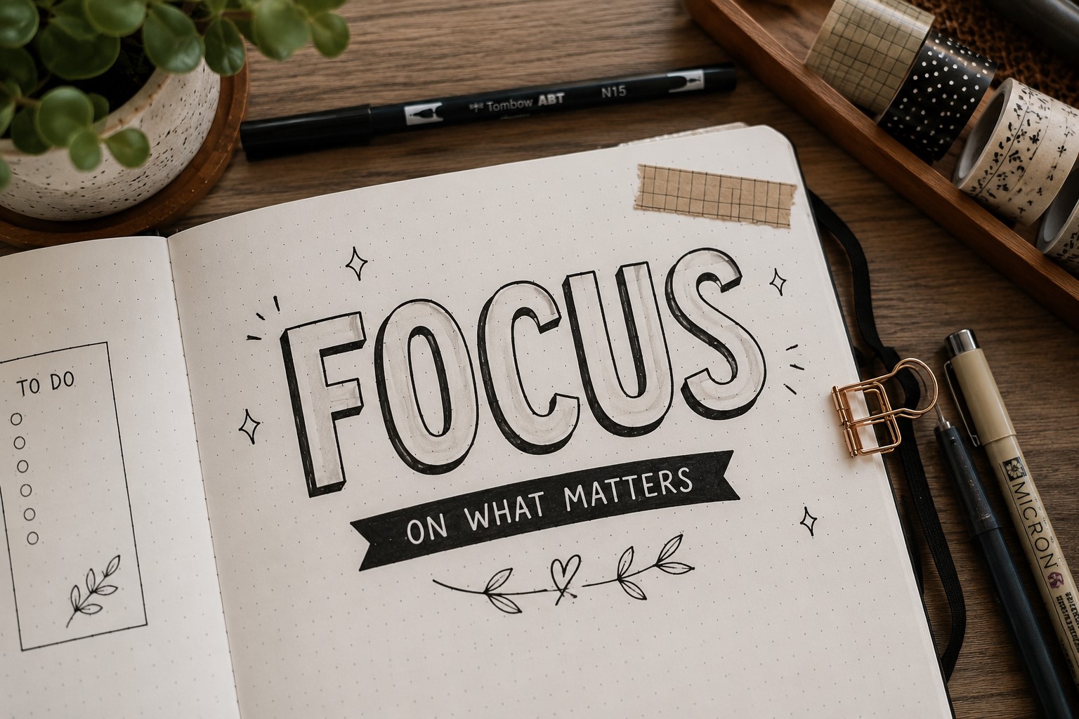
Large block letters remain one of the most popular lettering styles for a reason. They instantly catch the eye and give a page a strong focal point.
Many journal users choose this style for monthly covers, yearly goals, and major planner sections. Since the letters have bold shapes, they stand out even when you use a simple black pen.
To create this look, start by sketching your title lightly in pencil. Next, draw thicker outlines around each letter. Try to keep the width similar throughout the word.
Once you like the shape, trace everything with a pen and erase the pencil lines. The finished title will already look impressive.
You can also personalize block letters with patterns. Try stripes, dots, stars, or tiny flowers inside the shapes. A small shadow behind the letters adds even more depth.
If you love creating bold headings, you might also enjoy 21 Bullet Journal Title Lettering Ideas That Look Professional.
2. Simple Faux Calligraphy
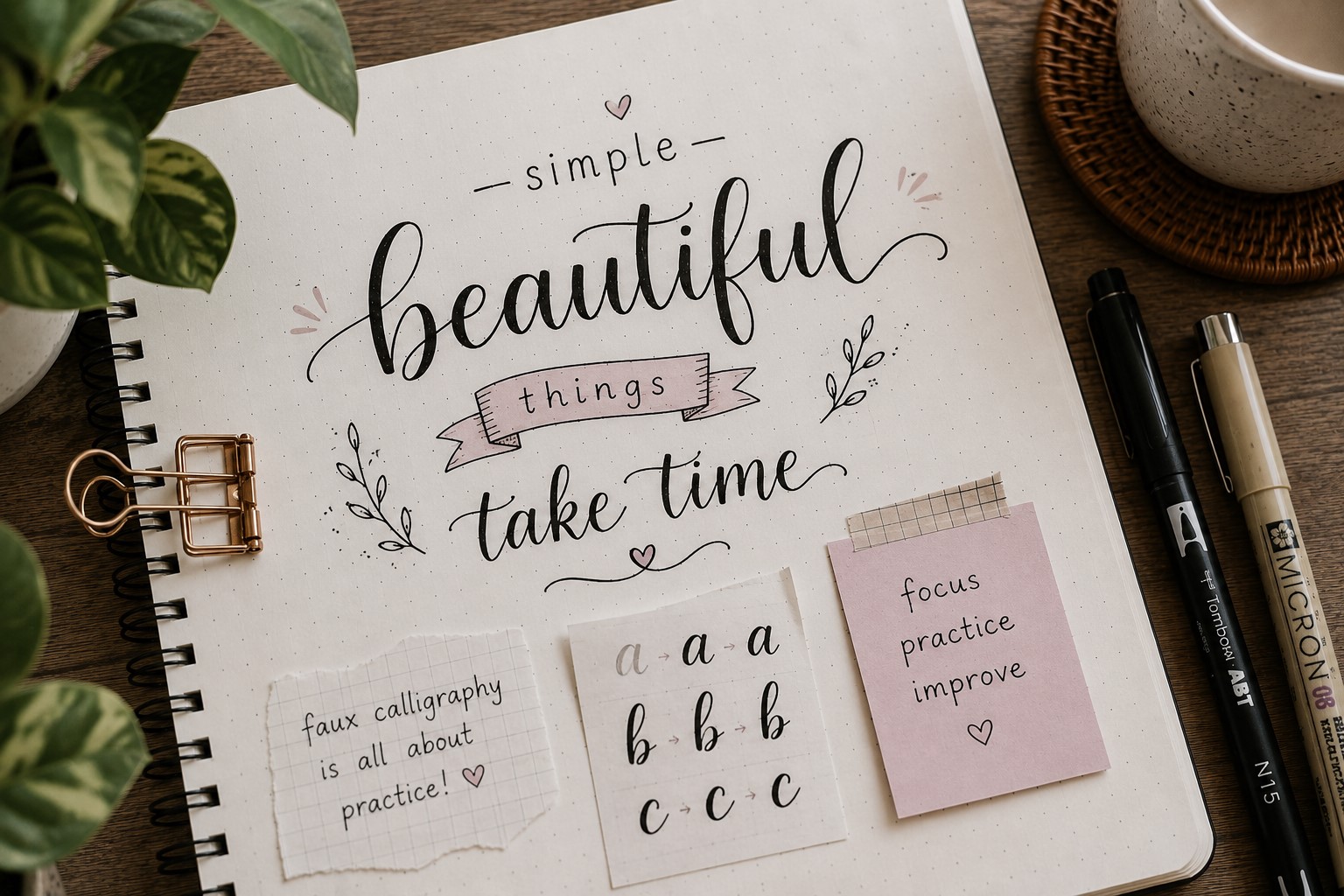
Faux calligraphy gives ordinary handwriting a beautiful upgrade. Many beginners start with this style because they do not need brush pens or special tools. Even better, the technique looks elegant without requiring advanced skills.
Begin by writing a word in cursive or neat print. After that, look at every downward stroke. Add a second line beside those strokes to make them thicker.
Then fill the space between the lines. This simple adjustment creates the signature calligraphy effect.
This lettering style works especially well for quote pages, gratitude logs, and weekly spread titles. It also pairs nicely with floral decorations and soft color palettes.
At first, the strokes may look uneven. That is completely normal. As you practice, your hand will naturally become more consistent.
If you want to improve your lettering confidence, visit How to Practice Bullet Journal Lettering in 21 Days. The extra practice will make styles like this much easier.
3. Tall and Narrow Lettering
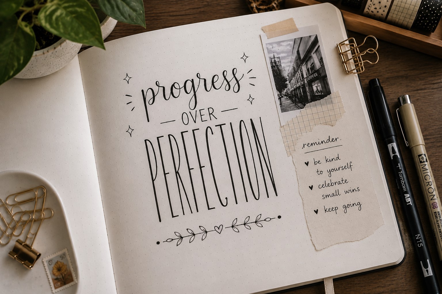
Tall and narrow lettering creates a clean and modern appearance. This style looks simple at first glance, yet it can completely change the mood of a page.
Many minimalist journal users prefer it because it feels organized and stylish without looking busy.
The secret lies in the proportions. Instead of creating wide letters, make them taller than usual.
Keep each stroke slim and leave even spacing between the characters. This balance helps the title look polished and intentional.
Tall lettering works beautifully on habit trackers, goal pages, and productivity spreads. Since the letters take up less horizontal space, you still have room for doodles and decorative elements.
Some people add small stars or lines around the title. Others keep the design clean and let the lettering speak for itself. This style proves that simple designs can often create the strongest impact.
4. Bubble Lettering

Bubble lettering brings energy and personality to a journal page. The rounded shapes instantly create a playful and welcoming feel.
Because of that, this style works perfectly for fun themes and creative layouts.
Start by writing your title using simple letters. Then draw rounded outlines around each one. The goal is to make every letter look soft and puffy.
Leave enough space between the letters while sketching. Otherwise, the finished word may feel crowded.
Many journal users choose bubble lettering for birthday spreads, vacation planners, and memory pages. The style also looks fantastic with bright colors. You can fill the letters with gradients, patterns, or tiny doodles.
One common mistake involves making the bubbles different sizes. Instead, try to keep the thickness consistent throughout the word.
This small detail creates a cleaner result. For more playful page decorations, explore 21 Cute Bullet Journal Banner Doodles Anyone Can Draw.
5. Shadow Lettering

Shadow lettering can make even basic handwriting look more professional. The technique creates depth and gives words a three-dimensional appearance. Yet the process remains surprisingly simple.
First, write your title using any lettering style you like. Next, choose a direction for your shadow. Many people place it on the lower right side of each letter.
Once you decide, keep the shadow consistent throughout the word. This consistency makes the effect look natural.
A thin shadow creates a subtle enhancement. Meanwhile, a thicker shadow creates a bolder statement. Gray pens work well for soft shadows. Bright colors create a more playful look.
Shadow lettering fits almost every journal theme. It works on monthly covers, weekly layouts, and reading trackers. In fact, adding a shadow often transforms an average title into something much more memorable.
6. Serif Lettering
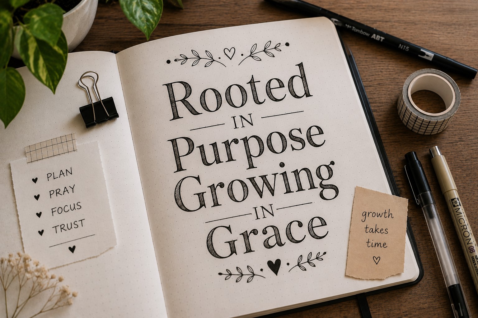
Serif lettering brings a timeless and polished feel to bullet journal pages. You probably see serif fonts every day in books and magazines. Those small finishing lines at the ends of strokes create an elegant appearance.
To recreate this style, begin with simple block letters. Then add tiny lines to the ends of each stroke. Keep the details small and consistent. Large serifs can make the letters feel heavy and difficult to read.
This lettering style works particularly well for reading journals, book reviews, and long-term planning spreads.
The classic appearance helps create a sophisticated look without much effort. Many journal users also combine serif lettering with light shadows or simple borders.
If you enjoy exploring different lettering styles, you may find inspiration in 19 Easy Bullet Journal Fonts Anyone Can Learn. Trying different fonts can help you discover a style that feels natural to you.
7. Ribbon Lettering

Ribbon lettering adds movement and character to a page. Instead of looking flat, the words appear to twist and fold like real ribbon.
This effect makes even a simple title feel more decorative. Many journal users choose ribbon lettering for celebration spreads, holiday layouts, and monthly cover pages.
Start by drawing basic block letters. Then imagine a ribbon wrapping through each letter. Add small folds where the ribbon appears to turn.
After that, shade one side of the folds to create depth. The shading does not need to be perfect. Even simple shadows help the illusion look more realistic.
Try using two shades of the same color for a softer look. You can also add tiny flowers or stars around the lettering. Keep the decorations light so they do not compete with the title.
Ribbon lettering takes a little patience, yet the finished result often looks much more complicated than it really is.
8. Brush Lettering
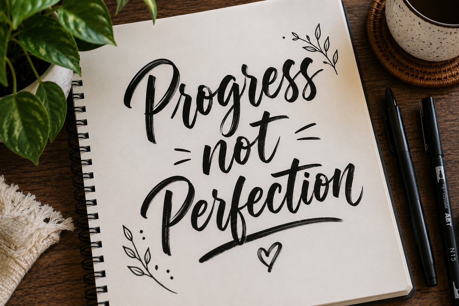
Brush lettering remains a favorite among journal lovers because it feels expressive and elegant.
The contrast between thick and thin strokes creates a natural flow that immediately catches attention. While the style looks advanced, beginners can learn the basics with consistent practice.
The key rule involves pressure. Use light pressure on upward strokes and heavier pressure on downward strokes.
At first, focus on individual letters rather than complete words. Once the movements feel comfortable, begin connecting letters together.
Brush lettering works beautifully for monthly covers, seasonal pages, and quote spreads. Many people also combine it with watercolor backgrounds for extra impact.
If a brush pen feels difficult to control, start with faux calligraphy first. That approach helps train your eye before moving into true brush lettering.
For more creative inspiration, explore 17 Creative Bullet Journal Calligraphy Ideas to Try Today.
9. Stacked Lettering

Stacked lettering offers a smart solution when a page has limited space. Instead of writing across the page, the letters sit one beneath another.
This arrangement creates a unique visual effect while keeping the design compact.
Many people overlook this style when searching for Bullet Journal Lettering Ideas. Yet it can completely transform a narrow section of a spread.
Habit trackers, sidebars, and dashboard layouts often benefit from stacked titles.
Begin by writing one letter per line. Keep the letters centered and evenly spaced. Once the word is complete, add small decorative details around it. Tiny stars, dots, or leaves work especially well.
A common mistake involves making the letters too large. Smaller lettering usually creates a cleaner result. With a little practice, stacked lettering can become one of the most versatile styles in your journal.
10. Floral Lettering
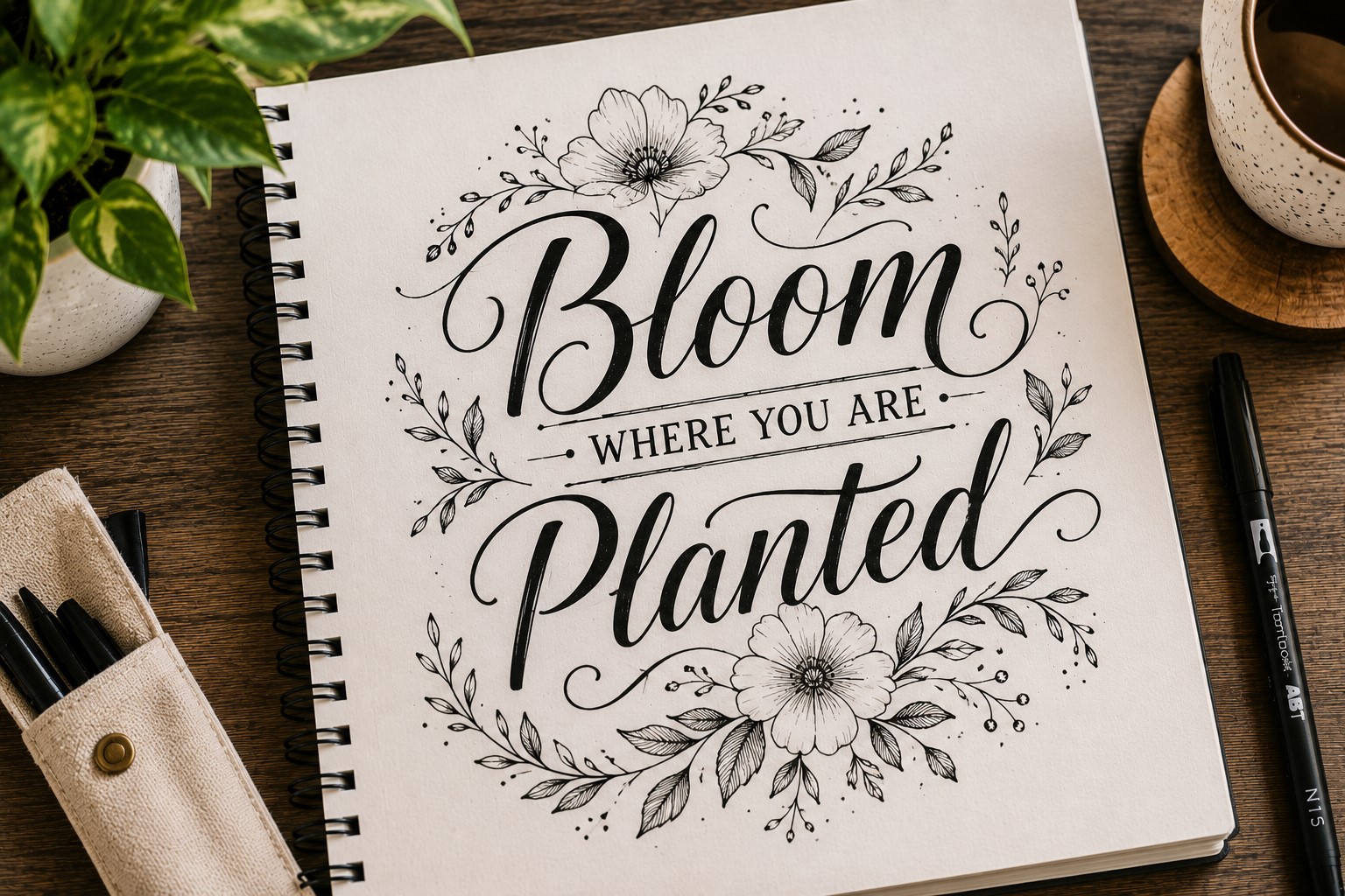
Floral lettering combines beautiful words with simple botanical details. This style works especially well when you want a page to feel soft and welcoming.
The flowers do not need to be elaborate. In fact, simple blooms often create the most balanced designs.
Start by lettering your title first. Once the word looks complete, identify empty areas around the letters. Then add small flowers, leaves, and vines in those spaces.
This approach keeps the composition balanced and prevents overcrowding.
Floral lettering suits gratitude pages, spring spreads, garden journals, and self-care trackers.
Soft colors such as pink, lavender, and sage green complement the style nicely. At the same time, black-and-white floral designs can look equally elegant.
The goal is not to create a detailed botanical illustration. Instead, use flowers to support the lettering and help it stand out.
11. Outline Lettering

Outline lettering gives you endless opportunities for creativity. The style begins with simple hollow letters, yet you can customize them in countless ways.
Because of this flexibility, many beginners return to it again and again.
Draw the letters using clean outlines. Leave the centers empty at first. After that, decide how you want to decorate them. Some people fill the space with stripes. Others prefer dots, checkerboard patterns, or tiny doodles.
This style works for almost any journal theme. It fits seasonal spreads, reading logs, monthly covers, and project planners. The open spaces make the lettering feel light rather than heavy.
If you enjoy decorative details, take a look at 11 Decorative Bullet Journal Lettering Ideas for Stunning Pages. You can borrow many of those ideas to customize outline lettering even further.
12. Script Lettering
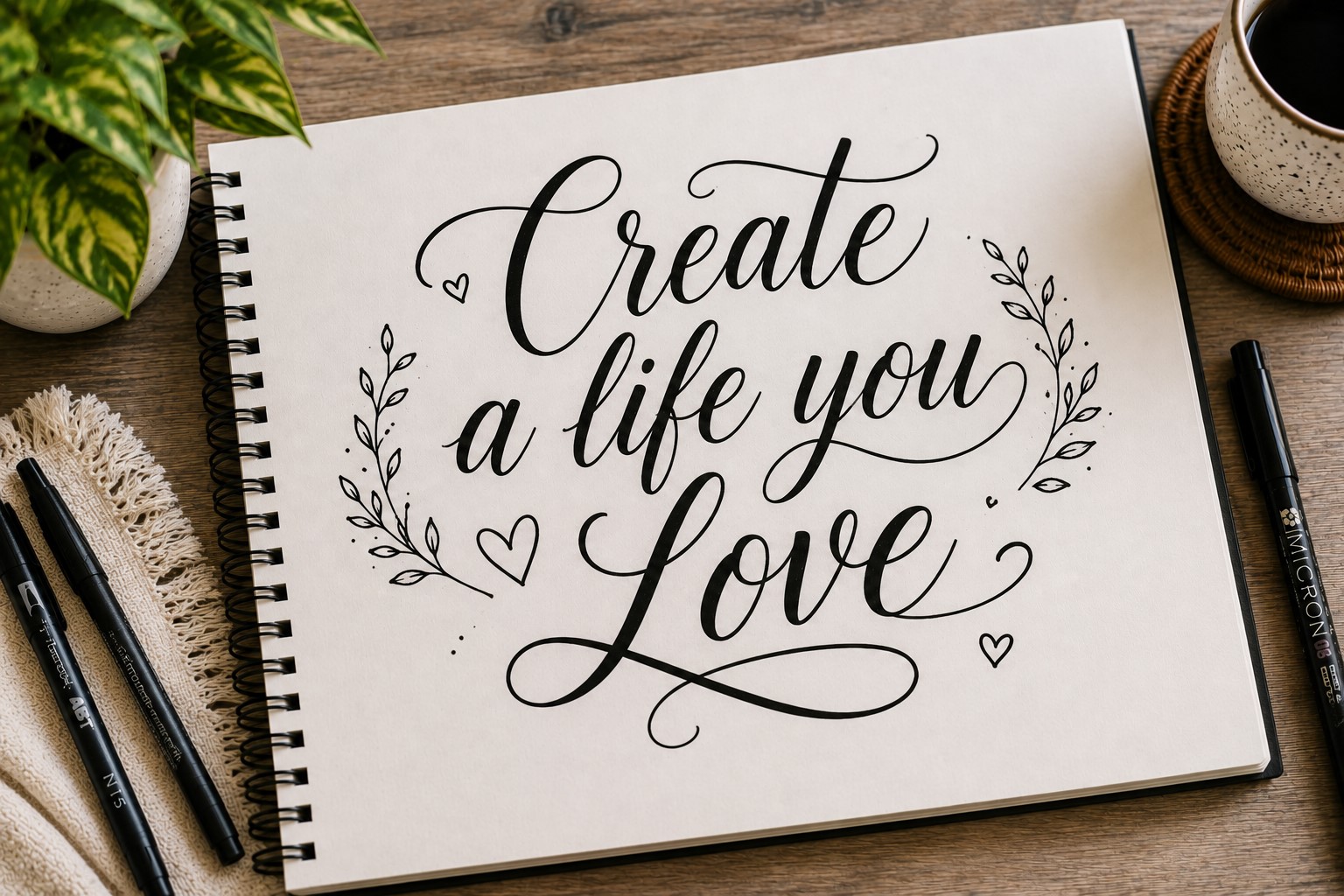
Script lettering creates a graceful handwritten appearance. The connected letters flow smoothly together and give pages a personal touch.
Many people use this style when they want their journal to feel elegant without becoming overly formal.
Among popular Bullet Journal Lettering Ideas, script lettering remains one of the most versatile.
It works beautifully on quote pages, reflection spreads, gratitude journals, and memory logs. The flowing strokes naturally create a softer mood.
Begin with simple cursive writing. Focus on smooth connections between letters rather than fancy flourishes.
Once you feel comfortable, experiment with larger loops and decorative swashes. Small adjustments can dramatically change the overall look.
Avoid squeezing the letters together. Extra breathing room helps the words stay readable. As your confidence grows, script lettering can become one of your favorite styles for decorative journal pages.
13. Decorative Initial Letters
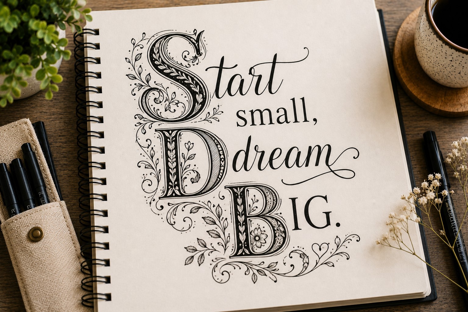
A decorative initial letter can instantly make a title look more interesting. Instead of styling the entire word, you focus on the first letter and turn it into the main feature.
This technique works well when you want a page to feel creative without spending too much time on lettering.
Start by drawing the first letter much larger than the rest of the word. After that, add details inside or around it. You can use flowers, swirls, dots, stars, leaves, or geometric patterns.
Then write the remaining letters in a simpler style. The contrast helps the decorative letter stand out even more.
This approach works beautifully for monthly covers, reading journals, and quote pages. It also helps when a title feels too plain.
Since only one letter requires extra work, this style remains beginner-friendly while still creating a strong visual impact.
14. Double-Line Lettering
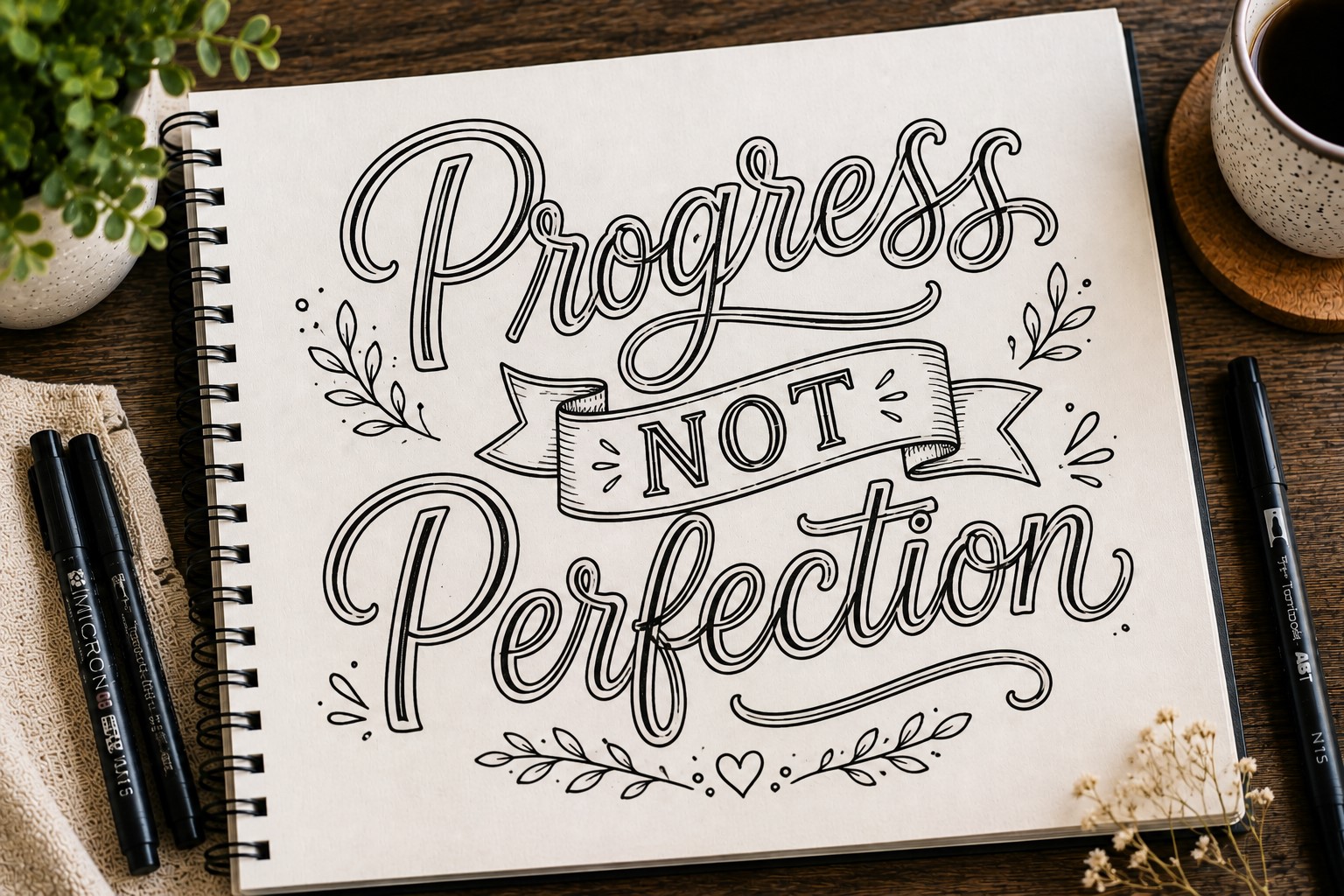
Double-line lettering looks clean, modern, and surprisingly professional. The letters consist of two parallel lines rather than solid strokes.
This simple change creates an airy appearance that works well in many journal themes.
Begin by writing your word lightly in pencil. Then draw two lines for every stroke. Try to keep the spacing between the lines consistent throughout the word.
Once you finish outlining the letters, trace them with a pen and erase the pencil marks.
The open space inside each stroke creates room for creativity. You can leave it empty for a minimalist look. On the other hand, you can fill it with color, shading, or patterns.
This lettering style works especially well on goal-setting pages and productivity spreads. The clean design helps the page feel organized while still looking decorative.
15. Vintage Lettering

Vintage lettering brings an old-fashioned charm to bullet journal pages. It often combines bold shapes, decorative serifs, shadows, and subtle flourishes. The result feels warm, nostalgic, and full of personality.
Many people use vintage lettering for reading trackers, memory journals, and seasonal spreads. The style pairs especially well with earthy colors and aged-paper themes.
Start with simple serif letters. Next, add gentle shadows and small decorative touches. You do not need to copy antique signs exactly. Instead, borrow a few classic elements and make them your own.
One mistake people make involves adding too many details. Vintage designs look best when the decorations support the letters rather than overpower them.
If you enjoy exploring typography styles, check out 29 Bullet Journal Font Ideas to Make Your Pages Pop. You may discover additional vintage-inspired fonts to try.
16. Rainbow Lettering
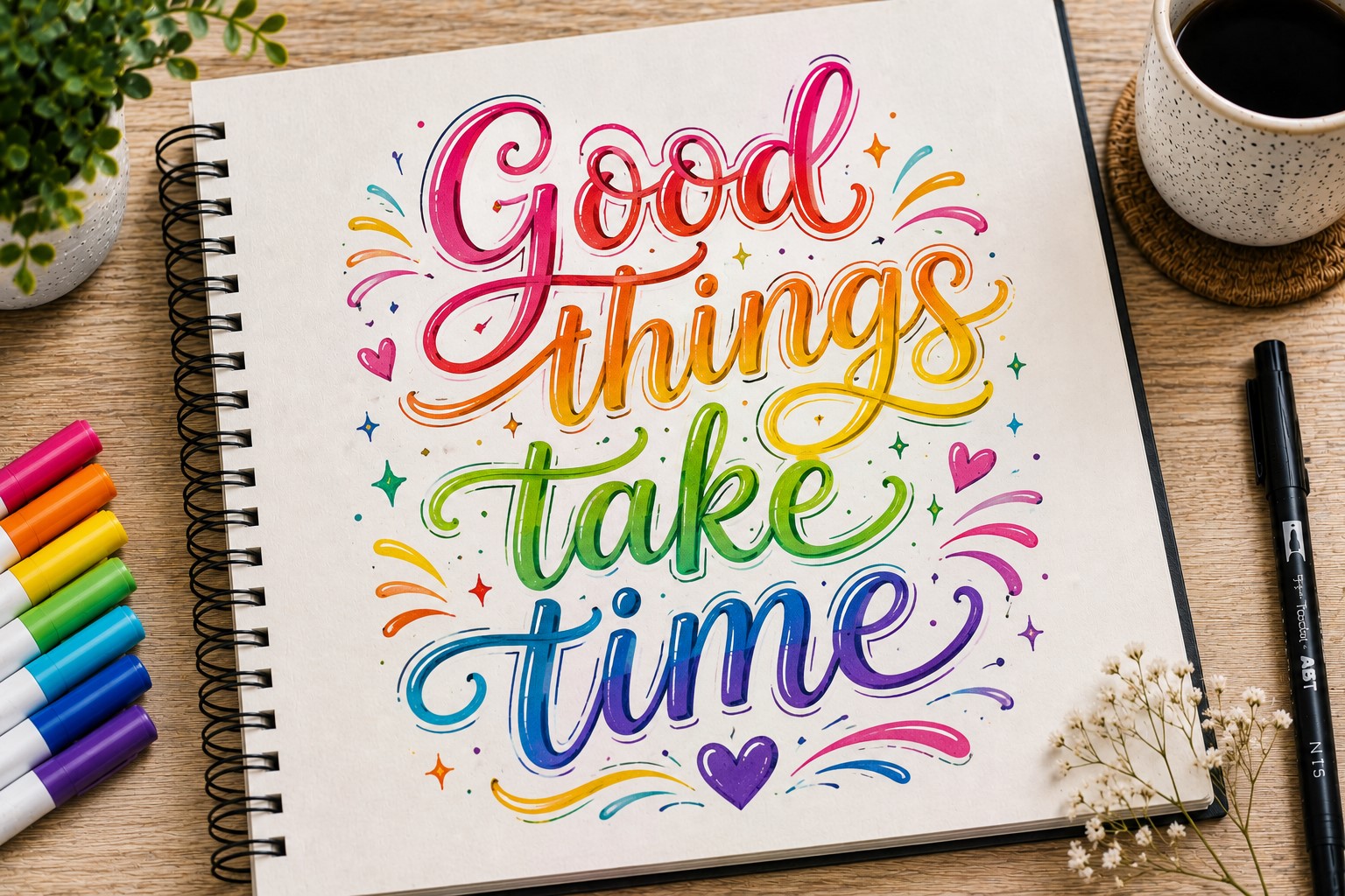
Rainbow lettering adds energy and color to a journal spread. It instantly creates a cheerful atmosphere and works well for bright, positive themes.
Even simple words can look exciting when different colors appear throughout the lettering.
When people search for colorful Bullet Journal Lettering Ideas, rainbow lettering often appears near the top of the list. The style feels fun, approachable, and easy to customize.
There are several ways to create the effect. Some people use a different color for each letter. Others blend multiple colors across a single word.
You can also create an ombré rainbow effect that transitions smoothly from one shade to another.
This style works wonderfully for mood trackers, birthday spreads, summer themes, and gratitude pages. Just remember to choose colors that complement each other. Too many clashing shades can make the title difficult to read.
17. Banner Lettering

Banner lettering combines decorative banners with beautiful words. The banner acts like a frame and helps direct attention toward the title. Because of this, the style works especially well on cover pages and section headers.
Begin by writing your title. Then draw a ribbon banner around or beneath the words. Add small folds at the ends to create dimension. Finally, use light shading to emphasize the folds.
Banner lettering suits monthly covers, goal pages, travel journals, and special event spreads. It also works nicely with floral elements and seasonal decorations.
One advantage of this style is its flexibility. A simple banner creates a clean appearance. A more detailed banner creates a dramatic effect. Both approaches can look beautiful when used thoughtfully.
For more heading inspiration, browse How to Create Gorgeous Bullet Journal Headers in 15 Steps.
18. Dotted Lettering

Dotted lettering proves that simple techniques can still create stunning results. Instead of drawing solid strokes, you build the letters using small dots. The finished design feels light, delicate, and creative.
Start by sketching the letter shapes lightly in pencil. Then place dots along those lines until the letters become clear. You can keep the dots evenly spaced or vary their size for extra texture.
This style works beautifully on minimalist spreads. It also pairs well with celestial themes, soft color palettes, and delicate doodles.
Because the letters appear less heavy, they help maintain an open and airy page design.
Take your time while placing the dots. Rushing often creates uneven spacing. A little patience can make the final result look much more polished.
19. Geometric Lettering

Geometric lettering relies on shapes, angles, and structure. The style feels bold and modern while maintaining a clean appearance.
If you enjoy organized layouts, this lettering style may quickly become a favorite.
Start by breaking letters into basic shapes. Use rectangles, triangles, circles, and straight lines to build each character. Then refine the shapes until the word becomes clear and readable.
This approach works particularly well for goal trackers, productivity dashboards, and technology-themed spreads. The structured appearance helps reinforce a sense of order.
Many journal users combine geometric lettering with simple line art. Together, these elements create a cohesive and modern design. Even small geometric accents around the title can strengthen the overall look.
20. Watercolor Lettering
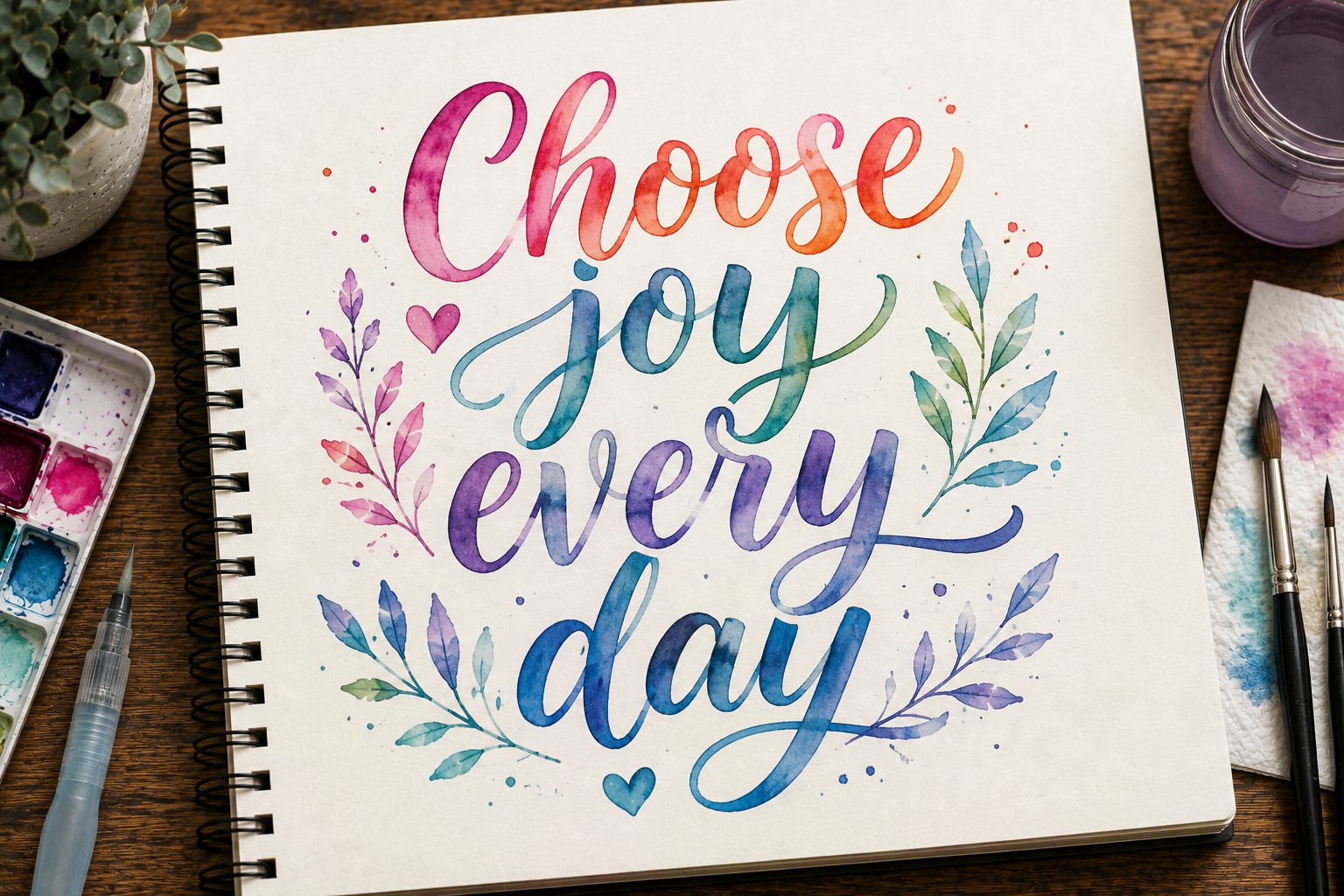
Watercolor lettering creates a soft artistic effect that feels both elegant and relaxed. The gentle color transitions can make a title look like a piece of artwork.
Among creative Bullet Journal Lettering Ideas, watercolor lettering stands out because of its versatility. It works with floral themes, seasonal spreads, travel journals, and mood trackers.
Begin by painting the shape of each letter using watercolor. Allow the paint to dry completely. Then outline the letters with a fine pen if you want additional definition. This combination often produces beautiful results.
Pastel shades create a calm atmosphere. Bright colors create a more energetic look. You can also blend multiple colors together for extra depth.
If you enjoy aesthetic journal designs, you may love 25 Aesthetic Bullet Journal Lettering Ideas You’ll Love.
21. Split Lettering
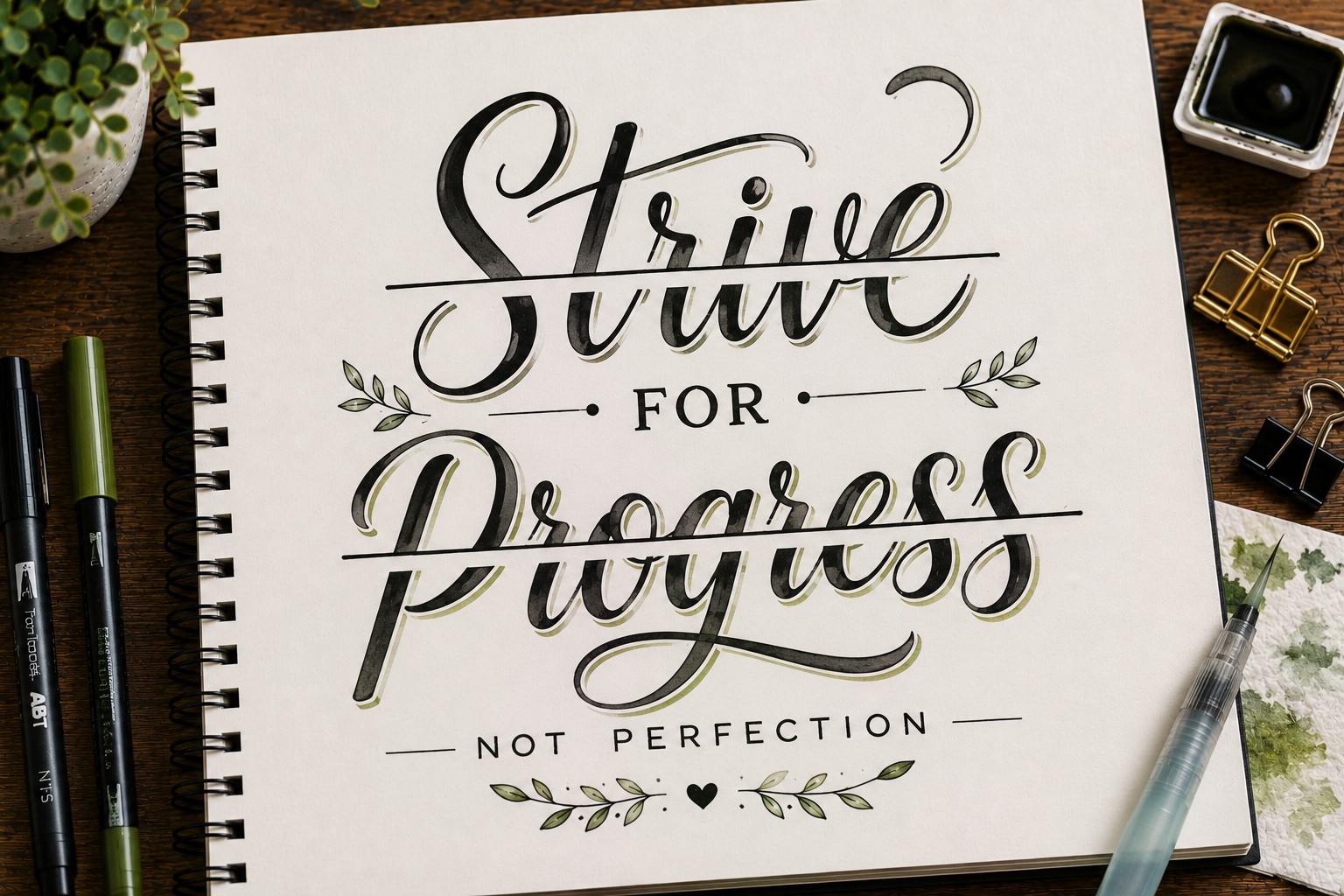
Split lettering offers a unique twist on traditional lettering styles. A line divides each letter into two sections, creating a striking visual effect. Despite its appearance, the technique remains simple to create.
First, draw your word normally. Then add a straight or curved line through the center of each letter. After that, decorate the top and bottom sections differently. You might use different colors, patterns, or shading techniques.
This style works especially well for monthly covers and themed spreads. The contrast between the two sections naturally attracts attention.
One of the best things about split lettering is its flexibility. You can keep it subtle or make it bold depending on your chosen colors and decorations.
22. Pattern-Filled Lettering

Pattern-filled lettering transforms simple words into decorative artwork. Instead of leaving letters plain, you fill them with creative designs. This extra detail can completely change the mood of a page.
Start with outline letters. Once the outlines are complete, choose a pattern for the interior. Stripes, polka dots, hearts, checkerboards, waves, and tiny stars all work beautifully.
This style works particularly well when you want a title to feel playful and personalized. Different patterns create different moods. For example, hearts feel cheerful while geometric shapes create a more modern appearance.
You can also mix several patterns within one word. Just make sure they complement each other. Too many unrelated designs can make the title feel busy.
For additional decorative inspiration, explore 15 Easy Bullet Journal Doodle Borders Anyone Can Draw.
23. Mixed Style Lettering
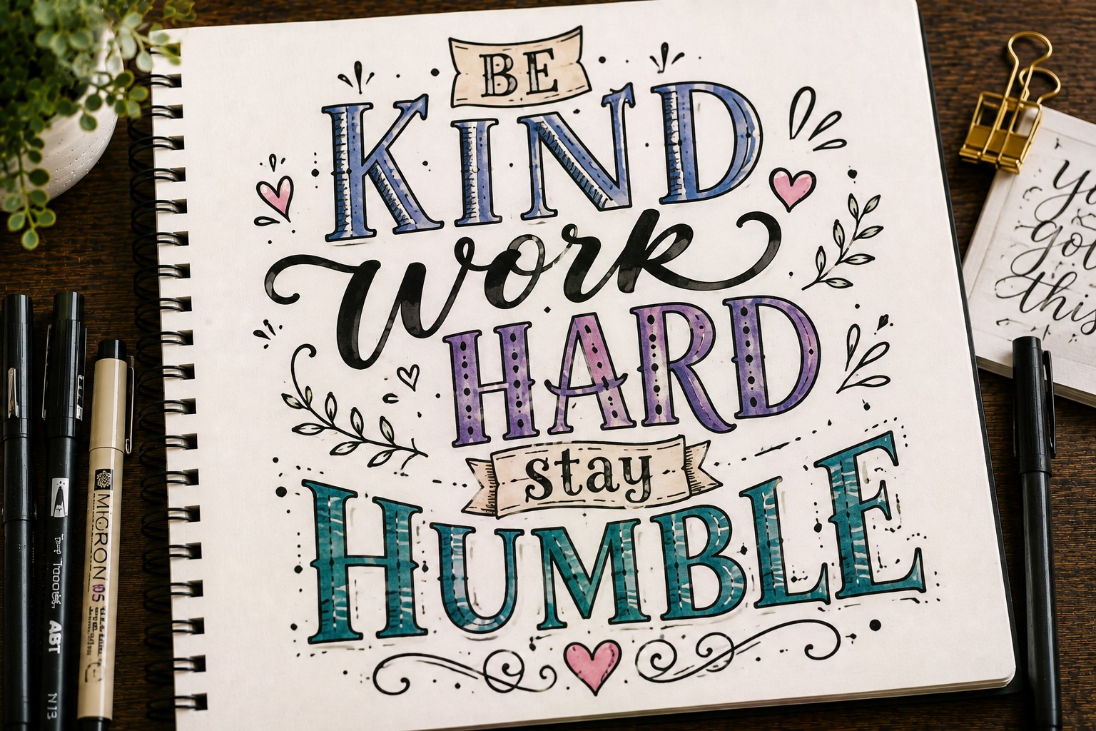
Mixed style lettering encourages creativity because it removes the need to follow one specific approach. Instead, you combine multiple lettering styles within the same title. The result feels unique and highly personalized.
Many people discover their favorite Bullet Journal Lettering Ideas by experimenting with mixed styles. You might pair block letters with script lettering. You could also combine shadows, patterns, and banners in one design.
Start with a simple word and choose two styles that complement each other. For example, use bold block letters for one word and elegant script for another. This contrast creates visual interest without making the title difficult to read.
The key is balance. Too many styles can feel chaotic. A thoughtful combination often creates the strongest result. For even more inspiration, visit How to Make Beautiful Bullet Journal Headers in 13 Easy Steps.
Final Thoughts
Beautiful lettering can completely change the way a bullet journal feels. A simple page suddenly becomes more inviting, creative, and enjoyable to use.
The best part is that you do not need expensive supplies or years of experience to get started. Small improvements often create noticeable results.
As you explore different Bullet Journal Lettering Ideas, remember that there is no single correct style. Some people love bold block letters.
Others prefer elegant script, playful bubble lettering, or decorative floral designs. The goal is not to copy every style perfectly. Instead, discover which techniques fit your personality and the mood of your journal.
You may also find inspiration in 15 Easy Bullet Journal Lettering Styles Every Beginner Should Learn as you continue building your skills.
Most importantly, have fun with the process. Experiment with new techniques, mix different styles, and allow your creativity to grow. The more you practice, the more confident you will become.
Before long, those blank journal pages will feel full of possibilities. And when you need fresh inspiration, revisit these Bullet Journal Lettering Ideas and give a few new favorites a try.