21 Bullet Journal Title Lettering Ideas That Look Professional
Disclosure: Some of the links in this post are affiliate links. This means if you click on the link and purchase an item, I will receive an affiliate commission at no extra cost to you.
Scroll through enough bullet journal photos and you will start noticing something interesting. The pages that catch your attention first are not always the most colorful ones.
They are not always packed with doodles either. More often, the title grabs your eye before anything else. A strong title can make an ordinary spread look polished and intentional.
That is why collecting great Bullet Journal Title Lettering Ideas can completely change the way your journal pages look.
Think about a movie poster, a book cover, or even a shop sign. Before you notice the details, you usually notice the title. The same thing happens inside a bullet journal.
A well-designed title creates a strong first impression and helps set the mood for the rest of the page. Some titles feel playful. Others feel elegant, creative, modern, or bold.
The style you choose quietly tells the reader what to expect before they even read the content.
The good news is that impressive title lettering does not require advanced calligraphy skills. Many eye-catching titles rely on simple shapes, clever spacing, and a few thoughtful details.
Once you understand how these elements work together, creating beautiful titles becomes much easier.
If you want even more lettering inspiration, explore 23 Beautiful Bullet Journal Lettering Ideas You’ll Want to Copy before trying the ideas in this guide.
21 Bullet Journal Title Lettering Ideas That Look Professional
Simple Title Styles That Always Work
1. Bold Block Letter Title

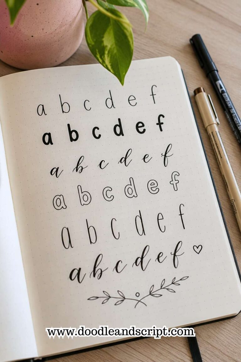
Some title styles never go out of fashion. Bold block lettering is one of them. This style works because it immediately creates structure and clarity. Even from a distance, the title remains easy to read.
Start by sketching simple block letters. Focus on consistent height and spacing rather than decoration. Once the letters look balanced, you can leave them plain or add subtle details such as shading or patterns.
This style works especially well on monthly covers, yearly goals, and major section pages. Since the letters already create strong visual impact, you do not need many extra decorations around them.
One reason this title style appears so often is its flexibility. It can feel modern, playful, minimalist, or professional depending on how you finish it.
2. Tall and Narrow Lettering
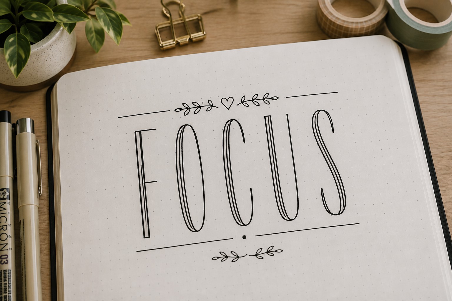
Some page titles contain several words. Large block lettering may take up too much space. A tall and narrow style solves that problem while still creating a professional appearance.
The trick is simple. Stretch the letters upward while keeping them relatively thin. The result feels elegant and modern without becoming difficult to read.
This style works beautifully on habit trackers, reading logs, and productivity spreads. It also pairs nicely with minimalist layouts because it adds visual interest without overwhelming the page.
If you enjoy experimenting with different font styles, take a look at 19 Easy Bullet Journal Fonts Anyone Can Learn for more ideas.
3. Faux Calligraphy Title
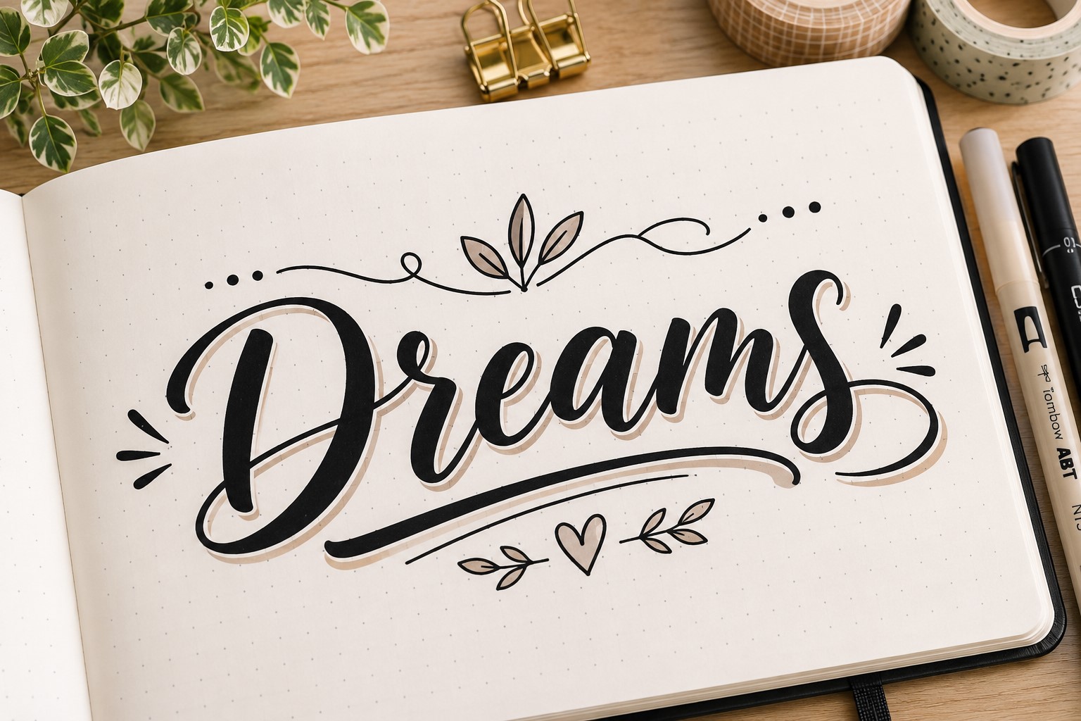
Many people love the appearance of calligraphy but feel intimidated by it. Faux calligraphy offers a beginner-friendly alternative that still looks impressive.
Write your title in cursive first. Then thicken the downward strokes by adding a second line beside them. Fill the space between those lines to create contrast.
The finished result often looks much more advanced than it actually is. That makes this style perfect for people who want elegant titles without investing in special tools.
Faux calligraphy works particularly well for gratitude journals, memory spreads, and inspirational pages where a softer appearance feels appropriate.
4. Outline Letter Title
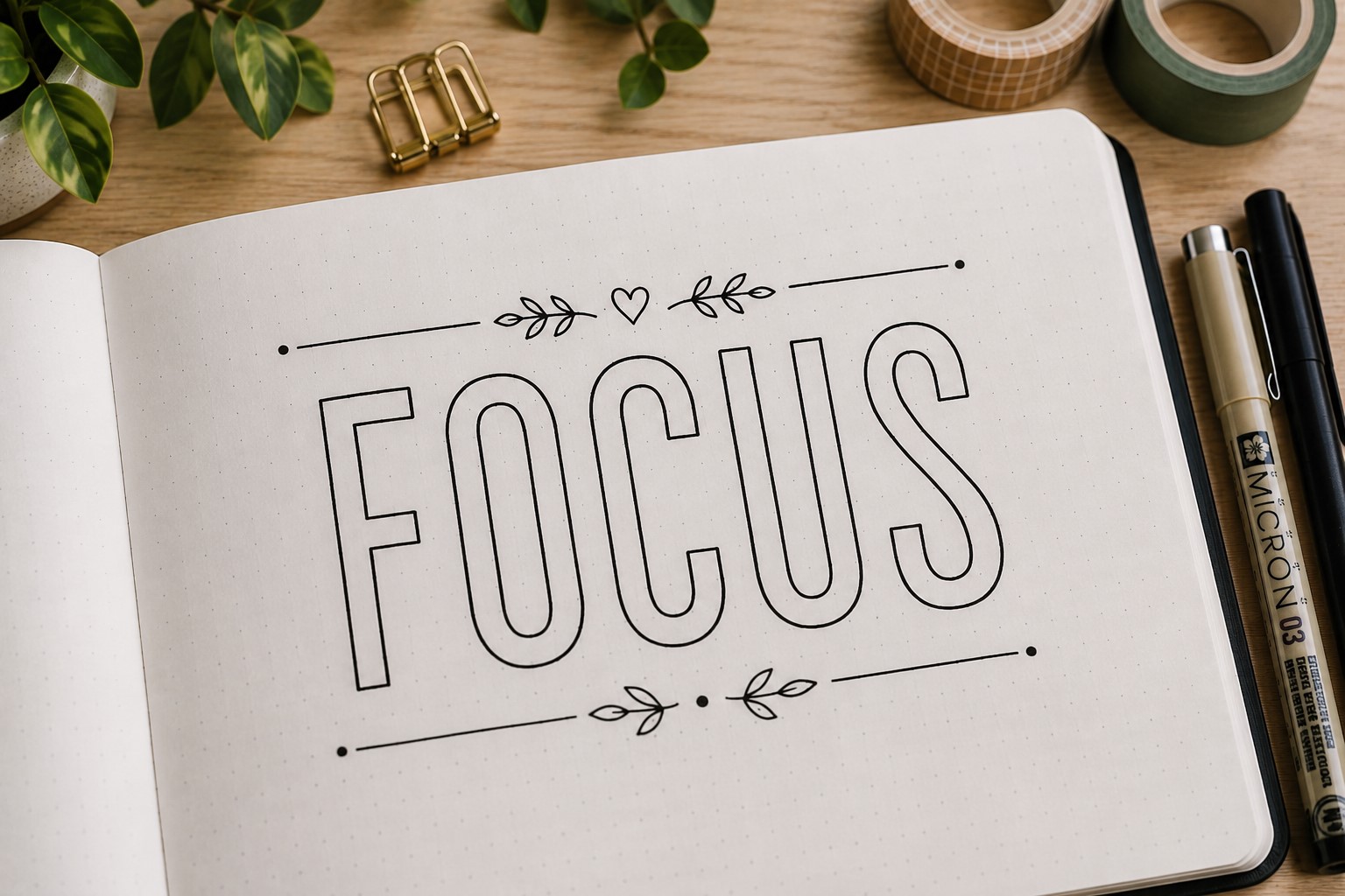
Sometimes the simplest titles create the biggest impact. Outline lettering proves that perfectly. Instead of filling each letter completely, you leave the inside open. This creates a clean and airy look that feels modern and polished.
One advantage of outline lettering is its flexibility. You can leave the letters empty for a minimalist appearance.
You can also add patterns, dots, stripes, or seasonal decorations inside the letters later. That means the same title style can look completely different from one spread to the next.
This style works especially well on monthly covers and section dividers because it attracts attention without making the page feel crowded. The open space inside the letters also gives your eyes a place to rest.
If you enjoy decorative lettering techniques, explore 11 Decorative Bullet Journal Lettering Ideas for Stunning Pages for additional inspiration.
5. Stacked Word Title

A stacked title instantly creates a designer-inspired look. Instead of writing words in a long horizontal line, place them on top of one another.
This arrangement creates a stronger visual shape and often helps long titles fit more comfortably on a page.
For example, instead of writing “Monthly Reading List” across the page, place each word on its own line. The title immediately feels more intentional and balanced.
Many journal users rely on this approach when they want a title to stand out without increasing the letter size.
Spacing plays an important role here. Keep the distance between words consistent so the title feels connected rather than fragmented. Small adjustments can dramatically improve the final appearance.
6. Shadow Letter Title
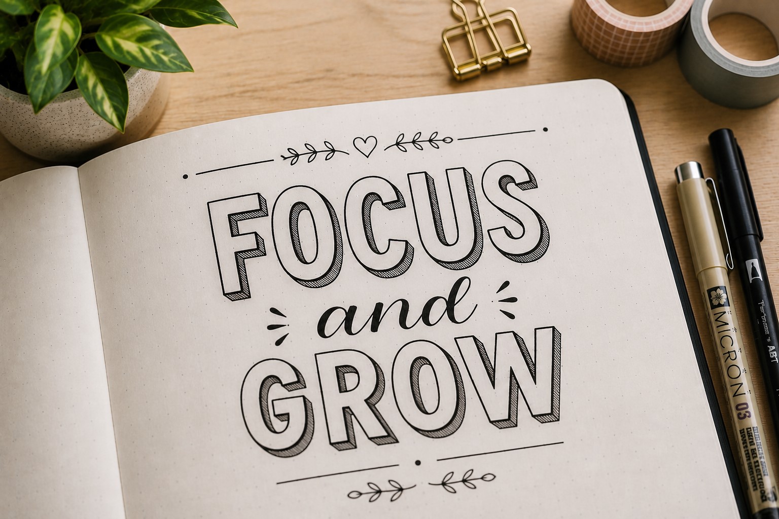
A shadow can completely change how a title looks. Even ordinary lettering feels more polished when a subtle shadow creates depth and dimension.
Start with a simple font style. Then add a thin shadow to one side of every letter. Keep the direction consistent throughout the title. This small detail creates the illusion that the letters sit above the page.
Many beginners make shadows too large. In most cases, smaller shadows create a cleaner and more professional result. The effect should support the lettering rather than compete with it.
For more ideas that pair beautifully with title designs, check out How to Create Gorgeous Bullet Journal Headers in 15 Steps.
Title Ideas That Feel Creative and Unique
7. Mixed Font Title

Some of the most memorable titles combine multiple font styles. One word may use bold block letters while another uses script lettering. This contrast creates instant visual interest.
The key is restraint. Two styles often work better than three or four. Too many font combinations can make the title feel chaotic rather than creative. The goal is to create contrast while maintaining harmony.
This approach works especially well when one word deserves extra emphasis. The larger or bolder font naturally becomes the focal point.
Many Bullet Journal Title Lettering Ideas use this technique because it allows simple fonts to create impressive results together.
8. Banner Title

A banner title combines lettering with decorative framing. Instead of placing the title directly on the page, you place it inside a banner shape.
This instantly gives the heading more presence. Even simple handwriting can look polished when framed inside a well-designed banner. That makes this style especially useful for beginners.
Banners also help organize a spread. They create clear visual separation between different sections and guide attention toward important information.
If you enjoy this style, take a look at 21 Cute Bullet Journal Banner Doodles Anyone Can Draw for additional banner inspiration.
9. Script and Block Combination

This title style combines elegance and structure. One part of the title uses flowing script lettering. Another uses bold block letters. The contrast creates a professional appearance that feels balanced.
For example, the main keyword might appear in block lettering while supporting words use script. This approach naturally creates hierarchy and makes the title easier to scan.
Many journal users rely on this combination because it works with almost any theme. It feels decorative without becoming overwhelming.
The style also photographs beautifully, which explains why it appears frequently in journal inspiration posts.
10. Geometric Letter Title

Geometric lettering uses simple shapes such as circles, rectangles, and triangles to build letters. The result feels modern and highly structured.
This style works particularly well in productivity journals and minimalist spreads. The clean lines create a sense of order that complements organized layouts.
One benefit of geometric lettering is that it encourages consistency. Since each letter relies on shapes, maintaining uniform proportions becomes easier.
If you enjoy experimenting with typography, browse 29 Bullet Journal Font Ideas to Make Your Pages Pop for more creative approaches.
11. Monoline Title
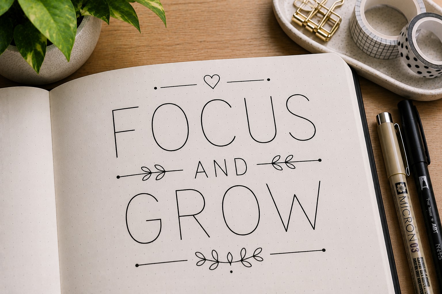
Monoline lettering follows one simple rule. Every stroke maintains the same thickness. While the style appears simple, the finished result often looks surprisingly sophisticated.
This approach works well when a page already contains decorative elements. The title remains clear without competing for attention. That balance makes monoline lettering extremely versatile.
Many people underestimate this style because it lacks dramatic flourishes. Yet its simplicity often becomes its greatest strength. Clean lettering tends to age well and remains easy to read.
Monoline titles work beautifully on planners, trackers, and functional spreads where clarity matters.
Elegant Titles for Beautiful Spreads
12. Serif Letter Title
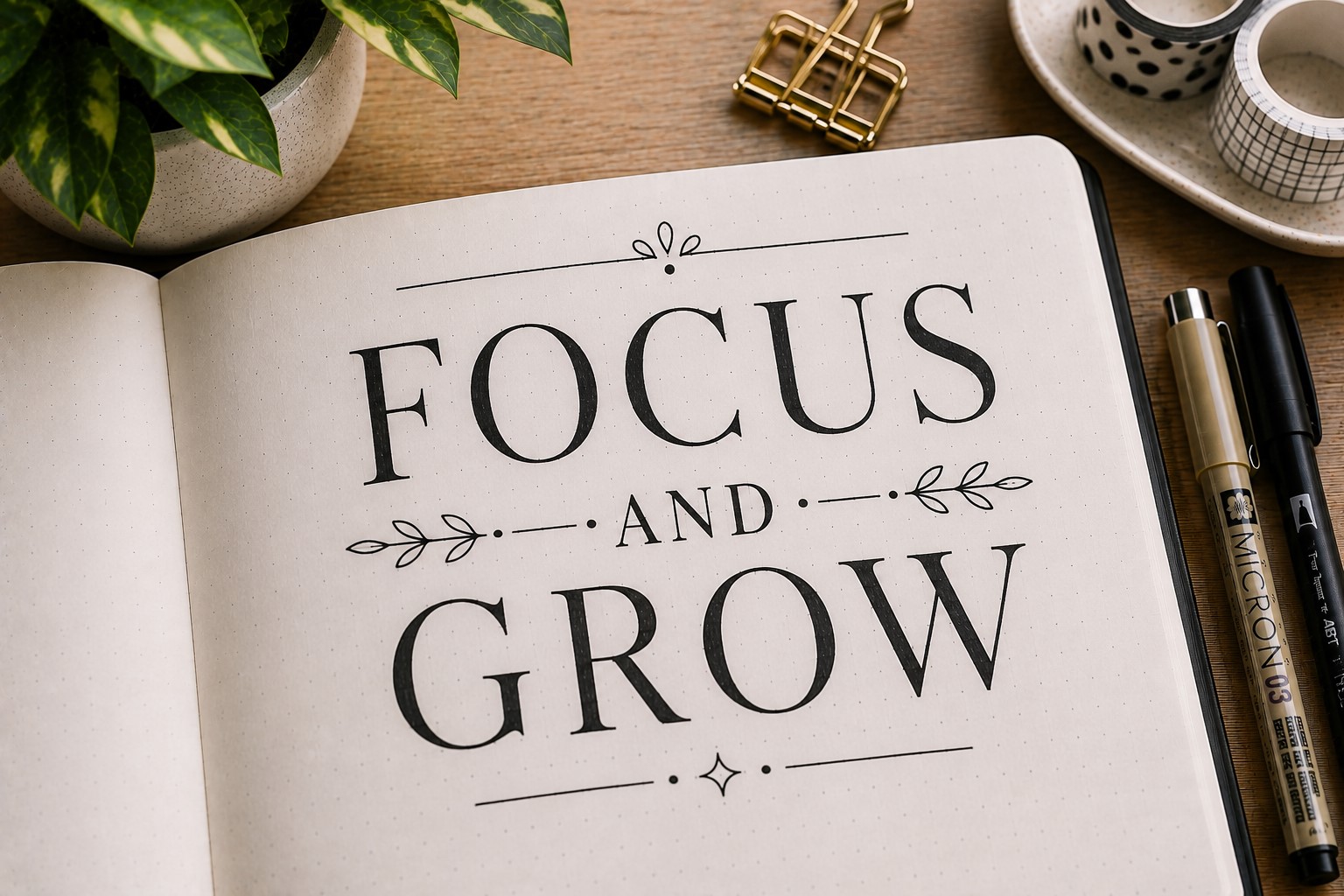
A serif title adds a touch of sophistication without requiring much extra effort. Those small finishing lines at the ends of letters immediately make the title feel more refined.
This style works especially well for reading journals, goal pages, and vintage-inspired themes. The structure creates a timeless appearance that feels organized and intentional.
You do not need dramatic serifs to achieve the effect. Small details often create enough contrast to elevate the lettering.
If you want to improve your overall lettering confidence, visit How to Practice Bullet Journal Lettering in 21 Days.
13. Floral Accent Title
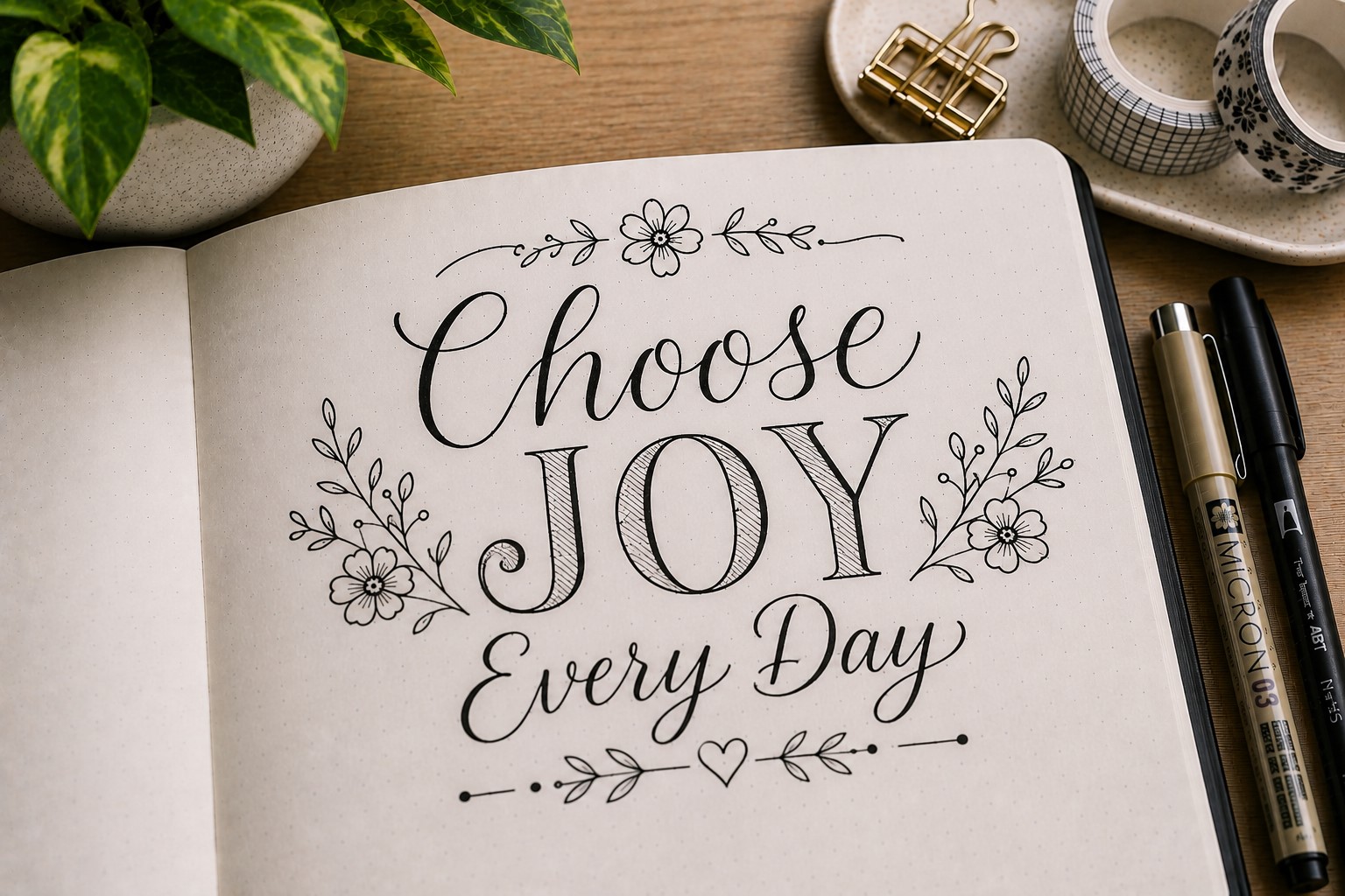
A floral accent title combines simple lettering with small botanical details. Tiny leaves, flowers, or vines help transform an ordinary title into something more decorative.
The key is knowing when to stop. You do not need to decorate every letter. A few carefully placed accents usually create a more elegant result.
This style works beautifully in spring spreads, gratitude journals, and self-care layouts. The natural details add warmth without making the page feel cluttered.
Many people enjoy this approach because it allows them to combine lettering and doodling in one design.
14. Ribbon Letter Title

Ribbon lettering creates the illusion that letters fold and twist like fabric. The effect looks impressive, yet the basic concept remains surprisingly approachable.
Start with simple block letters. Then add folded sections where parts of the ribbon appear to overlap. These extra details create movement and depth.
This title style works especially well for celebration spreads, milestone pages, and yearly goals. It naturally attracts attention and creates a focal point.
If you enjoy decorative page elements, explore 15 Easy Bullet Journal Doodle Borders Anyone Can Draw for more creative framing ideas.
15. Dotted Letter Title

A dotted title proves that a design does not need thick lines to stand out. Instead of drawing solid letters, you build each letter with small dots. The finished result feels light, creative, and a little unexpected.
This style works especially well when a page already contains lots of writing. The dots create visual interest without adding too much visual weight.
That balance helps the title stand out while keeping the overall spread clean.
You can create the letters entirely from dots or draw the letters first and trace them with dots afterward. Both methods work well. The important thing is keeping the spacing relatively consistent.
Many journal users save this style for spring layouts, mood trackers, and creative spreads where a softer appearance feels appropriate.
16. Layered Title Lettering

A layered title creates depth by placing multiple versions of the same lettering behind one another. The effect looks detailed, yet the process is surprisingly simple.
Start with your main title. Then draw a second version slightly offset behind it. Some people add a third layer for even more depth. The overlapping lines create dimension and make the title feel more dynamic.
This approach works particularly well on cover pages because it immediately grabs attention. It also gives simple fonts a more advanced appearance.
One reason many people love layered titles is that they look impressive in photos while remaining beginner-friendly on paper.
If you enjoy stylish lettering layouts, take a look at 25 Aesthetic Bullet Journal Lettering Ideas You’ll Love.
17. Minimalist Spaced-Out Title
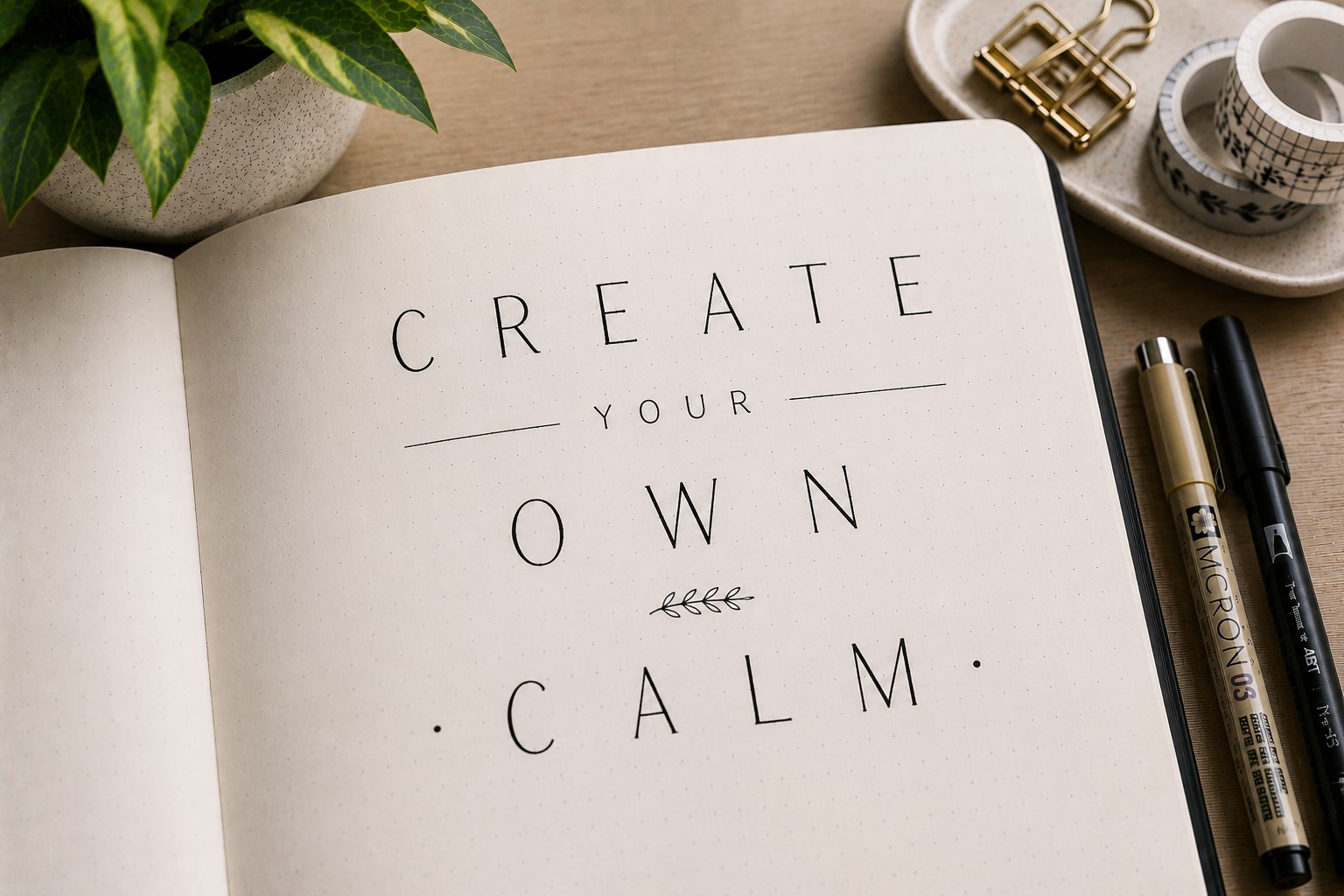
Not every title needs decoration. Sometimes extra space creates more impact than extra details. A minimalist spaced-out title relies on generous spacing between letters to create a clean and professional look.
The technique is straightforward. Write the title normally, then increase the space between each letter.
The wider spacing creates a sense of balance and sophistication that works beautifully in modern layouts.
This style works especially well for productivity spreads, goal pages, and minimalist journals. The simplicity helps the page feel organized and intentional.
Many designers use spacing as a design tool. Bringing that same idea into a bullet journal can instantly elevate a spread without requiring advanced lettering skills.
18. Double-Line Title

A double-line title adds interest without becoming overly decorative. Each letter contains two parallel outlines instead of one. That extra detail helps the title stand out while keeping the design clean.
This style works particularly well for larger headings where the details remain visible. Smaller titles can lose the effect because the spacing becomes difficult to see.
One advantage of double-line lettering is its flexibility. You can leave the space between the lines empty or fill it with color and patterns. Either option creates a different mood.
Many Bullet Journal Title Lettering Ideas rely on simple effects like this because they create a strong visual payoff without adding much complexity.
If you want more font inspiration, check out 19 Easy Bullet Journal Fonts Anyone Can Learn.
19. Faux Brush Lettering Title

Brush lettering often looks intimidating until you discover faux brush lettering. This style captures much of the same elegance while remaining accessible to beginners.
The process starts with cursive writing. Then you thicken the downstrokes to create contrast. That simple adjustment transforms ordinary handwriting into something that feels much more polished.
This style works beautifully for quote pages, gratitude logs, and memory spreads. The flowing appearance creates warmth and personality that suits reflective content.
Many people start here before moving into true brush lettering because it helps build confidence and muscle memory.
For more lettering techniques, explore 17 Creative Bullet Journal Calligraphy Ideas to Try Today.
20. Decorative Frame Title
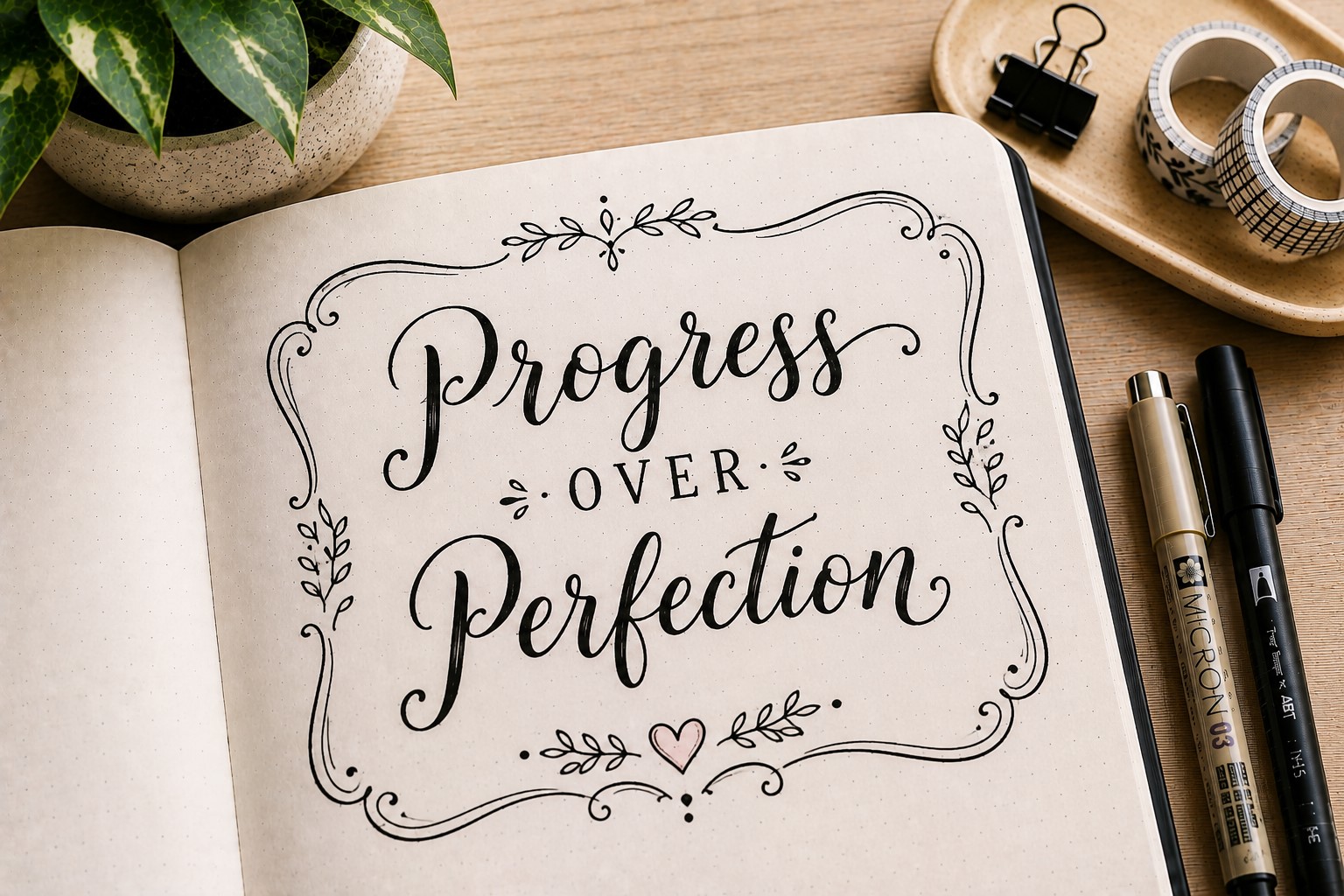
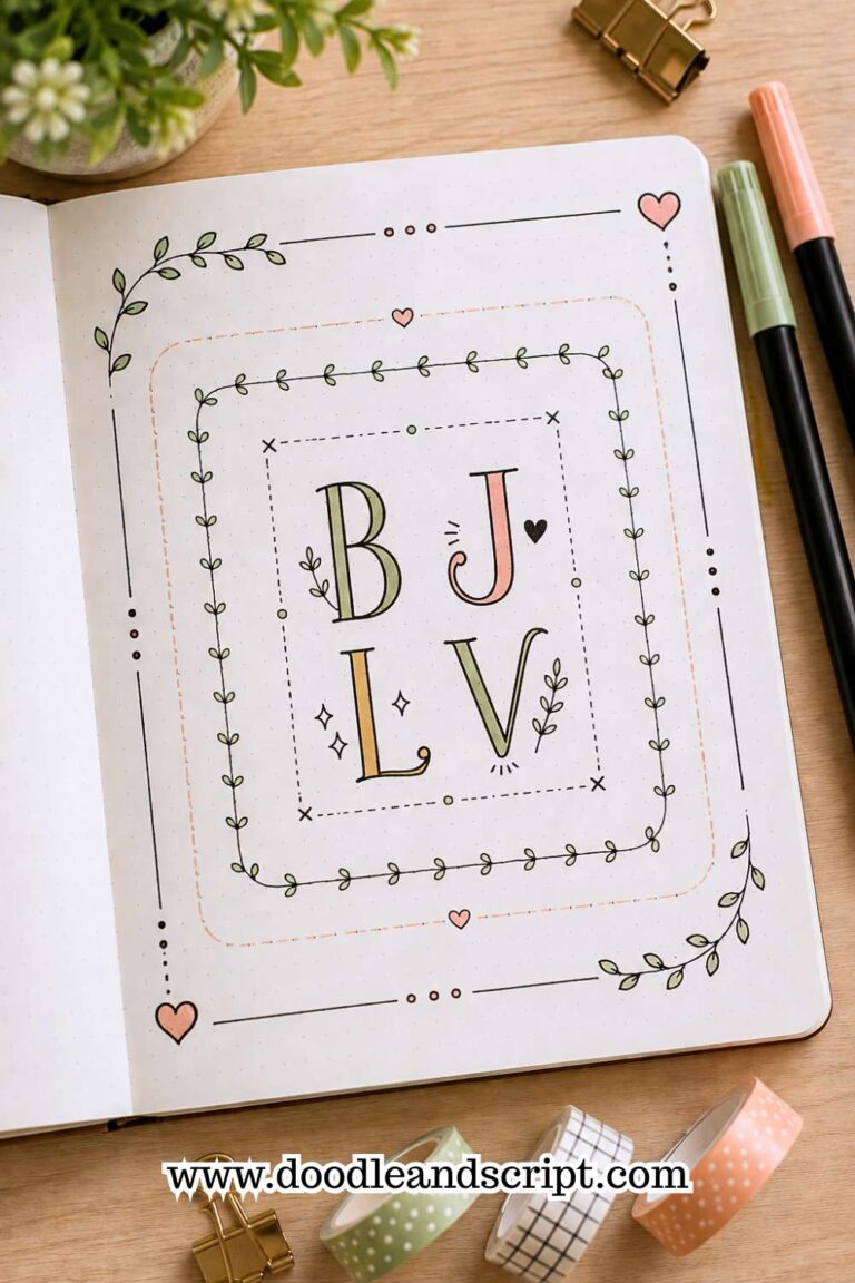
Sometimes the lettering itself remains simple while the surrounding details create the impact. A decorative frame title does exactly that. The title sits inside a border, label, shape, or illustrated frame.
This approach helps the title feel more important while creating a natural focal point on the page. Even everyday handwriting can look intentional when placed inside a well-designed frame.
The frame can match the theme of the spread. Floral frames work beautifully in spring journals. Geometric frames suit modern layouts. Seasonal frames help reinforce monthly themes.
This title style offers plenty of creative freedom while remaining approachable for beginners.
21. Handwriting Upgrade Title
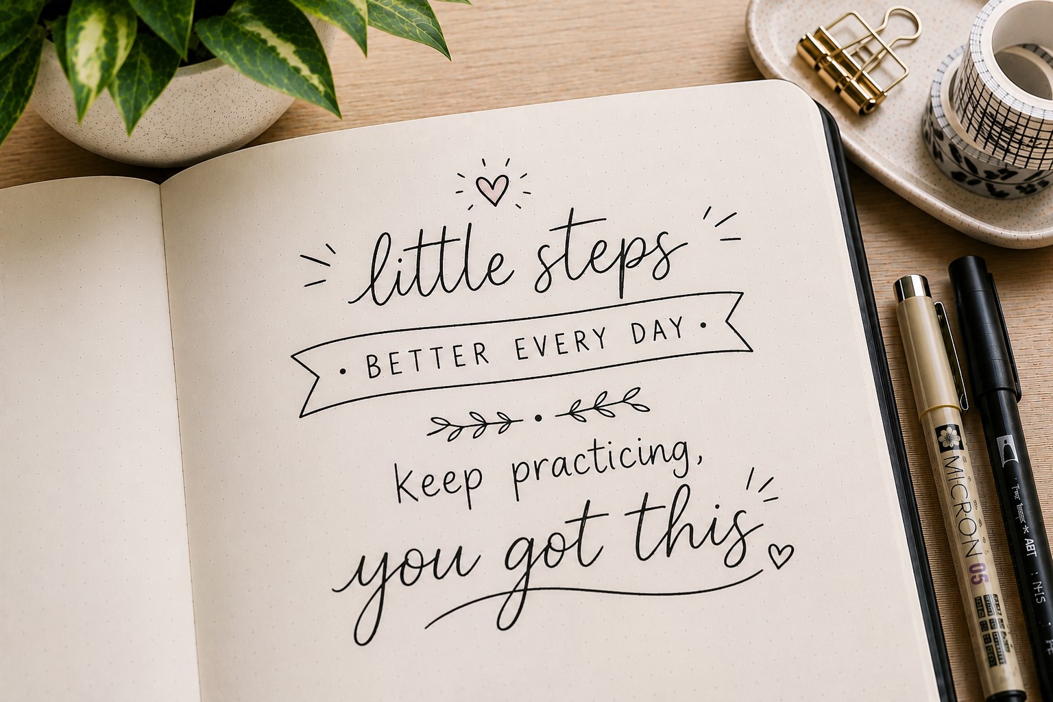
The final idea may be the most practical one. Instead of learning an entirely new font, improve the handwriting you already use. Small adjustments often create dramatic improvements.
Focus on consistency first. Keep letter heights similar. Maintain even spacing. Slow down when writing the title. These simple habits can transform ordinary handwriting into something much more polished.
Many experienced journal users eventually rely on this approach because it feels natural and sustainable. They no longer need to copy styles from other people. Their handwriting becomes part of their creative identity.
One reason this technique works so well is that it remains unique. No one else will create the exact same result.
If you want to explore more lettering variations, visit 15 Easy Bullet Journal Lettering Styles Every Beginner Should Learn.
Final Thoughts
Beautiful titles do more than label a page. They help create a mood, guide attention, and make a spread feel complete.
The best Bullet Journal Title Lettering Ideas are often the ones that balance creativity with readability. A title should look good, but it should also be easy to understand at a glance.
As you experiment with different styles, focus on finding techniques that fit the way you actually journal. Some people love decorative ribbon lettering.
Others prefer clean monoline titles. There is no single correct approach. The most effective title style is the one you enjoy using consistently.
You do not need to master all 21 ideas immediately. Start with a few favorites and practice them regularly. Over time, your confidence will grow and your titles will start feeling more natural.
If you want additional ways to decorate your pages, explore 27 Easy Bullet Journal Doodle Ideas for Every Page.
You can also find creative quote layouts in 17 Bullet Journal Quote Lettering Ideas That Stand Out. Those skills pair beautifully with strong title lettering and help create more polished journal spreads.