17 Creative Bullet Journal Calligraphy Ideas to Try Today
Disclosure: Some of the links in this post are affiliate links. This means if you click on the link and purchase an item, I will receive an affiliate commission at no extra cost to you.
Most people focus on what they will write in their bullet journal. They think about goals, plans, habits, or ideas. Yet the first thing people usually notice is not the content.
It is the lettering. A simple page can look exciting with the right title. At the same time, a well-planned spread can feel unfinished if the lettering looks rushed.
That is why so many journal lovers keep searching for new Bullet Journal Calligraphy Ideas.
Calligraphy can completely change the energy of a page. The same habit tracker can feel elegant with flowing script lettering. It can feel playful with bouncy strokes.
It can even look modern with clean, structured calligraphy. That is what makes calligraphy so useful in a bullet journal. It is not just decoration.
It helps create the personality of the spread before anyone reads a single word.
Some people assume they need a brush pen and advanced skills before trying calligraphy. That belief stops them before they even begin.
The truth is that some of the most creative Bullet Journal Calligraphy Ideas rely on simple techniques, clever details, and a little experimentation.
A few small changes in the way you shape letters can make a huge difference. If you enjoy exploring new lettering styles, take a look at 15 Easy Bullet Journal Lettering Styles Every Beginner Should Learn before trying the ideas in this guide.
17 Creative Bullet Journal Calligraphy Ideas to Try Today
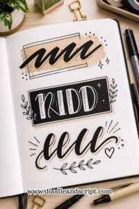
1. Faux Brush Calligraphy
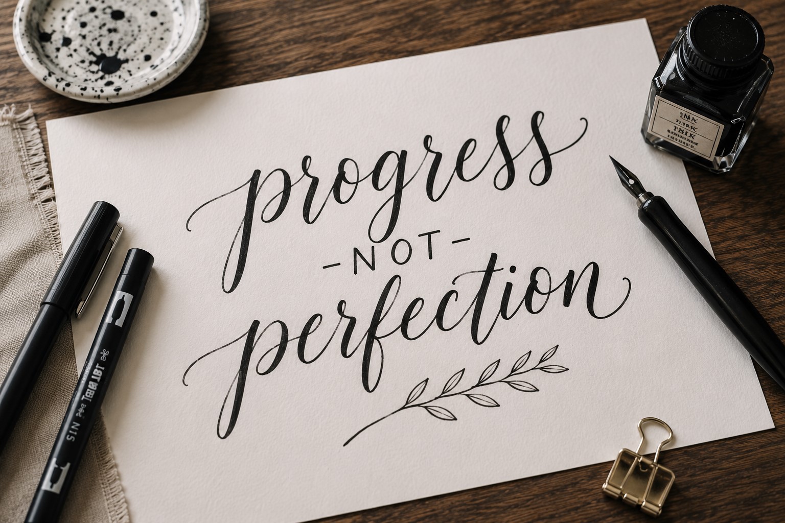
If you have ever admired brush lettering, this is one of the best Bullet Journal Calligraphy Ideas to start with.
Faux brush calligraphy gives you a similar look without requiring brush pens or advanced techniques.
Begin by writing a word in cursive. Once the word is complete, go back and thicken every downward stroke. Leave the upward strokes thin.
That simple contrast creates the illusion of brush lettering and instantly makes the word look more polished.
This style works beautifully on monthly covers, gratitude pages, quote spreads, and section dividers. It feels elegant without looking overly formal.
Another reason people love this technique is that mistakes are easy to fix. Since you add the thicker strokes afterward, you have more control over the final result.
Many journal users continue using faux brush lettering long after learning more advanced calligraphy because it is quick, reliable, and always looks impressive.
2. Bounce Lettering Calligraphy

Not every calligraphy style needs perfect alignment. Bounce lettering proves that beautifully. Instead of keeping every letter on the same baseline, some letters sit slightly higher while others dip lower.
The result feels energetic and full of personality. A title immediately looks more relaxed and creative. That makes bounce lettering perfect for journals that feel fun, colorful, and expressive.
The key is not overdoing it. A few subtle changes in height usually create a better result than dramatic jumps between letters. Think of it as adding rhythm rather than chaos.
Many people find bounce lettering easier than traditional calligraphy because it allows more freedom. Small imperfections often add to the charm rather than taking away from it.
If you enjoy experimenting with title designs, explore 21 Bullet Journal Title Lettering Ideas That Look Professional.
3. Monoline Calligraphy
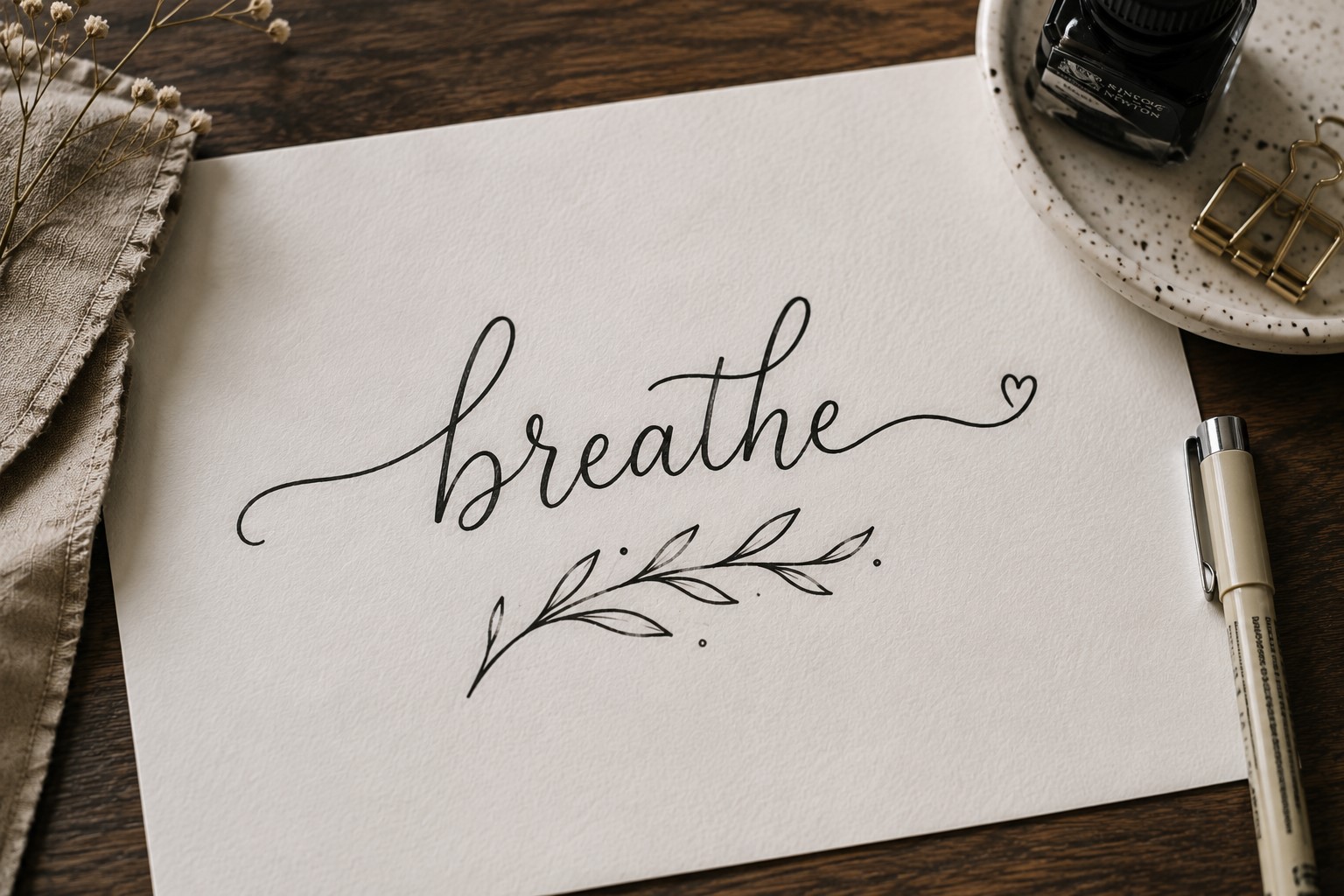
Some of the most effective Bullet Journal Calligraphy Ideas are also the simplest. Monoline calligraphy uses strokes that stay the same thickness throughout each letter. There are no dramatic contrasts or complicated flourishes.
At first glance, the style may seem plain. Yet that simplicity creates a clean and modern appearance that works beautifully in many journal layouts.
It pairs especially well with minimalist themes where clarity matters more than decoration.
Monoline lettering also helps build confidence. Since you do not need to worry about thick and thin strokes, you can focus on spacing, consistency, and letter formation.
This style works particularly well on trackers, planners, study logs, and productivity pages. It remains easy to read while still feeling intentional and polished.
4. Oversized First Letter Calligraphy
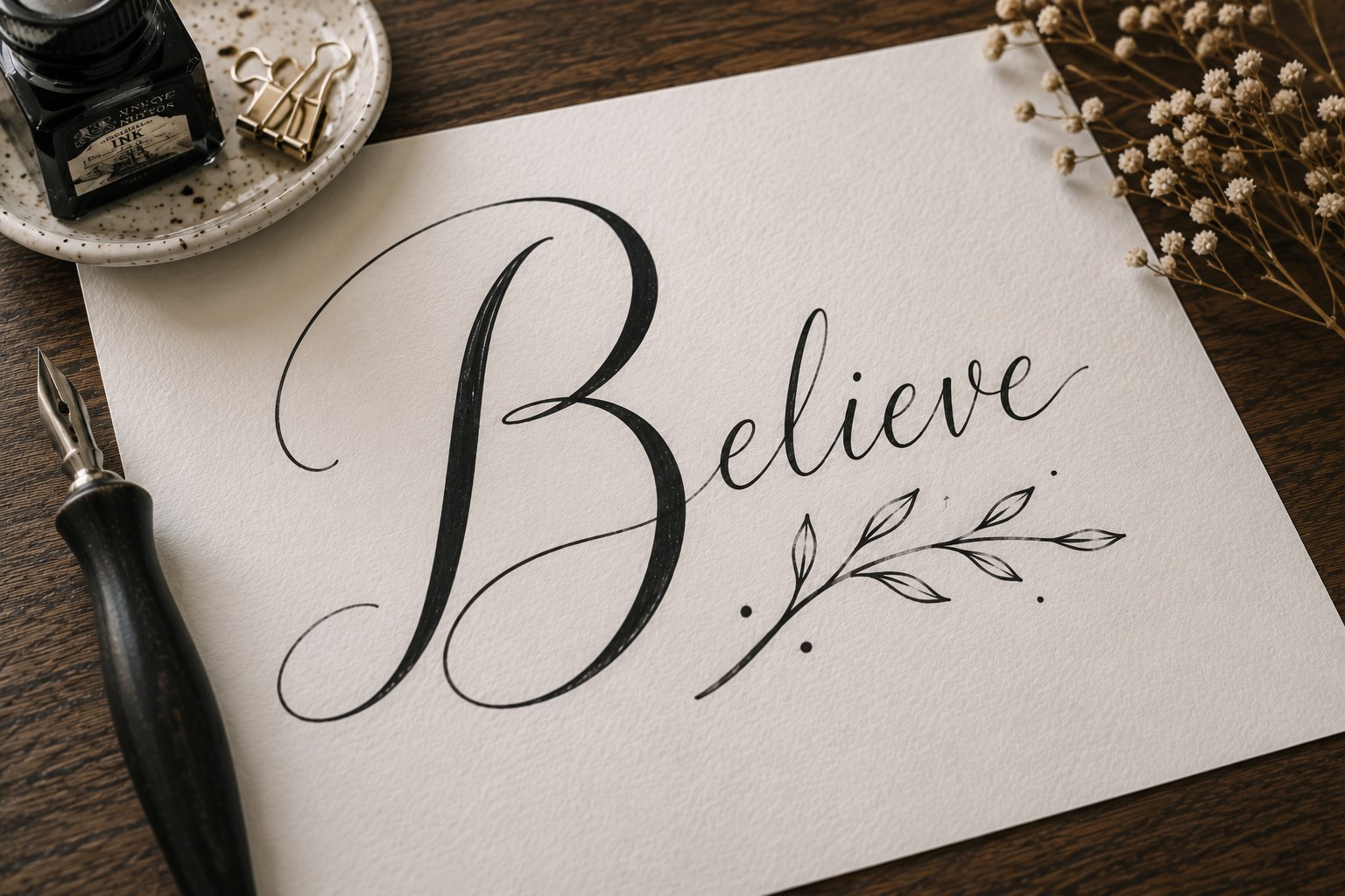
One oversized letter can completely transform a title. This technique draws inspiration from classic books where the first letter of a chapter appeared much larger than the surrounding text.
Start by creating a large decorative first letter. Then write the rest of the word in a smaller calligraphy style. The contrast immediately creates a focal point and helps the title stand out.
This approach works especially well for monthly covers, reading journals, memory pages, and quote spreads.
The oversized letter gives the title a sense of importance without requiring every word to be heavily decorated.
Many journal users enjoy this style because it feels creative while remaining approachable. You only need to focus on making one letter special instead of the entire title.
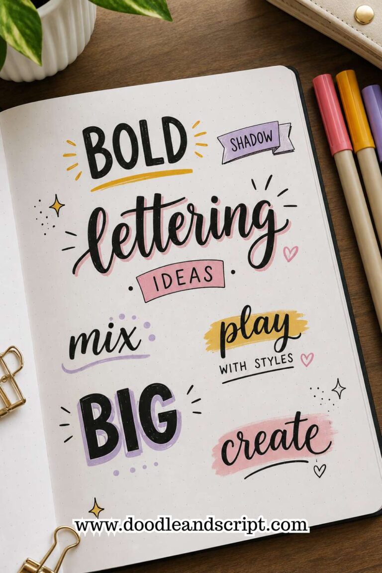
5. Shadow Calligraphy
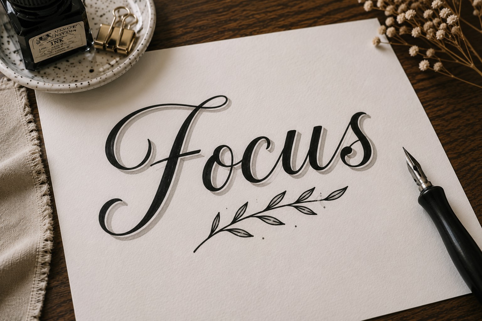
A shadow can make simple calligraphy look far more sophisticated. The lettering itself may remain basic, yet the added depth creates a completely different effect.
Write your title first. Then choose one side of the letters and add a thin shadow. Keep the direction consistent throughout the word. This helps the title look intentional and balanced.
Shadow calligraphy works especially well when the page contains lots of decorative elements. The extra depth helps the lettering stand out from the background without making it larger.
Many people make the mistake of creating shadows that are too thick. In most cases, a subtle shadow looks cleaner and more professional.
For more decorative lettering inspiration, check out 11 Decorative Bullet Journal Lettering Ideas for Stunning Pages.
6. Floral Calligraphy
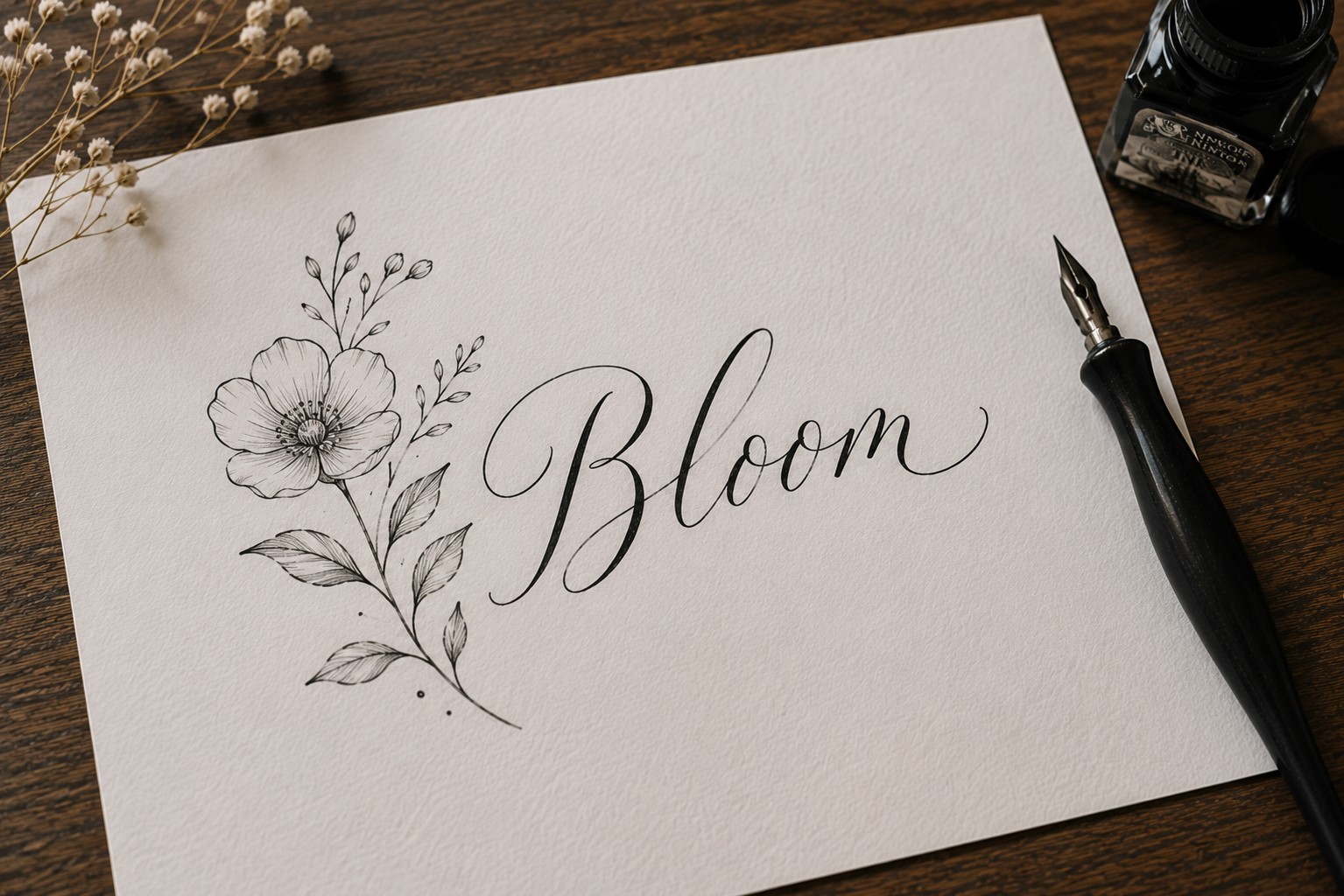
Floral calligraphy combines lettering and doodling in a way that feels natural and elegant. Instead of leaving letters plain, you decorate them with flowers, vines, leaves, or tiny botanical accents.
The best floral calligraphy usually focuses on balance. A few carefully placed flowers often create a stronger result than filling every empty space. Too many decorations can make the title difficult to read.
This style feels perfect for spring spreads, gratitude journals, self-care pages, and memory keeping. The natural elements add warmth and softness to the overall design.
One reason floral calligraphy remains popular is that every design looks different. Even when two people use the same word, their decorative choices create completely unique results.
7. Ribbon Calligraphy
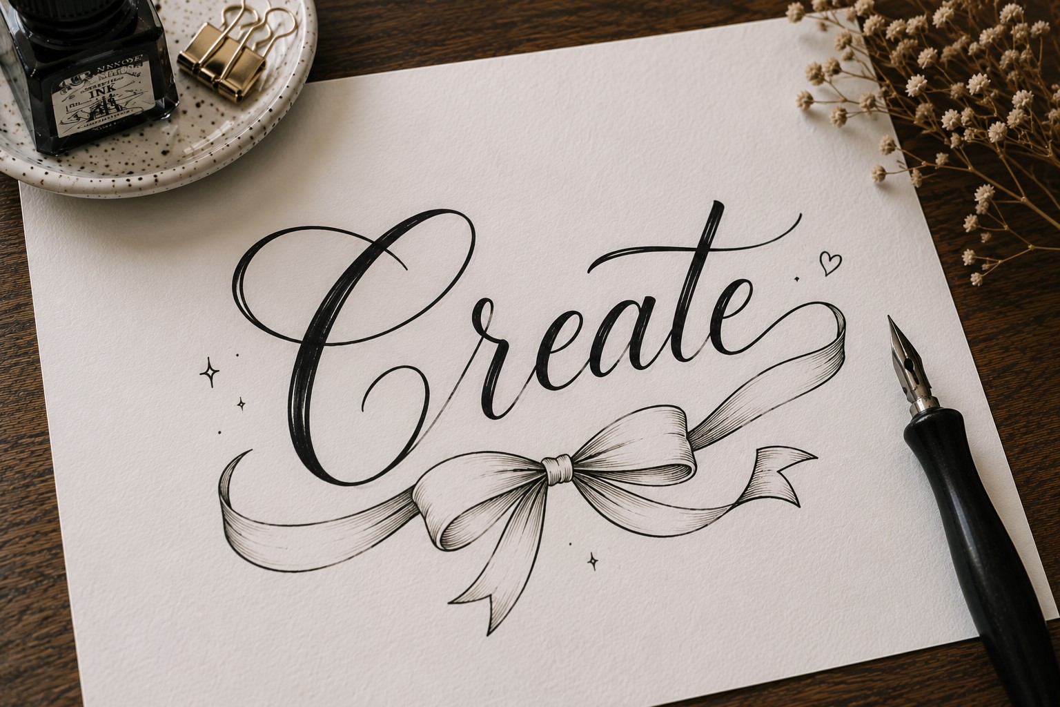
Ribbon calligraphy creates the illusion that letters fold and twist like strips of fabric. The finished result looks detailed and artistic, yet the basic concept is easier than many people expect.
Start with simple block-style lettering. Then add folded sections where the ribbon appears to overlap itself. These extra details create movement and dimension.
This style works particularly well on celebration spreads, yearly goals, milestone pages, and seasonal covers. Since it naturally attracts attention, it performs best as a large title rather than a small heading.
If you enjoy combining lettering with decorative page elements, take a look at 21 Cute Bullet Journal Banner Doodles Anyone Can Draw for more creative ideas.
8. Color-Fade Calligraphy
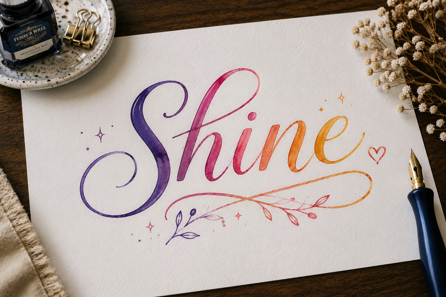
A color-fade title can completely change the mood of a page. Instead of using a single color from beginning to end, the lettering gradually shifts between two or more shades.
The transition creates movement and makes the title feel more artistic.
You do not need professional markers to try this technique. Many journal users create a similar effect by alternating colors between letters or blending shades where two letters meet. The goal is to create a smooth visual flow across the word.
This style works beautifully on seasonal covers, birthday spreads, travel journals, and creative projects. It instantly draws attention without requiring complicated lettering skills.
One reason this technique remains popular is that it allows simple calligraphy styles to feel more exciting. Color does much of the work while the lettering itself stays relatively easy to create.
9. Double-Line Calligraphy
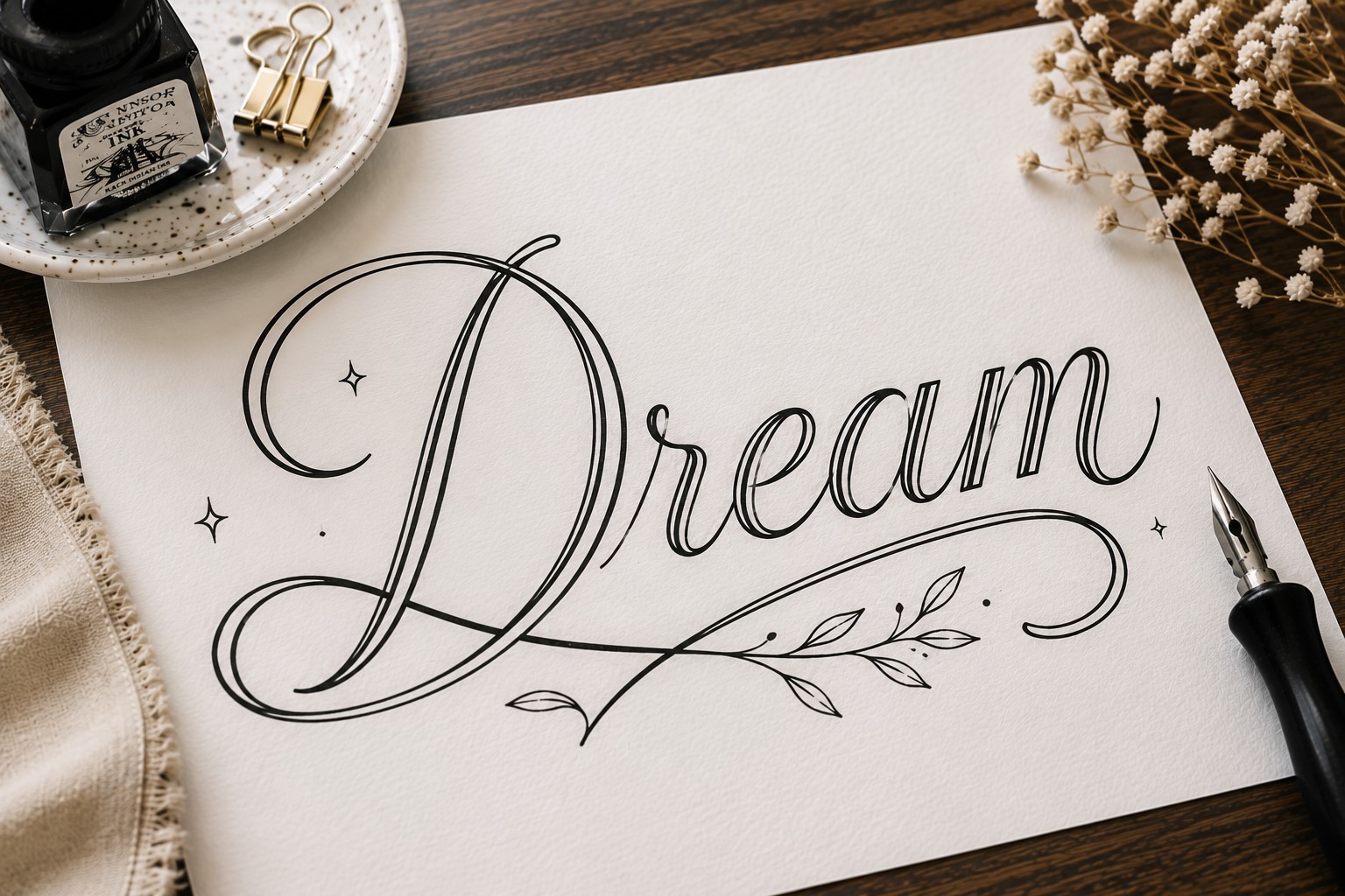
Sometimes a small detail can make a huge difference. Double-line calligraphy proves that perfectly. Instead of using a single stroke, each letter contains two parallel lines.
The extra line adds dimension and makes the title feel more decorative. Yet the lettering still looks clean and easy to read. That balance makes this technique useful in many different journal styles.
This approach works especially well for larger headings where the details remain visible. The open space between the lines also creates opportunities for creativity. You can leave it empty or fill it with patterns and color.
Many Bullet Journal Calligraphy Ideas focus on dramatic flourishes. This one achieves impact through simplicity instead.
If you enjoy experimenting with different lettering styles, explore 19 Easy Bullet Journal Fonts Anyone Can Learn.
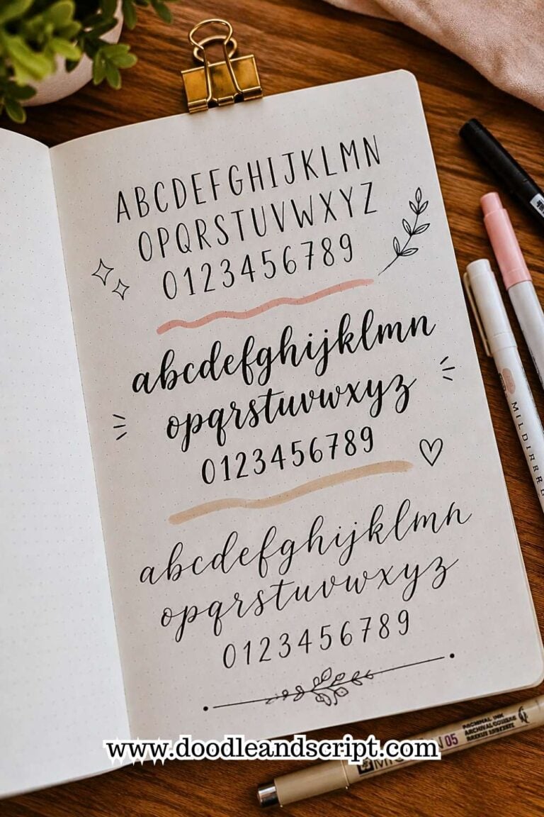
10. Minimalist Script Calligraphy
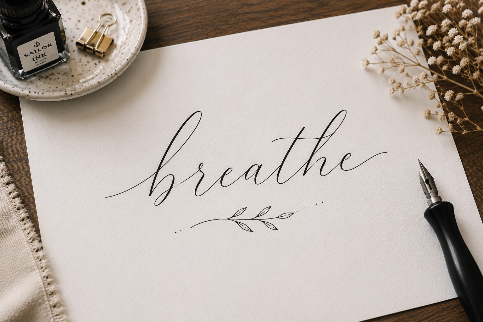
Some titles do not need decorations, shadows, or embellishments. A clean script font can create all the impact you need.
Minimalist script calligraphy focuses on smooth letter shapes and balanced spacing rather than extra details.
This style works particularly well when the page already contains colorful layouts, stickers, or illustrations. The simplicity prevents the title from competing with the rest of the design.
Many experienced journal users return to minimalist calligraphy because it feels timeless. Trends change, but clean lettering almost always looks good.
The challenge lies in consistency. Paying attention to spacing, slant, and letter height helps the title feel polished and intentional.
11. Decorative Swirl Calligraphy
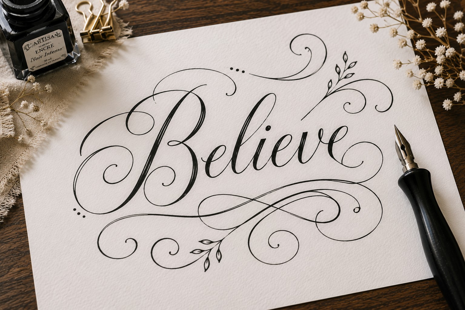
A swirl can transform an ordinary title into something memorable. Decorative swirls add movement and elegance by extending certain strokes beyond the letters themselves.
The trick is knowing where to place them. Not every letter needs a flourish. In many cases, adding swirls only to the beginning or end of a word creates the best result.
This style works beautifully on quote pages, memory spreads, and special occasion layouts. The flowing lines naturally draw the eye across the title.
Many beginners assume flourishes require advanced skills. In reality, a few simple curves can create a dramatic effect when used thoughtfully.
For more decorative title inspiration, check out 25 Aesthetic Bullet Journal Lettering Ideas You’ll Love.
12. Geometric Calligraphy
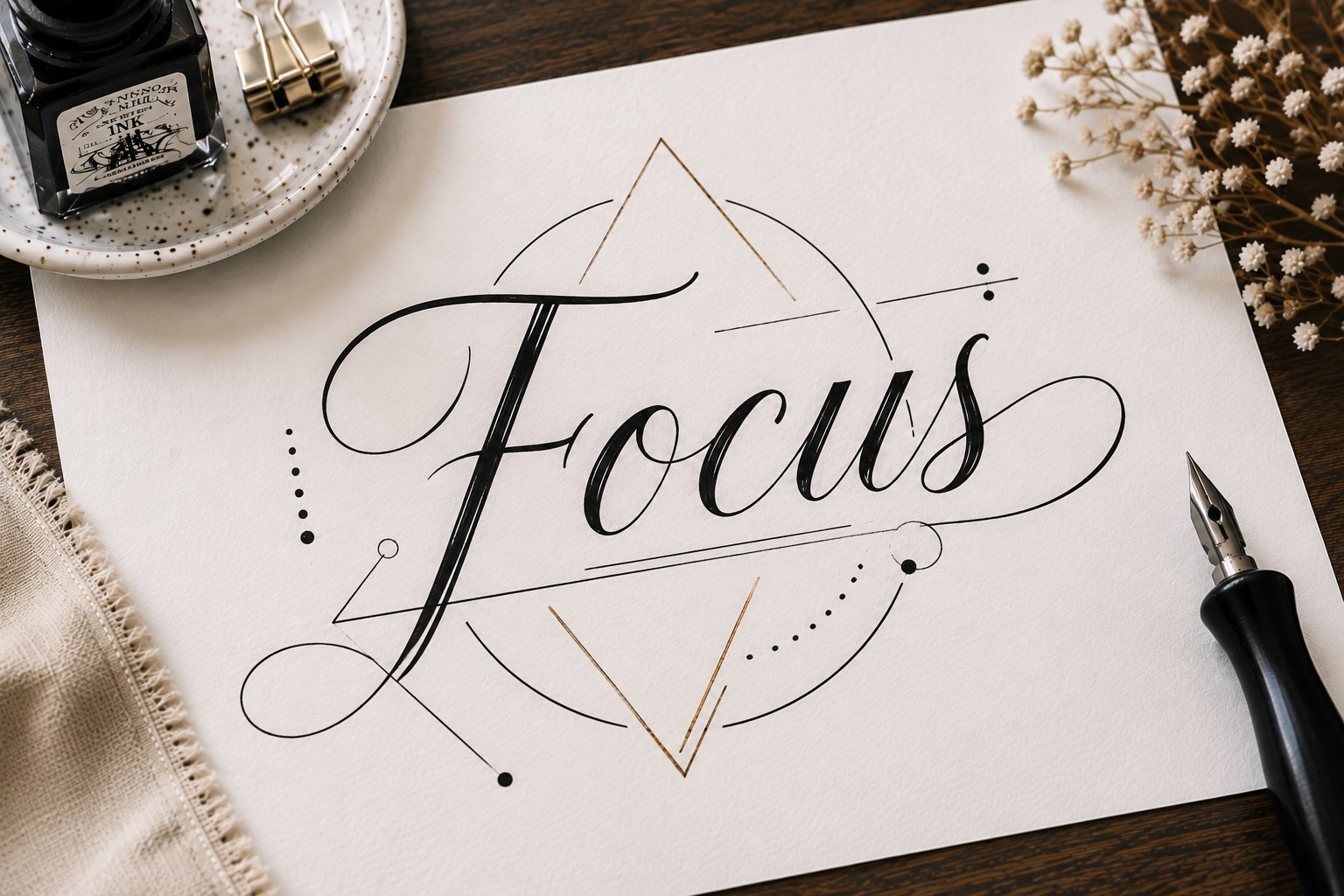
Geometric calligraphy combines structure and creativity. Instead of relying entirely on traditional handwriting, the letters incorporate shapes such as circles, triangles, and rectangles.
The result feels modern and unique. This style often works well in productivity journals because the structured shapes complement organized layouts.
One advantage of geometric lettering is that it encourages consistency. Shapes provide clear guidelines, which can make spacing and proportions easier to manage.
Many people enjoy this style because it feels different from traditional calligraphy. It pushes you to think about letters as design elements rather than simply words on a page.
13. Layered Calligraphy
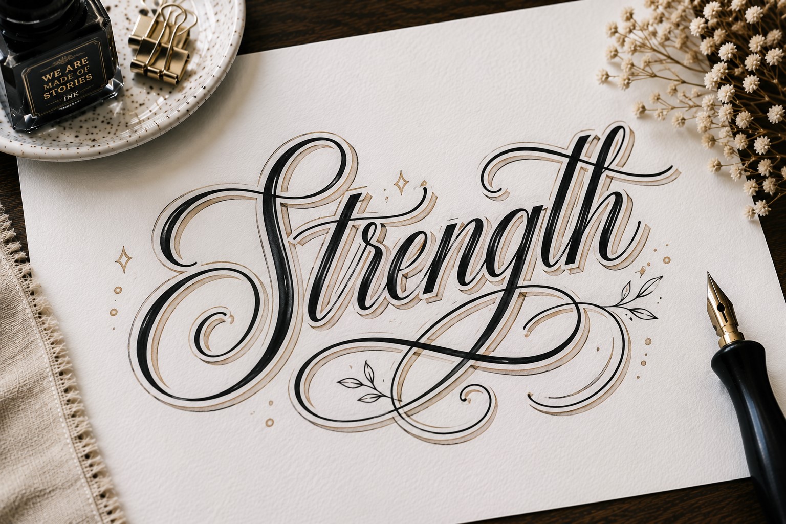
Layered lettering creates depth by placing multiple versions of the same word slightly behind one another. The overlapping effect gives the title more visual presence and helps it stand out.
Start with a simple calligraphy word. Then draw another version slightly offset behind it. Some people add a third layer for extra dimension. Even small shifts create a noticeable difference.
This style works especially well on monthly covers and section dividers because it naturally attracts attention. It also photographs beautifully, which explains why it appears often in journal inspiration galleries.
One reason people love layered lettering is that it looks complicated while remaining surprisingly approachable.
If you want stronger page structures to support your titles, explore How to Create Gorgeous Bullet Journal Headers in 15 Steps.
14. Botanical Vine Calligraphy
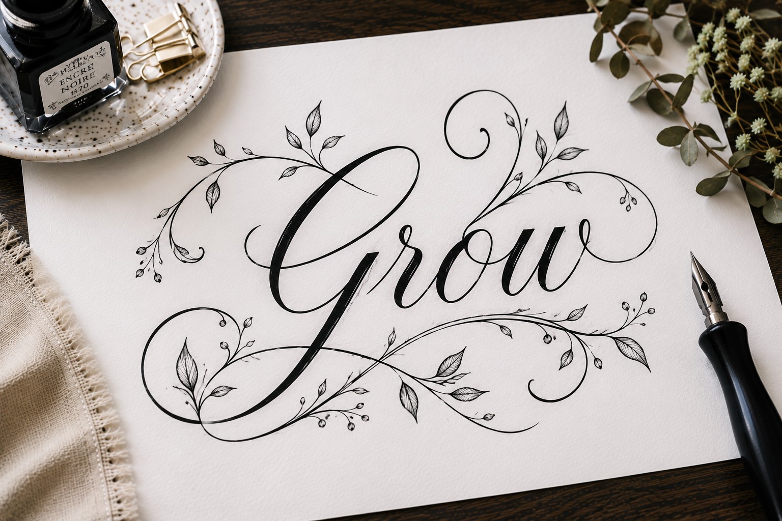
Botanical vine lettering takes floral calligraphy a step further. Instead of simply adding flowers around letters, vines become part of the lettering itself.
A stem might form part of a letter. Leaves might extend from the ends of strokes. These details create a seamless connection between the lettering and the decorative elements.
This style works beautifully in nature-themed journals, spring layouts, gardening logs, and gratitude pages. The organic shapes create a calm and welcoming feel.
The key is maintaining readability. Decorative elements should enhance the lettering rather than overwhelm it. A few thoughtful additions usually create the strongest result.
15. Mixed-Style Calligraphy
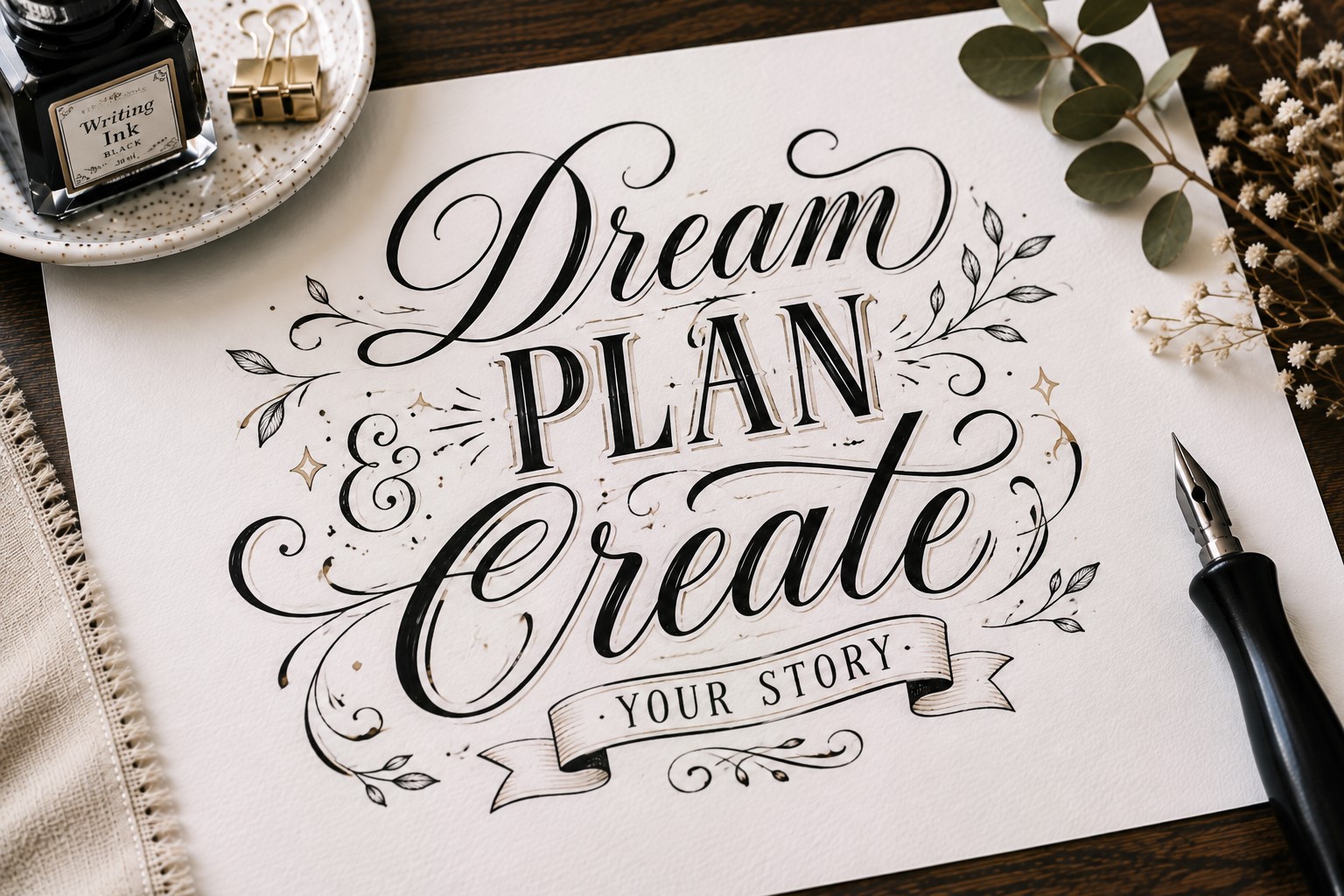
One of the easiest ways to create a unique title is by combining different calligraphy styles within the same phrase.
Instead of using one lettering style from beginning to end, mix two styles that contrast with each other.
For example, you might write the main word in bold calligraphy and the supporting words in a thin script.
The difference immediately creates hierarchy and helps guide the reader’s eye through the title. It also makes certain words feel more important without increasing their size.
This technique works especially well for monthly covers, vision boards, reading journals, and project pages. The contrast creates visual interest while keeping the title readable.
Many journal users discover that combining simple styles often creates a stronger result than using one highly decorative style throughout the entire heading.
If you enjoy trying different lettering approaches, explore 15 Easy Bullet Journal Lettering Styles Every Beginner Should Learn.
16. Framed Calligraphy
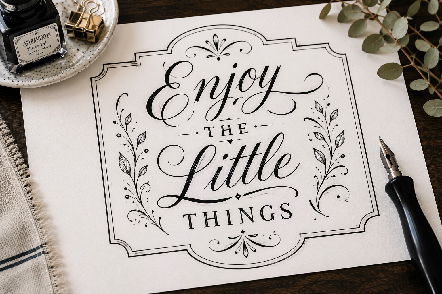
Sometimes the lettering itself remains simple while the presentation creates the impact. Framed calligraphy does exactly that.
The title sits inside a decorative frame, label, shape, or border that helps it stand out from the rest of the page.
The frame can match the theme of your spread. A floral frame works beautifully in spring layouts. Geometric frames suit modern journals. Seasonal frames can help reinforce monthly themes.
One advantage of this technique is that it works with almost any calligraphy style. Even basic lettering looks more polished when it has a dedicated space on the page.
Many people use framed titles when they want a spread to feel organized because the frame naturally creates a visual focal point.
17. Quote-Style Calligraphy
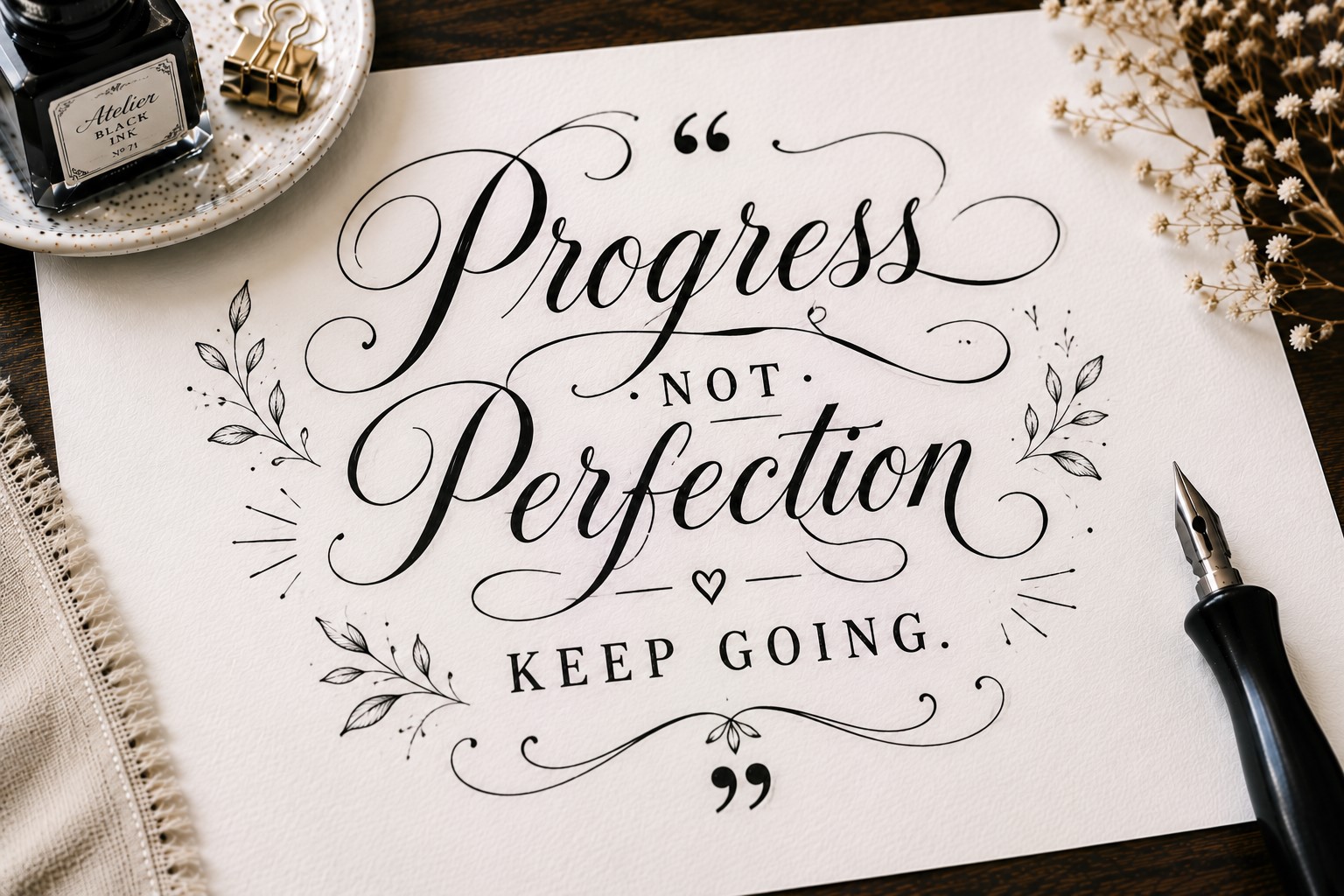
A quote-style title treats the lettering as the main design feature rather than simply a label. Instead of placing all the words on one line, you arrange them creatively across the page.
Some words become larger. Others become smaller. Different alignments help create movement and balance.
This approach works especially well when the title contains several words. Breaking the phrase into multiple sections allows you to highlight important words and create a more interesting composition.
The style feels expressive, artistic, and highly customizable. No two layouts need to look the same. Small changes in spacing and placement can completely transform the finished result.
Many of the most memorable Bullet Journal Calligraphy Ideas use this approach because it combines lettering, layout design, and creativity in one technique.
If you want more inspiration for arranging words beautifully, take a look at 17 Bullet Journal Quote Lettering Ideas That Stand Out.
Final Thoughts
The best Bullet Journal Calligraphy Ideas are not always the most complicated ones. In many cases, simple techniques create the strongest results.
A small shadow, a few floral details, or a clever layout can completely change how a page feels. The key is experimenting with different styles until you discover the ones that match your journal and your personality.
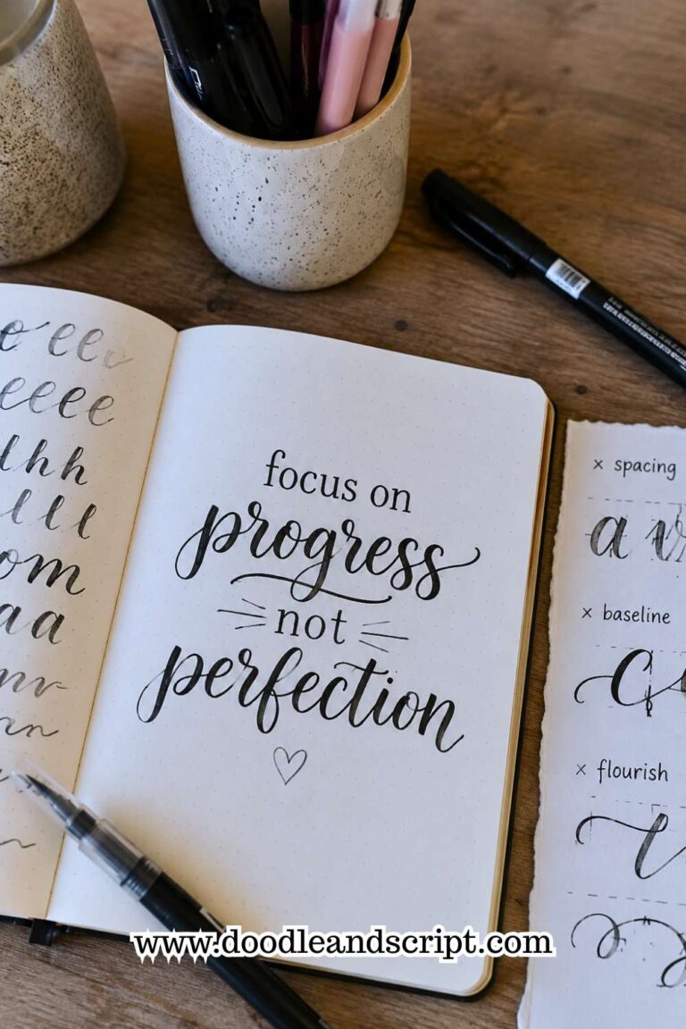
As you practice these Bullet Journal Calligraphy Ideas, focus on progress rather than perfection. Every title teaches you something about spacing, balance, and letter formation.
Over time, those small improvements add up. If you want even more ways to improve your lettering skills, explore How to Practice Bullet Journal Lettering in 21 Days.
The more you experiment, the more confident you will become. Before long, you will start combining techniques, creating variations, and developing your own signature style.
That is when calligraphy becomes even more enjoyable because your journal begins to reflect your creativity in a truly personal way.