15 Common Hand Lettering Mistakes (And How to Fix Them)
Disclosure: Some of the links in this post are affiliate links. This means if you click on the link and purchase an item, I will receive an affiliate commission at no extra cost to you.
Two people can use the same brush pen, the same paper, and even follow the same tutorial, yet one page looks polished while the other feels like something is missing. The difference usually isn’t expensive supplies or natural talent.
It’s often a handful of tiny habits that are easy to overlook but impossible to ignore once you notice them. That’s why understanding Common Hand Lettering Mistakes can completely change the way you practice.
The interesting thing about lettering mistakes is that they rarely announce themselves.
A word might look slightly uneven, a quote may feel unbalanced, or a page simply doesn’t have the polished look you were hoping for. At first, it’s hard to explain why.
Then you spot a pattern; your spacing keeps drifting, your letters change size halfway through a word, or your downstrokes lose consistency. Suddenly, the problem isn’t a mystery anymore; it’s something you can fix.
Before you start refining those details, 17 Lettering Exercises That Instantly Improve Pen Control will help you build the control needed to put every correction into practice.
In this guide, we’ll uncover 15 of the most Common Hand Lettering Mistakes, explain why they happen, and show you simple ways to correct them.
Once you know what to watch for, you’ll spend less time wondering what’s wrong with your lettering and more time creating work you’re genuinely proud of.
15 Common Hand Lettering Mistakes (And How to Fix Them)
1. Skipping Basic Strokes

One of the biggest Common Hand Lettering Mistakes is jumping straight into words before mastering the basic strokes.
It’s exciting to letter quotes and create beautiful designs, but every letter is built from a handful of simple movements. If those movements aren’t consistent, your finished words won’t be either.
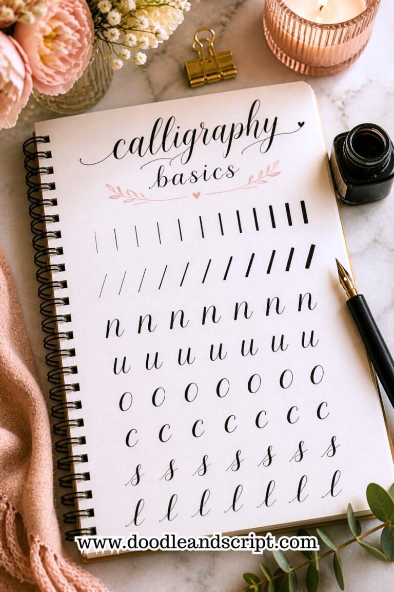
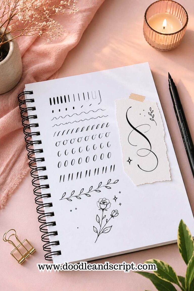
Spend a few minutes at the beginning of each practice session drawing entry strokes, underturns, overturns, loops, and compound curves.
Think of them as a warm-up for your hand. They improve muscle memory and make your lettering feel smoother throughout the page.
Even experienced lettering artists return to these drills because strong fundamentals never go out of style.
The more comfortable you become with these strokes, the less you’ll have to think about them while lettering words. Over time, your hand will naturally create smoother curves and cleaner transitions between letters.
If you’re unsure where to begin, 25 Beginner Lettering Exercises That Actually Work includes simple drills that strengthen the skills behind every beautiful letter.
2. Pressing Too Hard with Your Pen

Many beginners believe pressing harder will create better-looking letters. In reality, too much pressure makes brush pens wear out faster and often produces shaky, uneven strokes.
Instead, let the pen do most of the work. Apply firm pressure only on downstrokes and release it naturally on upstrokes.
This creates the contrast that makes hand lettering look elegant. Practice slowly until changing pressure feels automatic.
Your hand will also become less tired during longer practice sessions, allowing you to letter more comfortably. A relaxed grip gives you much better control than squeezing the pen tightly.
If your fingers begin to ache after only a few minutes, that’s usually a sign you’re applying more pressure than necessary. Remember that smooth, controlled strokes always look better than heavy, uneven ones.
3. Making Every Letter the Same Height

Consistency is important, but that doesn’t mean every letter should be identical. Ascenders, descenders, and capital letters naturally vary in height, creating rhythm throughout a word.
Use guidelines whenever possible, especially while you’re learning. They help keep your x-height consistent while allowing taller and lower letters to stand out naturally.
Over time, your eye will begin recognizing balanced proportions without relying on guide sheets.
Looking closely at professional lettering examples can also help you understand how different letter heights work together. You’ll notice that beautiful lettering feels balanced rather than perfectly uniform.
If you want to understand letter structure better, How to Master the Hand Lettering Alphabet in 15 Simple Steps walks through every letter in a beginner-friendly way.
4. Ignoring Spacing Between Letters

Beautiful letters can’t save poor spacing. Even perfectly formed characters look awkward when they’re squeezed together or spread too far apart.
Instead of focusing only on the letters, pay attention to the empty spaces between them.
Those spaces should feel visually balanced from the beginning of the word to the end. Reading your lettering from a short distance also makes spacing problems much easier to spot.
Another helpful trick is turning your page upside down to evaluate the spacing without being distracted by the actual words.
This allows your eyes to focus on the shapes and gaps instead of the text itself. Developing this habit will gradually improve every lettering project you create.
5. Rushing Through Practice
 Improvement doesn’t happen by filling pages as quickly as possible. When you rush, you repeat mistakes instead of correcting them.
Slow your pace and concentrate on one letter at a time. Pay attention to the beginning and ending of every stroke rather than simply finishing the word.
Practicing with intention produces better results than practicing for hours without focus.
Give yourself permission to pause whenever something doesn’t look right and make small adjustments before moving on. Quality practice is far more valuable than completing dozens of rushed pages.
If you’re looking for a more effective routine, 21 Proven Ways to Improve Your Hand Lettering Faster shares practical habits that help beginners make steady progress.
6. Copying Without Understanding
Studying other lettering artists is an excellent way to learn, but copying every style without understanding why it works can slow your progress.
Instead of tracing a design repeatedly, analyze it. Notice how the artist spaces letters, creates contrast, or balances the composition.
Then apply those principles to your own words rather than reproducing the exact artwork. This approach helps you develop your own creative voice while still learning from experienced artists.
Challenge yourself to recreate the overall feel of a piece instead of every individual stroke.
You’ll learn much more by understanding the design choices than by simply producing an identical copy. Over time, those observations will naturally influence your own unique lettering style.
7. Using Too Many Decorative Elements

Flourishes, banners, shadows, and doodles can enhance lettering, but too many decorations compete with the words themselves.
Start with clean lettering first. Once the words look balanced, add one or two decorative elements that support the design rather than dominate it.
Simplicity often creates a stronger visual impact than excessive detail. Ask yourself whether each decoration improves the design or simply fills empty space.
Removing unnecessary details often makes the lettering appear more polished and professional.
If you’re trying to make your lettering more attractive without overdoing it, 23 Easy Tricks to Create Aesthetic Hand Lettering offers simple ideas that keep designs clean and stylish.
8. Choosing Words That Are Too Long

Long quotes often seem exciting, but they’re surprisingly difficult for beginners to arrange neatly. Many people run out of space halfway through or end up shrinking the final words.
Begin with short quotes or even single words. Smaller projects allow you to focus on letter quality instead of constantly adjusting your layout.
Once you’re comfortable with spacing and composition, longer phrases become much easier to manage. Completing smaller projects also gives you a sense of accomplishment that keeps you motivated to practice.
As your confidence grows, gradually increase the length of your quotes instead of making a huge jump all at once. This steady progression will help you improve without becoming discouraged.
9. Not Planning Your Layout First

Many beginners dive straight into lettering without thinking about where the words will sit on the page.
A design may start off looking great, but by the final line, the spacing feels cramped or the last word barely fits. This is one of those Common Hand Lettering Mistakes that can ruin an otherwise beautiful piece.
Before you touch your brush pen, lightly sketch the placement of your words with a pencil.
Decide which words should be the largest, where line breaks will go, and how much empty space you want around the design. A quick layout sketch only takes a few minutes, but it prevents frustrating mistakes later.
It also gives you the freedom to experiment with different arrangements before committing to ink. As you gain experience, planning your layout will become second nature.
If you’d like to create lettering that feels balanced from the very beginning, 13 Secrets to Creating Beautiful Hand Lettering Compositions will help you understand how to arrange words like a designer.
10. Holding Your Pen Too Tightly

It’s common to grip your pen tightly when you’re concentrating, especially if you’re worried about making mistakes.
Unfortunately, a tense grip reduces flexibility and often causes shaky lines, uneven curves, and tired hands.
Try relaxing your fingers and letting your wrist move naturally across the page. Hold the pen firmly enough to control it, but not so tightly that your hand becomes stiff.
You should be able to write for several minutes without your fingers feeling sore. Taking short breaks during longer practice sessions also helps prevent fatigue and keeps your strokes consistent.
A relaxed hand produces smoother lettering because your movements become more fluid and controlled. The more comfortable you feel while writing, the more enjoyable your practice sessions will become.
11. Comparing Your Progress to Other Artists

Social media makes it easy to compare your work with artists who have been lettering for years.
Looking at their polished pages can make it seem like you’re improving too slowly, even when you’re making steady progress.
Instead of comparing yourself to someone else’s tenth year of practice, compare today’s work with something you created a month ago.
That’s where you’ll see your real improvement. Save your early practice sheets instead of throwing them away because they become valuable reminders of how much you’ve learned.
Every experienced lettering artist started exactly where you are now. Progress isn’t measured by perfection; it’s measured by consistency.
If you need encouragement and practical advice, 17 Hand Lettering Tips Every Beginner Should Know will help you stay motivated throughout your journey.
12. Practicing Only When You Feel Inspired
Waiting for inspiration sounds appealing, but it often leads to long gaps between practice sessions. Hand lettering is a skill that improves through regular repetition, not occasional bursts of motivation.
Create a simple routine that fits your schedule, even if it’s only ten or fifteen minutes a day.
Short, consistent practice sessions are far more effective than practicing for several hours once every few weeks. Keeping your supplies in an easy-to-reach place also removes excuses and makes it easier to build the habit.
Before long, picking up your pen will become part of your daily routine instead of something you only do when inspiration strikes. Consistency builds confidence, and confidence leads to noticeable improvement.
13. Avoiding Mistakes Instead of Learning from Them

Many beginners throw away pages as soon as they notice a mistake. While that may feel satisfying in the moment, it also removes valuable opportunities to learn.
Instead of starting over immediately, study the page and identify what went wrong. Did the spacing become uneven? Were your downstrokes inconsistent?
Did you rush through the final few words? Answering these questions helps you avoid repeating the same mistake next time. Keeping imperfect pages creates a visual record of your progress that you’ll appreciate later.
Some of your greatest improvements will come from understanding your mistakes rather than hiding them.
If you’re looking for fresh projects to apply what you’ve learned, 27 Easy Hand Lettering Ideas Every Beginner Should Try is filled with creative ways to practice.
14. Sticking to Only One Lettering Style

It’s natural to have a favorite lettering style, but using only one style can limit your growth.
Exploring different approaches strengthens your understanding of letterforms and helps you become a more versatile artist.
Spend time experimenting with script lettering, serif lettering, sans serif, block letters, and playful decorative fonts. Every style teaches you something different about spacing, proportions, and composition.
You may even discover a style you enjoy more than your current favorite. Trying new styles also keeps practice sessions exciting because every page feels like a fresh challenge.
The wider your experience becomes, the easier it is to develop a unique style that feels completely your own.
If you’re ready to branch out, 11 Hand Lettering Styles Every Beginner Should Try is an excellent place to begin.
15. Expecting Perfect Results Too Soon
Perhaps the most common mistake of all is believing your lettering should look professional after only a few practice sessions.
Hand lettering is a skill, and like every skill, it develops gradually through patience, repetition, and curiosity.
Give yourself permission to be a beginner. Every page teaches you something, even if it doesn’t turn out the way you hoped. Celebrate small improvements, whether it’s smoother curves, better spacing, or more confident strokes.
Those little victories eventually become big transformations. The artists you admire today reached their level by practicing through countless imperfect pages.
Keep showing up, trust the process, and enjoy watching your skills grow.
When you’re ready for your next challenge, Beginner Hand Lettering Ideas: 27 Easy Projects Every Beginner Should Try will give you plenty of creative ways to continue improving.
Final Thoughts
Making mistakes is part of every creative journey, and hand lettering is no exception. The good news is that most Common Hand Lettering Mistakes are easy to correct once you know what to look for.
Whether you’re working on smoother strokes, better spacing, or stronger layouts, every small improvement brings you one step closer to lettering with confidence.
Don’t try to fix every mistake at once. Pick one habit from this list, focus on it for a few practice sessions, and then move on to the next.
You’ll make far more progress by improving one skill at a time than by trying to perfect everything overnight.
Most importantly, enjoy the learning process. Every page you complete is another opportunity to grow as a lettering artist.
When you’re ready to strengthen your foundation even further, Easy Hand Lettering Tutorial: Learn in 21 Minutes is the perfect next step for building consistent, confident lettering skills.