11 Decorative Bullet Journal Lettering Ideas for Stunning Pages
Disclosure: Some of the links in this post are affiliate links. This means if you click on the link and purchase an item, I will receive an affiliate commission at no extra cost to you.
What if the secret to better-looking bullet journal pages is not learning a new font at all? Most people spend their time searching for lettering styles, practicing alphabets, and copying title ideas.
Meanwhile, some of the most eye-catching journal pages get their charm from something much simpler.
The letters themselves may be fairly basic, but the decorative details around them make them impossible to ignore.
That is what makes Decorative Bullet Journal Lettering so much fun to explore. Instead of focusing only on how the letters are written, you start thinking about how they interact with the rest of the page.
A title can weave through leaves, sit inside a banner, sparkle with tiny accents, or stand out with clever shadows and patterns. Suddenly, the lettering becomes part of the design instead of just a label at the top of the page.
The good thing about these decorative techniques is that they work for almost any skill level. You do not need perfect handwriting or advanced drawing skills to make a title look special.
Often, a few thoughtful details can have a bigger impact than an elaborate font. If you are ready to give your journal pages a little more personality, these Decorative Bullet Journal Lettering ideas are a great place to start.
If you need extra inspiration first, explore 23 Beautiful Bullet Journal Lettering Ideas You’ll Want to Copy.
11 Decorative Bullet Journal Lettering Ideas for Stunning Pages
1. Wrap Your Letters with Delicate Vines
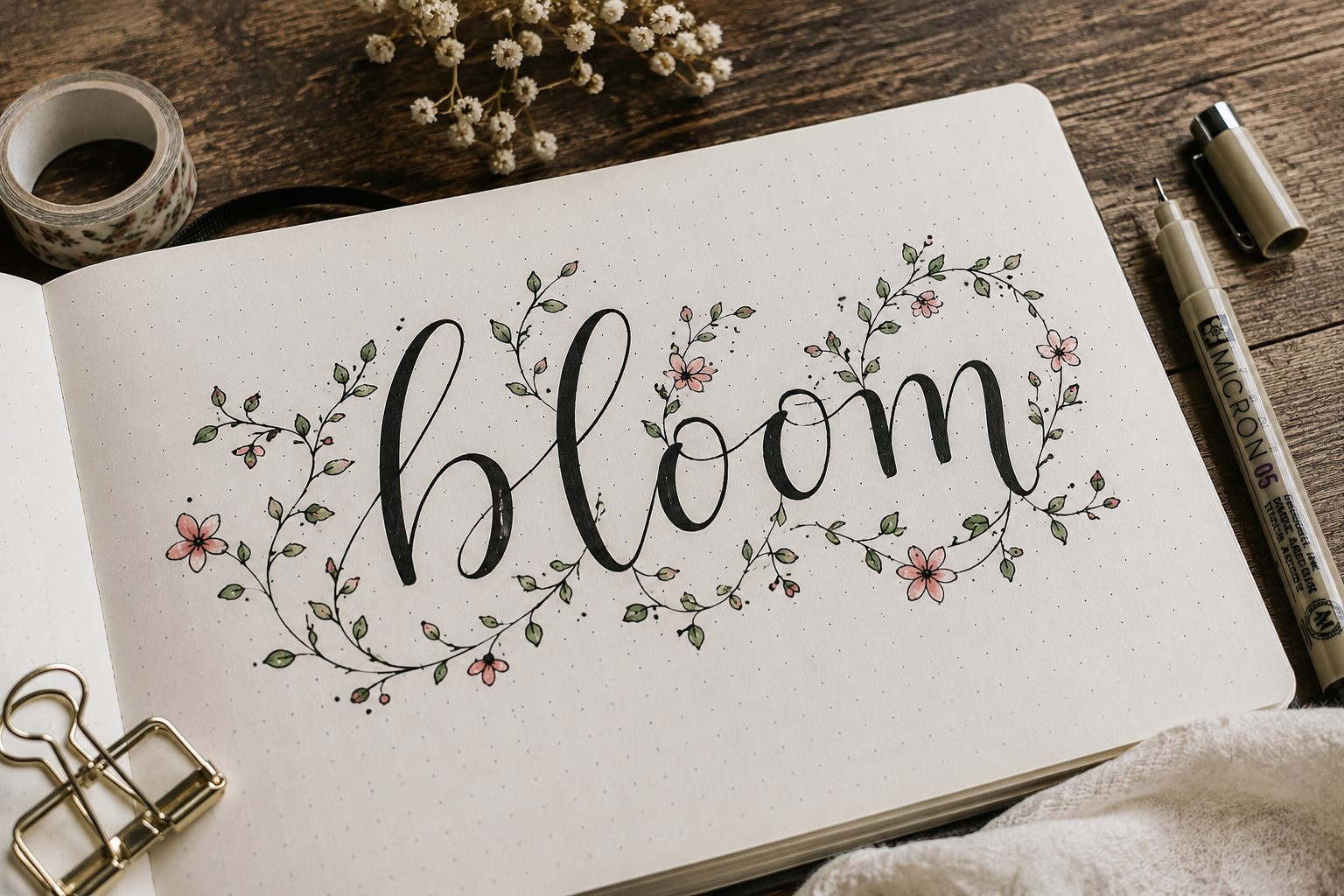
One of the easiest ways to create Decorative Bullet Journal Lettering is by adding vines around your words.
The lettering can stay simple while the vines add movement and personality to the title. This technique works especially well for monthly covers, gratitude logs, and reading journals.
Start by writing your title first. Then add a thin vine that curls around a few letters or flows beneath a word.
Small leaves can be added along the vine to make the design feel more complete. The goal is to enhance the lettering, not hide it behind decorations.
A common mistake is adding too many leaves and swirls. When every space is filled, the title can start to look cluttered. A few carefully placed vines usually create a cleaner and more attractive result.
What makes this style so popular is its versatility. By changing the shape of the leaves or the direction of the vines, you can give the same lettering a completely different feel.
Small decorative details like these can make Decorative Bullet Journal Lettering look much more creative without requiring advanced drawing skills.
If you are looking for more creative title inspiration, explore 21 Bullet Journal Title Lettering Ideas That Look Professional.
2. Add Tiny Sparkles Around Important Words

Sparkles are a simple way to make Decorative Bullet Journal Lettering feel more playful and eye-catching. They work especially well when you want certain words to stand out without changing the lettering style itself.
The key is placing the sparkles strategically. Add a few around the beginning or end of a title, or use them to draw attention to the most important word.
Small starbursts, diamonds, and dots all work well. You do not need many to create an impact.
One mistake beginners make is scattering sparkles everywhere. Too many can make a page feel busy and take attention away from the lettering. A few well-placed sparkles usually look cleaner and more intentional.
Sparkles are also incredibly versatile. They can make a spread feel dreamy, magical, elegant, or fun depending on the style you choose.
That flexibility makes them one of the easiest decorative elements to use in Decorative Bullet Journal Lettering.
3. Decorate Letters with Tiny Florals
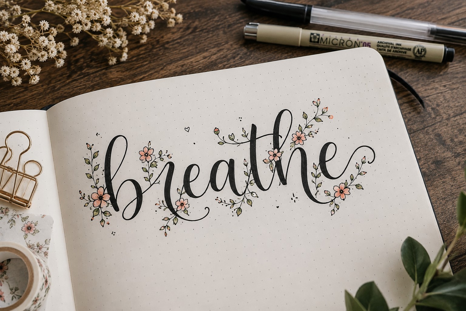
Tiny flowers can instantly make lettering feel softer and more decorative. Instead of drawing large floral arrangements around the title, add small blooms directly to the letters themselves.
You can replace the dot above an “i” with a flower, add petals to the ends of letters, or tuck tiny blossoms into empty spaces within the title. These small details add charm without overwhelming the page.
The best part is that the flowers do not need to be realistic. Simple daisies, tiny roses, and basic five-petal flowers often create the prettiest results. Keeping the flowers small helps the lettering remain easy to read.
If you enjoy elegant journal styles, take a look at 25 Aesthetic Bullet Journal Lettering Ideas You’ll Love.
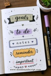
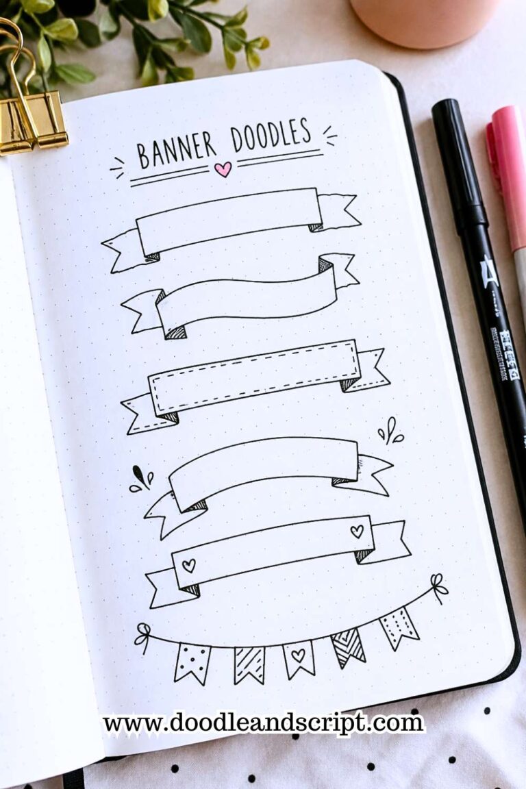
4. Use Decorative Banners as Part of the Design

A banner does more than hold a title. It can become part of the overall lettering design. Even simple handwriting can look more polished when placed inside a banner.
Try experimenting with different banner shapes instead of using the same ribbon style every time.
Curved banners, layered banners, and simple folded ribbons can all create different effects. The shape you choose can completely change the personality of the title.
The trick is making sure the banner supports the lettering rather than overpowering it. The words should remain the focus, while the banner helps frame them and create structure.
Banners are especially useful for monthly covers, section dividers, and goal-setting pages because they naturally attract attention.
If you love creative banner ideas, explore 21 Cute Bullet Journal Banner Doodles Anyone Can Draw.
5. Fill Large Letters with Fun Patterns

Patterns are a great way to add interest to large lettering. Instead of leaving oversized letters empty, fill them with designs such as dots, stripes, stars, hearts, waves, or geometric shapes.
This technique works best when the letters are large enough for the patterns to be visible. Tiny patterns can add texture and make a title feel more creative without changing the overall font style.
One reason people love this technique is its flexibility. The same lettering style can look completely different depending on the pattern you choose.
That means you can reuse your favorite fonts while keeping your pages fresh and interesting. If you want more font inspiration, check out 29 Bullet Journal Font Ideas to Make Your Pages Pop.
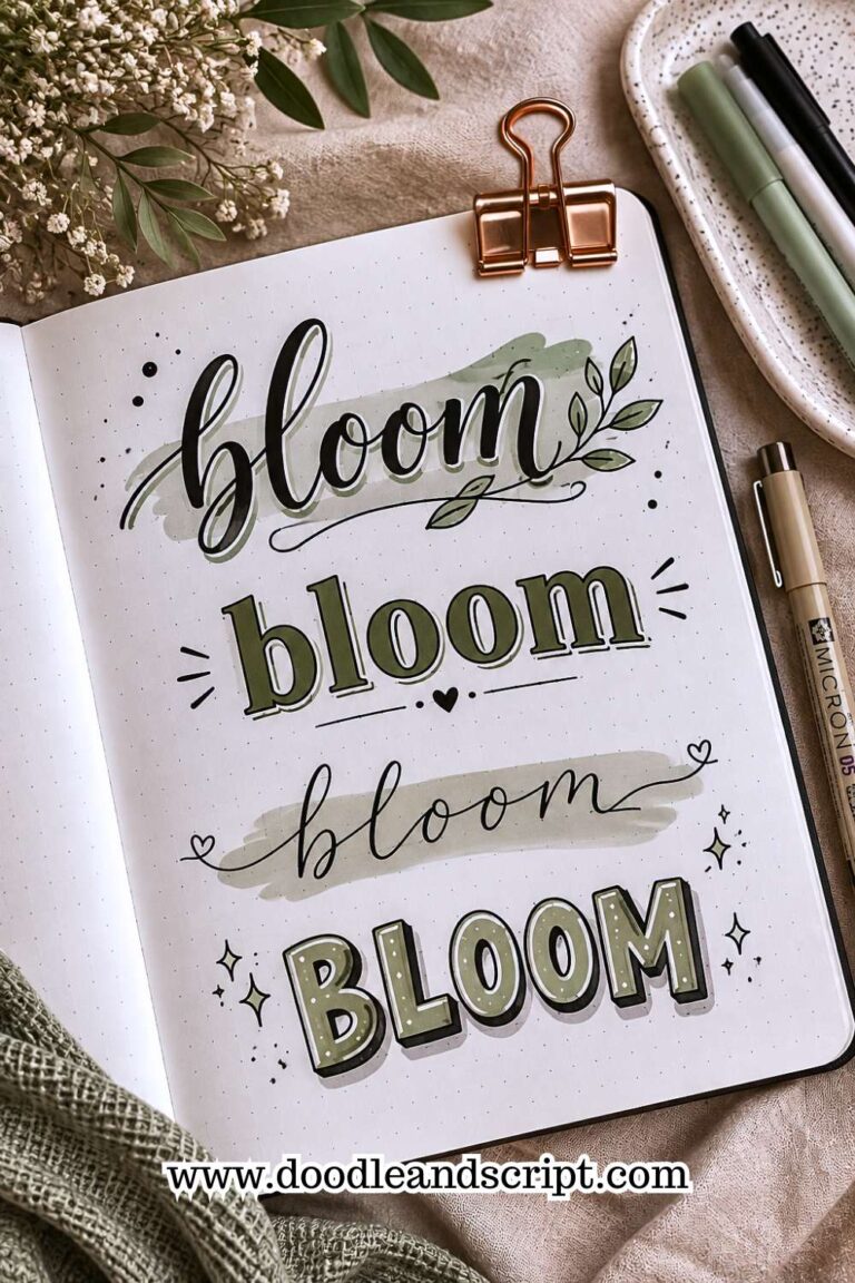
6. Create a Decorative Shadow
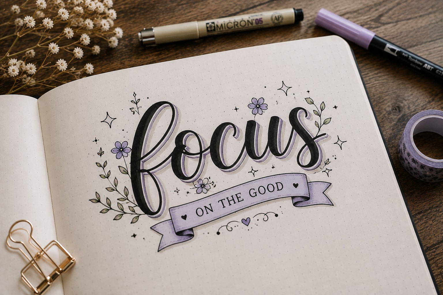
Most people use shadows simply to add depth, but shadows can also become decorative elements. Instead of leaving the shadow plain, fill it with tiny patterns, dots, stars, or simple doodles.
This creates a more creative look while still keeping the dimensional effect that shadows provide. The technique works particularly well with bold lettering because there is more space for decorative details.
The key is keeping the shadow design simple enough that the title remains readable. The shadow should support the lettering, not compete with it.
Decorative shadows are a great way to experiment with Decorative Bullet Journal Lettering because they build on a technique many journal users already know.
If you enjoy expressive lettering styles, explore 17 Creative Bullet Journal Calligraphy Ideas to Try Today.
7. Let Decorative Lines Become Part of the Lettering
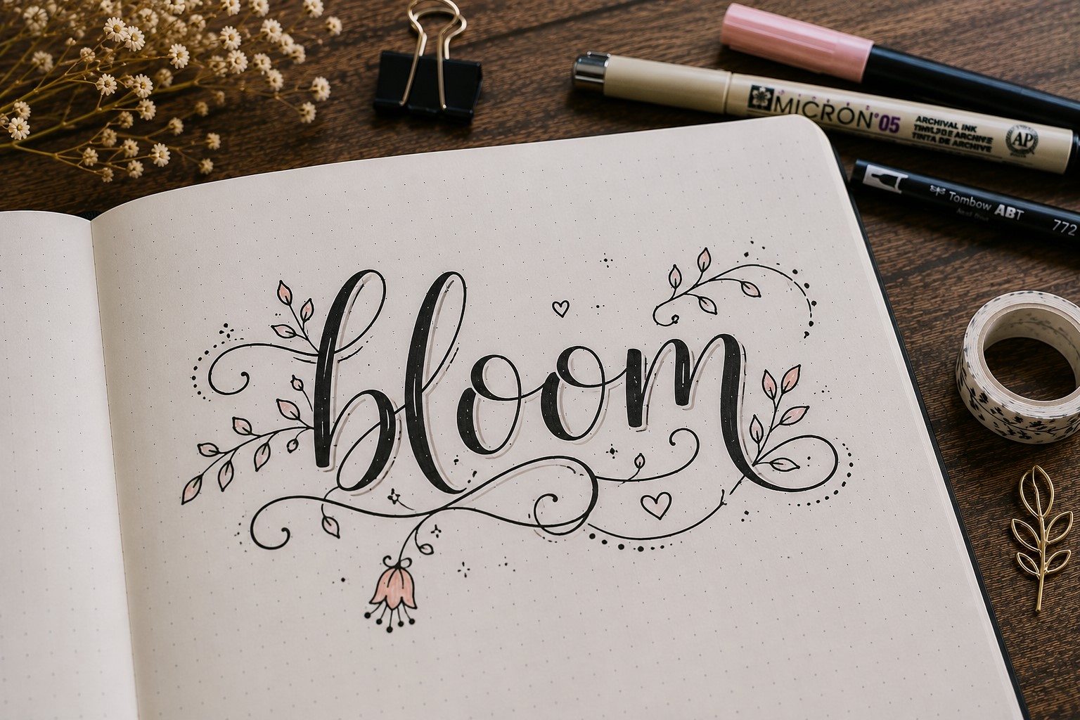
Decorative lines can do much more than sit underneath a title. They can help connect words, guide the eye across the page, and make the lettering feel more dynamic.
A simple swirl, wave, or looping line can completely change the look of a heading.
One easy trick is to extend the last stroke of a letter into a decorative flourish. This helps the decoration feel connected to the lettering rather than added as an afterthought. The result often looks more natural and polished.
The key is not overdoing it. Long, complicated flourishes can make a title difficult to read. A few well-placed curves usually create a stronger effect.
Small details like these can make Decorative Bullet Journal Lettering feel much more intentional.
If you enjoy adding playful details to your pages, explore 27 Easy Bullet Journal Doodle Ideas for Every Page.
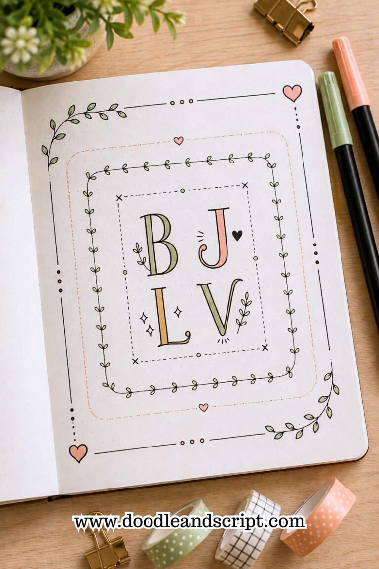
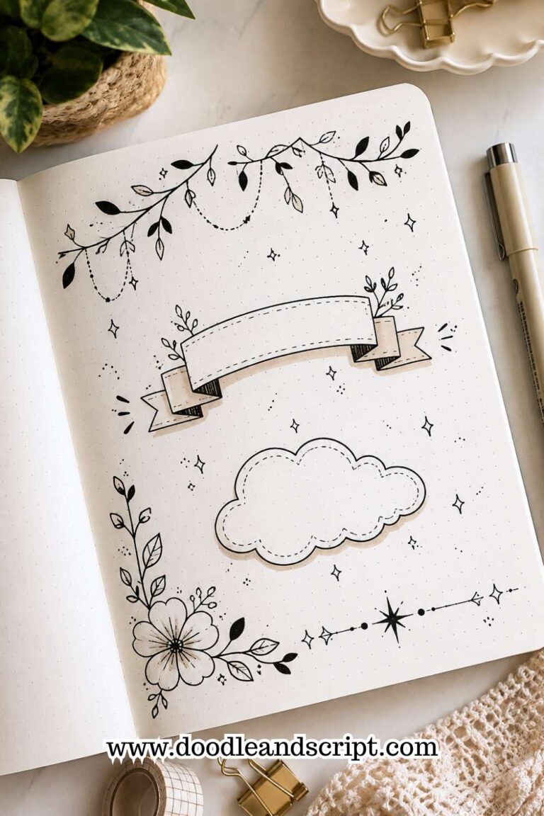
8. Build a Decorative Frame Around Your Title

Sometimes the easiest way to make a title stand out is to decorate the space around it. A decorative frame naturally draws attention to the lettering and helps create a clear focal point on the page.
The frame can match the theme of your spread. Floral frames work beautifully for spring layouts, while geometric borders can create a cleaner and more modern appearance. Even a simple border can make a title feel more important.
The mistake many people make is creating a frame that is too heavy. Thick borders and excessive decorations can distract from the lettering. A lighter frame often creates a more balanced and attractive result.
If you love decorative page elements, take a look at 15 Easy Bullet Journal Doodle Borders Anyone Can Draw.
9. Turn the First Letter into a Statement Piece
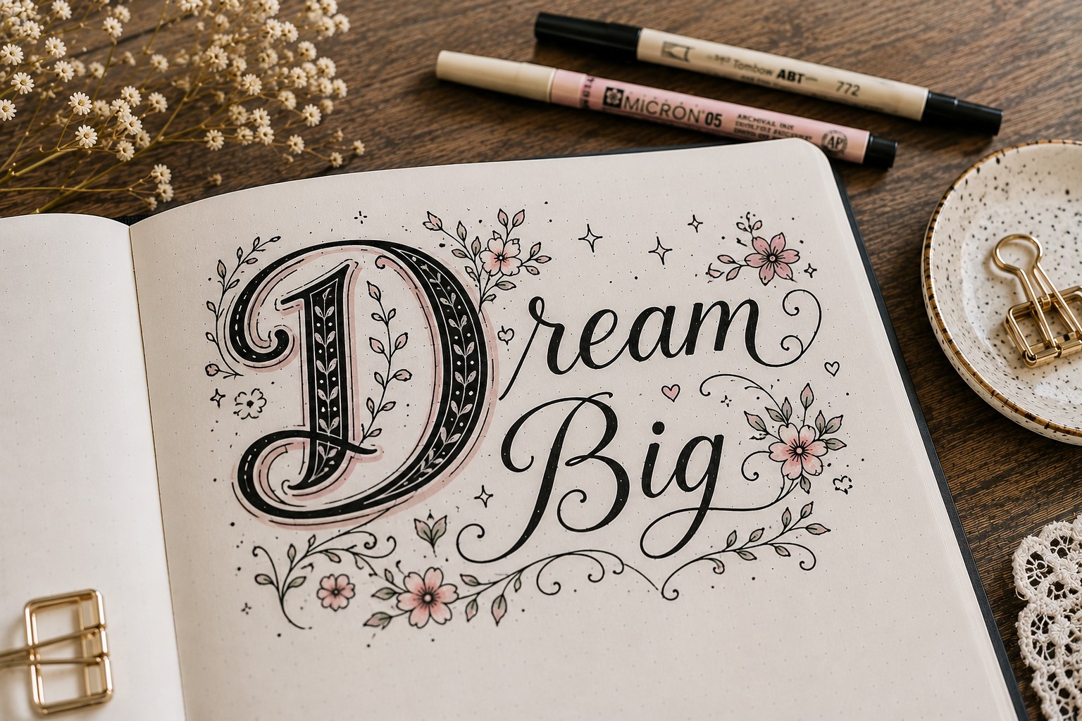
One of the oldest decorative lettering techniques is making the first letter larger and more detailed than the rest. This instantly creates a focal point and gives the title a more artistic feel.
You can decorate the first letter with patterns, florals, shadows, or small doodles that match the theme of the spread. The rest of the title can remain fairly simple, allowing the decorative letter to grab attention.
This technique works because it creates contrast. Your eyes notice the detailed letter first and then naturally move through the rest of the title.
It is a simple way to make Decorative Bullet Journal Lettering feel more creative without decorating every single letter.
If you want more header inspiration, explore How to Make Beautiful Bullet Journal Headers in 13 Easy Steps.
10. Match Your Decorations to the Theme
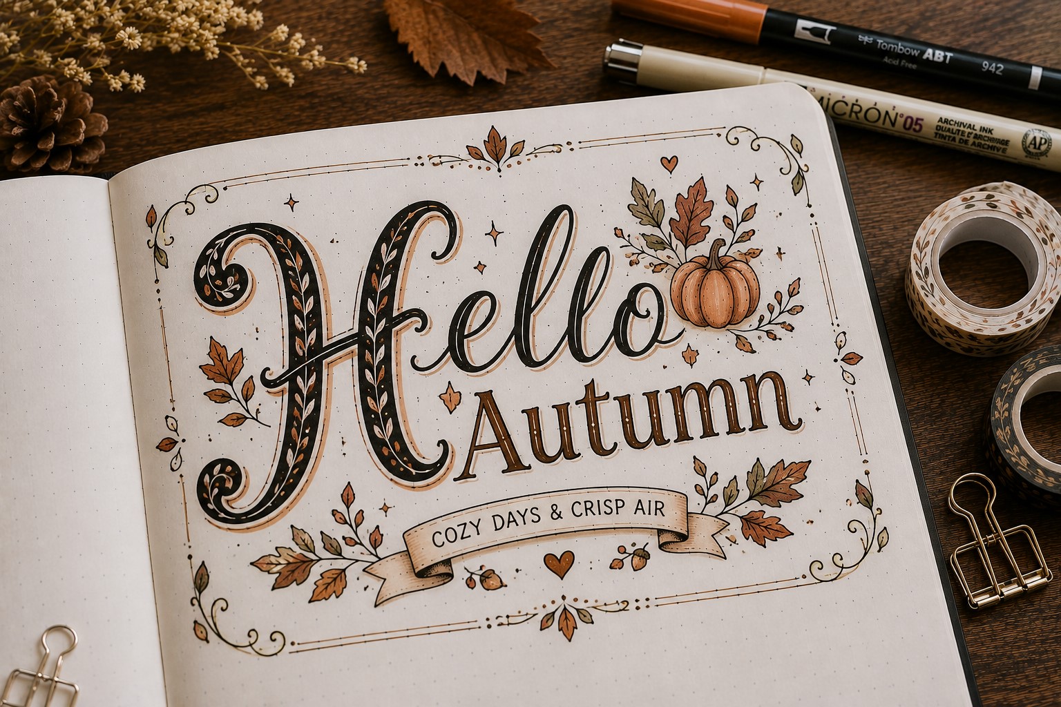
Decorative lettering looks best when it feels connected to the page. Instead of adding random decorations, choose elements that support the theme of the spread.
A reading journal might include tiny books or bookmarks. A travel spread could feature airplanes, maps, or arrows.
A self-care page may benefit from florals, hearts, or calming botanical details. These small touches help create a cohesive design.
The goal is not to fill every empty space. A few thoughtful decorations often create a stronger result than dozens of unrelated doodles.
When the decorations support the theme, the entire page feels more polished and intentional.
If you need more title inspiration, check out How to Create Gorgeous Bullet Journal Headers in 15 Steps.
11. Combine Multiple Decorative Techniques
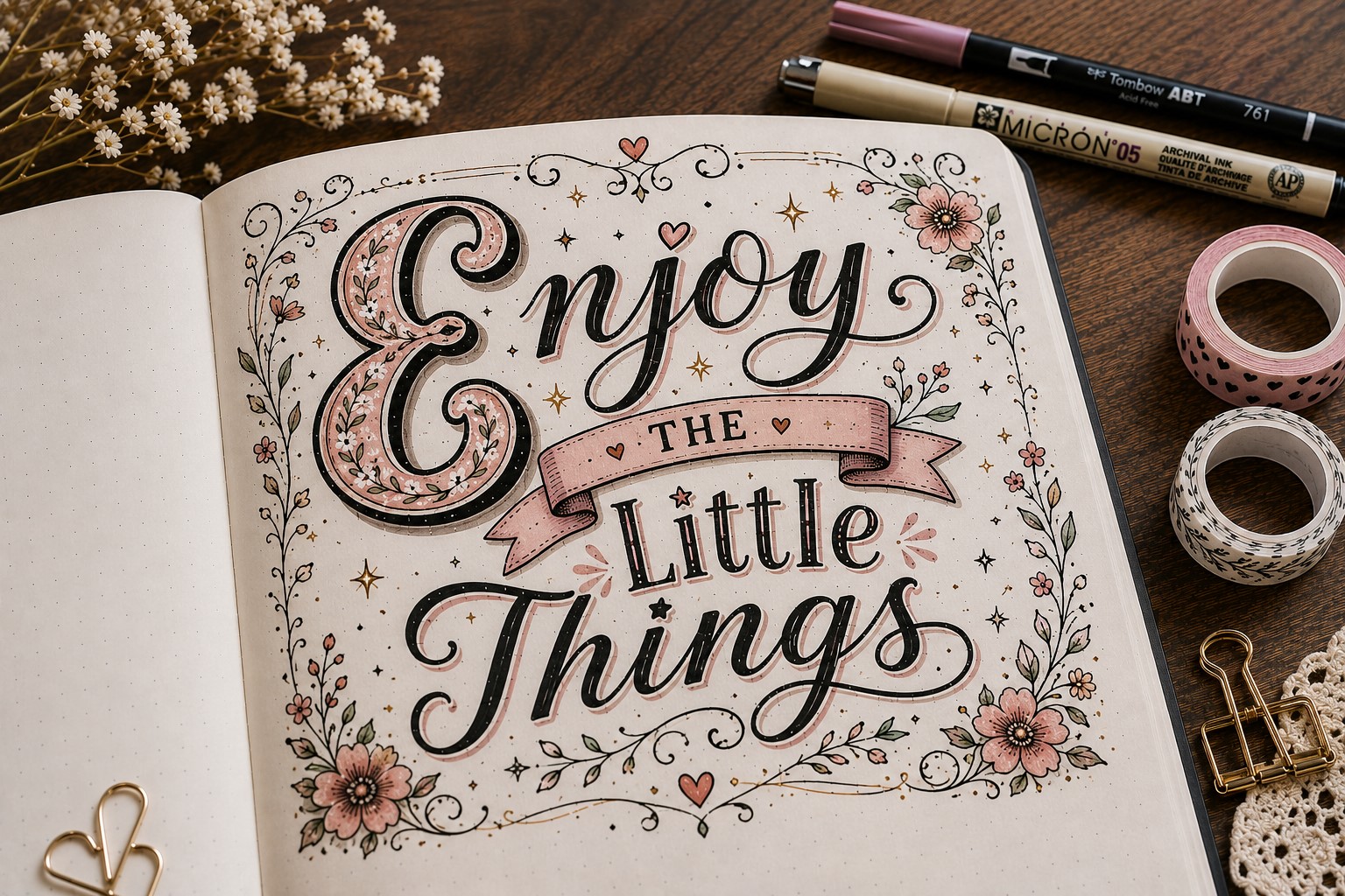
Once you become comfortable with different decorative elements, try combining them. A title might include a banner, decorative shadow, floral accents, and a few sparkles all working together.
The trick is choosing techniques that complement each other. Too many competing details can make the page feel cluttered.
Two or three decorative elements usually create a stronger result than using everything at once.
A good way to practice is by starting with a simple title and adding one decorative feature at a time. This makes it easier to see which details improve the design and which ones feel unnecessary.
As you experiment, you will begin discovering combinations that fit your style. That is often when Decorative Bullet Journal Lettering becomes the most enjoyable because your pages start developing a unique look of their own.
If you want to improve your lettering consistency, explore How to Practice Bullet Journal Lettering in 21 Days.
Final Thoughts
The best thing about Decorative Bullet Journal Lettering is that you do not need artistic talent to make it work. Most of these ideas rely on small details rather than complicated techniques.
A few sparkles, a decorative shadow, or a simple floral accent can completely change the way a title looks. The more you experiment, the easier it becomes to spot opportunities to add personality to your pages.
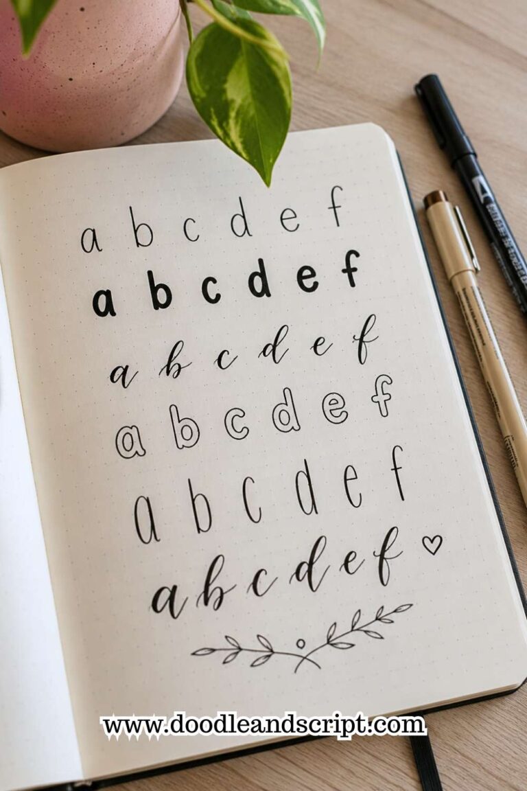
As you try these ideas, remember that decorative lettering does not have to start with an elaborate font. In fact, many beautiful designs begin with simple handwriting.
Once you have a solid foundation, it becomes much easier to add creative details that enhance the lettering instead of distracting from it.
If you want to strengthen that foundation, explore 19 Easy Bullet Journal Fonts Anyone Can Learn. Another helpful approach is learning a few reliable lettering styles that you can use repeatedly.
Having a small collection of go-to styles makes it easier to create attractive headers without spending ages deciding what to write.
For more inspiration, check out 15 Easy Bullet Journal Lettering Styles Every Beginner Should Learn.
Finally, do not be afraid to let your personality show through your lettering. The most memorable journal pages are often the ones that feel personal rather than perfect.
Mix techniques, try new combinations, and create designs that make you excited to open your journal again. If you need more creative inspiration, take a look at 17 Bullet Journal Quote Lettering Ideas That Stand Out.