19 Beautiful Ways to Letter Quotes Like a Pro
Disclosure: Some of the links in this post are affiliate links. This means if you click on the link and purchase an item, I will receive an affiliate commission at no extra cost to you.
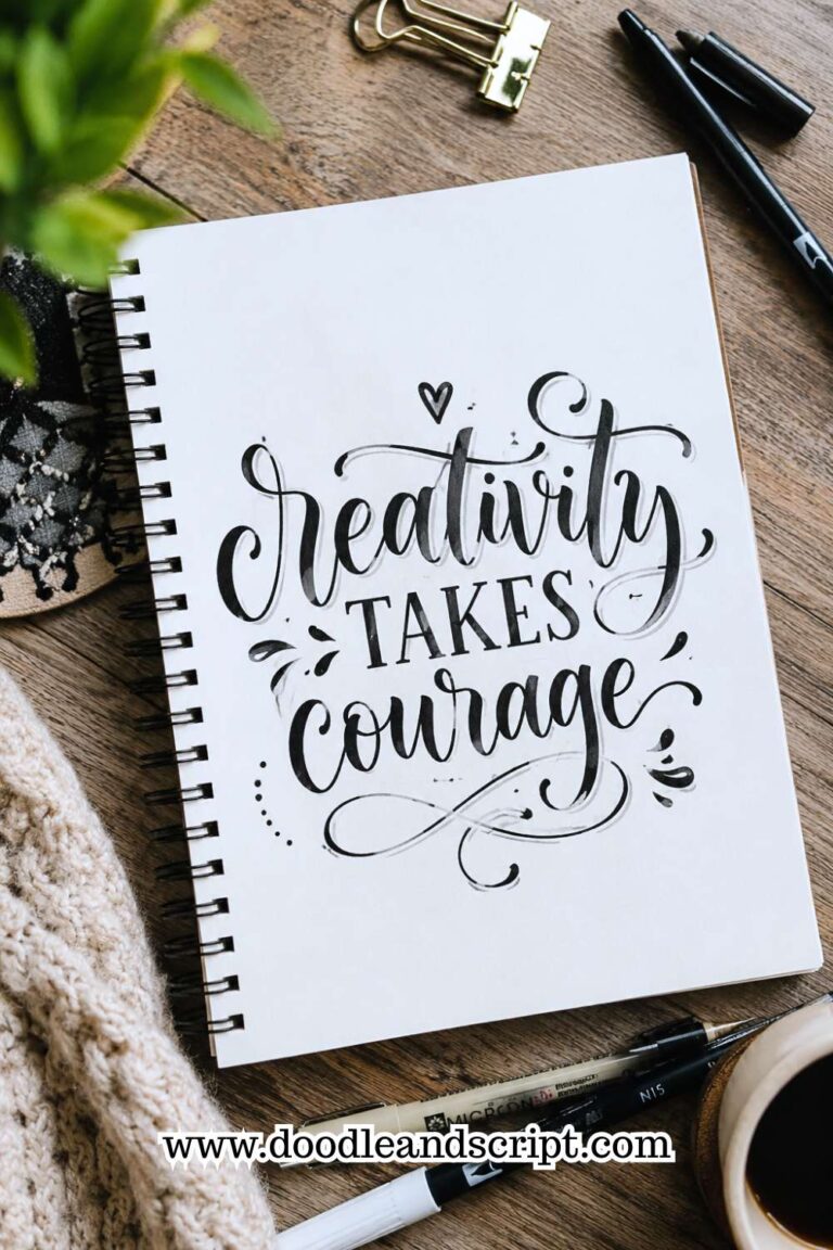
The right lettering can make a familiar saying feel inspiring again. It naturally draws attention to the most important words and gives the message its own unique style.
It’s the reason one hand-lettered quote ends up framed on a wall while another is quickly forgotten. Learning Beautiful Ways to Letter Quotes is really about learning how to make words feel as powerful as they sound.
The secret isn’t writing every word in an elaborate script or filling empty spaces with decorations. In fact, the most striking quote designs often rely on thoughtful choices that most people never notice.
A single bold word, a well-placed line break, or a little extra breathing room can completely change the mood of the entire piece. Once you begin paying attention to those small details, you’ll start looking at every quote differently.
Before creating your next lettering project, 13 Secrets to Creating Beautiful Hand Lettering Compositions will show you how to build layouts that feel balanced, intentional, and professional.
In this guide, we’ll explore 19 Beautiful Ways to Letter Quotes that go beyond simply writing words on paper.
You’ll learn how to arrange, emphasize, and style your favorite quotes so they capture attention, tell a story, and leave a lasting impression.
19 Beautiful Ways to Letter Quotes Like a Pro
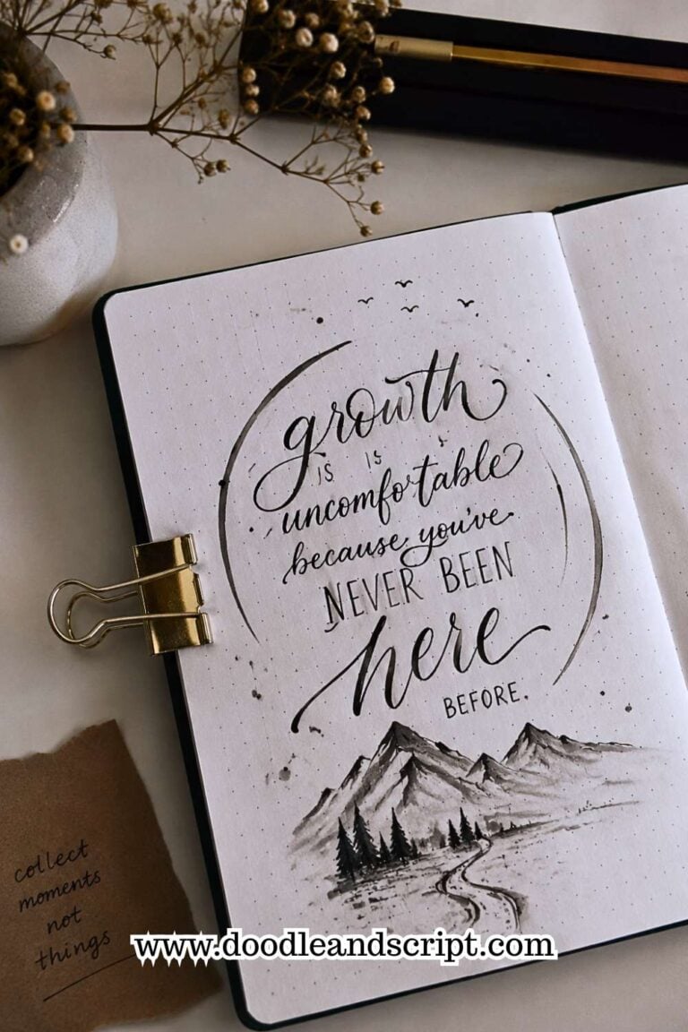
1. Make the Most Important Words Stand Out

One of the easiest ways to learn Beautiful Ways to Letter Quotes is by deciding which words deserve the most attention.
Instead of giving every word the same size and style, choose one or two keywords that carry the main message. Words like Hope, Believe, Dream, or Love naturally make strong focal points.
You can make these important words larger, bolder, or use a completely different lettering style from the rest of the quote. The remaining words should support the design instead of competing with it.
This creates a clear visual hierarchy that guides the reader’s eyes through the quote. Before you begin, read the quote several times so you understand its meaning.
Knowing the message makes it much easier to decide which words deserve the spotlight. If you’d like to improve your layouts even more, How to Create Modern Hand Lettering in 17 Easy Steps shares practical design techniques that work beautifully with quotes.
2. Mix Two Lettering Styles

Using only one lettering style can sometimes make a quote look flat. Mixing styles adds contrast and helps create a more interesting composition.
Try pairing bold block letters with flowing script or combine a simple sans serif font with elegant brush lettering. The contrast makes your design feel more dynamic without becoming difficult to read.
Limit yourself to two styles when you’re starting out so the page still feels balanced. Too many fonts can make the quote look busy instead of beautiful.
As you gain experience, you’ll naturally discover combinations that match your personal style. If you’re unsure where to begin, 11 Hand Lettering Styles Every Beginner Should Try introduces styles that work well together.
3. Break Long Quotes into Shorter Lines

Many beginners try to fit an entire quote onto one long line. This often creates awkward spacing and makes the design harder to read.
Instead, break your quote into smaller sections that feel natural. Group words that belong together and leave enough space between each line.
This makes the layout look balanced while giving the reader’s eyes a comfortable path to follow.
Don’t be afraid to experiment with different line breaks before choosing your final arrangement. A quick pencil sketch can save you from having to start over later. Even a simple quote becomes more attractive when it’s thoughtfully divided across the page.
4. Leave Plenty of White Space

One of the biggest mistakes beginners make is trying to fill every empty corner with words or decorations. In reality, white space is an important part of good design.
Giving your lettering room to breathe makes the entire piece look cleaner and easier to read. Empty space naturally draws attention to the quote itself instead of distracting from it.
Resist the urge to add extra flourishes simply because an area looks empty. Professional lettering often feels calm because it isn’t overcrowded.
White space creates balance, improves readability, and gives your finished piece a polished appearance.
If you’ve struggled with crowded layouts before, 15 Common Hand Lettering Mistakes (And How to Fix Them) explains how to avoid this common problem.
5. Sketch Your Layout First

Even experienced lettering artists rarely begin with ink. They usually create a quick pencil sketch to test different layouts before committing to the final design.
A rough sketch helps you check spacing, alignment, and word placement while mistakes are still easy to erase. It also gives you the confidence to experiment with different ideas without worrying about ruining your page.
Spending five minutes planning often saves much more time later. You’ll also feel less pressure because you’ve already solved most layout problems before picking up your pen. This simple habit can dramatically improve the quality of your finished quotes.
6. Use Different Letter Sizes

Not every word should have the same visual weight. Changing letter sizes creates movement and makes the design more engaging.
Choose larger letters for important words and smaller ones for supporting text. This technique naturally directs attention to the message you want readers to remember most.
Be careful not to make the size differences too extreme, or the design may feel unbalanced. Gradual contrast usually looks more polished than dramatic changes.
As you practice, you’ll develop a better eye for choosing the right proportions.
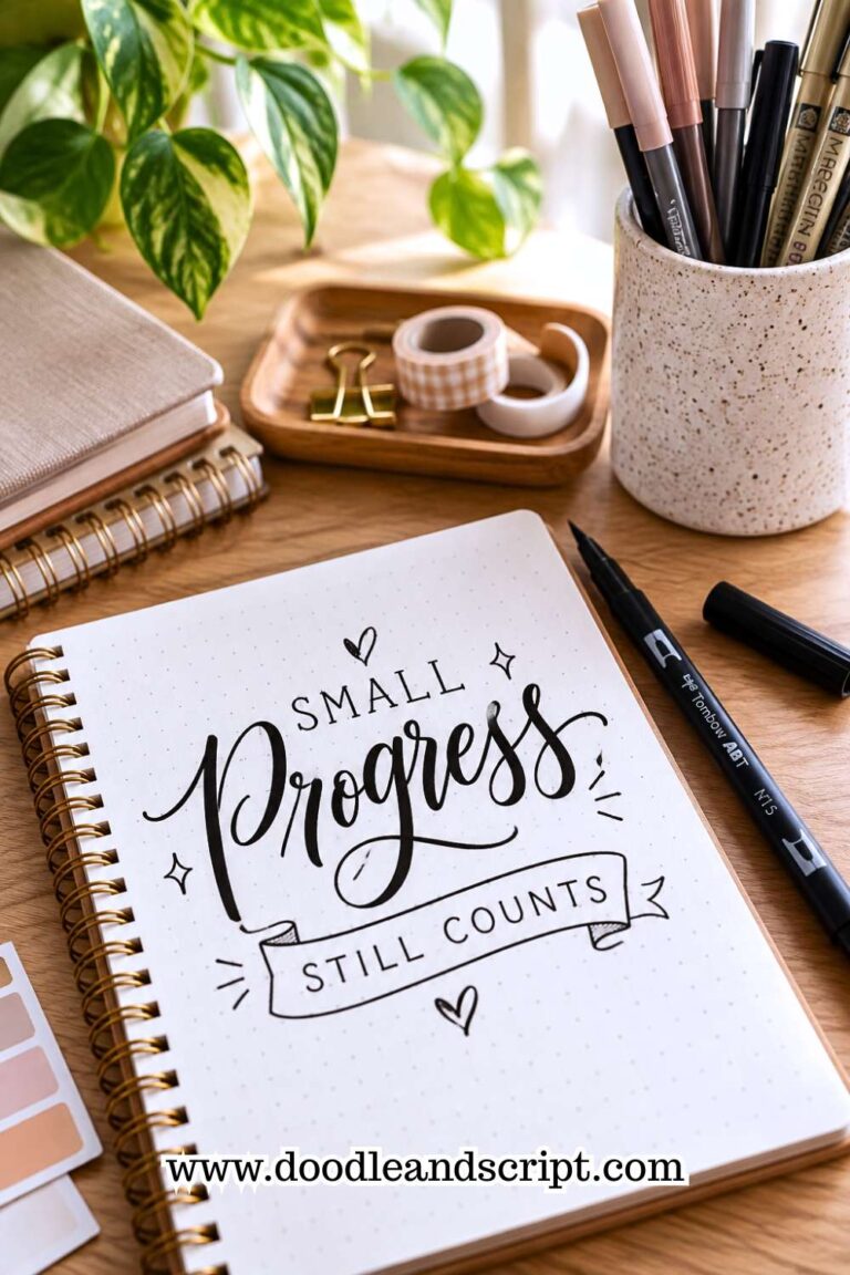
7. Add Simple Decorative Elements

Decorations should enhance your quote rather than compete with it. Small leaves, stars, hearts, banners, or dotted lines can beautifully frame your lettering.
Choose decorations that match the mood of the quote. A motivational quote may suit clean banners, while a floral quote pairs well with delicate leaves or flowers.
Keep your embellishments simple so the lettering remains the main attraction. If every empty space is filled with decoration, the message becomes harder to appreciate.
Small details often have the greatest impact when they’re used thoughtfully. For more creative design ideas, 23 Easy Tricks to Create Aesthetic Hand Lettering offers plenty of inspiration.
8. Choose Quotes That Mean Something to You
 You’ll enjoy lettering much more when the words have personal meaning. A quote that inspires you naturally encourages you to spend more time creating a beautiful design.
Whether it’s a favorite book quote, Bible verse, song lyric, or personal motto, meaningful words make every project feel more rewarding. You’ll also be more motivated to finish the piece because the message matters to you.
Personal connection often shines through in your work and makes it feel more authentic. As your collection grows, you’ll have a notebook filled with quotes that continue to inspire you long after you’ve finished lettering them.
9. Create Contrast with Bold and Simple Lettering

One of the easiest methods to learning Beautiful Ways to Letter Quotes is to create contrast between different parts of the quote. If every word is written using the same lettering style, the design can feel flat and predictable.
By pairing bold lettering with a simpler style, you instantly create a quote that’s easier to read and much more interesting to look at.
Start by identifying the most meaningful words in the quote. Those words can be written in large brush lettering, while supporting words stay smaller and simpler.
This naturally guides the reader’s eyes through the design without you having to add lots of decorations. The contrast also helps communicate the emotion behind the message, making important words feel even more powerful.
Be careful not to overdo it by making every other word bold. Too much contrast creates confusion instead of emphasis.
Usually, highlighting one or two words is enough to create balance while keeping the quote easy to follow.
If you’re still experimenting with lettering styles, 11 Hand Lettering Styles Every Beginner Should Try will introduce combinations that work beautifully together.
10. Use Bounce Lettering for Extra Personality

If a quote feels a little stiff or formal, adding bounce lettering can instantly make it feel friendlier and more energetic.
Bounce lettering creates gentle movement by allowing selected letters to rise above or dip below the baseline. When used carefully, it gives your quote a relaxed and playful personality.
This technique works especially well for cheerful words like Smile, Joy, Bloom, Happy, and Dream. Instead of bouncing every letter, choose one or two letters in each important word.
Small movements often have a much stronger effect than dramatic ones because they keep the quote balanced and readable.
Many beginners make the mistake of forcing every word to bounce. Unfortunately, that usually makes the design look messy instead of expressive. Practice adding movement gradually until it feels natural.
Once you understand the rhythm, you’ll know exactly where a little bounce creates the biggest impact.
If you’d like to master this technique, How to Create Bounce Lettering in 13 Easy Steps explains the process from start to finish.
11. Keep Your Alignment Consistent

Alignment is one of those details people rarely notice when it’s done well, but they immediately notice when it’s wrong.
If one line is centered, another leans to the left, and a third drifts to the right, the quote can feel unbalanced even if every letter looks beautiful.
Choose an alignment before you begin. You might center every line, align everything to the left, or create a carefully planned mixed layout. Whatever you choose, stay consistent throughout the design. A consistent structure makes the finished piece look intentional and professional.
Light pencil guidelines can help you keep everything straight while you’re working. Once the ink is dry, erase the guidelines and enjoy a much cleaner-looking result.
Developing this simple habit will improve every quote you create because strong layouts always begin with good planning.
12. Match the Lettering Style to the Quote

Every quote has its own mood, so the lettering should support that feeling instead of working against it. A playful quote might suit loose brush lettering, while a thoughtful or elegant quote often looks better with clean script or refined serif letters.
Before you start writing, read the quote several times and think about how you want readers to feel when they see it. Should it feel joyful, calming, motivational, or sophisticated? Let the answer influence your font choices, spacing, and decorative details.
Using the right style makes the message feel more authentic. Even simple quotes become much more memorable when the lettering reflects their emotion.
Over time, you’ll naturally begin pairing certain lettering styles with certain moods without having to think about it.
13. Use Decorative Borders Sparingly

Borders can beautifully frame a quote, but they should never steal attention from the words themselves. A thin line, leafy vine, dotted frame, or simple geometric border is often all you need to complete the design.
Before adding a border, finish your lettering first. This allows you to judge how much empty space remains and choose a border that complements the layout.
If you design the border first, you may accidentally limit the space available for the quote.
Keep the border consistent with the overall style of your artwork. A delicate floral frame pairs beautifully with elegant script, while clean geometric lines suit modern lettering. Small details like these help the entire piece feel connected rather than random.
If you’d like more inspiration for creating polished pages, 27 Easy Hand Lettering Ideas Every Beginner Should Try includes several projects that combine lettering with simple decorative elements.
14. Pay Attention to Line Spacing

Many beginners focus entirely on the letters while forgetting about the space between each line. Even beautifully lettered words can feel crowded if they’re stacked too closely together. On the other hand, leaving too much space can make the quote feel disconnected.
After writing one line, pause before starting the next. Look at the overall balance instead of rushing ahead. Try to keep the spacing visually consistent throughout the design while allowing enough room for flourishes or descenders.
A good rule is to leave slightly more space than you think you need. You can always add small decorative elements later, but fixing cramped lettering is much more difficult.
Balanced line spacing makes your quotes easier to read and gives the entire page a more professional appearance.
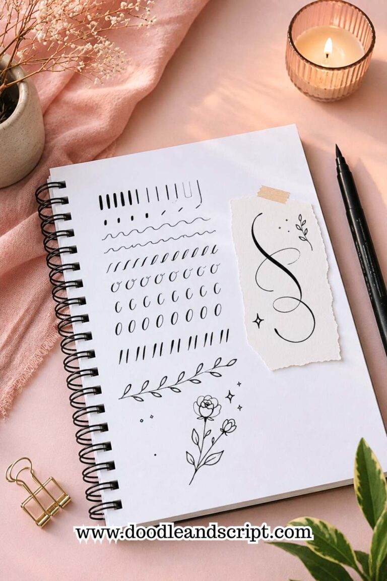
If spacing is something you struggle with regularly, How to Master the Hand Lettering Alphabet in 15 Simple Steps will strengthen the foundational skills that make spacing feel much more natural.
15. Practice One Quote More Than Once

It’s easy to assume your first version should be your best one, but that’s rarely how hand lettering works. Most professional artists create several versions of the same quote before deciding which layout they like most.
Challenge yourself to letter the same quote three different ways. Change the alignment, lettering styles, decorative elements, or emphasis each time. Comparing the finished pieces will teach you far more than creating three completely different quotes.
This exercise also removes the pressure to get everything perfect on your first attempt. Instead of worrying about mistakes, you’ll start viewing every version as another opportunity to improve.
Over time, you’ll become faster at recognizing layouts that work and avoiding ones that don’t.
If you want to build stronger daily habits while practicing, 21 Proven Ways to Improve Your Hand Lettering Faster offers simple strategies that make every practice session more productive.
16. Add Small Illustrations That Support the Message

Simple illustrations can make a quote feel more complete, but they should always support the message instead of distracting from it.
Tiny flowers, leaves, stars, hearts, books, coffee cups, or sunshine icons can reinforce the meaning of the quote without taking attention away from the lettering.
Choose illustrations that naturally relate to the words you’re writing. A quote about growth might include leafy vines, while a quote about dreams could feature stars or clouds. Keeping the illustrations simple allows the lettering to remain the star of the page.
Avoid filling every empty corner with drawings. A few well-placed illustrations usually create a stronger design than dozens of tiny decorations.
Thoughtful details make your artwork feel intentional and help tie the entire composition together.
If you’re looking for ways to make your designs look polished without overcomplicating them, 23 Easy Tricks to Create Aesthetic Hand Lettering is packed with beginner-friendly ideas.
17. Use Color to Create Emphasis

Color is another powerful tool for highlighting important parts of a quote. Instead of using the same ink color throughout the design, choose one accent color for key words or decorative details.
You don’t need an entire collection of markers to make this work. Even black lettering with one gold, pink, blue, or green accent can completely transform the finished piece.
Using color sparingly often creates a much more elegant result than making every word a different shade.
Think about the emotion behind the quote when selecting your colors. Soft pastels work beautifully for calming messages, while brighter colors suit cheerful or motivational quotes. The right color choices help reinforce the mood of your lettering without overwhelming the design.
18. Step Back Before Calling It Finished
One habit that separates experienced lettering artists from beginners is taking a final look before putting everything away.
After spending a long time focused on small details, it’s easy to overlook uneven spacing, crooked lines, or decorations that feel out of place.
Set your pen down and look at your quote from a few feet away. You can even take a photo with your phone or view it in a mirror. Seeing your work from a different perspective makes small problems much easier to notice.
Don’t be discouraged if you find something you’d like to improve. Every adjustment helps you become a better lettering artist.
Learning to evaluate your own work objectively is one of the most valuable skills you can develop, and it becomes easier with every project you complete.
19. Let the Message Be the Star

At the end of the day, the purpose of lettering a quote is to help people connect with its message. Beautiful flourishes, elegant fonts, and creative layouts all matter, but they should never overshadow the words themselves.
Whenever you’re unsure whether to add another decoration or another lettering style, ask yourself one question: Does this make the quote easier or harder to appreciate?
If the answer is harder, simplify the design. Simple, thoughtful lettering almost always has a greater impact than an overly complicated composition.
As your confidence grows, you’ll realize that beautiful quote lettering isn’t about using every technique you’ve learned. It’s about choosing the right techniques for each individual quote.
If you’re ready to continue refining your lettering skills, Easy Hand Lettering Tutorial: Learn in 21 Minutes is the perfect next lesson for strengthening your technique while keeping your designs clean and expressive.
Final Thoughts
Learning Beautiful Ways to Letter Quotes isn’t about having perfect handwriting or owning every brush pen on the market.
It’s about learning how to guide the reader’s eyes, highlight the words that matter most, and arrange each quote in a way that feels balanced and meaningful.
The more you pay attention to details like spacing, contrast, alignment, and composition, the more professional your lettering will begin to look.
Don’t feel like you have to use every technique in this guide on a single project. In fact, some of the most striking quote designs use only one or two of these ideas.
Start with a simple quote, experiment with different layouts, and allow yourself to create multiple versions before choosing your favorite.
Every page you finish teaches you something new about your style and helps you build confidence for the next project.
Most importantly, remember that quote lettering is about sharing a message. Beautiful lettering may catch someone’s attention, but it’s the words themselves that leave a lasting impression.
As your skills grow, you’ll find yourself creating quote art that not only looks beautiful but also inspires the people who see it.
If you’re ready for another creative challenge, Beginner Hand Lettering Ideas: 27 Easy Hand Lettering Ideas Every Beginner Should Try will give you plenty of fun projects to keep practicing while developing your own unique style.