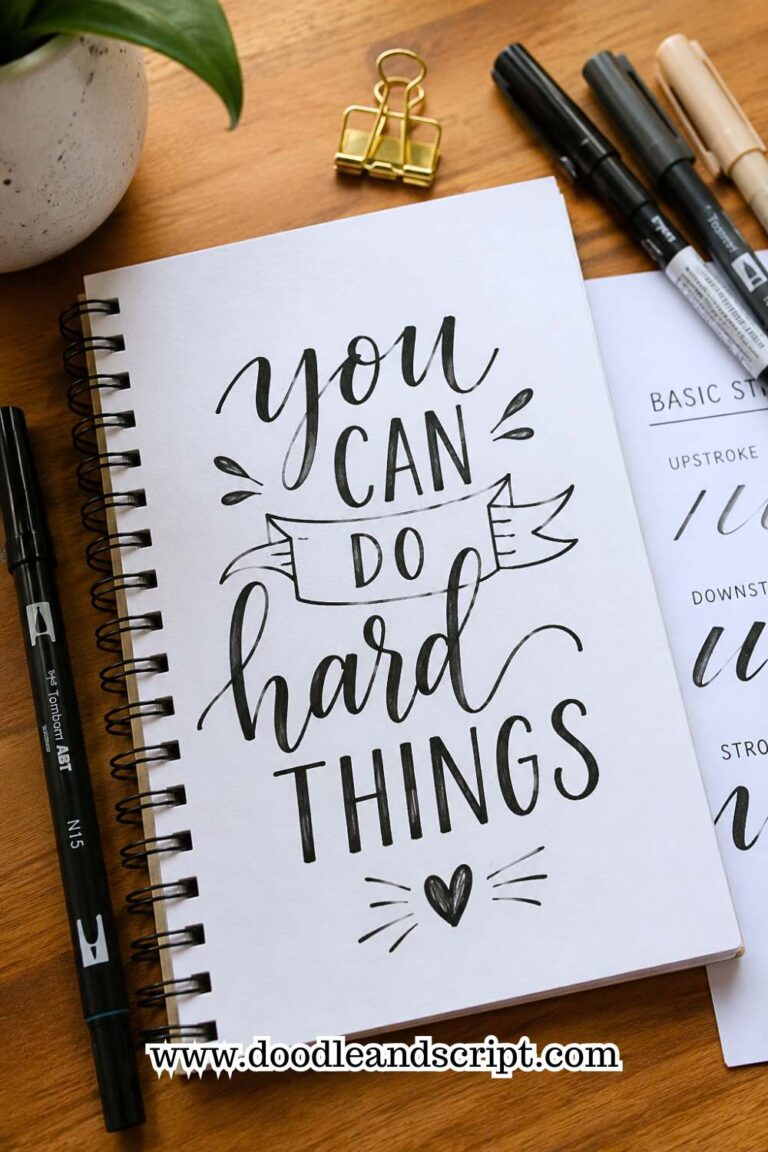
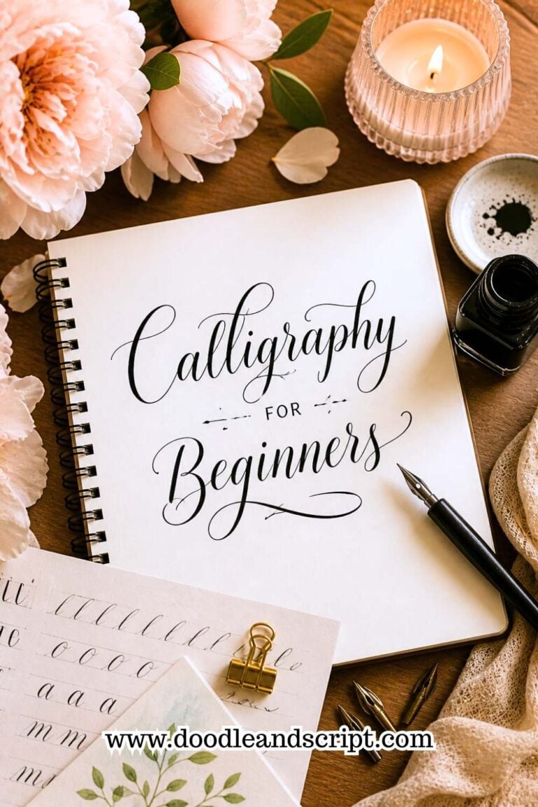
How to Create Modern Hand Lettering in 17 Easy Steps
Disclosure: Some of the links in this post are affiliate links. This means if you click on the link and purchase an item, I will receive an affiliate commission at no extra cost to you.
Scroll through Pinterest or Instagram for just a few minutes, and you’ll probably save dozens of lettering designs without even realizing it.
A simple quote written in flowing letters suddenly feels like wall art. A grocery list somehow looks beautiful. Even a single word, like bloom or breathe, can grab your attention because of the way it’s lettered rather than what it says. That’s the charm of modern hand lettering.
Unlike traditional calligraphy, modern hand lettering gives you room to play. Letters don’t have to look perfectly identical, every line doesn’t have to be perfectly straight, and you’re encouraged to add your own personality along the way.
It’s a style that values creativity just as much as technique, making it one of the easiest and most enjoyable lettering styles to learn.
That freedom can also feel a little overwhelming when you’re just starting out. You might know the look you’re trying to achieve, but getting your letters to flow naturally, balance each other, and fill a page beautifully isn’t always as easy as it seems.
The good news is that modern hand lettering is built on a handful of simple skills that anyone can learn with regular practice.
If you’re still getting comfortable with the basics, How to Learn Hand Lettering Step-by-Step (Even If You Can’t Draw) is a great place to strengthen your foundation first.
This guide will show you How to Create Modern Hand Lettering one step at a time. You’ll learn how to build stylish letterforms, improve your layouts, add movement and personality, and develop lettering that feels modern without becoming complicated.
By the time you finish, you’ll have practical techniques you can use in everything from journal pages and greeting cards to wall prints and digital designs.
How to Create Modern Hand Lettering in 17 Easy Steps
1. Understand What Makes Modern Hand Lettering Different

Before you start creating modern hand lettering, it helps to understand what sets it apart from other lettering styles. Traditional calligraphy follows strict rules for letter shapes, spacing, and angles.
Modern hand lettering takes inspiration from those rules but isn’t limited by them. It allows you to experiment with different styles while still keeping your words attractive and easy to read.
One of the defining features of modern lettering is personality. You can mix playful loops with clean lines, create slightly taller letters, or adjust your spacing to give your words more movement. The goal isn’t perfection. Instead, it’s creating lettering that feels balanced, expressive, and enjoyable to look at.
As you practice, you’ll naturally develop preferences for certain letter shapes, layouts, and decorative elements. That’s one of the reasons modern hand lettering feels so unique.
Every artist brings their own style to the page. If you’d like to explore the different looks you can create, 11 Hand Lettering Styles Every Beginner Should Try is an excellent place to find inspiration.
2. Gather the Right Supplies

You don’t need an expensive collection of art supplies to create beautiful lettering. A quality brush pen, smooth paper, a pencil, and an eraser are enough to begin practicing.
Starting with simple tools also allows you to focus on building good techniques instead of constantly switching between different materials.
Choosing beginner-friendly supplies can make learning much easier. Some brush pens are very flexible, while others have firmer tips that offer better control. Likewise, smooth paper helps protect your brush pen and makes it easier to create clean strokes.
As your skills improve, you can gradually experiment with different pens, markers, colored inks, and specialty papers. For now, focus on becoming comfortable with a few reliable tools rather than collecting everything at once.
Essential Hand Lettering Supplies Every Beginner Needs explains exactly what to buy when you’re getting started.
3. Master Thick and Thin Strokes

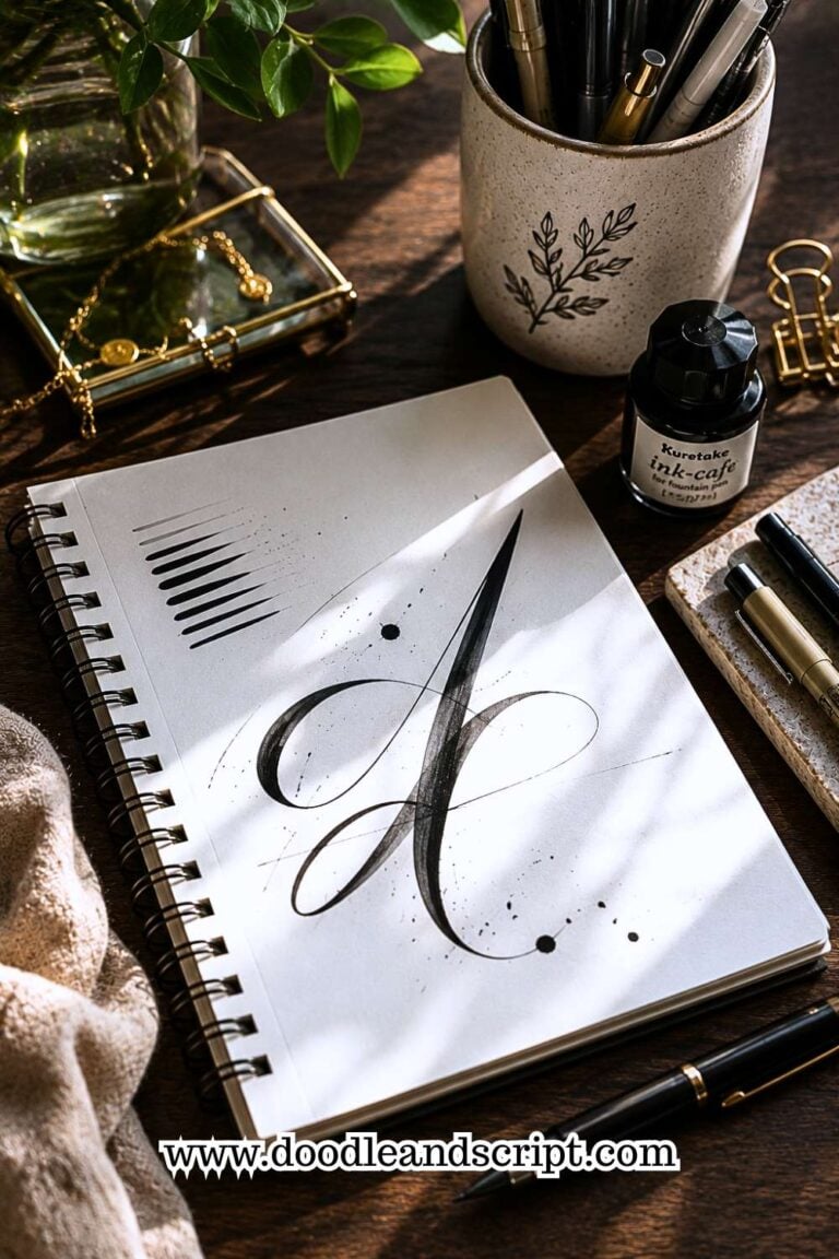
One of the easiest ways to make your lettering look modern is by creating strong contrast between thick and thin strokes. Thick downstrokes combined with light upstrokes add movement, elegance, and visual interest to every word you write.
This skill takes practice because it depends on pressure control rather than drawing ability. As you move your pen downward, apply gentle pressure to create a thicker line. As you move upward, release that pressure so the line becomes thin again. Over time, these movements become second nature.
Don’t worry if your first attempts look uneven. Every practice page helps your hand build the muscle memory needed for smoother transitions.
If you’d like a step-by-step approach to improving your pressure control, How to Create Perfect Thick and Thin Strokes in 11 Steps walks you through the process.
4. Learn the Basic Letter Strokes First

Many beginners immediately jump into writing words, only to wonder why their letters don’t look consistent. That’s because every alphabet is built from a small collection of basic strokes. Learning those first makes everything else much easier.
Practice simple shapes like ovals, underturns, overturns, loops, and straight downstrokes before writing complete letters.
These movements appear repeatedly throughout the alphabet, so improving them improves almost every letter you create.
Once those strokes begin to feel comfortable, you’ll notice your lettering becoming smoother and much more consistent without needing to think about every movement. This strong foundation also makes it easier to experiment with more decorative modern styles later.
5. Choose a Simple Alphabet

Modern lettering often looks effortless because the artist isn’t trying to use a different style for every single letter. Instead, they choose one alphabet style and repeat it consistently throughout the entire word or quote.
Start with a clean, beginner-friendly alphabet that feels comfortable to write. Avoid adding dramatic flourishes or unusual letter shapes until you’re confident with the basics. Consistency almost always looks better than unnecessary decoration.
Once you’ve mastered one alphabet, you can gradually introduce small changes that make it feel more personal while still keeping the overall design balanced.
If you’re unsure where to begin, How to Master the Hand Lettering Alphabet in 15 Simple Steps provides a structured approach to learning every letter.
6. Keep Your Letter Size Consistent

One of the easiest ways to make your lettering look polished is by keeping your letters a consistent size. Modern hand lettering gives you the freedom to be creative, but random changes in height can make your words feel unbalanced.
If one lowercase letter is much taller than the others or your capital letters vary dramatically, the overall design becomes distracting instead of stylish.
A helpful habit is to check your lettering every few words. Compare similar letters and ask yourself if they share the same proportions.
Notice whether your ascenders reach the same height and whether your descenders extend to a similar length. These small observations train your eyes to recognize inconsistencies before they become part of your finished piece.
As your control improves, you’ll spend less time correcting uneven letters and more time enjoying the creative side of lettering. If consistency is something you’re still working on, 13 Simple Tricks to Improve Your Lettering Consistency will help you build stronger habits.
7. Add Bounce Lettering With Intention

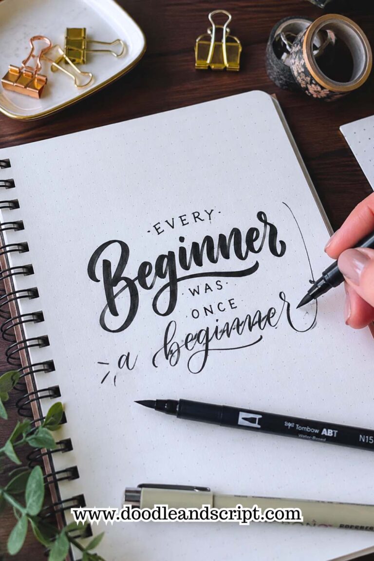
Bounce lettering is one of the features that gives modern hand lettering its relaxed and playful personality. Instead of placing every letter neatly on the baseline, you intentionally allow a few letters to rise slightly above it or dip below it. This creates movement and makes your lettering feel less rigid.
The secret is knowing when to stop. A little bounce adds character, but too much can make your words difficult to read. Begin by adjusting only one or two letters in each word and leave the remaining letters sitting naturally on the baseline. This creates a balanced design that still feels modern and expressive.
Practice writing the same word several times while experimenting with different bounce placements. You’ll quickly discover which letters naturally create movement without making the word feel awkward.
As you become more comfortable with this style, 11 Hand Lettering Styles Every Beginner Should Try can introduce you to other creative lettering techniques.
8. Leave Enough Space Between Letters

Beautiful lettering isn’t only about drawing attractive letters. The empty space between those letters plays an equally important role.
When letters are squeezed together, words become difficult to read. When they’re placed too far apart, the word loses its natural flow. Finding the right balance gives your lettering a clean and professional appearance.
Instead of measuring the distance between the edges of your letters, pay attention to the white space they create. Your goal is to make those spaces feel visually balanced across the entire word.
Some letter combinations naturally sit closer together than others, so trust your eyes rather than trying to create identical gaps everywhere.
A useful exercise is to write one word several times while focusing only on spacing. Ignore decorative flourishes and simply work on creating even visual balance. You’ll be surprised how much cleaner your lettering looks after making this one adjustment.
If you’d like more exercises like this, 21 Hand Lettering Drills You Should Practice Every Week is an excellent resource.
9. Practice Words Instead of Random Letters

Writing the alphabet over and over helps you learn letter shapes, but practicing complete words teaches you how letters interact with one another.
You’ll begin noticing patterns in spacing, rhythm, and balance that aren’t obvious when you’re writing isolated characters.
Choose a few short words and repeat them across an entire page. Words like bloom, dream, create, and happy are excellent choices because they contain a variety of useful strokes and letter combinations.
With each repetition, look for one small improvement, such as smoother curves, more even spacing, or better letter height.
Repeating familiar words also allows you to concentrate on technique instead of thinking about what to write next. Once those words begin to feel comfortable, you’ll naturally carry the same consistency into longer quotes and phrases.
If you’re looking for fresh ways to keep your practice interesting, 27 Easy Hand Lettering Ideas Every Beginner Should Try offers plenty of creative exercises.
10. Plan Your Layout Before You Start Lettering

One thing that makes modern hand lettering stand out is thoughtful composition. Instead of writing directly onto the page and hoping everything fits, take a few minutes to plan where your words will go. This simple step helps prevent awkward spacing, crowded lines, and words that suddenly become too large for the page.
Lightly sketch your layout with a pencil before reaching for your brush pen. Decide which words should stand out, where line breaks will happen, and how much space you’ll leave around the design. Having a plan allows you to focus on creating beautiful letters instead of constantly worrying about running out of room.
Don’t be afraid to try several rough layouts before choosing your favorite. Sometimes a small change in word placement can completely transform the finished piece.
Once your layout is ready, you’ll find it much easier to create lettering that looks balanced, modern, and intentionally designed.
For inspiration on turning simple words into eye-catching artwork, 19 Beautiful Ways to Letter Quotes Like a Pro is a great next step.
11. Mix Letter Sizes for Better Emphasis

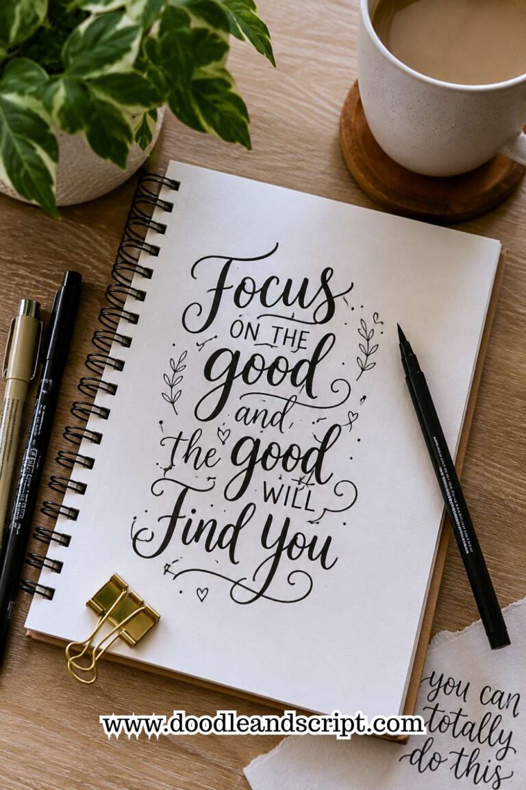
One of the easiest ways to make your lettering feel modern is by creating contrast. Instead of writing every word in exactly the same size, choose one or two important words to become the focal point of your design. This naturally draws the reader’s attention and makes your composition more interesting.
For example, in a quote, you might write words like believe, grow, or dream in larger letters while keeping the remaining words smaller and simpler.
This creates a clear visual hierarchy without making the page feel cluttered. The important part is to plan your emphasis before you begin lettering rather than deciding halfway through the design.
Keep the contrast intentional. If every word is oversized, nothing stands out anymore. A little variation goes a long way in creating a balanced, modern look.
If you’re looking for more creative ways to style your lettering, 23 Easy Tricks to Create Aesthetic Hand Lettering offers plenty of ideas you can try.
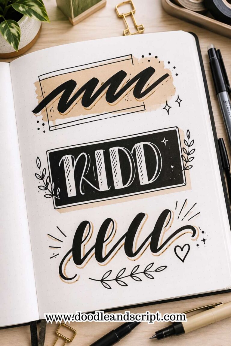
12. Add Flourishes After Finishing Your Words

Flourishes can make modern hand lettering look elegant and expressive, but they should never be the starting point. Many beginners try to add loops and swirls while they’re still writing the letters, which often makes their words look crowded or difficult to read.
A better approach is to finish lettering the entire word first. Once you’re happy with the spacing, letter size, and overall balance, go back and decide where a flourish would enhance the design. This makes it much easier to see which areas have enough empty space and which areas should remain simple.
Remember that flourishes are decorations, not the main attraction. One or two well-placed flourishes usually have a stronger impact than filling every empty corner with extra lines. As your confidence grows, you’ll naturally discover which letters work best for decorative finishes.
13. Keep Practicing the Same Style

It’s exciting to experiment with new lettering styles, but constantly switching between different alphabets can slow your progress. If your goal is to create beautiful modern hand lettering, spend time becoming comfortable with one style before moving on to another.
Writing the same alphabet repeatedly helps build muscle memory. Your hand begins to remember the size, spacing, and movement of each letter, making your work look more consistent with every practice session. Once that style feels natural, adding your own creative touches becomes much easier.
There’s nothing wrong with exploring new ideas, but building confidence in one style first will make learning every future style much simpler. If you’re still refining your everyday lettering, 17 Hand Lettering Tips Every Beginner Should Know will help strengthen the habits that matter most.
14. Don’t Be Afraid to Leave Empty Space

Many beginners feel the need to fill every corner of the page with words, flourishes, banners, or decorative elements. Modern hand lettering takes the opposite approach. Empty space is part of the design, and it helps your lettering stand out instead of competing for attention.
Leaving space around your words gives the reader’s eyes a place to rest. It also makes important words feel more noticeable because they aren’t surrounded by unnecessary decorations. Clean, open layouts often look more professional than busy ones.
Before adding another flourish or decorative element, step back and ask yourself if it truly improves the design. Sometimes the strongest creative decision is choosing not to add anything at all.
Studying beautiful examples can help you recognize this balance, and 27 Easy Hand Lettering Ideas Every Beginner Should Try includes plenty of inspiration.
15. Practice With Real Projects

Practice sheets are important, but applying your skills to real projects teaches you even more. Creating greeting cards, journal titles, gift tags, bookmarks, wall prints, or planner pages helps you think about composition, spacing, and readability in ways that worksheets cannot.
Real projects also make practice more enjoyable because you’re creating something you can actually use or share. Each finished piece teaches you something new about planning layouts, choosing letter sizes, and balancing decorative elements.
Don’t wait until you think you’re “good enough.” Every project becomes another opportunity to improve, and you’ll often be surprised by how much progress you’ve made after completing just a few designs.
If you need ideas for what to create next, 19 Beautiful Ways to Letter Quotes Like a Pro is full of projects that let you practice while making something meaningful.
16. Learn From Every Practice Session
Every page you complete has something to teach you. Instead of putting your practice sheets away immediately, spend a few minutes looking through them with fresh eyes. Notice which words feel balanced, which letters gave you trouble, and where your spacing could improve.
This simple review helps you identify patterns in your work. You may discover that your curves become uneven whenever you rush or that certain letters consistently look larger than the rest. Once you recognize these habits, you can focus your next practice session on improving them.
Progress comes much faster when you practice with a purpose instead of simply filling pages. Small improvements made consistently will have a much bigger impact than trying to fix everything at once.
If you’re unsure what habits might be affecting your results, 15 Common Hand Lettering Mistakes (And How to Fix Them) is a great guide to help you identify them.
17. Develop Your Own Modern Style

As you become more comfortable with modern hand lettering, you’ll naturally notice that certain letter shapes, layouts, and decorative details appeal to you more than others. That’s the beginning of developing your own style, and it’s one of the most rewarding parts of the journey.
Take inspiration from other artists, but avoid copying their work exactly. Instead, pay attention to what you enjoy about their lettering.
Maybe it’s the spacing, the bounce, the flourishes, or the way they arrange words on the page. Use those observations to inspire your own ideas rather than recreate someone else’s designs.
Your style will continue to evolve with every project you complete, so don’t rush the process. The more you practice, the more your lettering will begin to reflect your own personality and creativity. That’s what makes modern hand lettering so enjoyable; it gives you the freedom to create something that’s uniquely yours.
If you want to continue growing your skills, 15 Hand Lettering Drills That Will Improve Your Skills Fast will help you build even greater confidence and control.
Final Thoughts
Learning How to Create Modern Hand Lettering is about much more than writing beautiful letters. It’s about understanding how letter shapes, spacing, balance, movement, and creativity work together to create designs that feel stylish and effortless. Every small improvement you make brings you closer to developing lettering that feels uniquely your own.
Don’t feel pressured to master every technique at once. Focus on one step, practice it regularly, and then build on that success.
Over time, you’ll notice your letters becoming smoother, your layouts becoming stronger, and your confidence growing with every page you complete.
Most importantly, enjoy the creative process. Try new layouts, experiment with different word combinations, and don’t be afraid to make mistakes. Every finished project teaches you something valuable, and every practice session helps you refine your personal style.
If you’re looking for fresh inspiration after mastering these techniques, 27 Easy Hand Lettering Ideas Every Beginner Should Try is filled with creative projects that will help you keep practicing while exploring new lettering designs.