11 Hand Lettering Styles Every Beginner Should Try
Disclosure: Some of the links in this post are affiliate links. This means if you click on the link and purchase an item, I will receive an affiliate commission at no extra cost to you.
Learning hand lettering is exciting until you realize there are so many styles to choose from. One tutorial teaches elegant script. Another focuses on bold block letters.
Then you discover bounce lettering, serif lettering, and dozens of other designs. Sometimes, you wonder where you’re supposed to begin.
If you’re searching for Beginner Hand Lettering Styles, you don’t need to learn them all. You simply need to start with the ones that are easiest to understand and practice.
The good news is that every lettering style helps you build a different skill. Some improve your pen control. Others teach better spacing, cleaner shapes, or smoother strokes. As you try different styles, you’ll also discover what matches your personality and creative goals.
If you’re still building your confidence, 17 Hand Lettering Tips Every Beginner Should Know will help you avoid common mistakes before they become habits.
This guide introduces eleven beginner-friendly lettering styles that are both beautiful and approachable. You’ll learn what each style looks like, why people love it, and simple tips to help you practice with confidence.
By the end, you’ll know which styles to explore first and how each one can make you a stronger hand lettering artist.
11 Hand Lettering Styles Every Beginner Should Try
1. Modern Hand Lettering

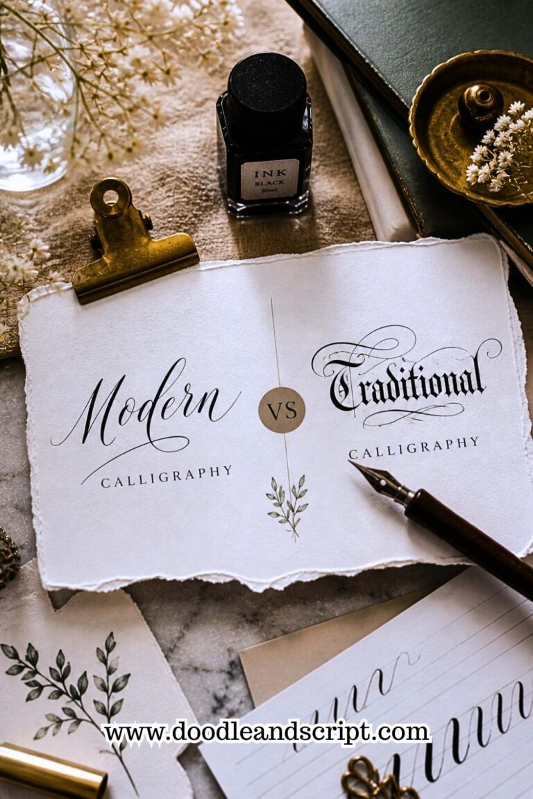
Modern hand lettering is often the first style beginners fall in love with. It combines clean letter shapes with a relaxed, creative feel. Unlike traditional calligraphy, modern lettering doesn’t follow strict rules.
You have the freedom to experiment with letter sizes, spacing, and flourishes while still creating beautiful words. That’s one reason it remains one of the most popular Beginner Hand Lettering Styles.
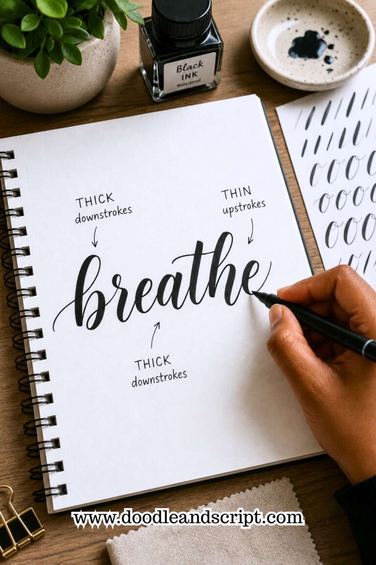
This style usually features thick downstrokes, thin upstrokes, and smooth curves. You can create it with a brush pen, brush marker, or even an ordinary pencil while learning.
Don’t worry if your letters aren’t perfectly even at first. Modern lettering is meant to have personality, and small differences often make your work look more natural.
Start by practicing simple words instead of long quotes. Focus on creating smooth strokes before adding decorative details. Once you’re comfortable, you’ll find that modern lettering becomes a great foundation for learning many other styles.
If you want a complete walkthrough, How to Create Modern Hand Lettering in 17 Easy Steps will guide you through the process.
2. Block Lettering

If brush pens feel intimidating, block lettering is an excellent place to begin. Instead of worrying about thick and thin strokes, you’ll focus on drawing bold, solid letter shapes. This style builds confidence because it’s easy to see where each letter begins and ends.
Block lettering works well for greeting cards, journal titles, posters, classroom displays, and social media graphics. Since every letter has a simple structure, beginners can spend more time improving consistency instead of struggling with complicated strokes.
Practice drawing each letter slowly and keep the height as even as possible. Light pencil guidelines can help you maintain straight lines while you learn.
Once you’re comfortable, try filling your letters with patterns or shading to make your designs more interesting.
3. Bounce Lettering

Bounce lettering brings movement and personality to your words. Instead of keeping every letter on the same baseline, some letters sit slightly higher while others dip lower. The result feels playful, relaxed, and full of energy.
Many beginners think bounce lettering is completely random, but that’s not true. The movement still needs balance. If every letter jumps in a different direction, the word becomes difficult to read. Start by allowing only one or two letters in each word to bounce below the baseline.
Don’t rush this style. Learn how the letters flow together before exaggerating the movement. Once you understand the basics, bounce lettering quickly becomes one of the most enjoyable Beginner Hand Lettering Styles to practice. For step-by-step guidance, read How to Create Beautiful Bounce Lettering in 13 Easy Steps.
4. Serif Lettering

Serif lettering is easy to recognize because each letter has small finishing strokes at the ends. These tiny details give words a classic and elegant appearance. You often see serif lettering in books, newspapers, invitations, and luxury branding.
Although the decorative ends may seem difficult, the basic letter shapes are actually straightforward. Begin by drawing simple block letters first.
Once you’re happy with their proportions, add the small serif details one at a time. Working this way keeps your letters balanced and neat.
Serif lettering also teaches patience and precision. Since every small detail matters, you’ll naturally improve your control while practicing.
If your goal is cleaner, more polished lettering, this style is well worth adding to your practice routine.
5. Sans Serif Lettering

Sans serif lettering is one of the simplest styles you can learn. Unlike serif lettering, it doesn’t have decorative strokes at the ends of each letter.
The clean, straightforward shapes make it perfect for beginners who want to improve consistency before trying more detailed styles.
You’ll notice this style everywhere, from modern logos and websites to planners and minimalist posters. Its simple appearance doesn’t make it boring. Instead, it teaches you how to create balanced letters with even spacing and smooth lines.
As you practice, pay close attention to the height and width of each letter. Small differences become easier to notice in a clean style like this. Once you can create neat sans serif letters, many other lettering styles will feel much easier to learn.
6. Faux Calligraphy

Faux calligraphy is one of the smartest styles for beginners because you don’t need a brush pen to create it. A regular pen or pencil is enough.
Instead of relying on pressure to make thick and thin strokes, you simply draw the letter first and then add thickness to the downstrokes afterward.
Many people begin with faux calligraphy because it allows them to create beautiful lettering without buying special supplies. It also helps you understand where thick and thin strokes belong before moving on to brush lettering.
Work slowly and add thickness evenly to every downstroke. Avoid making them too wide, or your letters may lose their shape. Once you’ve mastered this technique, switching to brush lettering becomes much less intimidating.
If you’re still building confidence with your strokes, Easy Hand Lettering Tutorial: Learn in 21 Minutes is a great place to practice the basics.
7. Script Lettering

Script lettering creates smooth, connected letters that flow naturally across the page. It looks elegant and graceful, making it popular for greeting cards, wedding signs, invitations, and inspirational quotes.
Although script lettering looks effortless, it requires patience. Every letter connects to the next, so uneven spacing or rushed strokes become easy to notice. Beginners should start with short words before attempting long sentences.
Spend time practicing common letter connections like “th,” “er,” and “ing.” The more comfortable these combinations become, the smoother your lettering will look.
If your letters still feel shaky, don’t get discouraged. Like every style, script lettering becomes easier with regular practice.
8. Decorative Lettering

Decorative lettering allows you to add your own creative touch to simple letterforms. Instead of changing the basic structure, you enhance your letters with shadows, banners, flowers, leaves, sparkles, swirls, or other simple details.
This style is perfect once you’ve learned the basics because decoration should enhance your lettering, not hide weak letter shapes. Start with clean letters first, then add small embellishments after you’re happy with the overall word.
It’s tempting to decorate every letter, but sometimes less creates a stronger design. Choose one or two simple elements that support your message instead of overwhelming it.
If you’d like to create more balanced layouts while decorating your words, 13 Secrets to Creating Beautiful Hand Lettering Compositions offers practical techniques that beginners can easily follow.
9. Vintage Lettering

Vintage lettering takes inspiration from old signs, advertisements, and packaging. It often features bold letters, decorative details, banners, shadows, and unique shapes that give your work a timeless feel.
While some vintage designs look complex, beginners can start with simple versions and build their skills over time.
Begin by drawing bold block letters with even spacing. Once you’re happy with the basic shape, add a light shadow or a simple outline.
These small details instantly give your lettering an old-fashioned look without making the design feel overwhelming.
Don’t try to copy every decorative element you see. Focus on creating clean letters first. As your confidence grows, you can experiment with ribbons, borders, and other vintage-inspired touches. Taking your time will help you create designs that look intentional instead of crowded.
10. Monoline Lettering

Monoline lettering uses the same line thickness from beginning to end. There are no thick downstrokes or thin upstrokes. Every stroke has equal weight, making this one of the easiest Beginner Hand Lettering Styles to practice.
Because the lines stay consistent, monoline lettering helps you focus on the shape of each letter instead of pen pressure.
It also improves your spacing and teaches you how to create smooth, balanced words. Many minimalist designs use this style because of its clean and modern appearance.
A regular pen works perfectly for monoline lettering. Practice writing the alphabet slowly while keeping every stroke the same thickness. Resist the urge to press harder on certain letters. The goal is consistency, not decoration.
If you want more ideas for strengthening your technique, 25 Beginner Lettering Exercises That Actually Work includes simple drills that pair well with monoline practice.
11. Brush Lettering

Brush lettering is one of the most popular styles, but many beginners save it until they’ve built confidence with simpler techniques.
Using a brush pen, you create thin upstrokes and thick downstrokes by changing the amount of pressure you apply. It takes practice, but the results are beautiful.
Don’t expect perfect letters during your first few sessions. Brush lettering requires muscle memory, and that develops with consistent practice.
Spend time working on basic strokes before writing complete words. Those simple exercises will make a huge difference later.
It’s also important to use the right amount of pressure. Beginners often press too hard throughout every stroke, making their letters look heavy and uneven. Relax your grip and let the brush do the work.
If you make mistakes, don’t erase every one. Looking back at older practice pages is one of the best ways to see how much you’ve improved.
For more guidance, 15 Common Hand Lettering Mistakes (And How to Fix Them) can help you avoid the errors that slow many beginners down.
Final Thoughts
Trying different lettering styles is one of the fastest ways to grow as a hand lettering artist. Each style teaches something valuable, whether it’s better spacing, smoother strokes, stronger pen control, or cleaner compositions.
As you explore these Beginner Hand Lettering Styles, you’ll naturally discover which ones feel the most enjoyable and which skills need a little more practice.
Remember that you don’t have to master every style at once. Pick one that excites you, practice it consistently, and then move on to another.
Taking small, steady steps will help you build confidence without feeling overwhelmed. Every page you complete brings you closer to creating lettering that feels natural and uniquely yours.
Most importantly, have fun with the process. Experiment with different pens, try new words, and don’t be afraid to make mistakes. Every letter you draw helps your skills grow.
When you’re ready to take your practice further, 21 Proven Ways to Improve Your Hand Lettering Faster will help you build stronger habits and continue improving with confidence.