13 Simple Tricks to Improve Your Lettering Consistency
Disclosure: Some of the links in this post are affiliate links. This means if you click on the link and purchase an item, I will receive an affiliate commission at no extra cost to you.
If your lettering looks amazing one day and completely different the next, you’re not alone. Some beginners assume they’re doing something wrong, but inconsistent results are simply part of the learning process.
As your hand gets used to new movements, it’s normal for your letters to change in size, spacing, and shape from one practice session to another.
The challenge isn’t creating one beautiful word; it’s creating beautiful lettering every time you pick up your pen. That’s where consistency makes all the difference.
When your letters have the same proportions, your spacing stays even, and your strokes follow a steady rhythm, your work immediately looks cleaner and more intentional.
You don’t need naturally perfect handwriting to become consistent; you just need the right practice habits. The more you practice with the right techniques, the more naturally your lettering begins to look balanced and polished.
If you’re still working on the fundamentals, How to Learn Hand Lettering Step-by-Step (Even If You Can’t Draw) is a helpful guide to build a strong foundation first.
In this guide, you’ll learn Tricks to Improve Your Lettering Consistency that are simple to practice and easy to turn into daily habits. Practice these techniques regularly, and you’ll soon notice your letters becoming more even, balanced, and polished with every page you complete.
13 Simple Tricks to Improve Your Lettering Consistency
1. Slow Down Your Hand

One of the fastest ways to improve your lettering consistency is to slow down. Many beginners try to write at their normal handwriting speed, but lettering requires much more control.
When you rush, your letters often become different heights, your curves lose their smooth shape, and your spacing starts changing without you even noticing. Before long, the first word on the page looks completely different from the last.
Instead of focusing on finishing an entire page, pay attention to one letter at a time. Watch how your pen moves, make deliberate strokes, and give yourself enough time to form each letter properly.
You may feel slower at first, but you’re actually training your muscles to repeat the same movements accurately. As those movements become more familiar, your speed will naturally improve without affecting the quality of your lettering.
If you’re still building good lettering habits, 17 Hand Lettering Tips Every Beginner Should Know covers several beginner-friendly techniques that will make every practice session more productive.
2. Use Guidelines Every Time You Practice

Guidelines might seem unnecessary once you’ve learned the alphabet, but they’re one of the easiest ways to make your lettering look more consistent.
They act as a visual guide that keeps your letters the same height, helps your words stay straight, and prevents some letters from becoming much larger than others.
Many professional lettering artists still use guidelines, especially when creating finished pieces. Rather than guessing where each letter should sit, they give themselves clear reference points for the baseline, x-height, ascenders, and descenders. This creates lettering that feels balanced from beginning to end.
You don’t need fancy practice sheets to do this. Dot grid notebooks, graph paper, or even lightly drawn pencil lines work perfectly.
Over time, your eyes will become trained to recognize these proportions naturally, making it easier to letter neatly even on blank paper.
3. Practice Similar Letters Together

The alphabet isn’t made up of twenty-six completely different letters. Many letters share the same basic shapes, and practicing them together helps your hand develop consistent movements. Instead of jumping randomly from one letter to another, group letters that are built in similar ways.
For example, a, c, d, g, o, and q all begin with an oval shape. Letters like m, n, h, and r rely on similar entrance strokes and arches.
Practicing these groups repeatedly helps your muscles remember the movement, making each letter look more uniform every time you write it.
This approach also helps you spot mistakes more easily. If one letter suddenly looks wider, taller, or more slanted than the others in the same family, you’ll immediately know what needs adjusting.
How to Master the Hand Lettering Alphabet in 15 Simple Steps is a helpful guide for understanding how letters are built from these basic shapes before combining them into complete alphabets.
4. Focus on Consistent Letter Size

Letter size has a huge impact on how polished your lettering looks. Even if your strokes are smooth, words can appear messy when some letters are noticeably taller or wider than others.
This often happens because beginners pay so much attention to individual letters that they forget to look at the word as a whole.
A simple way to improve this is by checking your work every few words instead of waiting until you’ve finished the entire page.
Compare the height of similar letters, look for oversized loops, and notice whether your lowercase letters stay within the same height range. Making small corrections early prevents those inconsistencies from repeating across the rest of the page.
As you continue practicing, your eyes will naturally begin to recognize uneven letter sizes before your pen even leaves the paper. That’s a sign your consistency is improving, and it will make every future lettering project look cleaner and more balanced.
5. Keep Your Letter Spacing Even

Beautiful lettering isn’t just about drawing attractive letters. The space between those letters matters just as much. When some letters are crowded together while others have large gaps, words can look awkward even if every individual letter is well formed.
A common mistake is spacing letters based on their edges instead of the empty space between them. For example, the gap between A and V naturally looks different from the gap between H and I.
Rather than measuring the distance with your eyes alone, try to create equal-looking white space throughout the word. This simple adjustment makes your lettering feel much more balanced.
One helpful exercise is to write the same word several times while focusing only on spacing. Ignore flourishes and decorative details for now. Train your eyes to notice the spaces just as much as the letters themselves.
If you want more exercises to strengthen this skill, 21 Hand Lettering Drills You Should Practice Every Week includes practice routines that improve both control and consistency.
6. Hold Your Pen the Same Way

Your pen grip affects every stroke you make. If you change the angle of your pen halfway through a practice session, your thick and thin strokes can start looking uneven, and your letters may lose the consistent style you’re trying to achieve.
Find a comfortable grip that allows your hand to move freely without squeezing the pen too tightly. Keep the pen at a similar angle throughout your practice instead of constantly rotating it in your fingers. Small adjustments happen naturally, but dramatic changes can make your lettering look inconsistent.
It’s also worth paying attention to your posture. Sit comfortably, rest your arm on the table when needed, and let your shoulder and forearm help guide longer strokes instead of relying only on your wrist. These small habits improve control and reduce hand fatigue during longer practice sessions.
7. Practice the Same Words Repeatedly

Many beginners constantly switch between different quotes and phrases because it feels more exciting. While there’s nothing wrong with variety, repeating the same word several times is one of the fastest ways to improve consistency.
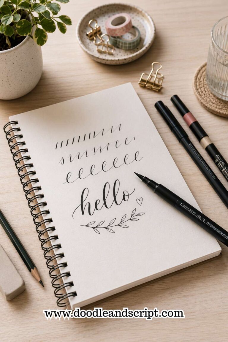
Choose a simple word like hello, create, dream, or happy and write it across an entire page. Each repetition gives you another opportunity to improve the size, spacing, slant, and overall flow of the letters. By the end of the page, you’ll often notice that your final attempts look much more polished than your first ones.
Repeating familiar words also removes the pressure of thinking about spelling or new letter combinations. Your attention stays focused on improving the quality of each stroke instead.
8. Maintain a Consistent Slant

A consistent slant helps your lettering feel organized and intentional. Even if your letters aren’t perfectly identical, keeping them leaning in the same direction creates a sense of harmony across the entire word or sentence.
Many beginners accidentally change the angle of their letters as they move across the page. The first few letters may stand upright, while the last few gradually lean to one side. This usually happens when your writing position changes or you begin rushing.
A simple solution is to practice with slant guidelines or lightly imagine invisible diagonal lines as you write. Every few words, pause and check whether your letters are still following the same angle. With enough repetition, maintaining a consistent slant will become something you do automatically without thinking about it.
9. Build Every Letter from the Same Basic Strokes

Every beautiful alphabet starts with the same small collection of basic strokes. When you rush into writing complete words without mastering those strokes, your letters often end up looking different from one another because you’re drawing each one differently every time.
Instead, think of lettering like building with blocks. Every oval, underturn, overturn, loop, and downstroke should be created the same way whenever it appears.
If your oval changes shape from one letter to the next, you’ll notice that your a, d, g, and o all begin to look inconsistent as well.
Spending a few minutes practicing these building blocks before writing words can make a surprising difference. Your hand becomes familiar with the movements, making it much easier to produce letters that look balanced throughout an entire page.
If you’d like a structured way to practice these foundations, 15 Hand Lettering Drills That Will Improve Your Skills Fast is an excellent place to start.
10. Don’t Skip Warm-Up Exercises

Think of your practice session the same way an athlete thinks about a workout. You wouldn’t expect your body to perform at its best without warming up first, and the same idea applies to lettering. Jumping straight into a detailed quote can leave your strokes feeling stiff and uneven.
Spend five to ten minutes drawing simple lines, ovals, loops, and curves before writing actual words. These quick exercises wake up your hand, improve your control, and help you settle into a steady rhythm before tackling more detailed lettering projects.
Warm-ups are also a great opportunity to identify problems early. If your ovals look shaky or your downstrokes feel uneven, you can correct those issues before they appear throughout your finished piece. Making warm-ups part of your routine will lead to more consistent results over time.
11. Compare Today’s Work to Yesterday’s

One of the easiest ways to lose motivation is by comparing your lettering to artists who have been practicing for years. Instead, compare your work to your own previous practice pages. That’s where you’ll notice real progress.
Keep your old worksheets, even the ones you don’t like. Every few weeks, flip back through them and look for improvements in your spacing, letter size, stroke control, and overall balance. You’ll probably notice changes that weren’t obvious while you were practicing every day.
This habit also helps you identify patterns. Maybe your spacing has improved, but your slant still changes throughout a sentence. Or perhaps your downstrokes look much smoother than they did a month ago. Recognizing both your strengths and areas for improvement makes your practice sessions much more focused.
If you’re unsure what common habits might be affecting your progress, 15 Common Hand Lettering Mistakes (And How to Fix Them) can help you spot them.
12. Practice More Often Instead of Practicing Longer
Many people believe they need hours of free time to become better at lettering. In reality, short, consistent practice sessions usually produce better results than long sessions that only happen once in a while.
Even ten or fifteen minutes each day is enough to strengthen your muscle memory and improve your control. Frequent practice helps your hand remember the movements, while long breaks often make you feel like you’re starting over each time you pick up your pen.
Creating a simple routine also makes it easier to stay motivated. You don’t have to finish a masterpiece every day. Sometimes a single page of basic strokes or a few repeated words is enough to keep your skills moving in the right direction. Over weeks and months, those small sessions add up to significant improvement.
13. Be Patient and Let Consistency Develop Naturally
It’s easy to feel discouraged when your lettering doesn’t look the same every time you practice. You might have one page that you’re proud of, followed by another that feels like a step backward.
That doesn’t mean you’re losing progress. Learning lettering isn’t a straight line, and even experienced artists have practice days that don’t go as planned.
Instead of aiming for perfection, focus on making small improvements every time you sit down to practice. Maybe today your spacing is more even. Tomorrow your downstrokes might feel smoother.
Next week you may notice that your letters naturally stay the same height without relying as much on guidelines. These small wins are signs that your consistency is growing, even if the changes seem subtle.
The more often you practice with intention, the less you’ll have to think about every stroke. Your hand will begin to repeat the same movements automatically, allowing you to focus on creativity instead of correcting mistakes.
If you want to strengthen the foundation behind consistent lettering, How to Create Perfect Thick and Thin Strokes in 11 Steps will help you develop better pen control and smoother letterforms.
Final Thoughts
Improving your lettering consistency doesn’t happen overnight, but every practice session brings you one step closer. The goal isn’t to make every letter look identical.
Instead, it’s to create words that feel balanced, intentional, and pleasing to the eye. When your letter size, spacing, slant, and strokes work together, your lettering naturally begins to look more polished.
As you continue practicing, don’t be afraid to slow down, repeat the same exercises, and pay attention to the little details. Those simple habits often make a bigger difference than learning complicated lettering styles.
Keep your old practice sheets so you can look back and see how much you’ve improved. You’ll be surprised by the progress that happens when you stay consistent.
Once you feel confident with these techniques, try applying them to different lettering projects instead of only practicing drills. Experiment with quotes, greeting cards, journal titles, and decorative headings to see how your consistency holds up in real designs.
If you’re looking for inspiration, 19 Beautiful Ways to Letter Quotes Like a Pro is a great next step for putting your new skills into practice.
Finally, remember that every lettering artist develops at their own pace. Some skills click quickly, while others take weeks of repetition before they feel natural.
Keep showing up, enjoy the process, and celebrate every improvement along the way. With patience and regular practice, consistent lettering will become one of your greatest strengths.