25 Aesthetic Bullet Journal Lettering Ideas You’ll Love
Disclosure: Some of the links in this post are affiliate links. This means if you click on the link and purchase an item, I will receive an affiliate commission at no extra cost to you.
What is it about some bullet journal pages that makes you want to keep staring at them? You could give ten people the exact same journal prompt, and somehow one page would instantly stand out.
Not because it used expensive supplies. Not because it had perfect drawings. It would stand out because the lettering made the page feel alive. That is the power of Bullet Journal Lettering.
One of the biggest mistakes people make is thinking aesthetic journal pages come from artistic talent. They see beautiful spreads online and assume the creator must have amazing handwriting.
The truth is much simpler. Most eye-catching lettering styles rely on small choices that anyone can learn. A word written larger than the others.
A shadow behind a title. A playful mix of fonts. Tiny details like these can completely change the way a page feels.
What makes lettering so fun is that it lets you change the mood of a spread in seconds. The same habit tracker can look cute, elegant, bold, vintage, modern, or creative just by changing the lettering style.
That means you never need to feel stuck with one look. If your journal pages have started feeling repetitive lately, these ideas might be exactly what you need.
Before getting started, explore 23 Beautiful Bullet Journal Lettering Ideas You’ll Want to Copy for even more inspiration.
25 Aesthetic Bullet Journal Lettering Ideas You’ll Love
1. Soft Bubble Lettering
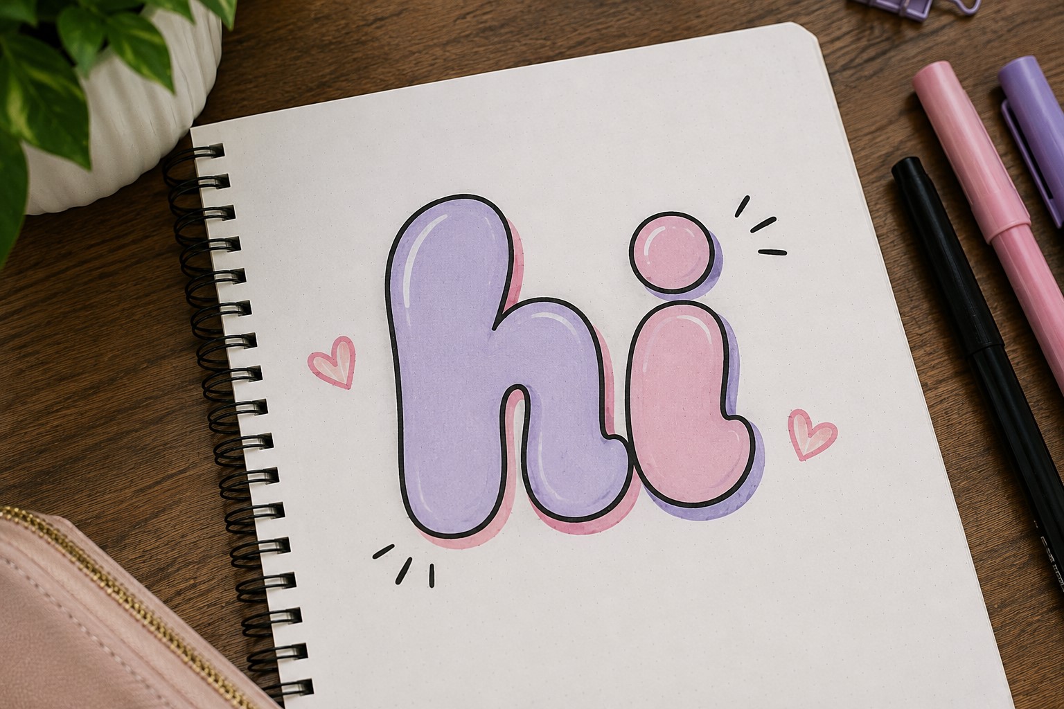
Bubble lettering has been around for years, yet it still works beautifully in a bullet journal. The rounded shapes make a page feel fun, relaxed, and welcoming.
That is why many people use this style for monthly covers and personal spreads.
The trick is keeping the letters balanced. Try not to make some letters extremely large while others stay tiny.
Consistent sizing helps the title look intentional rather than messy. You can also leave the letters empty or fill them with simple patterns.
One reason bubble lettering remains popular is that it works for almost every skill level. Even beginners can create attractive results after a few attempts.
That makes it one of the easiest ways to improve your Bullet Journal Lettering without feeling overwhelmed.
2. Thin and Tall Lettering
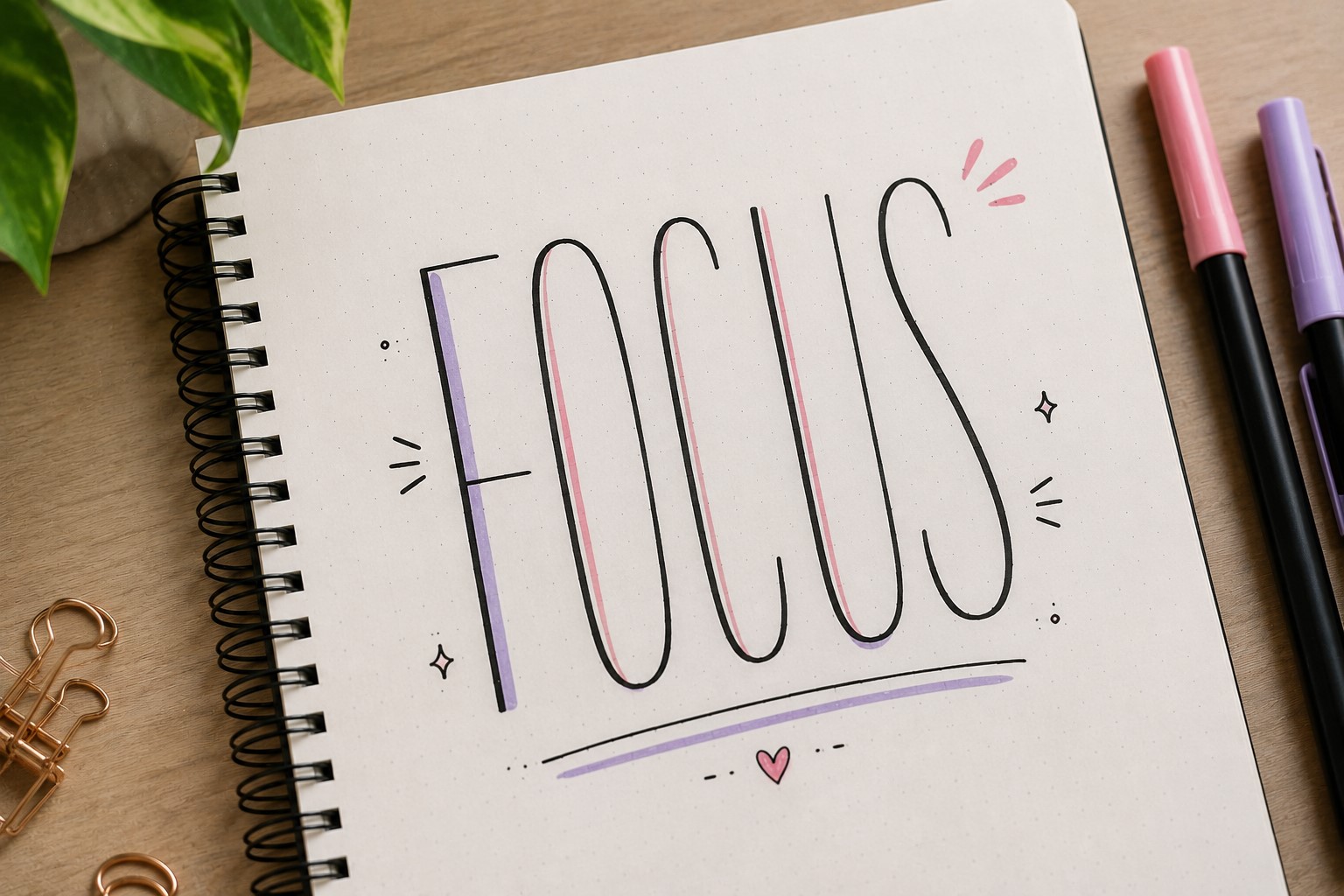
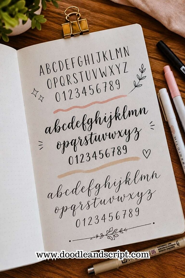
Some lettering styles attract attention through decoration. Others do it through shape. Thin and tall lettering belongs in the second group.
The stretched letters immediately create a modern and stylish appearance.
This style works especially well when you have long titles that need to fit into a smaller space. Instead of making the words wider, you simply give them more height. The result feels clean and elegant.
Many journal users pair this style with minimalist layouts because the lettering already provides enough visual interest. It creates a strong focal point without requiring extra decorations.
If you enjoy exploring different font styles, check out 19 Easy Bullet Journal Fonts Anyone Can Learn.
3. Shadow Lettering
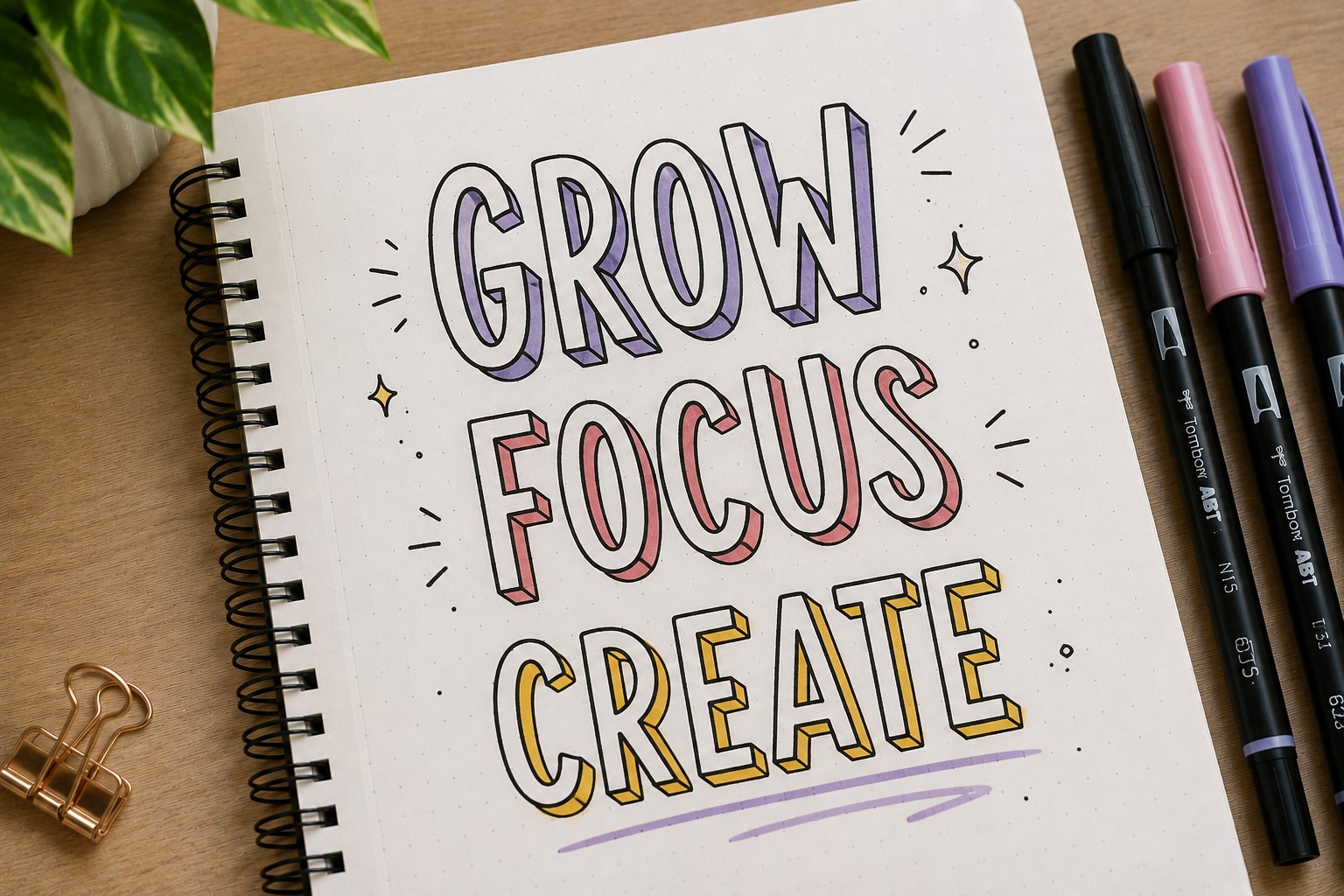
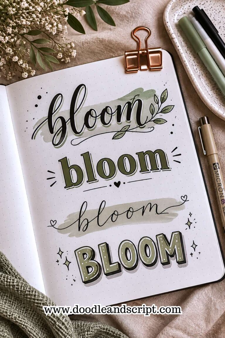
A shadow can completely change the way a title looks. Even simple handwriting becomes more eye-catching when a shadow adds depth and dimension.
Start with a basic lettering style. Then add a thin shadow on one side of each letter. Keep the shadow direction consistent throughout the word. This small detail creates a much more polished result.
The best part is that shadows work with almost every lettering style. They look great on script fonts, block letters, bubble lettering, and minimalist titles.
Many people overlook shadows because they seem like a minor detail. Yet they often make the biggest difference on a finished page.
4. Mixed Font Titles

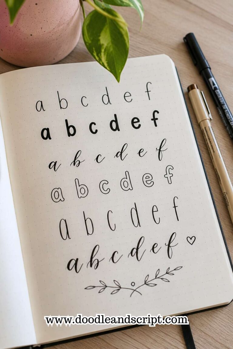
Some of the most attractive journal pages combine different lettering styles within the same title. One word might use bold block letters while another uses a softer script font.
This contrast helps create hierarchy. Your eyes naturally focus on the most important word first. The result feels dynamic without looking cluttered.
The key is limiting the number of styles. Two fonts usually create a stronger result than four or five competing styles. Simplicity often looks more professional.
This technique remains one of the most versatile Bullet Journal Lettering ideas because it works with nearly every journal theme.
If you want more title inspiration, explore 21 Bullet Journal Title Lettering Ideas That Look Professional.
5. Faux Calligraphy
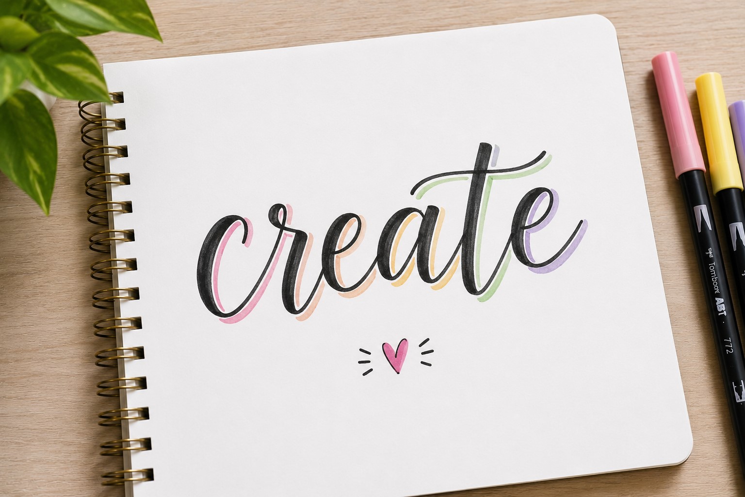
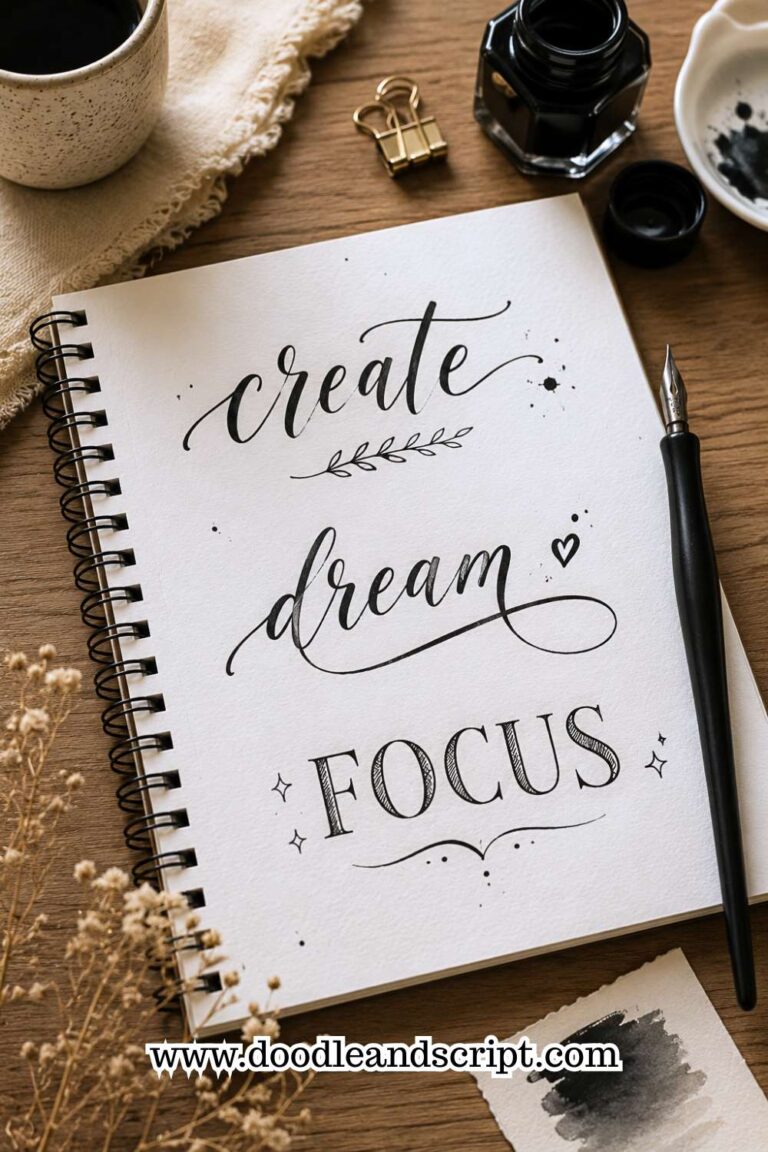
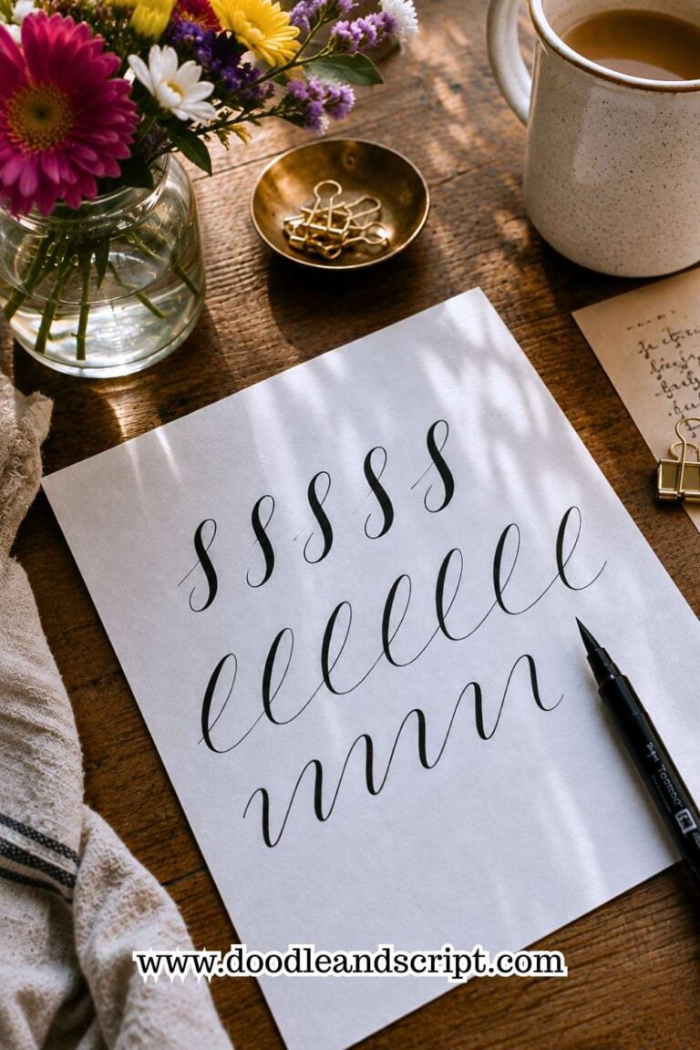
Faux calligraphy is perfect for people who love elegant lettering but do not own brush pens. The process starts with simple cursive writing. Afterward, you thicken the downward strokes.
That small adjustment creates beautiful contrast and makes the lettering appear much more advanced than it actually is. Many beginners are surprised by how effective this technique looks.
This style works especially well for quote pages, gratitude logs, memory spreads, and monthly covers. The flowing lines create a softer and more decorative feel.
The best thing about faux calligraphy is its accessibility. A regular pen is often all you need.
If you enjoy decorative writing styles, take a look at 17 Creative Bullet Journal Calligraphy Ideas to Try Today.
6. Outline Lettering
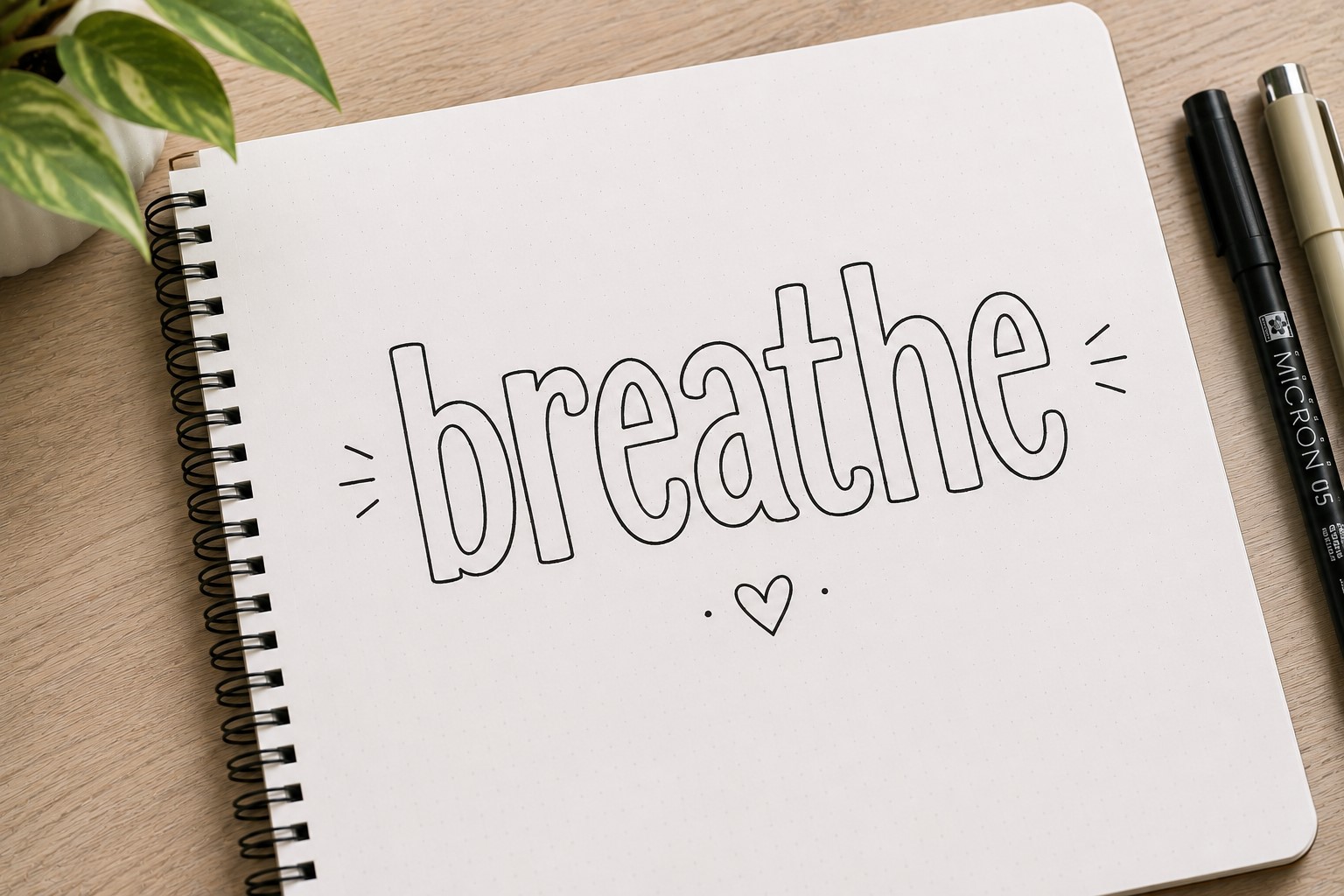
Outline lettering proves that you do not always need solid letters to make an impact. Instead of filling each letter completely, you draw only the outer edges.
This creates an airy and modern look that feels clean without being boring. The open space inside the letters also gives you room to add patterns, dots, flowers, or other decorative elements.
Many journal users love outline lettering because it feels highly customizable. The same title can look completely different depending on what you place inside the outlines.
This style works beautifully on cover pages where you want the title to stand out without overwhelming the rest of the design.
7. Daisy Lettering
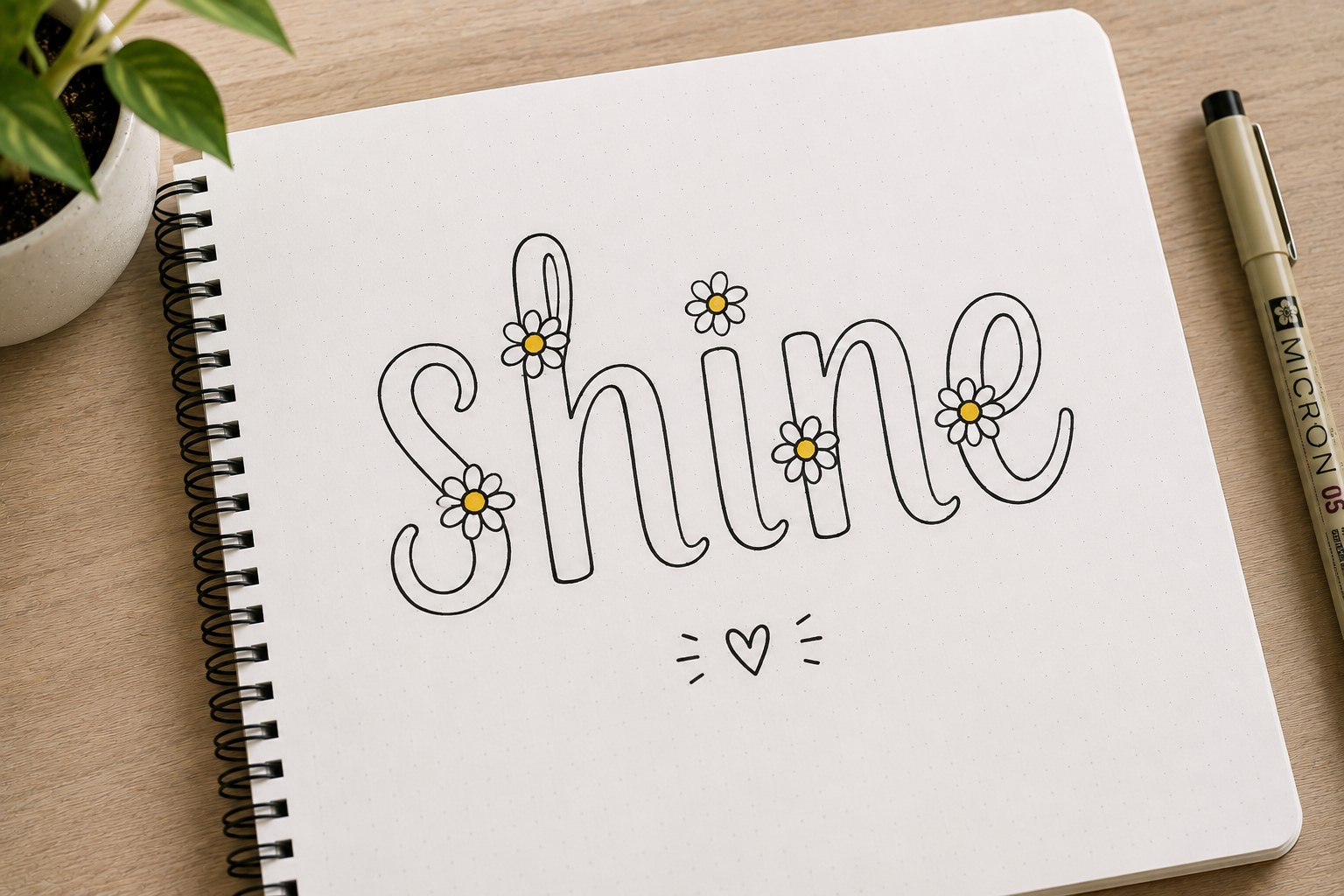
Daisy lettering combines simple handwriting with tiny floral details. Small daisies can replace dots above letters or decorate the ends of certain strokes.
The style feels cheerful and youthful without becoming overly complicated. That balance makes it a favorite for spring spreads, mood trackers, and self-care pages.
The flowers do not need to be detailed. In fact, simple petals often create the best result. The goal is adding charm rather than creating a botanical illustration.
If you enjoy combining lettering with decorative details, explore 11 Decorative Bullet Journal Lettering Ideas for Stunning Pages.
8. Spaced-Out Lettering

Sometimes the secret to aesthetic lettering is not adding more details. Sometimes it is creating more space. Spaced-out lettering increases the distance between letters to create a clean and sophisticated appearance.
This technique works especially well in minimalist journals because it creates elegance through simplicity. The wider spacing also helps titles feel more intentional.
Many people underestimate this style because it looks so simple. Yet it appears frequently in modern journal layouts because it photographs beautifully and remains easy to read.
A little extra spacing can completely change the mood of a title without requiring any additional drawing skills.
9. Banner Lettering

A banner can make even the simplest lettering look more exciting. Instead of placing a title directly on the page, you place it inside a hand-drawn banner.
The banner instantly gives the words more importance and helps them stand out.
This style works especially well for monthly covers, goals pages, and section dividers. The banner acts like a frame and naturally draws attention to the text inside it.
You can keep the banner simple or add small folds and details for extra dimension. Either way, the design remains beginner-friendly and easy to customize.
Many journal users love this style because it creates a decorative look without requiring complicated lettering skills.
If you enjoy this type of design, explore 21 Cute Bullet Journal Banner Doodles Anyone Can Draw.
10. Block Lettering with Patterns
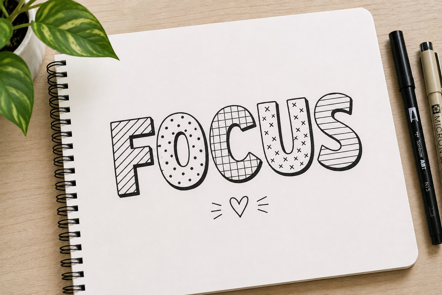
Block lettering already creates strong visual impact. Adding patterns inside the letters takes the style even further.
Stripes, dots, stars, checkers, and tiny doodles can completely change the appearance of a title.
This technique works particularly well for large headings where the patterns remain visible. The decorations help transform ordinary letters into design elements.
One advantage of this style is its versatility. You can match the patterns to the theme of your spread. A reading log might use tiny books, while a travel page could include miniature airplanes.
The possibilities are nearly endless, which keeps the lettering feeling fresh and creative.
11. Layered Lettering
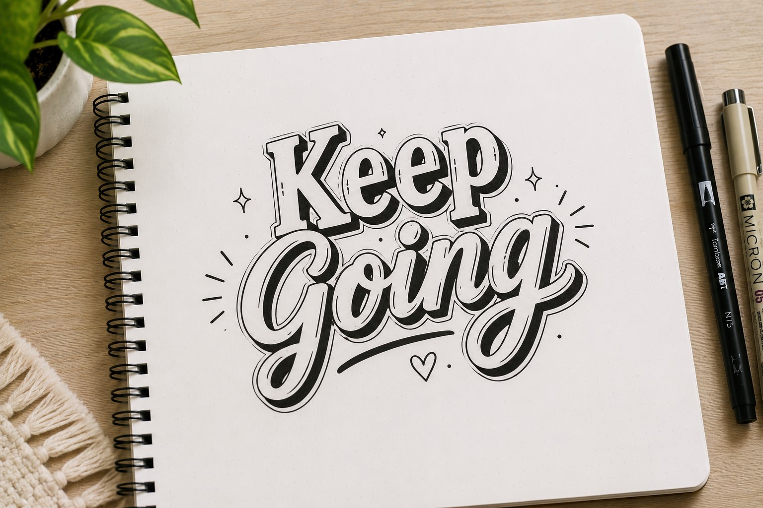
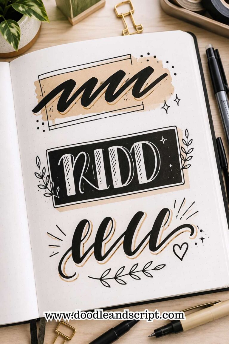
Layered lettering creates depth by placing multiple versions of the same word behind one another. The overlapping effect makes a title look more dynamic and visually interesting.
Start with your main lettering. Then create a second outline slightly offset behind it. Some people even add a third layer for extra depth. The finished result looks detailed without being difficult to achieve.
This style works beautifully on cover pages because it naturally attracts attention. It also pairs well with simple layouts where the title becomes the focal point.
Many aesthetic journal pages use layered lettering because it creates a professional look with minimal effort.
If you want even more font inspiration, take a look at 29 Bullet Journal Font Ideas to Make Your Pages Pop.
12. Floral Frame Lettering
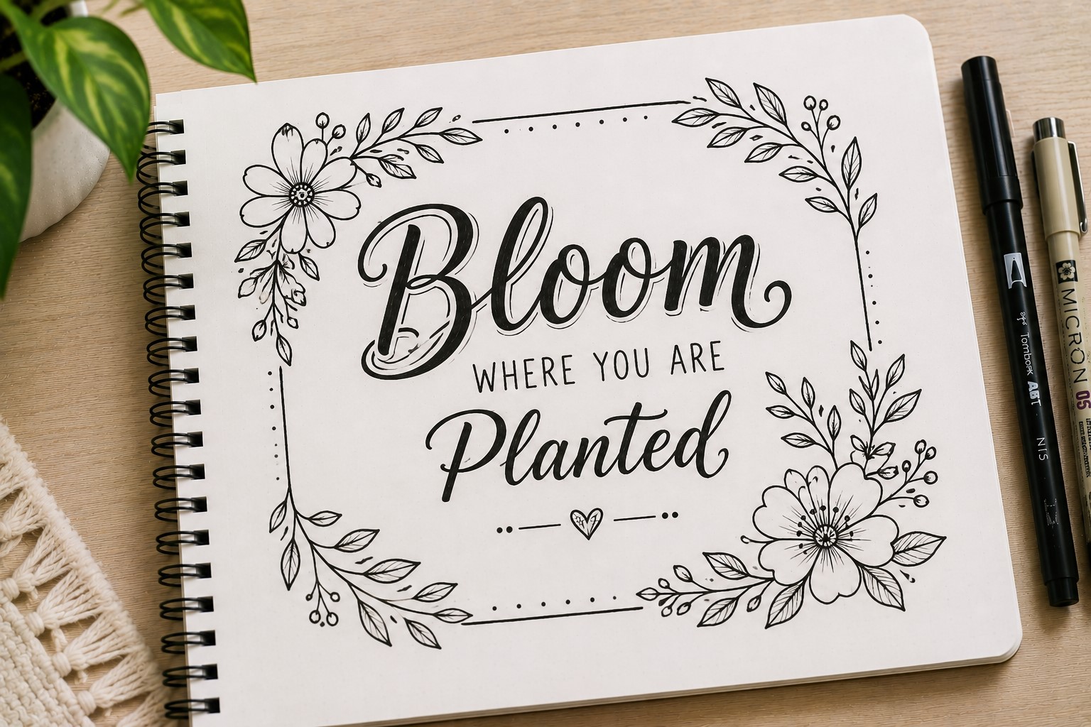
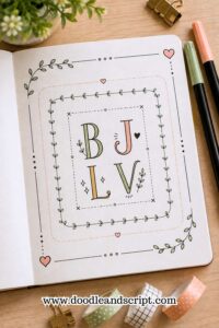
Instead of decorating the letters themselves, this style decorates the space around them. A simple title sits inside a frame made from leaves, flowers, vines, or small botanical elements.
The lettering remains easy to read while the frame adds personality and softness. This balance makes the style ideal for gratitude journals, memory spreads, and wellness pages.
The floral elements do not need to be elaborate. A few leaves and simple flowers often create a stronger result than a crowded design.
This approach works especially well when you want your title to feel elegant without relying on complicated calligraphy.
13. Stacked Word Lettering
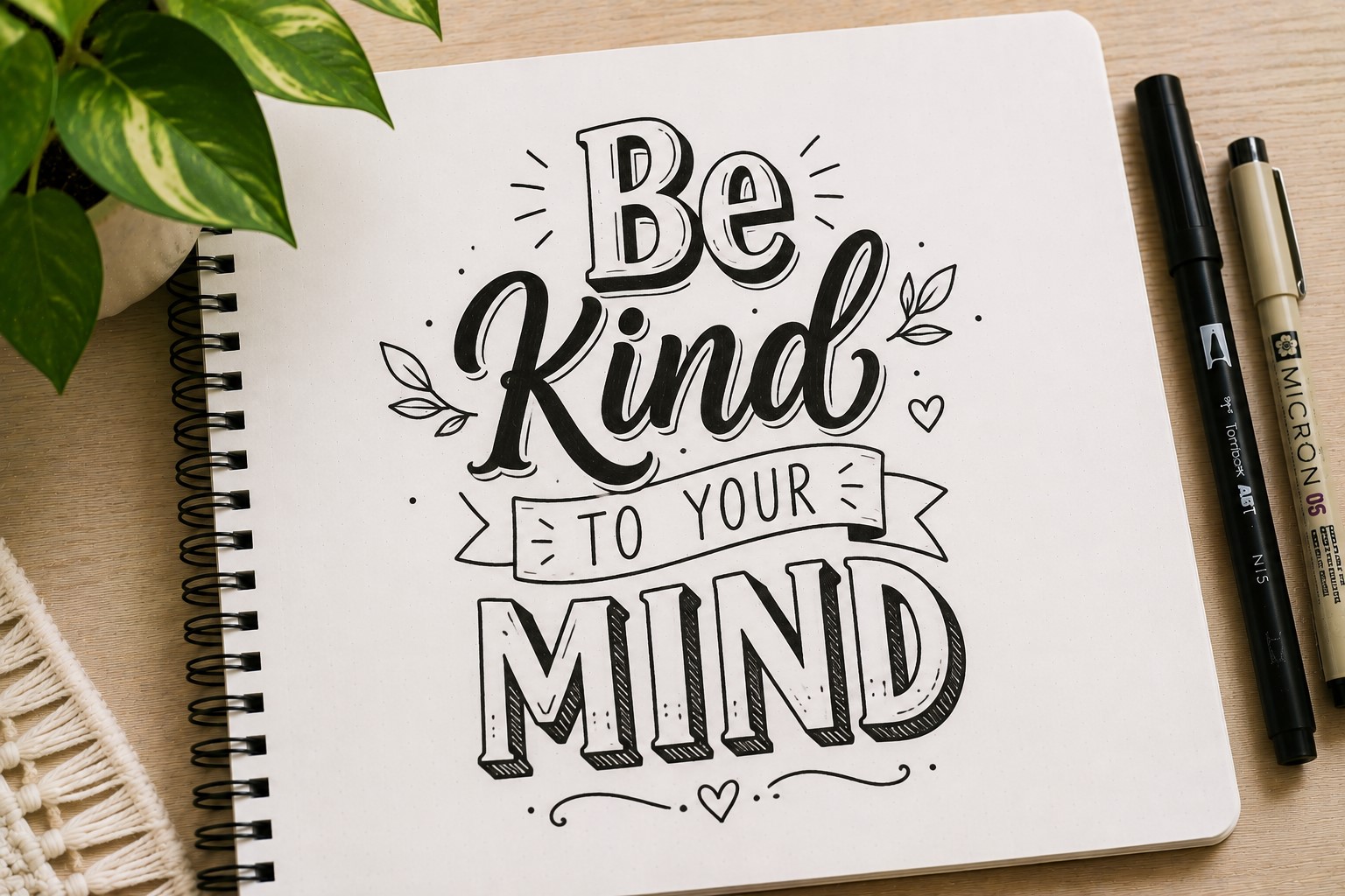
Some titles become more interesting when the words sit on separate lines. Instead of stretching a phrase across the page, you stack the words vertically to create a stronger visual shape.
This style works particularly well for longer titles that might otherwise feel awkward. Stacking creates better balance and allows each word to contribute to the design.
Many journal users combine stacked layouts with different lettering styles to create even more contrast. One word may be bold while another appears thin and delicate.
The result feels intentional and often looks more polished than a traditional horizontal title.
If you want to improve the structure of your headings, check out How to Create Gorgeous Bullet Journal Headers in 15 Steps.
14. Tiny Accent Lettering
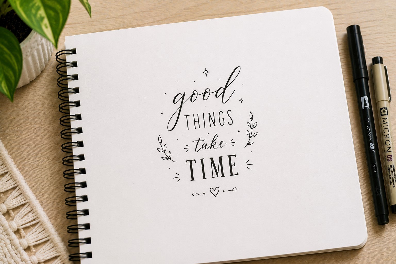
Sometimes the smallest details create the biggest impact. Tiny accent lettering uses stars, sparkles, hearts, arrows, or dots around a title to enhance the overall design.
The lettering itself remains fairly simple. The decorative accents help create personality and movement around the words.
This style works beautifully for planners, mood trackers, and personal journals because it adds charm without taking up much space.
The key is restraint. A few accents often create a better result than filling every available area around the title.
15. Wavy Lettering

Wavy lettering introduces movement into a title. Instead of keeping every letter perfectly straight, the word follows a gentle wave across the page.
This technique instantly makes a spread feel more playful and relaxed. It works particularly well in creative journals and seasonal layouts.
Many people enjoy this style because it breaks away from rigid structures. The slight curves create energy while keeping the title readable.
You can exaggerate the wave or keep it subtle depending on the overall mood of the page.
If you love playful page designs, explore 27 Easy Bullet Journal Doodle Ideas for Every Page.
16. Geometric Lettering

Geometric lettering uses shapes such as circles, triangles, and rectangles to build letters. The result feels modern, bold, and highly structured.
This style works especially well in study planners, project pages, and productivity spreads. The clean shapes create a sense of order that complements organized layouts.
One advantage of geometric lettering is consistency. The shapes act like guidelines, making it easier to maintain uniform proportions.
Many people discover that geometric titles become a favorite because they look unique without requiring advanced drawing skills.
17. Double-Line Lettering

Double-line lettering takes a simple font and gives it a little more personality. Instead of drawing one outline for each letter, you create two parallel outlines. The extra line adds detail without making the title look crowded.
This style works especially well for larger headings where the details can be seen clearly. You can leave the space between the lines empty or fill it with color and patterns.
Many journal users enjoy this style because it feels decorative while remaining clean and easy to read. It also pairs beautifully with minimalist layouts.
If you want more ways to improve your page layouts, explore How to Make Beautiful Bullet Journal Headers in 13 Easy Steps.
18. Vintage Lettering

Vintage lettering brings an old-school charm to a journal spread. The letters often include small serifs, decorative curves, and classic proportions that feel timeless.
This style works beautifully for reading journals, memory pages, and seasonal themes. It creates a cozy feeling that makes a spread feel more personal.
One reason vintage lettering remains popular is that it stands out from modern minimalist styles. The extra details create character and warmth without becoming overwhelming.
You do not need to copy antique signs perfectly. Even small vintage-inspired details can completely change the mood of a title.
19. Highlighted Lettering
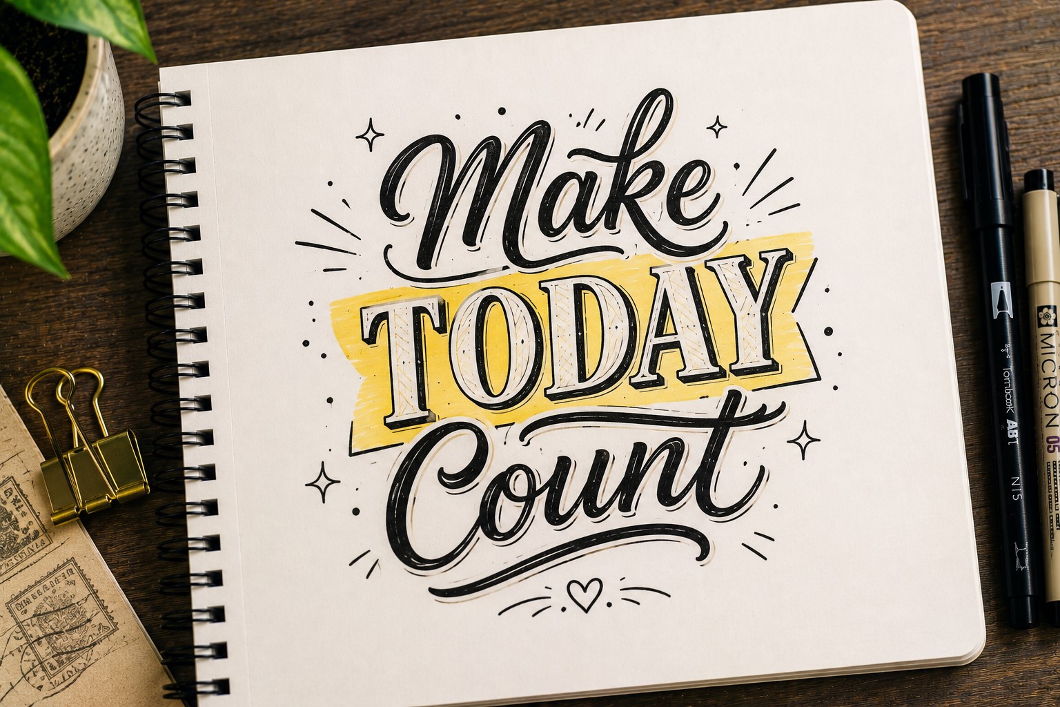
A simple highlighter can make ordinary Bullet Journal Lettering look much more intentional. Instead of changing the font itself, you create contrast behind the letters.
The highlight can appear as a soft shadow, a brush stroke, or a colored rectangle. This technique helps important titles stand out while keeping the lettering easy to read.
Many journal users rely on this method because it is fast. A title that feels plain can instantly become a focal point with just a few seconds of extra work.
This style works particularly well in study planners and productivity spreads where clarity matters.
20. Floating Lettering
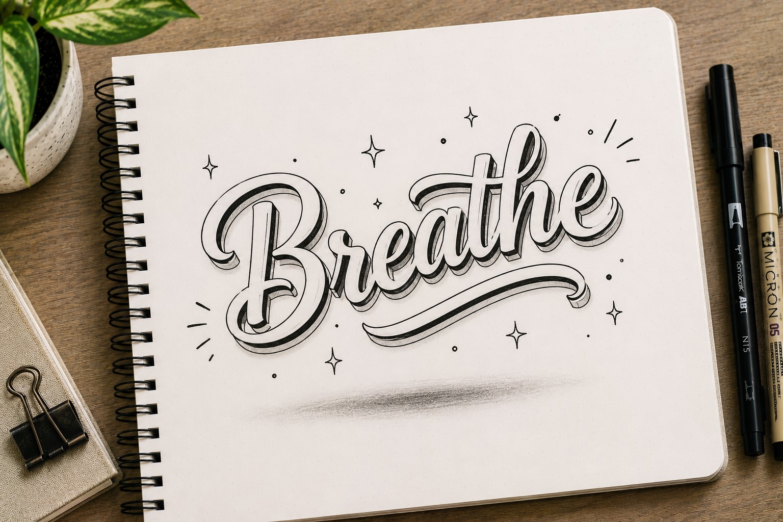
Floating lettering creates the illusion that words sit slightly above the page. This effect often comes from subtle shadows, spacing, or layered outlines.
The style feels modern and eye-catching without requiring complicated drawing techniques. Even a simple font can look more interesting when it appears to float.
This approach works beautifully for monthly covers and section dividers because it naturally attracts attention.
Many aesthetic journal pages use floating effects because they create depth while keeping the overall design clean.
If you want more decorative ideas for your pages, take a look at 15 Easy Bullet Journal Doodle Borders Anyone Can Draw.
21. Script and Block Combination
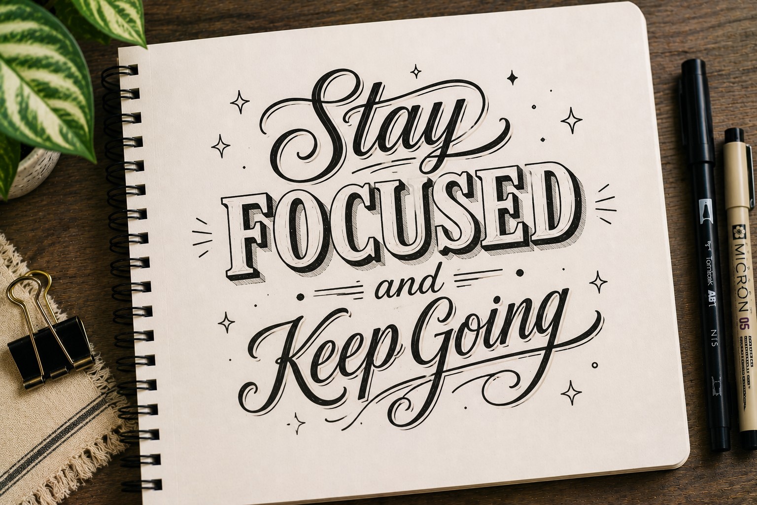
Some of the best Bullet Journal Lettering styles come from combining opposites. Pairing a flowing script font with bold block letters creates instant contrast and visual balance.
The bold letters attract attention first. Meanwhile, the script adds elegance and softness. Together, they create a title that feels both structured and creative.
This technique works especially well for cover pages, quote spreads, and vision boards. The mix of styles helps certain words stand out naturally.
Many journal users return to this approach repeatedly because it works with almost any theme or color palette.
22. Decorative Corner Lettering
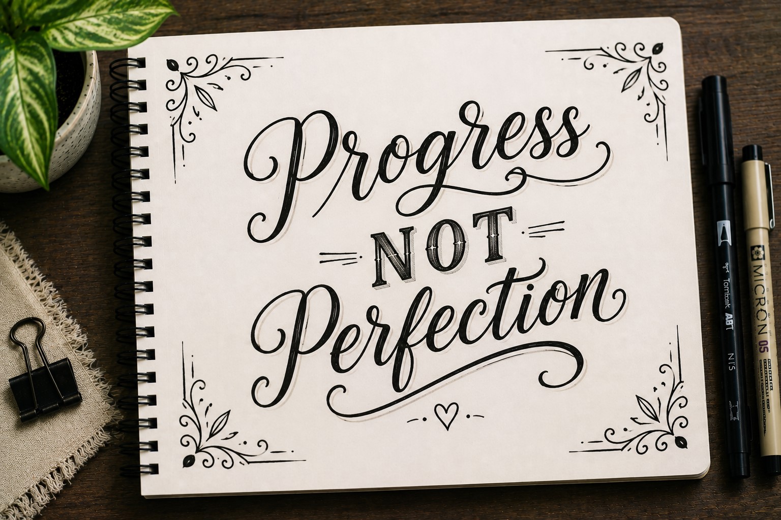
Sometimes the lettering stays simple while the decoration appears around it. Decorative corner lettering uses small embellishments placed near the corners of a title.
Stars, leaves, sparkles, hearts, and tiny flowers all work beautifully. These details help frame the lettering without competing with it.
The style works particularly well when a page already contains plenty of information. The small decorations add charm without taking up valuable space.
Many people find this approach easier than decorating every letter individually.
If you enjoy creative decorative techniques, explore 15 Easy Bullet Journal Lettering Styles Every Beginner Should Learn.
23. Quote-Inspired Lettering
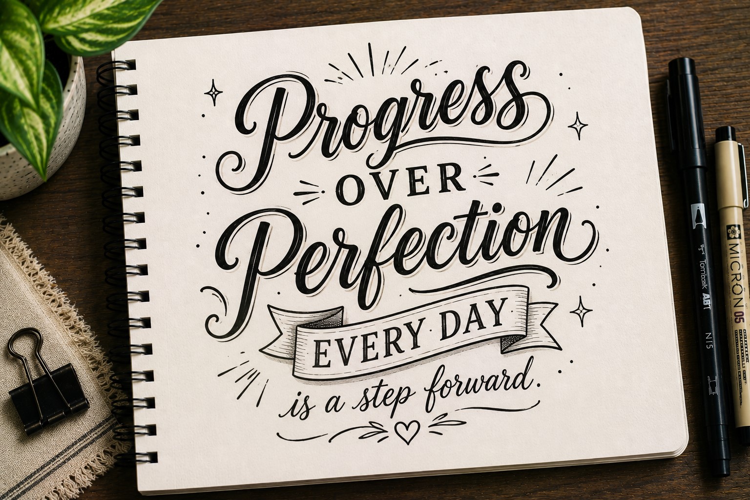
Quote-inspired lettering focuses on arrangement as much as the lettering itself. Different words use different sizes, styles, and positions to create a visually interesting composition.
This technique works beautifully even when the title contains only a few words. The varying sizes help create hierarchy and movement across the page.
Many journal users borrow this approach from quote art because it allows them to emphasize important words naturally.
The result often feels more artistic than a standard title while remaining surprisingly easy to create.
If you enjoy arranging words creatively, check out 17 Bullet Journal Quote Lettering Ideas That Stand Out.
24. Minimal Outline Lettering
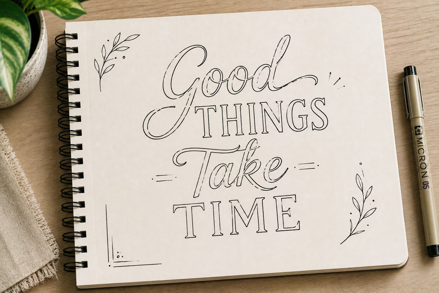
Minimal outline lettering strips away unnecessary details and focuses on clean shapes. The letters remain open and simple, creating a modern appearance that works with almost any layout.
This style pairs especially well with colorful backgrounds because the open letters prevent the title from feeling too heavy.
One reason people love this approach is its versatility. The same font can look elegant, playful, or sophisticated depending on the surrounding design.
Minimal styles often age well because they do not rely on trends. They simply look clean and intentional.
25. Personalized Signature Lettering
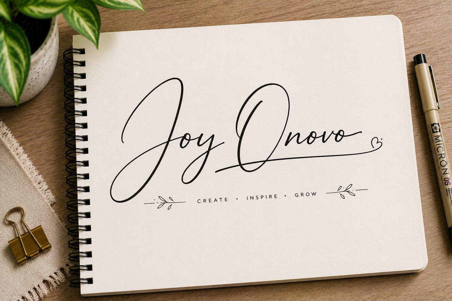
The final idea may be the most important one. Instead of copying someone else’s style exactly, create a lettering style that feels like your own.
Take pieces from different fonts you enjoy. Maybe you like the curves from one style and the spacing from another. Over time, those influences blend together and become something unique.
Many people spend so much time chasing perfect lettering that they forget the goal is self-expression. A journal should reflect your personality, not someone else’s.
If you want to build consistency and confidence in your lettering, explore How to Practice Bullet Journal Lettering in 21 Days.
Final Thoughts
The best thing about Bullet Journal Lettering is that there is no single right way to do it. Some people love bold titles that dominate the page.
Others prefer soft and minimalist designs. The beauty of lettering is that it gives you endless ways to make a journal feel more personal and creative.
As you experiment with these ideas, remember that small changes often create the biggest impact.
A shadow, a different font shape, or a little extra spacing can completely change how a spread feels. That freedom is what makes Bullet Journal Lettering so enjoyable to explore.
You do not need to master all 25 ideas at once. Pick a few favorites and start there. The more you practice, the more natural these techniques will feel.
Before long, you will begin mixing styles, creating variations, and developing a look that is completely your own.