23 Easy Tricks to Create Aesthetic Hand Lettering
Disclosure: Some of the links in this post are affiliate links. This means if you click on the link and purchase an item, I will receive an affiliate commission at no extra cost to you.
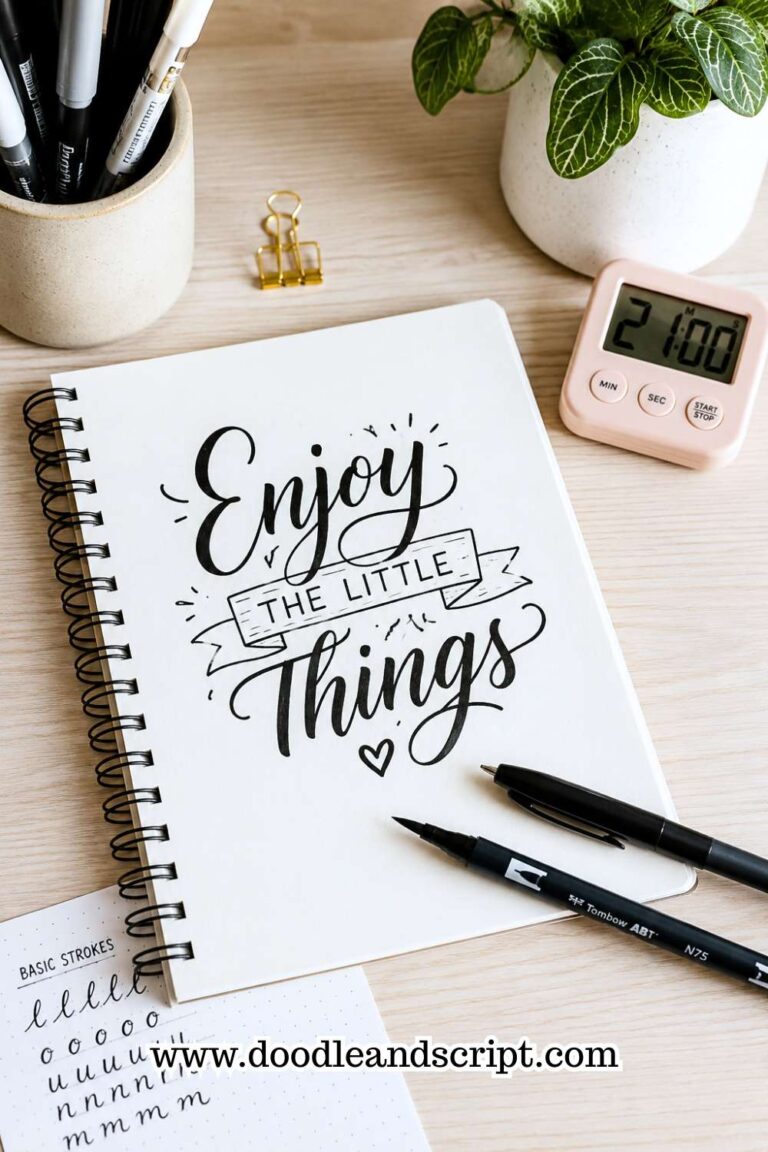
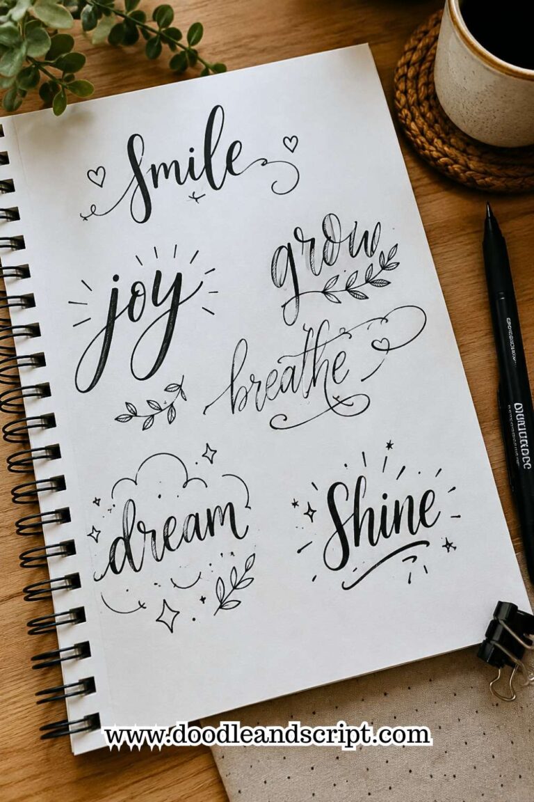
Why do you think some hand lettering pieces make you want to keep staring at them? It’s rarely because the artist used the fanciest brush pen or added dozens of flourishes.
More often, it’s the tiny details working together. The spacing feels just right. The letters seem to breathe. Every curve, shadow, and line has a purpose. Those little choices are the secret behind the Tricks to Create Aesthetic Hand Lettering.
Here’s something I love to tell beginners: aesthetic lettering isn’t a talent you’re born with. It’s a collection of simple tricks that anyone can learn.
Once you know what to look for, you’ll start noticing beautiful layouts on coffee cups, book covers, café menus, greeting cards, and social media posts.
Better still, you’ll know exactly how to recreate that same polished look in your own lettering.
If you’re still building your foundation, How to Master the Hand Lettering Alphabet in 15 Simple Steps will make these tricks much easier to apply.
In this guide, I’ll walk you through twenty-three practical tricks that instantly elevate your lettering. We’ll focus on the small details that create the biggest visual impact, so you can turn ordinary words into artwork that feels clean, stylish, and impossible to scroll past.
23 Easy Tricks to Create Aesthetic Hand Lettering
1. Mix Two Lettering Styles

One of my favorite Tricks to Create Aesthetic Hand Lettering is combining two lettering styles in the same design.
Contrast naturally attracts attention, so pairing bold block letters with a soft script creates a layout that feels balanced and interesting.
The key is knowing when to stop. Two styles are usually enough. Adding three or four different styles often makes your lettering look busy instead of beautiful.
Try making the most important word bold while keeping the supporting words simple. This small change gives your design a clear focal point without much effort.
If you’re unsure which styles work well together, 11 Hand Lettering Styles Every Beginner Should Try is full of beginner-friendly inspiration.
2. Make One Word Stand Out

Every beautiful lettering piece has a word that immediately catches your eye. Instead of giving every word the same size and weight, choose one that carries the message. Make it larger, bolder, or place it in a different lettering style.
For example, in the quote “Choose Joy Every Day,” the word Joy deserves more attention than the others. This simple trick creates hierarchy and makes your lettering easier to read.
Before you begin any project, decide which word you want people to notice first. That decision alone can completely change the finished design.
3. Don’t Be Afraid of Empty Space

A common beginner habit is filling every empty corner with flourishes, stars, or extra decorations. The result usually feels crowded. Empty space is actually part of the design because it helps your lettering breathe.
It also makes the important words stand out much more clearly. The next time you finish a piece, step back before adding another decorative element.
Ask yourself if it truly improves the design or simply fills space. You’ll often discover that a cleaner layout looks much more elegant than a crowded one.
4. Keep Your Letters Consistent

Beautiful lettering isn’t about drawing one perfect letter. It’s about making every letter work together. Pay attention to your letter height, spacing, slant, and stroke thickness as you practice.
Small inconsistencies may not seem obvious while you’re writing, but they become much easier to spot when you look at the finished word.
Using light pencil guidelines can help you keep everything aligned until consistency becomes natural.
If you’d like more structured practice, 19 Beginner Hand Lettering Practice Sheets You’ll Actually Use will help you build this skill faster.
5. Add a Simple Shadow

Adding a shadow is one of the quickest ways to make flat lettering look more interesting. You don’t need complicated techniques to create depth.
Simply decide where your imaginary light source is coming from and keep every shadow on the opposite side of each letter.
Consistency is what makes the effect believable. Start with a thin shadow instead of a thick one, especially if you’re still learning. A subtle effect usually looks cleaner and keeps the focus on the lettering itself.
If your letterforms still need work, 21 Proven Ways to Improve Your Hand Lettering Faster will help you strengthen the basics before adding decorative effects.
6. Limit Your Color Palette

Color can make your lettering more attractive, but using too many colors often has the opposite effect.
Instead of reaching for every marker in your collection, choose two or three colors that work well together. This keeps your design looking clean and intentional.
A soft neutral paired with one bold accent color is usually enough to make your lettering pop. As you practice, you’ll also begin to discover color combinations that match your personal style.
Remember, beautiful lettering doesn’t need a rainbow to stand out. Sometimes a simple color palette creates the biggest impact.
7. Pay Attention to Letter Spacing

Even perfectly formed letters can look untidy when they’re spaced unevenly. One letter may feel squeezed while another sits too far away, making the entire word look unbalanced.
As you practice, shift some of your attention from the letters themselves to the spaces between them. Those gaps should feel as consistent as possible. A good trick is to look at your word upside down.
This helps your eyes focus on spacing instead of getting distracted by the letters. If you’d like to improve this skill, How to Master the Hand Lettering Alphabet in 15 Simple Steps explains how consistent spacing transforms your lettering.
8. Use Short Quotes to Practice

Long quotes can feel overwhelming, especially when you’re trying to improve your layout. Instead, start with two- to five-word phrases.
Short quotes give you enough room to experiment with different lettering styles, spacing, and decorations without worrying about fitting everything onto one page.
You’ll also finish projects more quickly, which builds confidence and keeps practice enjoyable. Once you’re comfortable arranging short quotes, moving on to longer designs becomes much easier.
For inspiration, 19 Beautiful Ways to Letter Quotes Like a Pro is packed with creative ideas you can practice.
9. Round Sharp Edges

If your lettering feels a little stiff, look closely at the corners of your letters. Softening sharp edges can instantly make your work look friendlier and more modern.
This works especially well with block lettering, where slightly rounded corners create a smoother appearance without changing the overall style.
You don’t need to round every corner dramatically. Small adjustments are often enough to make a noticeable difference.
Experiment with one word written both ways, and you’ll quickly see which version feels more balanced and inviting.
10. Sketch Before You Ink

It can be tempting to start lettering with your favorite pen straight away, but spending a minute on a light pencil sketch usually leads to a much better result.
Sketching helps you decide where each word will sit, how large the letters should be, and whether your layout feels balanced before you commit to ink.
It also gives you the freedom to adjust mistakes without worrying about ruining your page. Many experienced lettering artists still sketch first because they know good planning creates better designs.
If you want to improve your layouts even further, 13 Secrets to Creating Beautiful Hand Lettering Compositions is a helpful next read.
11. Repeat Your Decorative Elements

Decorations can make your lettering more interesting, but they should work together instead of competing for attention.
If you add tiny stars around one word, repeat those same stars elsewhere instead of introducing hearts, flowers, arrows, and swirls all at once.
Repeating the same decorative element creates harmony and makes the design feel intentional. This doesn’t mean every decoration has to be identical, but keeping them within the same style gives your lettering a polished, professional appearance.
12. Let Flourishes Support the Lettering

Flourishes are beautiful when they’re used with purpose. They should guide the eye around your design, not distract from the words themselves.
A common mistake is adding flourishes simply because there’s empty space on the page. Instead, place them where they improve balance or frame an important word.
If a flourish makes a letter difficult to read, it’s probably doing too much. Start with one or two simple curves and build your confidence over time.
If you’d like to learn controlled flourishes through movement, How to Create Beautiful Bounce Lettering in 13 Easy Steps is a great place to continue.
13. Play With Different Letter Sizes

One of the easiest Tricks to Create Aesthetic Hand Lettering is changing the size of your letters. If every word is the same height and weight, the design can look flat.
Instead, make your main word larger while keeping the supporting words smaller. This creates contrast and naturally guides the reader’s eye through the quote.
You don’t have to make the difference dramatic. Even a slight change in size can make the layout feel more dynamic.
Before you start lettering, decide which word deserves the most attention and build the rest of the design around it. A little planning goes a long way.
14. Write the Same Design More Than Once

Your first attempt is rarely your best, and that’s perfectly okay. Instead of moving on to a new quote, try lettering the same one two or three more times.
You’ll naturally adjust the spacing, improve the layout, and notice little details you missed the first time.
I like doing this because it takes the pressure off creating something perfect. Each version becomes a chance to improve instead of a test.
If you’re looking for more ways to make every practice session count, 25 Beginner Lettering Exercises That Actually Work offers simple routines you can repeat every day.
15. Add Simple Underlines and Banners

A clean underline or a small banner can make an important word stand out without overpowering the design. The trick is to keep these elements simple. They should support the lettering, not compete with it.
For example, you can underline the word Believe with a gentle curve or place Happy Birthday inside a small ribbon banner.
Little details like these help frame your words and make the finished piece feel complete. If the decoration catches your eye before the lettering does, it’s probably too large.
16. Keep Your Slant Consistent

Have you ever noticed that some letters lean left while others lean right? It may seem like a small detail, but an inconsistent slant can make your lettering feel untidy.
Choose a comfortable angle and try to maintain it throughout the entire word or quote. You don’t have to measure every letter, but being aware of the direction of your strokes makes a noticeable difference.
With regular practice, your hand will naturally develop a consistent rhythm, and your lettering will look much more polished.
17. Add a Gentle Bounce

Bounce lettering adds movement and personality, but subtlety is the secret. Lowering every letter below the baseline creates chaos, while adding a gentle bounce to only a few letters creates a playful and balanced look.
Start with letters like y, g, p, or h, and experiment with lowering them slightly. Then step back and see how the word flows. A little movement often looks more elegant than an exaggerated bounce.
If you want to master this style, How to Create Modern Hand Lettering in 17 Easy Steps also shares techniques that pair beautifully with bounce lettering.
18. Practice Confident Strokes

One smooth stroke almost always looks better than several hesitant ones. If you find yourself tracing over the same line again and again, slow down instead of trying to fix it afterward.
It’s completely normal if your lines aren’t perfect at first. Confidence grows with practice, and every page helps your hand become steadier. Focus on making each stroke with intention, even if it isn’t flawless.
If you’re building your confidence from the ground up, How to Learn Hand Lettering Step-by-Step (Even If You Can’t Draw) will help you develop strong lettering habits from the beginning.
19. Frame Your Lettering

A simple frame can make your lettering look finished without taking attention away from the words. It could be a circle, a rectangle, a loose arch, or even a hand-drawn border.
The frame doesn’t have to be perfect. Its job is to bring everything together and give your design a clear boundary.
Choose a frame that matches the mood of your lettering. A soft oval works beautifully for elegant quotes, while a simple rectangle suits modern designs. Keep it subtle so the lettering remains the star of the page.
If you need more inspiration for creating balanced layouts, Easy Hand Lettering Tutorial: Learn in 21 Minutes shares simple techniques you can apply right away.
20. Learn by Observing Great Lettering
One of the quickest ways to improve is by studying lettering you admire. Don’t just think, “That looks nice.” Instead, ask yourself what makes it look so appealing. Is it the spacing? The color choices? The large focal word? The clean layout?
Try recreating one small element rather than copying the entire design. You might borrow a color combination, a layout idea, or the way the artist uses shadows.
Over time, you’ll collect inspiration from many places and naturally develop your own style instead of imitating one person.
21. Don’t Aim for Perfection
Perfection is one of the biggest creativity killers. If you’re constantly trying to make every letter flawless, you’ll spend more time erasing than improving.
Instead, focus on making each new piece a little better than the last. Save your older practice pages and compare them with your recent work every few weeks. You’ll be surprised by how much you’ve improved.
If you’re struggling with habits that slow your progress, 15 Common Hand Lettering Mistakes (And How to Fix Them) can help you identify what to work on next.
22. Practice a Little Every Day

You don’t need hours of practice to create beautiful lettering. Ten or fifteen focused minutes each day can produce better results than one long session every weekend.
Choose one skill to practice during each session. One day, work on spacing. The next day, focus on shadows or letter size. Breaking your practice into small goals keeps it enjoyable and helps you improve steadily.
If you’re looking for simple daily habits that make a real difference, 17 Hand Lettering Tips Every Beginner Should Know is full of practical ideas.
23. Let Your Style Grow Naturally
The final one of these Tricks to Create Aesthetic Hand Lettering is remembering that your lettering should reflect you. It’s perfectly fine to admire other artists, but don’t feel pressured to make your work look exactly like theirs.
As you practice, you’ll naturally discover the things you enjoy most. You may prefer clean layouts with lots of white space, bold block lettering, soft script, or delicate floral accents.
Those preferences become part of your creative identity. Keep experimenting, keep learning, and allow your style to evolve with every project.
If you’re ready to refine your overall technique even further, How to Create Beautiful Bounce Lettering in 13 Easy Steps is a great next read.
Final Thoughts
Creating beautiful lettering isn’t about buying better pens or mastering complicated techniques overnight. More often, it’s the small details that make the biggest difference.
The Tricks to Create Aesthetic Hand Lettering in this guide are simple enough for beginners, yet powerful enough to transform the way your finished pieces look.
Don’t feel like you have to use all twenty-three tricks at once. Pick a few that stand out to you and practice them consistently.
As those become second nature, add a few more. You’ll build confidence without feeling overwhelmed, and your lettering will improve with every page you complete.
Most importantly, enjoy the process. Every quote you letter, every practice page you fill, and every small improvement brings you closer to developing a style that’s uniquely yours.
Beautiful lettering isn’t created in a day, but with patience and consistent practice, you’ll be amazed by what your hands can create.
When you’re ready to sharpen your skills even further, 15 Hand Lettering Drills That Will Improve Your Skills Fast will give you focused exercises to help you continue growing.