21 Hand Lettering Drills You Should Practice Every Week
Disclosure: Some of the links in this post are affiliate links. This means if you click on the link and purchase an item, I will receive an affiliate commission at no extra cost to you.
Beautiful lettering starts long before you write your first word. The secret isn’t finding the perfect brush pen or copying hundreds of quotes; it’s repeating small movements until they feel effortless.
Every smooth downstroke, balanced curve, and consistent letter is built through simple practice that strengthens your muscle memory over time. That’s why experienced lettering artists still spend time on basic drills, even after years of practice.
It will interest you to know that you don’t need to dedicate hours to improving your skills. Just a few focused minutes each week can make a noticeable difference in your control, spacing, pressure, and overall confidence.
These Hand Lettering Drills You Should Practice are designed to help you master the fundamentals so creating words, quotes, and creative projects becomes easier and more enjoyable.
Whether you’re picking up a brush pen for the first time or refining your technique, these exercises will help you build stronger habits one stroke at a time.
If you’re completely new to lettering, begin with How to Learn Hand Lettering Step-by-Step (Even If You Can’t Draw) before working through these weekly drills. A solid foundation will make every exercise more effective and help you see progress much faster.
21 Hand Lettering Drills You Should Practice Every Week
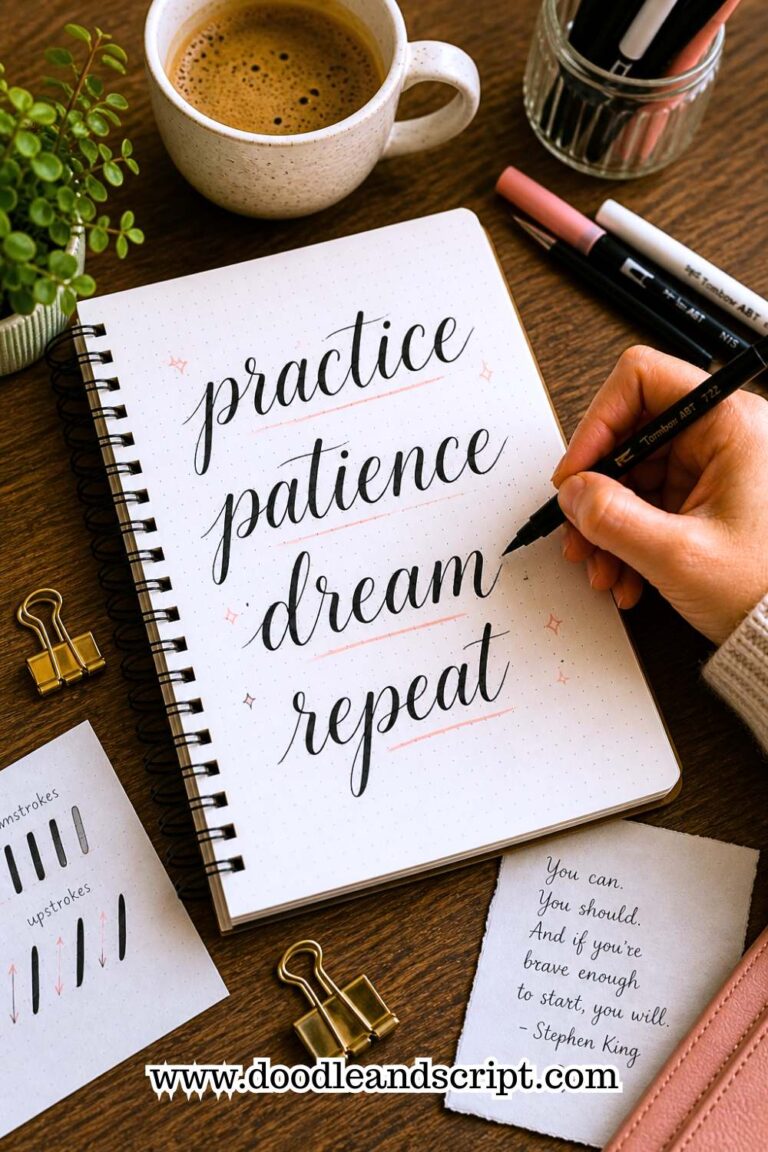
1. Practice Basic Upstrokes and Downstrokes

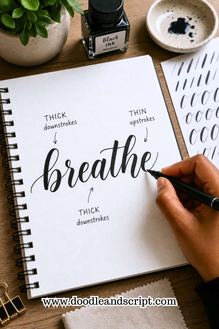
Every beautiful lettering style begins with two simple strokes: the thin upstroke and the thick downstroke. Nearly every letter you write is made from a combination of these movements, so it’s worth spending time mastering them before moving on to more advanced drills.
If these strokes become smooth and consistent, every word you create will immediately look cleaner.
Draw a full page of straight upstrokes using very light pressure, then switch to downstrokes using firm, even pressure. Focus on making each line the same height and thickness. Don’t rush through the exercise. Slow, controlled movements train your muscles much better than fast, uneven ones.
Pay close attention to how your pen responds to pressure. Many beginners accidentally press too hard on both strokes, making every line look thick.
Others lift the pen too early during downstrokes, creating uneven lines. Practicing these two movements separately helps you understand exactly how much pressure your brush pen needs.
Repeat this drill for five to ten minutes at the beginning of every practice session. As your control improves, you’ll notice smoother transitions between thin and thick strokes in your finished lettering.
If you’re still learning how pressure works, How to Master the Hand Lettering Alphabet in 15 Simple Steps will reinforce these foundational techniques.
2. Fill a Page with Oval Shapes

Rounded letters like a, c, d, e, g, o, and q all rely on smooth oval movements. If your ovals are uneven, many of your letters will also appear inconsistent. That’s why practicing ovals is one of the most effective drills you can do every week.
Start by drawing large ovals across the page before gradually making them smaller. Try to keep every oval the same size while maintaining smooth, continuous movement. Don’t worry about speed. Instead, aim for consistency and balanced shapes from beginning to end.
Watch for common mistakes like pointed ends or flattened sides. These tiny imperfections may seem unimportant during practice, but they become very noticeable when you begin writing full words. Slowing down and completing each oval in one continuous motion helps eliminate these problems.
Once you’re comfortable drawing individual ovals, connect several together without lifting your pen. This improves both your rhythm and hand control while preparing you for writing connected letters. Over time, you’ll notice your rounded letters becoming more balanced and natural.
3. Master Entrance and Exit Strokes

Every letter has a beginning and an ending. These small strokes, known as entrance and exit strokes, help letters flow smoothly into one another. When they become inconsistent, words can look choppy even if the individual letters are well formed.
Spend several minutes drawing gentle entrance strokes followed immediately by matching exit strokes. Keep the movement relaxed and consistent rather than forcing dramatic curves. These tiny details create smoother transitions when writing cursive or brush lettering styles.
As you practice, imagine how one letter connects to the next. Instead of thinking about isolated strokes, begin training your hand to create continuous movement across the page. This mindset helps your lettering feel more fluid and less mechanical.
Avoid making entrance strokes too long or exit strokes too decorative. Their purpose is to support readability, not distract from it. Once these movements become automatic, connecting entire words will feel much easier.
For more ways to improve flowing letterforms, 17 Hand Lettering Tips Every Beginner Should Know offers practical advice you can combine with this drill.
4. Draw Continuous Underturns

Underturns appear in letters like u, i, j, m, n, and y, making them one of the most repeated movements in hand lettering. Practicing them regularly helps create cleaner letter connections and smoother writing overall.
Fill an entire page with evenly spaced underturns. Focus on creating identical heights and smooth rounded bottoms instead of sharp corners. Each movement should feel relaxed and controlled rather than stiff.
Many beginners rush through this exercise and end up with underturns that lean in different directions or vary in height. Slow down enough to compare each shape with the previous one. Small corrections during practice lead to much more consistent lettering later.
Once your underturns become comfortable, practice linking several together in one continuous line. This strengthens muscle memory while improving the rhythm you’ll need for writing complete words.
5. Practice Overturn Strokes

Overturns are essentially the opposite of underturns and appear in letters such as h, m, n, and r. They help create graceful arches that make lettering look elegant and balanced.
Begin with large overturns before gradually reducing their size. Concentrate on maintaining a smooth curve rather than making quick directional changes. The goal is to create identical arches from one repetition to the next.
Look closely at where each stroke begins and ends. Uneven starting points often make entire words appear crooked. By practicing this movement separately, you’ll develop better control over your letter proportions.
This drill pairs perfectly with underturn practice because the two movements often work together within the same words. Building confidence with both will dramatically improve your overall lettering consistency.
6. Create Smooth Compound Curves

Compound curves combine an overturn with an underturn in one continuous motion. They’re found in letters like a, d, g, m, and n, making them an essential movement for anyone serious about improving their lettering.
Start slowly, allowing your pen to flow naturally from one curve into the next without stopping midway. Maintaining steady pressure during the transition is far more important than speed. A smooth movement creates cleaner letters than a fast, uneven one.
Pay attention to how the curve changes direction. Beginners often hesitate during this transition, creating awkward bumps in the middle of the stroke. Relax your grip and allow your arm; not just your fingers; to guide the movement.
Practicing compound curves regularly improves rhythm throughout your lettering. Once these movements become comfortable, you’ll notice your letters connecting much more naturally and your overall writing becoming noticeably smoother.
7. Fill a Page with Ascender Loops

Tall letters like b, d, h, k, and l all rely on neat ascender loops. If these loops vary in height or width, your lettering can quickly look uneven. This drill trains your hand to create tall, elegant strokes that stay consistent from the first line to the last.
Start by drawing one ascender loop repeatedly across the page. Focus on making each loop the same height and keeping the top rounded instead of pointed. Use light pressure on the upward stroke and increase pressure gradually as you move downward.
One mistake beginners often make is making every loop a different size. Some become tall and narrow, while others are short and wide. Before moving to the next line, compare your loops and make small adjustments. Consistency is far more important than perfection.
As you improve, combine several loops into a continuous pattern without lifting your pen. This strengthens muscle memory and prepares you for writing words that contain multiple tall letters.
If maintaining consistent letter heights is difficult, 15 Common Hand Lettering Mistakes (And How to Fix Them) will help you identify habits that may be holding you back.
8. Practice Descender Loops

Descender loops appear in letters like g, j, p, q, and y. Because they extend below the baseline, they add movement and elegance to your lettering. Well-shaped descenders make words feel balanced, while uneven ones can make a design look messy.
Begin by filling a page with large descender loops before gradually making them smaller. Concentrate on smooth curves and even spacing rather than trying to finish quickly. Every loop should return naturally to the baseline without looking forced.
Avoid making your descenders too long or overly decorative during practice. While dramatic flourishes can look beautiful, it’s important to master clean, simple loops first. Once your basic movement feels comfortable, adding style becomes much easier.
This drill also improves your control when creating flourishes later on. Spending just a few minutes each week practicing descenders will make many lowercase letters look noticeably cleaner and more polished.
9. Connect Letters Without Forming Words

Many people practice individual letters but struggle when it’s time to join them together. That’s because connecting strokes require their own kind of practice. This drill focuses entirely on creating smooth transitions without worrying about spelling or finished words.
Choose two or three lowercase letters, such as a, n, and o, and connect them repeatedly in different combinations. Write ananana, ononono, or nanana across the page. These patterns allow you to focus on rhythm rather than thinking about what you’re writing.
Pay close attention to the connecting strokes between each letter. They should feel smooth and natural, not rushed or hesitant. If one connection feels awkward, slow down and repeat it several times before moving on.
Over time, you’ll notice that writing complete words becomes much easier because your hand already understands how letters flow together. This simple drill builds confidence that carries into every lettering project.
10. Write the Same Letter in Different Sizes

Controlling the size of your lettering is just as important as controlling the shape. Whether you’re creating titles, greeting cards, or quote art, you’ll often need to write large focal words alongside smaller supporting text. Practicing different sizes helps you stay consistent regardless of scale.
Pick one letter, such as S or A, and write it repeatedly in large, medium, and small sizes. Keep the proportions the same even as the letter changes size. The goal isn’t simply making it bigger or smaller; it’s maintaining the same overall structure.
Beginners often discover that their larger letters become too wide or their smaller letters lose important details. This exercise helps you recognize those patterns and adjust them over time. It also strengthens your ability to switch sizes confidently within a single design.
After practicing one letter, move on to another with a different shape. This exposes you to a wider variety of movements and prepares you for more advanced lettering compositions.
If you’d like to use different sizes more effectively in finished projects, 19 Beautiful Ways to Letter Quotes Like a Pro shows how size creates emphasis and visual interest.
11. Practice Keeping Equal Letter Spacing

Beautiful letters alone don’t guarantee beautiful lettering. If the spacing between them is inconsistent, even perfectly formed words can look awkward. This drill teaches your eyes to recognize balanced spacing while training your hand to maintain it naturally.
Choose a simple word like hello, dream, or create and write it repeatedly across the page. Instead of focusing only on the letters, pay attention to the empty spaces between them. Those spaces should feel visually equal rather than mathematically identical.
Many beginners accidentally crowd rounded letters while leaving too much space around straight ones. Looking at the overall word instead of each individual letter helps you spot these issues more easily. If something feels off, compare your newest word with the previous one and make small corrections.
With regular practice, balanced spacing becomes second nature. You’ll spend less time adjusting layouts and more time enjoying the creative side of lettering.
12. Draw Straight Lines Freehand

Straight lines may seem simple, but they reveal how steady your hand really is. They also improve overall pen control, making every stroke in your lettering more confident and deliberate.
Using plain paper without guidelines, draw vertical, horizontal, and diagonal lines across the page. Try to keep each line smooth from beginning to end without wobbling or changing direction. Don’t worry if they’re not perfect at first; the goal is steady improvement.
Avoid gripping your pen too tightly. A relaxed hand creates smoother movements than one that’s tense. You may also find it helpful to move your entire arm instead of relying only on your fingers, especially when drawing longer lines.
Although this drill doesn’t involve letters, its benefits appear everywhere in your lettering. Cleaner flourishes, straighter layouts, and more confident strokes all begin with better pen control.
For more exercises that strengthen your overall technique, 21 Proven Ways to Improve Your Hand Lettering Faster is an excellent next read.
13. Practice Consistent Slant

One of the easiest ways to make your lettering look polished is by keeping every letter at the same angle. Even beautifully formed letters can look messy if some lean left, others stand upright, and a few tilt to the right. This drill trains your eyes and your hand to maintain a consistent slant throughout an entire word.
Start by drawing a few light slant guidelines with a pencil or use practice paper that already includes them. Write the same letter, such as l, h, or n, repeatedly while matching the angle every time. Once that feels comfortable, move on to short words and eventually complete sentences.
Don’t worry if your slant isn’t perfect at first. Instead of correcting every letter as you go, finish the line and look at it as a whole.
You’ll quickly notice patterns, such as certain letters leaning more than others. Those observations will help you improve much faster than constantly stopping to erase mistakes.
As your consistency improves, try practicing without guidelines. Your muscle memory will gradually take over, allowing you to keep a steady slant even on blank paper. This simple habit makes your lettering feel more intentional and professional, no matter what style you use.
14. Repeat One Word Across the Page

Sometimes the best way to improve isn’t by practicing lots of different words; it’s by repeating the same one. Writing one word over and over removes the distraction of spelling and lets you focus entirely on improving your technique.
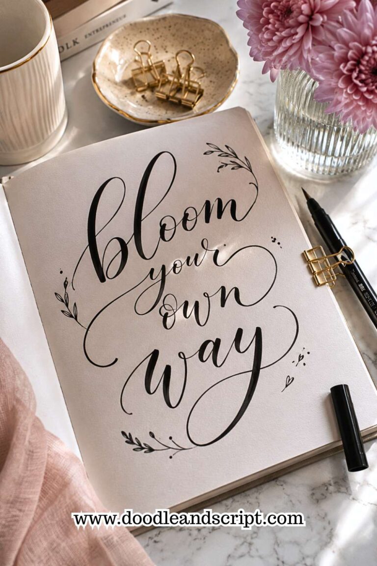
Choose a short word like create, bloom, dream, grow, or shine. Write it across an entire page, paying attention to your spacing, pressure, letter height, and connections.
After every few repetitions, pause and compare your newest version with your first one. You may be surprised by how much it improves in just one practice session.
This drill also helps you spot recurring mistakes. Maybe your r is always too narrow, your e is slightly oversized, or your final letter tends to drift downward. Recognizing these patterns is the first step toward fixing them.
Don’t erase imperfect attempts. Looking back at earlier versions helps you see your progress and reminds you that improvement comes through repetition.
If you’re looking for more fun ways to practice without feeling repetitive, 27 Easy Hand Lettering Ideas Every Beginner Should Try includes creative projects that reinforce the same skills.
15. Strengthen Your Flourish Control

Flourishes can make lettering look elegant, but they require much more control than many beginners realize. Before adding dramatic loops to finished pieces, it’s important to practice the movements on their own.
Start by drawing simple loops, spirals, and gentle curves across an entire page. Focus on keeping each movement smooth and even instead of making the flourishes as large as possible. Slow, controlled practice produces much better results than quick decorative scribbles.
Watch how your lines cross each other. Clean intersections make flourishes look intentional, while messy overlaps can make even beautiful lettering feel cluttered. Practicing these details separately gives you more confidence when adding flourishes to quotes, cards, or artwork.
Remember that flourishes should enhance your lettering, not compete with it. Once you can create smooth, balanced loops consistently, you’ll find it much easier to decorate finished pieces without overwhelming the words themselves.
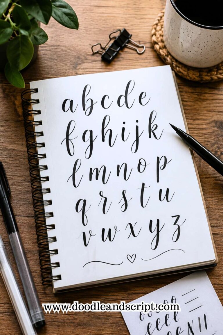
16. Write the Entire Lowercase Alphabet

After practicing individual strokes, it’s important to bring everything together. Writing the lowercase alphabet is one of the best ways to test your consistency because it includes every major stroke you’ve been practicing.
Write the alphabet slowly from a to z, paying close attention to letter height, spacing, and pressure changes. Treat every letter as if it belongs in the same word rather than rushing through the exercise. The goal is to create a complete alphabet that looks balanced from beginning to end.
As you work, notice which letters feel comfortable and which ones still need improvement. Many beginners struggle with letters like s, k, g, or r because they combine several different movements. Identifying those weaker letters gives you a clear direction for future practice sessions.
Repeat this drill every week and compare your pages over time. You’ll be amazed at how much cleaner and more consistent your alphabet becomes after only a few weeks of focused practice.
If you want to improve specific letterforms, Easy Hand Lettering Tutorial: Learn in 21 Minutes provides additional exercises that build on this drill.
17. Write the Uppercase Alphabet

Uppercase letters often receive less practice than lowercase ones, yet they play a huge role in titles, quotes, greeting cards, and monograms. Since many uppercase letters use larger movements, they require extra control and confidence.
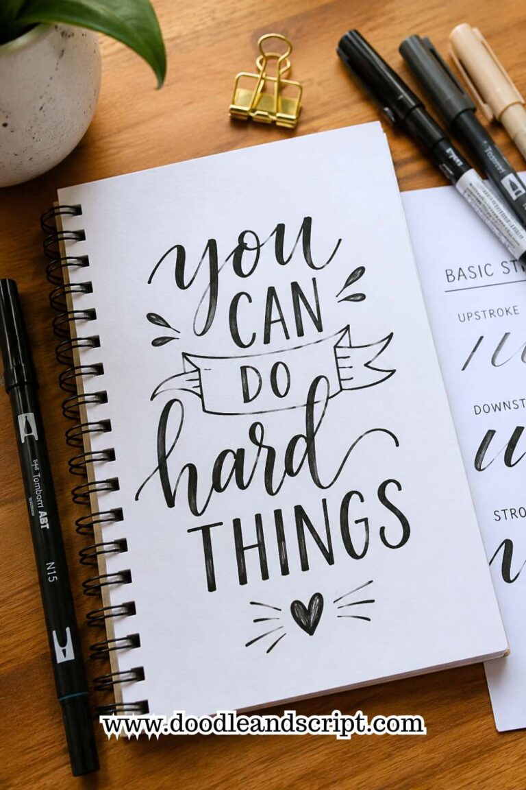
Practice writing the entire uppercase alphabet while keeping the height, width, and style as consistent as possible. Resist the urge to decorate every letter with flourishes. Instead, focus on creating clean, balanced shapes that are easy to recognize.
Pay attention to letters with similar structures, such as E, F, and L, or O, Q, and C. Keeping these related letters consistent helps your overall lettering style feel more unified.
As your confidence grows, experiment with writing uppercase letters in different sizes. This prepares you for creating eye-catching headings and focal words in future projects.
18. Finish with Five Minutes of Free Lettering
Every practice session should end with something enjoyable. After spending time on structured drills, give yourself five minutes to letter anything you like. This allows you to immediately apply the skills you’ve been practicing while keeping lettering fun and creative.
Write your favorite quote, your name, song lyrics, positive affirmations, or random words that come to mind. Don’t worry about creating a masterpiece. Instead, focus on noticing how much easier your strokes feel after completing your drills.
This final exercise also helps bridge the gap between technical practice and finished artwork. You’ll begin to see how your improved pressure control, spacing, and rhythm naturally appear in real lettering projects.
Over time, these five minutes become a rewarding way to measure your progress. What once felt difficult will gradually become effortless, proving that small, consistent practice sessions really do make a difference.
If you’re ready to challenge yourself further, Beginner Hand Lettering Ideas: 27 Easy Hand Lettering Ideas Every Beginner Should Try offers plenty of creative projects where you can put these new skills into action.
19. Practice Without Guidelines

Guideline paper is incredibly helpful when you’re learning hand lettering, but you shouldn’t depend on it forever. Eventually, you’ll want to letter in sketchbooks, greeting cards, journals, or gift tags where perfectly spaced guide sheets aren’t available. That’s why practicing without guidelines is an important weekly drill.
Start by writing a few simple words on blank paper. At first, don’t worry if your letters aren’t perfectly straight. Instead, focus on keeping the baseline as steady as possible using only your eyes.
After you’ve finished, step back and look at the entire word instead of judging each letter individually. This makes it much easier to spot patterns, such as words that gradually drift upward or letters that become smaller toward the end.
As your confidence grows, challenge yourself by writing longer quotes or short paragraphs without drawing pencil lines first. This exercise improves both your visual judgment and your muscle memory.
After several weeks, you’ll notice that your lettering stays much straighter, even when you don’t have guidelines to rely on. It’s a skill that gives you much more freedom when creating handmade cards, journal pages, or wall art.
20. Time Yourself for Five Minutes
Many beginners practice slowly but struggle when they try to create a finished project. That’s because speed introduces a completely different challenge.
Timing yourself teaches you to maintain quality while working at a comfortable pace instead of overthinking every stroke.
Set a timer for five minutes and spend that time writing words, short quotes, or repeating your favorite drills. Don’t rush just because the timer is running. Instead, aim for steady, controlled movements while maintaining the same quality you achieve during slower practice sessions.
When the timer ends, look over your work and ask yourself a few questions. Did your spacing stay consistent? Did your pressure remain even?
Which letters started to lose their shape as you became more comfortable? These observations help you identify exactly what needs extra attention during your next practice session.
Repeat this drill once or twice each week and compare your pages over time. You’ll gradually notice that you’re producing cleaner lettering in less time. That improvement makes larger projects feel much less intimidating because your hand naturally works with greater confidence and rhythm.
21. Review Your Previous Practice Pages
One of the most overlooked Hand Lettering Drills You Should Practice isn’t writing at all; it’s reviewing your own work. Many people fill page after page with practice sheets but never stop to evaluate what they’ve learned. Looking back at your earlier pages helps you recognize progress that you might otherwise miss.
At the end of each week, spread out your practice pages and compare them. Look closely at your spacing, slant, pressure, curves, and overall consistency.
You’ll probably notice improvements that didn’t seem obvious while you were practicing. Seeing your progress is incredibly motivating and reminds you that small daily efforts really do add up.
Reviewing your work also helps you spot recurring mistakes. Maybe your lowercase s still feels awkward, your descender loops need more consistency, or your flourishes become too large. Once you identify those weak areas, you can make them the focus of your next week’s drills instead of practicing everything equally.
Most importantly, celebrate the improvements you’ve made. Hand lettering is a skill that develops through patience and repetition, not perfection.
Every smoother stroke, straighter baseline, and more balanced word is proof that your practice is paying off. If you’re ready to continue growing beyond these exercises, 11 Hand Lettering Styles Every Beginner Should Try is a great next step for applying your stronger fundamentals to new lettering styles.
Final Thoughts
The best lettering artists aren’t necessarily the ones with the fanciest supplies; they’re the ones who practice the basics consistently.
These Hand Lettering Drills You Should Practice may seem simple on their own, but together they build the control, rhythm, and confidence needed to create beautiful lettering. Every straight line, oval, loop, and connecting stroke strengthens the skills you’ll use in every future project.
Don’t feel pressured to complete all 21 drills in a single session. Instead, choose five or six exercises each week and rotate through the list.
This keeps your practice interesting while ensuring every fundamental skill gets regular attention. Even spending just 10 to 15 minutes on focused drills is far more effective than practicing randomly without a plan.
Most importantly, be patient with yourself. Progress in hand lettering doesn’t happen overnight, but it does happen with consistent practice.
If you’d like to take your skills even further, 23 Easy Tricks to Create Aesthetic Hand Lettering is a perfect follow-up for turning solid fundamentals into eye-catching designs.