19 Easy Bullet Journal Fonts Anyone Can Learn
Disclosure: Some of the links in this post are affiliate links. This means if you click on the link and purchase an item, I will receive an affiliate commission at no extra cost to you.
A funny thing happens when people start a new bullet journal spread. They spend time choosing colors, planning the layout, and adding decorative details.
Everything seems to come together nicely. Then it is time to write the title. Suddenly, the page does not look quite as good as it did a few minutes earlier. The problem is not always the design. Sometimes it is simply the font.
Lettering has a bigger impact than many people realize. A bold font can make a page feel confident and energetic. A neat handwritten style can make the same spread feel calm and organized.
Even small changes in lettering can completely shift the mood of a page. That is why learning a few Easy Bullet Journal Fonts can be such a game changer.
You do not need advanced calligraphy skills or expensive markers. A handful of simple font styles can instantly make your journal look more polished.
The great thing about bullet journal fonts is that most of them follow easy patterns. Once you learn the basic structure, recreating them becomes much easier.
Before long, you will have a collection of go-to fonts for monthly covers, trackers, quotes, and daily pages.
In this guide, you will discover 19 font styles that are simple to learn, fun to use, and versatile enough for almost any journal spread.
If you love experimenting with creative lettering, take a look at 23 Beautiful Bullet Journal Lettering Ideas You’ll Want to Copy for even more inspiration.
19 Easy Bullet Journal Fonts Anyone Can Learn
Fonts That Make Strong First Impressions
1. Block Font
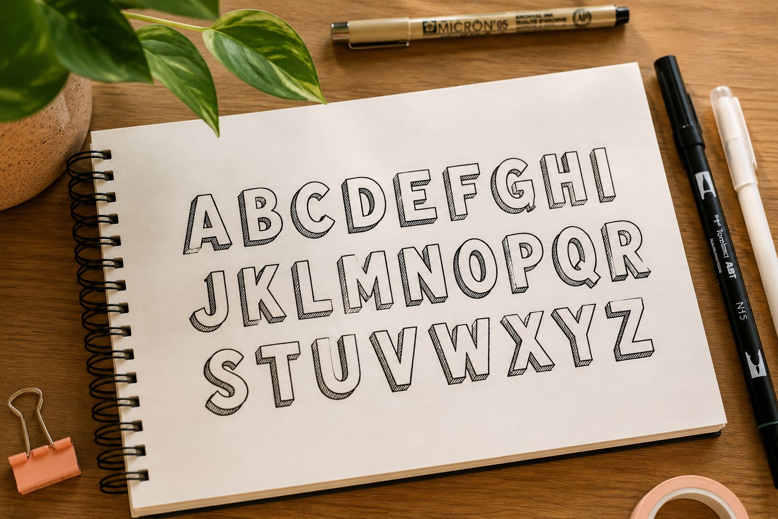
Imagine opening a bullet journal and seeing a bold title that instantly grabs your attention. Chances are, it is a block font.
This style remains one of the most popular Easy Bullet Journal Fonts because it looks impressive without requiring advanced skills.
The structure is simple. Start by writing your word lightly. Then draw larger outlines around each letter.
Once the outlines are complete, you can leave them empty or decorate them with patterns and color. Both approaches work beautifully.
Block fonts shine on monthly covers, yearly goals, and major section dividers. They create a strong visual anchor that helps organize the page.
Another benefit is that the letters stay highly readable even from a distance.
Many journal users eventually explore more decorative styles, yet they still return to block fonts because they are reliable, versatile, and easy to customize for almost any theme.
2. Bubble Font
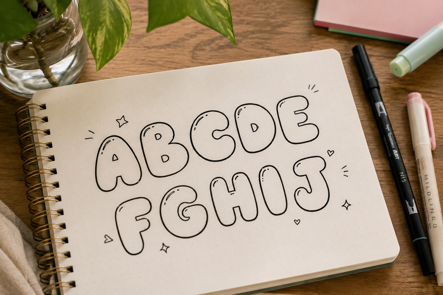
Some journal spreads need a little more personality. A bubble font can provide exactly that. The rounded letters instantly make a page feel friendlier and more relaxed.
Rather than focusing on perfectly straight lines, think about soft curves and smooth edges. The goal is to make each letter feel light and playful. Small imperfections often add charm rather than taking it away.
This style works especially well for birthday pages, memory spreads, wish lists, and creative challenges.
It also pairs nicely with colorful themes because the rounded letters already create a fun atmosphere.
Many people assume bubble lettering belongs only in children’s designs. In reality, it can look surprisingly stylish when used thoughtfully.
The key is keeping the spacing consistent and avoiding overcrowded letters.
If you enjoy playful lettering styles, explore 15 Easy Bullet Journal Lettering Styles Every Beginner Should Learn.
3. Tall Skinny Font

Have you ever tried fitting a long title into a narrow space? A tall skinny font solves that problem beautifully. Instead of making letters wider, you stretch them vertically.
This simple adjustment creates a surprisingly elegant appearance. The font feels modern and organized without demanding much attention.
That balance makes it useful in journals where the layout already contains decorative elements.
Many people discover this style by accident while trying to save space. Then they keep using it because it works so well. The letters look intentional, clean, and slightly sophisticated.
One helpful tip is to keep the spacing between letters consistent. Uneven gaps become more noticeable when letters are narrow. A little attention to spacing can dramatically improve the final result.
4. Rounded Print Font
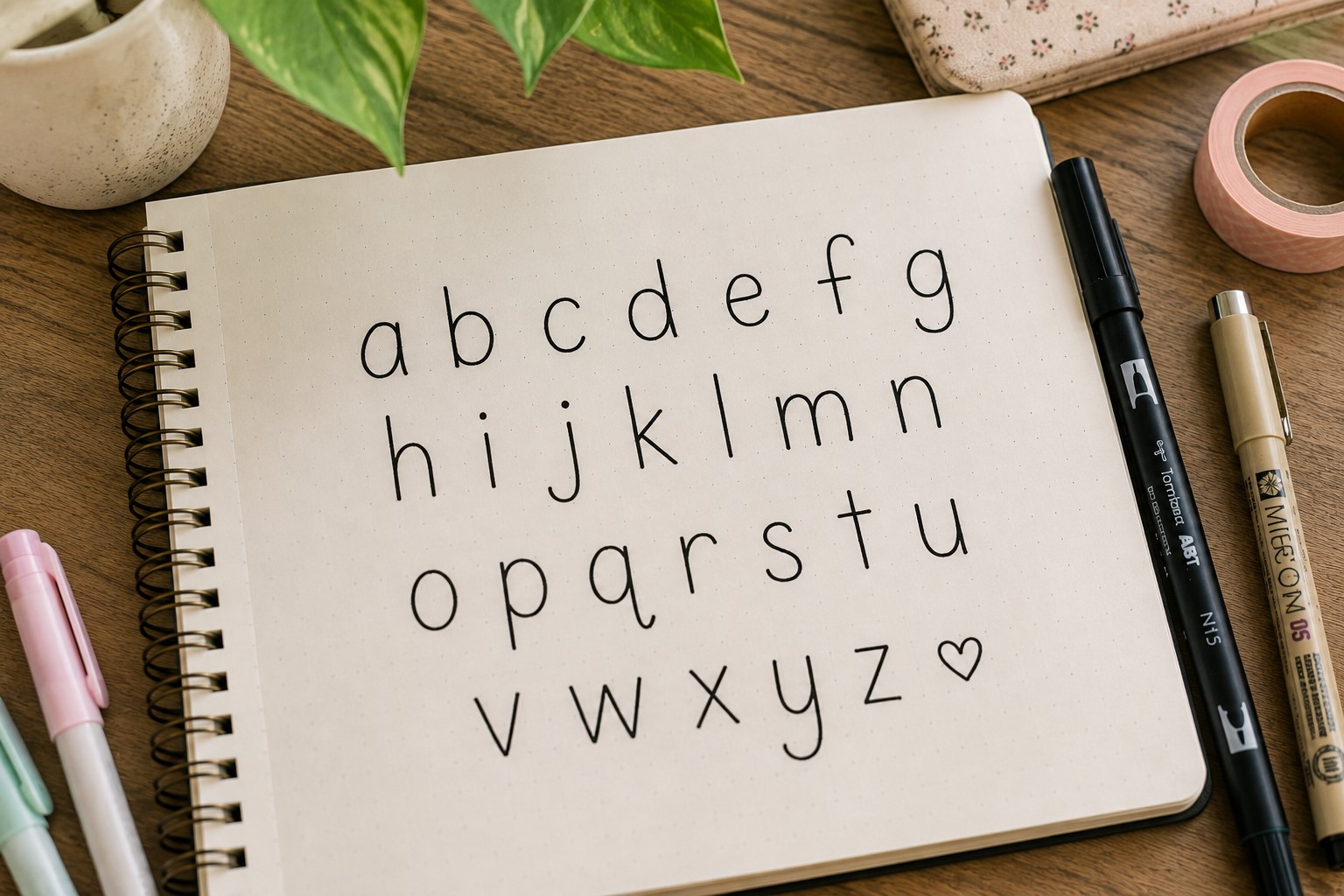
Not every title needs to make a bold statement. Sometimes a page benefits from lettering that feels calm and approachable. Rounded print lettering does exactly that.
The easiest way to create this font is by modifying your existing handwriting. Replace sharp corners with gentle curves. Round the ends of letters slightly.
Those small changes create a softer appearance without forcing you to learn a completely new style.
This font works beautifully in gratitude journals, wellness trackers, and reflective spreads. It feels welcoming without becoming overly decorative.
Many journal users appreciate how practical this font is. Unlike some styles that only work for titles, rounded print lettering remains readable throughout an entire spread.
For additional title inspiration, take a look at 21 Bullet Journal Title Lettering Ideas That Look Professional.
Fonts That Add Personality to a Page
5. Shadow Font
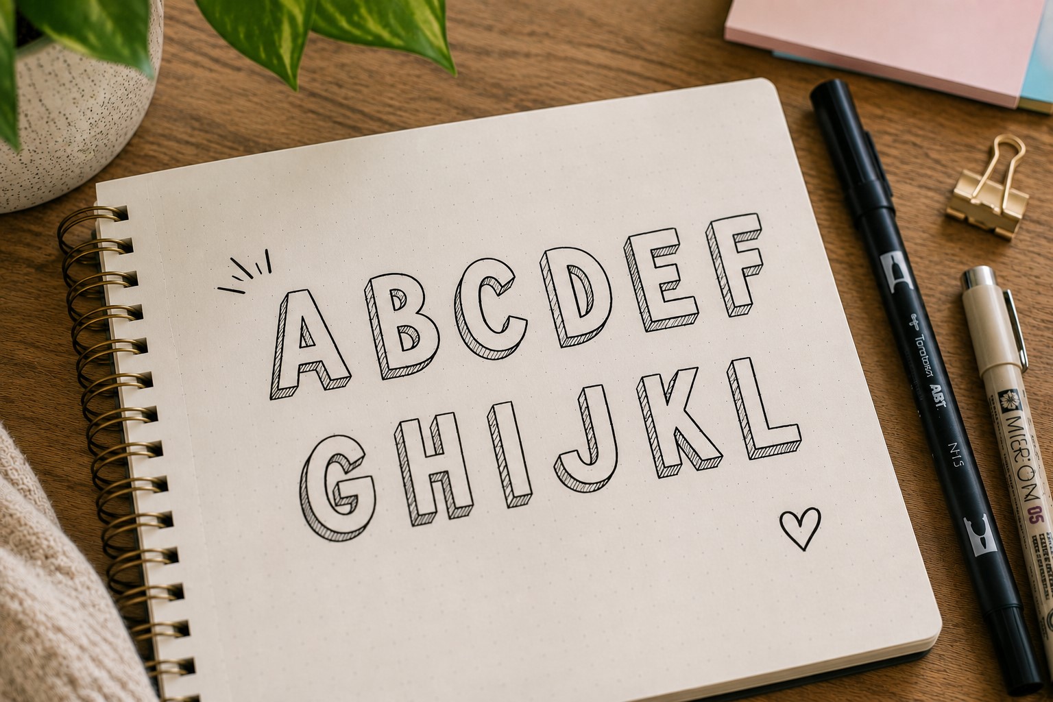
Sometimes a title looks good but still feels like something is missing. That missing detail might be a shadow. Adding a simple shadow can instantly make lettering look more polished.
The technique itself is straightforward. Draw your letters first. Then add a thin shadow along one side of each letter. Keep the direction consistent across the entire word.
The effect creates depth and helps the title stand out from the page. It also adds visual interest without making the design feel cluttered.
That balance makes shadow lettering one of the most practical Easy Bullet Journal Fonts to learn.
Smaller shadows usually look better than dramatic ones. A subtle effect often creates a cleaner and more professional appearance.
6. Serif Font
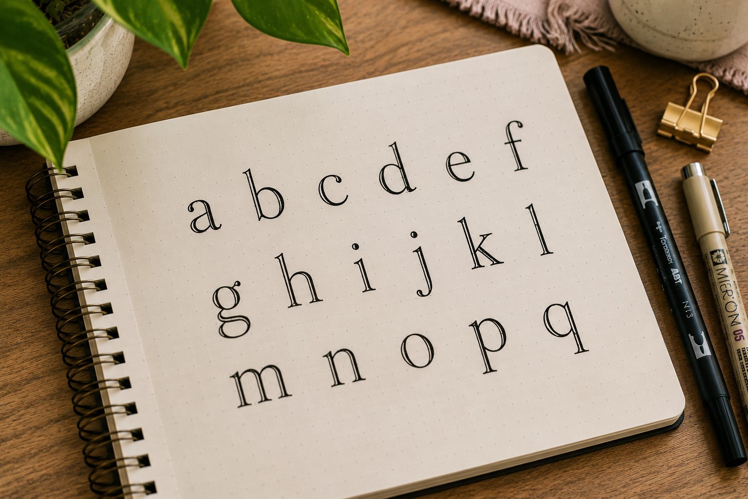
You have probably seen serif fonts in books, magazines, and newspapers for years. Those small finishing lines at the ends of letters create a timeless appearance that translates beautifully into bullet journals.
This style works especially well when you want a page to feel structured and refined. Reading logs, study planners, and goal-setting spreads often benefit from the extra sophistication.
Many beginners worry about drawing the tiny details correctly. Fortunately, the serifs do not need to be perfect. Even simple extensions can create the desired effect.
One reason this font remains popular is its balance. It feels decorative enough to stand out while remaining highly readable. That combination makes it useful for both titles and subheadings.
If you enjoy experimenting with elegant page designs, check out 25 Aesthetic Bullet Journal Lettering Ideas You’ll Love.
7. Outline Font
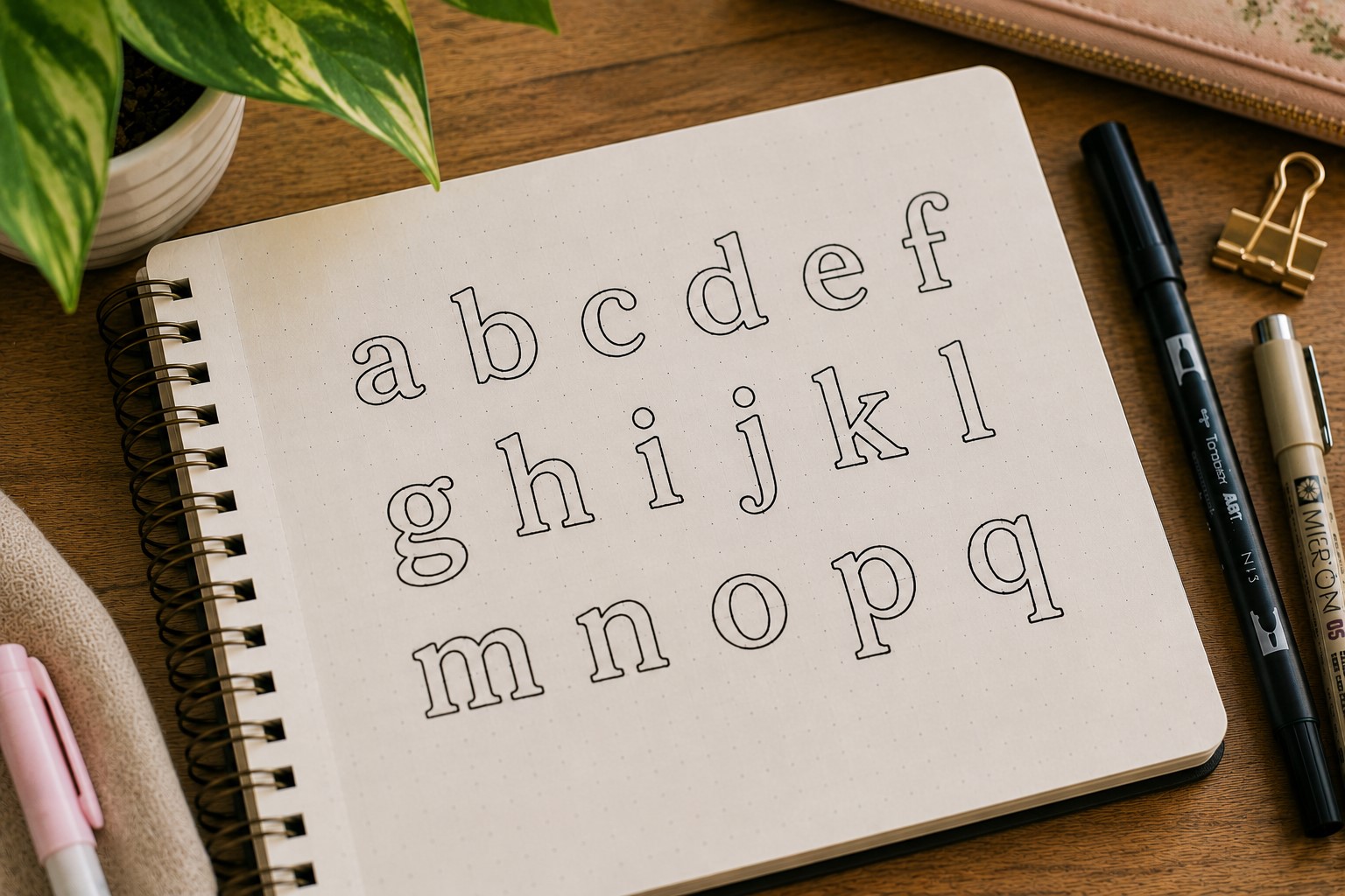
An outline font gives you two creative projects instead of one. First, you create the lettering. Then you decide what happens inside the letters.
Some journal users fill the letters with stripes. Others prefer dots, florals, checkerboard patterns, or seasonal themes. Every choice creates a different result while using the same basic font.
This flexibility makes outline lettering useful throughout the year. A spring spread can use floral details. A winter page can use snowflakes. The structure remains the same while the mood changes completely.
Outline lettering also gives beginners room to experiment without pressure. Small mistakes often disappear once decorative details are added inside the letters.
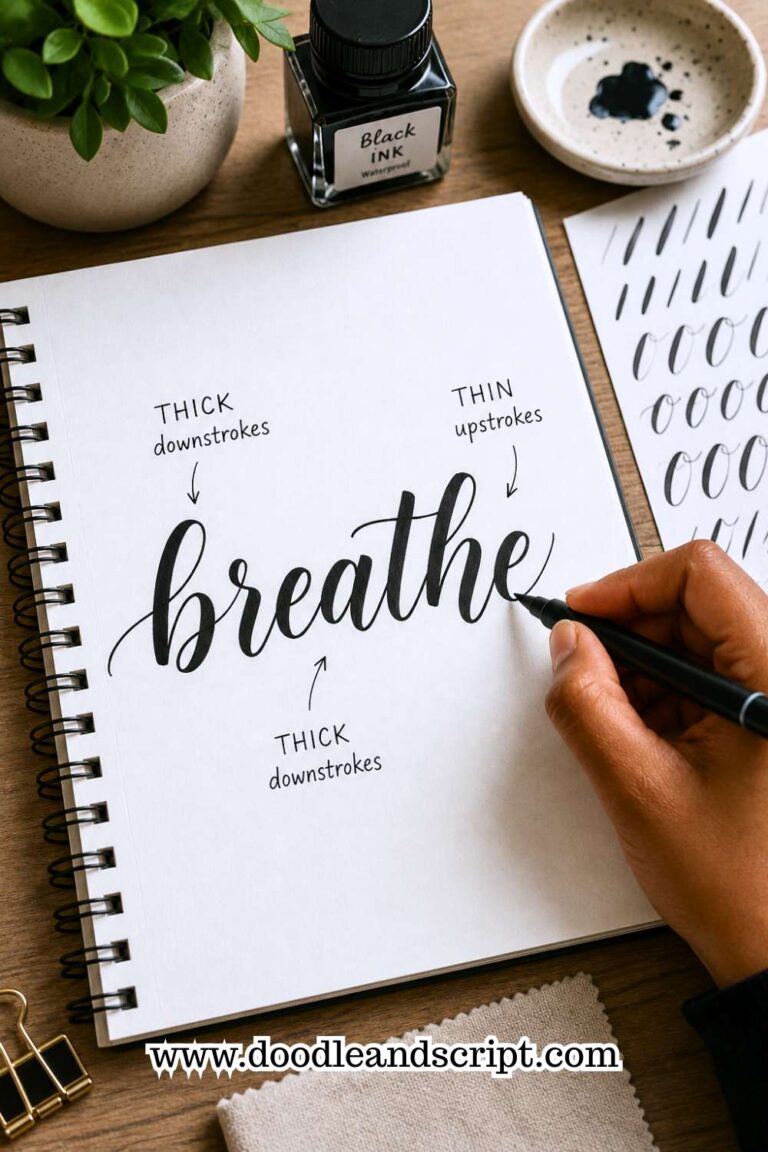
8. Faux Calligraphy Font
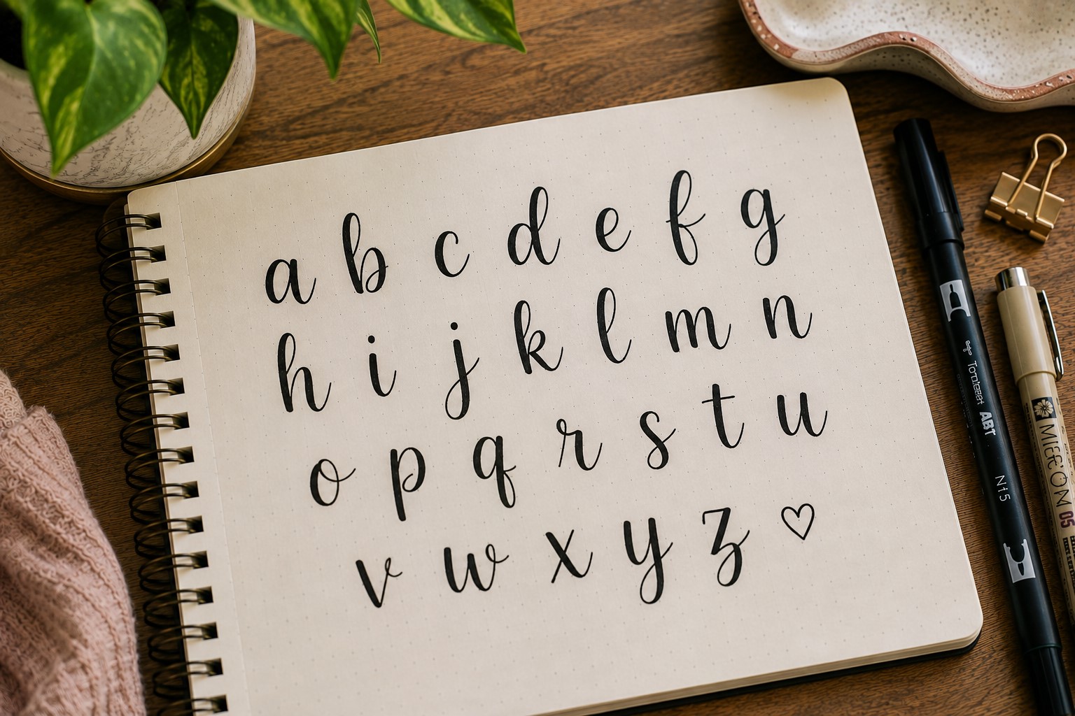
Many people fall in love with the look of brush lettering long before they learn how to create it. Faux calligraphy offers a much easier starting point.
Begin by writing a word in cursive. Next, identify every downstroke. Add a second line beside those strokes and fill the space between them. The result closely resembles traditional calligraphy.
What makes this style so appealing is the dramatic transformation. A simple word suddenly feels elegant and intentional. Yet the technique remains accessible to beginners.
This font works especially well for quote pages, gratitude spreads, and monthly covers where you want the title to feel special.
For more lettering inspiration, explore 17 Creative Bullet Journal Calligraphy Ideas to Try Today.
9. Monoline Font
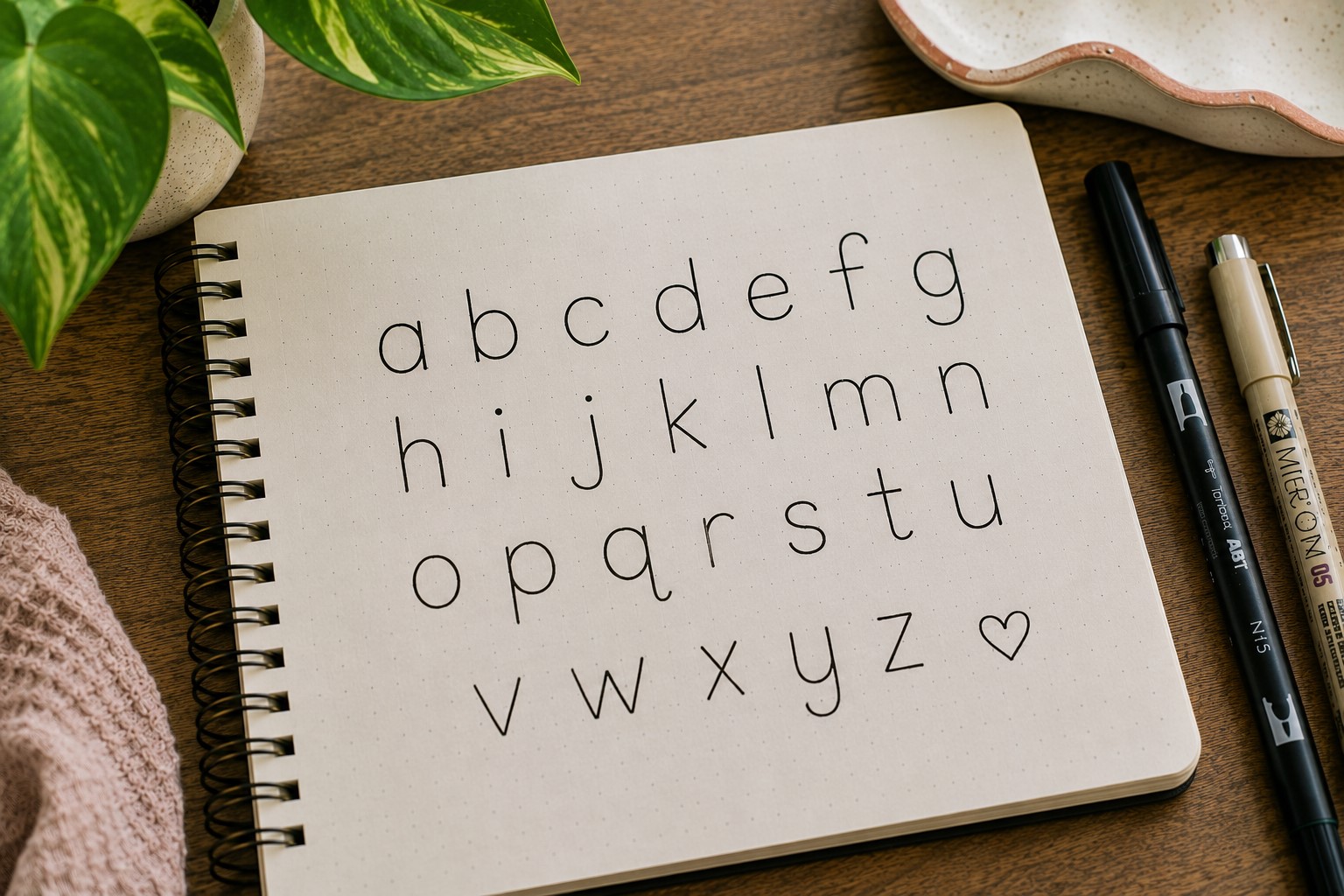
A monoline font follows one simple rule. Every stroke stays the same thickness. That consistency creates a clean and modern appearance that works in almost any journal.
Many people underestimate this style because it looks simple. Yet simplicity often becomes its biggest strength. The font feels organized, readable, and polished without relying on decorative effects.
This style pairs beautifully with minimalist layouts. It also works well in professional journals where clarity matters more than decoration.
Another advantage is speed. Once you become comfortable with the letter shapes, monoline fonts are quick to write. That makes them practical for everyday use rather than special occasions only.
Modern Fonts That Feel Fresh
10. Stacked Font
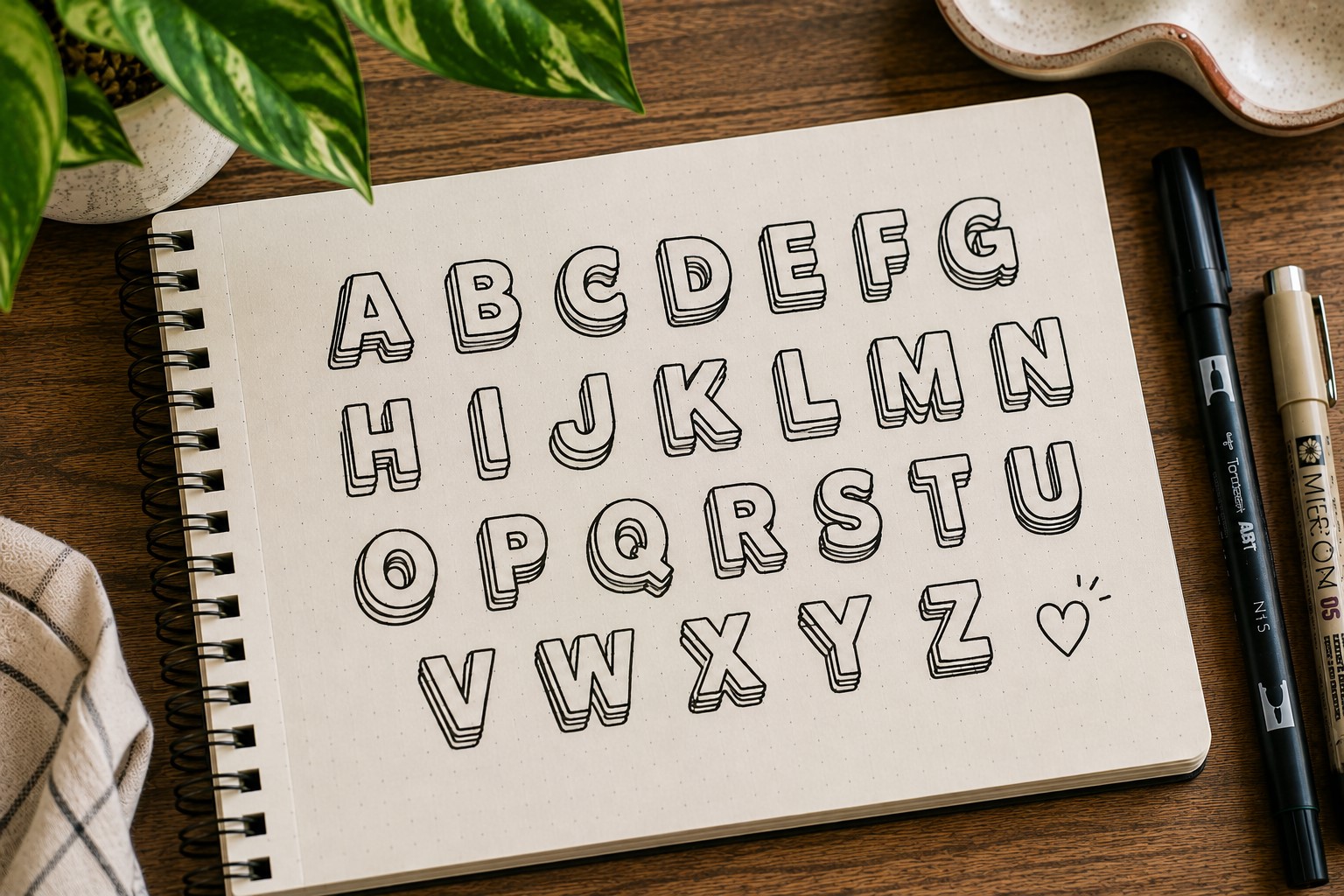
Some titles deserve attention even when space is limited. A stacked font helps achieve that by bringing letters closer together vertically.
The compact structure creates a bold visual presence. It also allows longer words to fit into smaller spaces without looking cramped. This makes stacked lettering especially useful for monthly covers and dashboard pages.
Many journal users discover this font while experimenting with layouts. Once they see how much space it saves, they continue using it regularly.
One helpful trick is to sketch the overall shape lightly before committing to the final lettering. Planning the layout first often creates a more balanced result.
If you want stronger page layouts overall, visit How to Create Gorgeous Bullet Journal Headers in 15 Steps.
11. Geometric Font
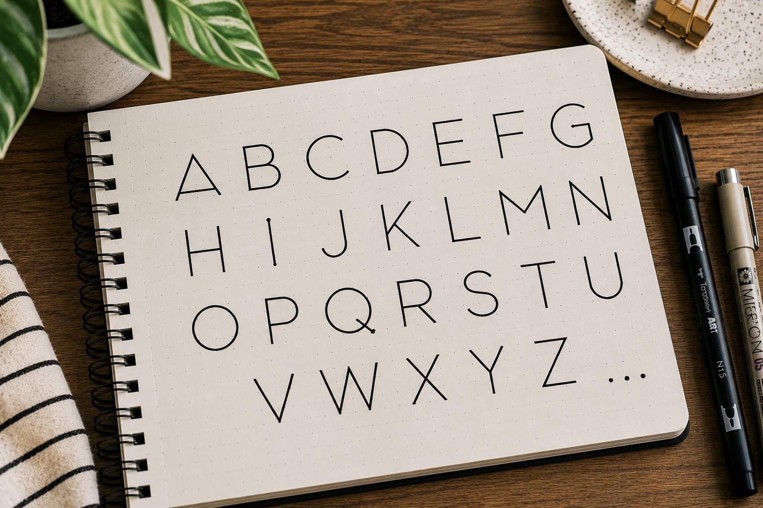
Some fonts feel artistic because they are built from shapes rather than handwriting. Geometric lettering is a great example.
Instead of focusing on traditional letter forms, think about circles, rectangles, triangles, and straight lines. Building letters from these shapes creates a bold and modern appearance.
This font works especially well in productivity spreads and minimalist designs. The structured look naturally complements organized layouts.
One reason many people enjoy geometric lettering is that it feels different. It encourages you to think about letters as design elements rather than simply words on a page.
12. Double-Line Font
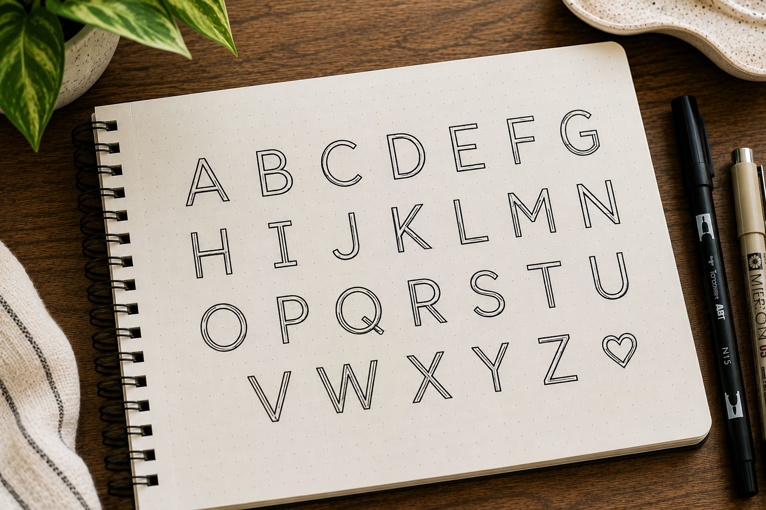
A double-line font creates visual interest with very little extra effort. Each letter contains two parallel outlines rather than one.
At first glance, the effect seems minor. Yet the added dimension helps titles stand out and feel more decorative. The font remains clean while offering more personality than standard lettering.
The empty space between the lines also creates opportunities for creativity. Some people add color. Others leave it blank for a minimalist look.
This style works especially well for seasonal covers, project pages, and themed spreads where a simple font might feel too plain.
For more creative typography ideas, check out 29 Bullet Journal Font Ideas to Make Your Pages Pop.
Decorative Fonts That Elevate Any Spread
13. Ribbon Font
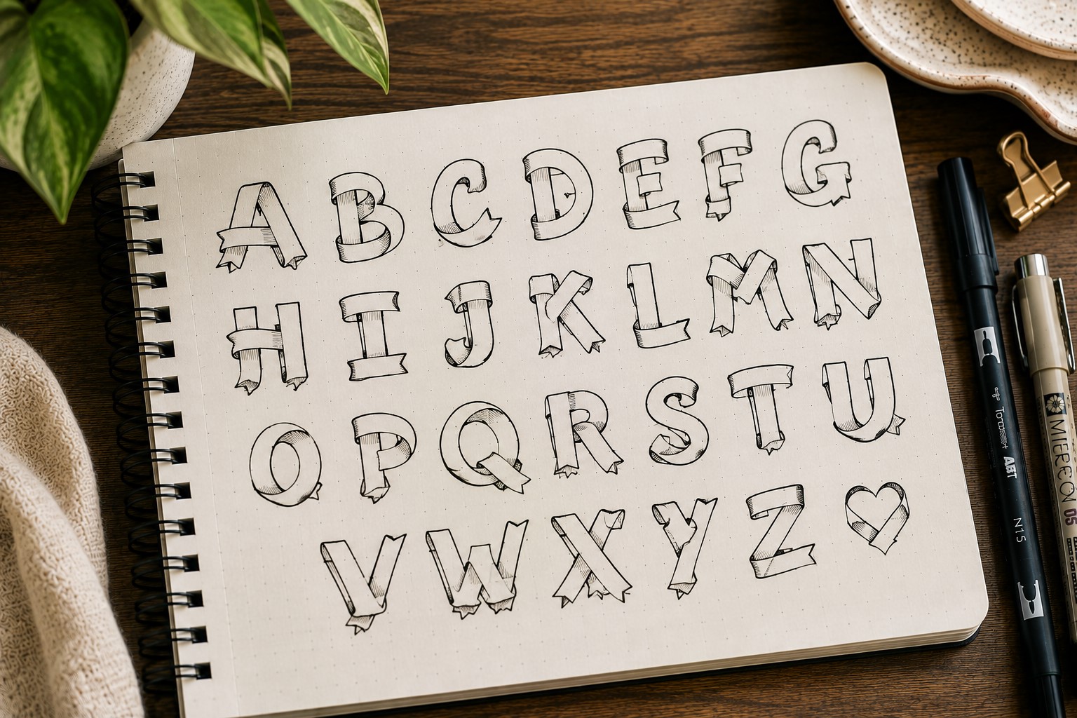
The ribbon font looks much more difficult than it actually is. That is one reason so many journal users love it.
At first glance, the letters appear folded and layered, almost like pieces of ribbon twisting across the page. Yet once you understand the basic structure, the style becomes much easier to recreate.
The simplest approach is to start with block letters. After drawing the letters, add small folded sections where parts of the ribbon appear to overlap.
These extra details create depth and movement without requiring advanced drawing skills.
This font works especially well for celebration pages, birthday spreads, yearly goals, and seasonal covers. It naturally attracts attention, so it performs best when used for major titles rather than smaller headings.
A common mistake is adding too many folds. Keeping the design simple often creates a cleaner and more professional result.
14. Dotted Font
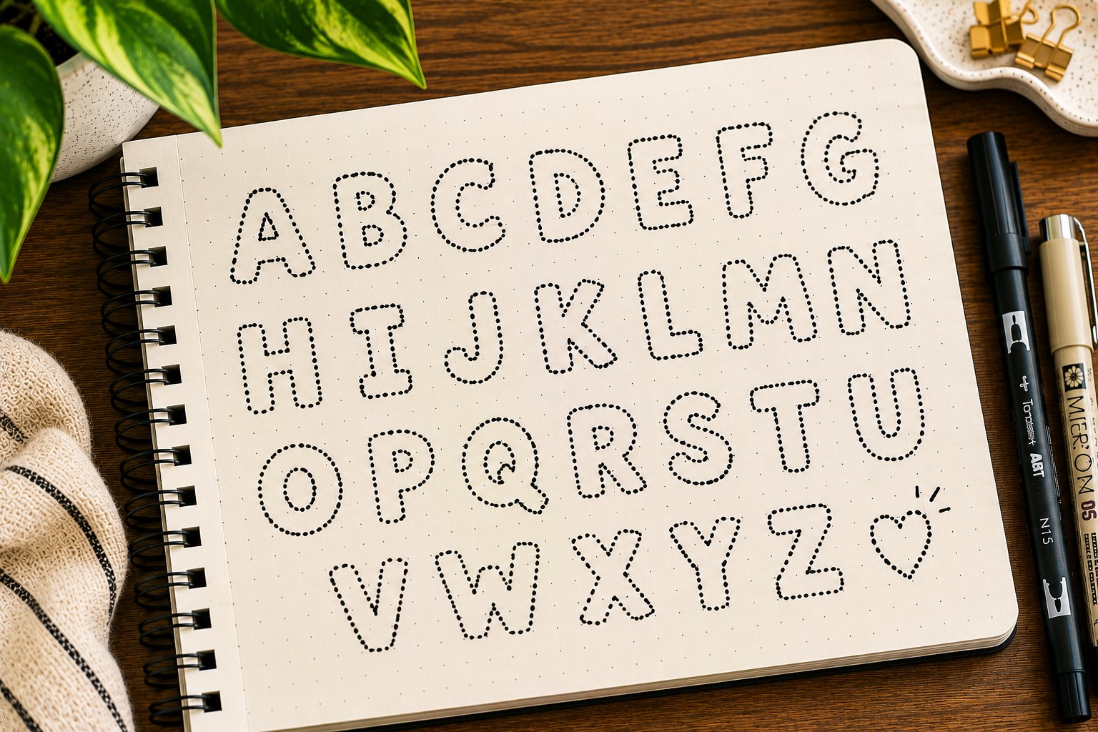
Not every font needs bold lines to stand out. Sometimes the smallest details create the biggest impact. A dotted font proves that beautifully. Instead of drawing solid letters, you build each letter using a series of small dots.
The finished result feels playful, creative, and slightly whimsical. It can soften a page that feels too structured or serious.
Many journal users enjoy using dotted fonts because they create texture without adding visual weight.
This style works particularly well in spring spreads, habit trackers, mood logs, and creative journals. It also pairs nicely with floral themes and decorative doodles.
One helpful tip is to keep the spacing between dots relatively consistent. Uneven spacing can make the lettering look messy rather than intentional.
If you enjoy combining lettering with decorative elements, explore 15 Easy Bullet Journal Doodle Borders Anyone Can Draw.
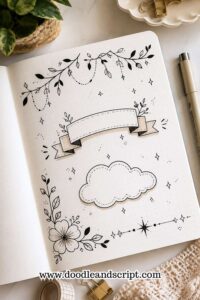
15. Banner Font
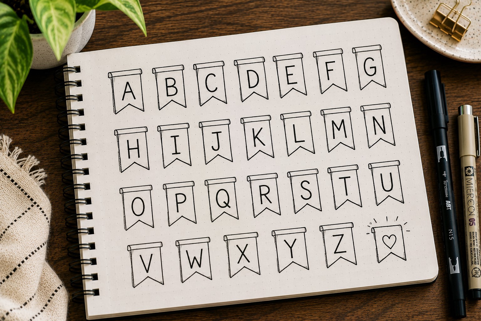
Sometimes the font itself stays simple while the presentation creates the magic. That is exactly what happens with a banner font.
Instead of focusing only on the lettering, you place the title inside a decorative banner.
The banner immediately gives the heading more importance. Even ordinary handwriting can look polished when framed by a well-designed ribbon or label.
This makes banner fonts perfect for beginners who want impressive results without learning complicated lettering techniques.
The style works especially well on monthly covers, section dividers, and special event pages. It naturally draws attention while helping organize information.
Many journal users discover that banner fonts become one of their most-used styles because they work with nearly every theme imaginable.
16. Floral Font
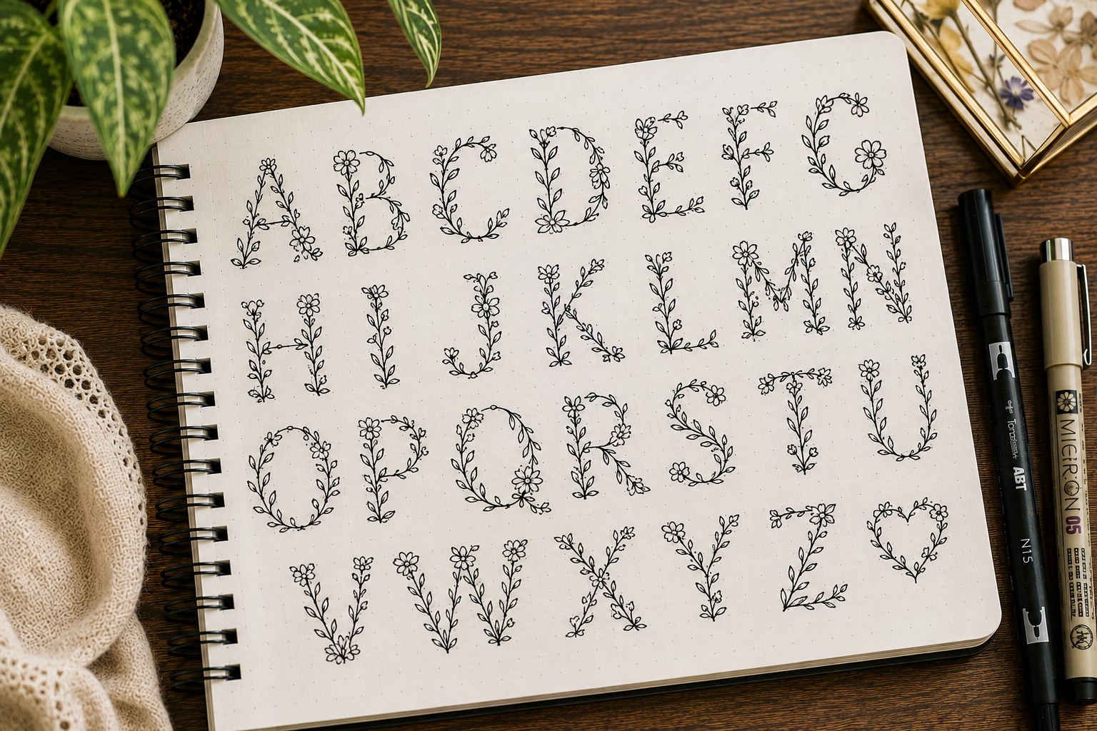
A floral font brings together two things many journal lovers already enjoy: lettering and doodling. Instead of keeping letters plain, you decorate them with flowers, leaves, vines, or small botanical accents.
The key is balance. You do not need to cover every letter with decoration. In many cases, adding floral details to just a few letters creates a more elegant result. Too many embellishments can make the title difficult to read.
This font works beautifully in spring layouts, gratitude journals, self-care spreads, and memory pages. The natural elements add warmth and personality without overwhelming the design.
One reason floral fonts remain popular is that no two versions ever look exactly the same. Each person develops their own approach over time.
For more decorative lettering inspiration, take a look at 11 Decorative Bullet Journal Lettering Ideas for Stunning Pages.
Fonts That Get Better With Practice
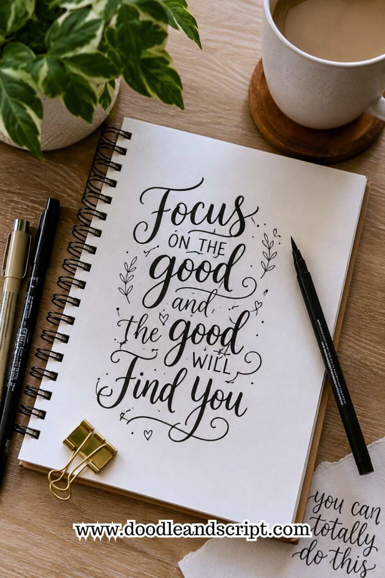
17. Hand-Drawn Script Font
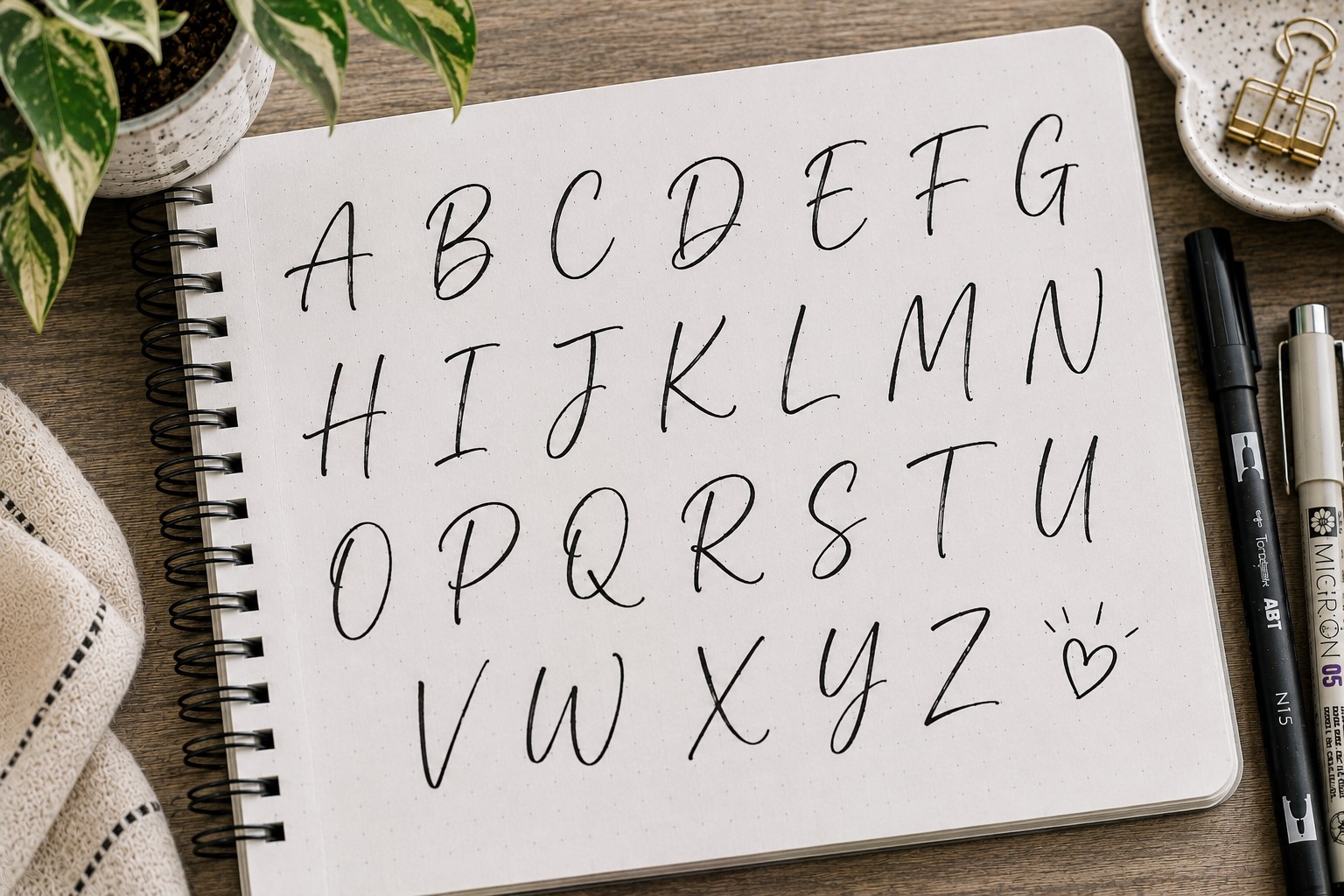
A hand-drawn script font feels personal in a way many other styles do not. The letters flow naturally across the page and create a relaxed appearance that works beautifully in reflective spreads.
Unlike traditional calligraphy, this style does not require strict rules. The goal is not perfection. The goal is creating smooth movement from one letter to the next. Slight imperfections often make the font feel more authentic.
This style works especially well for journal prompts, personal reflections, quote pages, and gratitude entries. It creates a softer atmosphere that encourages readers to slow down and engage with the content.
Many people find this font intimidating at first. Yet after a few practice sessions, it often becomes one of their favorite styles because it feels so natural to write.
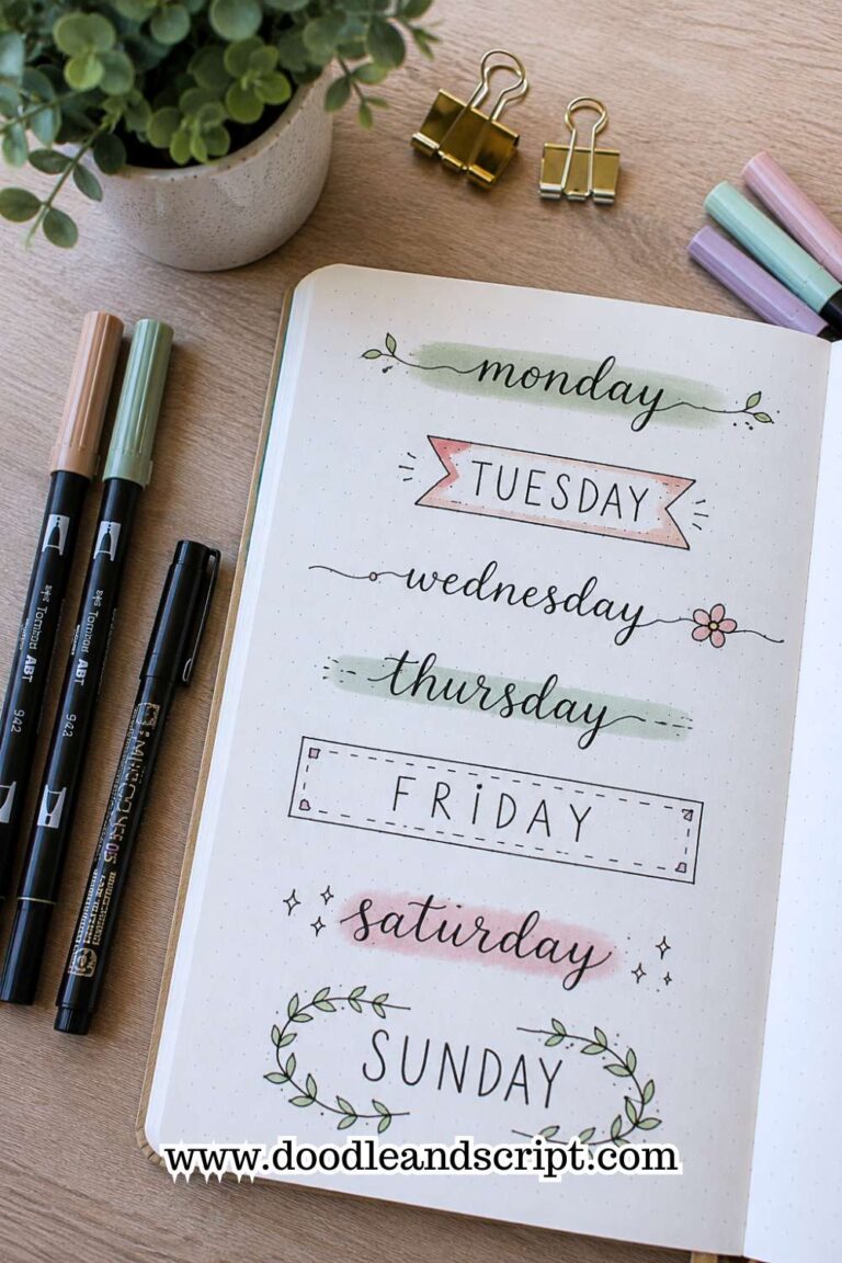
18. Mixed Font Style
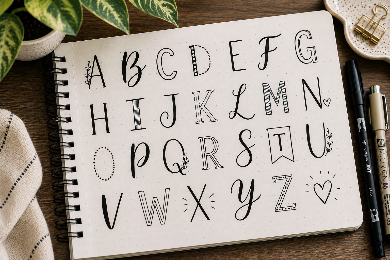
Some of the most eye-catching journal titles use more than one font. A mixed font style combines different lettering approaches within a single heading. The contrast instantly creates visual interest.
For example, one word might use bold block letters while another uses a thin script font. The difference helps certain words stand out and creates a stronger visual hierarchy. Readers naturally notice the most important part of the title first.
Many beginners make the mistake of combining too many styles. That usually creates confusion instead of contrast. Starting with only two fonts often produces the best results.
One reason Easy Bullet Journal Fonts are so useful is that they work beautifully together. Mixing simple styles often creates a more impressive result than relying on one complicated font.
If you enjoy experimenting with decorative page designs, check out How to Make Beautiful Bullet Journal Headers in 13 Easy Steps.
19. Refined Everyday Handwriting
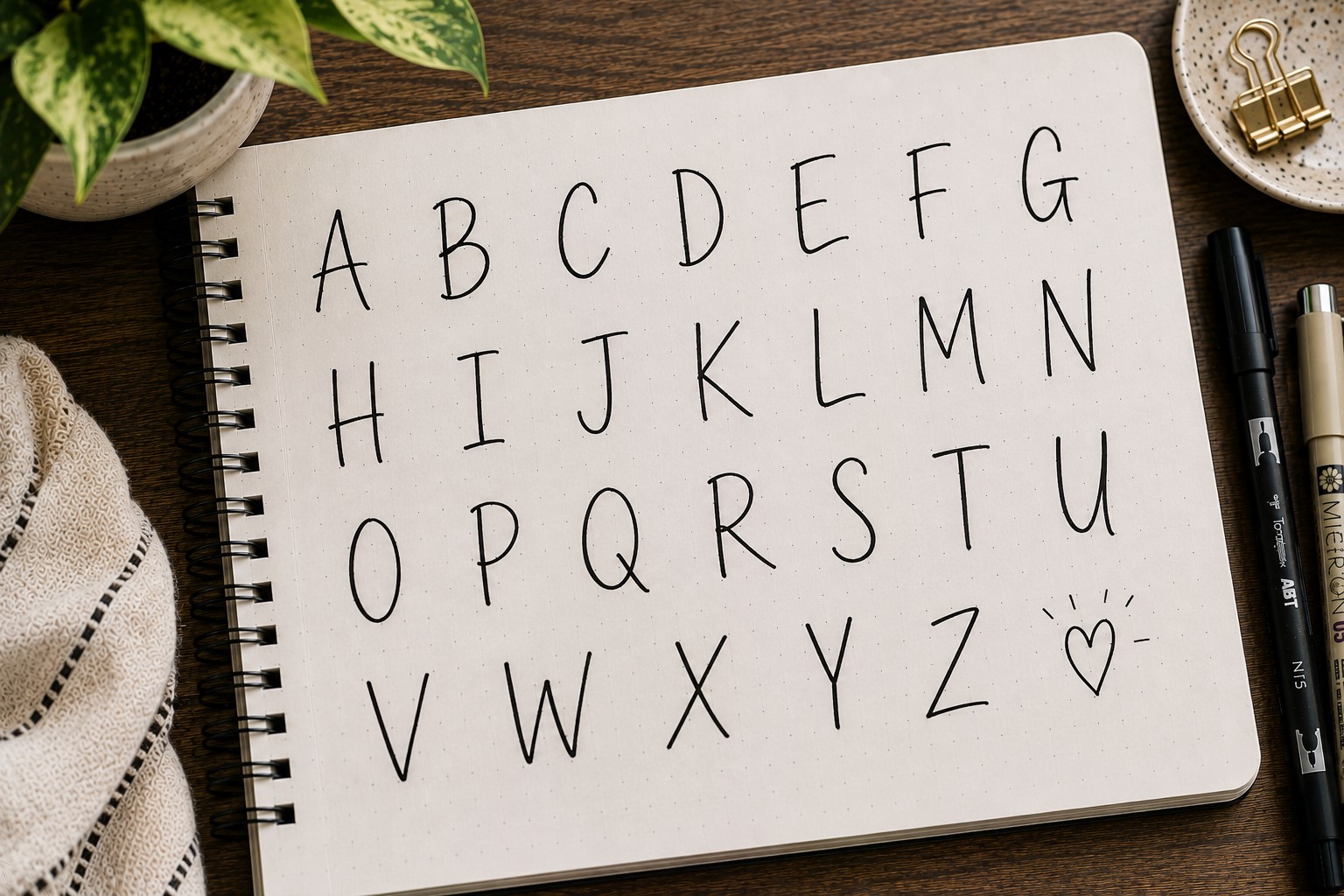
The final font on this list may surprise you. It is your own handwriting. Many journal users spend months searching for the perfect font while overlooking a style they already use every day.
The secret is not changing your handwriting completely. Instead, make small improvements. Increase the spacing slightly. Keep the letter height more consistent.
Slow down when writing titles. These simple adjustments often create a dramatic difference.
A refined handwriting font feels authentic because it belongs to you. No one else will create exactly the same result. That uniqueness gives your journal personality and character.
Many experienced journal users eventually return to this approach. They discover that the most sustainable lettering style is often the one that feels natural to write.
Final Thoughts
Learning new fonts can feel overwhelming at first. There are countless styles online, and it is easy to believe you need to master all of them. In reality, most people regularly use only a handful of favorites.
A small collection of reliable Easy Bullet Journal Fonts can completely transform your journal without making the process stressful.
As you experiment, focus on finding styles that match the way you actually journal. A decorative ribbon font might be perfect for monthly covers.
A monoline font might work better for everyday pages. The goal is not to copy every lettering trend. The goal is to build a collection of fonts that fit your personal style and workflow.
The more you practice these Easy Bullet Journal Fonts, the more natural they will feel. Over time, you will start mixing techniques, creating variations, and developing your own unique approach.
If you want to continue improving your journal pages, explore 27 Easy Bullet Journal Doodle Ideas for Every Page for creative decorations and 17 Bullet Journal Quote Lettering Ideas That Stand Out for inspiring quote layouts.
Those skills work beautifully alongside strong lettering and can help every spread feel more complete.