Calligraphy Basics: Strokes Every Beginner Must Learn
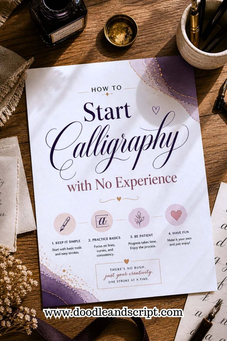
If you’ve ever thought that calligraphy is all about picking a pen and then beautiful lettering will just drop onto your paper, then I kid you not, you may have been wrong. You probably may have been writing cursive all along thinking, its calligraphy. That’s why you need this guide on Calligraphy Basics: Strokes Every Beginner Must Learn. If you’re not sure where calligraphy actually begins and where regular writing ends, the calligraphy for beginners complete starter guide clears that up beautifully before you dive into strokes.
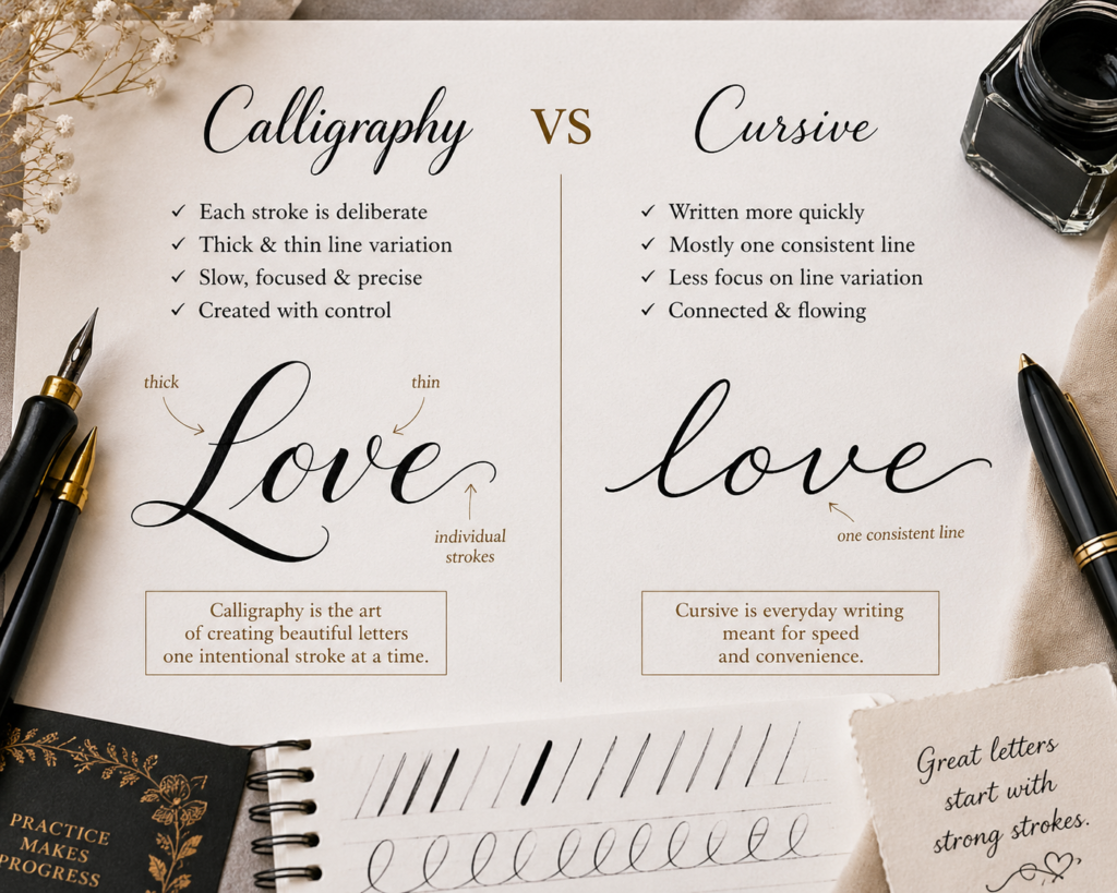
In calligraphy, you just don’t write, you create consistent individual lines, curves and movements to form a letter. And these individual lines or curves are called Strokes.
Each stroke is made up of thick and thin lines, you need to be slow, focused and precise to get the consistency while cursive is written more quickly without varying in line size and frequent arm movement.
Why strokes matter in calligraphy
- Each letter you see is made by combining different strokes like upstrokes, downstrokes, curves, and loops. It’s like some sort of building block that makes lettering to be called calligraphy.
- They form the foundation of beautiful lettering, it’s what gives calligraphy its signature look.
- When you practice the basic strokes, you train your hand to control pressure, create smooth lines, and maintain proper spacing. This is also why calligraphy drills every beginner should practice are so important; drills are specifically designed to help you repeat these strokes until they feel completely natural.
- Another wonderful benefit of practicing calligraphy strokes is that it can actually improve your regular handwriting. I used to have terrible handwriting and it has improved over the years. As you repeat the strokes, your hand becomes steadier and more controlled. Over time, you’ll notice that your everyday writing becomes neater, more balanced, and easier to read.
In this guide, I’m going to show you the 8 basic calligraphy strokes, how to write them, how to use them to form letters, how to combine them to form words and mistakes you should avoid as a beginner. So, sit tight, let’s begin.
The 8 Core Calligraphy Strokes
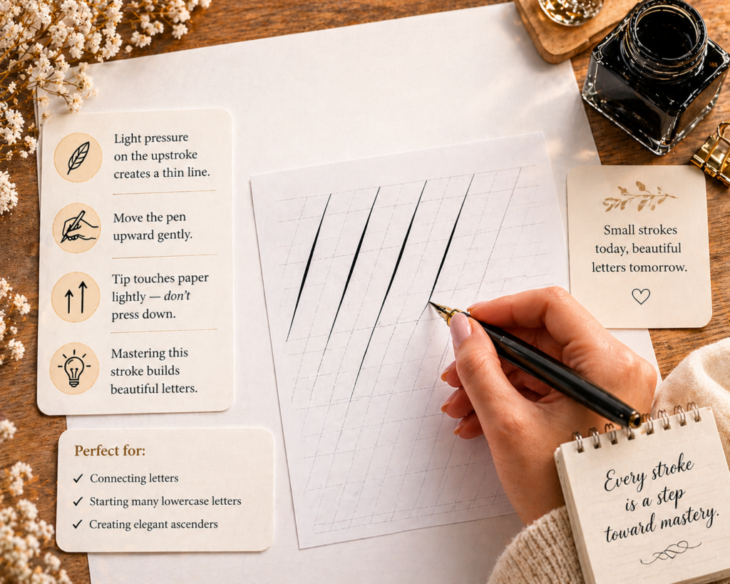
1. Upstroke
This is the lightest stroke in calligraphy; they are formed when you write with little applied pressure as your pen goes up on the page. When writing a thin line, all you have to do is reduce some pressure on how you grip the pen. Make the tip to touch the surface of paper lightly instead of pressing on it. To get a deeper understanding of how upstrokes and downstrokes work together, calligraphy basics: understanding upstrokes and downstrokes explains the full mechanics in a very clear and beginner-friendly way.
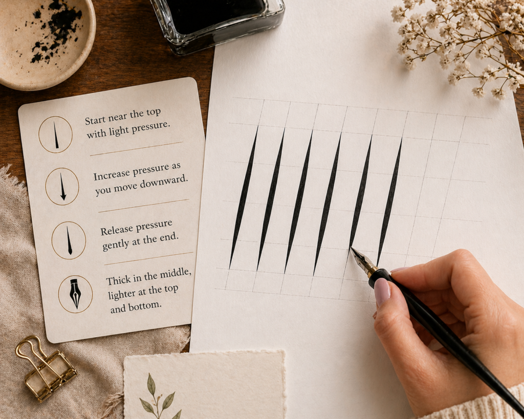
2. Downstroke
It’s the exact opposite of upward stroke. You create it by holding firmly onto your pen, starting all the way up with little pressure and increasing the pressure as you go down and then releasing a little at the end. If done correctly, the line will look a little lighter at the very top, and gradually becomes thicker as it moves down and then at the end, it becomes lighter again. One thing that will directly affect how well your downstrokes come out is your grip; make sure you’ve learned how to hold a calligraphy pen correctly before running rows of this stroke.
3. Overturn Stroke
It’s a combination of both the upward and downward stroke to form a u-like shape but flipped to face down or like a little hill shape. Letters that use the overturn stroke include; n, m, h and r.
To create an overturn stroke, start with moving your pen upward with a very light pressure and as your pen reaches the top, gently curve over and transition into a thick downstroke. Volaaaa! You’ve made an overturn stroke.
I would encourage you to practice what you’ve just learnt now, over and over and over till you achieve a smooth transition between thin and thick lines, this will help improve your control and consistency when writing calligraphy letters. Beginner calligraphy exercises to improve control gives you a structured set of exercises specifically designed to build this kind of smooth transitioning.

4. Underturn Stroke
As the name implies, it looks like a “u” and it’s the exact opposite of an overturn stroke. You write it the same way you write an overturn but instead of starting with a thin line, you start with a thick downward stroke, make a gentle u-turn and transition to a thin upward stroke. Letters that use this stroke are; u, i, w (which requires double underturns), t (it is formed at the base curve).

How to create a smooth transition curve (underturn/overturn)
- Start With a Light Upstroke: As your pen moves upward, allow it to gently curve over at the top to form the beginning of the overturn.
- Apply Pressure for the Downstroke: Once the stroke reaches the top of the curve, apply gentle pressure as you move downward. This creates the thick line that forms the second part of the overturn.
- Curve into the Underturn: As the downstroke reaches the baseline, begin to release pressure slowly while curving the stroke upward. This is where the underturn begins and the thick line gradually becomes a thin line as the pen curves upward.
- Keep the Motion Smooth and Continuous: Just allow your pen to move in one continuous curve, instead of stopping between strokes, so as to create a rhythm that will make your calligraphy look elegant.
5. The Compound Curve Stroke
This is simply combining the overturn and the underturn together to create a compound curve. You basically start an overturn and end with an underturn, forming a smooth “S”-like shape. It often appears in letters that require a flowing, connected shape, like at the middle arches of letter m, n, h and u (in some styles). Understanding how modern calligraphy vs traditional calligraphy approaches these compound curves is also useful here; traditional styles follow much stricter rules about how the S-shape should flow, while modern styles give you more freedom.

6. Oval Stroke
This one is a little bit tricky; a lot of beginners are likely to struggle here. This reminds me of the times I used to struggle when trying to write out the oval stroke in words, I would write and tear my paper and still not get it to write, it was so annoying then but I am glad, I didn’t give up.
If you can master oval strokes, your writing will look neat and more professional because several letters are completely made of ovals like the letter “a, o, d, g, q” or those that use it partly like the letter “c and e”. You’ll see ovals in numbers like 0, 6, 8 and 9.
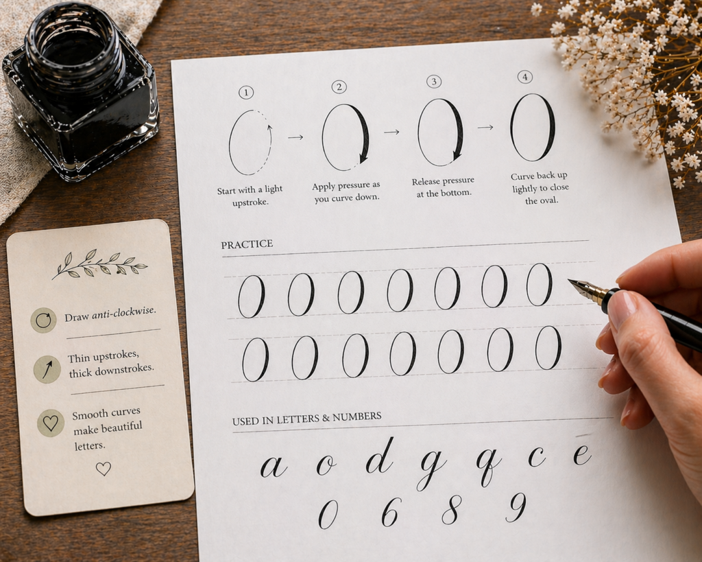
How to Write a smooth Oval Stroke
- It is written in an anti-clockwise manner and if you are right-handed, you need to learn how to place your paper in such a way that will make you comfortable.
- So, you begin with a light upstroke moving upward and slightly to the right. On reaching the top of the oval, you gently apply a little pressure, and curve downward with a deeper pressure to form the thicker part of the stroke. Then, when you reach the bottom, release the pressure and curve back upward to close the oval with a thin line.
- I know, this can’t be achieved by trying once, you need consistent practicing rows of ovals across your paper. I recommend using a trace paper and placing it on top of your worksheet and using your brush pens to trace the examples. First, trace papers are easy on the tips of brush pens and secondly, you get the chance to use the worksheet over and over again. If you’re using brush pens for this, make sure you already know how to use brush pens properly; the angle and pressure you use with a brush pen directly affects how clean your ovals come out.
7. Ascending Loop Stroke
They are elegant loops that extend above the x-height of a letter and rise into the ascender space which makes them add height, movement, and beauty to many lowercase letters. You’ll see ascending loops in alphabets like b, d, h, k, l and t.
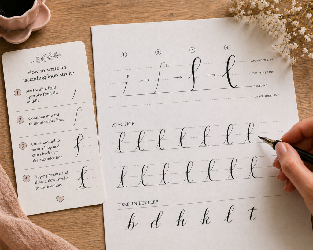
How to Write the Ascending Loop Stroke
First of all, draw guidelines, like four lines on your paper, then start with a light thin upward stroke at the middle and move upwards, towards the ascending line. Once you get to the top, curve around to form a loop then cross back over the ascending line as you move downwards and begin to apply more pressure to create a thicker downstroke towards the baseline. I hope it’s clear enough to understand. Once you’re comfortable with ascending loops, you’ll find them much easier to apply when you start working through how to create your first calligraphy alphabet.
8. The descending loop stroke
Unlike the ascending loop, this stroke usually begins with a thin downstroke that curves into a loop below the baseline, and then transitions back upward with light pressure.
They are used to form letters, g, j, y and most times z, q or f.
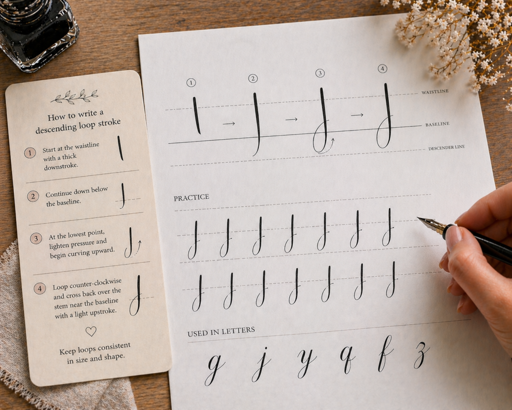
How to create a descending loop stroke
Imagine you are writing letter j on your paper, after ruling out your guidelines, start at the waistline by applying heavy pressures for a thick slightly curved downward stroke ( to create the stem) and move down below the baseline. At the lowest point, lighten the pressure and gently transition to a very light, upward stroke and curve the stroke in a counter-clockwise manner to cross over the stem just before or at the baseline. Keeping your descending loops consistent in size and shape is one of the keys to how to create consistent calligraphy letters; inconsistent descenders are one of the first things that make a word look unbalanced.
Tips for creating smooth strokes
1. Use very light pressure
Don’t panic, it’s simple, just hold your pen a little lightly but firm so it doesn’t slide off your fingers and create an upstroke without heavily touching the surface of your paper.
2. Relax your hand
To prevent shaky or uneven lines, try to relax your fingers, wrist and arm while writing. This is something covered in depth in how to avoid common beginner calligraphy mistakes; hand tension is one of the most common and easily fixable beginner errors.
3. Maintain a consistent pen angle
Usually at 45 degrees or 55 degrees. If your pen isn’t in a continuous deliberate angle, your thin strokes will look scratchy.
4. Move your arm instead of only your fingers
In everyday writing, it’s mostly the fingers and the wrist that moves but in calligraphy, you need to lift your arm and move it according to the flow of the lettering for a smoother and more stable strokes.
5. Use smooth, quality paper
For you to be able to produce a smooth thin stroke or any type of stroke at all, the quality of paper you use matters. I always recommend Rohdia pads because I’ve used it and love how it makes my pen glide easily.
6. Practice slow and controlled movements
Even as an experienced calligrapher, I don’t rush my letterings, I take it slow and steady for a beautiful finish. So, as a beginner, you need to take time and practice slowly, with time, your muscles will improve and your lines will become smoother naturally. Following a 30-day daily practice plan is one of the best ways to build this slow and steady habit without losing momentum.
7. Warm up before practicing letters
I had a mini accident where I injured my wrist while learning how to ride a bicycle. For 3 days I couldn’t hold my brush pen appropriately due to the pains and when writing, my lines were shaky. I had to pause writing for a while, when I came back, I practiced some simple drills. I drew rows of light upward and downward lines to help train my hand to create consistent strokes. It was kind of welcoming my hands back. If you want to know exactly which warm-up drills work best, beginner mistakes in calligraphy and how to fix them covers the warm-up process alongside the most common errors beginners make when jumping straight into letters.
8. Keep your pen tip clean
Ink buildup or debris on the pen tip can affect the smoothness of your strokes. Clean your nib or brush tip regularly to maintain consistent ink flow.
How to Practice Stroke Combinations
- Join two strokes together: Start with practicing two strokes together at a time. Like combining an overturn and an underturn to create a smooth arch shape.
- Repeat patterns: Keep writing rows of simple stroke combinations continuously across your page, so your hand quickly gets conversant with the curves and helps you maintain rhythm when writing.
- Keep it slow and steady: Don’t be like other beginners that love to rush only to end up with uneven, shaky strokes. Practice slowly at first, focus on creating smooth controlled letters before thinking of increasing your writing speed. If you feel like you’ve been practicing but not improving, how to improve calligraphy fast will show you the specific adjustments that create the fastest visible progress.
- Break letters into their basic parts: For instance, you want to practice the lowercase letter “a”. First, count how many strokes make up the letter “a”. It is made up of 3 strokes, the upstroke, oval and underturn. Once you’ve known this, next is to start by practicing your upstrokes, oval and underturn strokes repeatedly and then try to see if you can join each of the strokes together. This will help you understand how different strokes work together to form letters. For a full guide on applying this same approach to every letter in the alphabet, how to create your first calligraphy alphabet walks you through the entire process step by step.
- Maintain a consistent spacing and pressure: As you connect your strokes, ensure that there’s smooth transitions between thin and thick lines to make your calligraphy look more polished and professional. This is also the foundation of how to create consistent calligraphy letters; consistent spacing and pressure across connected strokes is what separates beginner work from polished lettering.
Final thoughts
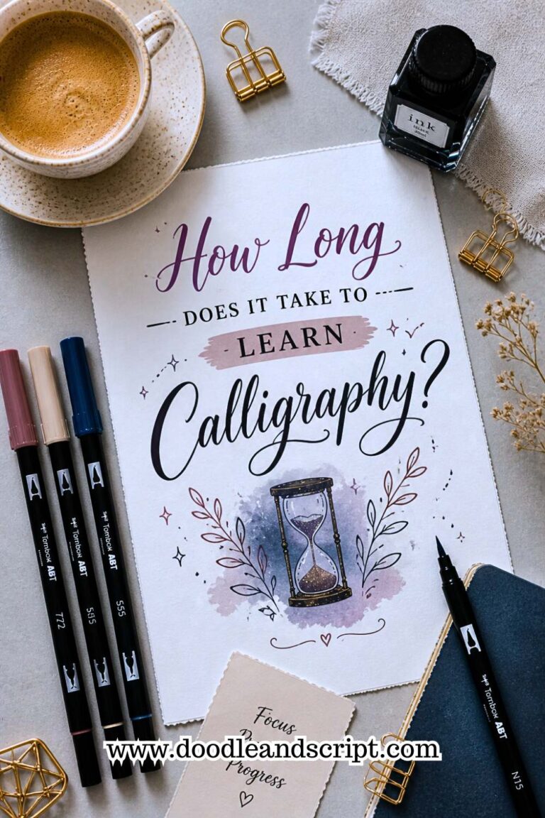
A lot of beginner calligraphers focus on how long it would take them to master these basic strokes, though it’s important but I would advise that you don’t put your mind into the time span so that you won’t rush everything and end up creating bad strokes. Nobody cares how much time you invested in learning, it’s the finishing that will make people look at your calligraphy twice. Take as much time as it requires to practice, just keep practicing. And if you’re curious about realistic timelines anyway, how long it takes to learn calligraphy gives you an honest breakdown so you can set expectations without putting unnecessary pressure on yourself.