How to Practice Bullet Journal Lettering in 21 Days
Disclosure: Some of the links in this post are affiliate links. This means if you click on the link and purchase an item, I will receive an affiliate commission at no extra cost to you.
One of the biggest lies social media tells about lettering is that people just wake up one day knowing how to do it.
You see a perfect journal page, a ridiculously neat title, or handwriting that looks like a font and think, there is no way my lettering will ever look like that.
What you do not see are the pages that came before it. The crooked letters. The uneven spacing. The practice pages nobody posts because they are honestly kind of embarrassing.
The weird part is that most lettering mistakes are not caused by bad handwriting. They usually come from rushing.
Your hand is trying to do something it has not practiced enough yet. That is why copying a beautiful font once rarely changes anything.
The improvement happens when you repeat simple skills until they start feeling natural.
That is what this guide on How to Practice Bullet Journal Lettering is all about. Not turning your handwriting into perfection. Not filling notebooks with endless drills.
Just spending a little time each day working on the skills that actually make a difference.
Twenty-one days might not turn you into a lettering expert, but it is more than enough time to see real progress and start feeling a lot more confident every time you open your journal.
If you want fresh styles to experiment with during the challenge, explore 29 Bullet Journal Font Ideas to Make Your Pages Pop.
How to Practice Bullet Journal Lettering in 21 Days
Day 1: Stop Worrying About Letters
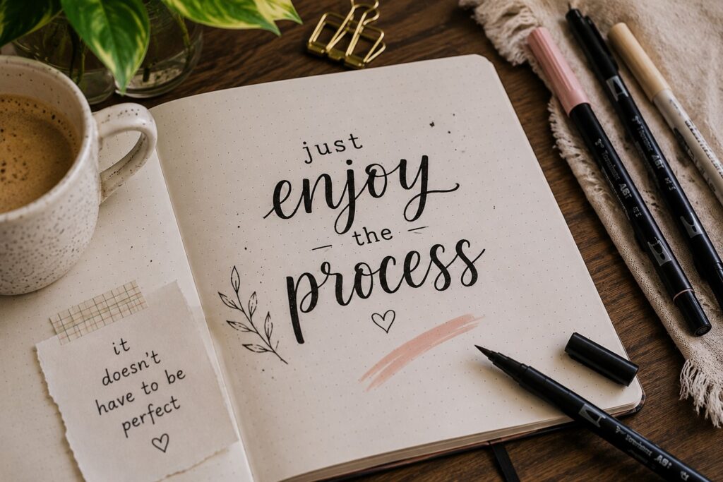
It sounds strange, but your first day of lettering practice should have very little to do with letters.
Most lettering styles are built from simple lines, curves, loops, and circles. If those basic shapes feel uncomfortable, the letters created from them usually will too.
Grab a page and spend a few minutes drawing straight lines, curved lines, circles, and ovals.
Focus on keeping your movements smooth rather than making everything perfect. Think of it as a warm-up for your hand.
A lot of beginners skip exercises like this because they seem too simple. The funny thing is that these basic drills often improve control faster than repeatedly writing random words.
Building confidence with simple shapes makes every lettering style easier to learn later.
If you want to see how these strokes appear in different styles, explore 15 Easy Bullet Journal Lettering Styles Every Beginner Should Learn.
Day 2: Keep Your Letters the Same Size
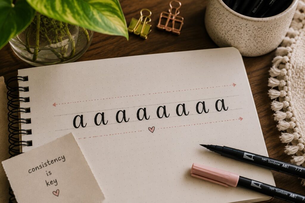
One of the fastest ways to make your lettering look cleaner is to work on consistency. A word can look messy when some letters are tall, others are short, and a few seem to have a mind of their own.
For today’s practice, draw two light guidelines and write simple words between them.
Pay attention to the height of each letter and try to keep everything as even as possible. Do not worry about writing beautifully yet.
This exercise trains your eyes to spot small differences that you might normally ignore.
Over time, keeping letters the same size starts feeling natural, and your headings instantly look more polished.
Day 3: Slow Down Your Writing
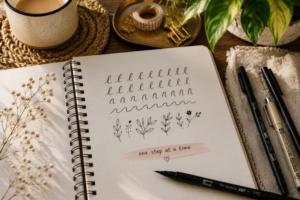
A lot of lettering mistakes happen because people rush. Your brain knows how you want the word to look, but your hand moves too quickly to make it happen.
Choose a few simple words and write them much slower than usual. Pay attention to every stroke and every curve. Notice which letters feel easy and which ones make you lose control.
Slowing down helps you build better habits. It also gives you a chance to spot mistakes before they become part of your normal writing style.
Sometimes improvement is less about learning something new and more about giving yourself time to do it properly.
Day 4: Practice One Letter Repeatedly
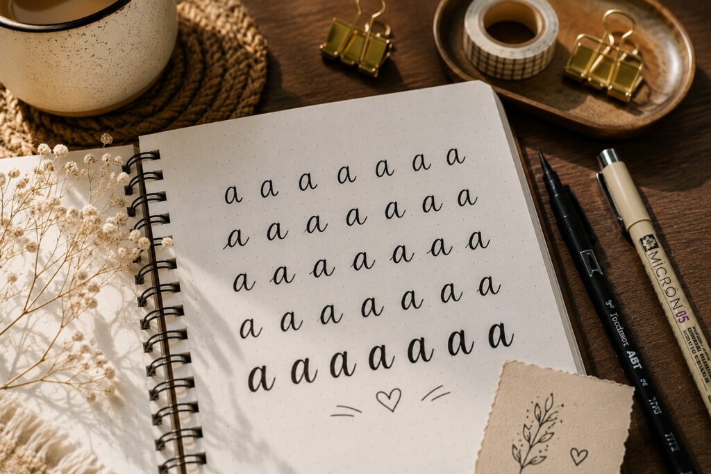
Most people practice words. Today, focus on a single letter instead.
Pick a letter that you struggle with and fill part of a page with it. You might choose “S,” “R,” “G,” or any letter that never seems to look right. Write it again and again while paying attention to its shape.
Repetition helps your hand remember the movement. By the end of the exercise, the letter will usually feel much more comfortable to write.
It may seem repetitive, but it is one of the quickest ways to improve problem letters.
If you need more creative lettering inspiration, check out 23 Beautiful Bullet Journal Lettering Ideas You’ll Want to Copy.
Day 5: Pay Attention to Spacing
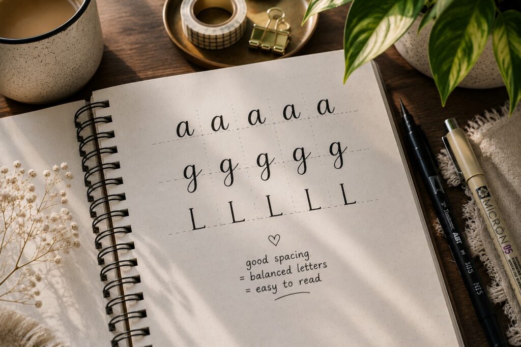
Good lettering is not just about the letters themselves. The spaces between them matter too.
Write a few short words and look closely at the gaps between each letter. Some spaces may look too wide while others feel crowded. Try adjusting them until the word feels balanced.
This is one of those skills that people rarely notice until they start practicing it. Once you develop an eye for spacing, your lettering becomes much easier to read and much more pleasing to look at.
Day 6: Trace a Font You Like
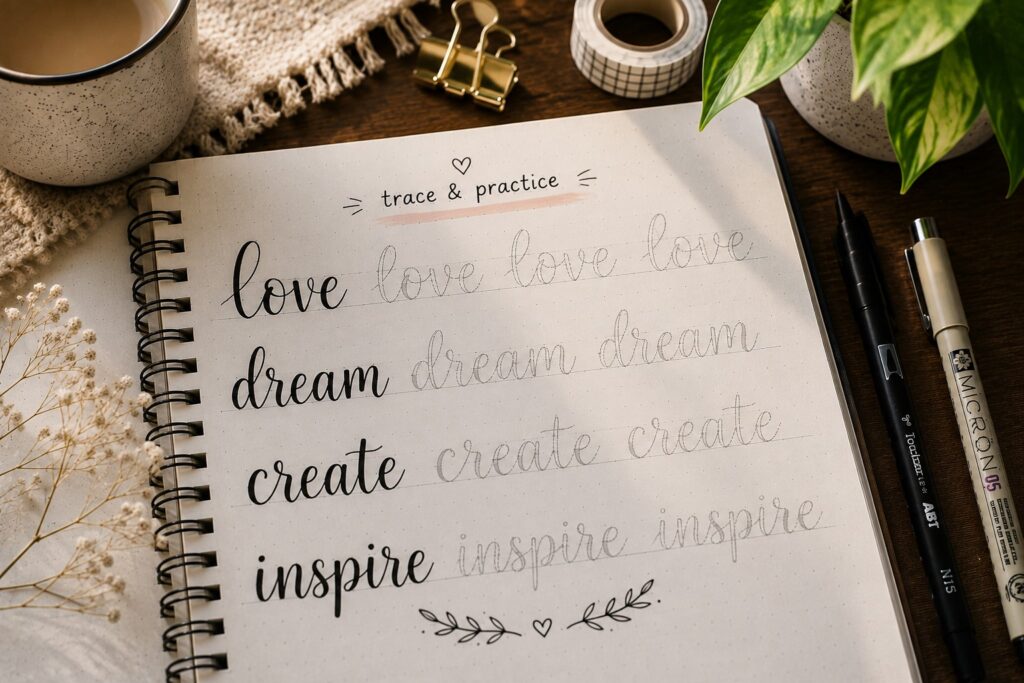
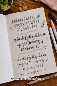
Tracing can teach you a lot about lettering. It helps you notice details that are easy to miss when you are only looking at a finished title.
Choose a font you love and trace it several times. Pay attention to the shapes, spacing, and proportions of the letters. Notice how the strokes connect and how each letter fits beside the next.
After tracing, try drawing the font on your own. You may not get it perfect right away, but you will start understanding why the style works.
That understanding is often more valuable than simply copying it. If you want more styles to experiment with, explore 19 Easy Bullet Journal Fonts Anyone Can Learn.
Day 7: Write Your Name in Three Fonts
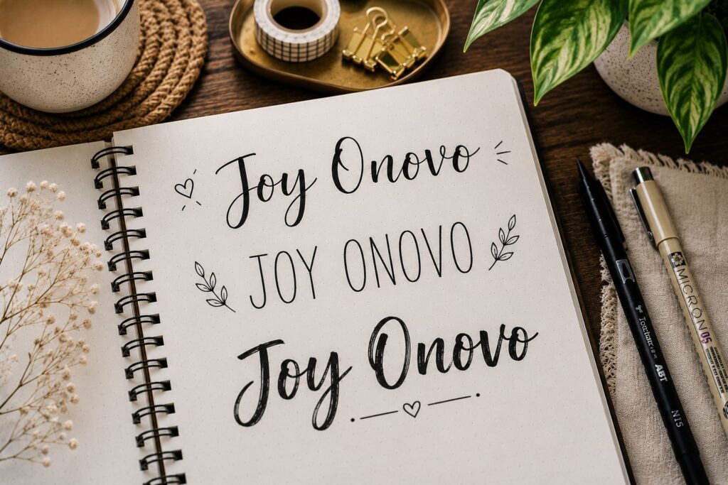
You have spent the first week building basic skills. Now it is time to use them.
Write your name three different ways using three different fonts. Try a bold font, a simple font, and a playful font. The goal is not perfection.
The goal is seeing how much a font can change the personality of a word.
This exercise is fun because it makes the differences between lettering styles easier to see. The same name can look elegant, energetic, creative, or relaxed depending on the font you choose.
It is also a good reminder that lettering is supposed to be enjoyable. The more you experiment, the easier it becomes to find styles that feel natural to you.
If you want more ideas for standout titles, explore 21 Bullet Journal Title Lettering Ideas That Look Professional.
Day 8: Practice Basic Word Connections
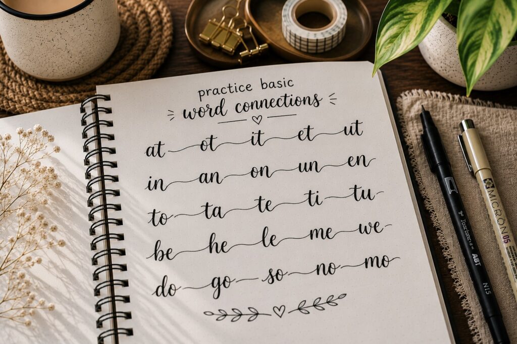
Some words look awkward because the letters do not seem to belong together. They may be individually neat, but the word feels disconnected as a whole.
For today’s practice, choose a few simple words and focus on how each letter flows into the next.
Pay attention to the spacing and the overall shape of the word rather than individual letters.
When letters work together, words instantly look smoother and more intentional. This is especially helpful if you enjoy script or cursive-inspired lettering styles.
Over time, you will start seeing words as complete shapes instead of a collection of separate letters.
Day 9: Copy a Journal Header You Love
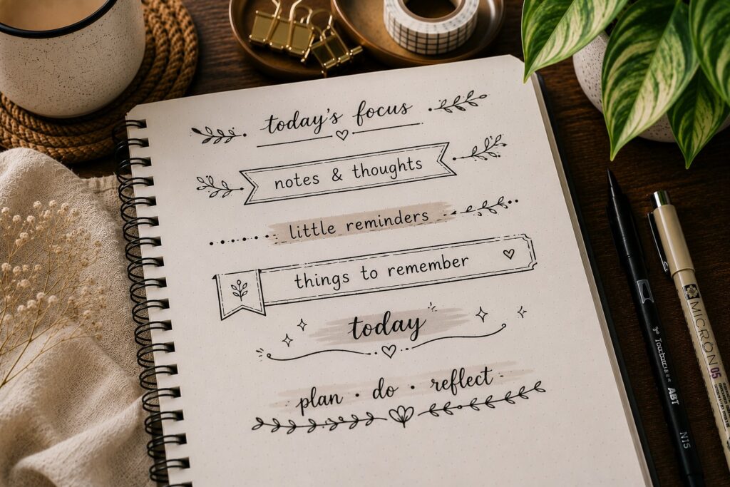
Everyone has seen a journal heading and thought, I wish I could do that.
Today, find a header style that catches your attention and try recreating it. Pay attention to the font, spacing, decorations, and overall layout. Focus on understanding what makes the title work.
This exercise helps train your eye for design. You begin noticing details that normally blend into the background.
The goal is not to create an exact copy forever. It is to borrow ideas and learn techniques that you can eventually make your own.
If you want more header inspiration, explore How to Make Beautiful Bullet Journal Headers in 13 Easy Steps.
Day 10: Work on Consistent Slant
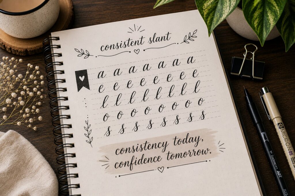
One thing that makes lettering look polished is consistency. When some letters lean left, others lean right, and a few stand straight up, words can feel messy even if the letters themselves look good.
Choose a few words and pay attention to the angle of each letter. Try to keep the slant consistent from beginning to end.
You may need guidelines at first, and that is perfectly fine. Many experienced letterers still use guides when practicing new styles.
This small adjustment can make a surprisingly big difference in the overall appearance of your lettering.
Day 11: Fill a Page With Simple Words
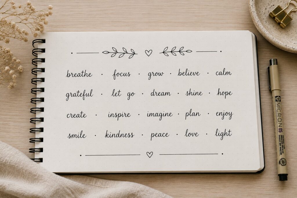
By now, you have practiced lines, spacing, sizing, and individual letters. Today is about putting those skills together.
Choose a list of simple words and fill a page with them. They can be your favorite foods, songs, movies, or random words from a book. The topic does not matter.
What matters is paying attention to the skills you have been building throughout the challenge. Focus on consistency rather than speed.
This exercise gives you more repetition without feeling as repetitive as writing the same letter over and over.
Day 12: Experiment With Thick and Thin Strokes
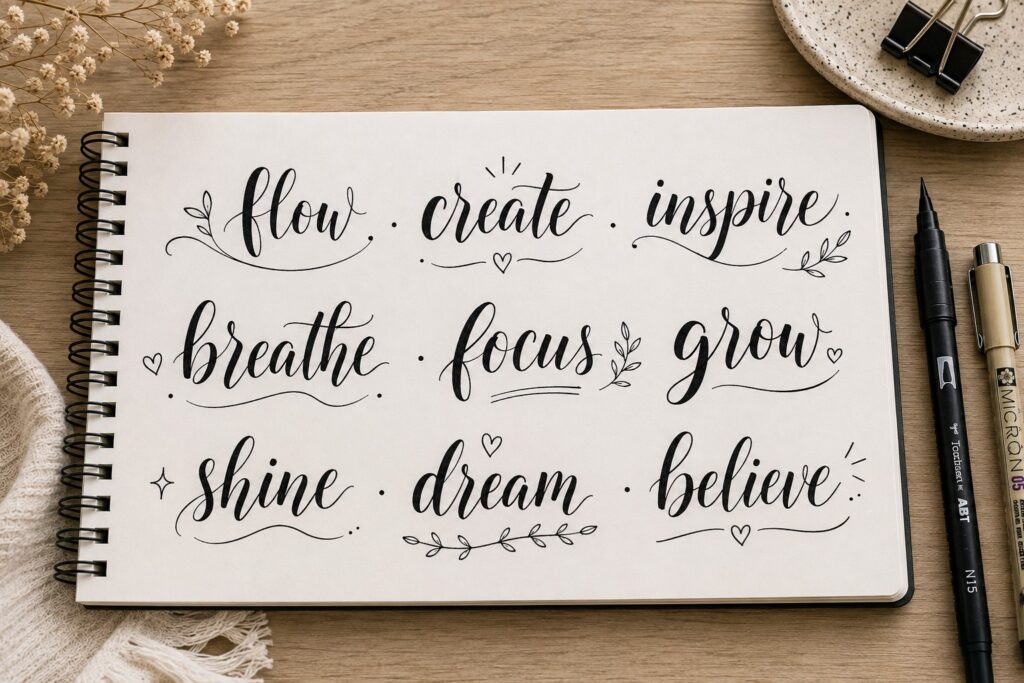
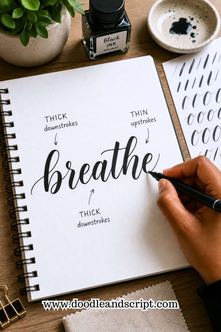
One reason some lettering looks more interesting than ordinary handwriting is the contrast between thick and thin lines.
Choose a simple word and try thickening certain strokes while leaving others thin. You do not need special pens for this exercise.
You can create the effect by drawing additional lines where needed.
The contrast adds depth and personality to your lettering. It is also one of the easiest ways to make a title feel more decorative.
Do not worry if it feels awkward at first. Like most lettering skills, it becomes easier with practice.
If you enjoy decorative styles, check out 11 Decorative Bullet Journal Lettering Ideas for Stunning Pages.
Day 13: Create a Mini Font Collection
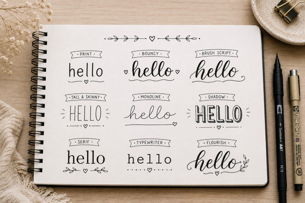
By this point, you have seen several lettering styles. Today, gather a few of your favorites on a single page.
Write the same word using different fonts. Try block letters, bubble letters, tall skinny letters, script, or any styles you enjoy. Label each one so you can revisit them later.
This page becomes a personal reference guide whenever you need ideas for future spreads. It is also a great way to see which styles feel most natural to you.
Many journal lovers end up creating several font reference pages because they are so useful.
Day 14: Practice Longer Titles
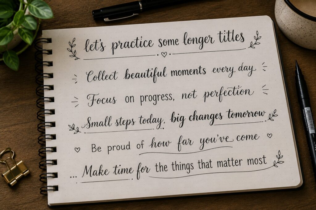
Short words are fun, but longer titles bring new challenges. Spacing becomes more important, and it is easier for letters to become inconsistent.
Choose a few journal-style headings and practice writing them across the page. Focus on keeping the lettering balanced from the first word to the last.
You may notice that certain letters start changing shape near the end of a title. That is completely normal. The goal is becoming aware of those changes.
The more you practice longer phrases, the more comfortable you will feel creating headings for real journal spreads.
If you need inspiration for beautiful layouts, explore 25 Aesthetic Bullet Journal Lettering Ideas You’ll Love.
Day 15: Try Lettering Without an Eraser
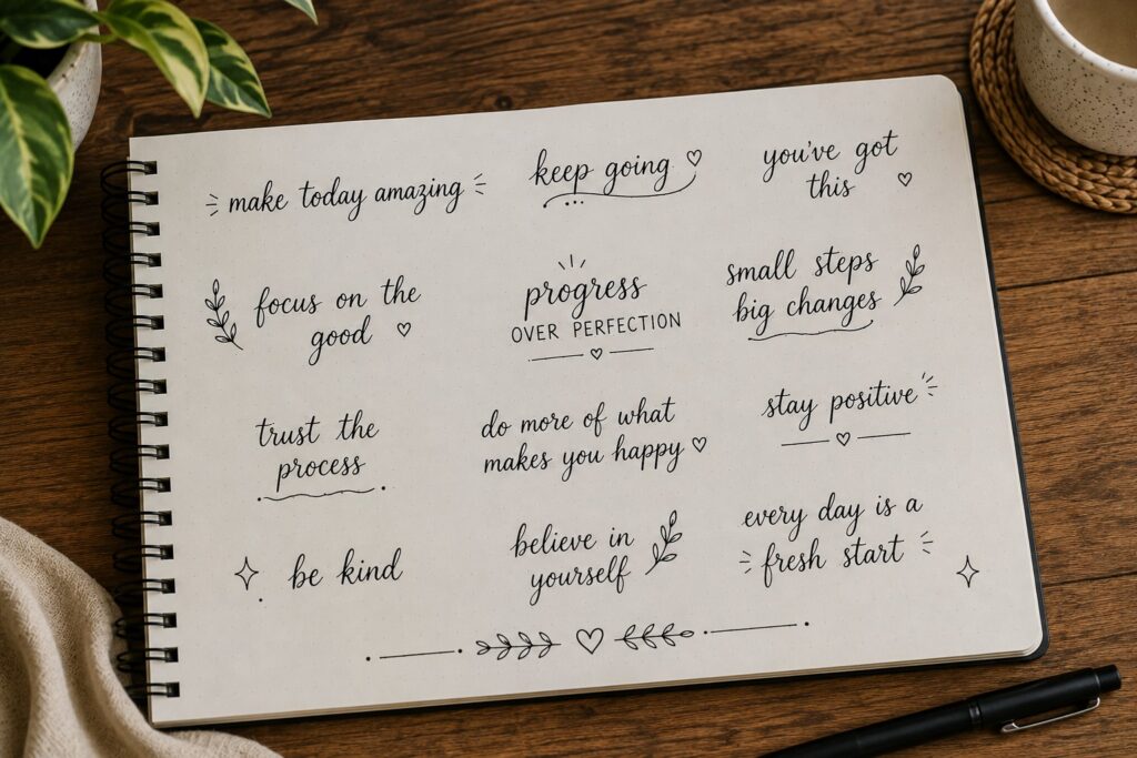
Today might feel a little uncomfortable, and that is exactly why it is useful.
Grab your journal and practice lettering without reaching for an eraser every time something looks slightly off. If a letter is not perfect, keep going. If a word feels uneven, finish it anyway.
A lot of beginners spend so much time fixing tiny mistakes that they never develop confidence. This exercise teaches you to focus on progress instead of perfection.
You may be surprised by how many “mistakes” stop bothering you once the entire word is finished. Sometimes the things we notice while lettering are invisible to everyone else.
If you want more creative lettering inspiration, explore 17 Creative Bullet Journal Calligraphy Ideas to Try Today.
Day 16: Practice Filling Empty Space
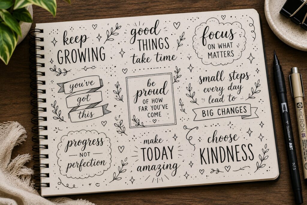
Lettering is not only about the letters. It is also about what happens around them.
Choose a title and experiment with the space surrounding it. Add small details, adjust the layout, or simply leave more breathing room around the words. Notice how the overall look changes.
Many beginners focus so much on the lettering that they forget the page itself is part of the design. A title often looks better when it has enough space to stand out.
Learning how to use empty space well can make even simple lettering feel more intentional.
Day 17: Create a Simple Quote Page

Now that you have practiced individual words and headings, it is time to work with a short quote.
Choose a sentence you like and write it across a page. Focus on making certain words stand out while keeping others smaller and simpler.
This exercise helps you think about hierarchy. Not every word needs the same amount of attention. In fact, the most interesting quote pages usually highlight only a few key words.
Working with quotes is also a great way to combine multiple lettering styles on a single page.
If you need ideas for standout quote layouts, check out 17 Bullet Journal Quote Lettering Ideas That Stand Out.
Day 18: Practice One Font for an Entire Page
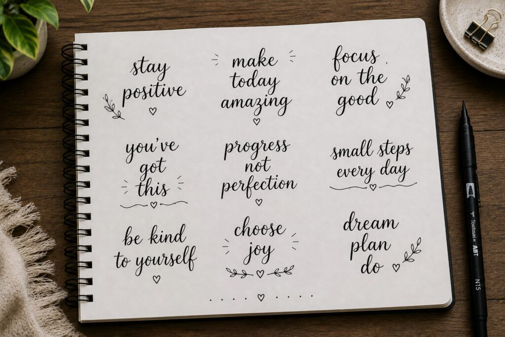
Most people jump between fonts constantly. Today, do the opposite.
Choose a single font and use it for an entire page of practice. Write words, phrases, and short headings using only that style.
By spending more time with one font, you start noticing small details you may have missed before. The letters become more consistent, and the style begins to feel more natural.
This exercise also helps you build confidence with fonts you want to use regularly in your journal.
Day 19: Compare Today’s Work to Day 1
This is one of the most important days in the challenge.
Pull out the page you completed on Day 1 and compare it with your recent practice. Look at your lines, spacing, consistency, and overall confidence.
Many people feel like they are not improving because they see their lettering every day. Looking back gives you a clearer picture of how far you have come.
Even small improvements are worth celebrating. Progress is often easier to see when you compare your work over time rather than from one day to the next.
If you want to expand your collection of styles, explore 29 Bullet Journal Font Ideas to Make Your Pages Pop.
Day 20: Mix Two Fonts Together
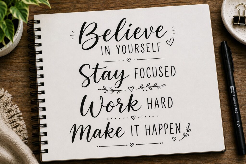
Today is all about creating contrast.
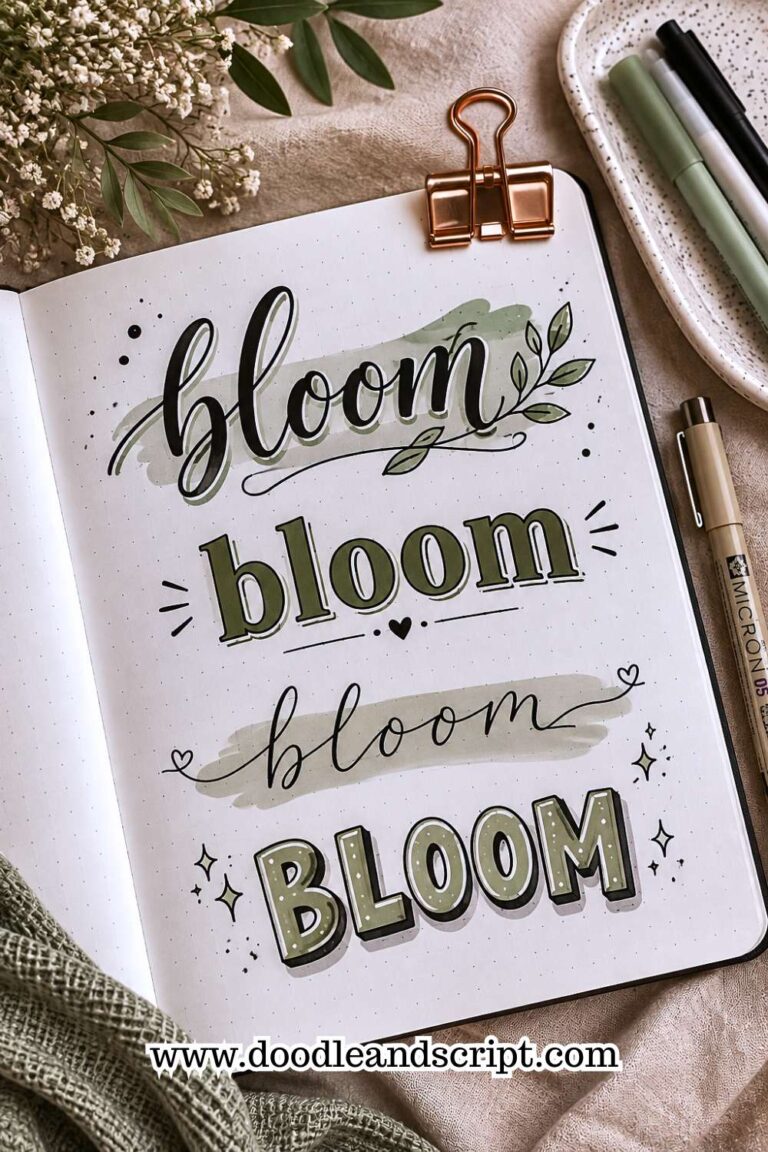
Choose two different fonts and use them in the same title. You might pair a bold block font with a script font or combine a tall skinny font with a playful bubble style.
The goal is learning how different fonts work together. Some combinations create a clean, balanced look, while others feel more energetic and creative.
This is a technique many journal creators use because it makes headings look more dynamic without requiring complicated decorations.
If you want more inspiration for combining styles, explore 23 Beautiful Bullet Journal Lettering Ideas You’ll Want to Copy.
Day 21: Create a Journal Title You’re Proud Of
For the final day, create a title using everything you have practiced throughout the challenge.
Pay attention to sizing, spacing, slant, consistency, and font choice. Take your time and enjoy the process. There is no rush.
The goal is not to create the most beautiful title ever made. The goal is to create something that shows how much you have learned over the past three weeks.
When you compare this title to your early practice pages, you will probably notice cleaner lines, stronger spacing, and more confidence.
That progress happened because you showed up and practiced.
Final Thoughts
Learning How to Practice Bullet Journal Lettering is not about finding a secret trick or buying the perfect pen.
It is about giving yourself enough time to build the skills that make lettering feel natural.
Some days in this challenge probably felt easy. Others may have felt repetitive. Both are part of the process. Every line, curve, and practice page helped strengthen your control and confidence.
The best thing about lettering is that improvement does not stop after 21 days. The more you practice, the more comfortable different styles become.
Keep experimenting, keep creating, and keep giving yourself permission to learn.
If you are ready to take your page designs even further, explore 21 Cute Bullet Journal Banner Doodles Anyone Can Draw.