Beginner Mistakes in Calligraphy and How to Fix Them
Calligraphy isn’t just a beautiful handwriting but also an art form that you can literally hold in your hands. I’ve always loved how a simple pen and some ink can turn ordinary letters into something elegant and eye-catching. Lately, calligraphy has become so popular, and I totally get why most content creators want to learn it. Apart from posting your pretty lettering on Instagram and Tiktok, calligraphy is seen almost everywhere, in wedding invitations, birthday cards, journals etc. I think it’s such a handy skill to learn. If you’re just getting started, the calligraphy for beginners complete starter guide is the best place to build your foundation before anything else.
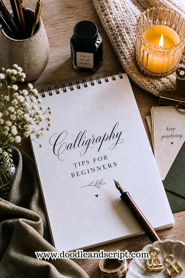
But here’s the thing, while it looks effortless in the hands of experts, calligraphy actually demands a solid foundation to be able to write like your favorite artist. And, I’ve seen so many beginners (myself included at first!) make little mistakes that slow down progress or even get frustrating. Things like holding your pen wrong, uneven letters, or spacing that just looks somehow crazy, all these are so common. If you want a deeper look at the most frequent errors and how to correct them, beginner mistakes in calligraphy and how to fix them breaks them all down clearly.
But don’t be worried because almost all beginner mistakes can be corrected. When you learn the basics the right way, your writing will improve and your letters will start to flow smoothly. In this post, I’ll walk you through the most common beginner mistakes in calligraphy and show you exactly how to fix them, so you can write with confidence while enjoying every stroke.

Beginner Mistakes in Calligraphy and How to Fix Them
1. Posture and Setup Mistakes
In calligraphy, the way you position yourself matters a lot because it will reflect in your writing. So, here are some mistakes you can check with yourself and correct;
Sitting too low or too high
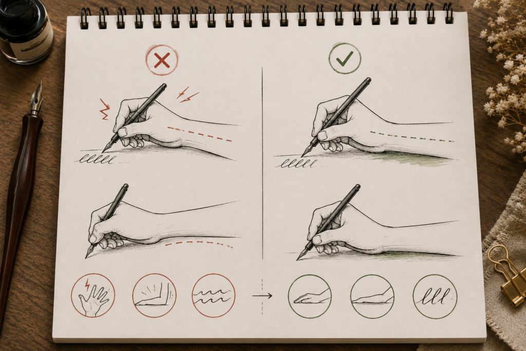
Initially, I used to casually sit on a bench and also place my paper on the same bench to write, it was always uncomfortable because I needed to bend and write every time, and my back felt the pains while my writing looked shaky . But each time I sat at my study corner with an appropriate table and chair, there was a difference, so I had to stop using the bench. This is the same mistake most beginners make too; thinking that any sitting position will be fine but it’s not always so.

If your chair is too low, you might find yourself hunching over your paper, straining your neck and shoulders. If it’s too high, your arms may float awkwardly, making your strokes uneven.
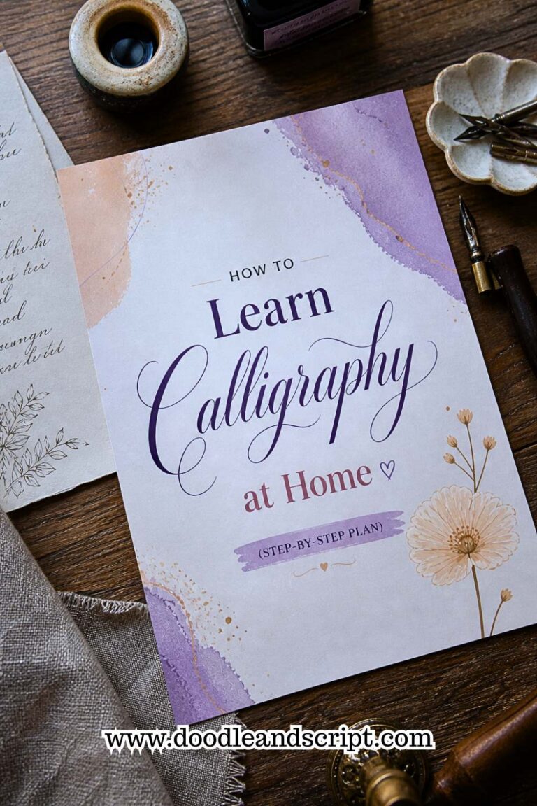
- How to fix it: Ensure that your chair is adjusted so that your feet are rested flat on the floor, knees should be comfortable at 90-degree angle, and forearms are parallel to the desk. You want your shoulders relaxed and not raised like you’re carrying something heavy. Try this, and you’ll notice your writing feels smoother almost instantly. This setup is also something covered in detail in how to learn calligraphy at home; your environment plays a bigger role than most beginners realize.
Incorrect arm and hand positioning
To avoid quick hand cramp after a few minutes of writing, you need to hold your pen gently and rest your forearm lightly on the desk to gain stability, this will make your strokes stay steady.
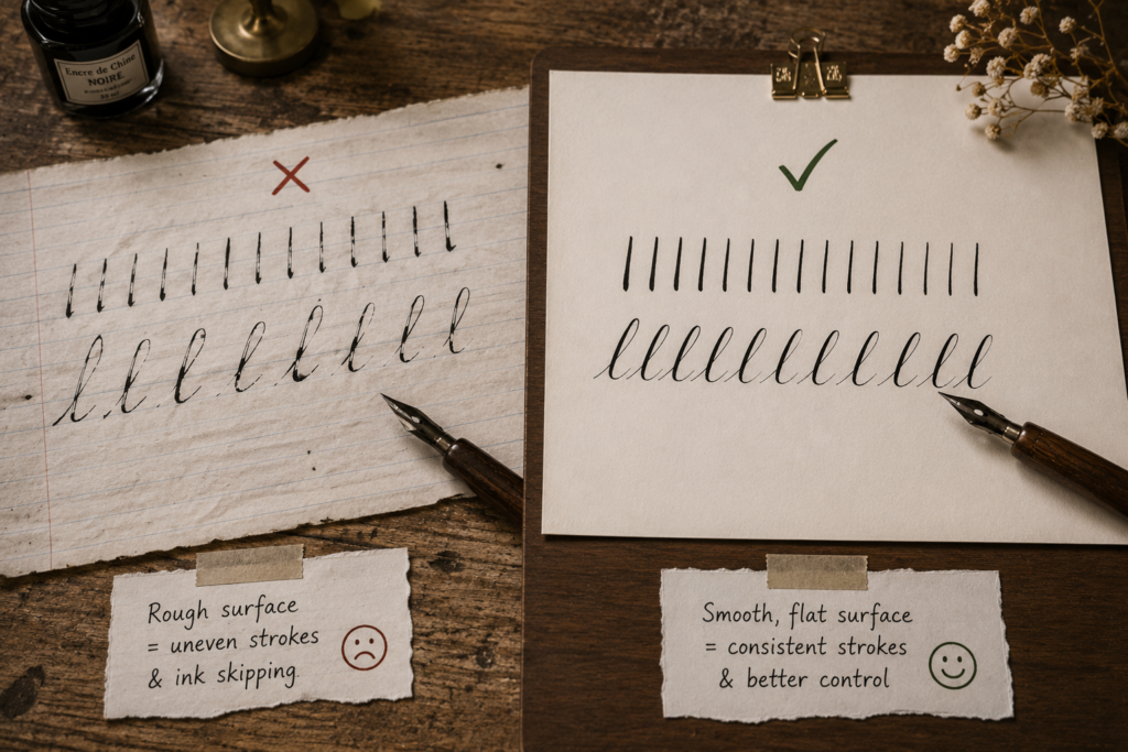
Not having a proper writing surface
Have you ever written an exam on a table with a rough surface before? If yes, then we came to relate to how the rough table can distort the flow of your writing. And if you are writing calligraphy, you need to avoid rough surfaces by all means because you’ll find it difficult to control your strokes and this will ruin your practice in real time.
What I recommend is a flat, sturdy but neat desk or table or you can opt for a drawing board which is even better because of the smoothness.
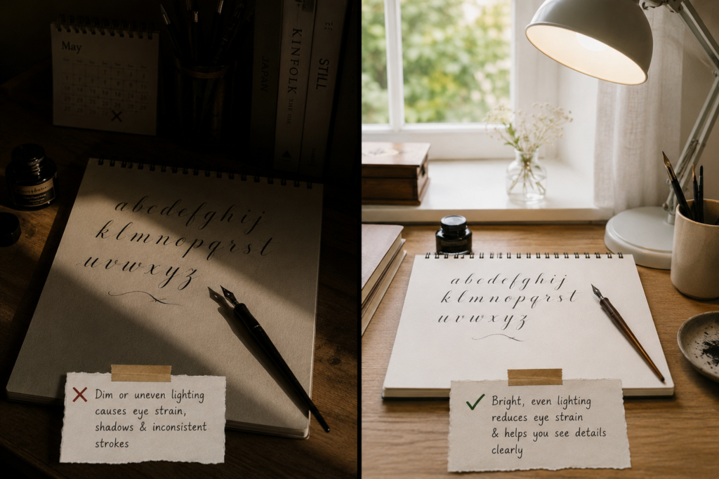
Using poor lighting
Any lightning that will cause you to strain your eyes will negatively affect the precision of your lines. Besides, stressing your eyes isn’t healthy either, set up your practice space near the window during the day, where direct sunlight can shine on you. Tiny details are what makes your calligraphy shine so make sure you use a bright reading lamp even when there’s power at night so that there’s no shadow on your paper when writing.
2. Grip and Pen Pressure Mistakes
Holding the Pen Too Tight
Holding your pen at a dead grip point will make both your upstroke and downstroke look alike and this can be so frustrating when you want to draw an upward stroke. It gets worse if you’re practicing traditional calligraphy, the ink will just over flow and mess up your work. Understanding the difference between how upstrokes and downstrokes should feel is explained in detail in calligraphy basics: understanding upstrokes and downstrokes.

Hold the pen lightly but firmly so it doesn’t slip off your hand. Think of it like holding a baby, soft but secure. With time, you’ll notice your lines become smoother and your hand will feel so much better after a few minutes of practice.
Loose Pen Grip
On the other hand, if you hold your pen too loose because I said that it shouldn’t be tight, your letters will just be so uneven. All you have to do is find a balance, your finger should guide the pen lightly, all you should aim for is control not tension.
Applying Inconsistent Pressure
This one was a big aha moment for me. I’d press too hard in some places and barely touch the paper in others. And the result was jagged strokes and letters that looked like they were running around.
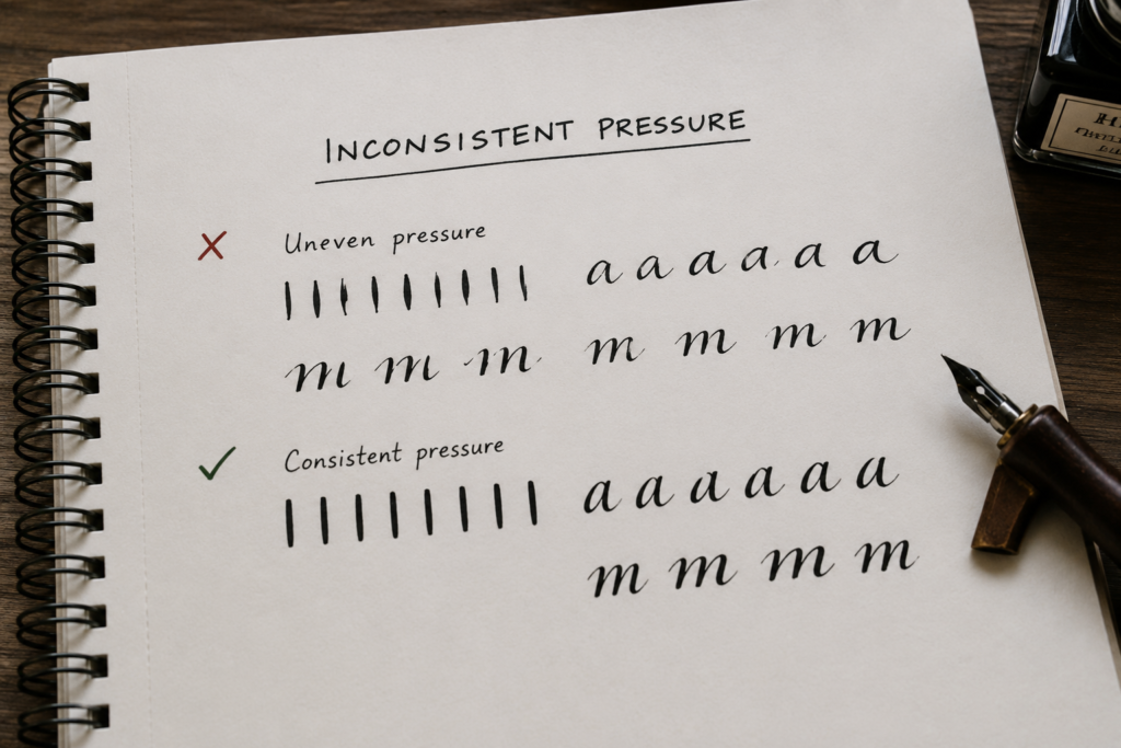
I had to dedicate time to practice controlling my pressure by doing simple exercises. I would draw straight lines while gradually increasing and decreasing pressure. And then tried curves and circles. In a few days, I felt the difference between light and heavy strokes, and my letters started flowing naturally. If you want structured exercises that specifically target pressure control, beginner calligraphy exercises to improve control is exactly what you need.
Ignoring Pen Angle
In calligraphy, angle matters and if you choose to hold your pen any how or the way you like, the letters you produce will appear awkward. Here’s how to do it right, first, try to tilt your paper slightly to match your natural hand movement. Then, keep the pen at a consistent angle, mine is usually at angle 45 degrees, you can keep yours depending on your style but make it consistent. To get the full picture on pen angle and hand position, read how to hold a calligraphy pen correctly; it covers everything from finger placement to wrist positioning.
3. Paper and Tools Mistakes
If you’ve ever felt frustrated because your ink smeared, your lines bled, or your nib just wouldn’t cooperate, bad tools would probably be the reason why. Let’s break down the common mistakes and how you can fix them.
Using the Wrong Paper Type
I used to grab whatever paper that I saw lying around; printer paper, notebooks, even scrap sheets because I was using pencil but when I moved to using real calligraphy pen, things changed, my ink just refused to behave and I didn’t like it at all.
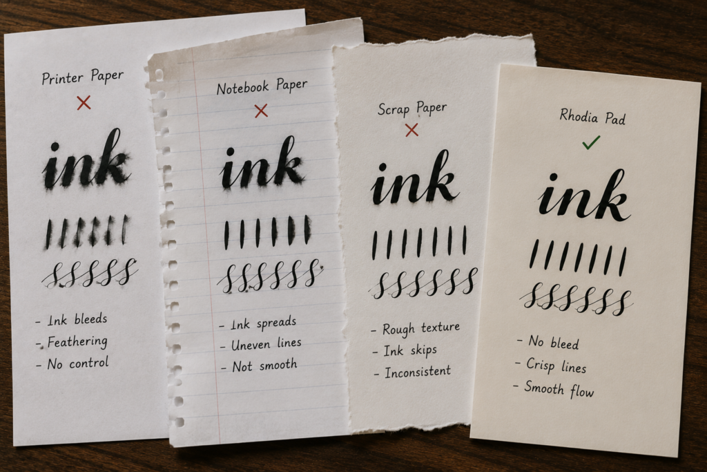
A quality paper will prevent your pen from gliding and ink from bleeding or feathering. Get papers that are specifically made for calligraphy or brush pens, my favorite paper is rhodia pads.
Using Low-Quality Pens or Nibs
Some nibs get bent too easily, imagine focusing on delivering a project and all of a sudden, your cheap nib starts producing scratchy lines on your paper. I am talking from experience though.
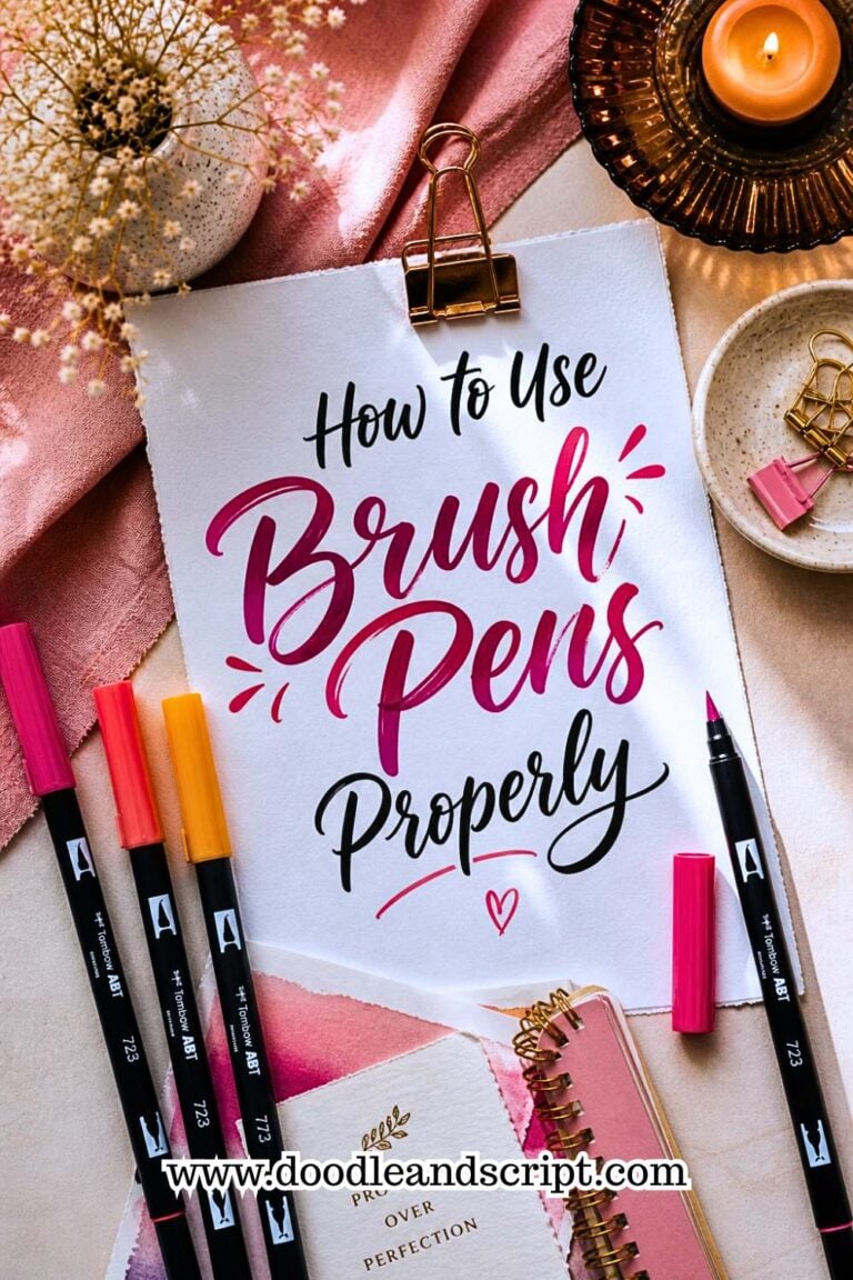
So, I advised myself to invest in a decent nib and pen holder. I don’t have the most expensive set yet but all my tools are quality and this has saved me from so much frustration. If you’re using brush pens for modern calligraphy, make sure you also learn how to use brush pens properly; even a good pen won’t perform well if the technique is off.
Not Cleaning Nibs Regularly
There’s no two ways about it, it’s either you clean your nib immediately after use or leave it to dry and face the consequences of improper ink flow. A lot of beginners are guilty on this table and if you’re fond of tossing your used nib without cleaning, I think you need to re-consider.
Overlooking Ink Consistency
Another mistake I made was ignoring my ink’s consistency. Sometimes it was too thick, sometimes too runny. I just thought it was normal but each time thick ink clogs my nib or thin ink bleeds through the paper, it became a thing of concern.
What I do now is that I always check my ink before starting. If it’s too thick, I’ll add a drop of water and if it’s too thin, I’ll let it sit a little to thicken. Keeping your ink at the right consistency makes your letters flow beautifully and helps avoid unexpected blobs or streaks.
How to Choose the Right Tools and Maintain Them
Here’s what I’ve learned about picking the right calligraphy tools and keeping them in tip-top shape:
- Paper: Opt for papers that are smooth, bleed-proof, and thick enough to prevent ink from seeping through. These are my top 3 calligraphy papers; rhodia pads, canson marker paper and HP premium 32lb paper.
- Pens and nibs: If there’s anything I’ll tell you to choose is quality over quantity, I know, you would want to test a lot of pens and to cut down on cut, you then tend to buy bad ones because they are too cheap. Pick a few good nibs and a sturdy holder like beginner friendly Nikko G Nib. You can also use modern calligraphy pens like tombow fudenosuke brush pen and markers. For a full walkthrough on getting started with the right setup, check out how to start calligraphy with no experience.
- Ink: I usually recommend starting out with sumi ink as a beginner. Also, test your ink consistency before writing, and adjust as needed.
- Maintenance: Clean your nibs after every session, store your pens safely, and replace worn nibs when necessary.
4. Letter Formation Mistakes in Calligraphy
Inconsistent Letter Size
This is a very common mistake and a funny one at the same time, you’ll write one letter nicely and then all of a sudden, the next letter would be twice the size of the first one, you’ll trash and trash your papers but don’t worry, it’s a phase and you’ll pass it.
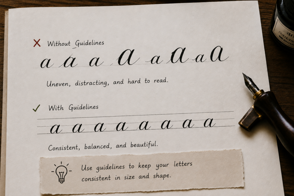
The best thing to do is to use guide lines, or rule out straight lines on your paper and ensure all your letters fit into the lines without shooting out. Learning how to create consistent calligraphy letters will show you exactly how to use guidelines and spacing rules to keep every letter uniform.
Uneven Spacing Between Letters
Have you ever written a word where some letters are too close together, and others look like they’re observing social distancing? I’ve definitely been there. It makes your writing harder to read and less visually appealing
Spacing between letters is just like leaving breathing room for your letters. Each letter should have enough space to stand out, but not so much that it feels disconnected from the word. One thing that helped me was slowing down and consciously checking the gaps between letters. Over time, your eye will naturally start to recognize what looks “right.” Running calligraphy drills every beginner should practice regularly is one of the fastest ways to train that eye for spacing.
Improper Slant of Letters
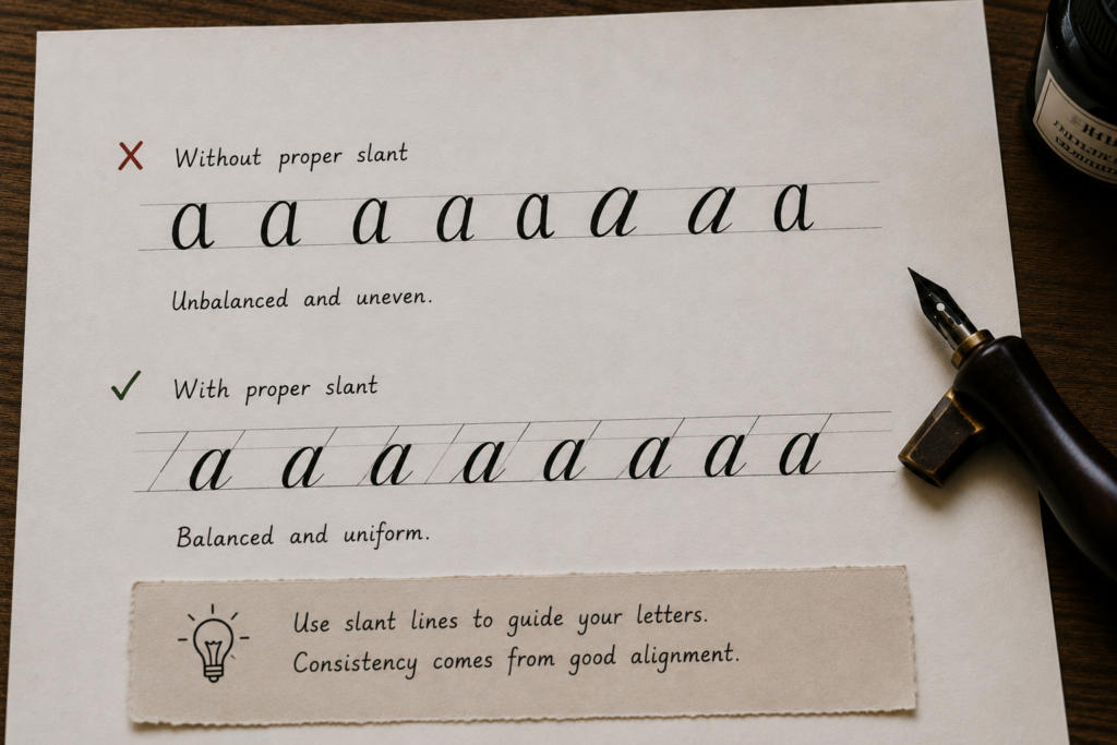
You might not notice it at first, but if your letters are leaning in different directions, any expert will just notice the imbalance. Like some letters will just stand straight, while others will lean as though they were tired.
How to fix this is that you’ll draw slant or diagonal lines across your horizontal guidelines, so whenever you write, the letters will relax on the slant lines making them look uniform. This simple exercise helped my hand movement and pen angle to be consistent.
Ignoring X-Height and Ascender/Descender Lines
I’ll be honest with you here, when I first heard terms like x-height and ascenders, I almost ignored them because I thought they were not really necessary since they sounded too technical. But if you understand them, it’ll change everything for you.
- X-height is the height of your main lowercase letters
- Ascenders are the parts that go up (like in “h” or “l”)
- Descenders are the parts that go down (like in “g” or “y”)

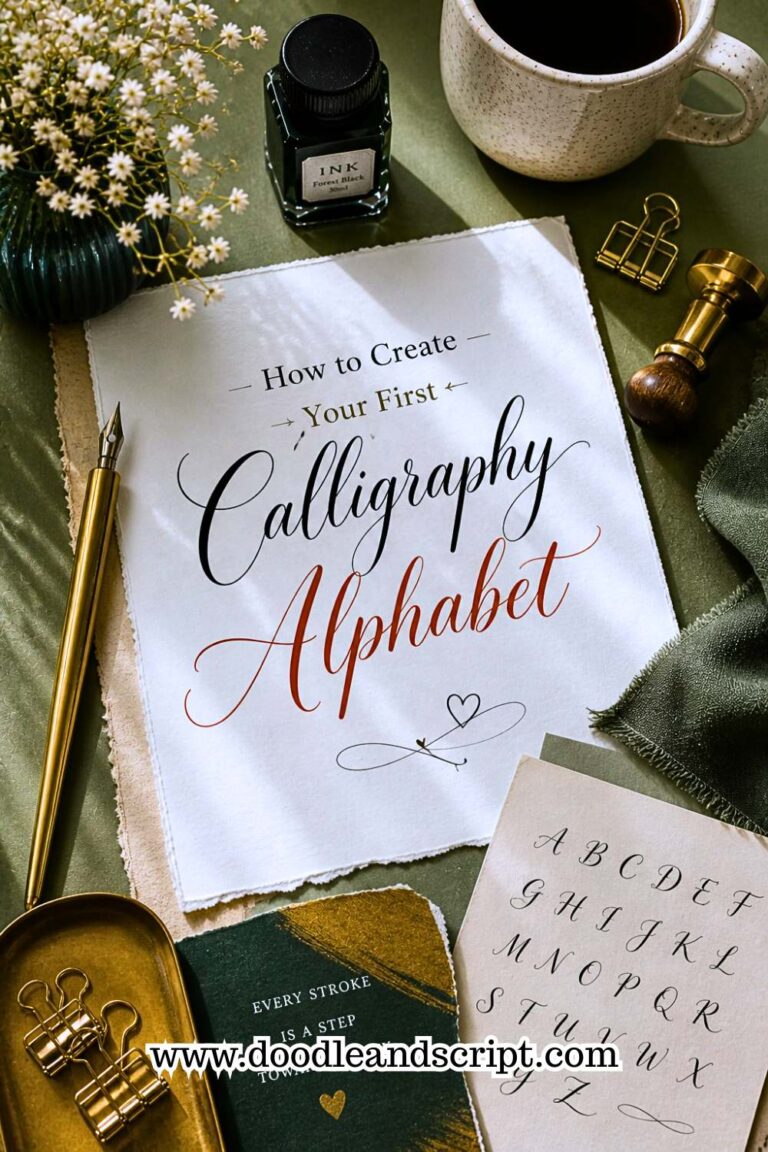
When you ignore these, your letters can look disproportionate, making some parts too long, others too short. What helped me was using practice sheets with clearly marked lines. It gave my letters structure and made everything look more balanced. Once you understand these proportions, the next step is putting them to work in how to create your first calligraphy alphabet where x-height and ascender lines become your best friends.
5. Mindset Mistakes
Enough of the technical errors, lets come down to the mind.
Impatience and rushing progress
Most beginners are impatient with themselves and this makes them rush only to end up with multiple mistakes. One of the best ways to stay patient and structured is to follow a 30-day daily practice plan; it removes the guesswork and gives you small, manageable goals each day so progress feels steady rather than overwhelming. If you’re also curious about realistic timelines, how long it takes to learn calligraphy will give you an honest picture so you can stop rushing and start trusting the process.
Comparing yourself to professionals
Every expert you admire today was once a beginner who made terrible mistakes and grew with time. Don’t compare your day 1 with a pro’s day 2000, it won’t just click. Instead focus on practicing and use their work as a motivation to stay consistent. Understanding the difference between modern calligraphy and traditional calligraphy can also help here; once you know which style you’re actually working toward, comparison becomes less distracting and practice becomes more focused.
Fear of making mistakes
The more you make mistakes, the more you learn, you can’t be perfect just instantly, it’s a gradual process. A great way to push through this fear is to start with something low-pressure like faux calligraphy; it teaches you the thick and thin stroke logic without the added pressure of ink and nibs, making it a perfect confidence builder.
Ignoring small improvements
I remember the first time I successfully made good uppercase flourishes, I jumped from my seat and shouted joyfully. Mind you, what has kept me this long is that I keep track of every little improvement. You don’t have to throw a party but you see that wide eye smile whenever you look back and compare your first upstroke to your current strokes? It’s inspiring. It’ll make you do more. If you want to speed up those visible improvements, how to improve calligraphy fast shares the most effective techniques for making noticeable progress in a short time.
Final thoughts
Now that you’ve realized some common mistakes that beginners make, take your time and keep track of your writing to check if you’ll notice them in your lettering. If they are there, quickly apply the fixes, I’ve recommended and you’ll see the result. Some may not be instant but with continuous practice, your calligraphy mistakes will reduce.