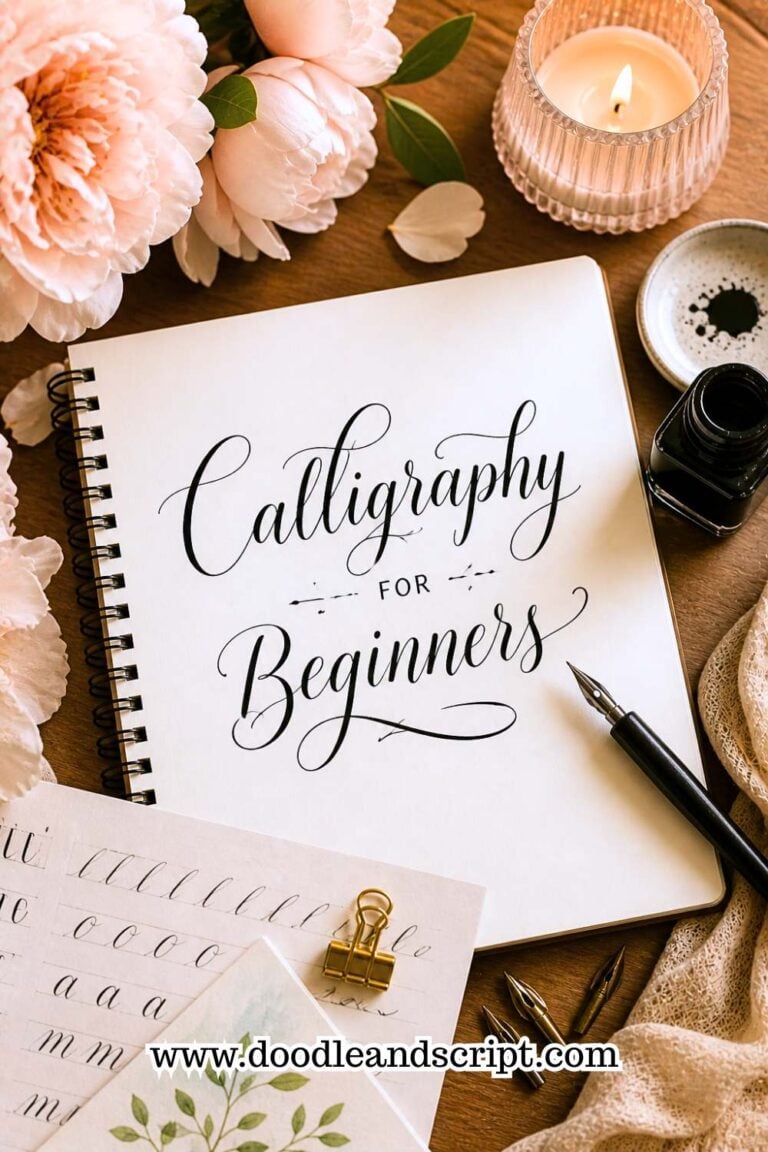
How to Create Your First Calligraphy Alphabet
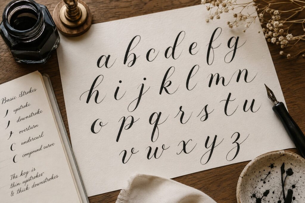
Calligraphy alphabet is a full set of letters (a–z) written in a calligraphy style, and to make it look beautiful and elegant, you need to know how to create thick and thin strokes or stroke combinations. But, don’t be scared, it’s not hard and you can actually do it.
If you prefer learning one letter at a time with clear, step-by-step guidance, in this guide, I’m going to walk you through how to create your first calligraphy alphabet and breaks down every letter stroke by stroke, step by step in a way that actually makes sense, even if you’re starting from scratch.
You’ll understand how each letter is formed from basic strokes, explore common variations, and gradually build consistency in your lettering style.
Before we dive in, if you haven’t already gone through a solid calligraphy for beginners: complete starter guide, I’d recommend doing that first. It gives you the full picture; from tools to mindset; so that everything in this post makes more sense and feels less overwhelming when you’re just starting out.
How to Create Your First Calligraphy Alphabet
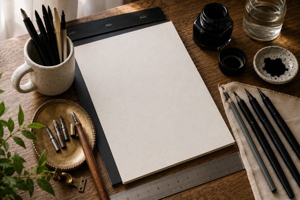
1. Get Your Tools Ready
There’s no time I talk about calligraphy that I don’t emphasize on the importance of your tools. Isn’t it obviously necessary? Like without your tools, you won’t be able to work. So, since you’re a beginner, I usually recommend starting with simple tool that you actually need, like brush pens, paper (use Rhodia pad), ink (if your doing traditional calligraphy). Also, you need ruler and pencil to draw out your guidelines. Ensure that the tools you are actually using are calligraphy writing tools like brush pen or dip pen not normal ball pen, calligraphy papers not rough papers.
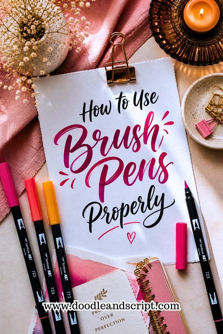
Speaking of brush pens, if you haven’t figured out how to use brush pens properly yet, now is the right time to sort that out. Using a brush pen incorrectly; wrong angle, too much pressure, wrong grip; will not only produce poor strokes but can also permanently damage the tip of your pen before you even get to practice your first letter.
2. Set Up Your Workspace Properly
Look for a comfortable place to practice. The mistake I usually see beginners make is sitting anyhow, at anyplace, some even stay on the bed to write and think that their strokes will come out fine. Your workspace matters more than you think. A well-organized, comfortable setup keeps you focused, reduces hand fatigue, and honestly makes you want to show up and practice every single day.

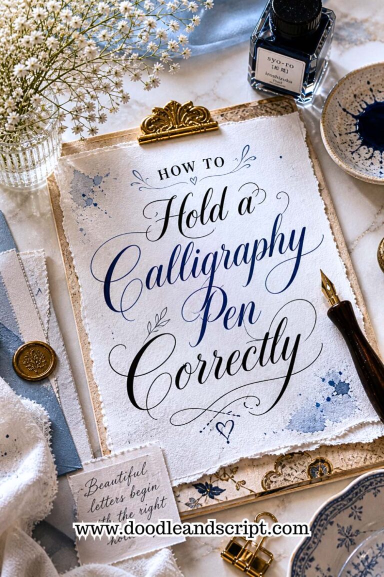
And please, don’t forget how to hold a calligraphy pen correctly before you even write your first stroke. Your grip is the foundation of everything; your pressure control, your stroke direction, your letter consistency; all of it starts with how you hold your pen.
3. Practice Basic Strokes First
Each time I want to write, I usually observe about 5 – 10-minute drills before I start the actual project or fun writing. So, as a beginner, start with the basic strokes first. Practice heavy and light strokes, then move on to curves and ovals, and lastly try loop strokes and transitions.
This is exactly why understanding calligraphy basics: understanding upstrokes and downstrokes is so important before you attempt any letter. These two strokes are the backbone of every single letter in the calligraphy alphabet. Get them right and everything else becomes significantly easier.
You should also make time for calligraphy basics: strokes every beginner must learn; things like ovals, curves, loops, and entry strokes. Think of these as your building blocks. Without them, your letters will always feel like they’re missing something, no matter how hard you try to make them look polished.
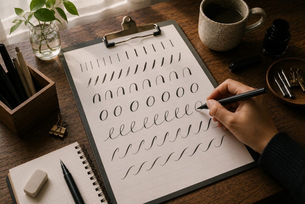
This will set your hands in the mood for the actual letter writing. And do you know what? I am not punishing you but you need to repeat these strokes, several times, rows by rows on your paper before actually beginning the real writing because it will make sense when you understand the strokes.
4. Start with Simple Letters
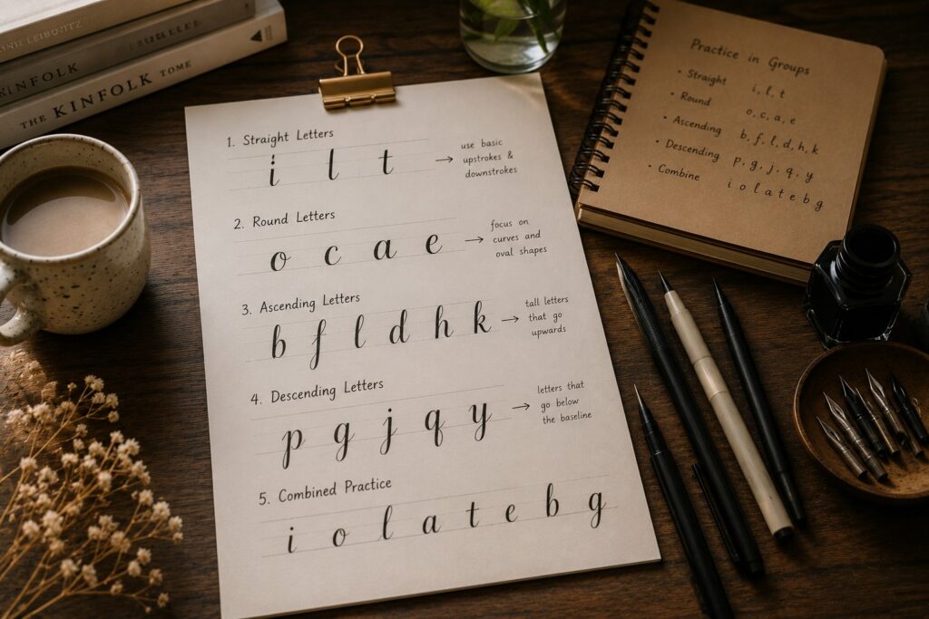
Don’t start with the full alphabet yet, yes don’t jump straight into writing the full letters a, b, c, d, etc. In order not to get overwhelmed or confused along the way. The best thing to do is divide them into groups of similar lowercase letters. So, if you look closely at these alphabets, you’ll see that some of them look alike, a perfect example is ascending (b, f, l, d) and descending (p, g, j, q) or you can group them into letters with similar strokes. Practicing in groups makes learning calligraphy feel less random and more structured. It also helps you see patterns, which makes it easier for you to remember how each letter is formed. This is one of those small tips that makes a big difference in how quickly you improve.
But I would recommend you begin with straight letters (i, l, t), because they’re the easiest way to practice control. These letters mainly use basic upstrokes and downstrokes, which are the foundation of brush calligraphy.
Then move on to round letters next, like o, c, a, and e, once you feel comfortable with straight strokes. These letters will help you in your curve’s movements. Your circles might look uneven at first and that’s completely normal, mine looked funny because I can still remember how my tutor, Mr. Henry laughed and I was ashamed of myself but now, each time I look at my first circles, I also laugh too.
I usually like to see everything together, it helps you feel more organized
Here’s how I love to put my letters in groups
- Straight or stem letters: i, l, t
- Oval letters: o, c, a, e
- Ascenders: b, d, h, k
- Descenders: g, j, p, q, y
- Connectors: n, m, u, w, r
- Mixed/unique: f, s, v, x, z
Once you are able to write each letter, then you can begin to write the letters according to the alphabet real arrangement.
So, let’s start writing them.
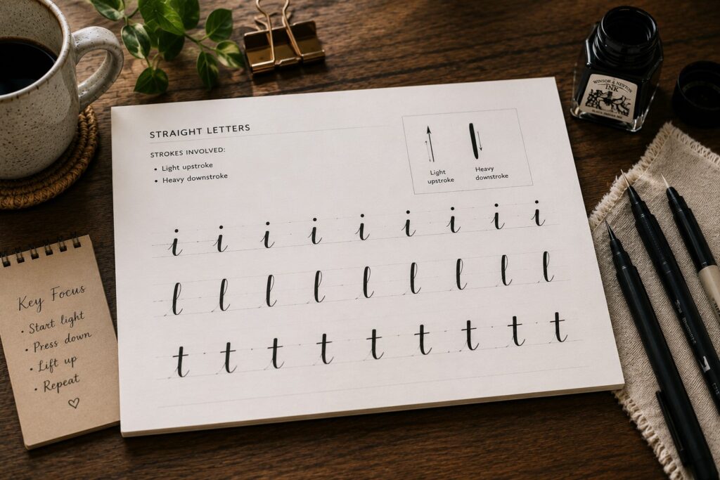
1. Straight letters
Strokes involved:
- Light upstroke
- Heavy downstroke
Step by step on how to write them
For letter i:
- Practice a row of light upstrokes
- Then add a controlled downstroke
- Finally, lift your pen and place a dot above.
And you’ve successfully written your letter i
For letter l:
- Begin with a thin upstroke moving slightly upward
- At this point, gently transition into a thick downstroke
For letter t:
This one is similar to letter l but a bit shorter, so all you need to do is add a light horizontal stroke after repeating the same procedure as letter l.
What you should focus on is keeping your strokes clean and controlled. I will advise that you practice each letter in rows, repeatedly to train your hand to be able to understand when to apply pressure and when to lighten up. But wait, have you seen how it is so easy to write them out? All because we grouped them.
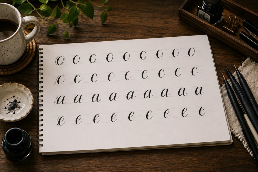
2. Oval (Round) Letters
Letters:
o, c, a, e
These letters will teach you how to create smooth curves and the stroke involved are
Strokes involved:
- Oval shape
- Entry stroke
- Exit stroke
How to combine the strokes:
Letter o:
- Start with a light entry upstroke
- Curve around into a thick downstroke
- Close the oval smoothly
- Then add a comma dot to the right side not at the top and leave the dot inside the oval.
Letter c:
It is written in a similar way to o but you don’t close the shape, you leave it open
Letter a:
- First, write out your entry stroke, make it light
- Then an oval
- And lastly an underturn
- Write the stroke out separately at first and then join them together on a different row.
Letter e:
- Start with a small entry stroke
- loop into a compact oval
- exit with a light stroke and always extend the exit stroke to match the oval’s height.
- What I want you to focus on:
Try to keep your ovals even and balanced
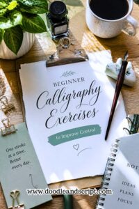
This is also a great time to incorporate beginner calligraphy exercises to improve control into your daily routine. Oval drills and circle repetition exercises will train your hand to produce smoother, more consistent curves; which makes a massive difference in how your round letters look.
3. Ascending Letters
Letters:
b, d, h, k
Once you’re comfortable with straight and oval shapes, you can now move to these set of letters because they need you to combine both skills in order to get them right.
Strokes that they are made up of:
- Entry strokes
- Upstroke (leading into ascender)
- Ascending loop
- Oval
- Exit stroke
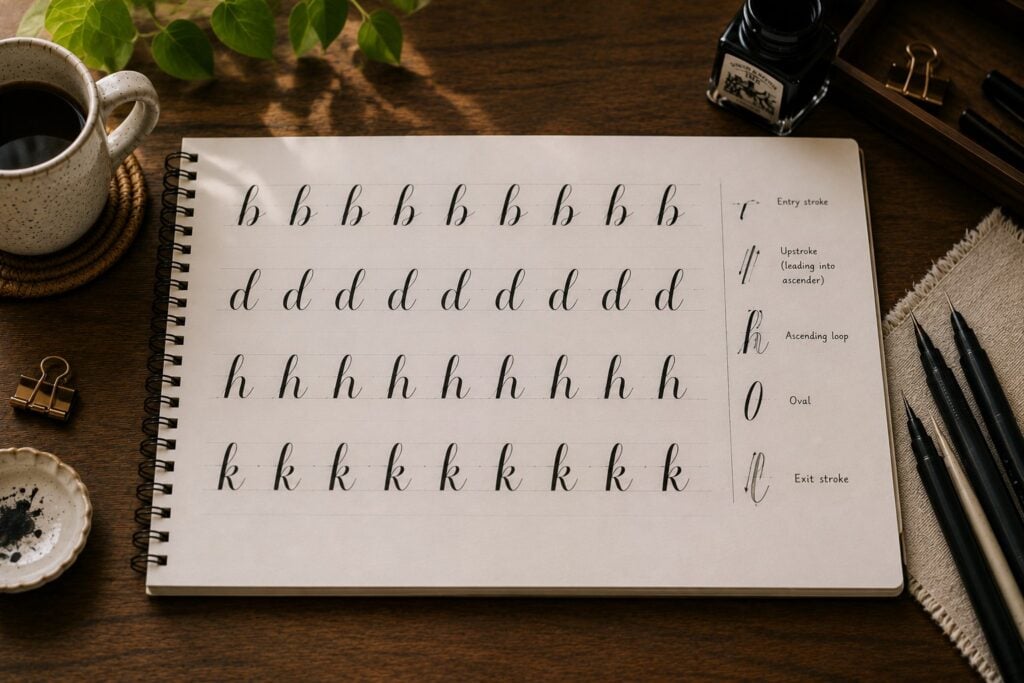
How to combine the strokes and form your letters:
Letter b:
- Begin with an upstroke
- Go in with a full tall downstroke
- Add an oval on the right side.
Letter d:
- Start with an entry thin upstroke
- Add a smooth oval, like o but slanted
- Finish it up with an extended underturn, the downstroke should begin from the ascender line and curve lightly upwards a bit as it sits on the waistline
Letter h:
It begins with an entry upstroke, followed by an ascending loop and then a compound curve as if you’re writing letter n.
Letter k:
- Light entry stroke
- An ascending loop
- Then add a shape that looks like the capital letter “R”
- And end with a light exit stroke.
- Ensure that each stroke is slant and parallel to each other not leaning on one another.
Final tip on this set: Keep your ascenders consistent in height. If one is taller than the others, your writing can look uneven. If you’re struggling with consistency at this stage, revisit some tips on how to create consistent calligraphy letters; small adjustments in slant, spacing, and stroke height can completely transform how polished your letters look.
4. Descending Letters (Descenders)
These set of letters are
g, j, p, q, y
Here, things are getting a bit more advanced, but don’t worry, its easy because you’ve already learned the strokes you need.
The Strokes combination for descending letters are:
- Entry stroke
- Downstroke
- Oval (for some letters)
- Descending loop (below the baseline)
- Exit stroke
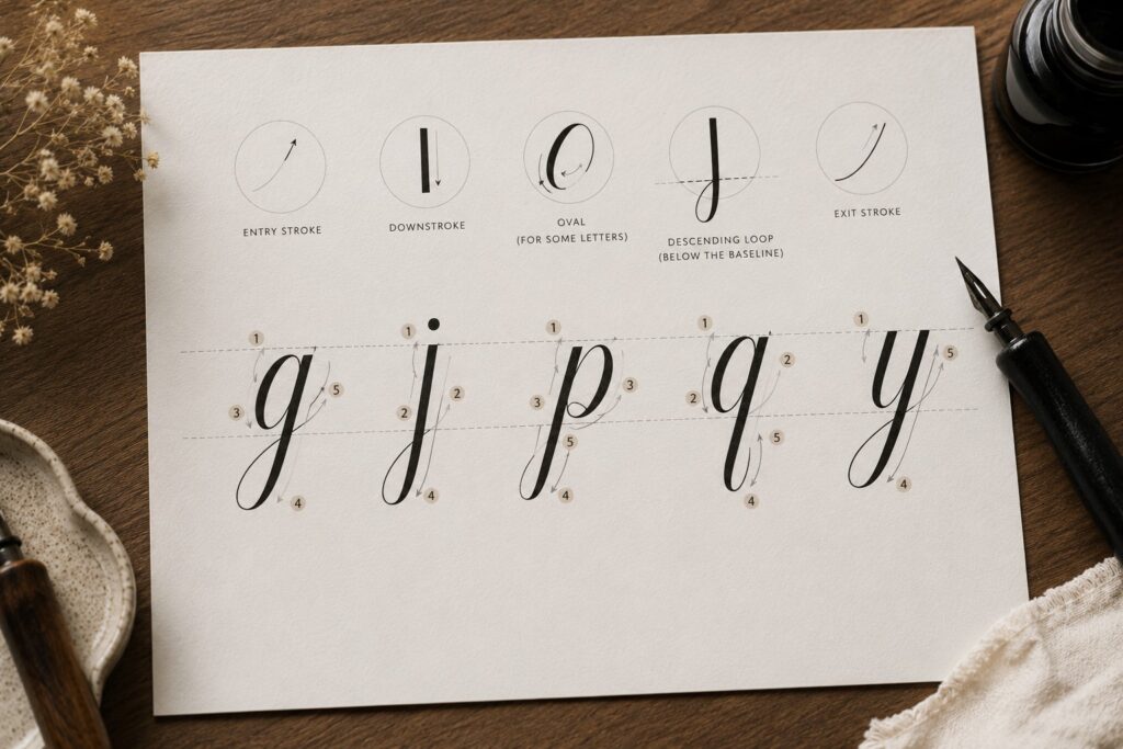
How to combine the strokes:
Letter g:
- At the baseline, start with an entry stroke
- Join an oval to it (a little slanted letter o)
- then extend a downstroke into a loop below the baseline.
Letter j:
- Light entry stroke
- Downstroke extending below the baseline
- Curve into a light tail to the left at the descender line, moving it up to finish at the baseline.
- Then an exit stroke
- Add a dot
For this letter j, ensure that the loop is a medium size one no too much space inside the curve.
Letter p:
- Entry stroke
- A full downstroke to the descender line, some people prefer to stop the thick stroke just immediately after passing through the baseline but I do extend mine down to the descender line.
- The go back up at the waistline and add a reverse oval. Sometimes, I do close the oval up or add a terminal, it all depends on what I want to achieve.
Tip: Make sure that the point where the oval is attached to the downstroke is rounded. Also, try to square the end of the downstroke, it makes your lettering look premium.
Letter q:
- Enter with a light upward stroke
- Form an oval
- Then add a tall descending tail passing through the waistline and ends at the descender line facing the right side.
- Pro tip: At the top of the descending stem loop, join the oval in such a way that there’s a triangle shaped gaps between the oval and the stem of the loop.
Letter y:
- Create a rounded compound curve
- Then a stroke downward into a tail facing left (a descender loop).
- An exit stroke.
- The compound curve should be parallel to the slant downstroke.
Make room for enough space between your descending stem loop and the entrance stroke. Focus on making the descenders flow naturally below the baseline and make them smooth.
5. Hump Letters (Connector Letters)
They are:
n, m, u, w, r, v. And, I usually group these together because they’re all built from repeating “humps” (those little curve shapes that look like mni arches).
Strokes involved:
- Entry stroke (light upstroke)
- Downstroke (heavy)
- Overturn
- overturns
- Exit stroke
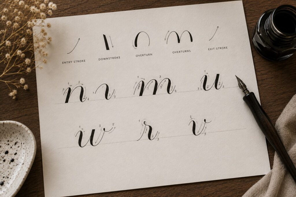
How to combine them:
- Letter n: It is not a full downstroke joined to an overturn because I see a lot of beginners make this mistake. Rather, letter n is formed from an overturn with a compound curve.
- Letter m: m is written just as n but with double overturn and then a compound curve.
- Letter u: It’s just like n but flipped to the opposite side but instead of a compound curve, you add two underturns. Start with a light entry stroke, join first underturn, then the second one.
- Letter w: This one is made up of two underturns but you’ll need to start with an entry stroke. Add a mini-underturn at the top, inside the final underturn and keep everything smooth and connected.
- Letter r: r is very unique and written different from the rest. You basically start with an entry stroke, make a loop a little above the baseline facing right and add an underturn. This will look a little bit tricky if you’re writing it for the first time, but just keep practicing it during your drill time and you’ll get it right.
- Letter v: Join an entry stroke to an underturn and finish up with a comma dot, that’s it.
6. Mixed Letters
These letters don’t fully fit into just one category, but they’re still built from the same basic strokes you already know and they are; f, s, v, x, z
Letter f: It is made up of both ascending loop and descending loop with entry and exit strokes respectively; that’s the reason I grouped it into the mixed letter. Normally, I don’t extend my descending loop to touch the descender line, else it will look so big in the midst of other letters in a word or sentence.
Letter s: If this is your first time of writing calligraphy alphabets, letter s might be a little bit difficult for you to write but follow this step to write it.
- Entrance stroke
- Apply pressure a little above the waistline as if you want to write letter r.
- Release the pressure and do as if you’re writing the reverse cure to create the s tommy.
- End with a terminal or thin upstroke.
Letter x: I usually think of x as a combination of two strokes crossing each other.
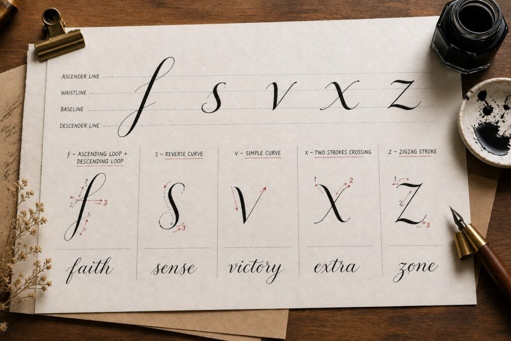
Strokes involved:
- Compound curve-like shape
- Light crossing stroke
How to write it:
Start with the compound stroke but here, you make it thick at the middle and flat as well then you cross at the middle with a light upstroke.
Letter z: I usually find z tricky at first, but it gets easier when you break it down.
Strokes involved are:
- Kind of a slanted overturn at the waistline like a top curve
- A loop or bottom curve
- Exit stroke.
And you’ve confidently written all 26 lowercase letters.
What Comes After Your First Alphabet?
Now that you’ve worked through all 26 letters, the real fun begins. Here’s what I’d recommend focusing on next:
Practice your letters consistently every day. Having a structured approach really helps here. If you need guidance on staying consistent, my 30-day calligraphy practice plan maps out exactly what to work on each day so you never feel lost or unsure about what to pick up next.
Keep improving your speed and quality. As you get more comfortable, you’ll naturally want to level up faster. Check out tips on how to improve calligraphy fast; sometimes a small technique tweak is all it takes to see a dramatic improvement in your overall lettering quality.
Build toward learning at home independently. If you’re on a self-teaching journey, how to learn calligraphy at home is a great resource to revisit regularly. It covers everything from setting up your learning environment to choosing the right resources and building a sustainable practice routine that actually works for your lifestyle.
And if you’re just getting started and wondering how long it takes to learn calligraphy, the honest answer is that your first alphabet is just the beginning of a beautiful, ongoing journey. Most beginners start feeling genuinely confident within a few weeks of consistent, focused practice; and creating your first full alphabet is one of the biggest confidence milestones you’ll hit on that journey.
If you want to go even deeper with your daily drills and stroke training, revisit calligraphy drills every beginner should practice; these targeted exercises will sharpen the exact strokes that make up every letter you just learned. And as your brush pen skills grow, always come back to how to start calligraphy with no experience fundamentals to make sure your foundation stays strong as you continue to grow.
Final Thoughts
It is highly recommended to create your own alphabet instead of copying random words. Do you know why? Because, you’ll get to focus on each letter, understand how it’s formed and build real confidence because it will be kind of unique. If you are going into calligraphy for the long term, it’s best because that’s how your skill actually sticks. Besides, trying to copy letters without knowing the basic strokes will get you frustrated.
Now that you’ve learnt how to write your first calligraphy alphabet, I want you to run a drill on each of the groups. But wait, you don’t need to master everything in one day. Just focus on one group at a time, and you’ll start seeing your calligraphy improve without feeling stressed.