How to Create Consistent Calligraphy Letters
What sets calligraphy apart from regular writing is the consistency of the letters, and that’s where its true beauty comes from. Have you ever seen a calligraphy word where some letters look noticeably bigger or smaller than the rest, or the spacing is so wide that the letters seem to be observing social distancing from each other? It makes the word harder to read right away, and that’s a perfect example of inconsistent calligraphy.
It’s not about making every single letter perfect (we are humans, of course, so there’ll be some errors); rather, it’s about creating letters that look like they belong together.
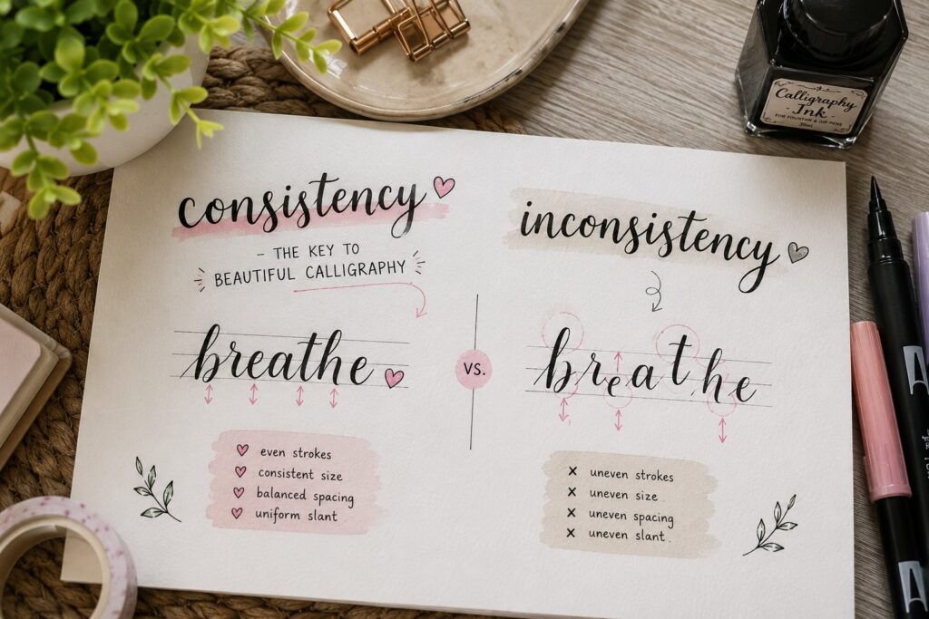
Your calligraphy only becomes consistent when your strokes, spacing, size, and slant are uniform across a word or sentence. Achieving this will make your writing instantly look cleaner, polished, and more intentional. If you’re just getting started and want to build this foundation properly, a solid calligraphy for beginners: complete starter guide will give you everything you need before diving into consistency work.
Here’s where a lot of beginners get it wrong: they focus too much on perfection. Thinking that each letter has to look flawless on its own is easy, but that’s not what actually makes calligraphy beautiful. In reality, consistency matters more than perfection. Slight imperfections are okay and even expected, as long as your letters follow the same pattern and rhythm across a word.
In this post, you’ll learn what truly creates consistency in calligraphy, the small details that make a big difference, and simple practical steps you can start applying right away.
What actually Makes Calligraphy Letters Consistent?
1. Your handwriting vs. Calligraphy
Handwriting is natural, fast, and automatic, and you’ve been doing it for years without thinking. But calligraphy is intentional; every stroke, curve, and spacing is done on purpose, like you are drawing an artwork.
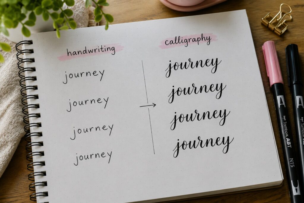
Approaching calligraphy the same way you approach normal writing will make your letters look rushed and uneven. One letter might be big, another small, one slanted, another straight. That’s because your brain is in “writing mode,” not “design mode”; and recognizing this shift is the first step toward consistency. If you’re unsure where to even begin with that shift, how to start calligraphy is a great place to get your bearings.
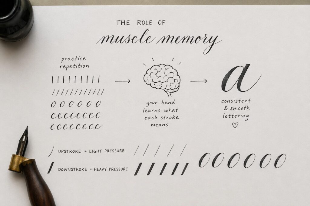
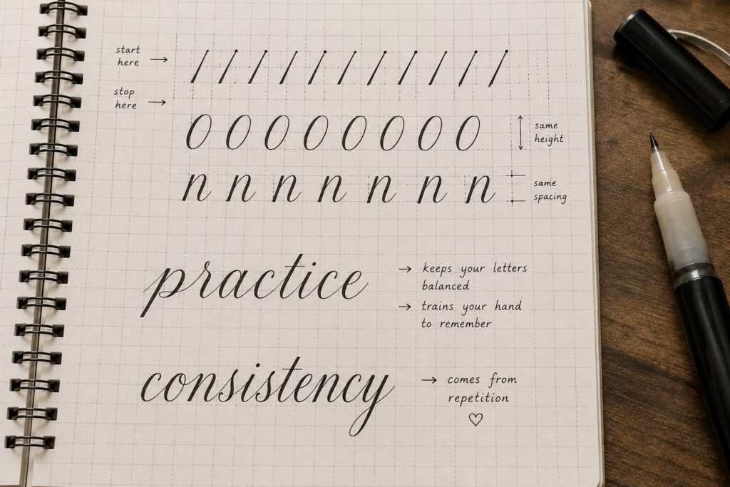
2. The role of muscle memory
Muscle memory is when your hand begins to understand what each stroke means. For example, when your pen goes up, it knows the pressure should be light. Achieving this requires you to practice and repeat the same drills, lines, curves, and ovals over and over again, so your lettering will start looking consistent. Calligraphy drills every beginner should practice are specifically designed to build this kind of muscle memory faster and more effectively.
3. Slow writing improves consistency
Speed is one of the biggest reasons your letters will often come out inconsistent. Whenever you write fast, your pressure is likely to become uneven, the shapes will get distorted, and the spacing will be unpredictable.
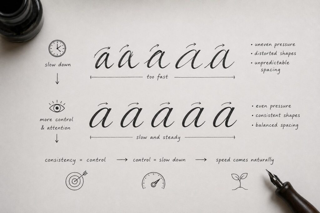
Slowing down gives you more control and the ability to pay attention to each stroke, curve, and letter connection. Think of it this way: consistency comes from control, and control comes from slowing down. Speed comes naturally once your hand truly understands the movements. For more targeted tips on progressing faster without sacrificing quality, check out how to improve calligraphy fast.
4. Pressure control
This is one of the biggest game-changers. Calligraphy gets its beauty from contrast; those elegant thick and thin lines actually come when you know how to control your pressure.
If your pressure is inconsistent:
Almost all your thick strokes will look uneven.
Thin strokes might fade or look shaky.
Your letters won’t match each other.
And you might notice that one letter has bold, beautiful strokes, and the next looks faint or messy. Don’t think that’s a style; it’s inconsistency.
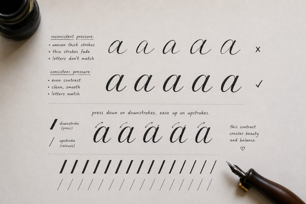
Applying pressure deliberately by pressing down on downstrokes and easing up on upstrokes is what makes your letters look uniform and balanced. A full breakdown of calligraphy basics: understanding upstrokes and downstrokes will help you master this pressure relationship much more quickly.
Letter Structure & Guidelines
Here are the little details that give your lettering structure;
1. Baseline, x-height, ascender, and descender lines
These lines are the framework for your letters:
Baseline is where all letters sit on.
X-height is the height of lowercase letters.
Ascenders are the parts that rise above the x-height. This is where the heads of tall letters like h, b or l end.
Descenders drop below the baseline, like where the tail of y, g, or p stops.
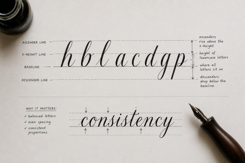
Understanding these lines helps you place each stroke correctly so your letters stay balanced and proportional, which is a huge step toward consistency.
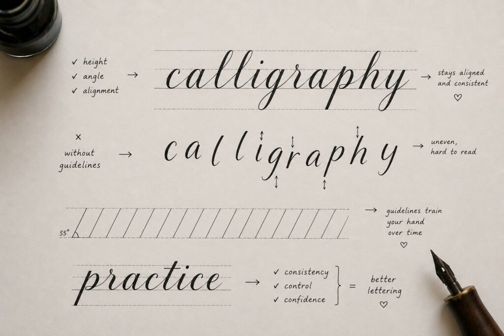
2. Make guidelines your best friend
Guidelines give you a clear reference for height, angle, and alignment. Following them prevents your letters from floating or slanting randomly, making your writing look more controlled and cohesive. They might seem basic, but using them regularly trains your hand to stay consistent even without them. Learning calligraphy basics: strokes every beginner must learn alongside your guidelines will make this training process significantly faster.
3. Use grid paper effectively
Grid paper or dot paper shows you where to start and stop your strokes, helping with both height and spacing. As a structured surface, practicing on it helps your hand internalize the measurements, so that when you move to blank paper, your letters keep their rhythm and uniformity.
4. Keep your letter size uniform
Uniform letter size directly affects readability and harmony. When some letters are taller or shorter than others, your text can look chaotic. Focusing on size trains your eye and hand to reproduce the same proportions every time, giving your calligraphy that polished, professional look.

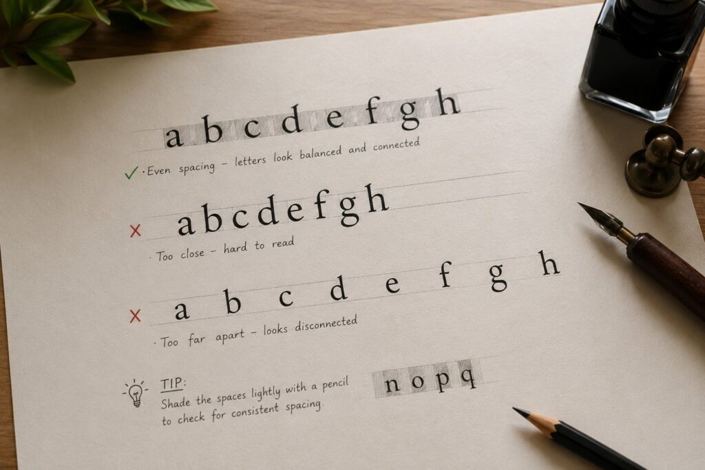
5. Spacing between letters and words
Make your letters evenly spaced so they look as though they belong to each other. Letters too close together make words hard to read; too far apart and they feel disconnected. Practice spacing to ensure your text flows smoothly across the page.
Tip: I usually shade the spaces between the letters lightly with a pencil to check if they have consistent density and spacing.
How to Form Consistent Letters
1. Break letters into simple strokes
One of the easiest ways to improve your calligraphy is by breaking each letter down into simple, basic strokes. Rather than trying to draw the whole letter at once, focus on mastering just a few repeating strokes like downstrokes, upstrokes, and curves. Practicing these individually is exactly what beginner calligraphy exercises to improve control are built around. The results also show quickly.

Let’s say you want to write the letter “a.” First, check how many strokes make up the letter, then draw out the strokes separately and rewrite it, focusing on joining the strokes to form the letter. This helps you create smooth, repeatable shapes every single time, so your letters look consistent and professional.
2. Practice lowercase letters first
Uppercase alphabets are usually beautiful and difficult at the same time for beginners, because of the many flourishes. Lowercase letters are simpler and smaller, which makes them perfect for building muscle memory and good habits early on. Once you get comfortable with them, your overall lettering becomes much more consistent and even. A step-by-step guide on how to create your first calligraphy alphabet will walk you through exactly how to approach both lowercase and uppercase letters in the right order.
3. Move to uppercase letters next
After feeling confident with lowercase, it’s time to move on to uppercase letters. Having already practiced the basic strokes and rhythm with lowercase, uppercase letters will feel more natural and consistency will be easier to achieve.
4. Keep your angles consistent
Pay close attention to the angle of your strokes, whether it’s the slant of your letters or the direction of your pen. Keeping the same consistent angle throughout your piece makes a huge difference.
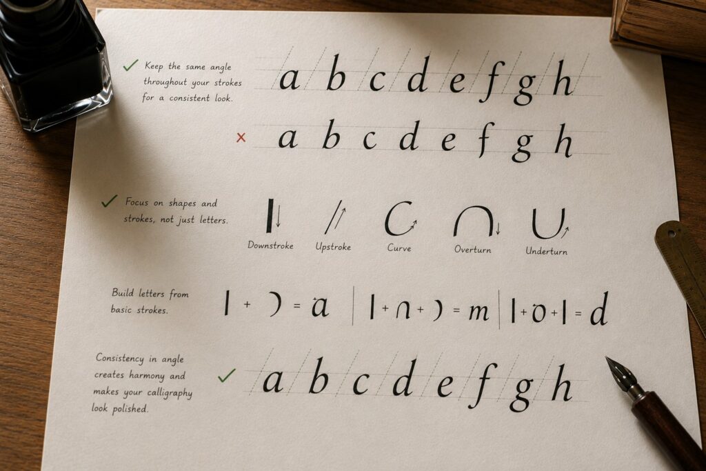
Another technique that really helps me is to stop thinking of the letters as actual letters. Instead, I treat them purely as shapes made up of basic strokes: upstrokes, downstrokes, curves, and so on. Focus on how these different lines relate to each other in terms of direction, spacing, and proportion.
For example:
· When writing the word “think,” all the downstrokes should be parallel to one another.
· The compound curve in the letter ‘h’ should be identical to the one in the letter ‘n’.
· The letters ‘h’ and ‘k’ should have the same height and width, and stop at the ascender line.
This approach makes it much easier to achieve consistency and balance in your lettering.
5. Avoid random letter shapes
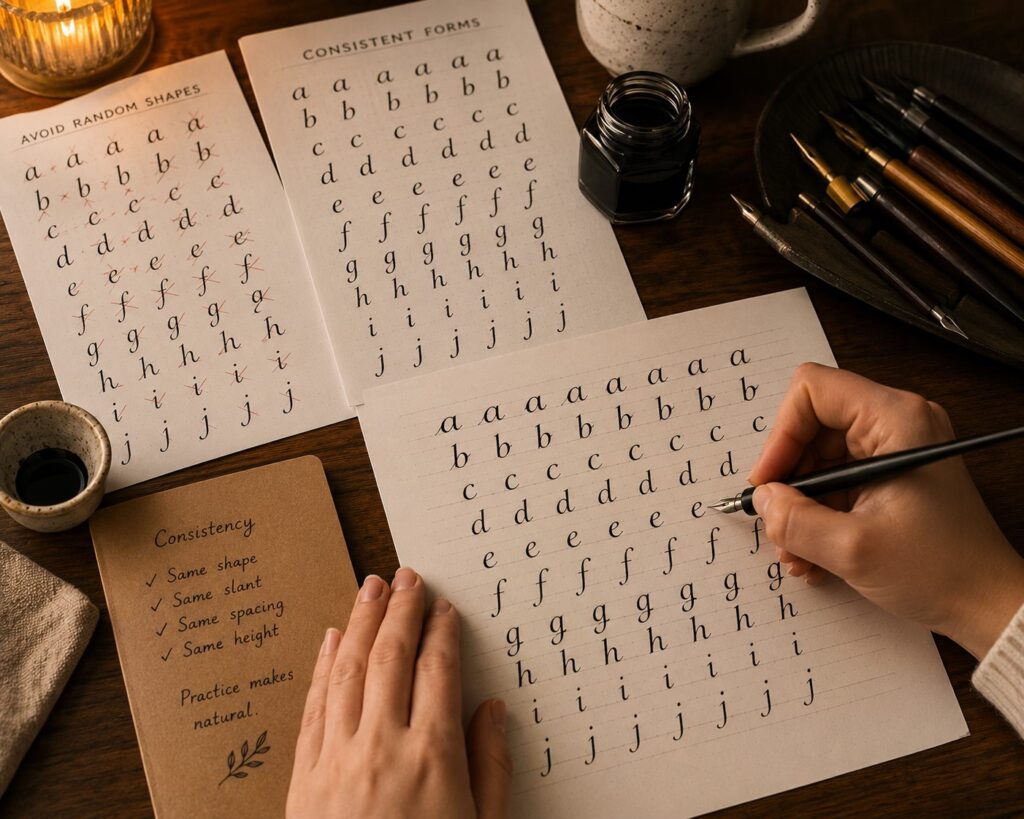
Try not to invent new shapes for the same letter as you write. Consistency comes from repeating the exact same form every time. Sticking to one reliable version of each letter instead of changing it randomly makes your entire piece look harmonious and much easier to read. This is also one of the key things covered in how to avoid common beginner calligraphy mistakes . Random letter shapes are one of the most common issues that beginners don’t even realize they’re doing.
How to Maintain Balance & Proportion for Consistent Calligraphy Lettering
Achieving beautiful, consistent calligraphy isn’t just about pretty shapes. It’s about creating balance and proportion to make your lettering look professional and pleasing to the eye. Here are some key tips that will really help you:
Keep letters aligned on the baseline
One of the simplest yet most powerful things you can do is to keep all your letters sitting nicely on the same baseline. When every letter rests at the same level, your word will look neat and grounded to prevent that “floating” or uneven look.
Avoid overcrowding your letters
Overcrowding your words can make even the most beautiful strokes look messy. Leaving enough white space around and between letters creates a more balanced and elegant composition.
For instance, I always give a bit more space to letters with open boundaries, like c, e, r, s, and t. It just makes the whole word look cleaner and more readable. Experience has also taught me to be careful with tricky connections; whenever the next letter is a, c, d, g, or q, adding a little extra space helps because these letters start on the right side, preventing words from looking cramped or messy.
Also, watch out for the combination c to l; bringing them too close easily makes them look like a “d.” Keep them nicely separated.
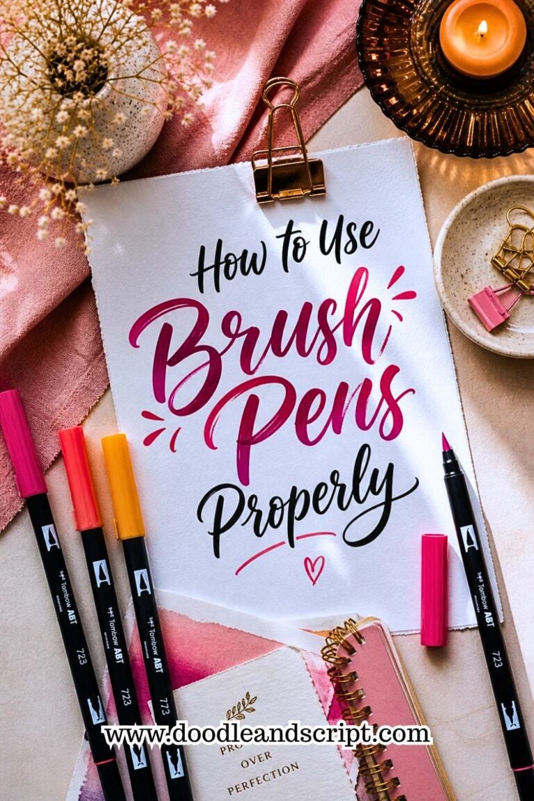
Finally, make your exit strokes long enough so they can smoothly connect to the next letter. Aiming for them to reach about halfway up the following letter really helps the flow and makes your lettering look more consistent. How to use brush pens properly also covers how the right tool technique directly supports better stroke connections and flow.
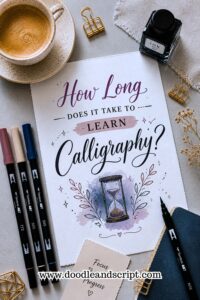
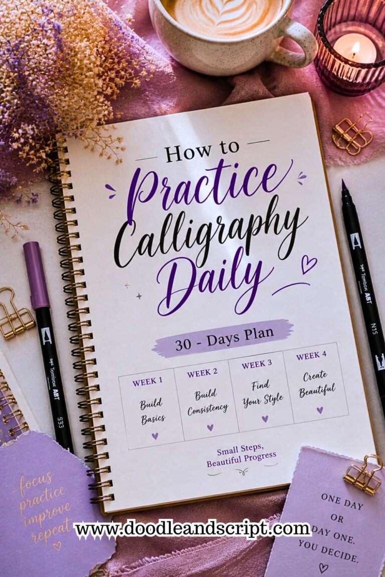
If you’re working on building a daily habit around all of these principles, a structured 30-day calligraphy practice plan will keep you on track and make the journey feel far less overwhelming. And if you’re ever wondering how quickly all of this should come together, how long it takes to learn calligraphy gives you a realistic and encouraging perspective on the timeline. For those learning entirely on their own, how to learn calligraphy at home is a great companion resource that ties everything together; from workspace setup to self-teaching strategies that actually work.
In conclusion
If you’re just starting out, you might notice common struggles like uneven letter sizes, inconsistent spacing, shaky lines, or strokes that don’t match. Sometimes your words look good on one line and completely different on the next. It can feel frustrating, especially when you’re practicing regularly but not seeing the improvement you expected.
That’s exactly what this guide is here to help you fix.
The goal of good calligraphy is visual harmony. When all the elements, like the height, width, slant, spacing, and curves, work together, your lettering will automatically become consistent. It’s what takes your calligraphy from “nice” to “wow, that looks amazing!”