Calligraphy Basics: Understanding Upstrokes and Downstrokes
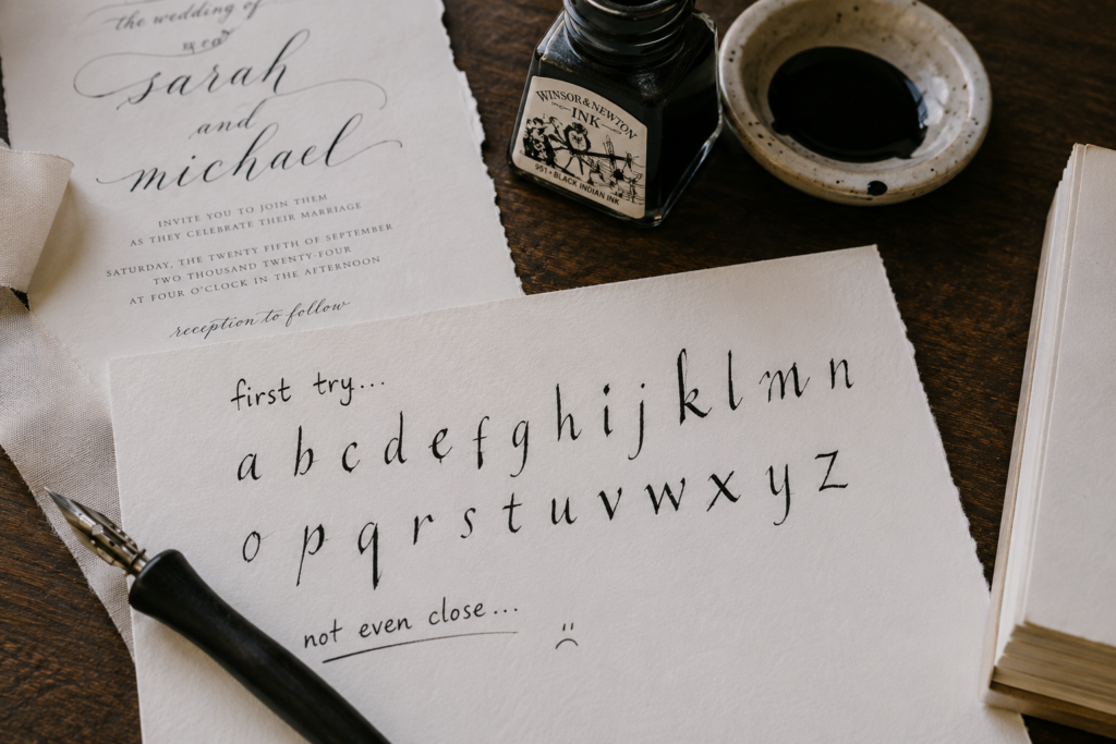
Actually, I didn’t start calligraphy with brush pens rather dip pens and I remember when I first picked up a Nikko G nib; I was so excited to start copying an elegant calligraphy I saw on a wedding invitation card but the result wasn’t even close to what I imagined. The lettering I usually do before this time with pencil was kind of way better than it. So, I blamed the innocent dip pen. More reasons why you need to check out these Calligraphy basics: understanding upstrokes and downstrokes.
What I didn’t know at the time is that the problem wasn’t my handwriting or my creativity or even the pen. It was my foundation. I did not understand the most important part of calligraphy, which is how strokes actually work: the specific upward and downward movement of the hand and pressure control. Without this understanding, everything else will feel confusing. If you’re just getting started, the calligraphy for beginners complete starter guide covers all the foundational knowledge you need before anything else.
But the moment I learned about upstrokes and downstrokes, things finally clicked. That was when I realized that beautiful calligraphy comes from a simple principle: thin lines when you move your pen upward, and thick lines when you move downward. That contrast is what actually gives calligraphy its signature look.
So, in this guide, I’m going to walk you through exactly what upstrokes and downstrokes are, why they matter, and how you can start practicing them in a way that actually works. If you’re also wondering how long it takes to learn calligraphy, mastering these two strokes first will shorten that timeline significantly.
What Are Upstrokes?
From normal English, you know that up means anything moving from a lower position to a higher point, while stroke is a drawn line. So, an upstroke is just the line you create when your pen moves up on the page. If you’re learning calligraphy as a beginner, this is one of the very first basics you need to get comfortable with because you’ll need it in almost every letter you write. It also connects directly to calligraphy basics: strokes every beginner must learn, which expands on all the foundational strokes beyond just upstrokes.
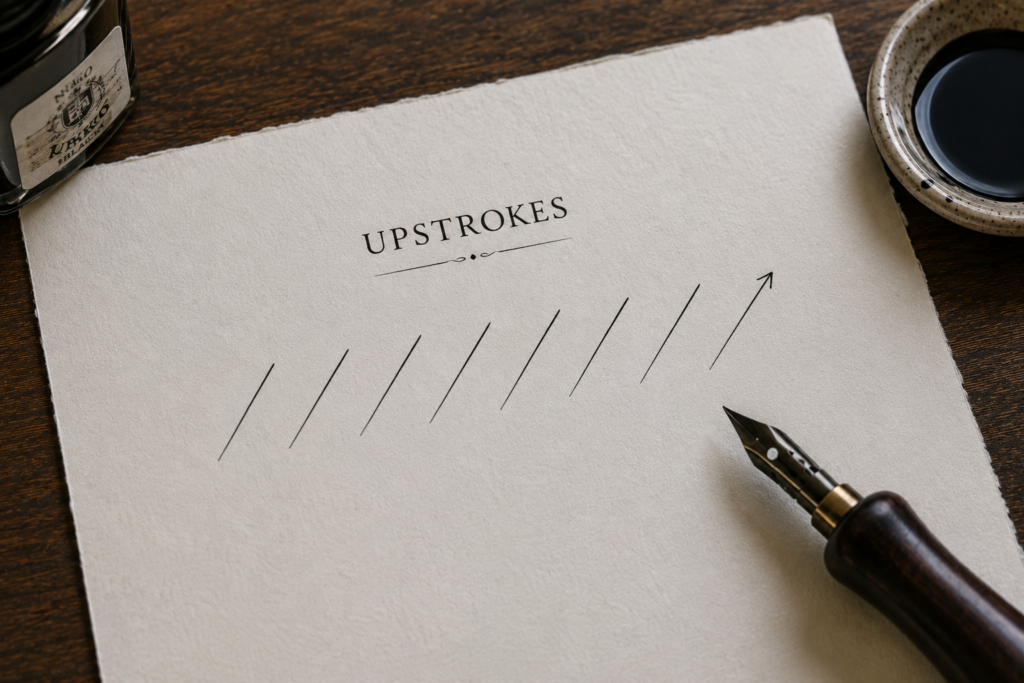
A lot of beginners get it wrong or are mostly confused when it comes to the direction of the upstroke. So, let’s clarify it once and for all: in calligraphy, an upstroke usually moves from the bottom to the top in a slant-like manner. Instead of dragging your pen downward like you normally would when writing, you’re gently guiding it upward.
Another important thing about an upstroke is the pressure control. It is usually a very light thin line; you don’t press your pen too hard when creating it or else, the line will look thick. Don’t hold it extremely light so that the line won’t look faint, uneven or maybe the pen falling off your fingers at the middle of your writing.
What Are Downstrokes?
Downstrokes are not that hard, and it’s all about making the line thick and bold but smooth at the same time. It is simply the line you create when your pen moves downward on the page. When the upstrokes are soft and light, the downstroke brings in emphasis.
It always moves from top to bottom. Whenever your pen is going down, whether you’re writing a straight line or an alphabet, you should just know that the downward movement of your pen or the line produced is called the downstroke. So, start now to pay attention to the direction of your writing.

Unlike upstrokes, where you barely touch the paper, downstrokes require heavy pressure. This means you intentionally press your pen down, so the tip spreads out, especially if you’re using a brush pen. So, what should a proper downstroke look like? It should be thick, bold, and smooth from top to bottom. Not shaky, uneven, or scratchy at all.
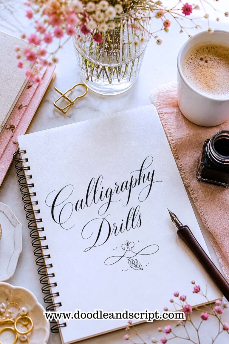
Tip: If you struggle with uneven strokes, like sometimes the stroke will just look light and other times it looks thick or not bold as it should be, I recommend you run drills on it to get it right. The calligraphy drills every beginner should practice guide will give you a structured way to drill these strokes until they feel natural.
Key Differences Between Upstrokes and Downstrokes
1. Thin vs. Thick Lines
The very first thing you’ll notice is how the lines look: upstrokes are light and thin, while downstrokes are heavy and thick. That distinctiveness between them is what gives calligraphy its beautiful style.
So, if all your up and downstrokes look just the same in thickness or plain, it’s because you haven’t created the contrast. What my tutor told me then was to ask myself each time I practice “Is this stroke supposed to be thin or thick?” I took his advice, each time I run drills, I ask that question in my mind till my hand got used to it and eventually recognized that whenever my pen moves up, the line is supposed to be thin and when it comes down, the line should be thick.

Following this simple principle made me to intentionally create thin and thick lines, and my writing instantly looked more like real calligraphy. So anytime you’re practicing, keep asking yourself: “Is this stroke supposed to be thin or thick?” This is also one of the core things covered in how to avoid common beginner calligraphy mistakes; not creating enough contrast between strokes is one of the most common errors beginners make.
2. Light vs. Heavy Pressure
This is where the real control comes in. When writing, upstrokes use light pressure, while downstrokes require heavy pressure. I want you to picture it like this: when you’re moving upward, your pen should barely touch the paper, but when you’re moving downward, you press the pen into the paper more.
At this point, you may be asking, “My lines usually come out all thickened. How do I control my hand to make my upstroke light and downstroke heavy?” This happens if your hand is tensed, and to fix this, you need to learn how to relax your grip and also control how much pressure you apply. Learning how to hold a calligraphy pen correctly will go a long way in fixing this tension issue because the right grip directly controls how much pressure your hand transfers to the pen.

Just have it at the back of your mind that if your strokes don’t look right yet, it’s usually a pressure issue, and that’s completely normal. Just loosen the pressure and you’re good to go.
3. Upward vs. Downward Movement
Another key difference is in the direction that your pen is moving. Upstrokes go upward (bottom to top), and downstrokes go downward (top to bottom). It sounds simple, but don’t ignore it. When you are intentional about direction slow down, and pay attention to it, you’ll start building better control and rhythm. It’s like training your hand to follow a pattern instead of guessing. Pairing this awareness with beginner calligraphy exercises to improve control will help you develop that muscle memory much faster.

Why the Contrast Matters Visually
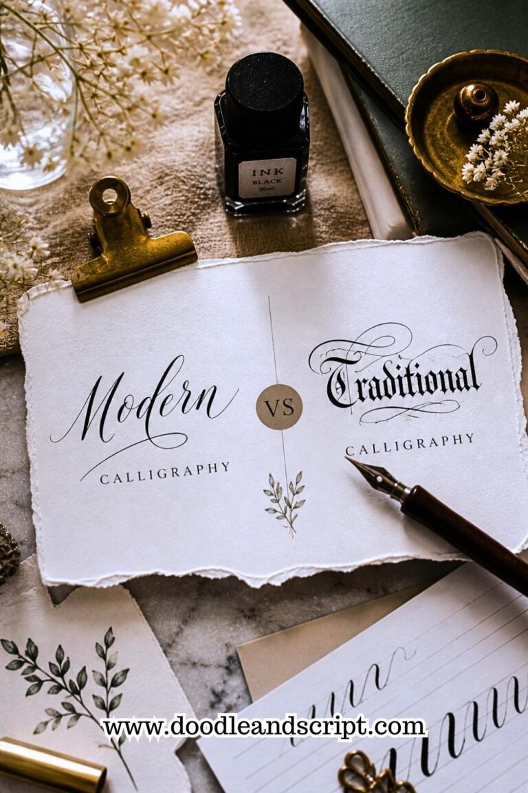
The reason normal writing isn’t regarded as calligraphy is because of the thin and thick strokes. It is basically what gives calligraphy that beautiful look. Without that contrast, your writing will just look like regular handwriting. This principle applies across every style; it’s one of the key things that separates modern calligraphy from traditional calligraphy, even though both rely on the same upstroke and downstroke contrast expressed in different ways.
So, if you’re feeling stuck right now, don’t overcomplicate it.
Just focus on this:
Thin + light + upward = upstroke
Thick + heavy + downward = downstroke.
You can even turn it into a song or rhyme for it to stick. It sounds funny, right? But this is the method I used in teaching my 7-year-old daughter, and without boasting, I can bet that her calligraphy is far better than that of some intermediate calligraphers. Once you get that into your muscle memory, everything else becomes so much easier. If you want to see how to improve calligraphy fast, locking in this contrast early is honestly one of the biggest shortcuts there is.
How to create upstrokes and downstrokes using different calligraphy techniques.
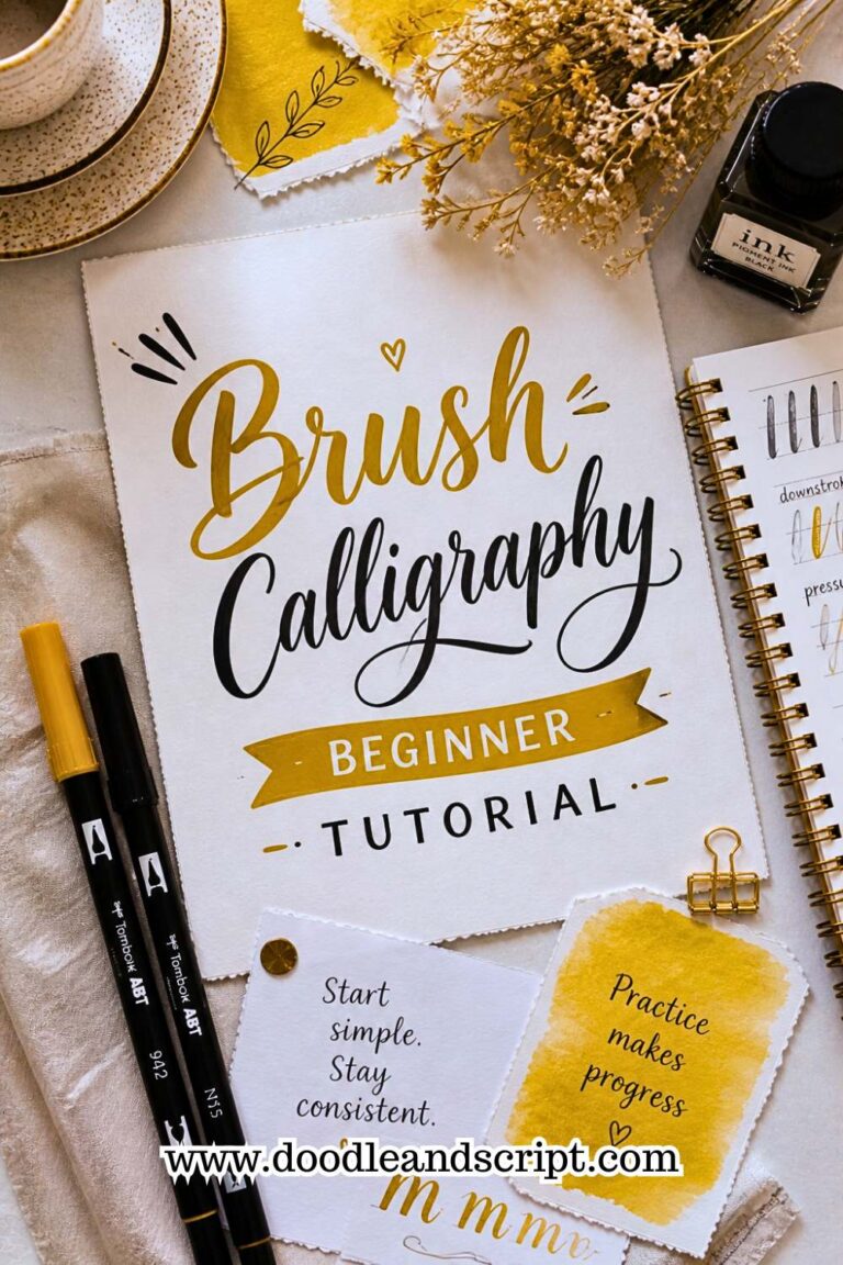
1. Brush pen calligraphy
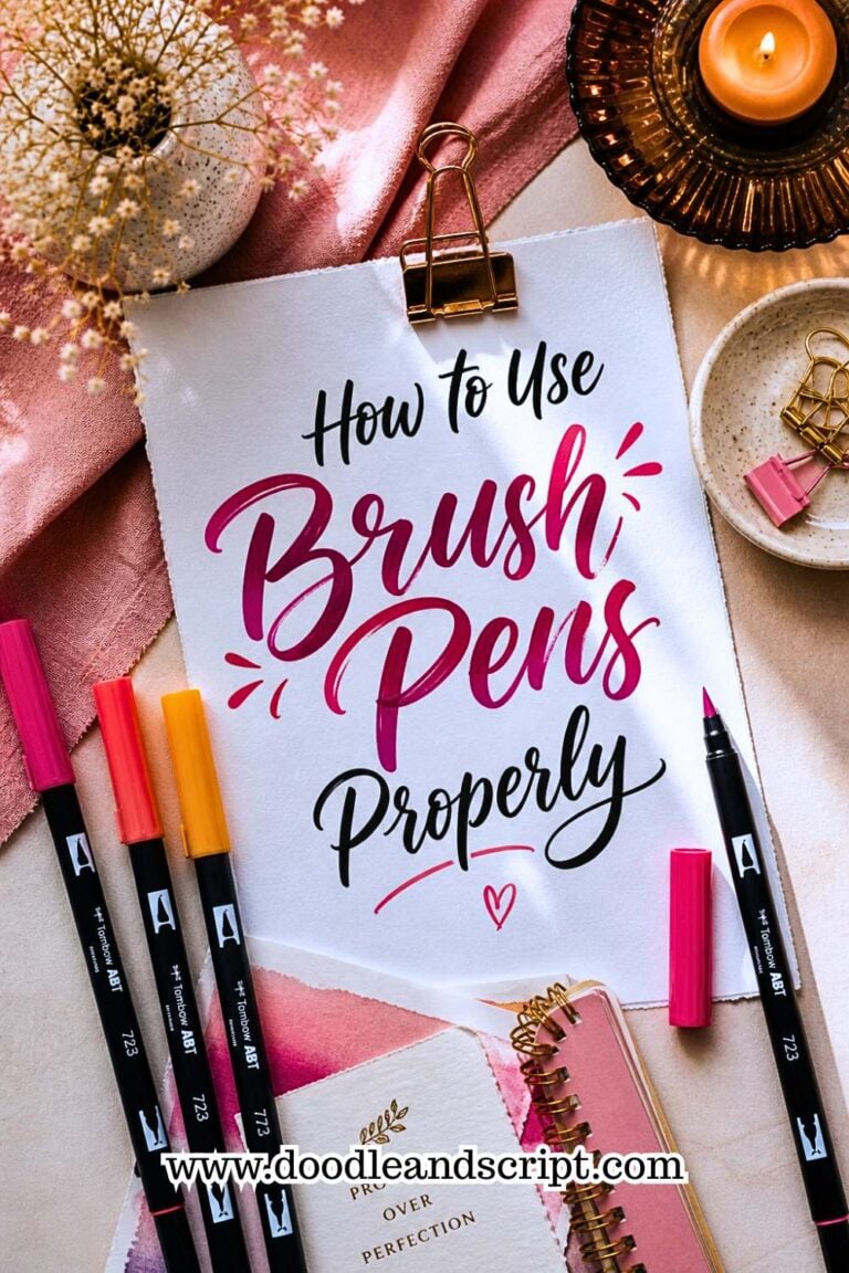
Making thin and thick lines with this technique is honestly the easiest. The supplies you’ll need are your brush pen and paper. If your paper is blank, use a ruler and pencil to create guidelines. Before you begin, make sure you understand how to use brush pens properly because the way you hold and angle the pen determines how well your thin and thick strokes come out.
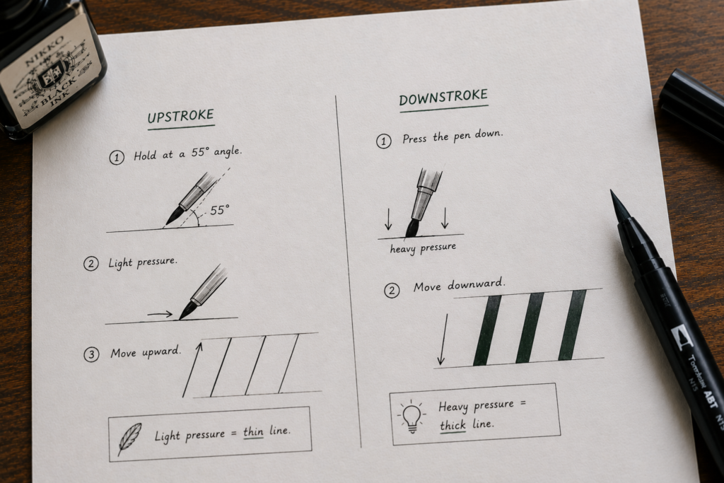
Upstroke
Hold your brush pen at a slight angle, not straight up. The correct angle for this is always 55-degree. The tip of the pen should somehow barely touch the paper. My tutor, Mr. Henry, used to say, “It’s like brushing a feather on the paper, soft and gentle.”
Downstroke
Here, you’ll need to press your pen against your paper, allowing the tip of the brush to spread out a little.
Tip: Don’t move too fast; take each line slowly in order for the thickness to stand out. If you’re new to this style entirely, the brush calligraphy beginner tutorial walks you through the full process from holding the pen to writing your first strokes. And if you’re still deciding where to begin your calligraphy journey altogether, how to start calligraphy with no experience is a great read before picking up your first pen.
2. Traditional calligraphy
If you’re a beginner, you have to be more careful here because it feels a bit different here although the principle is still the same. The tools you’ll need here are, dip pen, ink and paper.
After fixing your flange to your pen holder, dip your nib lightly into your ink, not too deep, just a little so that the ink will not blob on the paper when you are creating your downstroke.
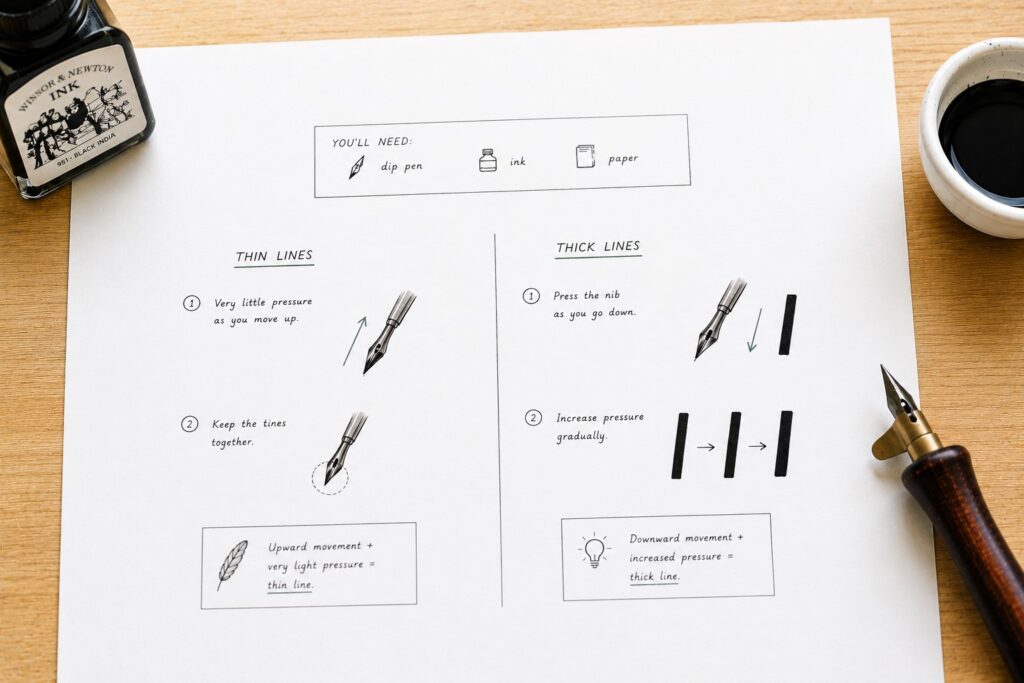
Thin lines
Apply very little pressure as you move upwards on the paper to keep the tines together
Thick lines
Hold firmly to the pen and press the nib to spread when writing downstrokes. As you go down, you increase the pressure gradually without forcing it. If you keep running into issues with blobs or uneven lines, beginner mistakes in calligraphy and how to fix them covers exactly what to do. You can also try faux calligraphy first if the dip pen feels too overwhelming; it teaches the same thick and thin stroke logic without the ink pressure challenge.
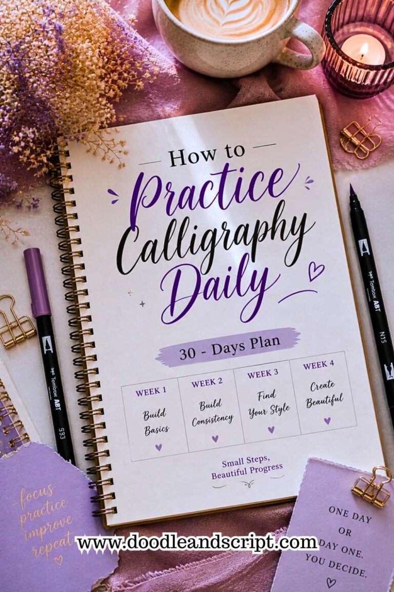
Simple Daily Practice Routine
I love this part because this is where everything comes together. You don’t need hours and hours, just a simple, consistent routine that actually guarantees progress.
Let me walk you through it the way I personally practice, and how I’d guide you if we were doing this together.
1. 5–10 minutes daily practice
Calligraphy is a writing that is done in a slow and relaxed atmosphere, even when you are practicing it, so you don’t need long hours to improve. Set a specific time of the day that you will be comfortable to run your drills. Just keep it short and realistic; it is all about consistency, not perfection. Following a structured 30-day daily practice plan is one of the best ways to build this habit without burning out.
2. Warm-up with lines
Even as I’ve gotten better, I don’t skip this routine; I usually go back to the basics just to keep my muscle memory in check. All you need to do is use a paper that has grid lines; my favorite is Rhodia pads, or you can simply rule out guidelines. Warm up with thin upstrokes and thick downstrokes, repeatedly in rows after rows across your paper. If you learn calligraphy at home, this warm-up routine is something you can easily build into your daily schedule without any special setup.
3. Move to curves and ovals
Another way to practice your upstrokes and downstrokes is with curves like C-shapes, reverse curves or normal ovals, which are made of thin and thick strokes. This will help train your hand to know when to apply pressure and when to release pressure. Once you’re comfortable here, you can move on to how to create your first calligraphy alphabet and start applying these strokes to actual letters, which is where everything really starts to come together. Keeping your letters uniform as you do this is also something you’ll want to focus on; how to create consistent calligraphy letters will show you exactly how.
Final thoughts
If you understand and practice these two basic strokes, everything becomes easier; your letters will start to look more balanced, your lines will become smoother even when you’re a beginner. As far as calligraphy is concerned, upstrokes and downstrokes are the foundation, and without them, you’ll just be doing normal writing, not calligraphy. Now that you’ve understood the difference between a thick line and a thin line, go and practice it to improve. Bye, see you in my next post.