How to Avoid Common Beginner Calligraphy Mistakes
Have you seen calligraphy videos on Instagram scrolls recently? Ever notice how they look so perfect, free of mistakes and effortless, but when you try, your own attempt looks messy and awkward. If this sounds like a situation you’re currently in, then stick around to the end to discover how to avoid beginner calligraphy mistakes.
In this guide, I’m going to talk about the 5 calligraphy mistakes I made as a beginner, which I now see beginners make as well, and, more importantly, show you exactly how to avoid them.

Common Beginner Calligraphy Mistakes
1. Beginner Mindset Mistakes
Here are the most common ones I see:
Expecting perfection too soon
It’s totally normal to want gorgeous lettering right away, but expecting perfection in your first few weeks usually leads to disappointment. When you pressure yourself to be flawless, your hand tenses up and your strokes lose consistency. Instead, give yourself permission to be a beginner.
Comparing yourself to pros on day one
Scrolling through stunning work by experienced calligraphers is inspiring, but comparing your Day 1 skills to their Year 5 work can crush your confidence. It often makes you rush or overthink every letter, resulting in uneven spacing and wobbly baselines.
Instead of comparing yourself with them, use their work as inspiration to do more.
Practicing without purpose
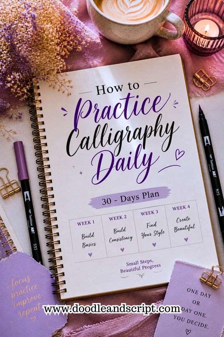
Just doodling random letters without a clear goal is one of the fastest ways to develop bad habits. Try to set a simple purpose for each session like you can determine to focus on even pressure, tomorrow, letter connection, next, flourishes. Purposeful practice trains your hand to repeat the same motion correctly, helping you build rock-solid consistency in your calligraphy lettering. A 30-day daily practice plan gives you exactly this kind of structured, purposeful routine.
2. Using the Wrong Tools
I know it’s tempting to think, “Let me just manage what I have for now.” Using the wrong tools will slow you down, frustrate you, and make you doubt yourself. This is where I struggled the most when I started calligraphy. I thought, “a pen is a pen”, so I grabbed the cheapest brush pen I could find and started practicing on random notebook paper.
Since I was just an ordinary beginner, I didn’t fully know my mistakes, but I knew something was off each time I stepped back to look at my lettering. It was when I saw a wedding invitation card that was given to my uncle that I realized I needed to get better tools. So, most times, it may not be your skill set but the tools that you’re using.
Cheap vs. Quality Pens & Nibs

Low quality pens make your learning way harder. Imagine the brush pen you just bought yesterday fraying up today, or the ink began to blob, and you can’t control your thick and thin strokes properly.
You don’t need the most expensive tools, but avoid the super-cheap ones. Look for pens that are specifically made for beginners because they’re more forgiving and easier to control.
My go-to pen is the Tombow Fudenosuke pens. No matter the level you are in calligraphy, it’s still useful. Others include Pentel Brush Sign Pen, Stabile pen 68 brush pens and sharpie brush pens but for traditional calligraphy, I usually use Nikko G. Read more on how to use brush pens properly so you can get the most out of whichever pen you choose.
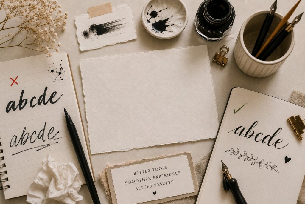
Using the Wrong Paper
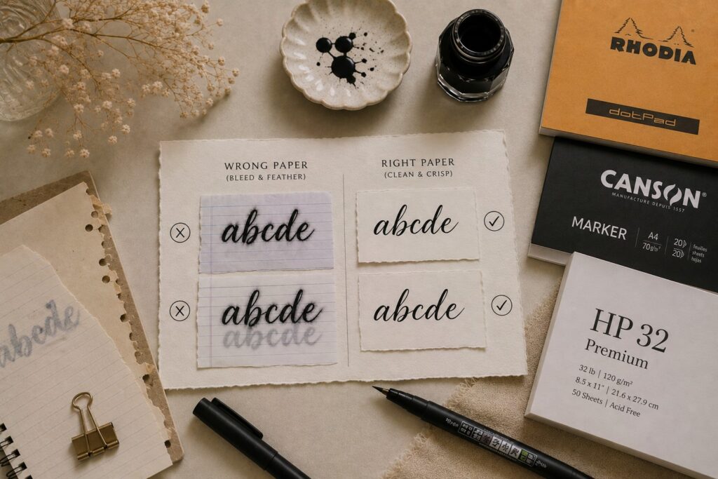
Even when you’re practicing faux calligraphy, it’s still not advisable to use your regular notebook paper because the ink of your pen will certainly bleed through to the other side of the paper and spread out (feather), making your letters look fuzzy.
Avoid thin, rough paper, they can absorb ink too quickly, and ruin your strokes, no matter how good your technique is.
Use beginner friendly papers like Rhodia pads, Canson marker paper, and HP 32 premium.
Incorrect Ink Consistency
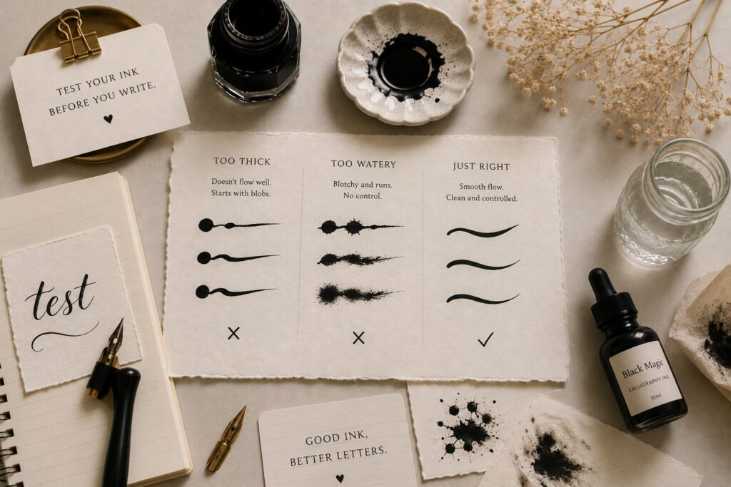
If you’re using dip pens, this one is important. Don’t make the mistake of using ink that is too thick because it won’t flow properly or too watery; it would blot and drip everywhere.
There was a time my ink kept forming blobs at the start of every stroke, and it was so annoying. Until I learned to test my ink before writing. If it felt too thick, I added a bit of water. If it was too runny, I switched inks.
Here’s how to avoid this mistake:
Use calligraphy-specific ink.
Test it on scrap paper first.
Aim for a smooth, controlled flow, not too thick and definitely not too watery.
3. Bad posture and grip
You won’t realize how much posture and grip matter until your hand starts to hurt after just a few minutes of practice.
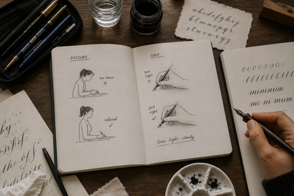
Why Hand Cramps Happen
If your hand cramps quickly, I can almost guarantee it’s not because calligraphy is “too hard”, it’s usually tension.
Here’s how to avoid it
Learn to loosen your grip (this one changed everything for me). And while you’re at it, make sure you’ve also learned how to hold a calligraphy pen correctly; the right grip from the start prevents a lot of tension issues.
Let your hand stay relaxed.
Focus on smooth movement instead of pressure.
Ideal Desk Setup and Lighting

I see some beginners posting on social media that they practice calligraphy on their bed, and it most times leaves me speechless. Like, how do you aim to achieve smooth lettering on an uneven surface?
At every chance I get to speak with beginners, I usually give hours of lecture on the importance of posture and proper lighting.
I do tell them to sit upright with their back relaxed, not stiff.
Ensure to keep your paper at a comfortable angle.
Make sure your space is well-lit; natural light is great if you have it.
Or you can set up your table close to the window.
Exercises to Improve Grip Endurance
Don’t just jump straight into lettering without warming up; it won’t help you at all.
What you should do
Start with 5 minutes of basic strokes. Check out calligraphy basics: strokes every beginner must learn to know exactly which ones to warm up with.
Take short breaks during practice.
Sometimes I even pause, stretch my fingers, and continue. It keeps my hands from getting stiff too quickly.
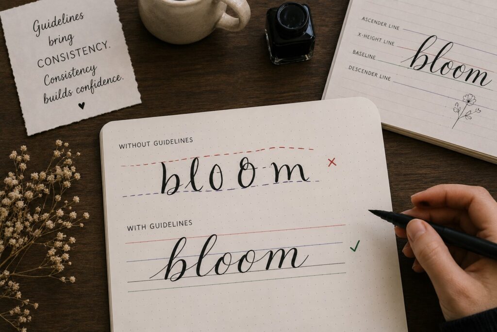
4. Ignoring guidelines and baselines
Most people feel guidelines would limit their creativity, but it turns out to be actually the opposite.
Why Freehand is Dangerous for Beginners
I know freehand looks cool. You see experienced calligraphers doing it effortlessly and you think, you should be able to do that too. That was me; I tried to copy the experts too early, and it slowed down my progress.
When you practice without guidelines:
Your letters won’t appear the same size.
The slant will keep changing.
And the words will look inconsistent.
What you should do
Don’t rush into freehand; rather, build your foundation first. Even the pro calligraphers you see doing freehand use guidelines when handling important projects. Guidelines will train your eyes and your hand to stay consistent. If you want to understand how to create consistent calligraphy letters, mastering guidelines is the first step.
How to create and use proper guidelines
Don’t use the excuse of not having guideline sheets to skip it; that is another mistake. Whenever I am short of guideline sheets, I quickly draw light lines using my pencil and a rolling ruler; if you have a T-square, still better. Or you can easily print basic guideline sheets; they are even cheap.
Ascender, X-height, and Descender Rules

This is very important because if you don’t understand them, your letter “h” would sometimes be too tall, “a” may randomly be bigger than other letters while “g” and “y” would just drop too low or not enough. So, instead of guessing, I follow a structure, and it shows in my work.
Baseline is where all your letters sit.
X-height is the height of your main lowercase letters like a, e, n.
Ascenders; the tall parts, where letters like h, l, b, end.
Descenders; parts that go below like g, y, p.
Now that you’ve understood the rules, here’s what you should do to avoid mistakes. These same principles apply when you’re learning how to create your first calligraphy alphabet:
Keep your x-height consistent.
Don’t let ascenders randomly grow taller or shorter.
Make sure descenders drop to the same level.
5. Overloading the nib with ink
This one can be so embarrassing, especially when you’re in the midst of other calligraphers. There was a time I went for an exhibition. As a beginner then, I didn’t really know that I shouldn’t dip my nib into ink and go straight to writing. I did, and boom, a big ugly blob at the start of my stroke; some of the ink even splattered on the page.
At first, I thought maybe my hand wasn’t steady because of stage fright. Or maybe I just needed more practice.
But nope, I was simply loading too much ink on my nib.

Signs You’re Using Too Much Ink
I ignored the signs for a long time because I didn’t know what to look for.
Here’s what kept happening to me:
Ink would pool at the beginning of letters.
My strokes looked too thick and uncontrollable.
Blobs would appear randomly; this can be so frustrating.
Sometimes ink would even drip before I touched the paper.
I remember writing a full word, thinking it looked okay, then I looked closer and saw tiny ink explosions everywhere.
If your ink isn’t flowing smoothly and neatly, something is off, and most times, it’s too much ink. So, pay attention to how your strokes start. If you see blobs or heavy pooling, that’s your sign to adjust.
Proper Dipping Technique
Don’t dip your nib too deep into the ink like you’re scooping it because it will overfill the nib, cause uneven ink flow, and make your control almost impossible. Instead;
Dip only the nib tip, but not all the way up
Lightly tap off excess ink
Test on scrap paper before writing
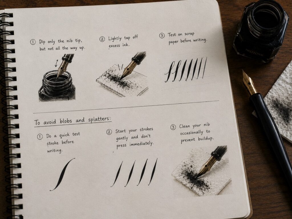
How to Avoid Blobs and Splatters
This can ruin so many of your practice sheets, even when you tried to be careful, blobs would still show up, especially at the beginning of strokes.
So, always;
Do a quick test stroke before writing
Start your strokes gently and don’t press immediately
Clean your nib occasionally to prevent buildup
6. Copying Styles Without Understanding Structure
Copying is tempting; it feels like the fastest way to get beautiful results.
You scroll through beautiful calligraphy on Instagram, pick a style you like, and try to copy it exactly, same curves, flourishes, and same everything.
But it can actually hold you back if you don’t understand what you’re doing.
Why Copying Fails Long-Term
I am not saying that trying to recreate an expert’s work is bad; it actually helps you observe, but most beginners copy the look without understanding how it works.
So anytime you don’t look at the reference, there’s a possibility that the letters will be inconsistent, the spacing will look off, and you may even forget how the strokes were connected.
So, copying is more like memorizing a drawing instead of learning the skill.
I remember trying to write a simple word without my reference beside me, and I just froze. I didn’t know how to form the letters properly on my own.
So instead of copying, use the reference as a learning tool to understand, not replicate.
How to analyze letterforms properly
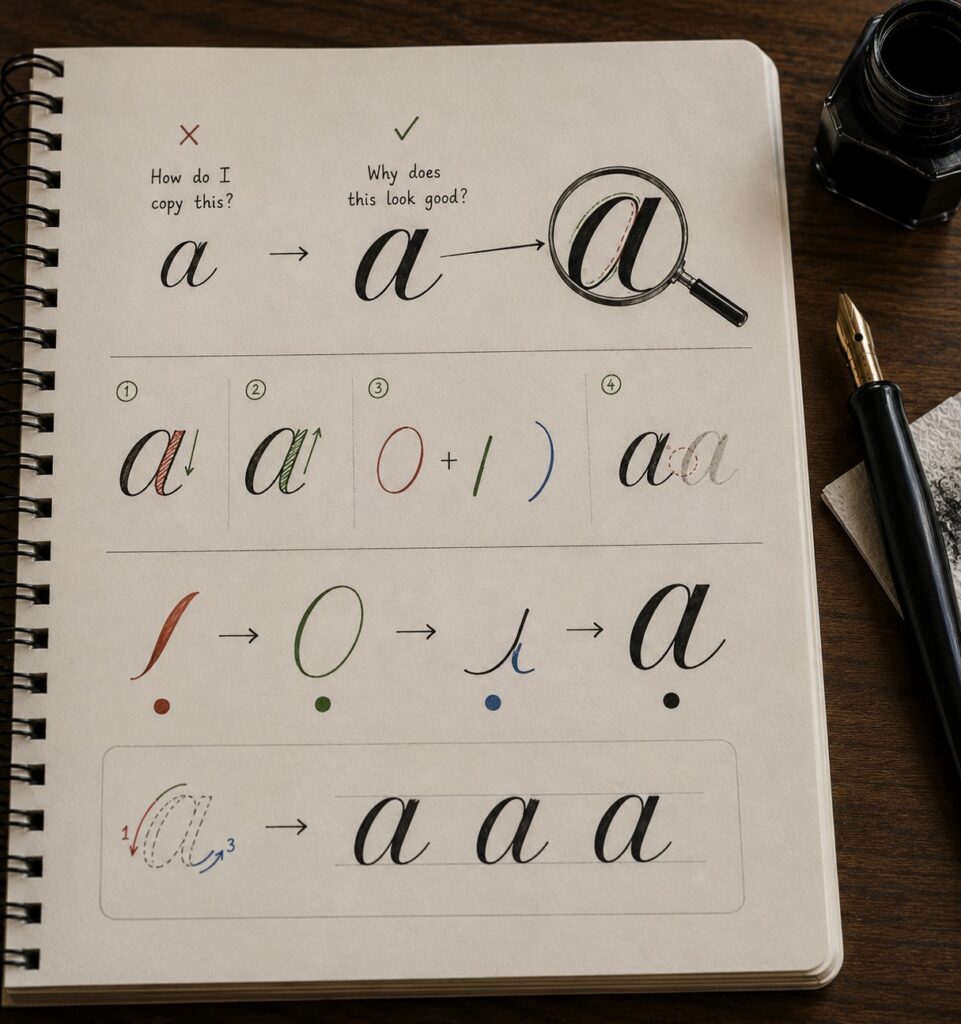
Instead of asking, “How do I copy this?” and start thinking, “Why does this look good?” this mindset shift will make a huge difference.
Now, when you look at a letter, break it down:
Where is the thick stroke (downstroke)?
Where is the thin stroke (upstroke)? Understanding the difference between the two is covered in detail in calligraphy basics: understanding upstrokes and downstrokes.
What shape is this letter really made of? Is it oval, curved, or a line?
· How does it connect to the next letter?
For example, instead of seeing the letter “a” as just “a”, I started seeing:
An entry stroke.
oval.
And an underturn.
This way it becomes easier to recreate it anytime, even without a reference.
Build Your Own Style Foundation
Having a “style” does not mean copying something that already exists perfectly, comes from understanding the basics first.
Here’s what you should do:
Master basic strokes before chasing fancy styles. The calligraphy drills every beginner should practice are a great place to start building that foundation.
Practice different variations, not just one look.
Allow your hand to develop its own rhythm so that your style will just come out without forcing it.
How to Analyze and Fix Your Own Mistakes
My Simple Self-Critique Checklist
At first, I didn’t even know what to check for. Everything just looked “off.”
So, I created a simple checklist for myself, and this helped me improve faster than anything else.
Now, after every practice, I ask:
- Are my downstrokes really consistent or not (whether some are thick or some thin)?
- Are my upstrokes light and smooth?
- Are my letters sitting properly on the baseline?
- Is my x-height consistent, or are some letters bigger than others?
- Are my spaces between letters even?
- Do my words look balanced overall?
Don’t just practice, observe. Even if you check just 2–3 things at first, that’s already a big step. And if you want to go deeper, beginner calligraphy exercises to improve control will help you work on each of these areas systematically.
The Before & After Comparison Method
This is something I wish I had started earlier.
I used to practice every day, but because I wasn’t comparing my work, it felt like I wasn’t making progress.
Then one day, I looked at an older page I had done weeks before and, wow; the difference shocked me.
What I started doing
- I kept my old practice sheets
- Rewrote the same words or drills after a few days or weeks
- I placed them side by side
That’s when I could clearly see:
- Cleaner strokes
- Better spacing
- And a lot more control
And honestly, it boosted my confidence so much.
Do this
- Don’t throw away your old work
- Repeat the same drills or words over time
- Compare side by side
Progress is easier to see when it is visual. If you want to know how long it takes to learn calligraphy so you can set realistic expectations for your before-and-after comparisons, that guide will give you an honest timeline.
When to Ask for Feedback
If you always think, “Let me just get better first before I show anyone.”
Stop it, yes, because majority of the times you won’t see your own mistakes clearly.
There were things I kept doing wrong that only became obvious when someone pointed them out, like my slant being inconsistent or uneven spacing.
- Ask for feedback when you feel stuck.
- Share your work with other calligraphy learners or communities.
- Be open to corrections (even if it stings a little at first).
Just make sure you’re asking the right people, those who understand calligraphy basics. If you want a head start on how to improve calligraphy fast, combining honest feedback with purposeful drills is one of the most effective methods.
Final Thoughts
Most of my struggles in calligraphy weren’t about talent; they were about small mistakes I didn’t even realize I was making. Once I slowed down, fixed my tools, posture, and actually paid attention to structure, everything improved. If you take anything from this, let it be this: be patient with yourself, stay consistent, and focus on doing the basics well, you’ll get there. And if you’re still figuring out how to start calligraphy from scratch, the complete beginner’s guide is the best place to begin.